

Your Monthly (creative) Booster: a one-stop for the freshest, coolest, design projects and resources I’ve found. Think of it as your creative espresso shot: quick, strong, and guaranteed to get your ideas flowing.
I’ll cover everything I can from branding breakthroughs and design trends to inspiring projects and tools you actually want to use. I’ll share my thoughts, hot takes, and maybe even a little tough love 🫢
What to expect from these monthly issues:
👉 Discover standout creative work from around the globe
👉 Learn what makes these projects tick, beyond the surface
👉 Apply fresh ideas to your own work and level up
So, grab your coffee and let’s dive in.
Yes, it’s already June — and, yes, this May Creative Booster is a tiny little bit late (life happens, right?). But May was a busy month for creatives full of moments across design, branding and marketing. I spent the month like a kid in the world’s biggest candy store: bookmarking, screenshotting, and full‑on geeking out over the brilliance flying past my feed every five minutes. Obviously, I had to funnel that energy into May’s Creative Booster, even if it means publishing on June 5.
WAIT…shall we make this official?🔒
Subscribe to The___Edit for free and get weekly fire content: no-BS design strategies, creative insights, and sneak peeks into premium posts.
Want to go all-in? Paid subscribers unlock masterclass-level deep dives, exclusive templates, and behind-the-scenes lessons from real projects. No fluff, just high-value insights you won’t find on Google. Join ⍟VIP⍟ now and save 20% off the annual pass:
So, what’s inside this month’s booster:
Branding: Coinbase x BUCK
Social media spotlight: Sandro Paris (and why weird wins)
Marketing corner: Cornetto “At Last!” & IKEA “Big Blue Bag”
Visual identity: Google
Photography spotlight: Sony World Photo Awards 2025
Event recap: OFFF Barcelona 2025 — 25th anniversary
So, pour yourself a generous cup of coffee (tea or wine), find a comfy spot and let’s dive in!
They weaponised a negative (the dreaded blue‑screen‑of‑death) and turned it into hype.
Flip the pain point → own the punchline. By sampling that electric‑cobalt error screen, BUCK positions Coinbase as the platform that fixes the glitchy past of finance.Code becomes THE character.
Every pixel is built from ASCII glyphs running on a Houdini‑fed particle system. The “letters” aren’t decoration — they behave like a crowd: clustering, collapsing, dancing along a bass‑heavy soundtrack.Retro‑future colour grading.
Ultra‑saturated blues + iridescent gradients nod to early Web aesthetics while feeling 2025‑fresh (bonus: they mirror Coinbase app UI, so brand cohesion stays tight).
What BUCK has done here is pure artistry. They've created this incredible world that feels like it's literally woven from ASCII characters and code snippets, but it’s imbued with such life, such dynamism. It’s retro-futuristic, playful, and incredibly sophisticated all at once.
“We wanted this world to be fun, slightly irreverent, and to ride the line between ‘how did they do that? and ‘who cares, this is a party.”
— Daniel Oeffinger (Group Creative Director at BUCK)
BTS: how they’ve built it?
Below is what BUCK have publicly confirmed in their Stash interview:
‘We needed more control over the ascii, something closer to a particle system. Our animation team, led by Anton Thallner, landed on a workflow that combined 2D and 3D inputs to create a controllable ascii set-up that could be influenced by dynamics, gravity, and disruption. We used a combination of Houdini, Cavalry, and Cinema 4D to accomplish the various challenges each shot presented.”
• ASCII particle rig with Houdini: A custom HDA converts meshes into live glyph instances. Velocity fields and layered noise make the “letter‑swarm” ripple like fluid rather than sit in a static grid.
• Typographic timing with Cavalry: Designers sequenced cursor blinks, word wipes, and micro‑loop offsets in Cavalry. Its procedural timeline let them tweak timing without re‑simulating Houdini every pass.
• Layout & lighting with Cinema 4D: The ASCII point clouds were imported via Alembic; subtle volumetrics and depth‑of‑field give the code‑built world tangible weight. BUCK often use Redshift for speed‑to‑previz, but they haven’t named the renderer, so treat this as an educated hunch.
• Composite & glitch passes with After Effects: Final colour, CRT‑style flicker, and blue‑screen burst overlays were layered here. Posterize‑Time plus displacement maps create the crash‑to‑party transition.
Reflecting Coinbase
The genius lies in how perfectly this aesthetic reflects Coinbase itself. It’s inherently digital, rooted in the language of code and the architecture of the crypto world. Yet, the animation's energy, its vibrant (often blue, naturally) color palette, and its slightly irreverent tone make Coinbase feel accessible, exciting, and deeply innovative. It’s techy without being intimidating; it’s complex under the hood but a joy to watch.
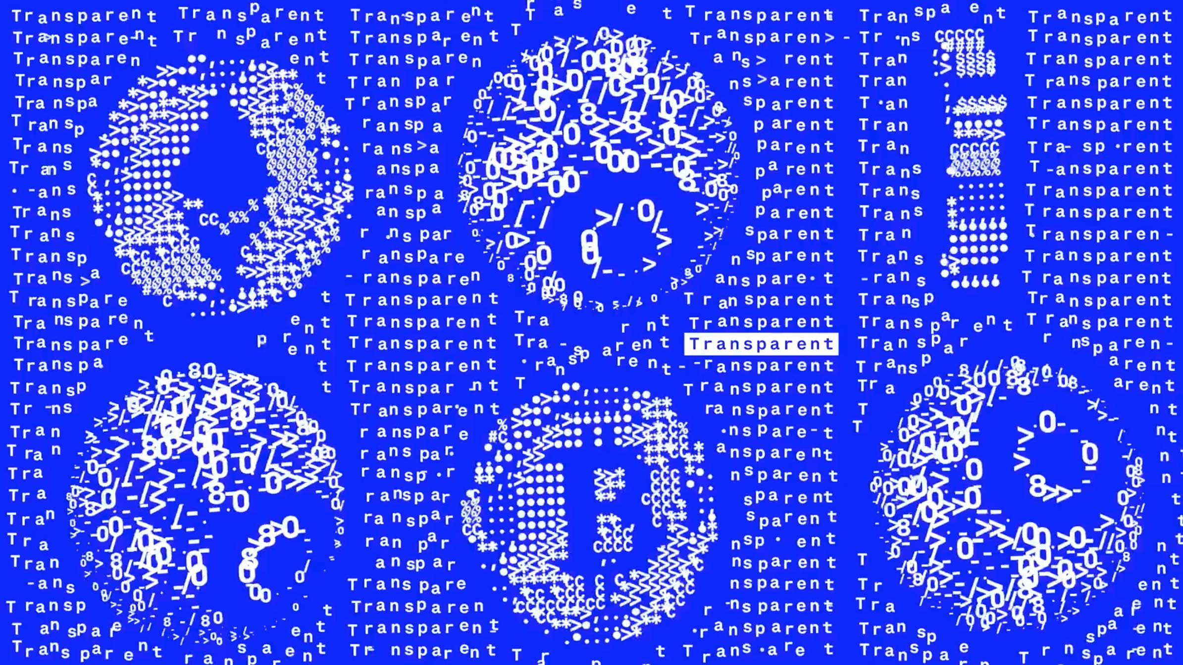
A good balance
BUCK aimed to "ride the line between 'how did they do that?' and 'who cares, this is a party.'" And they nailed it. There’s enough visual complexity to fascinate designers and animators, but the overall feeling is one of exhilaration and forward momentum that anyone can appreciate.
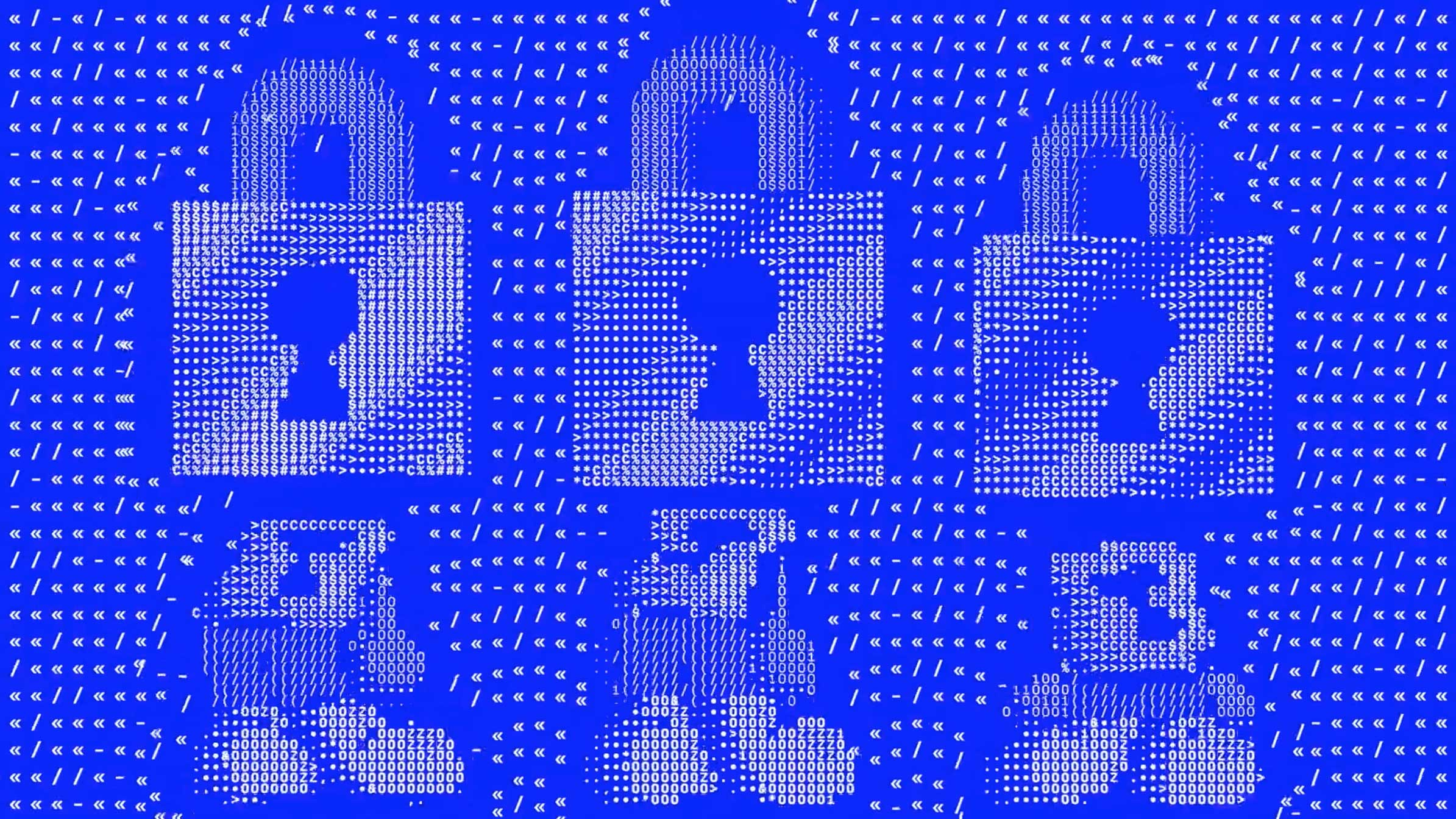
This Coinbase piece is a powerful reminder that branding, especially in the often-abstract worlds of tech and finance, is about storytelling and evoking a feeling. BUCK didn't just create a cool animation; they crafted an entire mood, a statement of intent. They took something potentially dry (the concept of a financial "reset" built on code) and made it feel like the opening scene of an exciting new chapter.
It's a masterclass in:
Conceptual bravery: Taking a potentially negative visual trope (BSOD) and flipping it on its head.
Technical excellence: Pushing the boundaries of a specific aesthetic to create something truly unique, using different softwares to work together.
Brand alignment: Ensuring every creative choice reinforces the core message and personality of the brand.
This isn't just good; it sets a new benchmark for how some financial and tech companies can communicate their essence with vibrancy and imagination. It makes me excited for the future of creative branding in these sectors. Seriously, go watch it a few times. You’ll see something new each time.
TikTok is still a volatility machine: trends flame out in 48 hours and any whiff of “corporate” gets roasted in the comments. Yet French label Sandro keeps landing videos that feel both gallery‑grade and native to the feed.
My first look through their TikTok feed felt less like Browse a brand’s social media and more like stepping into a cool, slightly enigmatic art student’s digital diary. It’s premium, it’s cinematic, it’s playful, and it’s undeniably chic.
The product is ALWAYS there. A perfectly tailored coat, a statement knit, an effortlessly cool silhouette – but it’s not screaming at you. It’s part of the art, part of the vibe.
There’s a raw, immediate quality to many of their videos, even the highly stylized ones. They tap into TikTok-native editing styles, sounds, and transitions, but always with their unique Sandro twist.
So, what’s their secret sauce? From what I can see, it boils down to a few key ingredients:
Art meets product, effortlessly: Sandro videos play like miniature visual poems. They feel more like a filmmaker × stylist × DJ collab than a “marketing asset.” Check the mirrored‑scarf piece, for their new collection “Louise Bourgeois”:
Fearless experimentation: zero sense of “this went through ten sign‑offs.” Some uploads are abstract, some comedic, some just gorgeous texture studies. The through‑line is permission to be weird.
Speed of culture — trending audio or filters appear on their feed within 24 h, but always through a Sandro lens. No clout‑chasing vibes here.
Niche & proud — they’re not talking to everyone; they’re talking to the Paris‑chic‑with‑an‑art‑degree crowd, and trusting that tribe to get the conceptual stuff.
Traditional approval chains murder TikTok relevance. By the time Legal blesses your copy, the trend is toast. Sandro and other brands nailing it on these rapid-platforms, prove that lean teams + trust beat big budgets.
Benefits of agile social:
• speed & relevance — jump on culture in real time.
• creative freedom — weird ideas survive.
• authenticity — raw > over‑produced.
• rapid learning — post, read data, iterate.
Mindset shift: It requires a fundamental shift from top-down control to empowering creative voices within the organization. It means valuing participation and conversation over perfection and monologue. It means trusting your team.
Secure an experiment sandbox — carve out 20 % of feed real‑estate for safe‑to‑fail posts.
Go native — edit inside TikTok so your content feels platform‑born.
Think like a creator — would you watch this if it hit your FYP?
Champion agility — propose a “TikTok task force” with fast‑track sign‑off.
Embrace strategic imperfection — audiences reward honesty over polish.
Blend art & product — ask “could this play in a gallery?” If yes, you’re close.
For me, this experimental, agile approach to social media is where the most exciting creative work is happening right now. It’s a playground for innovation. It’s a space that rewards bravery, quick thinking, and a genuine connection with culture. It’s a call to arms for brands to loosen the corporate reins, trust their creative teams, and be willing to put work out there that isn’t focus-grouped into blandness. We need more art, more personality, and less boardroom bureaucracy in our feeds. Sandro Paris is a shining example of how to do it right.
We live in push‑notification chaos, yet a single, well‑placed billboard can still freeze you mid‑stride. Great Out‑of‑Home (OOH) isn’t background decoration: it hijacks the street, the commute, the skyline. Two fresh campaigns prove how elegant ideas + bold scale still deliver goose‑bump ROI.
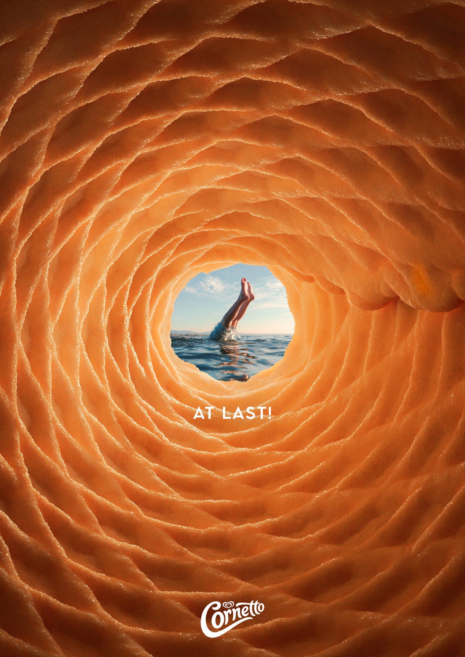
The insight
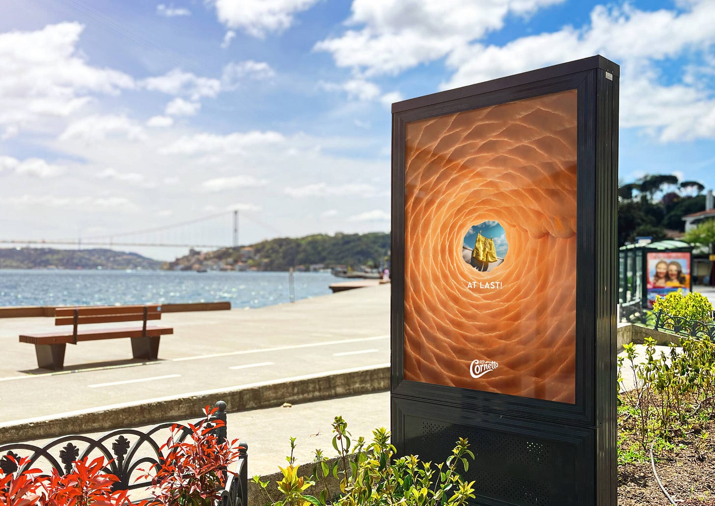
Cornetto isn’t just ice cream; it’s summer’s starter pistol. That first crunchy bite triggers dopamine and dolphin dives.
The execution
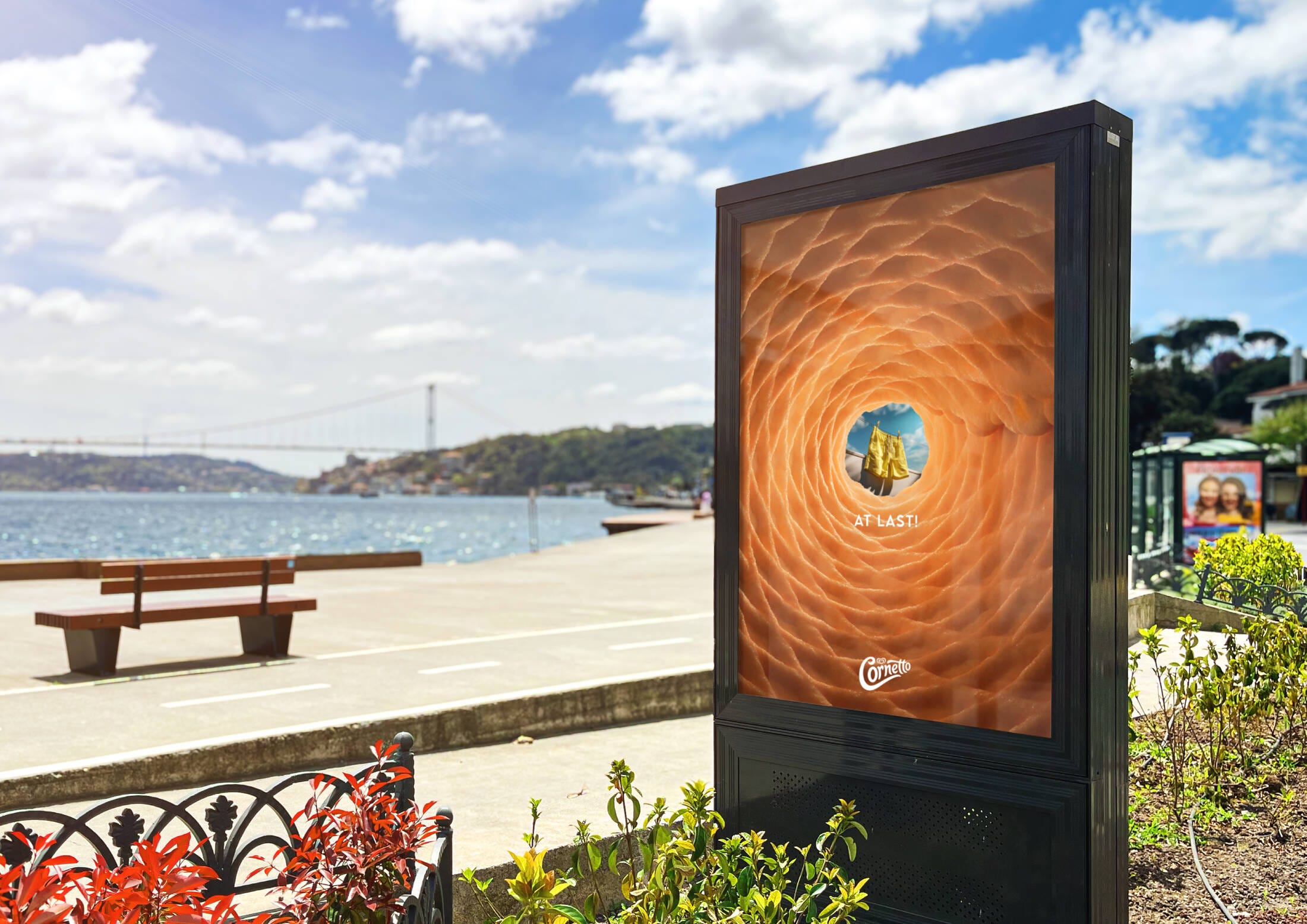
MullenLowe Istanbul lined metro tunnels with lenticular prints: move left and you’re stuck in weekday grey; move right and the Cornetto cone “viewfinder” opens onto azure water. Headline: At last. Minimal copy, maximal feels.
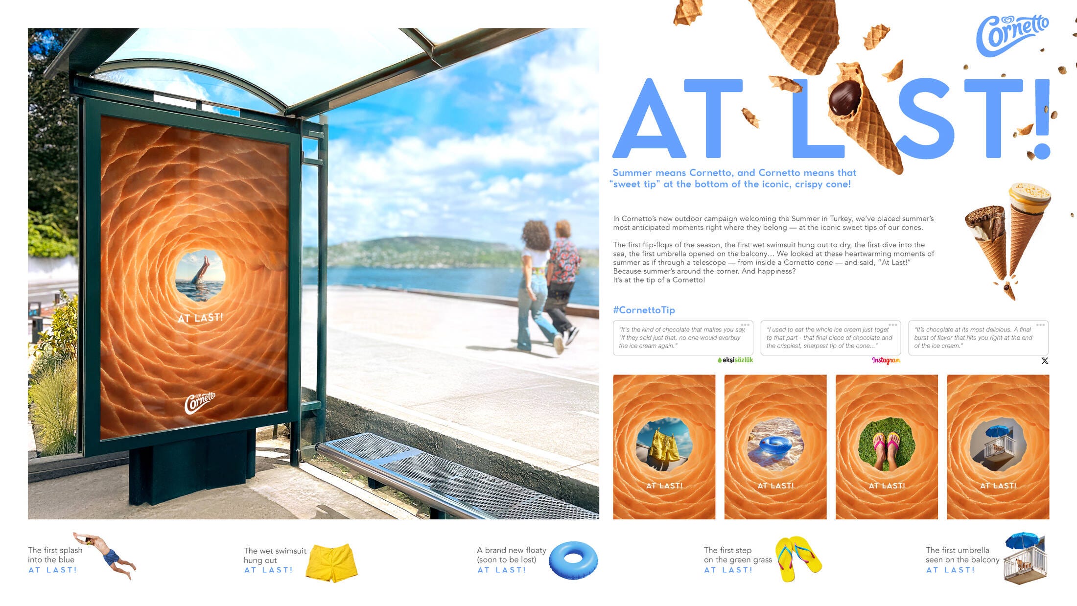
Why it works
iconic texture — that waffle pattern is an instant mental taste test.
sensory trigger — sight → taste → childhood memory in 0.1 s.
clarity in clutter — no rainbow gradient, no QR codes; the simplicity pops amid ad noise.
The context
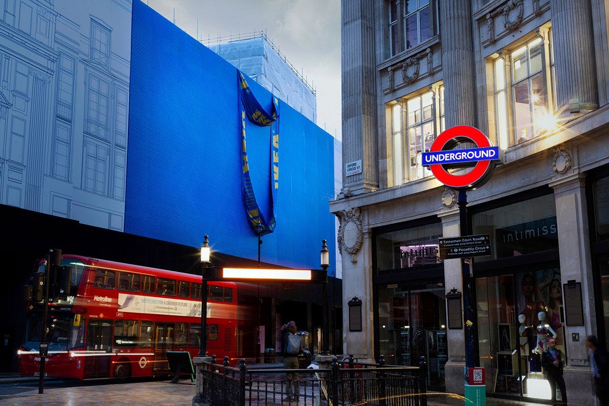
London’s Oxford Street loves excess: neon, tourists, luxury flags. IKEA’s flagship is behind schedule—so they turned delay into drama.
The idea
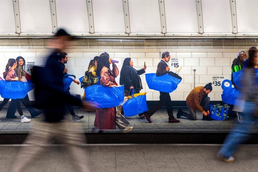
Supersize the €0.99 FRAKTA tote until it dwarfs the block. Mother London plastered two façades in bag‑texture vinyl, complete with oversize stitching and flapping handles. Extra cheek: photo‑series of the blue bag cradling fancy retail shopping bags—“one bag to rule them all.”
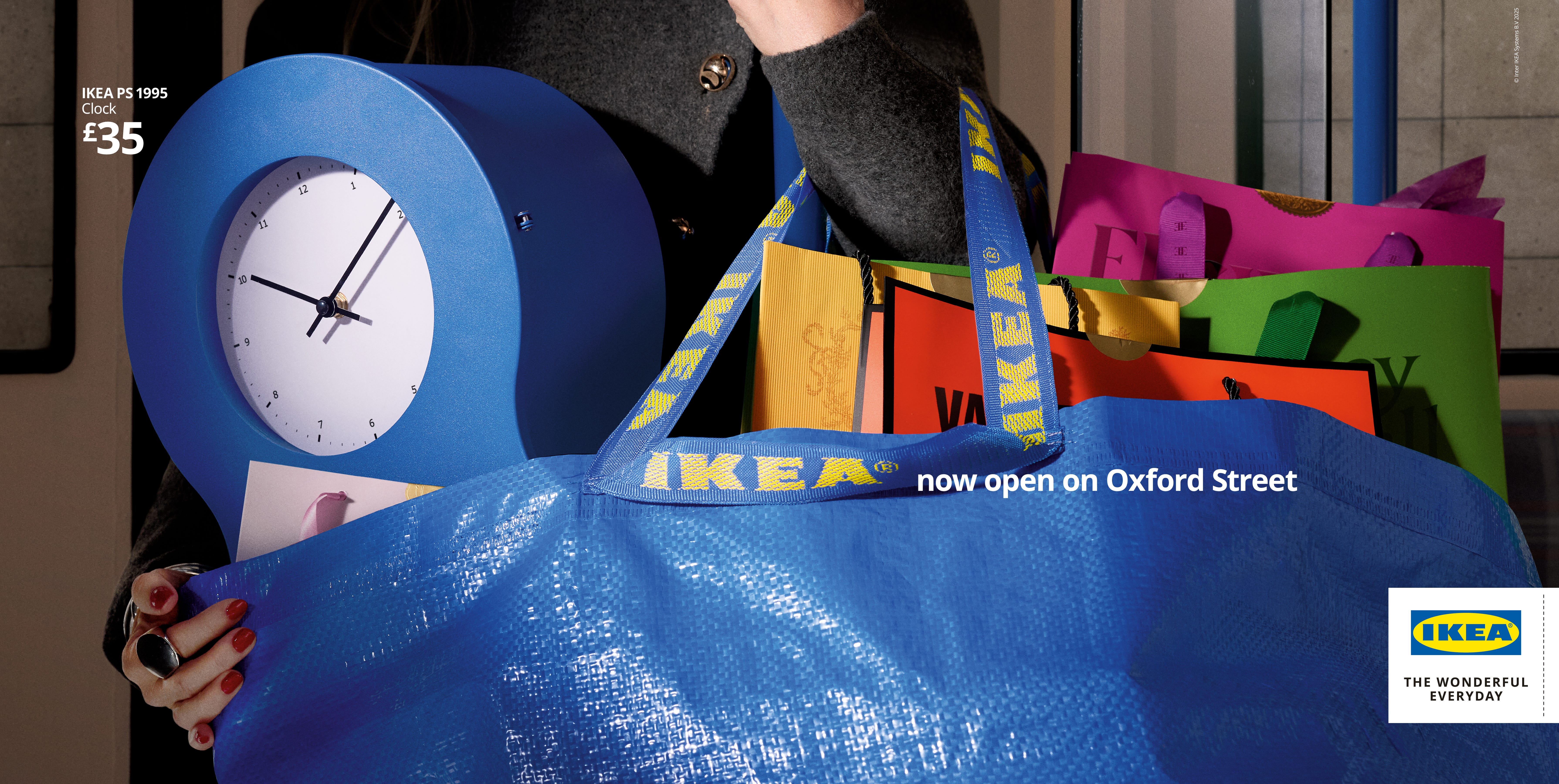
These campaigns are a testament to why OOH, when done well, is still such a vital part of the marketing mix.
Unskippable impact: In an age of ad-blockers and skippable pre-rolls, a massive billboard or a cleverly placed street poster demands attention.
The creative challenge: OOH forces creative clarity. You often have just a few seconds, a single image, and minimal words to convey an idea and make an impression. This constraint can breed incredible creativity.
Becoming part of the landscape: The best OOH doesn’t just occupy space; it interacts with it. It can become a landmark, a conversation starter, a piece of public art.
Both Cornetto and IKEA understood this. They didn’t just advertise a product; they created a moment, an experience, a feeling. And in a world of fleeting digital impressions, that kind of tangible impact is priceless.
For a decade we’ve chanted the minimalist mantra: fewer lines, more whitespace, don’t scare the user. But the pendulum is swinging. Fast Company just previewed Google’s “Material 3 Expressive” kit and called it “maximalist and gorgeous.” Translation: we’re about to swap monochrome zen gardens for colour‑drenched mood boards.
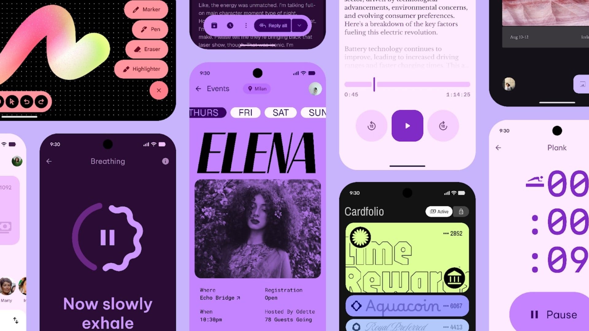
So, what exactly is this maximalist resurgence from Google's Material Design? It’s essentially a rebellion against the perceived sterility of pure minimalism. It’s characterized by:
Boldness: Audacious, even clashing, patterns and vibrant, unapologetic color palettes.
Richness: A blend of diverse textures, often drawing from both modern and retro cultural references.
Expression: A celebration of exuberant self-expression, rejecting rigid rules in favor of designs that are "vibrant and full of life."
Personal‑first theming — colours, fonts and animations can be tuned so your UI “evokes the feeling you want,” per design director Mindy Brooks. Think wallpaper‑based palettes turned up to eleven.
Spring‑ier motion system — dismiss a notification and it snaps off‑screen with “silky smooth physics” plus a soft haptic thunk. Same engine powers the cascading droplet effect in Recent Apps.
Live updates in the shade — real‑time delivery, rideshare and nav cards surface to the top so important info never buries itself.
Refined grids & quick settings — widgets align pixel‑perfect and you can pack more of your own toggles into the shade; background blur keeps context without battery drain.
Cross‑app typography refresh — Photos, Fitbit, Gmail are already adopting emphasised type scales and responsive components.
Wear OS 6 facelift — every element now hugs the circular watch face; list rows morph as you scroll, and battery life sees “up to 10 %” gain despite the eye‑candy.
This potential shift is exciting, but it's not without its challenges:
Pros:
+ personality: Apps and operating systems could feel much more distinct and engaging.
+ experiences: A move away from a "one-size-fits-all" aesthetic towards interfaces that delight and surprise.
+ differentiation: Brands could leverage a maximalist Material Design to create truly unique digital identities.
Cons:
Visual clutter: The biggest risk. Maximalism, if not expertly executed, can easily become overwhelming and hinder usability.
Accessibility concerns: Complex color schemes, busy backgrounds, or overly expressive typography could pose challenges for users with visual impairments or cognitive differences. This needs careful consideration.
Consistency vs. expression: Finding the right balance. How do you allow for rich expression while maintaining the underlying consistency and predictability that users rely on?
Google also slipped out its first “G” logo refresh since 2015. Blink and you’ll miss it, but the favicon now:
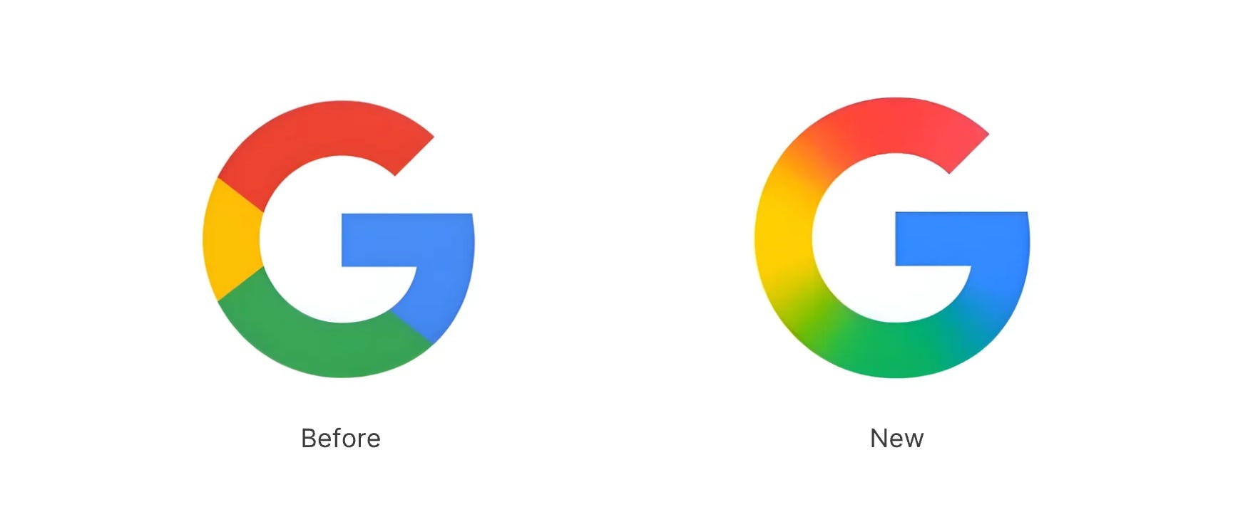
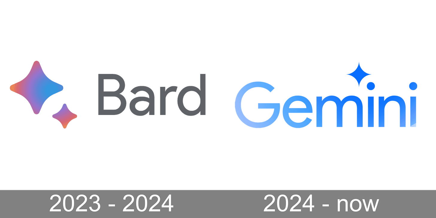
Blends a smooth gradient instead of hard colour borders, echoing their AI logo’s gradient.
Signals an AI‑centred brand system—Google says the softer transitions mirror Gemini’s “fluid helpfulness”
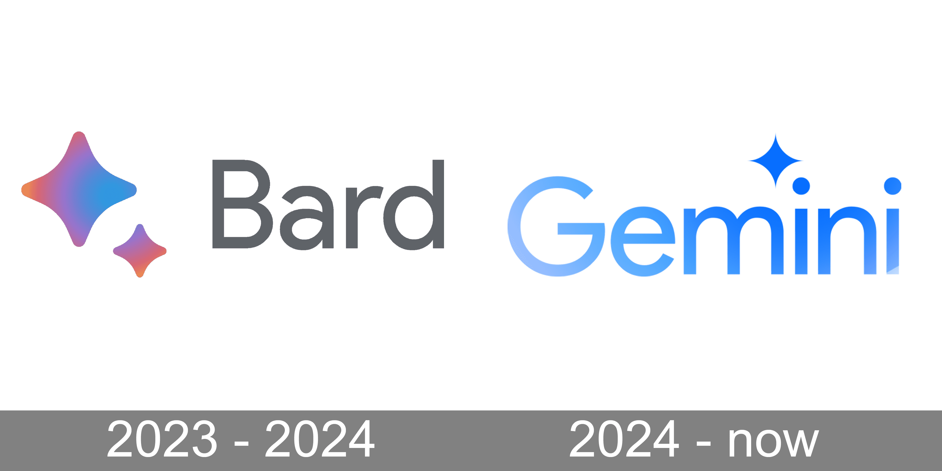
A micro‑update, but we should probably expect other sub-brands like Chrome, Maps and Gmail to inherit similar gradients this year.
What do you think of all these tech apps going full gradient mode?
The 18th edition of the Sony World Photography Awards wrapped in London last month, and—wow—the calibre this year was chef‑kiss. Below are the stand‑outs that made me double‑tap the gallery and screenshot for later mood‑board duty.
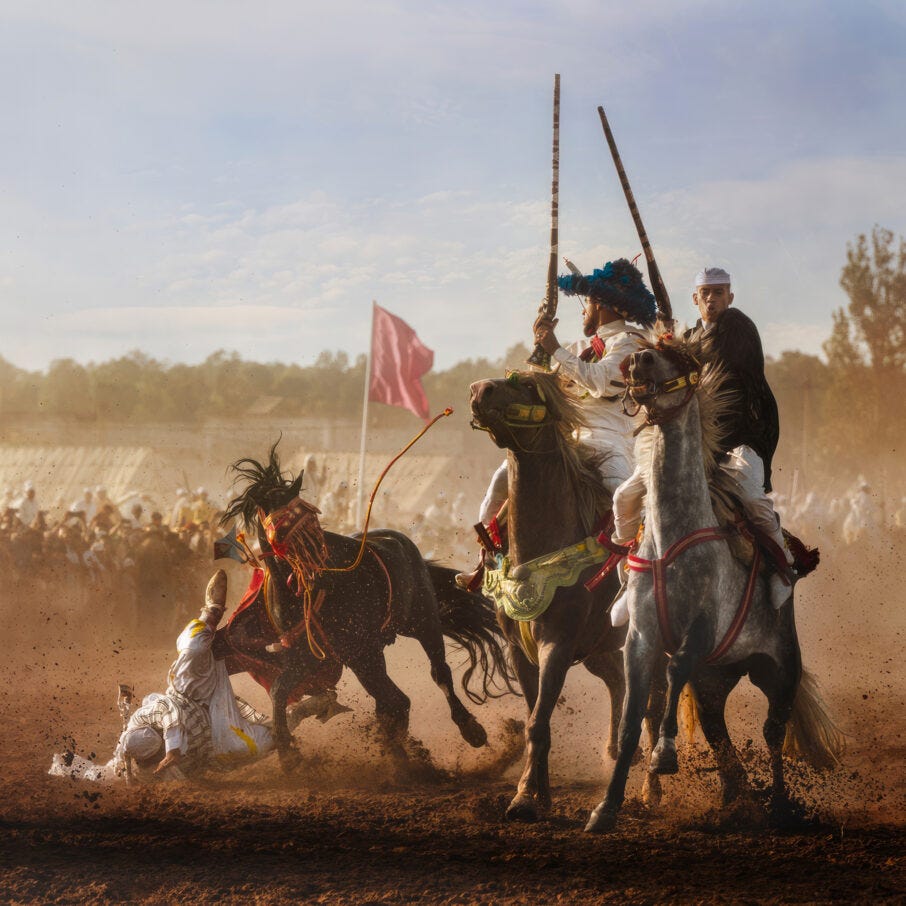
Open Photographer of the Year — Olivier Unia (France), “Tbourida La Chute.” A Moroccan equestrian charge frozen at the exact millisecond a rider is thrown. Dust, drama, and cultural electricity in one click.
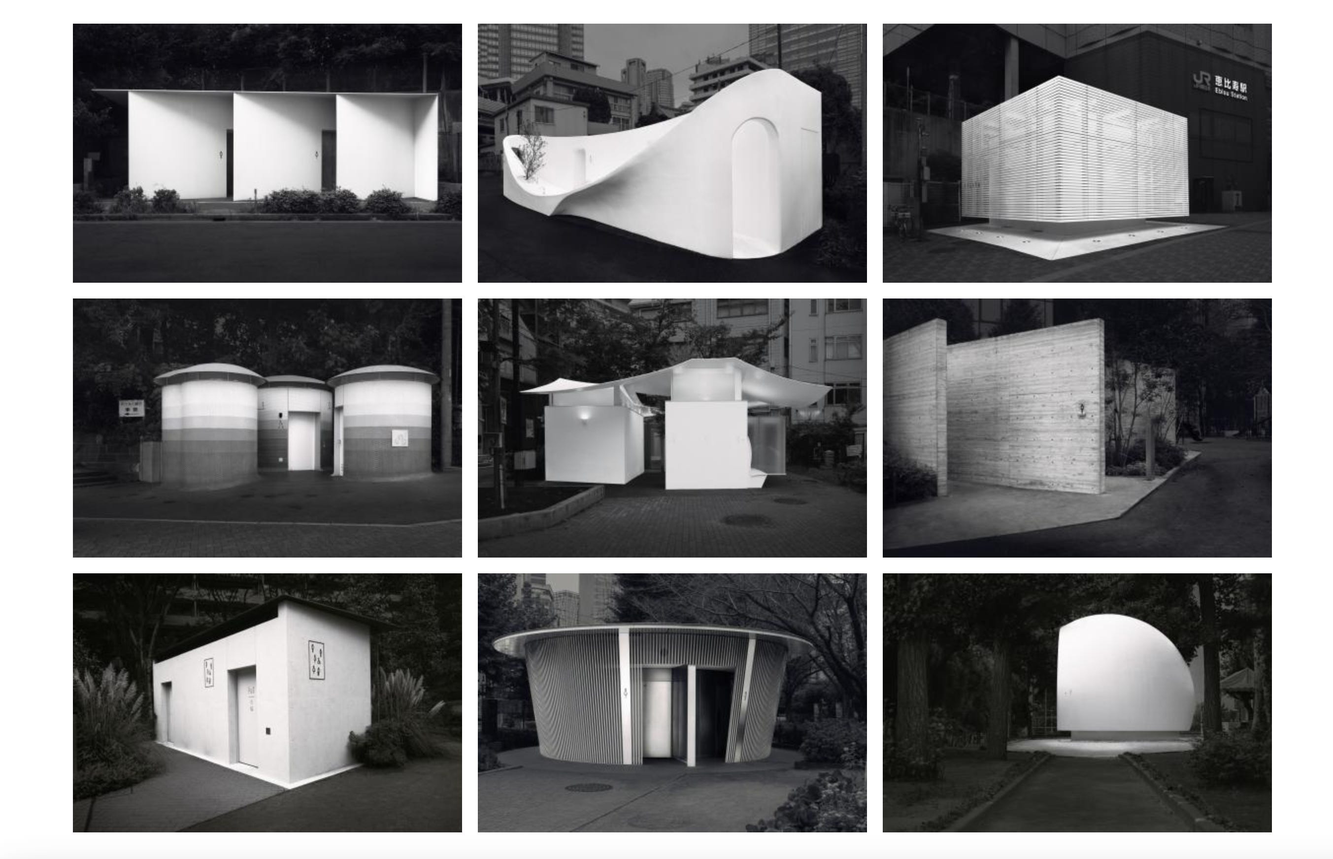
Architecture & Design: Ulana Switucha (Canada) — “The Tokyo Toilet Project.” Neon night shoots + Kengo Kuma restrooms = cyber‑serenity.
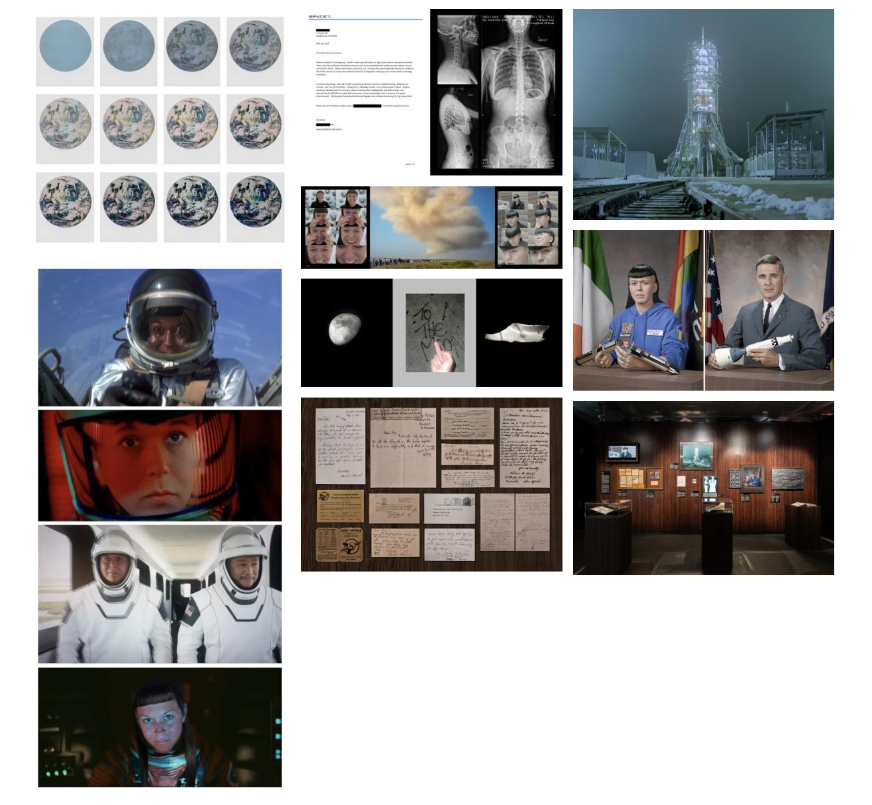
Creative: Rhiannon Adam (UK) — “Rhi‑Entry.” Self‑portraiture meets retro‑sci‑fi collage, stitched in‑camera, no AI cheats.
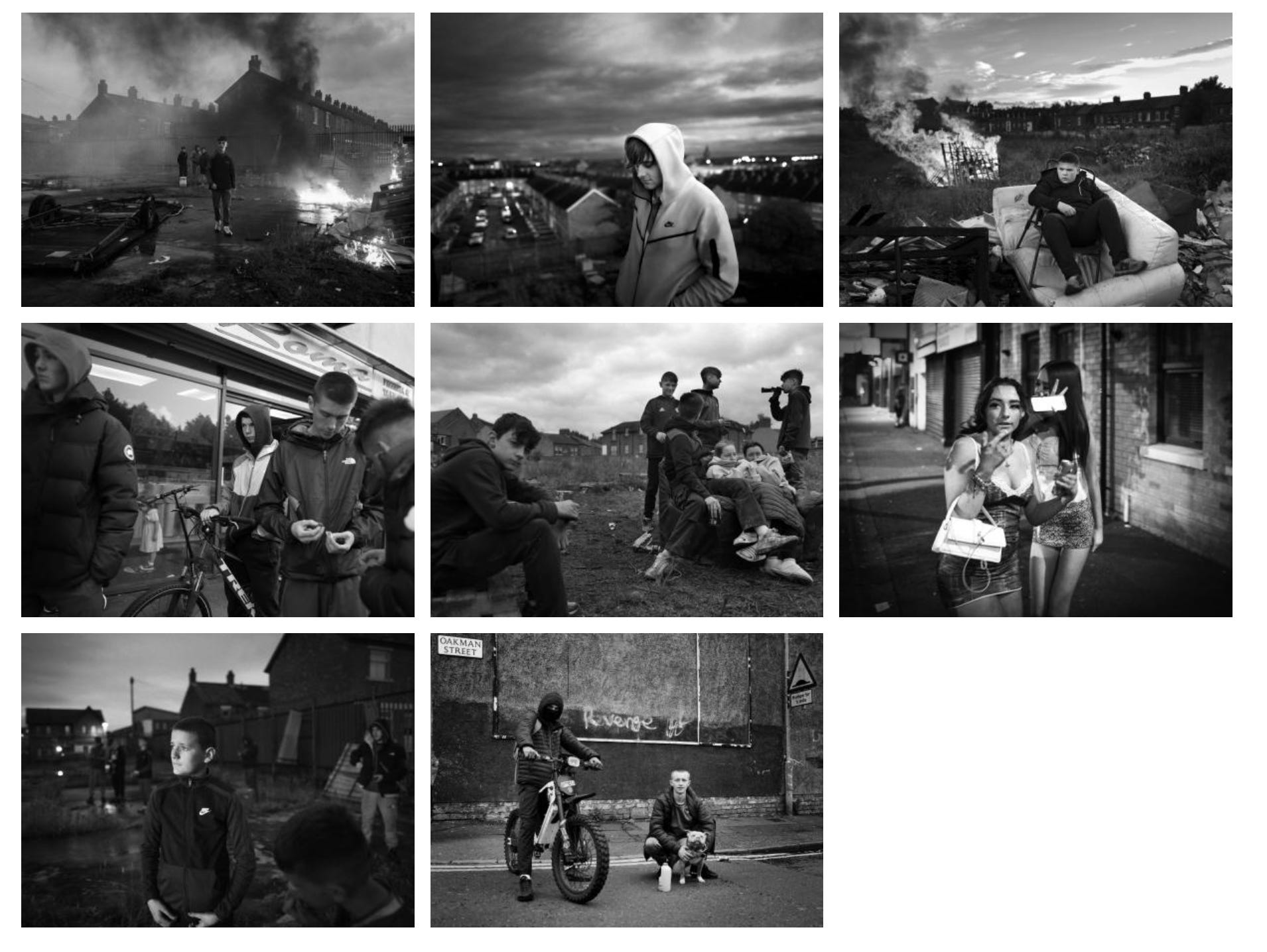
Documentary Projects: Toby Binder (Germany) — “Divided Youth of Belfast.” Parallel lives on either side of peace walls 25 years after the Good Friday Agreement.
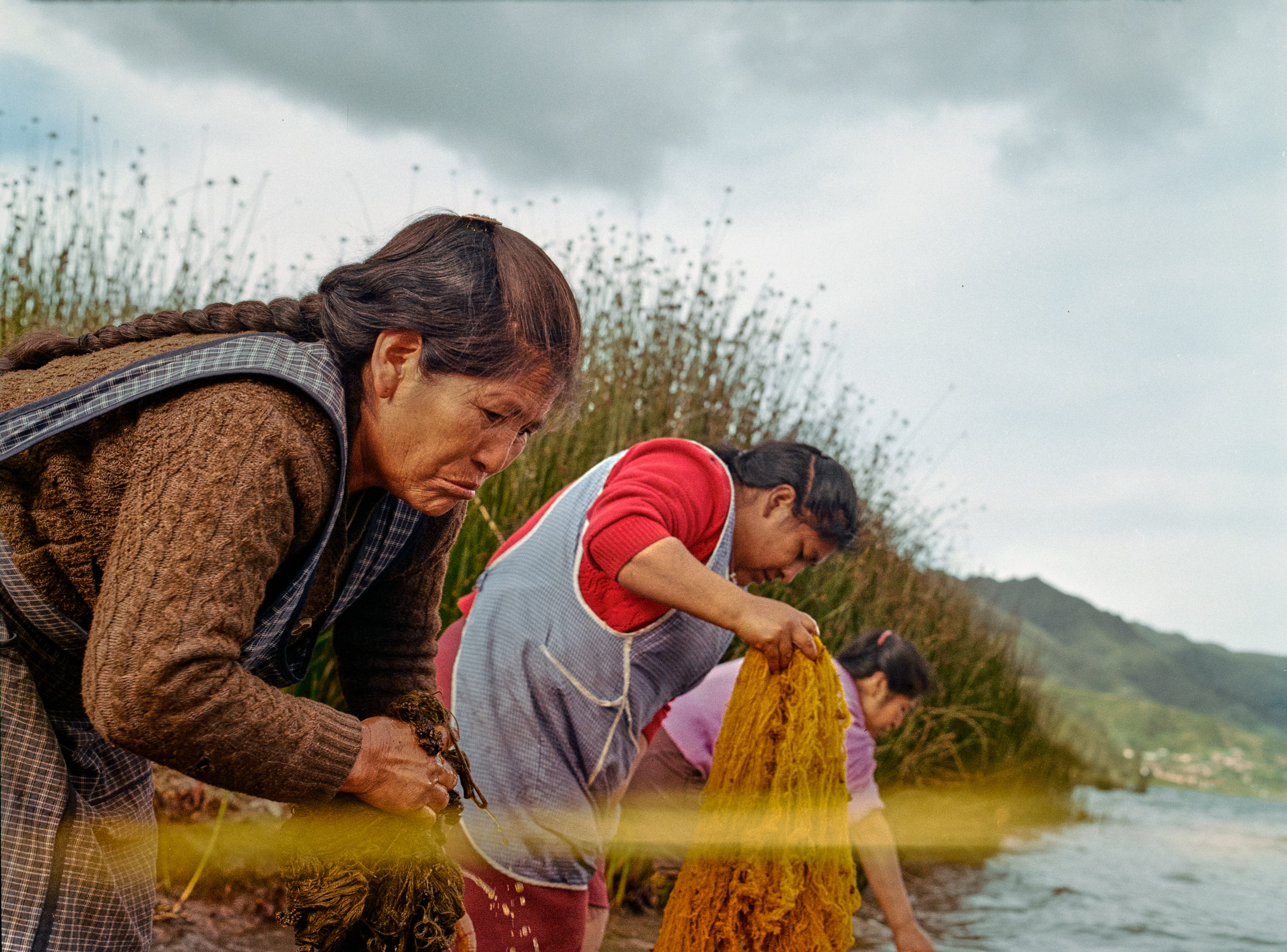
Environment: Nicolás Garrido Huguet (Peru) — “Alquimia Textil.” Slow‑exposure portraits of dye‑polluted rivers; beauty weaponised as warning.
Submissions open 1 July 2025 and the first three images are free. Categories span Open, Student, Youth, and Pro—so whether you’re side‑hustling or studio‑repping, there’s a lane.
2026 Sony World Photography Awards
Couldn’t make it to Barcelona? Same. But thanks to live tweets, Insta reels and blog dumps, OFFF’s 25th birthday still melted my feed. Here’s the distilled hit‑list of what mattered, why the FOMO is justified, and how those vibes can super‑charge your next brief.
COLLINS did the visual identity this year. Based on an “elastic” word‑mark that stretches and compresses like a gravity well, orbited by hand‑drawn rings that symbolise OFFF’s pull on the global design community. A custom variable font underpins the system, set in sun‑washed pastel backgrounds punctuated by a pop of festival yellow.
Territory Studio did (again) another masterpiece for the event’s Main Titles called “Echoes of Creation” (+4 min of AI‑fed 3D poetry)
“A poetic film blending AI-crafted visuals and city-recorded sound with a voiceover by Jade de Robles, honoring Barcelona’s art, history, and OFFF’s creative legacy.”
The Screen: 150+ global 10‑sec loops projection‑mapped each night onto the Disseny Hub façade, turning the building into a living, eight‑storey mood‑board. Congrats to my 2 co-workers whose work was displayed in this massive screen!
If you couldn’t attend as well, here’s a recap of what happened:
That’s a wrap! But I’m curious: what was your fav section in this month’s booster? What should I deep‑dive next month? Let me know by replying to this email or leave a comment in Substack🫶
Stay curious, ship it, and remember: weird > safe.
Until next time!

Before you go…
If you enjoyed reading this post, what about sharing it with someone that could benefit from it? ✨
Comments
Nothing yet. Say the first thing.
Sign in to join the conversation.