

Ever picked up a magazine and thought, “Why does this just look... right?” It’s not random. From that eye-catching cover to the layout that flows perfectly, every element of editorial design is intentional. So, if you’ve ever wanted to decode why some magazine pages just feel better, you’re in the right place.
These aren’t just “designy” terms—they’re the backbone of a polished, professional layout. Let’s dive into the essentials, so next time you flip through a magazine, you’ll know exactly what’s going on.
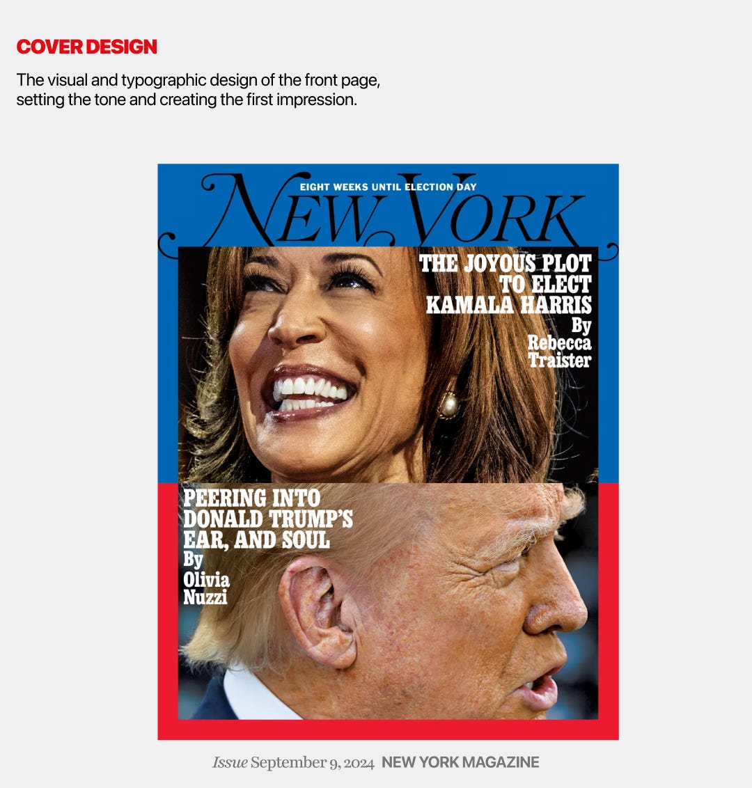
This is the opening shot, the first impression. It sets the tone, grabs attention, and invites readers in. Designers pour thought into every element here, making sure it conveys the theme and vibe of the entire issue.
Forget dumping text onto a page. Designers group text into three levels of importance: primary (headlines), secondary (subheadings), and tertiary (body text). This structure leads your eye through the content, giving the page a flow that’s easy to follow

This one’s simple but critical. Body text keeps things readable. Display text? That’s where we get creative. It’s the loud, impactful font that makes you take notice, usually in headlines or pull quotes. Without a clear distinction, pages look cluttered.


This little line above a headline does wonders. It’s like a mini preview, an intro that intrigues you before the main event. Kickers set the stage, making you curious to read on.

You know those giant letters that start a paragraph? They’re there for one reason: to draw you in. Drop caps add a splash of flair, giving the page a personality boost right from the start.

If two adjacent columns start with the same line height or element, it creates a jarring visual “tombstone” effect. Designers work hard to avoid this mess because it breaks the visual flow and makes the layout feel sloppy.

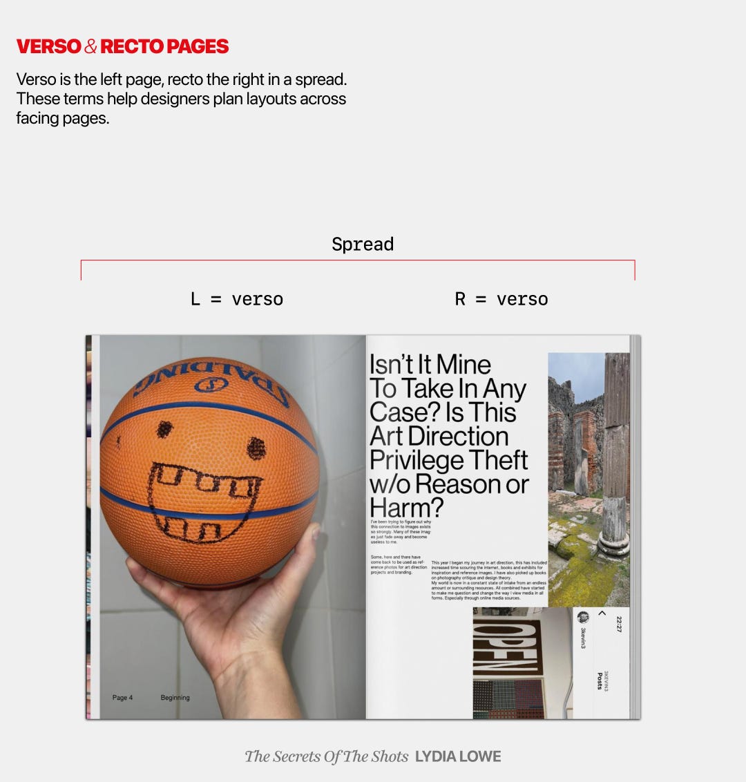
Fancy names for something simple. Verso is the left page, recto is the right. But designers think about these as a unit, balancing them like a dance so each spread flows smoothly.
When you see a title page without a subtitle, it’s called a “bastard title.” Why? Who knows. But it works by emphasizing hierarchy, letting that main title stand alone and command attention.

🔥 Want 90 days of premium for free? Share my newsletter with your circle and watch the counter climb. The instant 15 friends subscribe, you score 3 FULL months of ☻VIP access worth of deep‑dives, time-saving resource library, access to archive, Monthly (creative) Boosters, and more… FOR FREE. Turn your network into savings and bragging rights. Race you to 15👇
Without page numbers, where would you be? Lost in a sea of pages. Pagination keeps things accessible and orderly, especially in longer reads. Good design is functional, too.

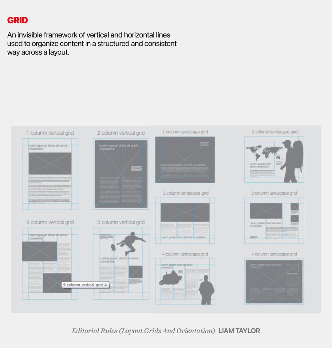
Think of a grid as the skeleton of the page. It’s invisible but crucial, providing a structure for everything else. Rule lines, meanwhile, separate sections, guide the reader’s eye, and help create balance and rhythm.
These are just the essentials, but what terms did I leave out? Every designer has their own tricks, their own favorite tools. Drop your must-know design terms in the comments.
So, what’s your favorite design term? And which of these do you notice the most? 👀 Let’s talk shop in the comments.
Comments
Nothing yet. Say the first thing.
Sign in to join the conversation.