
Sneak in for ☻free → Grow your creative muscle with brand insights, AI‑powered workflows and creative strategies straight to your inbox. Unsubscribe anytime, no hard feelings.
Let’s talk about awareness campaigns. They’re all about getting people to know your name and what you do. But here’s the thing—they need to stick. If your audience doesn’t immediately get what you’re about, you’ve already lost them.
This week, we’re looking at Claude.ai’s campaign. Spoiler alert: it’s a masterclass in what not to do🙊. But first, let’s break down what awareness campaigns are and why they matter.
What’s an awareness campaign?
Awareness campaigns are marketing 101. Their job? Make people aware of your product or service in a way that’s:
Clear: People should instantly understand what you do.
Memorable: Your message needs to stick.
Compelling: Give them a reason to care.
Awareness campaigns are like your elevator pitch—if they don’t land in 5 seconds, you’re out.
The best awareness campaigns nailed it
Here’s what great campaigns have in common: clarity and connection. Let’s see some examples from recent campaigns:
Gymshark took the focus off their products and put it on their community. By highlighting real people and their fitness journeys, they created an emotional connection.
Why It Worked:
they focused on people, not just products.
authentic storytelling made it relatable and shareable.
fitness is personal—and Gymshark nailed the emotional appeal.
Carlsberg took a bold approach with their campaign, “probably not the best beer in the world.” They leaned into honesty, poking fun at themselves while flipping the conversation around quality. By admitting their flaws, they gained trust.
Why it worked:
self-awareness is refreshing, especially from a big brand
humor made it memorable
they used bold outdoor ads that grabbed attention instantly
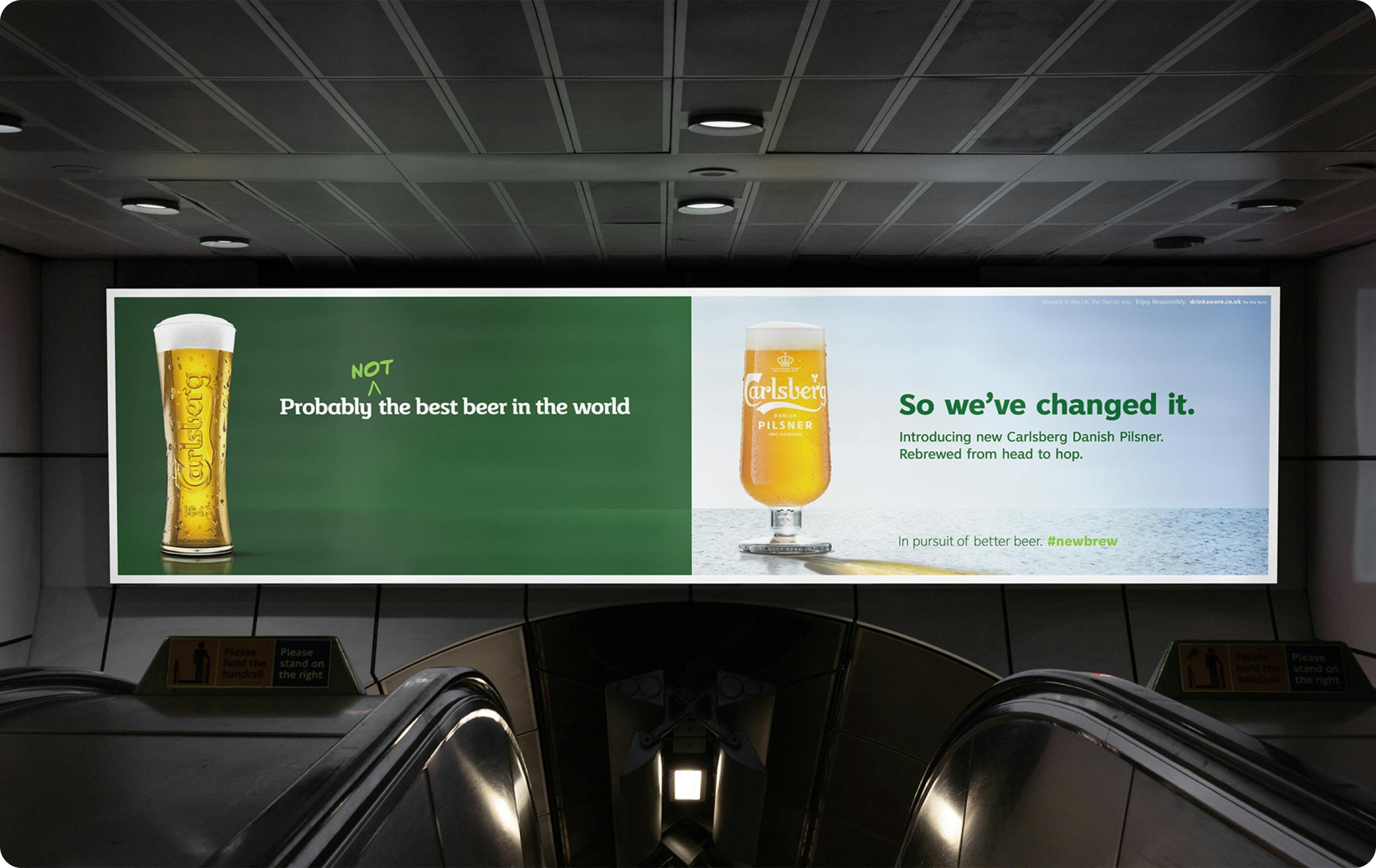
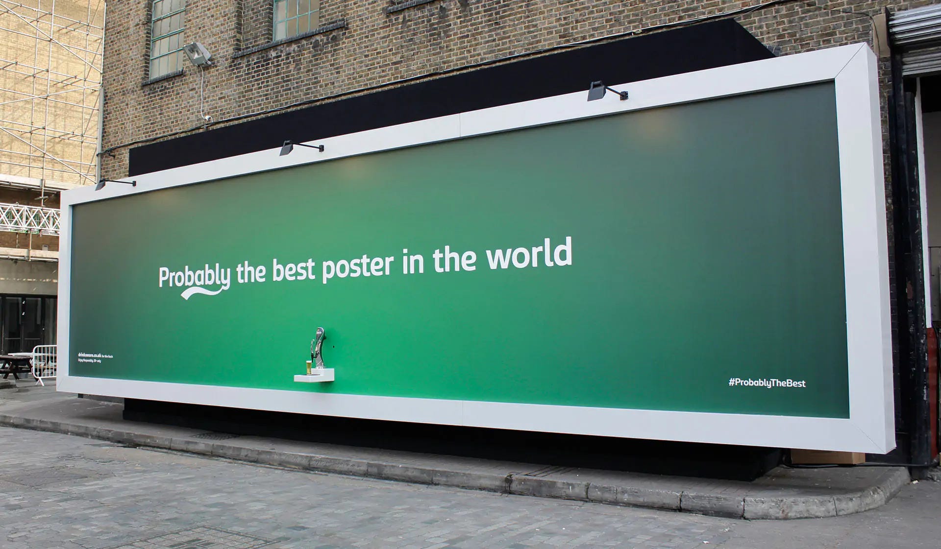
+ to prove they were serious, Carlsberg set up a real beer tap stand in the middle of London. Yes, free beer for everyone. The move wasn’t just bold—it was tailored. It showed their audience they weren’t just talking about change; they were delivering it, pint in hand.
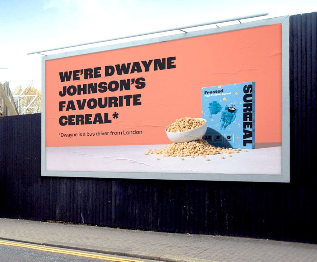
Surreal Cereal’s marketing leans all the way into absurdity. Their billboards are minimal and self-aware, with copy like “We’re Dwayne Johnson’s favourite cereal* — Dwayne is a bus driver from London”
Why it worked:
the humor is sharp, unexpected, and memorable.
the campaign doesn’t try too hard—it knows its audience and plays to them.
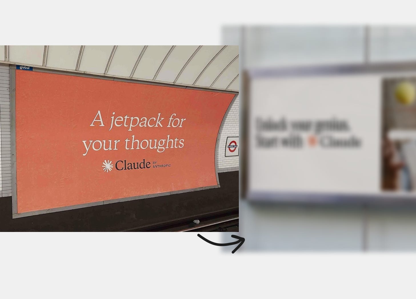
…and then there’s Claude with “A jetpack for your thoughts”
Let’s break this down:
The headline:
“A jetpack for your thoughts.” Cool metaphor? Sure. But for an awareness campaign, it’s too vague.What does this even mean?
Is it an AI tool? A journaling app? A tech gadget?
No value proposition:
What problem does Claude.ai solve?
Why should I care?
Assumes too much:
Claude.ai assumes people already know what it is.
Spoiler: most people don’t.
Awareness campaigns need to educate first. If your audience has to guess what you do, you’ve already lost them.
Like what you’re reading? Support the work by becoming a ☻VIP and keep the ideas flowing. I’m running a special sale with 20% off for 1 year!
My personal rethinking of Claude.AI’s campaign
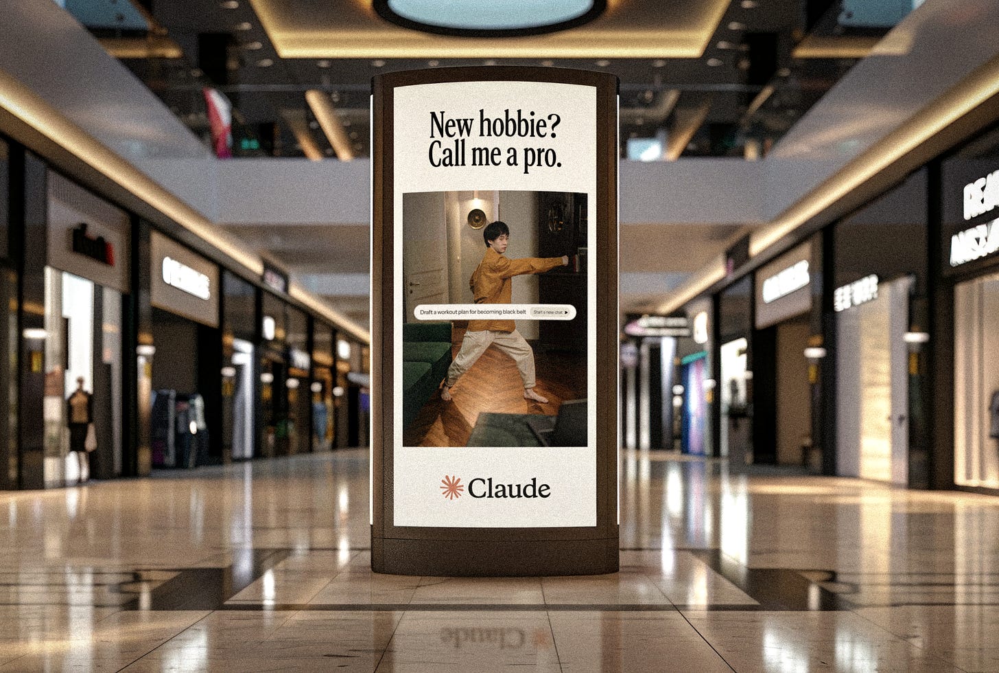
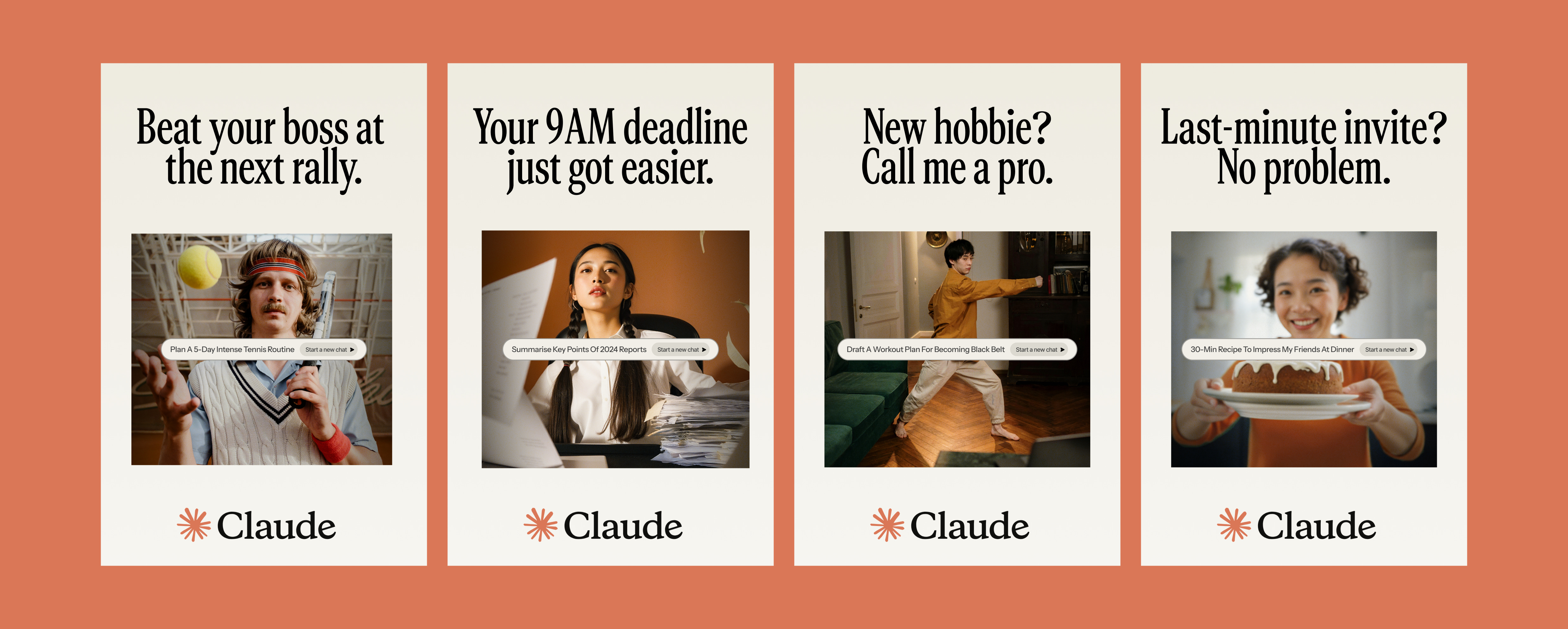
Sometimes, the best campaigns aren’t just eye-catching—they make you think. That’s exactly what I aimed to do with the OOH campaign concept for Claude.ai: a fresh take on awareness advertising that’s bold, direct, and impossible to miss.
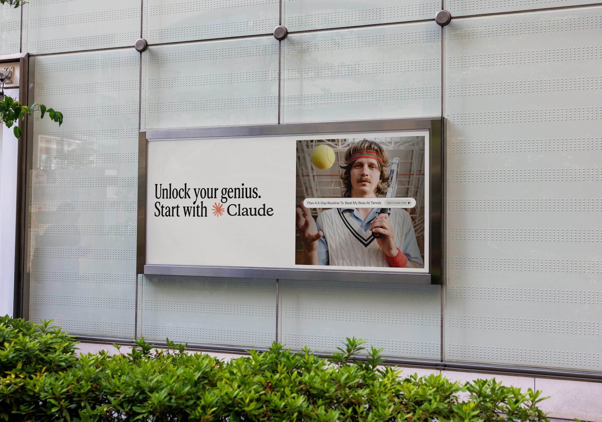
Disclaimer: This is not to underestimate the work behind the original Claude.ai campaign. This is simply my take on how I’d reimagine it for fun and exploration. Note I only spent roughly 2.5h putting together all this. Also, note that some images were AI-generated—this approach would be 10x better with a proper brand photoshoot.
🔥 Want 90 days of premium for free? Share my newsletter with your circle and watch the counter climb. The instant 15 friends subscribe, you score 3 FULL months of ☻VIP access worth of deep‑dives, time-saving resource library, access to archive, Monthly (creative) Boosters, and more… FOR FREE. Turn your network into savings and bragging rights. Race you to 15👇
Unlocking genius, one OOH at a time
What I focused on when developing a new concept for this campaign:
Relatable pain points: Everyone knows the feeling of being overwhelmed—whether it’s work, fitness, or life in general. The imagery taps into that shared experience.
Clear value proposition: The prompt demonstrates exactly how Claude.ai can help, turning chaos into clarity with just one line.
Versatility: The concept works across multiple use cases—professional, personal, creative—and reaches a broad audience
Recap of best practices for OOH campaigns
When it comes to creating impactful out-of-home campaigns, there are a few golden rules:
Simplicity wins: The average viewer only spends 3–5 seconds looking at an ad. Your message needs to be clear and digestible at a glance.
Bold visuals, minimal text: Visuals should do the heavy lifting. Use text sparingly to reinforce the image, not compete with it.
Placement matters: The environment where your ad appears plays a role in its effectiveness. Tailor the design for the space—whether it’s a busy subway station or a highway billboard.
Call to action (CTA): Even in awareness campaigns, a subtle nudge can go a long way. Think “Visit our website” or in our case “Start with Claude”
Cohesion across touchpoints: Your OOH ad should feel connected to your other marketing channels, reinforcing the overall message.


Why I think Claude’s campaign missed the mark
Claude.ai’s original OOH efforts lacked clarity and context, leaning heavily on abstract metaphors like “a jetpack for your thoughts.” While visually intriguing, the ads didn’t answer the essential question: “What does Claude.ai do?”
Missed simplicity: The message was too vague to capture attention in the brief moments viewers interact with an OOH ad.
No clear CTA: Without an actionable takeaway, the ad didn’t drive engagement.
Disconnected visuals: The creative direction, while sleek, didn’t tie back to the product’s core functionality
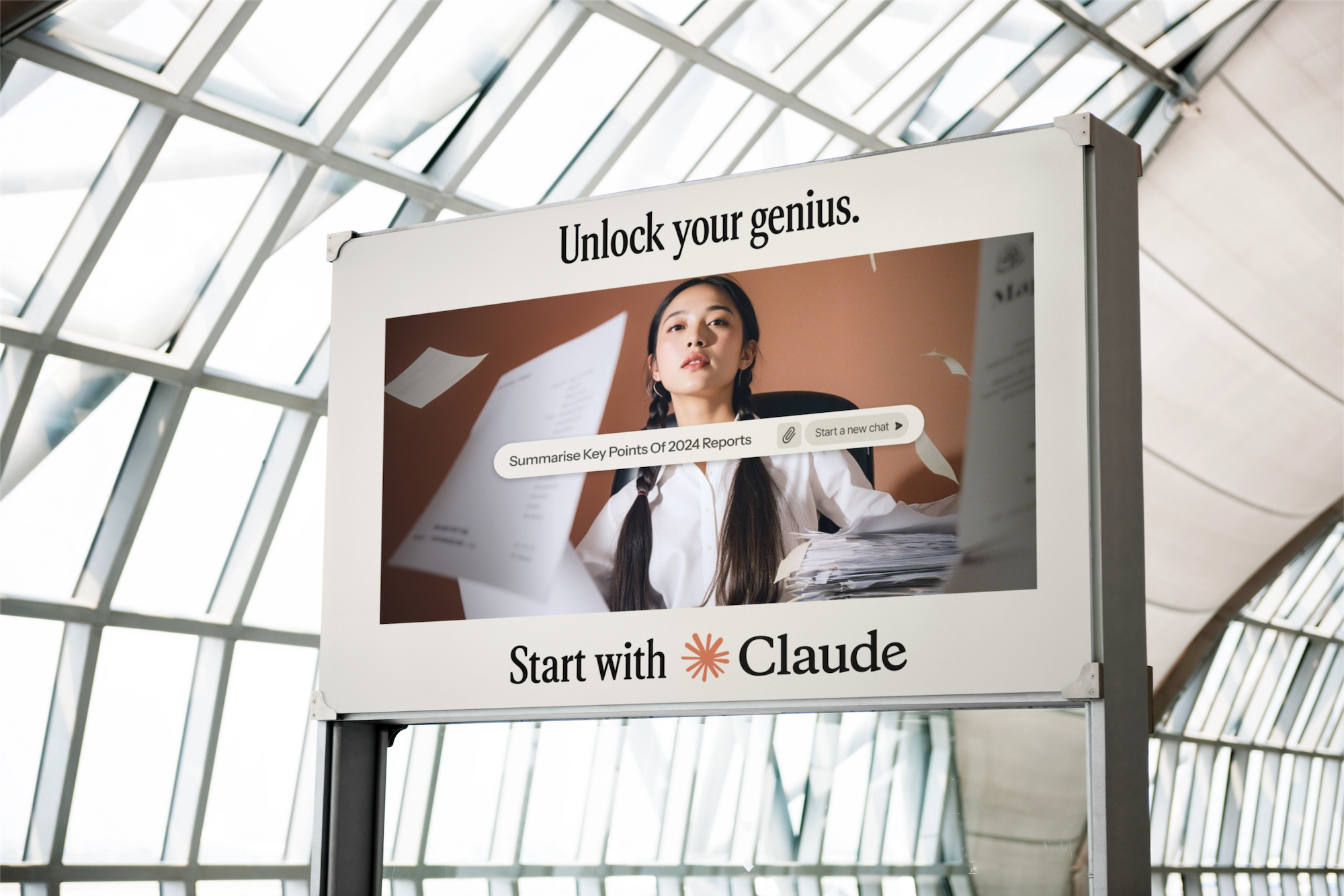
What makes these ads work (IMHO)
Here’s why these OOH designs deliver:
Relatability: Each scenario taps into universal experiences—whether it’s work stress, new challenges, or social obligations.
Playful Copy: The headlines are conversational and clever, drawing viewers in without feeling pushy.
Clean Design: The layouts balance humor with sophistication, reinforcing Claude’s premium yet approachable vibe.
Dynamic Prompts: Showing real use cases for Claude’s capabilities makes the AI feel practical and valuable.

Personal takeaways
OOH is one of the most challenging formats in advertising, but also one of the most rewarding when done right. If you’re planning your own out-of-home ads, here’s what to keep in mind:
Keep it simple: Bold headlines, clean visuals, and a single clear message work best.
Make it relatable: Speak to universal truths your audience will instantly recognize.
Show, don’t tell: Let your visuals demonstrate the value of your product or service.
Until next time!

Comments
Nothing yet. Say the first thing.
Sign in to join the conversation.