
There are two kinds of people in the world.
The ones who see an old-school romance novel with a windswept heroine wrapped in the arms of a broad-shouldered hero and laugh...
...and the ones who immediately pick it up.
Hi. It’s me.
I am unapologetically obsessed with classic romance covers. Not in an ironic way. Not because they’re “so over the top they’re good.” I genuinely believe they are some of the finest pieces of commercial art ever created.
Give me dramatic lighting. Give me impossible sunsets. Give me heroines whose hair has clearly decided the laws of physics are merely suggestions. Give me heroes with billowing pirate shirts, Highland kilts, or shirts that seem to have lost a very important battle with their buttons.
I want every ounce of that drama. Because those covers aren’t ridiculous. They’re iconic.
For decades they’ve been the visual shorthand for romance. They’ve been parodied on sitcoms, referenced in movies, recreated for Halloween costumes, and lovingly spoofed on everything from greeting cards to coffee mugs. Mention romance novels to someone who’s never read one, and chances are they’re picturing a painted clinch cover.
That kind of cultural recognition doesn’t happen by accident.
It happens because something works.
And clinch covers worked brilliantly.
What Is a Clinch Cover?
The name comes from the composition itself.
A clinch cover typically features two characters locked in an intimate embrace, whether they’re kissing, about to kiss, or standing so close you can practically feel the tension between them.
But calling them “clinch covers” almost undersells what they accomplished. These weren’t simply paintings of attractive people. They were visual storytelling.
Long before readers scrolled online retailers, watched BookTok reviews, or downloaded a sample chapter to their Kindle, they wandered bookstore aisles.
A cover had maybe three seconds to convince someone to stop. Three seconds to communicate genre. Three seconds to promise an emotional experience. Not the plot. The feeling.
Would this book sweep you away? Would it make you cry? Would it deliver adventure, danger, yearning, passion, or a happily ever after worth staying up until two in the morning to reach? Every brushstroke answered those questions.
Every Painting Was Built With Intention
One of my favorite things about these covers is how carefully they were composed. Nothing was random.
The hero’s hand resting gently on the heroine’s waist.
The way she leaned into him...or resisted him.
The distance between their faces.
The direction of the light.
A storm gathering behind a castle.
A horse waiting in the background.
A pirate ship cutting through impossible waves.
Even the movement of fabric mattered.
Artists weren’t illustrating a single scene from the novel.
They were distilling hundreds of pages into one unforgettable emotional moment.
Romance has never promised realism.
It promises emotion.
That’s exactly what these paintings delivered.
The Artists Behind the Magic
One thing that has always bothered me is how rarely the artists receive the same recognition as the authors.
Readers know Johanna Lindsey. They know Jude Deveraux. They know Kathleen E. Woodiwiss. Far fewer recognize the names of the painters who helped define what those stories looked like. Yet without them, romance publishing wouldn’t have the visual legacy it enjoys today.
Take Elaine Duillo, for example.
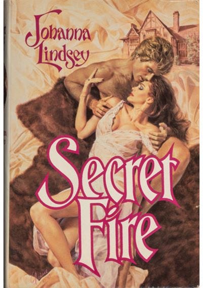
If historical romance had a queen of cover illustration, it was Elaine.
She painted thousands of covers over her career and became one of the most influential illustrators the genre has ever known. Classically trained as a fine artist, she brought movement, theatrical composition, and remarkable emotional expression to every painting. Her heroines weren’t simply beautiful. They looked determined, vulnerable, joyful, heartbroken, and fiercely alive.
She also helped usher in another chapter of romance history by using an up-and-coming model named Fabio on several covers before he became a household name.
Then there’s Pino Daeni, whose work is instantly recognizable once you’ve seen enough of it. No one painted light quite like Pino
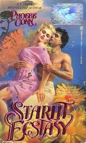
.
His fabrics practically floated off the page. His skin tones glowed. His backgrounds felt soft and dreamlike without ever distracting from the couple at the center of the painting.
Look at enough Judith McNaught, Johanna Lindsey, or Jude Deveraux paperbacks from the late '80s and '90s, and you’ll begin spotting his work from across the bookstore.
That’s how distinctive his style became.
Robert McGinnis brought yet another voice to romance illustration. Already celebrated for his work on James Bond posters and countless paperback covers, McGinnis approached romance with an elegance that elevated commercial illustration into something cinematic. His compositions were confident, dramatic, and incredibly sophisticated.
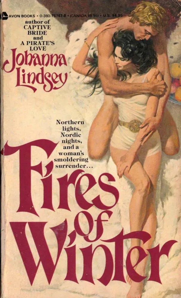
Artists like John Ennis, Roger Kastel, and Charles Geer also helped shape the visual language of romance, each bringing their own style to the genre during its golden age.
Collectively, these illustrators painted thousands upon thousands of covers.
Think about that for a moment.
Thousands of stories.
Thousands of promises.
Thousands of readers who picked up a book because a painting made them believe they were about to fall in love.
Before Digital, There Was Paint
What amazes me most is how these covers were actually created.
Most didn’t begin with an artist simply imagining a scene.
Publishers commissioned elaborate photo shoots using live models in costume. The illustrator used those reference photographs as the foundation for an oil painting, changing backgrounds, adjusting poses, softening expressions, adding flowing fabric, dramatic skies, castles, ships, horses, or entire landscapes that never existed in the original photograph.
The finished artwork wasn’t a photograph.
It wasn’t photo manipulation.
It was a hand-painted interpretation designed to make readers feel something.
Weeks of work often went into a single cover.
Imagine that level of craftsmanship for a paperback that might sell for just a few dollars at the grocery store.
Publishing invested in art because it knew the cover mattered.
Why I Still Love Them
Romance covers have evolved. Photography took over. Typography became bolder. Object covers arrived. Illustrated rom-coms exploded in popularity.
Now we have sprayed edges, foil stamping, embossed jackets, and collector’s editions that are works of art in their own right. I love seeing how romance continues to reinvent itself.
But I also think we’ve become a little too comfortable dismissing the clinch cover as something to laugh at.
I don’t see something outdated. I see extraordinary craftsmanship. I see artists who mastered anatomy, composition, color, movement, and storytelling. I see publishers who understood that a cover wasn’t decoration. It was the first chapter of the reading experience. The next time you’re in a used bookstore, pull one of those old paperbacks off the shelf.
Look past the flowing gown. Past the dramatic embrace. Past the shirt that’s hanging on for dear life. Look at the light. Look at the expressions. Look at how your eye travels across the painting. Ask yourself what emotion that artist wanted you to feel before you ever read the first sentence.
Because that’s what you’re really looking at.
Not just a romance novel.
A piece of publishing history.
And honestly?
I think it’s about time these artists got their flowers.
Next time we’ll look at the man who became the face of romance for an entire generation and how one cover model helped transform the entire look of the genre.
Comments
Nothing yet. Say the first thing.
Sign in to join the conversation.