
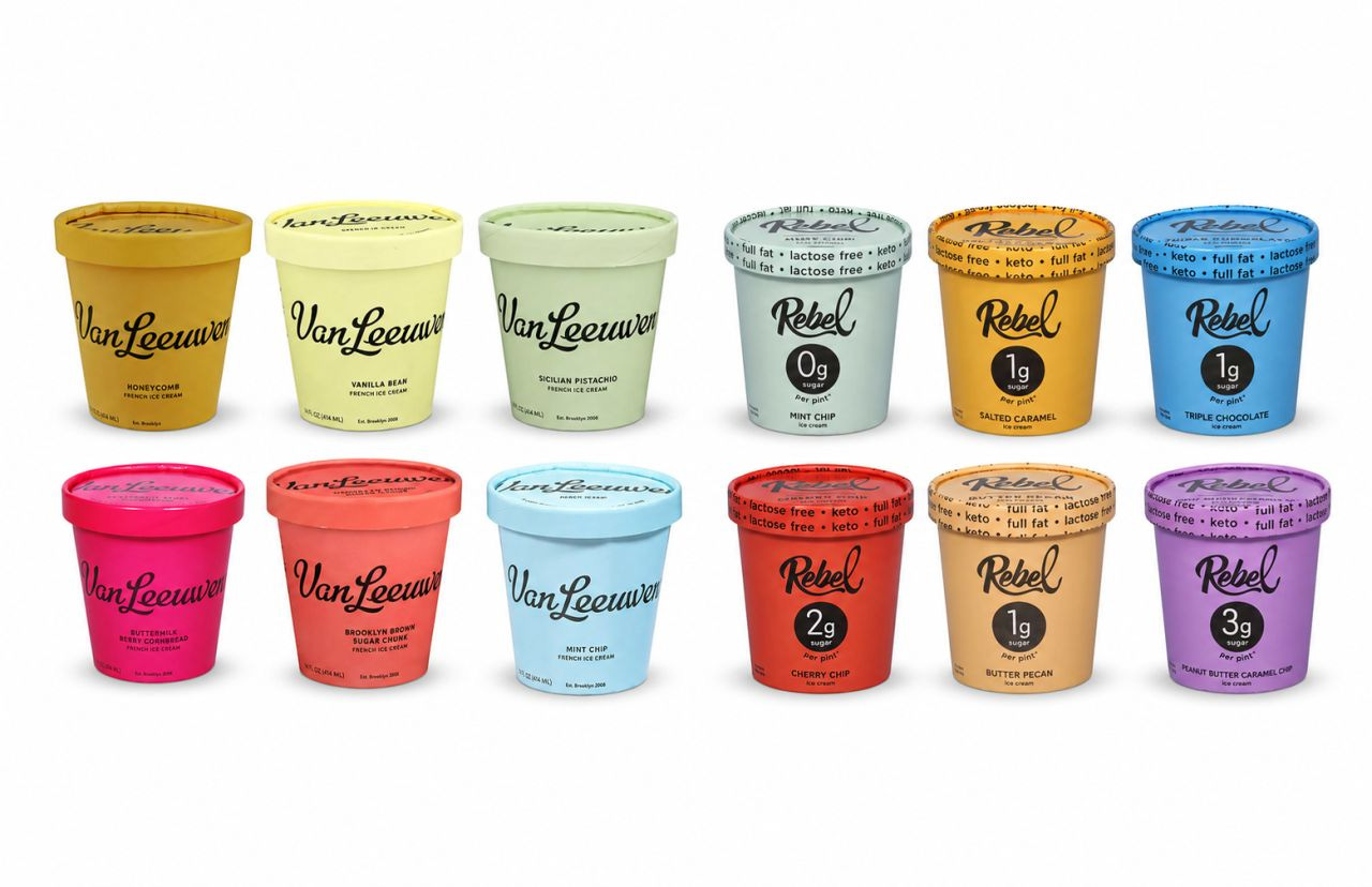
On July 16, a federal judge in Brooklyn ordered Rebel Creamery to hand Van Leeuwen Ice Cream $23,785,000. Not abstract damages, but from Rebel’s own profits from every pint it sold in packaging that the court found was intentionally copied from Van Leeuwen’s trade dress. Rebel also has to redesign its pints from scratch and is permanently barred from selling anything likely to be confused with Van Leeuwen’s look.
Van Leeuwen never claimed Rebel stole its name or logo. The case was built on four aspects:
Monochromatic cardboard pints with matching lids.
A pastel palette.
Black script lettering with an oversized first letter.
An overall minimalist design.
Rebel argued, reasonably on its face, that none of those elements is ownable. Pastels are everywhere. Script fonts are everywhere. Minimalism is a decade-old default. The court agreed on the parts, but ruled against Rebel on the combination of those parts. Trade dress protects the combined commercial impression, and the impression Rebel created was clearly Van Leeuwen’s.
Put the pints side by side and you understand the ruling in about two seconds.
I wrote about the force that drives emulation in my book, Quiet Killers. Survivorship bias is half of what I call the Bias Loop. It’s experienced when one looks at the brands at the top of their game and presume they did everything right. The bias compounds when it’s presumed that what those brands are doing now is what got them there. The resulting theory from this bias is that copying those tactics and approaches should guarantee success.
What could Rebel see in 2018? A Brooklyn ice cream brand that started in 2008 with one pastel yellow truck, hit the freezer aisle nationally, then grew like wildfire. The visible artifact was the packaging.
Van Leeuwen worked with Pentagram in 2016 to prepare for national wholesale, and the results were public and loud. Quartz reported the redesign lifted Van Leeuwen’s sales at Whole Foods by 50 percent. Design press covered it. Social media influencers did the rest. If you were a keto ice cream startup in Utah staring at a crowded freezer door, the lesson seemed obvious: pastel minimalist pint and cursive, black wordmark would ensure success.
Essentially that’s the survivorship bias trap. The packaging wasn’t the strategy. The packaging was the output of a strategy, and the strategy only worked because of when and where it was executed.
The 2016 freezer aisle was visual chaos. Old-fashioned typography, cutesy illustrations of fruit and cows, badges, burst graphics, every square inch shouting. Van Leeuwen’s pints worked because they were quiet in a loud room. The design was distinctive precisely because nobody else had it.
Copy that look in 2018 and the market condition that made it work no longer exists for you. Pastel minimalism is no longer open space. It’s Van Leeuwen’s identifier. You aren’t buying distinctiveness. You’re buying confusion, and confusion is the one thing trademark law is built to punish.
The copy also misses the machinery underneath. Pentagram researched the competitive set, presented seven concepts, and ran rounds of revisions before the founders picked the final direction. Natasha Jen’s team kept everything: briefs, presentations, rejected concepts, revision files. That paper trail became evidence at trial. It proved the design was an original, deliberate creation with a documented lineage. Rebel’s design trail, by the court record, was thin. One side could show its work. The other side looked like it traced the answer.
When you copy a winner, you inherit none of the process, none of the timing, none of the equity, and all of the legal exposure. The original owner spent years and money making that look mean something. That meaning is exactly what makes it protectable.
Sit with the name for a second. Rebel. The entire promise embedded in that word is defiance of the category standard. A rebel walks into the freezer aisle, looks at what everyone else is doing, and does the opposite. That posture was available to them, and it was arguably their birthright: a full-fat, near-zero-sugar keto ice cream in 2018 was already a middle finger to the low-fat orthodoxy that ruled the category for decades. The product rebelled. The packaging surrendered.
Instead of building a visual identity that matched the name, they found the most admired design in the aisle and wore it. That’s not rebellion. That’s cover-band branding. And it created a gap between what the brand claimed to be and how it behaved, which is the kind of contradiction consumers may never articulate but always feel. A brand is what it does, not what it names itself. Rebel named itself an outsider and behaved like a tribute act, realized real success in the borrowed look, and then paid full price for it, plus five years of legal fees, plus a court-ordered identity crisis.
The bitter irony is that honest rebellion was the cheaper path. Designing against the category standard, including against Van Leeuwen’s pastel minimalism, would have cost a design engagement. Adopting the standard cost $23.8 million.
Here’s what makes this case worse than a simple morality question: the copying worked. Rebel built a real business in those pints. The $23.8 million exists because there were $23.8 million in profits to take.
So no, the honest lesson is not “copying fails in the market.” Sometimes it converts just fine. The lesson is that copying builds your revenue on someone else’s asset, and the owner can come collect. With interest. Rebel argued that only some of its profits were attributable to the packaging, that the keto formula and the flavors drove sales too. The court put the burden of proving that split on Rebel, and Rebel couldn’t carry it. So Van Leeuwen got everything. Every dollar earned in the borrowed clothes was forfeit, plus five years of litigation, plus a forced rebrand at the worst possible moment, with retailers watching.
Ben Van Leeuwen testified that when an employee first showed him Rebel’s pints, the founders were shocked but hesitated to sue. Small company, little capital, never litigated before. They filed anyway in 2021. It took five years. It was worth roughly $24 million.
The strategic pathway that actually built Van Leeuwen is available to anyone, and it has very little to do with pastels:
Study your category’s visual noise.
Find the space nobody occupies.
Hire people who can execute against it, or do the disciplined work yourself.
Document everything.
Then commit to the position long enough for it to become recognition.
That process produced pastel minimalism for one Brooklyn ice cream brand in 2016. Run honestly today, in your category, it will produce something else. That’s the point. The output is context-dependent. The process is not.
Survivorship bias misleads you into thinking the safest move is to look like the category winner. The Rebel ruling is a $23.8 million data point showing the opposite: looking like the winner is now the single most expensive design decision in the ice cream aisle, and any other category. Distinctiveness is never decoration. It’s a protectable asset. Courts confirmed the price to pay for attempting to rip off that asset, and a brand literally named Rebel had to learn it under oath.
No posts
Comments
Nothing yet. Say the first thing.
Sign in to join the conversation.