
With Bayer Leverkusen having launched their new home kit on Monday, we have now been able to lay eyes on the home kits of all 18 Bundesliga clubs for the upcoming 2026/27 season. Due to the World Cup going on for what felt like an eternity, this round of kit drops happened with relatively little fanfare. Today, let’s take a look at the kits and cast judgment upon some shirts that are instant classics and some that need to go back to the brainstorming phase.
Bayern München - Adidas
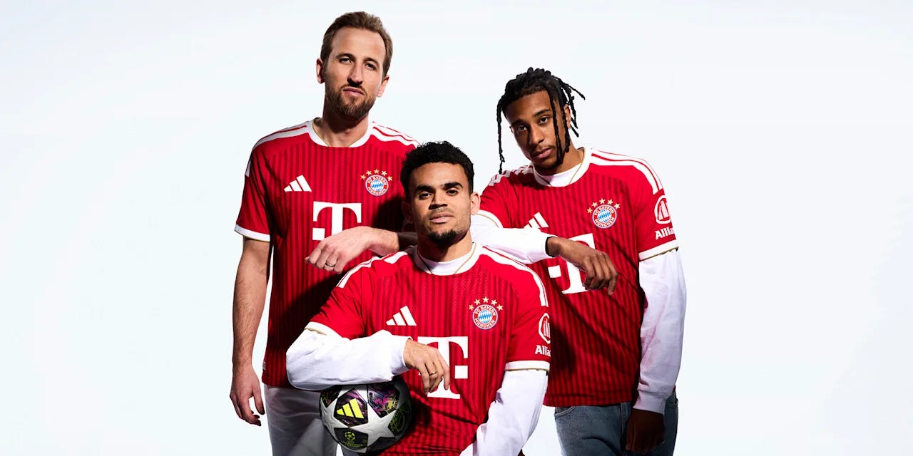
© FC Bayern/adidas
Having desecrated the Bayern shirt in recent seasons - such as changing the primary colour to white in 2023/24, or those weird white splotches on last season’s kit - Adidas have returned to a simple, classic red kit with white trim for the Stern des Südens. With the iconic three stripes of the manufacturer on the shoulders, and the simplified, symmetrical T-Mobile logo on the front, this is a definitely a kit for the purists to enjoy. The return of the gold trim on the collar is an additional touch that I like.
The two-tone red stripes add a little bit of fun to ensure that you won’t get it easily confused with past editions, but otherwise this signifies a return to normalcy, and dare I say a slightly more serious tone for the club. The shirt was debuted during the Champions League second leg against Paris St-Germain, where Bayern fell just short to the defending champions. Could this be the year that they get the elusive seventh European crown?
Rating - 8/10
Borussia Dortmund - Puma
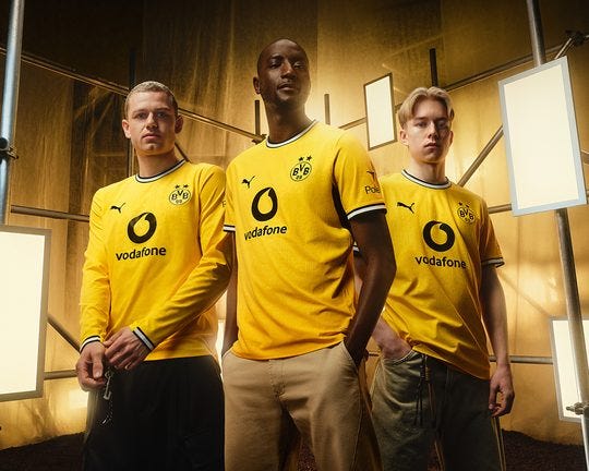
© PUMA
BVB will be continuing to sport Vodafone as their front of shirt sponsor for the second season running. Not satisfied with their rivalry with Bayern on the pitch, they’ve clearly decided to rival them in every department with Adidas rivals Puma being the manufacturer and Vodafone being a market rival of T-Mobile.
But it’s exactly the sponsor that’s my glaring problem with it. Combined with the plain yellow, I can’t get past the fact that it looks uncannily similar to a Kaizer Chiefs kit. That makes it difficult for me to accept that it is a genuine Borussia Dortmund kit. I’m also not a huge fan of this shade of yellow and much prefer the more fluorescent style that they wore for much of the 2010s.
I do like the black and white trim on the collar and sleeves, at least.
Rating - 2/10
RB Leipzig - Puma
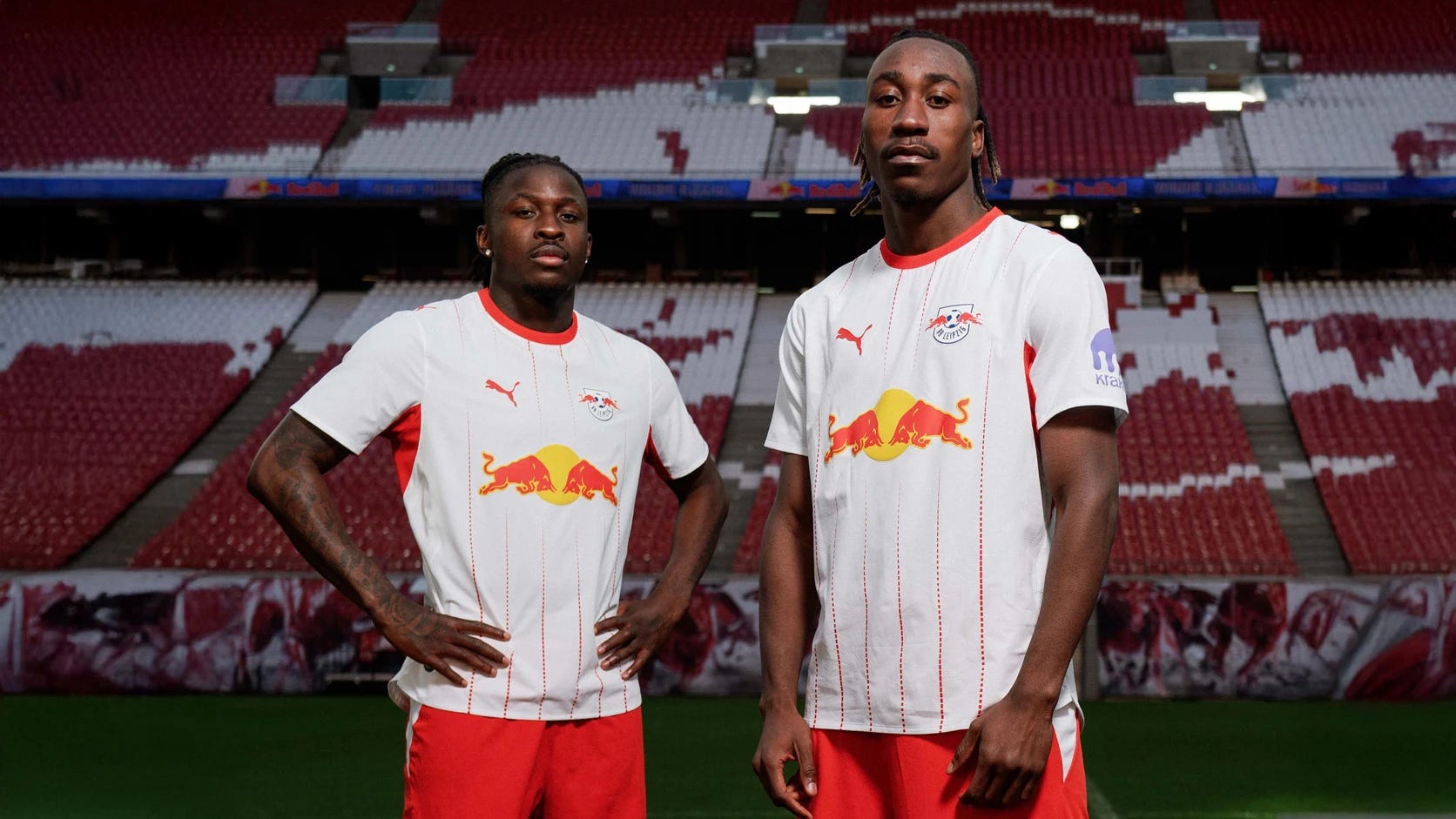
© PUMA
It feels like Puma are running out of ideas for random patterns to splash on the RB Leipzig home kit, as this is the ninth season running that they have opted against a plain white kit with red trim. This time, it’s a bunch of stripes made up of tiny vertical dashes that fade away as they approach the massive Red Bull logo in the middle.
Although it’s certainly less offensive than the kit from two seasons ago, which looked like Puma gave a small child a red crayon to design the kit with, it’s still not my favourite concept and I don’t think it’s particularly well-executed. The colour of the sleeve sponsor also does not complement the rest of the shirt at all.
Rating - 3/10
VfB Stuttgart - Jako
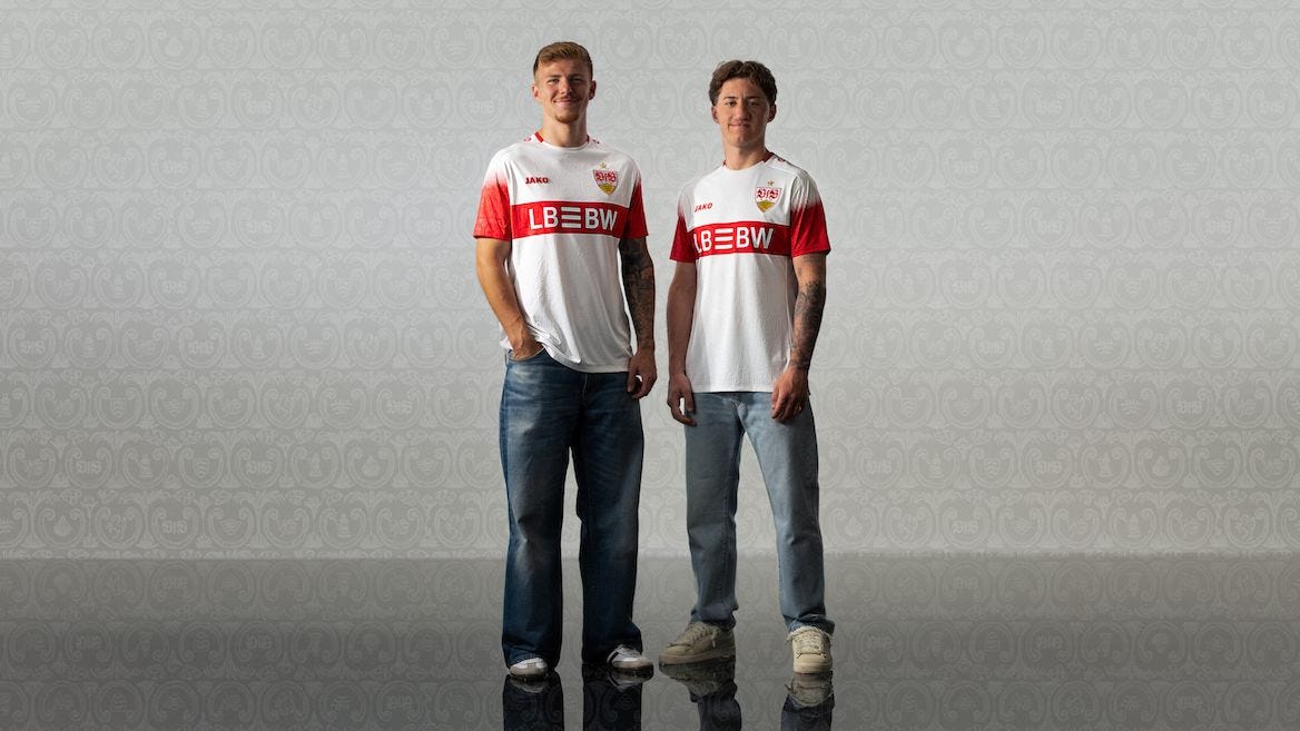
© Jako
One of only two clubs in the league using Jako as a kit manufacturer, VfB Stuttgart also continue with Landesbank Baden-Württemberg as the main sponsor. A rare foray into the land of red sleeves is an interesting choice, but I think it works decently. It’ll be hard to tell from this photo, but the sleeve fades into a bunch of red spots as it approaches the shoulder and fades into white.
Outside of the sleeve change, this feels like a generally safe choice for Deniz Undav and co. to don for matches at the MHPArena for 2026/27, so a middling score feels fair for Die Schwaben.
Rating - 5/10
TSG Hoffenheim - Macron
© Macron
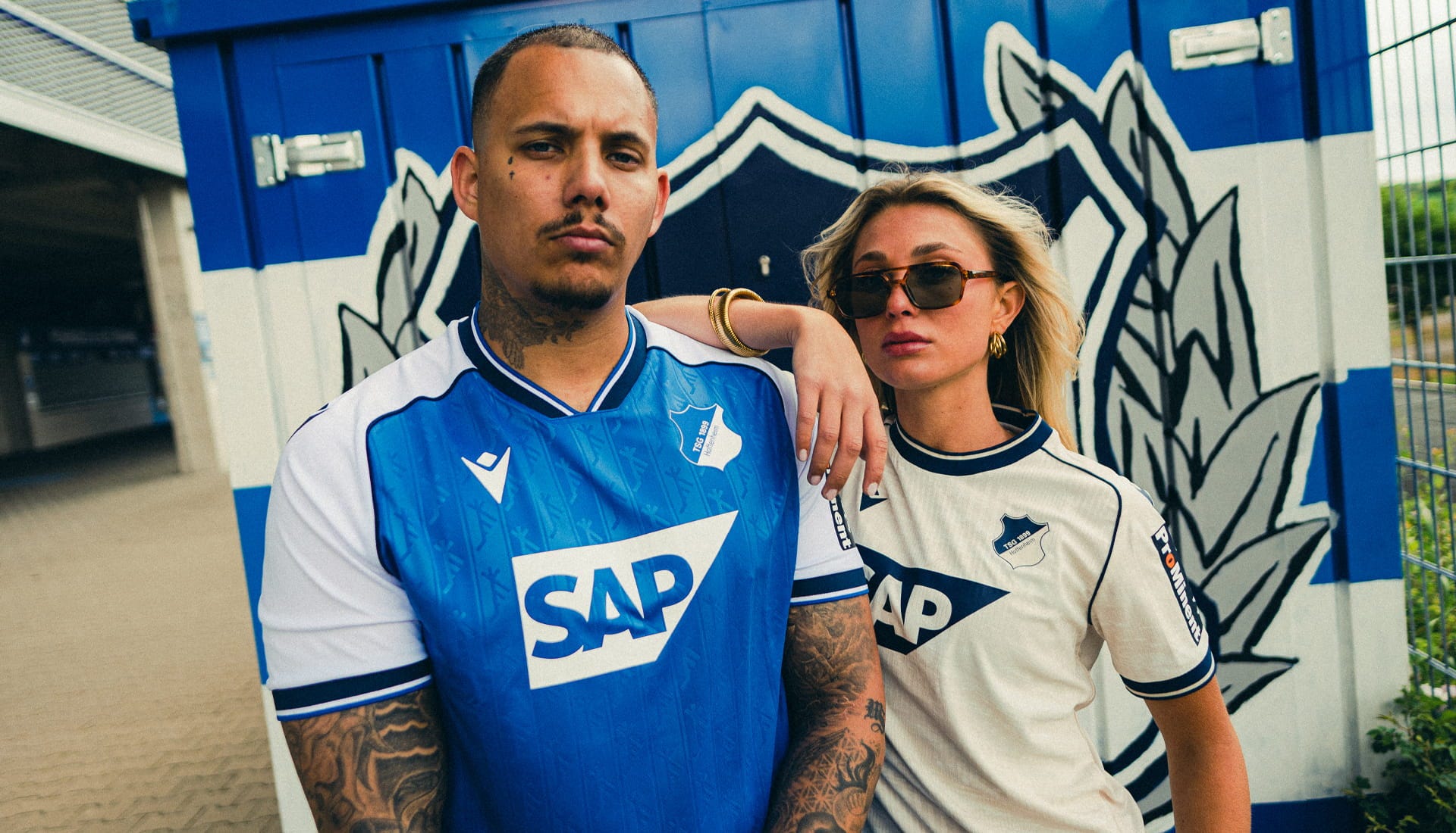
Hoffenheim are the first club on this list that has changed kit manufacturer for this season, ditching Spanish company Joma for Italy’s Macron. The Italians have done an excellent job with their debut kits, as I’d like to give a mention to the away shirt here which is a lovely off-white colour and looks clean.
The classic blue and white kit that we’re familiar with glistens nicely, and I think the sponsor is incorporated well and does not provide a distraction. The dark trim on the collar and sleeves is a nice contrast to the primary blue. But undoubtedly the highlight of this home kit is the pattern embossed inside the blue part of the shirt. The pattern represents the antlers of a stag, which is taken from the coat of arms of Hoffenheim, making it a brilliant nod to the village’s heritage. Macron has used a new jacquard fabric, which allows intricate designs to be woven in, as well as providing extra elasticity compared to standard polyester football kits.
The only change I would make is the shape of the collar, as the home collar feels like a halfway house between a V-neck and a crew neck.
Rating - 9/10
Bayer 04 Leverkusen - New Balance
© New Balance
A return to prominent red is on the menu for Bayer 04, having gone for a black shirt with some faded red last season. The way the thick red stripes travel slightly diagonally away from the black centre as they move down reminds me of spotlights at a concert and it looks pretty cool. The cross motif that features towards the bottom of the shirt, increasing in size as they travel south, is presumably inspired by the Bayer AG logo which is the word ‘Bayer’ written twice, once horizontally and once vertically, forming the shape of a cross or plus sign. Although this is New Balance’s only contract in the Bundesliga, I think they’ve done a stellar job at balancing (pardon the pun) creating a kit that looks unique but stays true to the club’s visual identity.
The magnitude of the upcoming season for Bayer 04 cannot be understated, as they hired 42-year-old Carles Martínez Novell, a coach that never played professionally but spent many years coaching in Barcelona’s academy before a three-year stint at Toulouse, finishing 9th last season. Will he be able to step up to managing in European competition? Only time will tell, but the bright red spotlights are beaming down on him.
Rating - 7/10
SC Freiburg - Nike
© Nike and footyheadlines.com
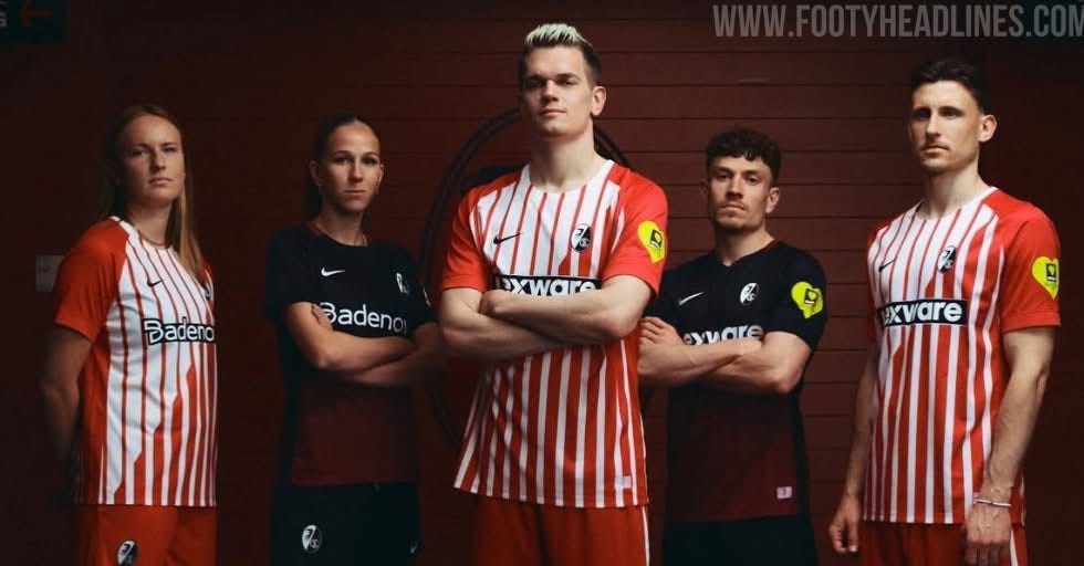
Freiburg enter the new season continuing with their red and white stripes from the previous campaign. A new front of shirt sponsor is announced for the men’s team - Lexware, a business software platform in Germany - replacing leasing company JobRad. I guess they were only a loan signing, then.
The distinctive feature of this shirt is the diagonal line from top-right to bottom-left (or top-left to bottom-right if you’re the one wearing it), upon which the vertical stripes change from thin to thick. Nike have taken their fair share of criticism for phoning it in with reusing template kits for clubs they’re contracted with, but this one seems like a more bespoke attempt. But on second thoughts, maybe they should’ve stuck to the tried and tested templates, as I think the execution lets the concept down.
Rating - 3/10
Eintracht Frankfurt - Adidas
© adidas
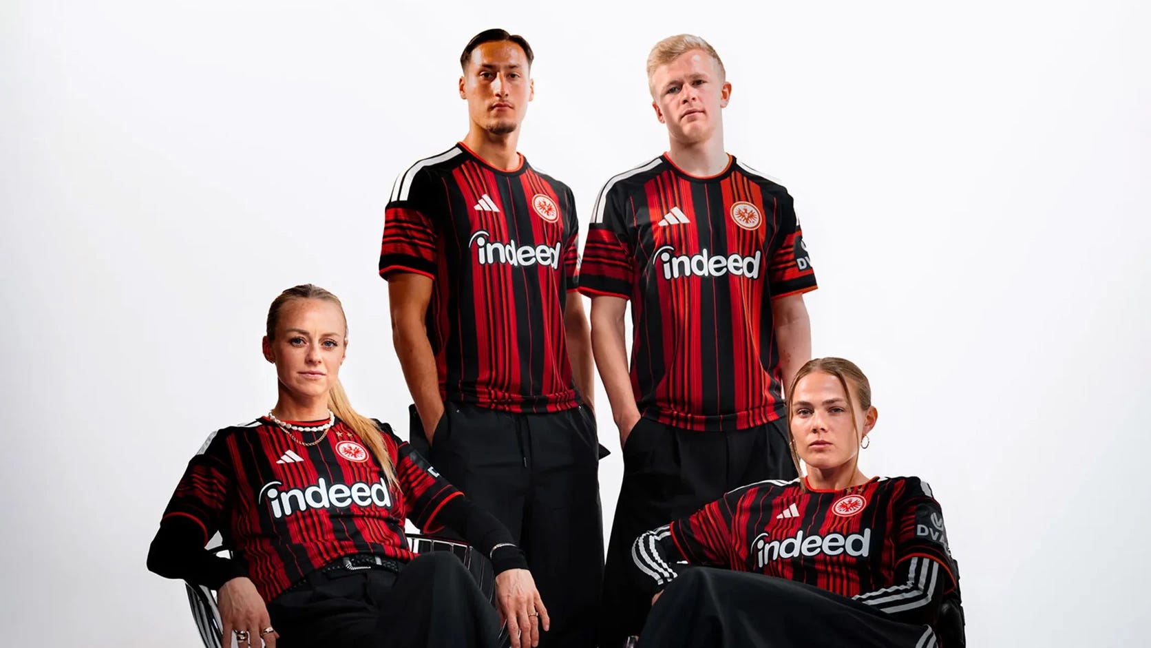
Three red stripes in a row now as we look at Eintracht Frankfurt’s new outfit. Broad black and red stripes are interspersed with much thinner stripes, which is a unique concept that I don’t recall having seen before. The red is a slightly deeper shade than last season where it was a considerably bright hue. The horizontal stripes running around the circumference of the sleeve nicely completed the vertical stripes on the torso, as well as the famous three white Adidas stripes on the shoulders, although they do make it look slightly as if everyone is wearing a captain’s armband.
The back of the shirt is mostly plain black but the stripes return towards the bottom, but naturally this will look less strange with the player names and numbers on. Jobs website Indeed continues for its tenth season as the main sponsor, although they have removed the ‘Jobs finden’ subtitle, which gives it a cleaner look.
Rating - 8/10
FC Augsburg - Mizuno
© Mizuno
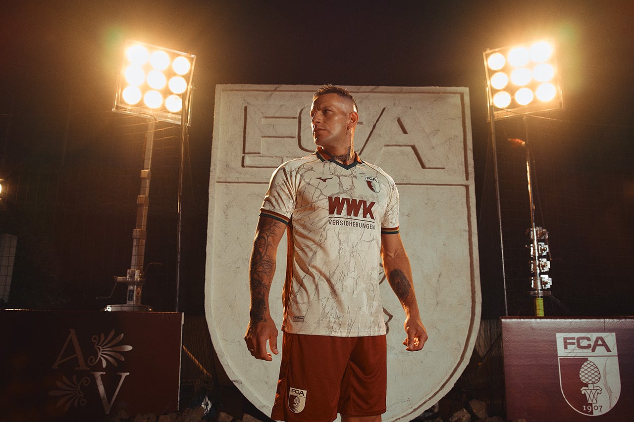
Japanese manufacturer Mizuno have upped their game considerably with the release of Augsburg’s new kit. Last season, they featured Augsburg’s secondary and tertiary colours (dark red and dark green) as diagonal stripes that look like a seatbelt, and I despise kits with the seatbelt design. This time around, they have absolutely smashed it out of the park.
The cream-coloured shirt is embossed with a marble pattern that pays homage to Augsburg’s history as a city founded in 15 BC under the Roman Empire, when it was named Augusta Vindelicorum. The jacquard fabric mentioned in the Hoffenheim section is used again here, allowing for such intricate design. The secondary and tertiary colours are featured minimally on the sleeve cuffs and the fabulous-looking collar, separated by a gold stripe. The side panels also feature the club badge’s iconic pine cone, which was a symbol of regeneration in the Roman Empire. Certainly my favourite kit of the season.
Rating - 10/10
1. FSV Mainz 05 - Jako
© Jako
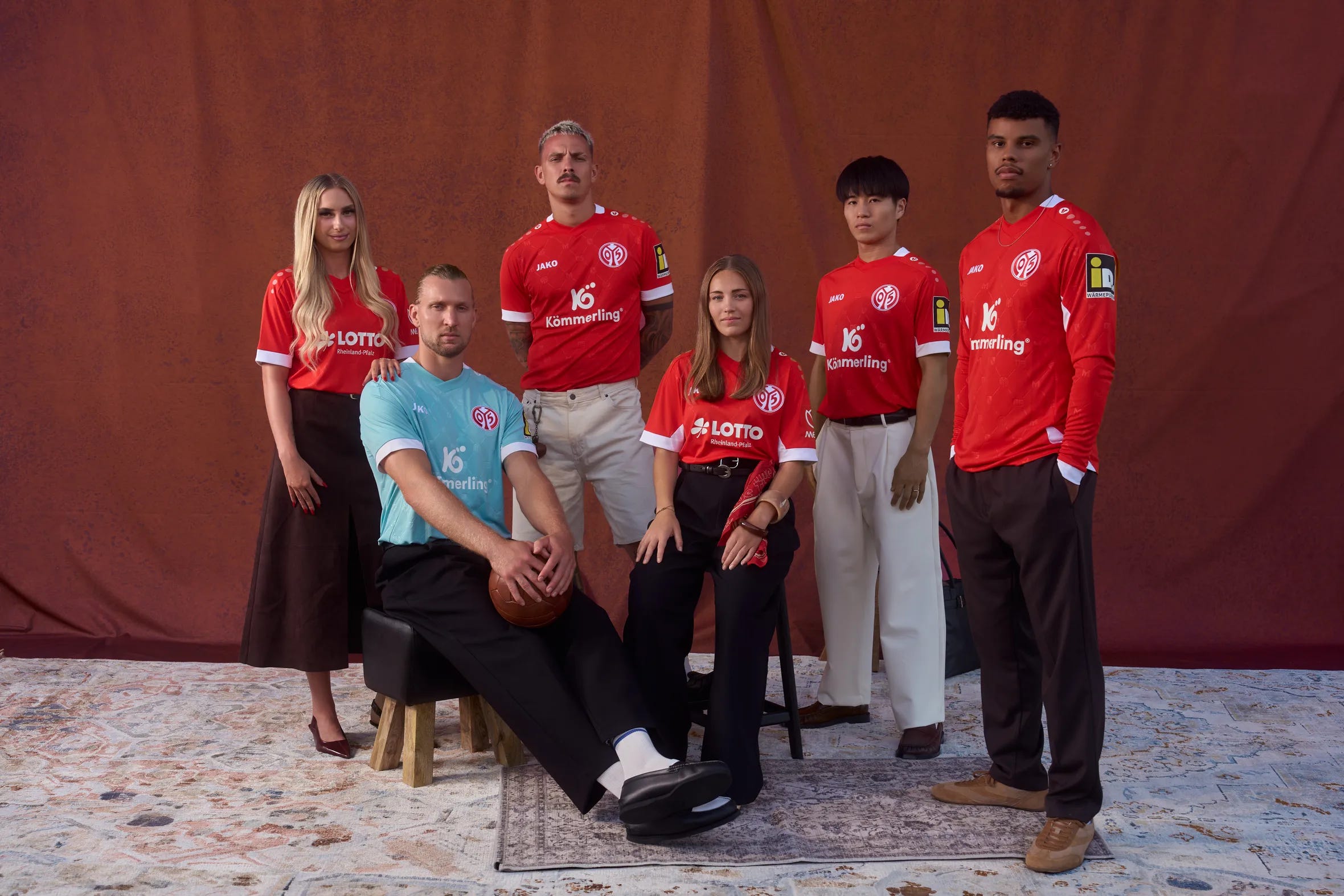
Mainz continue with their signature bright red, with a white trim which has been scaled back hugely compared to recent seasons. Embossed within the red home kit, as well as the turquoise goalkeeper kit pictured above, are three symbols with diagonal lines in between forming the shape of a diamond that repeats across the shirts. There is the letter M, the club’s famous 05, and the city’s coat of arms, known as the Wheel of Mainz which dates back to the 13th century.
Kömmerling, a window and door manufacturer, continues as the long-serving front of shirt sponsor for the club. The sleeve sponsor iDM, however, is a bit of an eyesore. Nothing about this kit completely wows me but it has a classy feel.
Rating - 7/10
1. FC Union Berlin - Adidas
© adidas
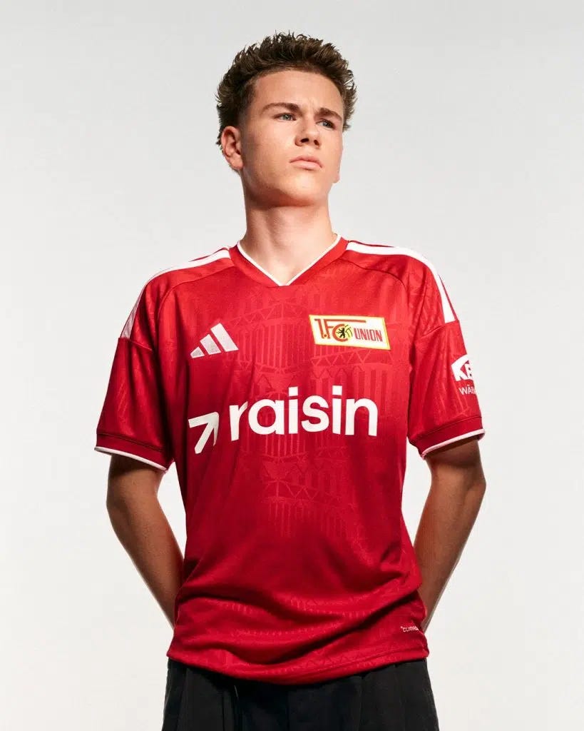
Union and Adidas have ditched the ghastly horizontal stripes from last season and returned with a traditional, standard red kit with a touch of white as a trim and in the lettering/Adidas logos. Overall, the shirt looks clean, and the choice to emboss architectural elements of the club’s Stadion an der Alten Försterei is an excellent one.
However, there are two issues that I have here that will sound silly and petty, but they definitely bring this kit down a few notches for me when coming to a final rating. I’ve personally never been a fan of Union’s badge as I think it’s too cluttered, and it therefore makes it difficult to incorporate seamlessly into the kit design, which is evident here too. The other issue is that front of shirt sponsor. Raisin may be a well-renowned FinTech company, but in my opinion, it’s a stupid name. Even if I was a Union fan, I don’t think I could bring myself to wear a shirt that says Raisin on it. But as I’m trying not to be overly subjective, I’ll be kind enough to give it a decent rating.
Rating - 6/10
Borussia Mönchengladbach - Puma
© PUMA
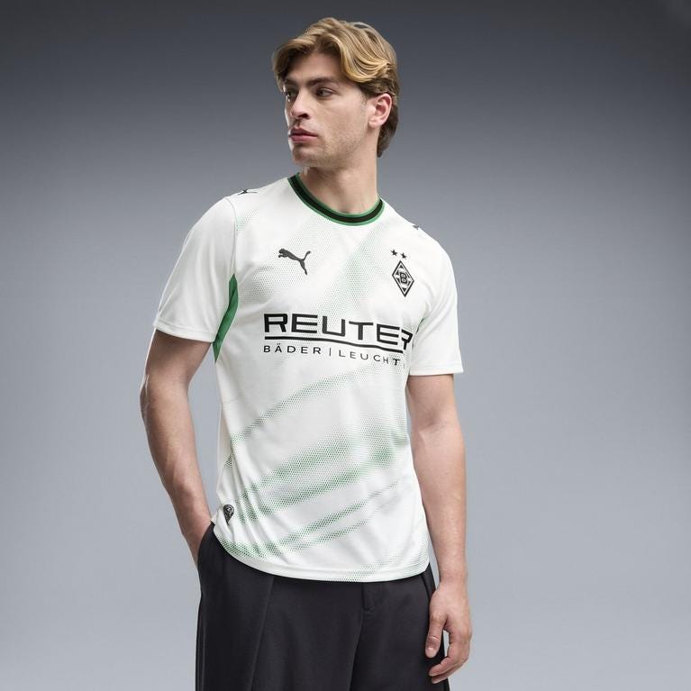
Borussia Mönchengladbach have brought the green trim back to their iconic white home kit after a year-long hiatus. Die Fohlenelf launched the kit alongside the slogan ‘For the new generation’, although I wouldn’t say that they are reinventing the wheel here.
The green brushstrokes across the torso seem somewhat random but they are faint enough to not be distracting. Reuter also return for their third season as Gladbach’s main sponsor. All in all, there’s not much to say about this one and it’ll probably be forgotten by this time next year.
Rating - 5/10
Hamburger SV - Adidas
© adidas
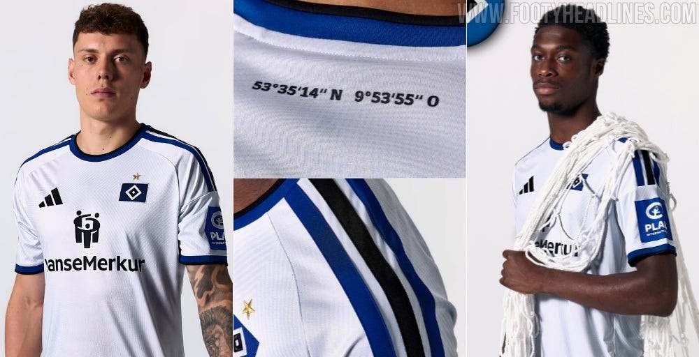
Another win for Hamburg this year with a kit that is as smart as it is aesthetically pleasing. The core inspiration for the design is the club’s iconic Volksparkstadion, one of only four stadiums in Germany that is on the UEFA 5-Star list (alongside the Olympiastadion, Allianz Arena and Veltins-Arena). A digital print of the stadium is embossed into the fabric, and although it is very subtle, it makes the kit stand out amongst its competitors. The stadium’s geographic coordinates are printed on the back of the shirt too.
Although the shirt looks white, in close up shots you can see that it has an extremely subtle blue tint which I think is pretty neat. The HanseMerkur Insurance Group sponsor, as well as the sleeve sponsor, are incorporated nicely in club colours, and the blue-black-blue colour scheme for the Adidas stripes is a cool idea and works well.
Rating - 9/10
1. FC Köln - Adidas
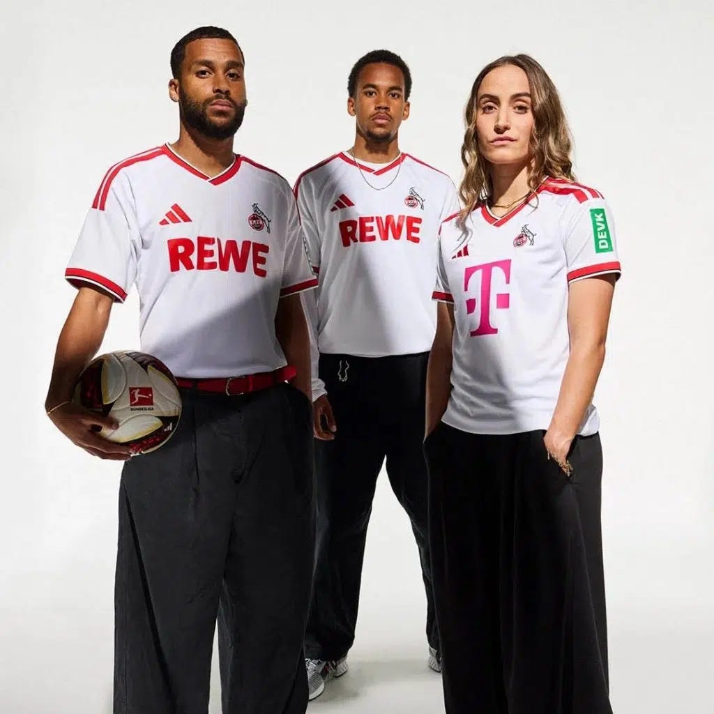
© adidas
Köln seem to enjoy alternating stripes and solids so much that you’d think they’re playing a game of pool all by themselves. This year, it’s the turn of the solid, and like previous editions of the plain white kit, they’ve kept it as simple as possible. The main difference for Köln this year, however, is the switch from Hummel to Adidas. The iconic German apparel company evidently chose to play it safe as to not wind up the Köln fans, which is a sensible move.
REWE remains as the main sponsor as it just wouldn’t be a Köln kit without it, although they have done away with the little smiley face logo that was next to it last season. The slightly asymmetrical collar adds something different to the design too. Overall, it’s a nice classic-style kit but lacking any standout features.
Rating - 6/10
SV Werder Bremen - Hummel
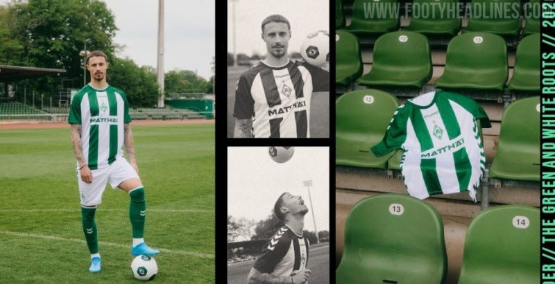
© Hummel
Since taking over from Umbro in 2023, Hummel have been smashing it with the Werder home kits they’ve designed, and that continues this season. The club has experimented with various forms of green and white vertical stripes in recent years, but usually green has been the dominant colour. This time, the club will turn out in a kit that is heavily reminiscent of their home shirt from the 2000/01 season, expertly modelled by captain Marco Friedl here.
The iconic diamond badge, as well as the Hummel logo, are located centrally on the kit which I think works with the positioning of the two green stripes either side. The Hummel arrows are embossed within the fabric across the entire shirt which creates a texture contrast when looking at it up close. It’s certainly a strong attempt at a throwback, although I do think Hummel are suffering from success because it’s probably my least favourite home kit of the four that they have created for Werder so far. The standard they’ve set is that high.
Rating - 7/10
Schalke 04 - Adidas
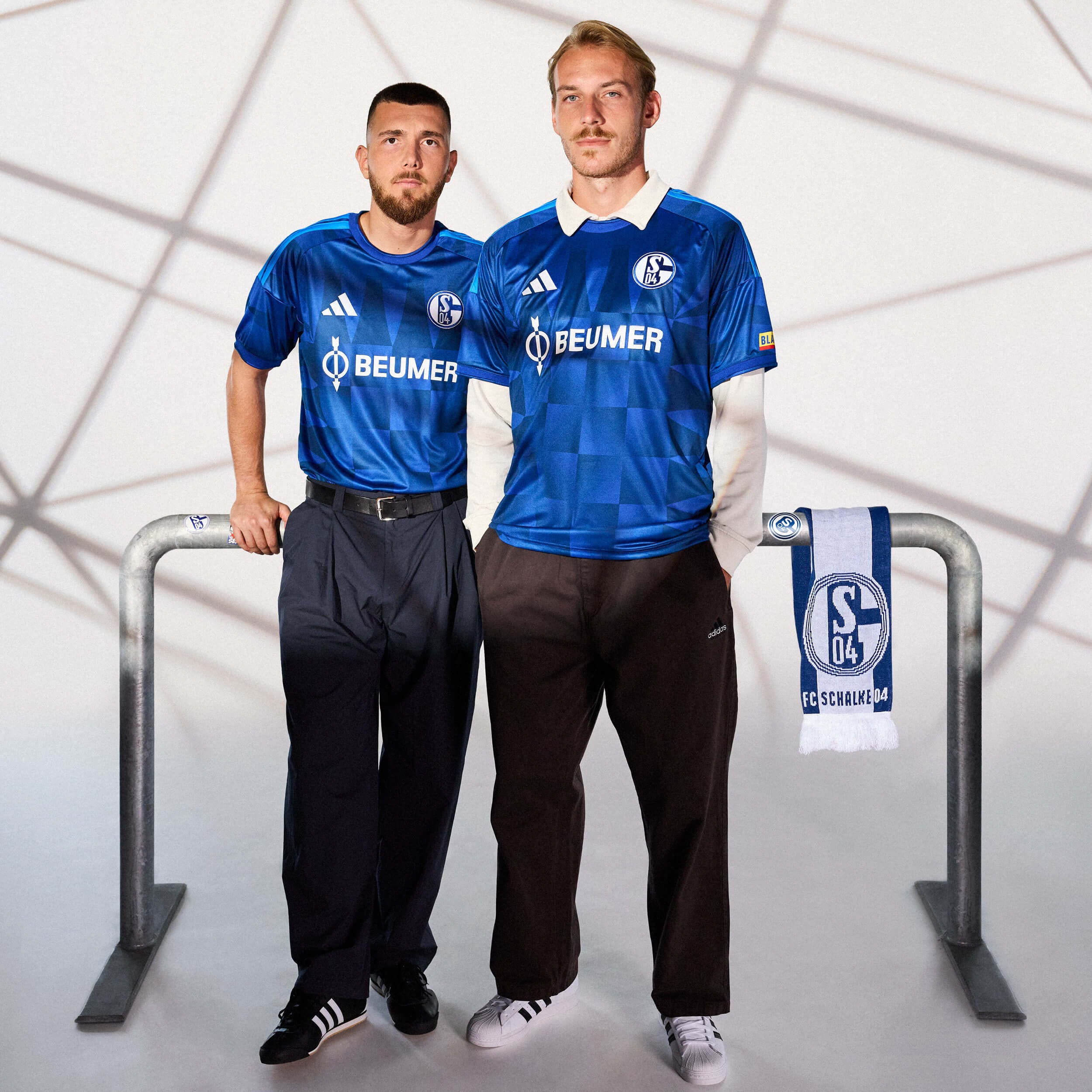
© adidas
Returning from their three-year banishment to the 2. Bundesliga, Schalke 04 return with a point to prove in this glossy blue kit inspired by the Veltins-Arena. On the 25th anniversary of the stadium being opened, the club partnered with Adidas to produce an abstract motif that celebrates the arena’s unique features. And I must say, I do not think it works. The contrast between the squares in the middle and the somewhat triangular shapes above and to each side makes the kit feel jarring to look at.
New main sponsor BEUMER, a logistics company, features in white and is incorporated into the overall design well. The Adidas shoulder stripes being in a lighter shade of blue works for me, and the glossy characteristic is definitely the highlight of this design which somewhat saves the poorly executed concept.
Rating - 4/10
SV Elversberg - Nike
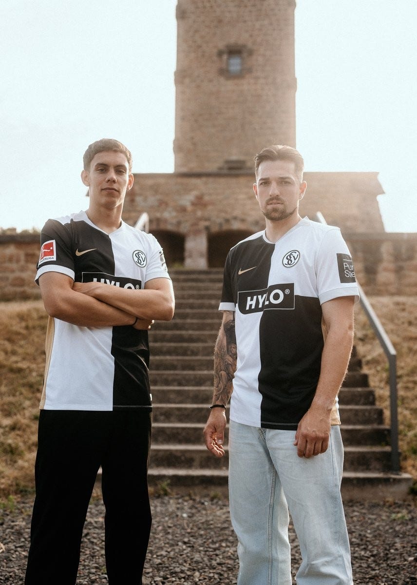
© Nike
Where to start with this one? Apologies to all Bristol Rovers fans but I personally find the four quarters design hideous, and it’s worse in black and white colours. The gold side panels and Nike logo don’t particularly work with the rest of the kit either. I would have much rather they kept the vertical stripes that worked well for them last season rather than making their Bundesliga debut in this abomination.
The “Die Elv” print on the back neck is nice, but I’m struggling to find anything else to compliment here.
Rating - 1/10
SC Paderborn - Hummel
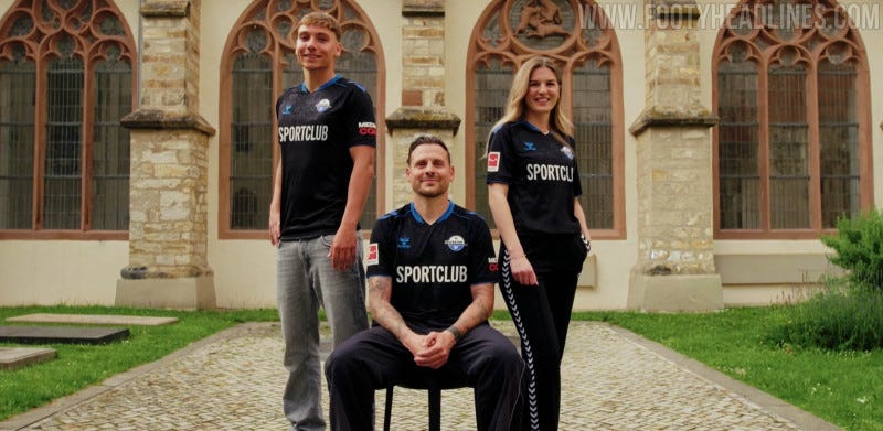
Ending on a high, we have the final promoted club, SC Paderborn. Hummel decided to ditch the Croatia-style, checkerboard black and blue pattern that the club sported in its promotion campaign, returning to a sleek black kit with a blue collar.
Without a main sponsor confirmed, they launched the kit with their own club name across the torso instead. The highlight of this kit is the beautiful pattern embossed into the black colour, albeit not visible in this photo. What is visible in the photo, however, is the Drei-Hasen-Fenster (three hares window - above the head of the woman to the right), which is the core feature of the pattern and looks excellent. Also embossed is the club’s founding year, 1907, and a replica of the church windows you can see in the photo too. Another fantastic concept and execution from Hummel.
Rating - 8/10
Comments
Nothing yet. Say the first thing.
Sign in to join the conversation.