
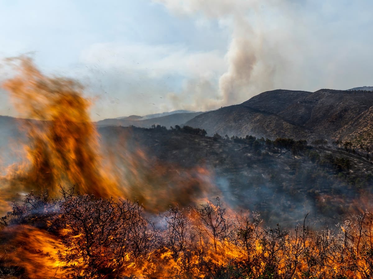
We hear a great deal about how much our world has heated up since pre-industrial times, and how we are on the cusp of crashing through the 1.5°C dangerous climate change guardrail, and rightly so. Rarely, however, do we read about what a rise of this magnitude means for different parts of the planet. Because this is a global average temperature increase, and unless everywhere is heating up at exactly the same rate, then some places must be heating up more slowly and others at a higher rate – the winners and losers if you like, at least for now. So, what does the planetwide heating map look like.
Comments
Nothing yet. Say the first thing.
Sign in to join the conversation.