
I bargained up my new book designer. Dan is married to a Grand Prairie Bird Alliance board member and I met him at a neighborhood potluck. I told him about my book and how I was meeting with a book designer in Minneapolis. They were great to talk to and I learned a lot about book design. When I told Dan I was about to commit to a $7,000 contract with them, his eyebrows raised slightly and he asked me to send him the first 50 pages of my manuscript.
He told me he was recently retired from Illinois State University, where he taught Media Design. He said once we decide on a few basic parameters, laying out the book was relatively easy. I was intrigued, so I set up a Google Meet calls and we talked through the pros and cons of different size books, type of paper, layout, and design. During our third call Dan said “I am enjoying this process and I would like to design your book.” That came as a surprise and I had to shift gears. I was prepared to work with the company in Minneapolis and this felt like a reassuring yet uncertain change. I had developed a rapport withDan at this point, so I decided to trust our relationship and commit to working with him. We developed a contract and settled on a price that was much easier for me to manage.
On our next call we discussed fonts. I use Georgia for my Substack essays and Dan suggested I consider EB Garamond. As soon as I saw that font I thought, that looks like a book. It turns out my reaction is rooted in history. Georgia was created for screens. EB Garamond originated in Paris in the fifteen hundreds and was created for ink pressed into paper.
I have had one meeting a week with Dan over the past month. During that time my manuscript has been transformed into a book.
The next step is for me to upload all of the photos so Dan can insert them into the text. That sounds simple, but for me it is not simple. I have 20,000 images and the JPEGs I use for Substack are not high enough resolution for the book, so I have to find the original raw file for every photo and re-export it as a TIFF in the appropriate aspect ratio. This has proven to be time-consuming, so I will be sharing some reader favorite essays from my archives over the next few weeks. This will give me more time to work on the photos.
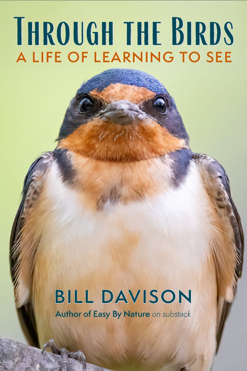
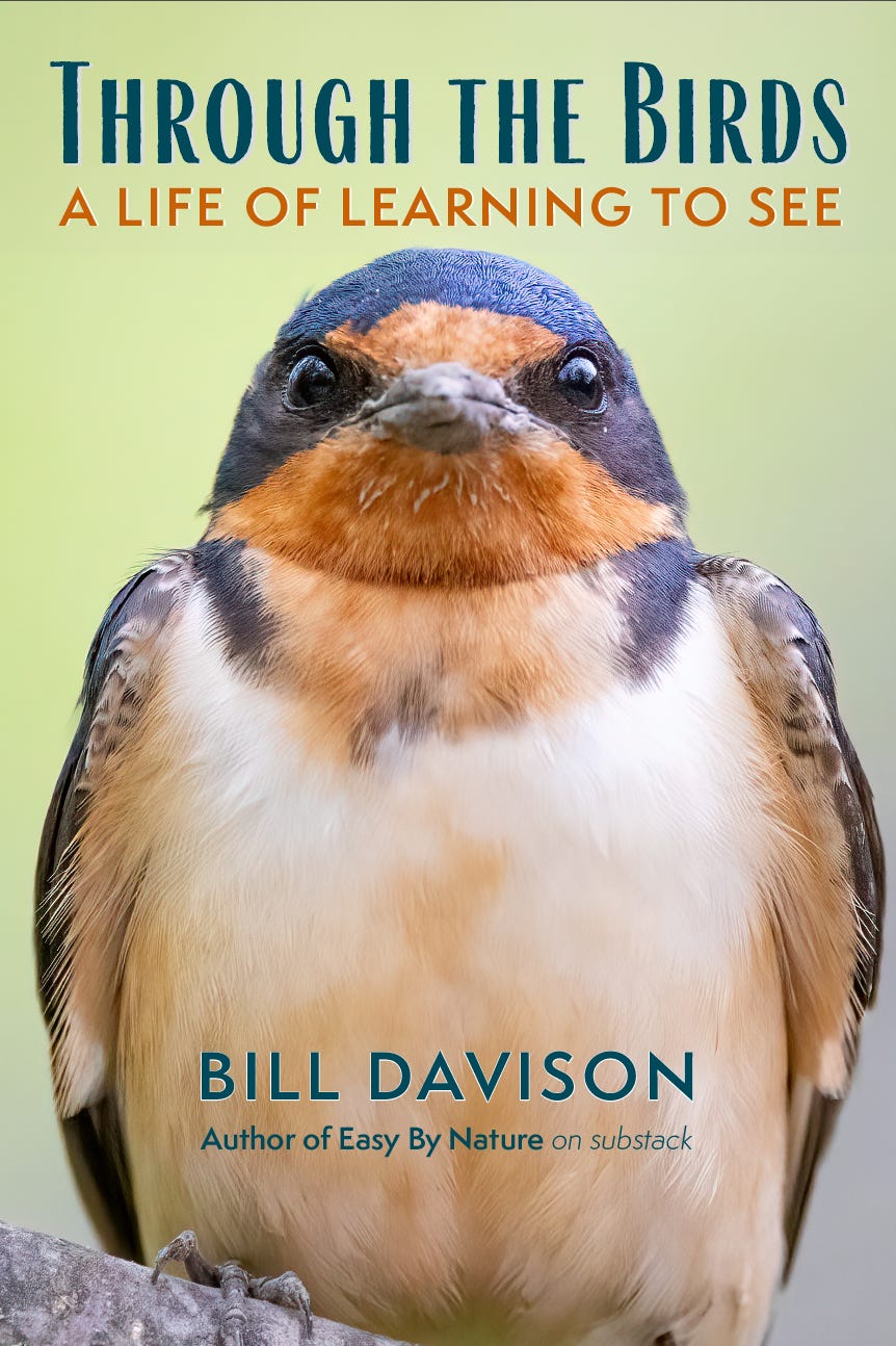
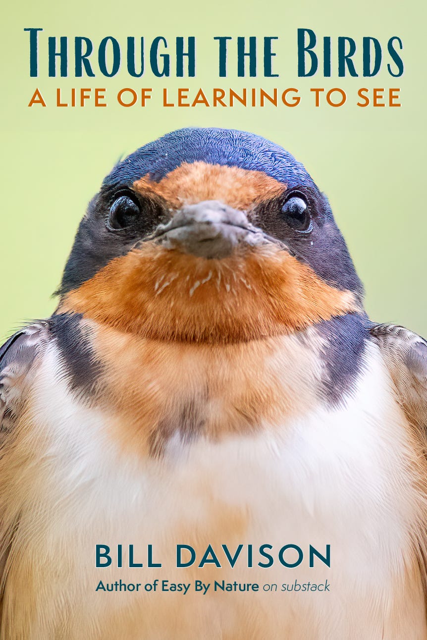
I have recently settled on an image for the cover. I tried several, and when I saw the Barn Swallow, I thought, that’s the cover.
Here are two versions we are considering. They both have their own merits, so I would appreciate it if you could let me know which one you prefer.
We have a clear path forward and I am looking forward to holding my book in my hands.
Comments
Nothing yet. Say the first thing.
Sign in to join the conversation.