
Now that we’ve spent time with light and shadow, let’s turn our attention to the next part of our series:
In truth, nothing an artist places is ever neutral. Not the figures, not the objects, not even the empty stretches in between.
When we look at a painting, our eyes naturally move toward the figures, the objects, and the action. But an image isn’t only made of the things we immediately notice. It is also built from the distances between them, the size of one form compared to another, and the empty stretches that surround them.
A figure made larger than it would appear in real life carries a weight beyond its physical body. An element pushed to the margins recedes, not only in space but in importance. The bare backgrounds, what we often overlook due to their “well, there’s nothing there,” can hold as much significance as the fully rendered subject within it.
So when we look at a painting, the question isn’t just “what am I seeing?”
It’s also “why this, and why here?”
So in this next part of the series, we’ll learn the language around scale and space, how an object’s size, placement, and what’s around it reveals about its logic—and with it, the mind of the artist behind it.
Here is the rest of this four-part series:
Reminder: You can support Behind the Masterpiece and get access to members-only content for a few dollars per month, such as:
Access to paid subscriber articles
Unlock the full curriculum: From the ‘Language of a Masterpiece’ to the ‘History of Colors’
Ask me anything about your favorite works or upcoming museum trips
Ability to comment and join community chats
Let’s start with our key term: scale. Scale is simply how big a painting, or any element within it, feels compared to its neighbours, the real world, or you standing in front of it.
It is about comparative size.
Closely related to this is proportion, which refers to the size relationships within a single object or figure. For example, how large a head is compared to the rest of the body.
This is where your eyes fall first; the specific area on the canvas that the artist wants you to start with, which is perhaps the most important component of a painting. After all, if the focal point doesn’t grab you, you might not stick around. So how do artists guide our eyes there?
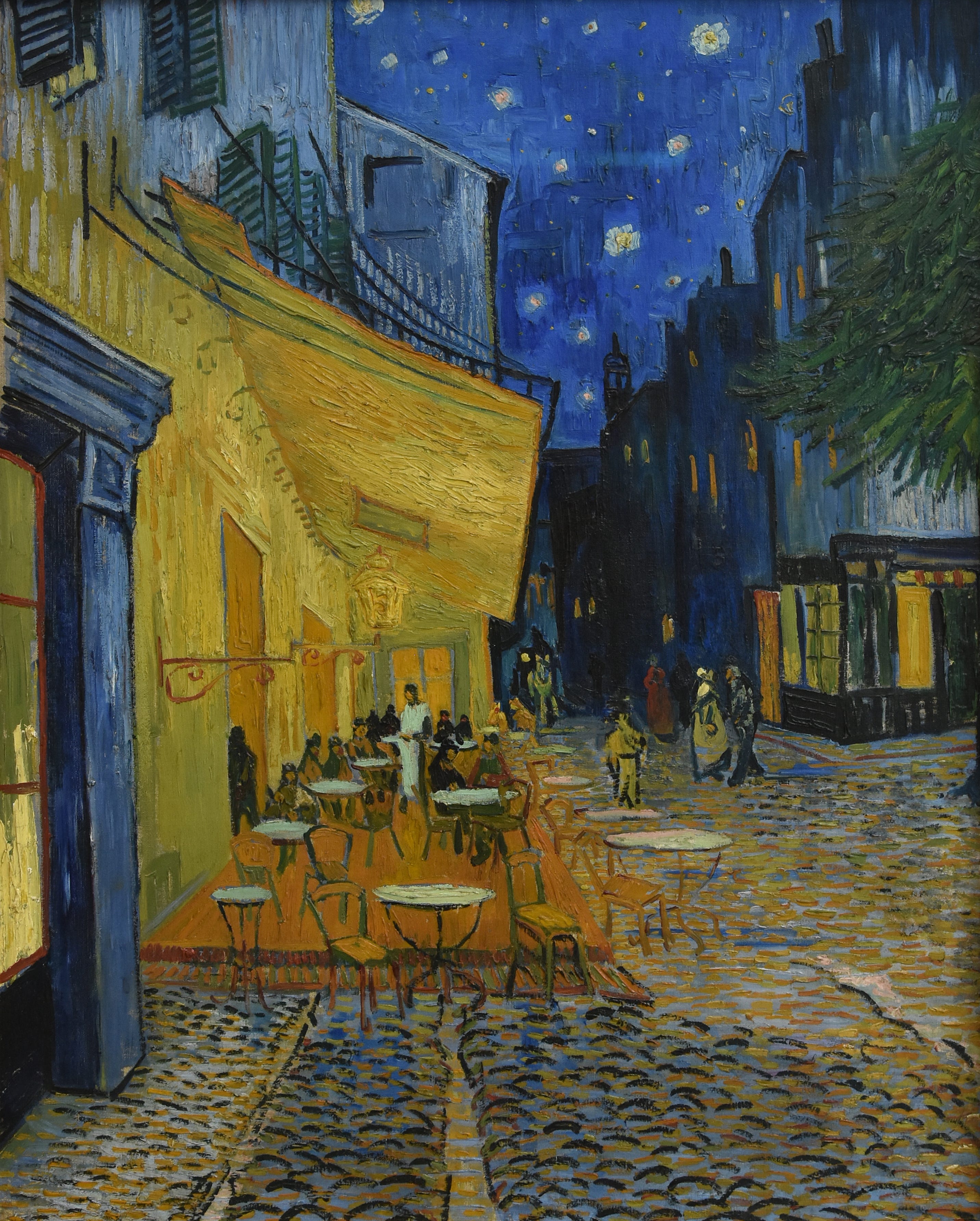
Sometimes this is done through color.
For example, in Vincent van Gogh’s Café Terrace at Night. The café’s warm yellows and oranges glow against the cool blues of the evening, making the terrace’s awning and walls the natural point of focus.
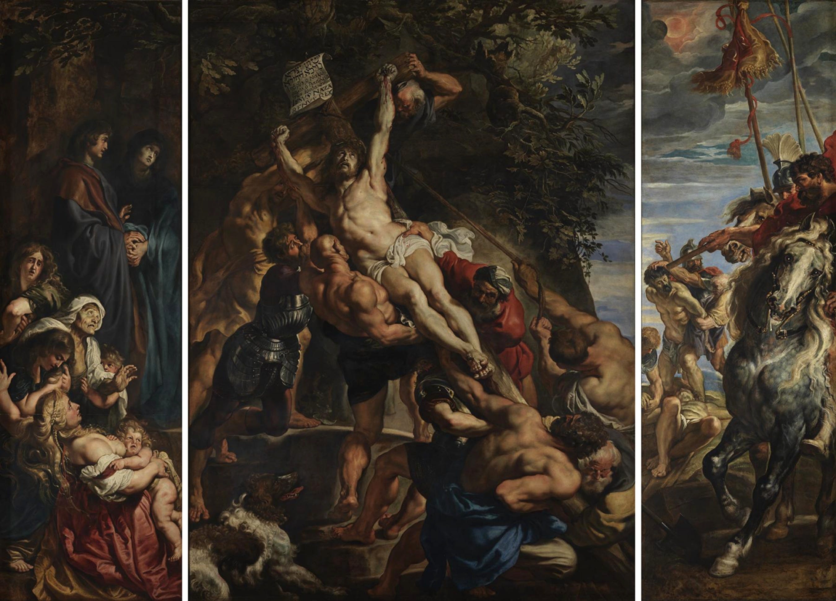
Light can do the same.
In Peter Paul Rubens’ The Elevation of the Cross, a beam of light pierces the dark, crowded scene to highlight the torsos and Christ’s pale body on the cross (If you remember, from last week’s post, this is achieved through chiaroscuro).
We immediately know where we are and feel the tension of the story unfold.
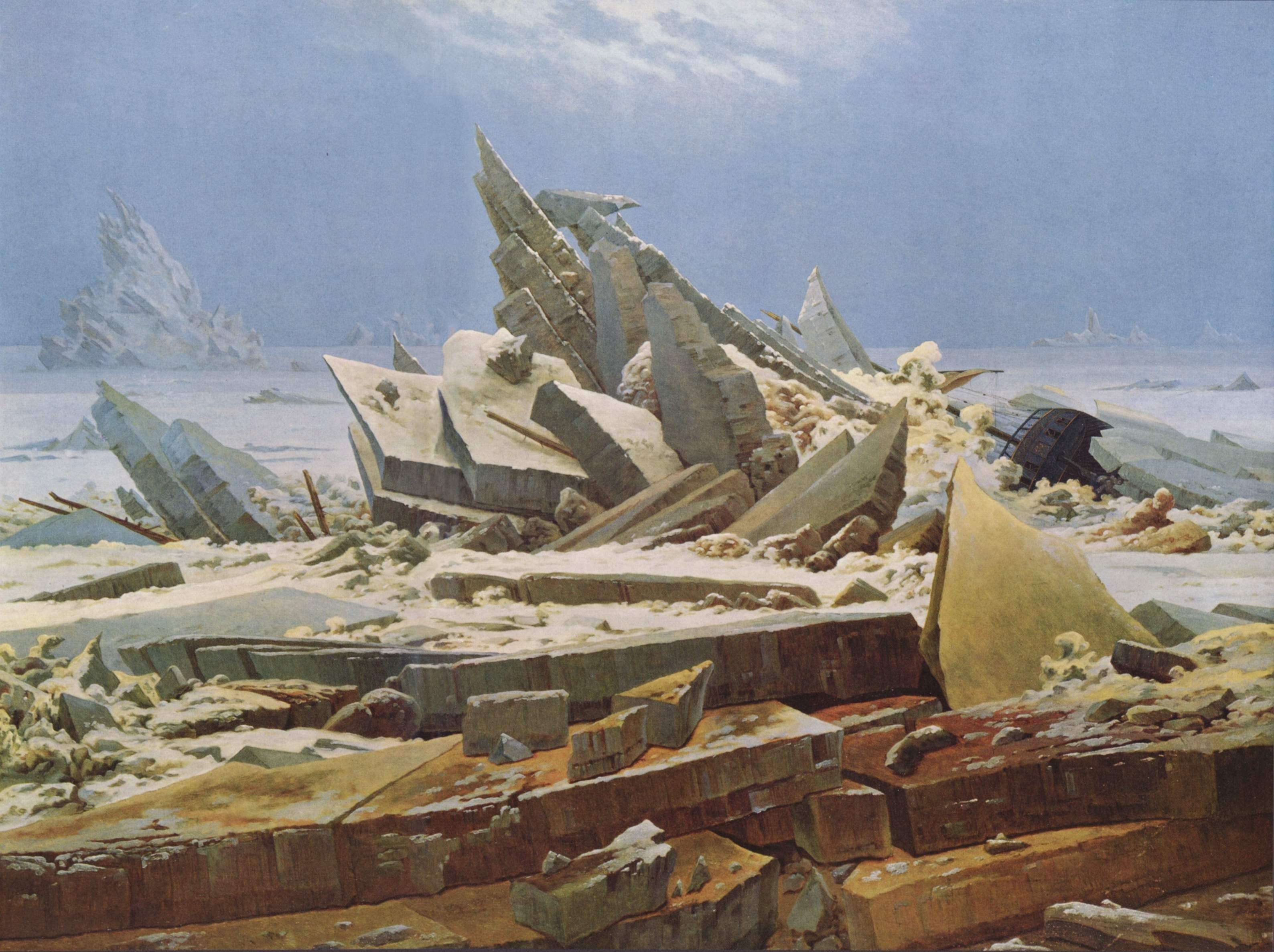
Line is another method.
In The Sea of Ice, Caspar David Friedrich uses diagonal lines of ice and jagged ridges to draw our attention toward the central shipwreck trapped amid ice pyramids.
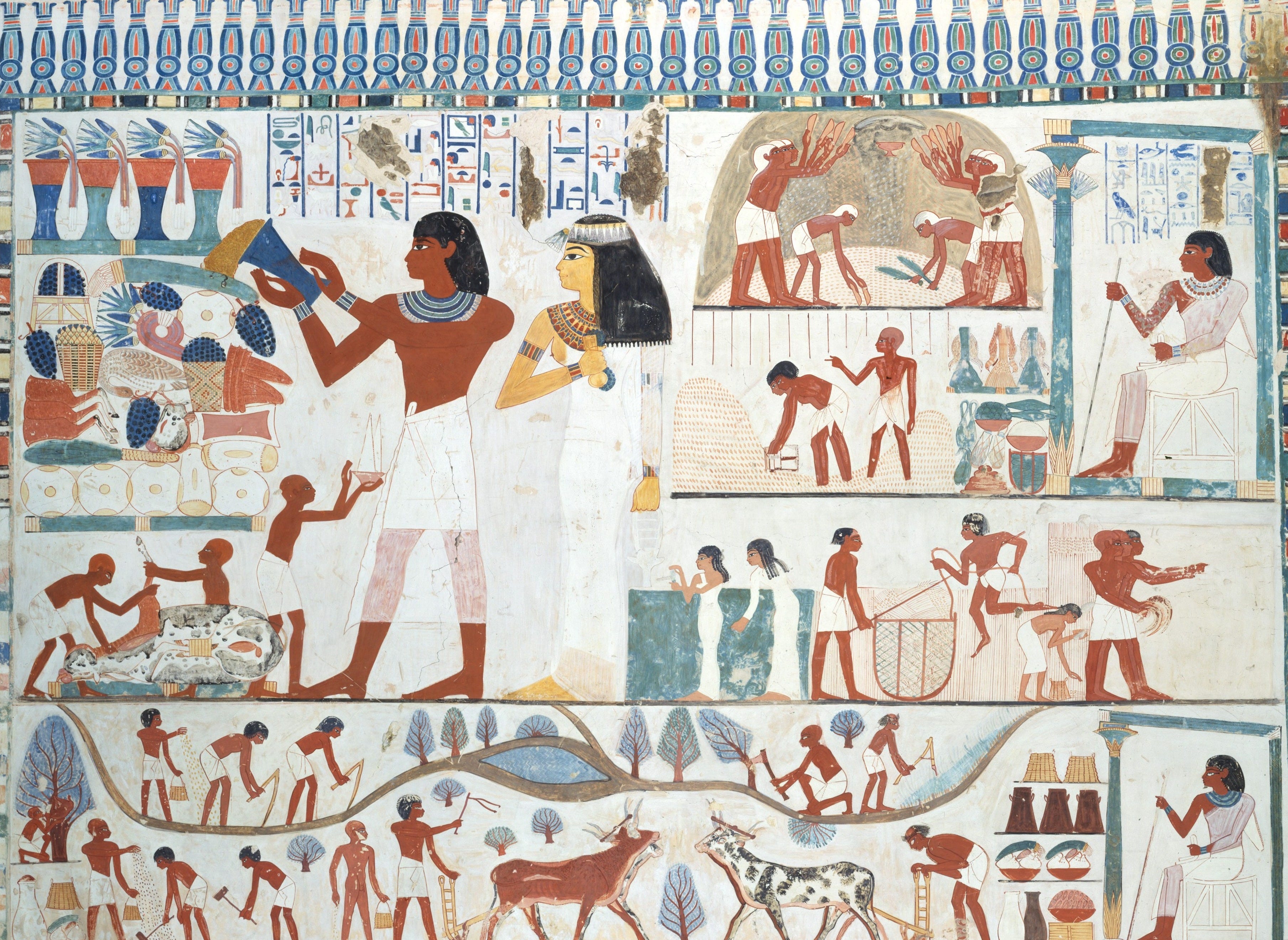
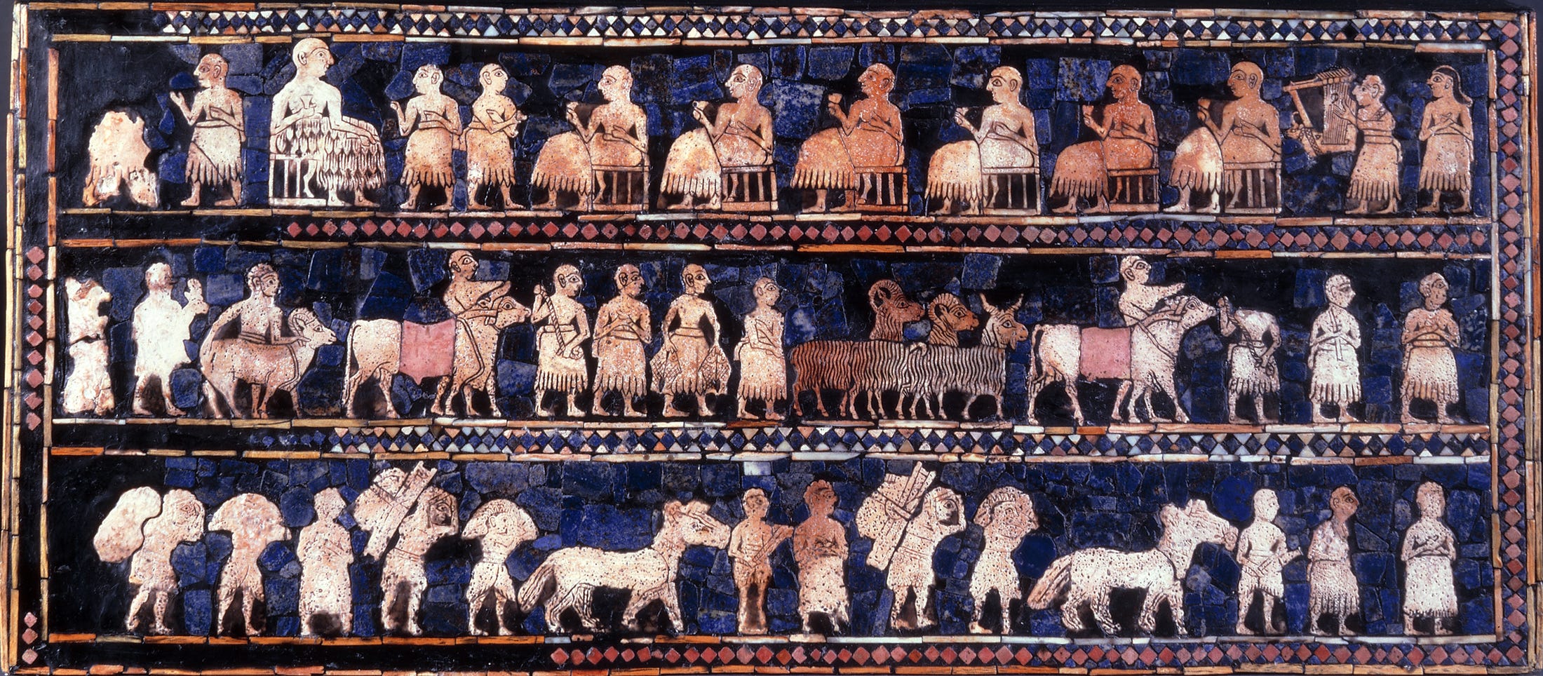
This is where figures’ sizes are painted according to their importance rather than how they would appear in reality.
In ancient Egyptian tomb painting, for example, a pharaoh is often depicted towering over servants and enemies to mark their elevated rank and semi-divine status.
Mesopotamian art also used this choice in scaling, as seen in the Standard of Ur, with the kings and queens seated on their thrones painted larger than the other subjects.
In Byzantine-era mosaics, the figures of Christ or the Virgin Mary are sometimes painted significantly larger than the apostles as a way to remind us of their supreme spiritual importance.
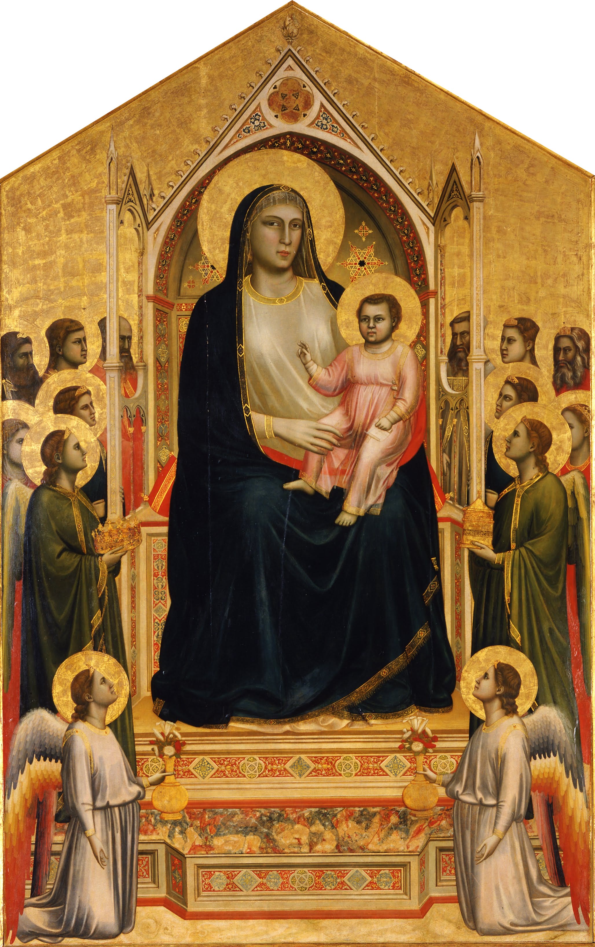
After the Byzantine era, the hieratic scale largely faded and was instead replaced by more naturalistic and anatomically accurate proportions seen during the Renaissance. Despite the style’s gradual disappearance, the core idea remained: scale can be used as a symbolic tool.
Linear perspective is a mathematical system to create the illusion of three-dimensional depth on a flat, two-dimensional surface like a canvas.
European artists had experimented with perspective throughout history, like placing one figure on top of one another to make it seem like they were behind them, but these attempts were irregular and lacked a consistent, systematic approach.
The Italian Renaissance architect Filippo Brunelleschi has been credited as the first person to describe a precise system of linear perspective around the year 1415.
Artists now needed to follow three components to accomplish three-dimensionality:
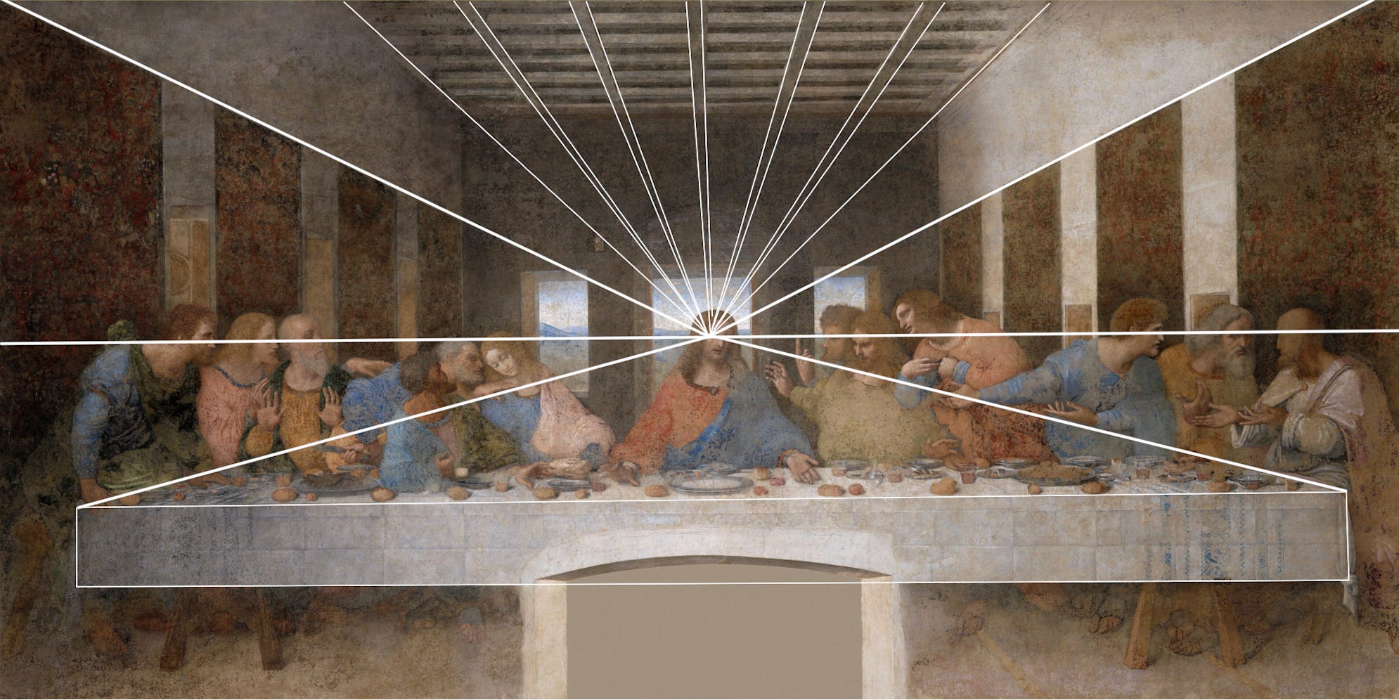
Orthogonals, better known as Parallel lines
Horizontal line (the eye-level line)
Vanishing point (where all of the lines appear to meet, even if they never do)
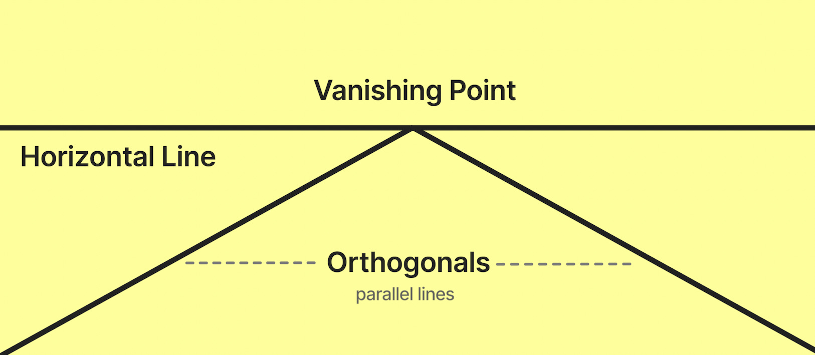
So now, to make objects appear more distant, artists would gradually reduce their size as they approached the vanishing point.
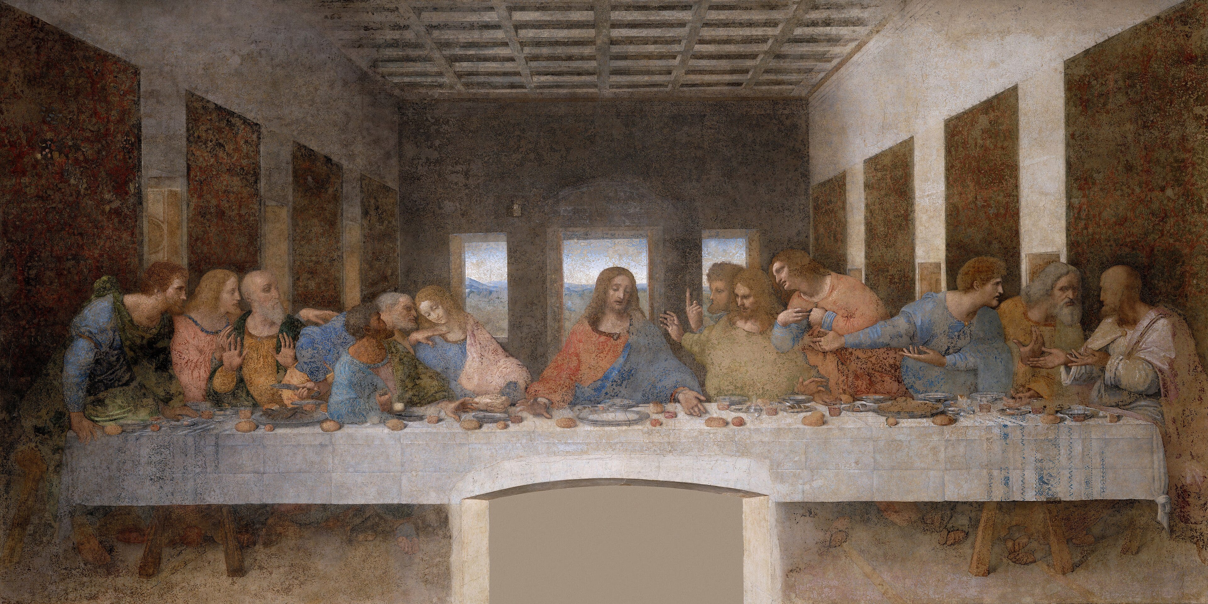
In The Last Supper, Leonardo da Vinci arranges all architectural elements—ceiling panels and the brown wall tapestries—to meet at a single vanishing point. Can you guess where it is? If you said Jesus, and more specifically His turned right cheek, you’d be right! This technique helps the viewer intrinsically establish Him as the visual and psychological center of the painting.
Comments
Nothing yet. Say the first thing.
Sign in to join the conversation.