
I recently reviewed the UBS Investment Returns Yearbook, and mentioned a report by Jim Reid of Deutsche Bank, The Ultimate Guide to Long Term Investing. Like the UBS Yearbook, Reid places markets in a much longer-term context and looks at 25 year rolling returns over a 200 year period.
I wanted to return to the Reid report as the article on the UBS report was so popular. Perhaps more important, I am becoming more nervous about markets. US treasuries don’t look attractive and US equities are looking expensive. It’s not just AI, I have mentioned Walmart here before and there are others like Costco, Caterpillar etc. The US market is making new highs and may be fine for now given strong earnings growth, so I shall return to this subject in due course. First, let’s look longer term.
Investors spend an enormous amount of time trying to forecast earnings, interest rates and GDP. But Reid contends that the most useful piece of information about the next 25 years is something much simpler - what you pay today.
The market may give you 8% p.a., but only over a long enough timescale. If you start at the wrong valuation, you will receive inferior returns – this assumes that the past is a guide to the future and of course that is not guaranteed either – there is a chance that Cathie Wood will make her investors rich. I doubt it, but I have seen stranger things in markets.
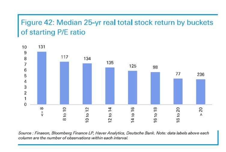
Reid thinks starting valuation is key to long term returns and the chart demonstrates this clearly:
25 Year Returns by Bucket of Starting P/E
Source: Deutsche Bank
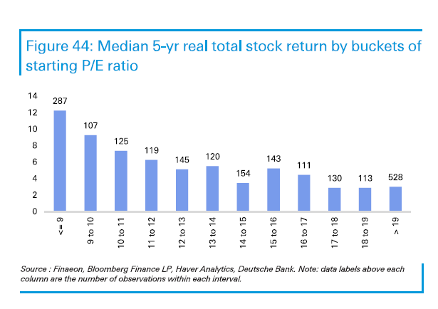
Now 25 years is a long time and may be longer than the time horizon of many readers – it’s certainly longer than mine. What is interesting is that the data paint a similar picture for forward 5 year returns:
5 Year Returns by Bucket of Starting P/E
Source: Deutsche Bank
Paying single digit multiples works, but interestingly, paying growth multiples also seems to work. In both time periods. The report doesn’t explain this and the data appear to show a U-shaped pattern rather than a simple “cheapest is always best” relationship.
The 5 year return is even more powerful for cheap stocks than the 25 year return which sounds odd initially but makes sense – you get a revaluation within a 5 year time frame which may not persist beyond a certain level. I don’t know what the optimum time frame would be but 25 years would be too long to sustain a rerating for most temporarily out of favour stocks. A 5 year timeframe makes more sense.
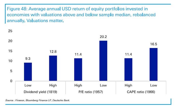
But Reid didn’t just look at P/E, he also looked at dividend yield and at CAPE ratios. The P/E history extended back to 1957, the CAPE ratio back to 1966 but the dividend yield data started in 1819, giving him a 200+ year dataset which is quite extraordinary. Each set existed for at least four economies throughout. Cheap stocks do better than expensive ones:
Cheap vs Expensive Stock Performance
Source: Deutsche Bank
For all these metrics, economies with lower starting valuations consistently outperformed more expensive ones. Outperformance was greatest on P/E at 8.1% - a gap of 11.4% vs 20.2% vs 5.1% for CAPE and 3.5% for dividend yield.
I would guess that dividend yield may lag perhaps because quite a lot of companies undergoing difficulty become high yielding stocks and go on to cut dividends? Reid didn’t explain this.
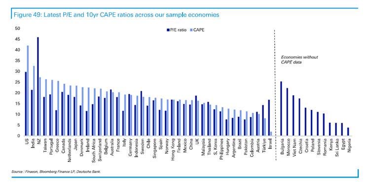
He then compares CAPE ratios – using inflation adjusted earnings – for a wide range of economies. The US has the highest CAPE and the second highest P/E, after New Zealand.
I was curious about why and it turns out that the country has some large, high quality and highly rated businesses – the top 5 stocks have multiples of 46x, 54x, 36x, 71x and 27x – full list at the end.
But the US stands out as an expensive market:
Markets Ranked by P/E and CAPE
Source: Deutsche Bank
The US is right at the expensive end of the distribution. The report explicitly identifies the US as “the elephant in the room”: it has delivered strong recent returns despite high P/E and CAPE ratios and historically low dividend yields.
Some will likely contend that the US is the exception that proves the rule. Or are investors making the same mistake that investors have made repeatedly through history - assuming that an exceptional market deserves an exceptional valuation indefinitely?
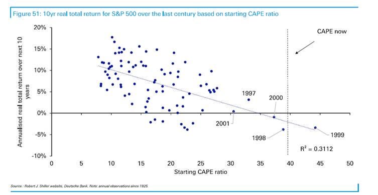
The report highlights that the US has only been more expensive in the dot.com bubble and thereafter 10 year returns were negative:
Starting CAPE vs Forward 10 Year Returns – S&P 500
Source: Deutsche Bank
Reid acknowledges that US equities could defy valuation gravity given AI optimism, but contends that a geographically diversified portfolio with a tilt towards lower valuations is more likely to perform better.
I would highlight that a high CAPE does not tell you when the market will fall. It simply implies that the hurdle for future returns is getting higher.
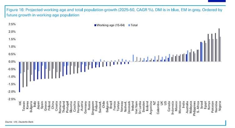
And demographics are unfavourable – the chart shows that 32 of the 56 economies studied are projected to see their working-age populations shrink over the next 25 years, with 21 expected to experience outright population decline. That has mattered in the past because fewer workers make it harder to generate the nominal GDP growth that ultimately supports corporate earnings. That could of course become irrelevant today because of AI.
Demographics Trends
Source: Deutsche Bank
In developed markets, the numbers are 17 and 9 out of 25 – so 2/3 of markets will see a shrinking working population and nearly 40% will see an outright population decline. It’s conceivable that AI will solve the working population problem, but it won’t compensate for an outright decline.
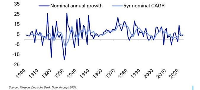
This is important because of the relationship of GDP to equity returns. Reid talks about nominal GDP growth being the “anchor of asset-class returns, driving corporate earnings, household incomes, interest rates and government revenues”.
World Nominal GDP Since 1900
Source: Deutsche Bank
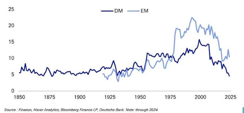
He points out that recent decades have seen a sharp drop in nominal growth with the 2010s being equivalent to the 19th century. And he offers that as the reason that by the end of 2024, rolling 25-year DM equity returns were the lowest since 1877!
Global Rolling 25-Year Stock Returns (Median, EM and DM)
Source: Deutsche Bank
His point is that nominal growth is not expected to improve that much so where will the returns come from? Especially given the obvious demographic challenges.
This is simply to highlight that the US stockmarket does not necessarily guarantee to deliver 8% pa in every period, which is what I often read. And bear in mind that those returns have benefited in the last 40-odd years from falling rates which cannot continue at the same rate.
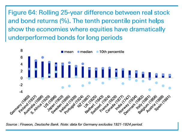
The report makes a number of uncomfortable observations which challenge received wisdom. You all prefer equities to bonds, right? But equities have not always outperformed bonds, even over his 25-year periods. There are substantial differences between countries, with some markets experiencing very long periods where bonds did better.
Stocks or Bonds? Returns Difference
Source: Deutsche Bank
The first chart above shows the difference between the returns from stocks and bonds over a 25 year period. The second chart is perhaps easier to conceptualise as it shows the percentage of 25 year periods when bonds outperform – Italy stands out in that over half the time, bonds beat equities.
Stocks or Bonds? Frequency that Bonds Beat Stocks

Source: Deutsche Bank
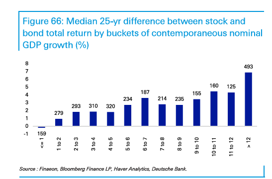
I don’t want to sound depressing - the good news is that the US is unusual in that bonds have never beaten equities in a 25 year period. And Reid also shows that it’s only when GDP growth turns negative that bonds beat stocks:
Amount Equities Beat Bonds by Bucket of GDP Growth
Source: Deutsche Bank
But Reid’s data raise a more important question for investors today. If the starting valuation is high, nominal growth is subdued and demographics are deteriorating, where exactly will the returns come from?
The data are uncomfortable. But they don’t tell us when to get out.
Below the paywall, I explain what I am actually doing about it - why I am reducing my dependence on the US, where I am looking instead, and why I think the conventional assumption of 8% annual equity returns deserves much more scrutiny.
Comments
Nothing yet. Say the first thing.
Sign in to join the conversation.