
I’ve been thinking about why some products feel like obligations and others feel like habits.
The obligation products are the ones you use because you have to. You open them, do the thing, close them. Invoicing tools, expense trackers, project management software. You get in, complete the task, get out. There’s nothing pulling you back except the next task.
The habit products are different. You open them and you stay. You explore. You try things. You get a little better each time and that feeling of getting better is what brings you back. Figma is like this. Notion is like this. Even something as simple as a good notes app can feel like this when it rewards you for developing your own system over time.
The difference isn’t features. It’s whether the product was designed around task completion or around mastery.
Daniel Cook, a game designer who’s been writing about this since the early 2000s, has a framework that changed how I think about product design. His argument is simple: games are the most engaging software ever built, and the reason has nothing to do with fun. It’s because games are learning machines.
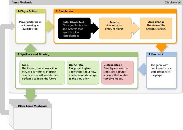
Every good game follows the same loop. You encounter something new. You try to figure it out. You fail. You adjust. You succeed. Then the game introduces something slightly harder that builds on what you just learned. That loop is addictive because your brain is wired to enjoy getting better at things. The dopamine hit isn’t from winning. It’s from the moment right before winning, when you realize you’ve figured it out.
Most software doesn’t have this loop at all. You learn the interface once, you use it the same way forever. There’s no progression. No increasing challenge. No feeling of mastery. The product stays flat while you stay flat inside it.
Think about how most SaaS products handle onboarding. You sign up. A checklist appears. Complete your profile. Connect your account. Invite a teammate. Set your preferences.
Every item on that checklist is a task. Do this, then this, then this. When you’re done, the checklist disappears and you’re “onboarded.”
But onboarded to what? You completed the setup. You didn’t learn anything about why the product is valuable. You didn’t discover anything surprising. You didn’t develop a skill. You just filled in forms.
Compare that to how Super Metroid teaches you to wall jump. The game doesn’t show you a tutorial. It traps you in a pit with small creatures that are already wall jumping. You watch them. You try it yourself. You fail a few times. Then you get it, and suddenly you can access areas of the game that were previously unreachable.
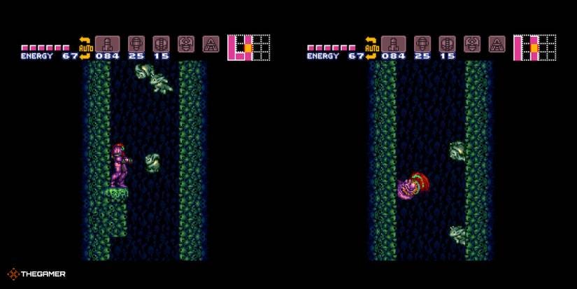
The skill wasn’t handed to you. You discovered it. And because you discovered it, you remember it, you value it, and you want to find out what else you can discover.
I think about this every time I design onboarding for Brisk. The temptation is always to frontload information. Explain everything. Show all the features. Walk the user through every setting. But the freelancers who stick with the product are the ones who discovered something on their own. They sent their first invoice, saw the follow-up reminder go out automatically, and thought “wait, it does that?” That moment of surprise is worth more than any checklist.
This also explains why those tooltip-driven feature tours feel so hollow. You know the ones. Little blue dots pulsing on the screen. “Click here to see your analytics!” You click, read the tooltip, close it, and immediately forget what it said.
There’s no learning happening. You’re being told about a feature. You’re not discovering it in a moment where it’s actually useful to you. The information has no context, so it has no weight.
The products that teach features well do it differently. They wait until you’re in a situation where the feature would help, then surface it. Figma does this when you’re manually resizing something and it suggests auto-layout. Notion does it when you’re writing a long page and it offers a table of contents. The feature appears at the moment of need, which makes it feel like the product is paying attention, not lecturing.
Cook calls this the difference between “priming” and “instructing.” Instructing is telling someone how to do something before they need to. Priming is creating a situation where they’ll naturally discover it themselves. Games almost always prime. Software almost always instructs. And that’s why games are stickier.
There’s another concept from game design that applies here: the “elder game.” In games, the elder game is what happens after you’ve mastered the basics. It’s the endgame content that keeps experienced players engaged. Raids in MMOs. Ranked modes in competitive games. Speed running in platformers.
Most products don’t have an elder game. They teach you the basics and then the experience flatlines. You use the same features the same way for years. There’s no progression, no new challenges, no reward for getting better.
The products that retain power users the best are the ones that reveal complexity gradually. Figma’s component system is an elder game. Most users never touch it in their first month. But as they get more experienced, they discover variants, then auto-layout nesting, then token systems. Each layer adds capability that rewards the investment of learning.
If your product feels the same on day 300 as it did on day 30, your experienced users are probably looking for something that grows with them.
I’m not saying every product needs to be gamified. Points and badges and progress bars are surface-level mechanics that miss the deeper principle. The principle is: people stick with things that help them get better.
A few questions I’ve started asking about every flow I design:
Does the user learn something by using this, or do they just complete a task?
Is there a moment of discovery baked into the experience, or is everything explained upfront?
Does the product reward getting better at using it, or does it treat all users the same regardless of experience?
Is there a next level for power users, or does the experience plateau?
Most of the time, the honest answer is that the product was designed for the first use. The setup, the tutorial, the first session. Everything after that is just repetition of the same interface at the same level.
The products people talk about, the ones they recommend to friends, the ones they’d miss if they disappeared, are the ones that kept teaching them something new long after the onboarding checklist was complete.
Task completion gets someone through the door. Mastery is what makes them stay.
If your product feels flat after the first week, the problem might not be missing features. It might be that you designed a tool when you could have designed a journey.
Thanks for reading :) If something in this issue resonated, please reply and tell me.
Even one line. These replies are my favorite part of writing this newsletter.
See you next Thursday 🙌
— Balint
What else I’m working on?


No posts
Comments
Nothing yet. Say the first thing.
Sign in to join the conversation.