
*Small update then the regular issue.
Last week I shared Brisk with you before anyone else, today it's going live.
A few of you signed up before the public launch. Your invoices were the first ones ever sent through Brisk. I don’t know if that matters to you but it matters to me 🫶
Because of your feedback, we already shipped mobile responsiveness.
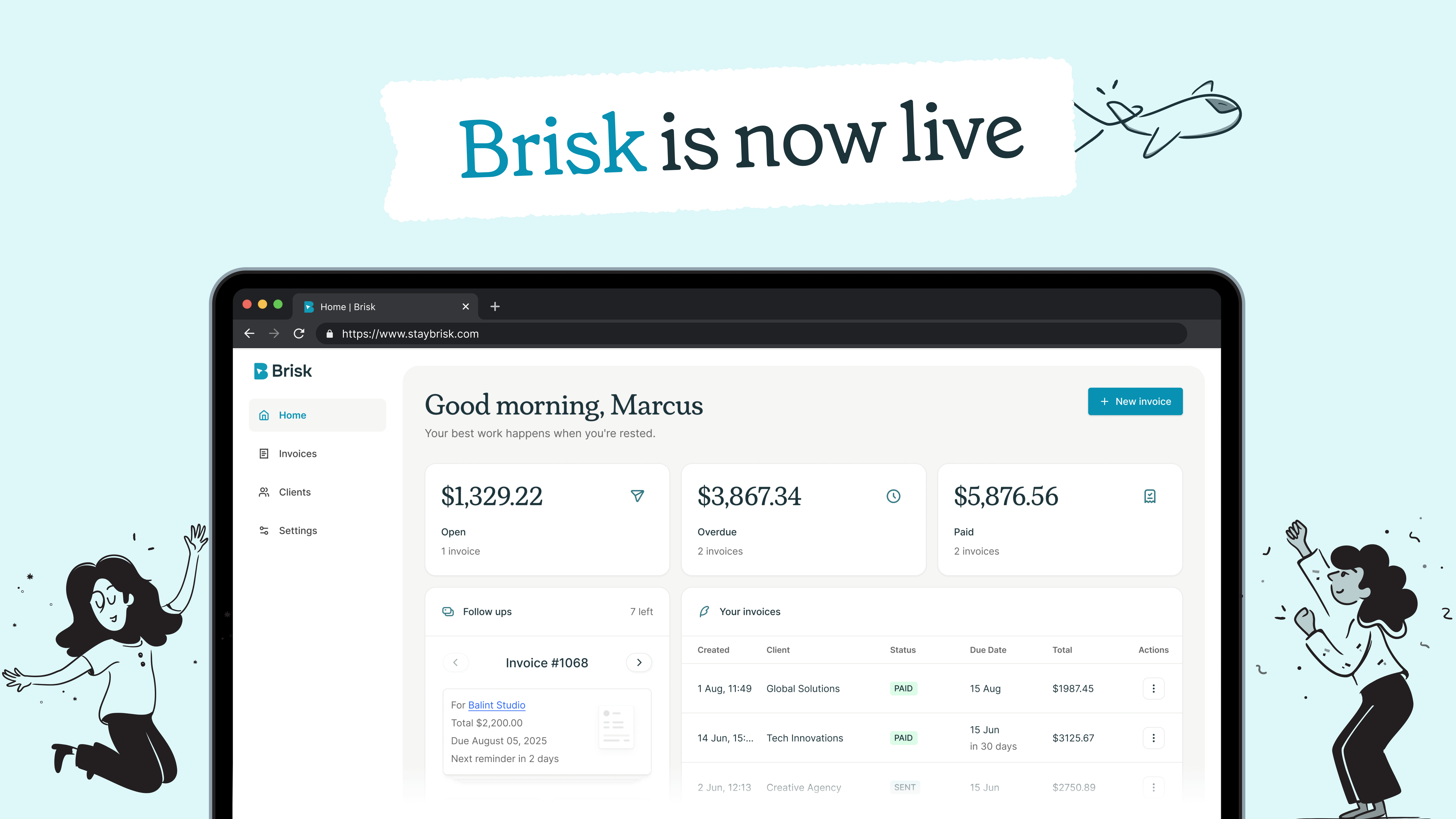
If you missed it: Brisk is a workspace for freelancers. Invoices, clients, contracts, all in one place with your branding. It’s built for myself and for people like me.
If you haven’t tried it yet and you freelance: staybrisk.com (it’s free to start)
Thanks for letting me be excited about this for two emails.
Now back to what you actually signed up for :)
When someone describes a problem, my brain immediately starts designing the solution.
Before the conversation is over, I’m already picturing the layout in my head.
This feels productive. It feels like I’m fast. What it actually means is I’m skipping the most important part of the process: making sure I understand the problem correctly.
Last year I spent a week designing a feature based on a stakeholder request. Beautiful work. Clean flows. Covered every state. When I presented it, the stakeholder said “this is great, but the actual problem is different from what I described in the brief.”
I’d designed the wrong thing perfectly.
That week wasn’t wasted because the design was bad. It was wasted because I started designing before I understood what I was designing for.

First principles for designers
There’s a concept in engineering called first principles thinking.
You break a problem down to its most basic parts before building anything.
You ask “why” until you hit the foundation.
Most designers skip this. We get a brief, we open Figma, we start. The brief says “add a dashboard,” so we design a dashboard. But nobody asked why users need a dashboard. What are they trying to accomplish? What information do they actually need? How often do they need it? Would a simple notification do the same job?
Those questions feel slow. They feel like you’re not making progress. In reality, they’re the fastest path to a good design because they prevent you from building the wrong thing.
I’ve started keeping a list of questions I ask before any project that’s going to take more than a couple of days.
Who specifically is this for?
What are they doing right before they use this feature?
What would success look like from their perspective?
What are we assuming that we haven’t validated?
It takes maybe 15 minutes to write down the answers. Sometimes those 15 minutes reveal that the project needs to be scoped completely differently.
The five whys, applied to design
A stakeholder says “we need a settings page.”
Why? Because users keep asking support how to change their preferences.
Why are they asking support? Because the current way to change preferences is buried three levels deep.
Why is it buried? Because it was added later and nobody updated the navigation.
The solution might be a settings page. It might also be moving one toggle to the main screen where users can actually find it. You don’t know until you dig.
I’ve started a habit of asking at least three “why” questions before I design anything. Sometimes the answer confirms the original request. Sometimes it reveals that the request was a symptom and the actual problem is somewhere else entirely.
When to break things down
The projects where I’ve done my best work all share something.
I spent the first few days not designing. Instead, I was writing down what I knew, listing what I didn’t, talking to people who understood the problem better than I did, and breaking the request into smaller questions I could answer one at a time.
“Redesign the checkout” is paralyzing.
“Why do 35% of users abandon at the payment step?” is a question you can actually investigate and the investigation usually reveals that the redesign you were about to do would have missed the real issue.
The same applies to smaller tasks.
“Improve the empty state” becomes “what does the user need to know and feel the first time they see this screen?” That reframe changes what you design because it shifts your focus from the screen to the person looking at it.
The patience problem
The hardest part of this approach is that it feels like you’re being slow in an industry that rewards speed.
When your PM asks for a design by Friday and you spend Monday and Tuesday asking questions instead of opening Figma, it can feel like you’re falling behind.
But the alternative, designing something based on assumptions and then spending two weeks revising it when those assumptions turn out to be wrong, is slower. It just doesn’t feel slower at the beginning.
I’ve learned to say “I need a day to understand the problem before I start designing” without apologizing for it. Most PMs appreciate it once they see the result. A design built on a well-understood problem rarely needs major revisions. A design built on assumptions almost always does.
Not every problem needs a deep investigation. If someone asks you to fix a button label, fix the button label, but for any project that’s going to take more than a few days, the time you spend understanding the problem before designing will save you twice that in revisions later.
Ask why before you open Figma. You’ll design less and ship more of the right thing.
Thanks for reading :) If something in this issue resonated, please reply and tell me.
Even one line. These replies are my favorite part of writing this newsletter.
See you next Thursday 🙌
— Balint
What else I’m working on?


No posts
Comments
Nothing yet. Say the first thing.
Sign in to join the conversation.