
Hey! Welcome to Since Last Commit, a publication where I cover all of my learnings while building Android applications. Subscribe to stay in touch for more content.
When building a mobile app, you often have releases lined up with exciting new features or critical bug fixes that you want in front of your users as soon as possible. When you start to roll-out the changes, you polish up the release notes with specific details and press the publish button on the Play store. But then a thought crosses your mind: does anyone ever read those release notes? Do my users even know that a new feature is available for them or a big bug that they were complaining about is fixed? Well, I am not sure myself. There could be additional challenges if apps are being auto-updated and users not being able to see those release notes on the store listing. I do find that the release notes on the Play store have a place, but there is a bigger responsibility at stake to educate users with all of the new changes being added to the new release. Addressing this opportunity, users are:
aware of critical bug fixes that have been fixed to improve their in-app experience
able to become early adopters of new features and provide meaningful insights
able to get a sense of where the product is headed and convert to loyal users
To experiment this opportunity on one of my personal projects, Hangar, I started to implement a What’s New feature within the application. If the app is updated and launched, users will see a list of changes along with more information that are included in the new version. Note that this is not a new idea, many apps currently do this. However, I will share a bit of my thought process while I was implementing this feature.
The Idea
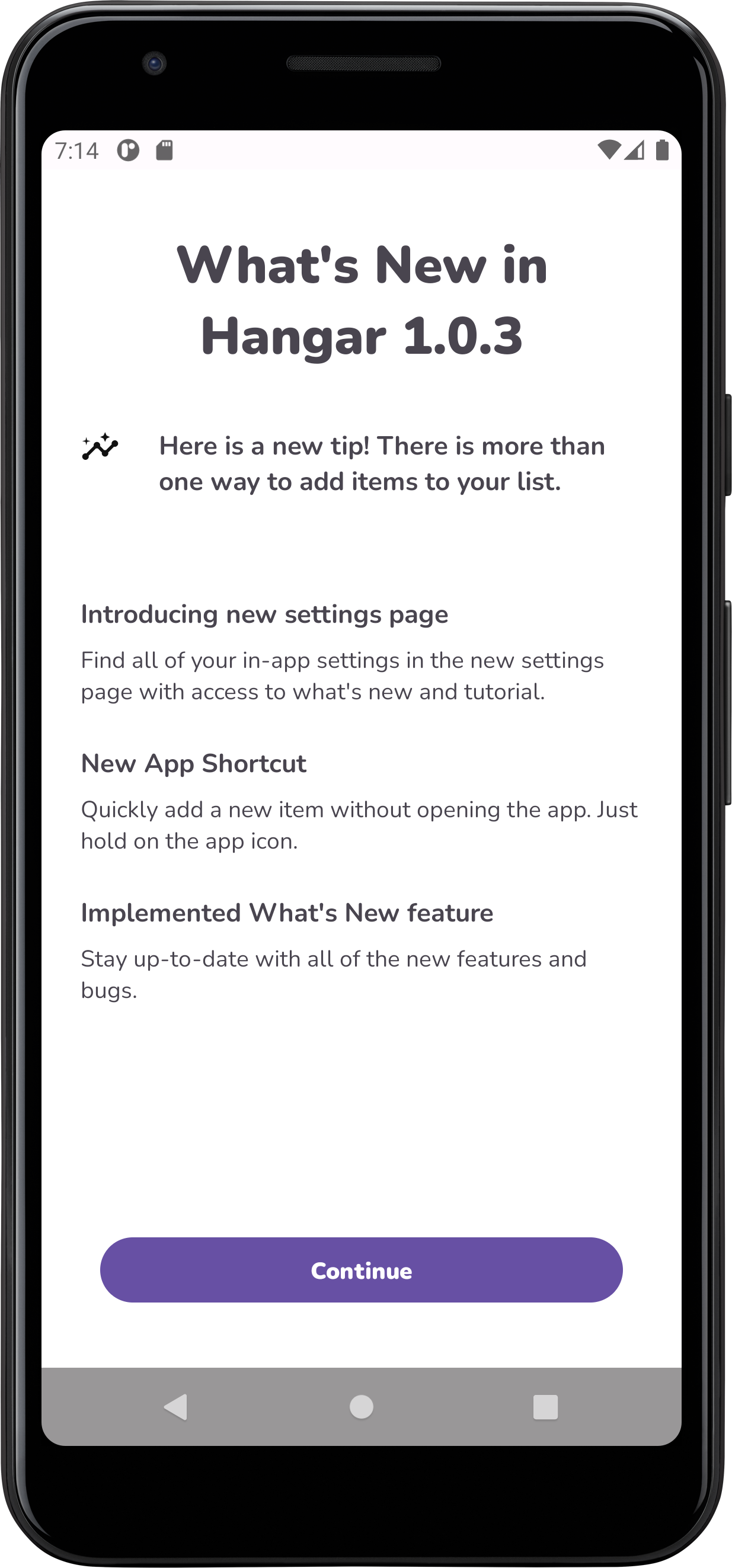
The main objective is to let users know that their app is updated to the latest version and what changes have been introduced to enhance their experience. In the screenshot above, I implemented this feature in the Hangar app. There are three parts to it. The first part is to acknowledge that an update has happened and that the users are on the latest version. The second part is to list out all of the changes that are introduced with some additional context for each change. These changes could be optimizations, bug fixes, new features or anything that the users should know about. In the future, I could improve the UI to add icons to better categorize the items to make it easier to scan. One idea that I have been thinking about is allowing a gateway for users to immediately try out the new features. What if they could just tap on it, which will open that particular feature or screen in which they can start interacting with. This mechanism is not included in this build, but something worth exploring and writing about in the future.
One downside of this experience is that it obstructs the user’s path when they open the app and are expecting something else. That is a valid concern. As of now, this screen only appears only once per version update. If that remains a concern in the future, there could be a setting option to enable or disable this feature to show on-launch in the app settings. Another way to resolve this is to move this screen to a different flow in the app so it does not obstruct the initial intention of the users. This can be done through a series of A/B experiments to get a better idea of what works for the users. If users wish to revisit the What’s New screen in the future, they have the option of accessing it in the app settings as well.
While designing the feature, I wanted to keep a balance between asking the user’s attention and also providing something of value to them. This is where the third part comes in. I added a tip feature letting the users know helpful tips and tricks on how they can optimize their app experience and get the most out of it. So even if users are not interested in the changes, they can find something of value by reading the tips. One thing I thought of while writing the post is the ability to not show this screen for a particular release. There could be an instance where a release is quite small or you do not want to annoy the user by frequent releases, in that case there could be a flag implemented that can determine whether to show this screen or not for a particular version.
The Flow
The feature can be summarized in the following diagram of what the users can expect from their app experience.
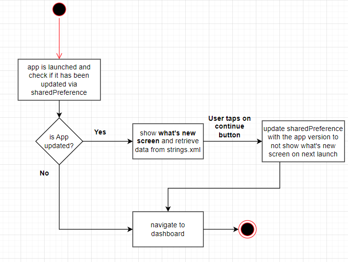
This is still in its early stages, but a few improvements I could make are to:
implement a flag to hide this feature on specific releases
fetch content remotely through a server instead of hard-coding the data
allow users to try out new feature instantly by tapping on it
That’s all for this post. Here was a quick snapshot of what I have been working on lately on the Hangar android app. If you are interested in following my android development journey, consider subscribing. Thank you!
Comments
Nothing yet. Say the first thing.
Sign in to join the conversation.