
Publication: Architectural Digest, Summer 1966
Publisher: Cleon T. Knapp
Editor: Bradley Little
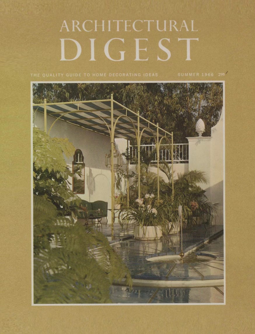
Cover: Exterior loggia by William Haines
A small note before this one: I recently came into a batch of vintage magazines, and I’ve been pulling from them constantly, for set design and art direction. This Architectural Digest, from the summer of 1966, is one I keep coming back to. The relationship between wallpaper, architecture, and staged domesticity in these pages feels more generous and more strange than almost any editorial interior being produced now, and I wanted to share some of it. Some interiors somehow still feel so relevant today.
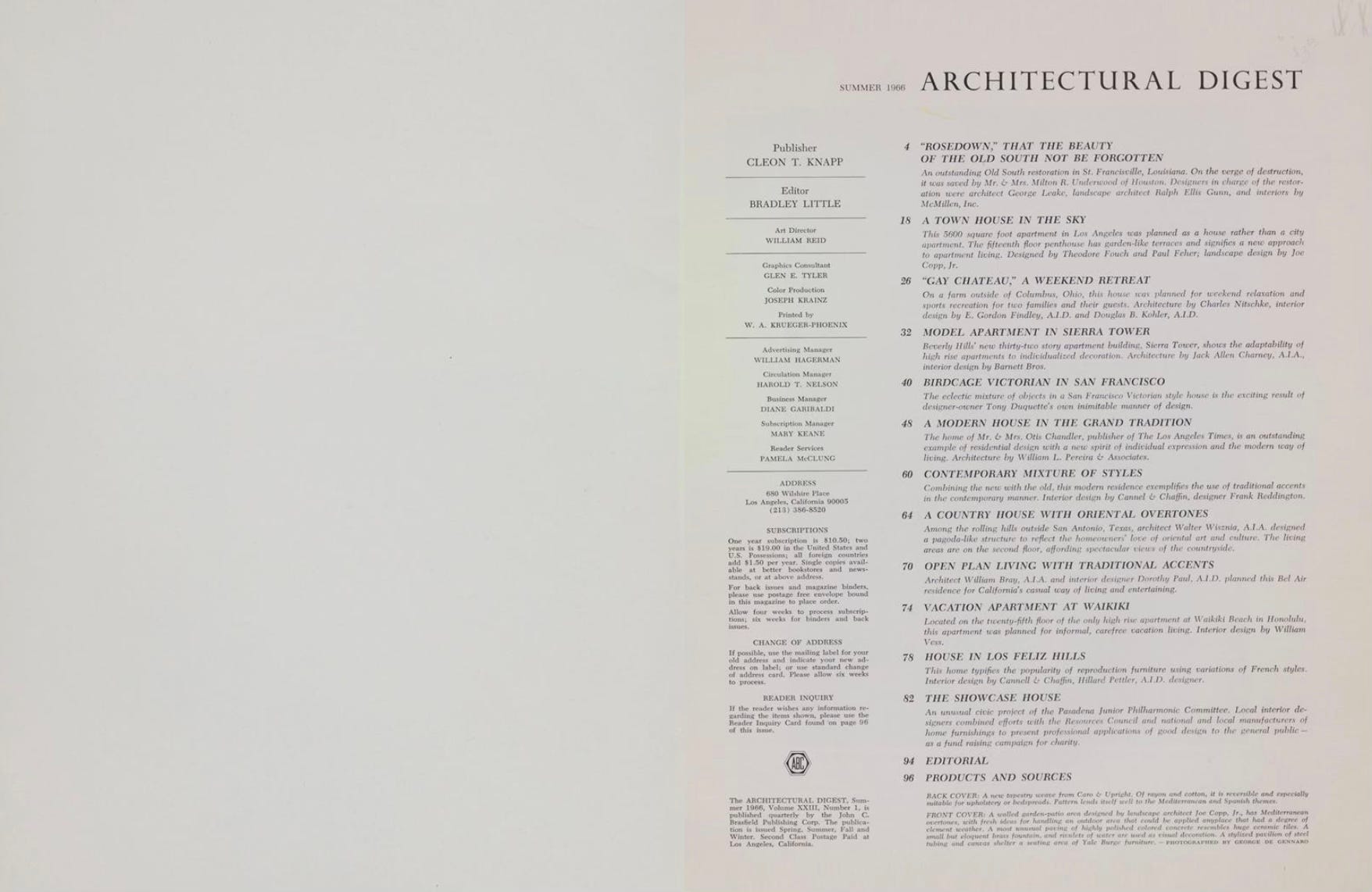
In 1966 Architectural Digest was not yet the international luxury design title it would become under Paige Rense in the late seventies. It was a regional California publication, subtitled “The Quality Guide to Home Decorating Ideas,” run by publisher Cleon T. Knapp, who had acquired the company in 1962, and editor Bradley Little, who held the role from 1964 to 1971. Its subject was overwhelmingly the residential interior, Hollywood homes, Beverly Hills apartments, weekend retreats, vacation properties in Waikiki and the Virgin Islands, documented in a style that sat somewhere between architectural record, society portraiture, and decorator showcase.
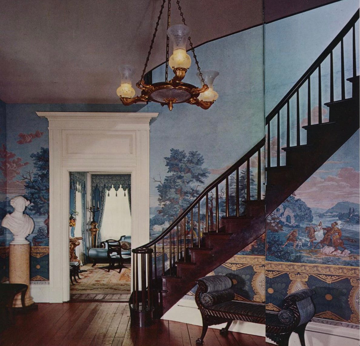
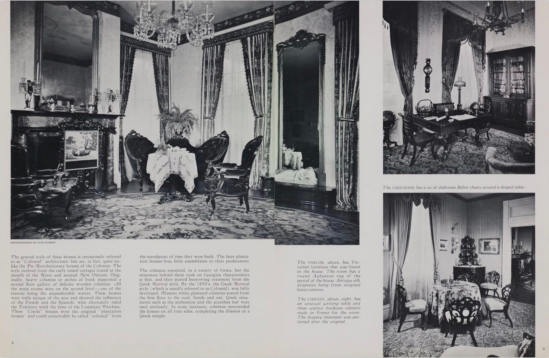
The Summer 1966 issue includes pieces titled “Moorish Mood,” “A Town House in the Sky,” “A Weekend Retreat,” “A Modern House in the Grand Tradition,” and “Vacation Apartment at Waikiki,” alongside a long feature on a Mirror Image apartment in Sierra Tower. The photography throughout is unsigned in the contents page but credited inside to figures like Max Eckert and William Vire, and the images are composed less like documentary interiors than like proper stage sets: chandeliers hung at exacting height, curtains arranged in full theatrical drop, armchairs placed in asymmetrical conversational groupings, and wallpaper treated as a proper pictorial surface rather than a background. One spread shows a foyer lined with a full hand-painted Zuber-style panoramic mural, the stair winding up through a painted landscape of horses and cliffs. Another shows a rec room sheathed in warped timber planks with a tartan sofa and a stag-themed gallery wall. A Waikiki terrace sits against Diamond Head with four rattan-and-floral printed chairs clustered around a low marble table, the ocean unfolding behind them as if the apartment had been built as a set piece to frame that specific view.
What strikes me, coming to this almost sixty years later, is how much freedom mid-sixties American decorating allowed itself in the register of pattern, color, and eccentricity. A Stockwell paisley wallpaper called Caliph runs a full-bleed ad on the back of one spread in four colorways: mustard, olive, maroon, and it is genuinely the kind of surface a film production designer would now commission from scratch. There is no restraint and no fear of maximalism, but there is also no kitsch. The rooms are fully committed to their own logic: a book-lined library is book-lined the whole way around, a chinoiserie dining room commits to its reds and golds, a pool terrace is dressed with massive white flowering urns and latticed iron pergola structures with striped canvas awning.
This is set design in the plainest sense, and it predates the professionalisation of the production designer’s role in residential editorial by a good fifteen years. The fact that Architectural Digest was, at this point, still essentially a West Coast architect’s magazine rather than a national luxury title is probably why. The pages feel made by people who actually lived in the houses and had strong, specific taste, instead of by stylists deploying a look. When I’ve been looking at these for art direction reference, what I’m really taking from them is the permission, the permission to let a wallpaper carry a scene, to let a color palette get weird, to let a room commit entirely to a single mood rather than diluting itself into neutrality. There are very few places in contemporary fashion imagery where that kind of commitment exists anymore, and I think that’s partly why this batch of vintage magazines has felt so useful to me.
Comments
Nothing yet. Say the first thing.
Sign in to join the conversation.