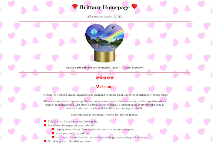
i've made some layouts for you to use! feel free to change as much (or as little) as you want to suit your purposes. i've tried to add comments on most of them to help with ease of use.
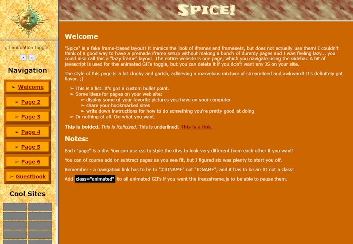
spice is a more in-depth but deceptively simple geocities style, this one based on iframe & frameset layouts! your whole website on one page, with a fixed sidebar and header framing it. javascript gif toggle included, but no other javascript. just css and html.
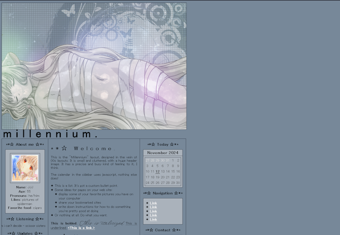
millennium is a compact three-column layout modeled after fansites and personal sites from the 00s, especially anime fansites! a disproportionately huge header, nearly unreadable text, and the crosshair cursor will have you saying, "oh, i remember those. kind of annoying..." in no time!
seize your destiny as king of longing! Golden Age is a plain and run of the mill sidebar + body page layout, styled after normal websites from the 00s. it's flexible and versatile theme and content-wise; you can dress it up with gradients and images or keep it simple. like millennium, it is left-aligned for authenticity and not mobile-responsive.
xtreme is a gradient-heavy three-column layout modeled after a different genre of website from the 00s - more gaming-type fansites, blogs, products, and forums. featuring gradients all over the goddamn place and preloaded with ads and shiny buttons! no javascript (besides the doodads and gizmos in the sidebars, which are not essential), somewhat responsive (it works on mobile, just doesn't look very good), a bit fiddly to customize.
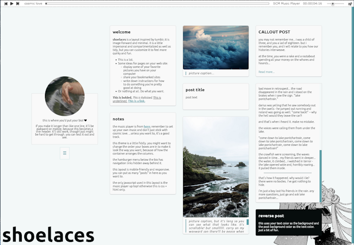
shoelaces is a layout based on tumblr themes from the 2010s: a minimalist page with three columns for content, one column for a tiny bio. the #aesthetic reigns supreme!
there are two versions! the first is the 3-column style and the second is one-column. they use the same stylesheet, just different html.
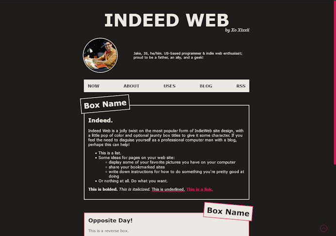
indeed web is a blog layout for infiltrating the indieweb, if you have a need to do such a thing! no javascript, mobile-friendly, with only one accent color to keep it simple.
cardio is a carrd-inspired dreamy layout for if you want one of these transparent-box gradient-background landing page situations. mobile-friendly & very simple.
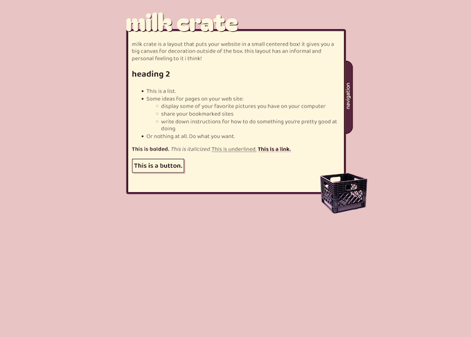
milk crate is a little box to put your little website in! it has a nifty little tab for navigation as its only frill. mobile-friendlyish (navigation tab doesn't work in safari on iphone, which im trying to figure out), no javascript.
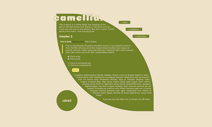
camellia is a leaf-shaped variant on the "small box" format! comes with a bunch of additional space to make up for its limitations. a bit kooky and fiddly but still with a soothing slightly classy feeling, i think. an interesting mix of vibes. mobile-friendly, no javascript. this one does have some pieces you could break that would fuck up the layout pretty badly, so it might not be best for beginners... that said, breaking things is a great way to learn how they work!
this layout is mobile-friendly, uses no javascript, and even (bonus?) works just fine if you do something like CSS Naked Day and delete all your css. if that's something you like to do.
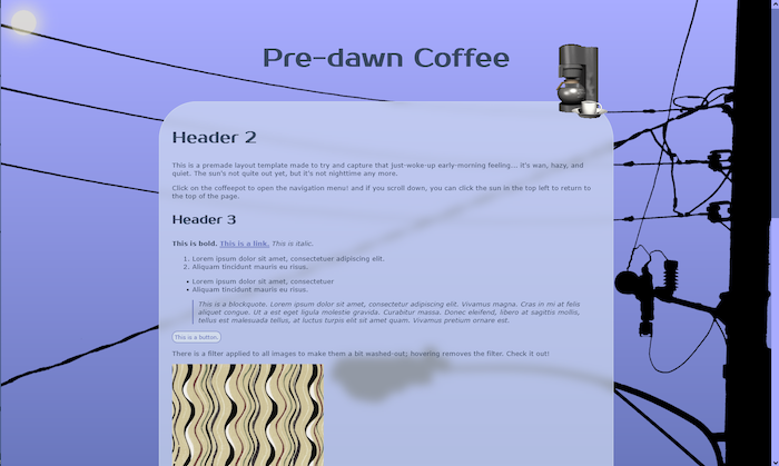
pre-dawn coffee is a hazy dreamy theme inspired by too-early mornings, road trips, and truck stops... i tried to emulate that washed-out grey look the world has right before the sun comes up. it's a pretty simple & uncluttered setup, with the navigation tucked away out of sight. simplebut stylish, i think!
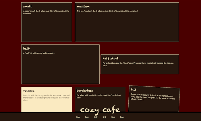
cozy cafe is a DIY sort of template with a ton of box options - i made a variety of types of divs for you in CSS, so you just need to figure out a combination of boxes that you like! it's a layout type that would normally be made with grid, i think, but i did it with a flexbox because i don't like grid.
this layout was going to be made for the spring 2025 32-bit cafe codejam, but i didn't end up submitting it because i didn't think it really fit the theme.
boko is an ereader-inspired layout meant for longform text! it is mobile-friendly and comes with a small options menu where you can give readers alternate fonts and a bigger font size. it uses only a bit of javascript for the options menu. not much going on here really; just a plain n simple look for when you want to make the text the focus and shift everything else out of the way.