The online version of Think Java now features interactive widgets that run the code examples in the browser. For readers, it means you can try out the examples, modify them, and test your code. And for us it means we can publish an interactive version of the book without providing servers.
The widgets use java-runner, an in-browser Java editor and interpreter developed by Think Java co-author Chris Mayfield.
java-runner implements a subset of Java with the features needed for most programming classes, plus some safety features — like a maximum instruction count to stop infinite loops. It provides a code editor and a REPL.
Here’s an example of the code editor, from Section 6.1:
And here’s an example of the REPL, from Section 6.6::
We’re aware of one example where the behavior of java-runner differs from the Java language specification — so we’re working on that.
A recent post claims that the “most statistically dominant athlete” of all time was cricketer Don Bradman. It’s a bold claim – let’s see if it holds up.
In Chapter 4 of Probably Overthinking It, I listed a few examples of athletes who are considered the Greatest Of All Time (GOAT), and noted that in many cases they are not just a little better than the second-best, but much better. That is, they are outliers among outliers.
And I suggested that part of the explanation for this phenomenon is that the distribution of accomplishment in many fields (at least, the ones where accomplishment can be quantified) follows a lognormal distribution. That matters because the lognormal distribution has a long tail, which means that extreme values can be much farther from the mean than we would see in a Gaussian (normal) distribution.
The most statistically dominant athlete ever isn’t Jordan or Messi — and you’ve probably never heard of him. 🏏
I plotted the career batting averages of the greatest Test cricketers of all time. They make a clean bell curve. In cricket, averaging 50 makes you an immortal legend, and the all-time record holders top out around 60 — about 2 standard deviations above the mean.
Then there’s Don Bradman: 99.94. More than 6 standard deviations out. The gap between him and the SECOND best player is bigger than the gap between #2 and the entire average. By the math, a batsman this good should appear about once in 7 billion.
To be this far ahead in basketball, Michael Jordan would’ve had to average 43 points in every single game he ever played. No one in any sport — not Jordan, not Gretzky, not Messi — is this far from their peers.
Not just the greatest. The single biggest outlier in the history of sport.
Let’s see if that’s true. In particular, I’ll investigate the “clean bell curve” – it implies a Gaussian model of the data, which is where that “once in 7 billion” comes from.
To give away the ending, here’s what I found:
The data don’t fit a Gaussian particularly well, especially in the tail, so the “one in 7 billion” might not be right.
I thought they might fit a lognormal better, but I was wrong.
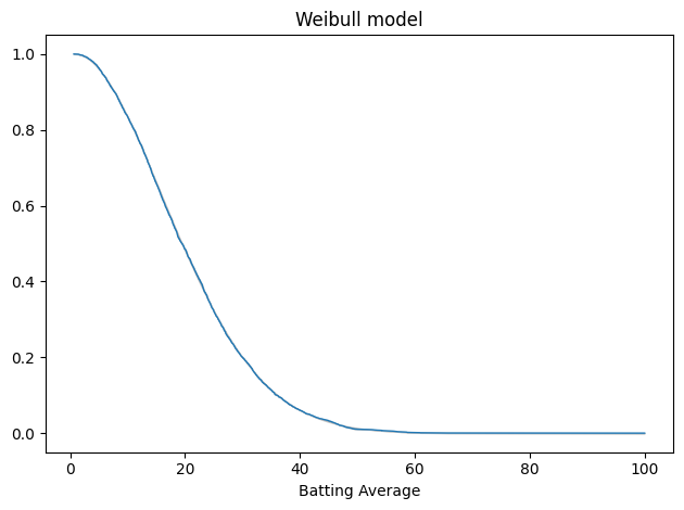
It turns out that the data fit a Weibull distribution very well, and from that we can get a revised estimate of how much of a GOAT Bradman was.
As it turns out, he was a pretty goaty GOAT – but not quite one in 7 billion.
DATA_PATH = "runs_of_batsmen.csv"

df = pd.read_csv(DATA_PATH)

# Convert to numeric, coercing errors to NaN
df['Batting Average'] = pd.to_numeric(df['Batting Average'], errors='coerce')
df['Innings'] = pd.to_numeric(df['Innings'], errors='coerce')
I select only batters with 10 or more innings.
df = df.query('Innings >= 10')
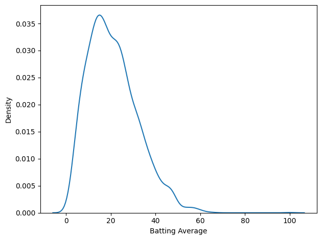
Here’s what the distribution of batting averages looks like.
import seaborn as sns

sns.kdeplot(df['Batting Average'])
decorate()
That’s not much of a bell curve. It’s pretty clearly skewed to the right, even if we leave Bradman out of it. But let’s fit a Gaussian to it anyway.
The Gaussian Model
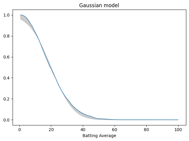
There are a lot of ways to fit a model to data. The one I like for applications like this is percentile matching – that is, finding a model that minimizes the average vertical distance between the empirical CDF of the data and the CDF of the model. That’s what fit_normal does.
Here’s what that looks like, plotting the tail distribution, which is the complement of the CDF. The shaded area shows the differences between the data and the model.
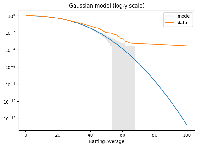
When we plot the tail distributions on linear scales, it looks like the model might be good enough. The problem is that we can’t see what’s happening in the tail. For that, it’s useful to plot the tail distributions on a log-y scale.
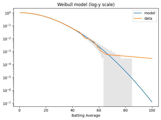
The model fits the left side of the distribution well enough, but after that, it diverges badly. Around 60, the difference between the model and the data is about an order of magnitude.
Nevertheless, we can use the Gaussian model to compute the probability of a batting average as high as Bradman’s 99.94.
And even if we account for the sample size, the probability that one of 3438 batsman reaches that level is one per 1.7 billion. So, according to the Gaussian model, this outcome is basically impossible.
n, in_sample / 1e9
(3438, 1.6613158346144736)
But the Gaussian model doesn’t fit the data well – and there’s no reason it should. To see why not, let’s think about the process that generates the distribution of batting averages.
As a simplifying assumption, suppose a batsman has the same probability of getting out at any time; in that case, the number of runs in an inning might follow a negative binomial (NB) distribution. As we add up innings (or average over them), the total would eventually converge to a normal distribution, but most batsmans don’t have enough innings to converge. So for each batsman, the distribution of runs follows something between NB and normal. And when we combine them, we get a mixture of those hybrids. There’s no obvious reason the results should fit a simple mathematical model.
But it turns out that they do.
The Weibull Model
The Weibull distribution is not the first thing I thought of – I tried a lognormal distribution first. But a Weibull distribution fits the data really, really well. The fit_scipy_dist is a more general version of fit_normal that works with any of the SciPy distributions.
It’s about one per 8 million. And in a sample of 3438 batsmen, the chance that any one of them reaches that level is one per 2,322.
in_sample / 1e3
2.3217442928624186
So Bradman is still an outlier among outliers, but not quite the statistical anomaly that he would be in a normal distribution.
Finally, let’s think about why a Weibull distribution fits this dataset so well. In the data-generating process I suggested earlier, if a batsman has the same probability of getting out at any time, the number of runs in an inning might follow a negative binomial (NB) distribution. If we think of the run-generating process as continuous, the distribution of runs before an out would be exponential. And if we relax the assumption that the hazard rate is constant, the distribution of runs per inning would be Weibull.
I think that’s an intriguing first step, but at best it explains the distribution of runs per inning – but not the distribution of batting averages across batsmen with, presumably, different hazard rates.
Appendix: The Lognormal Model
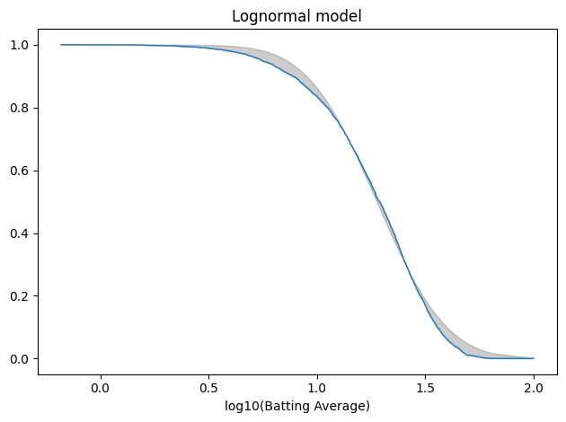
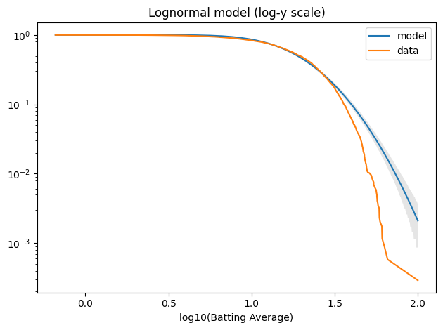
Just for completeness, here’s the lognormal model.
If you had to choose one moment in history in which you could be born, and you didn’t know ahead of time who you were going to be — what nationality, what gender, what race, whether you’d be rich or poor, gay or straight, what faith you’d be born into — you wouldn’t choose 100 years ago. You wouldn’t choose the fifties, or the sixties, or the seventies. You’d choose right now. If you had to choose a time to be, in the words of Lorraine Hansberry, “young, gifted, and black” in America, you would choose right now. [Emphasis added]
Was he right? It’s a broad claim — about racism, sexism, homophobia, and more — so I’ll focus on the last sentence: If you are young, gifted, and Black, would you choose right now?
And I’ll focus on just one part of the answer: public opinions about race relations and civil rights. On these topics, the General Social Survey includes several questions that have been asked repeatedly — although some of them were dropped from the survey before Obama’s assertion in 2016.
As an example, we’ll start with a question about open housing, which has been asked since 1973, and shows one of the clearest trends over time.
Open housing
The GSS asks this question about open housing:
Suppose there is a community-wide vote on the general housing issue. There are two possible laws to vote on. (A) One law says that a homeowner can decide for himself whom to sell his house to, even if he prefers not to sell to someone because of their race or color. (B) The second law says that a homeowner cannot refuse to sell to someone because of their race or color. Which law would you vote for?
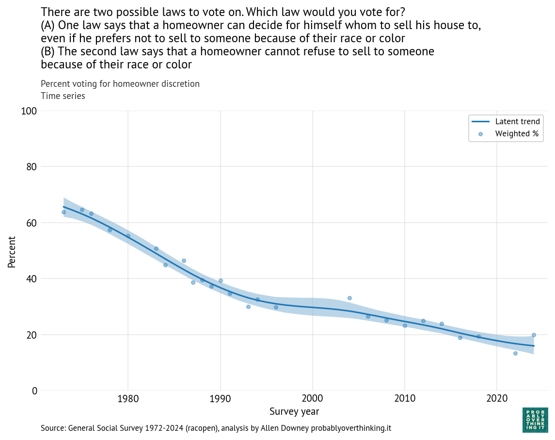
The following figure shows the percentage of respondents who chose the first law, which allows someone selling their house to discriminate.
Time series: percent voting for homeowner discretion.
In 1973, about 65% favored the first law; in 2024, it had dropped below 20%. When public opinion changes as fast as that, it is usually the result of two effects:
Generational replacement: as older people with receding viewpoints age out of the survey, they are replaced by young adults with rising viewpoints.
Changing minds: people adopt different views over the course of their lives, possibly in response to events.
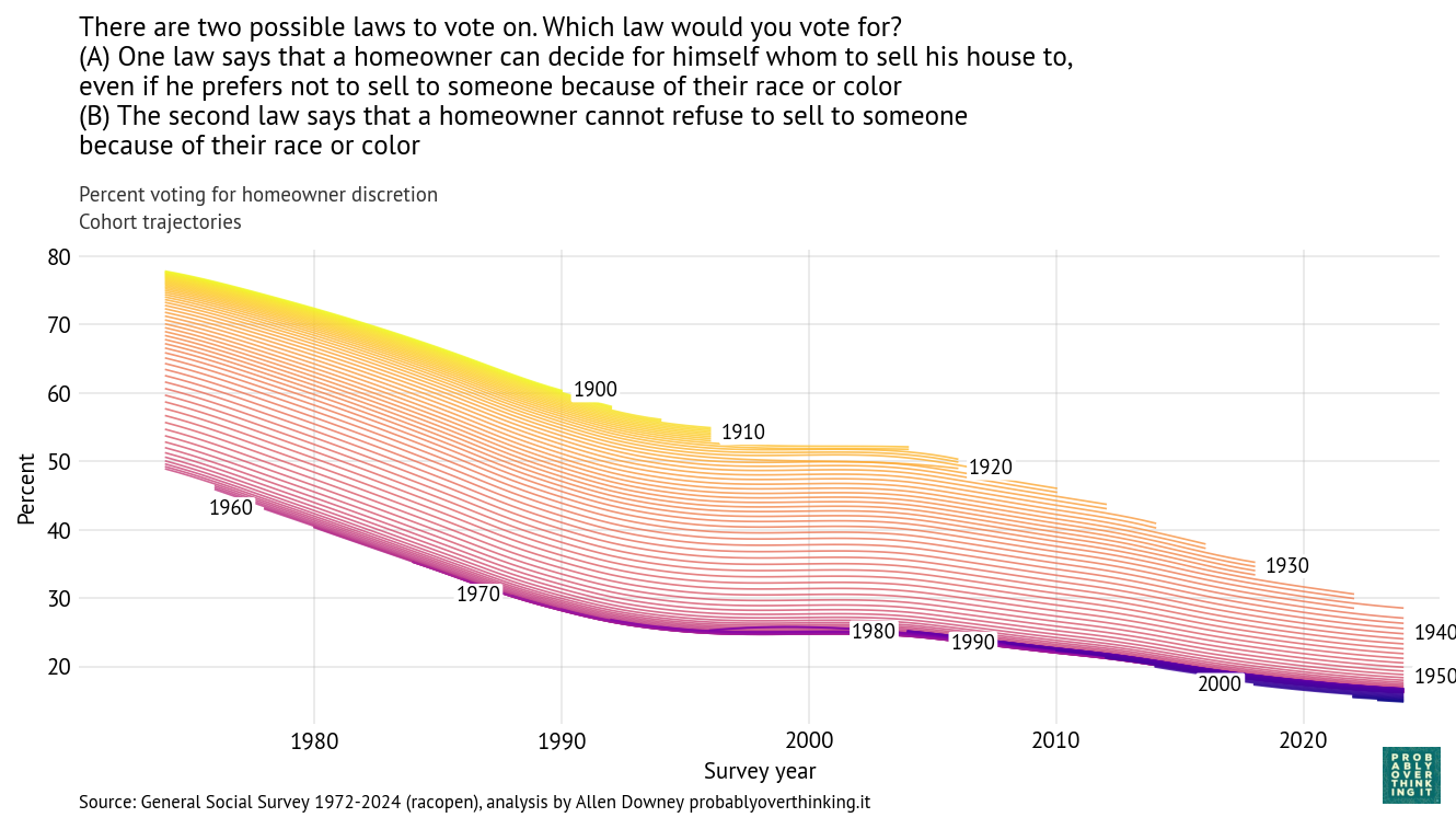
With a repeated survey like the GSS, we can follow each generation to see how it changes over time. The following figure shows one line for each year of birth, estimating support for homeowner discretion over time.
Cohort trajectories: percent voting for homeowner discretion, one line per birth year.
In the top left we can see that when people born in the 1900s and 1910s were interviewed in 1973, almost 80% of them said homeowners should be allowed to discriminate based on race. In the bottom right we can see that when people born in the 2000s were interviewed in 2024, fewer than 20% of them held that view. So there are big differences between generations. And, following the cohorts over time, we can see that the trend is downward — that is, toward support for open housing laws.
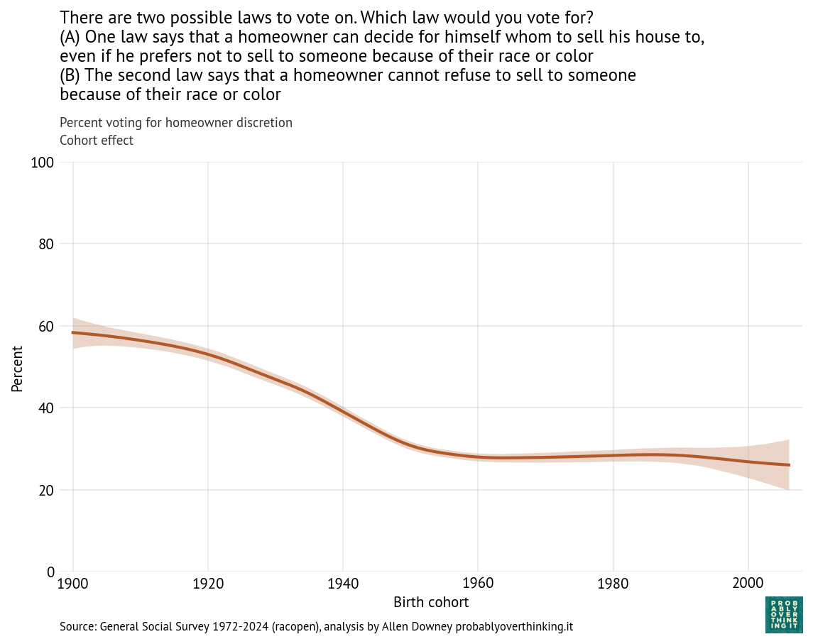
From this analysis we can decompose the period effect (holding the mixture of cohorts constant) and the cohort effect (holding the mixture of survey years constant). Here’s the estimated cohort effect:
Standardized cohort component, percent voting for homeowner discretion.
Looking at differences between cohorts, the biggest changes happened between people born in 1900 and 1960. Since then, the cohort effect is essentially flat.
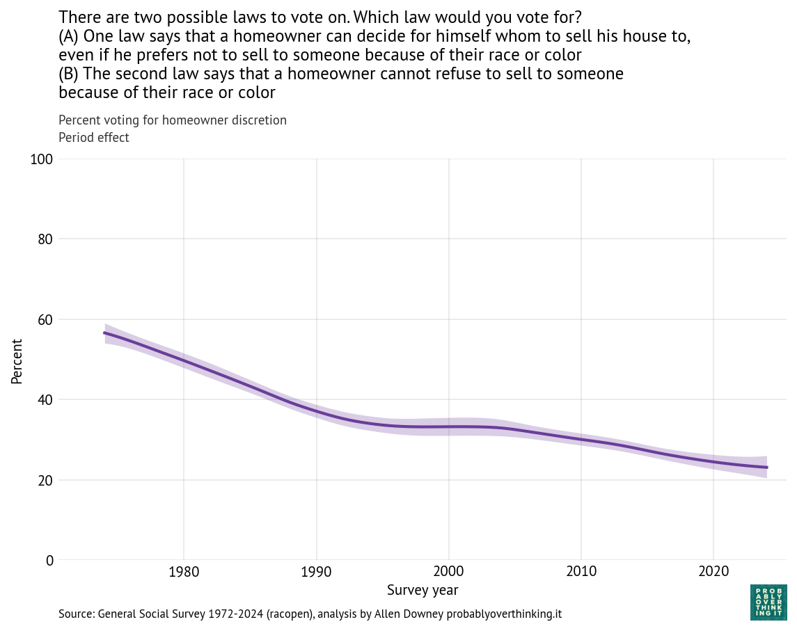
And here’s the period effect after factoring out the cohort effect.
Standardized period component, percent voting for homeowner discretion.
The trend is consistently downward, with a possible plateau between 1995 and 2005. If you are young, Black, and looking for a house, these trends are good news. Let’s see if the other questions show the same patterns.
Race relations and civil rights
Here are other questions related to race relations and civil rights — I selected the ones that were asked repeatedly over the widest intervals.
Affirmative action:
Some people say that because of past discrimination, Black people should be given preference in hiring and promotion. Others say that such preference in hiring and promotion of Black people is wrong because it discriminates against whites. What about your opinion — are you for or against preferential hiring and promotion of Black people?
Segregation:
Do you agree or disagree with the following statement: African-Americans shouldn’t push themselves where they’re not wanted.
Do you agree or disagree with the following statement: White people have a right to keep African-Americans out of their neighborhoods if they want to, and African-Americans should respect that right.
Interracial marriage:
Do you think there should be laws against marriages between African-Americans and whites?
Black presidential candidate:
If your party nominated an African-American for President, would you vote for him if he were qualified for the job?
If some of these questions seem dated, remember that they were written in the 1970s. The wording of the questions is mostly unchanged, except that the original use of “Negroes” was updated to “African-American” and then updated again to “Black”.
Now let’s see how the responses have changed. To make the results easier to compare, for each question we’ll look at responses associated with a more racist viewpoint. So we’ll track:
Support for segregation
Opposition to interracial marriage
Unwillingness to vote for a Black candidate
Opposition to affirmative action (with the acknowledgement that this view is not necessarily racist)
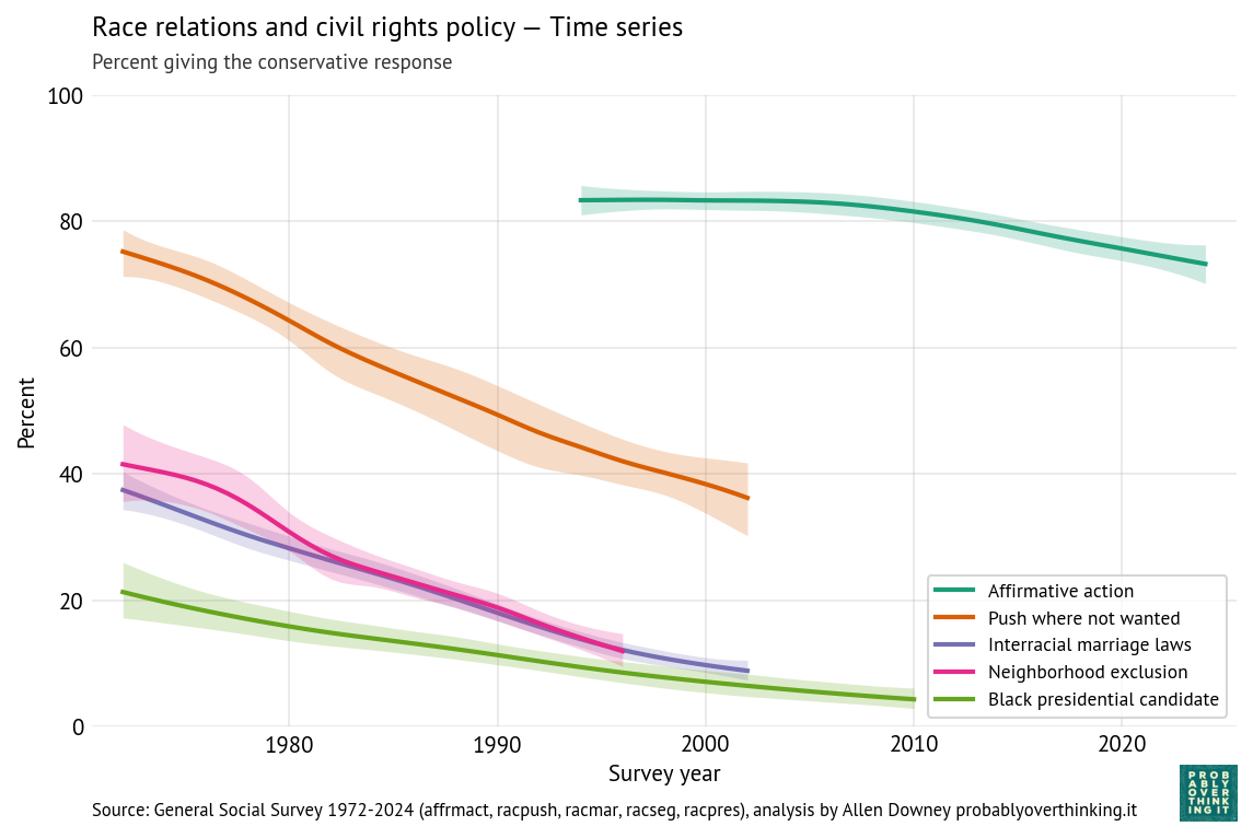
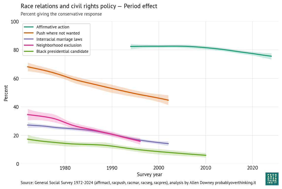
The following figure shows the percentage of respondents with these views, plotted over time.
Race relations and policy — time series.
All of these views have declined over time, although opposition to affirmative action is still high.
For three of the questions, support for the more racist responses had fallen below 15% when they were dropped from the survey. For example, in 1973 more than 40% agreed that “White people have a right to keep Negroes out of their neighborhoods if they want to, and Negroes should respect that right.” By 2002, it was below 10% — and in 2026 I think a lot of people wouldn’t read that sentence out loud, much less believe it.
One reason the GSS drops questions like these is that statistical estimates are less precise when an observed proportion is far from 50% in either direction. For example, in 2010, fewer than 4% of respondents said they were unwilling to vote for a Black presidential candidate. At that level, even a low error rate becomes a problem; for example, if 1% of respondents misunderstand the question or record the wrong response, they would account for 1 out of 4 of the negative responses.
Another reason is that a question that was relevant when it was added to the survey might seem dated a few decades later, might introduce a framing or mindset that influences responses, and might even antagonize respondents. For example, if you agreed to take a survey and they were still asking about interracial marriage in 2026, it might make you wonder about the worldview of the survey writers.
Now we’ll decompose these trends into cohort and period effects. The following figure shows the cohort effects.
Race relations and policy — standardized cohort component.
On support for segregation and opposition to interracial marriage, the cohort effect is consistently downward — that is, each generation is less likely to support these views.
Opposition to affirmative action was almost unchanged between cohorts born in the 1940s, 1950s, 1960s, and 1970s, but since then it has declined steeply.
Unwillingness to vote for a Black candidate declined earlier and reached a minimum with the Baby Boomers (born 1946 to 1964). It might have increased after that, but the increase is within the range of statistical uncertainty.
Now here’s the period effect after controlling for changes in the cohort mix.
Race relations and policy — standardized period component.
The trends are all consistently downward, which means that the changes we see in the time series are not just generational replacement — they are also changing minds.
Unequal Outcomes
In 1977, the GSS added four questions starting with this preamble:
On the average, African-Americans have worse jobs, income, and housing than white people. Do you think these differences are …
Then they ask:
… mainly due to discrimination?
… because most African-Americans have less in-born ability to learn?
… because most African-Americans don’t have the chance for education that it takes to rise out of poverty?
… because most African-Americans just don’t have the motivation or will power to pull themselves up out of poverty?
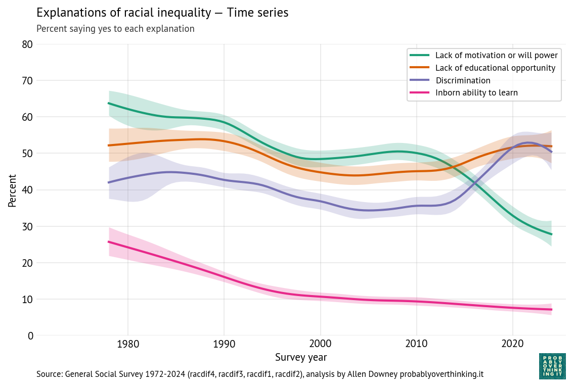
Respondents can answer yes or no to each question, so they could affirm all four, or none, or any combination. The following figure shows the percentage affirming each explanation.
Racial inequality explanations — time-series.
Over time, respondents are
Less likely to accept lack of motivation or in-born ability as explanations, and
More likely to accept discrimination.
Belief in educational opportunity as an explanation was high in the 1980s, declined in the 1990s, and has increased since.
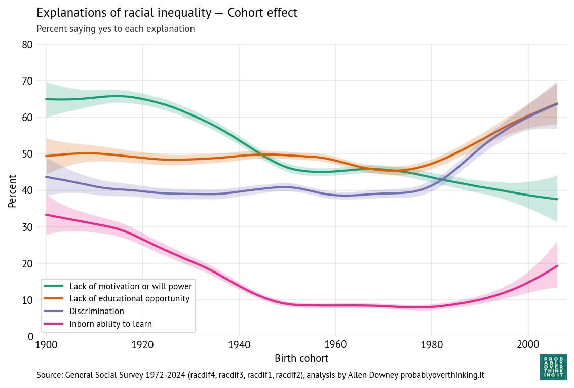
The following figure shows how the responses differ between generations.
The picture here is a little more complicated, but in general, more recent cohorts are more likely to endorse discrimination and educational opportunity, and less likely to endorse motivation and innate ability — although it looks like cohorts born after 1990 are increasingly likely to believe in innate differences.
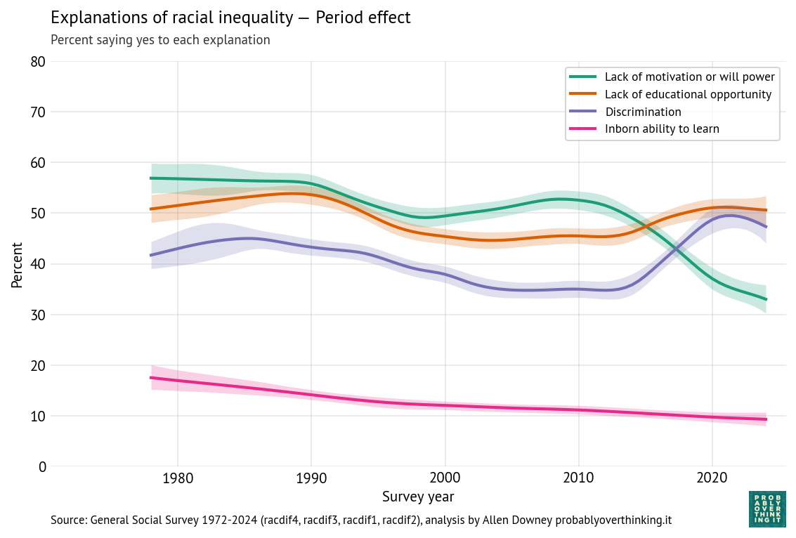
The following figure shows the period effects.
Racial inequality explanations — standardized period component.
The period effects have the same shapes as the original time series, but the magnitudes of the changes are a little smaller after we factor out the cohort effects. So again, the changes we see over time are a combination of generational replacement and changed minds.
What about now?
So when Obama said, “You wouldn’t choose the fifties, or the sixties, or the seventies. You’d choose right now,” was he right?
If the prevalence of racist views is one of the factors you would consider, the choice is clear: public opinion was less racist in 2016 than it was in the 1970s. We don’t have GSS data from the fifties and sixties, but we have data from people born in the 1900s and 1910s, and it is equally clear: younger cohorts are less racist than older cohorts.
Of course, these are survey results, and people don’t always say what they believe. But I think it’s likely that the changes we see in the responses reflect true changes in beliefs. For example, as opposition to interracial marriage has declined, rates of interracial marriage have in fact increased. And given that presidential elections tend to be tightly contested, if many people were unwilling to vote for a Black candidate, Obama would not have been elected (and might not have spoken at Howard University).
But even if we conclude that Obama was right in 2016, would he still be right in 2024? In the most recent data, it looks like fewer people believe that unequal outcomes are “mainly due to discrimination”. And it looks like the youngest respondents are more likely to believe in innate racial differences, compared to previous generations.
Because some of the questions where we see the biggest changes were dropped from the survey, we can’t rule out the possibility that those trends have reversed. But other surveys can fill in the blanks. For example, Gallup reported that opposition to interracial marriage dropped to 4% in 2021, less than the 12% seen in the GSS in 2002. And when they asked if people would vote for a Black presidential candidate in 2019, about 3% said no, slightly less than the proportion in the GSS in 2010. So I don’t think these trends reversed when the GSS stopped looking.
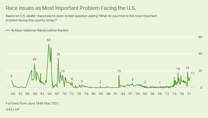
Even if racism is in decline, concern about racism is not. Since 1948, Gallup has asked “What do you think is the most important problem facing this country today?” The following figure shows the percentage who said racism or a related term:
Killing of George Floyd in May 2020, nationwide protests, and intense discussion of systemic racism.
The salience of racism as a national issue seems be driven by events, and media coverage, more than by the prevalence of racist attitudes. That’s not ideal — the limited resource of attention should go where it is most needed — but it might not be all bad. Even if racist beliefs are rarer than they used to be, they are not gone. I’m glad if only 3% of Americans refuse to vote for a Black candidate, but that’s not zero, and in a close election, it could be a deciding factor.
So we should be aware of what’s going on — and we should keep an eye on the trends that have stalled or reversed. But we should not ignore the consistent decline of racist attitudes in the last fifty years. Based on the data, if I had to choose when to be born, not knowing who I was going to be, I would choose right now.
Note: The scenario Obama posed is a nod to the veil of ignorance, a hypothetical used by moral philosopher John Rawls to support basic principles of justice.
When I go crawling around in data from the General Social Survey, sooner or later I run into Ryan Burge, who writes Graphs About Religion. In his most recent post, he wrote about changes in interpersonal trust, as measured by this GSS question:
Generally speaking, would you say that most people can be trusted or that you can’t be too careful in dealing with people?
Among other analyses, he looks at how the responses relate to self-identification as liberal, conservative, or moderate. The results are … complicated. Ryan writes:
Among older Americans who identify as liberal, they are more likely to trust other people. Among Gen Z liberals, it’s exactly the opposite.
To explain why older liberals are more trusting, Ryan suggests:
Liberalism is based on collectivism. It embraces the idea that “together, we can achieve more.” Things like universal healthcare rely on a sense of trust among large groups of people.
But if that’s true, why does the effect go in the opposite direction with Gen Z? Ryan speculates:
Well, maybe liberals feel very slighted by the fact that Donald Trump has been on the ballot for president in every election in which they’ve been eligible to vote, and he’s won twice. Or it could be that they are more impacted by the cynicism of the internet than conservatives? Or maybe it’s because they report higher rates of depression and anxiety than the rest of the ideological spectrum?
As it happened, I looked at the same GSS variable in a recent article. But I didn’t do the breakdown by political ideology, so let’s do that now.
The Story So Far
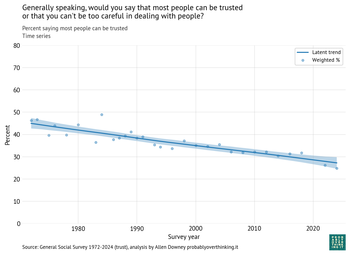
First, here’s a recap of what we saw in the previous post, with the whole GSS sample. The following figure shows the percentage of respondents who said “most people can be trusted.”
Time series: percent saying most people can be trusted (all respondents)
Interpersonal trust has declined consistently since the survey started in 1972. In the previous post, I decomposed this trend into cohort and period effects. Here’s the estimated cohort effect:
Standardized cohort effect with fixed time mix, percent saying most people can be trusted (all respondents)
The level of trust increased between the cohorts born in the 1900s through the 1940s, and then started a steep decline — more than 30 percentage points over 60 years. And here’s the remaining period effect, after factoring out the cohort effect.
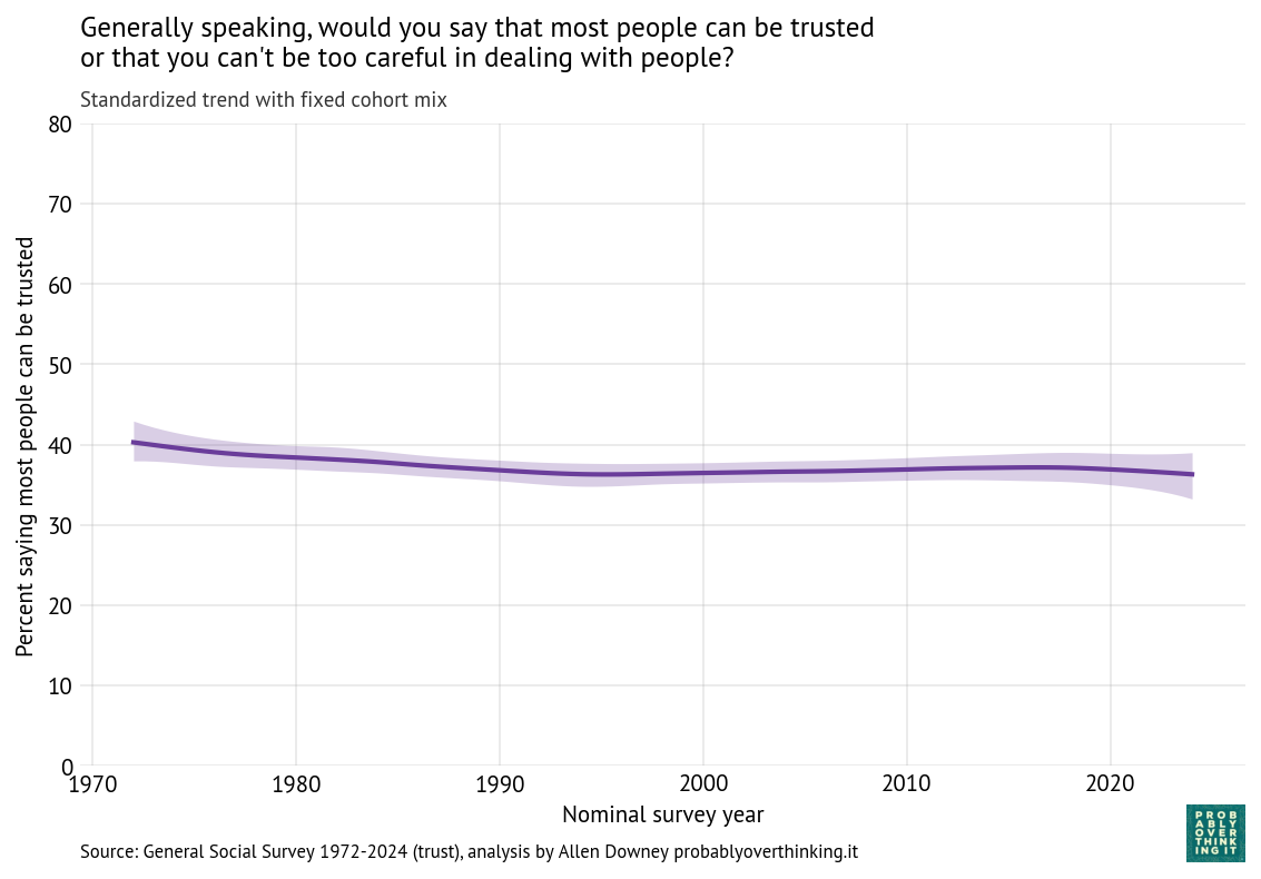
Standardized time trend with fixed cohort mix, percent saying most people can be trusted (all respondents)
There is almost no period effect in the full sample.
Breakdown by Politics
Now let’s get to the question we started with:
Who is more trusting: liberals or conservatives?
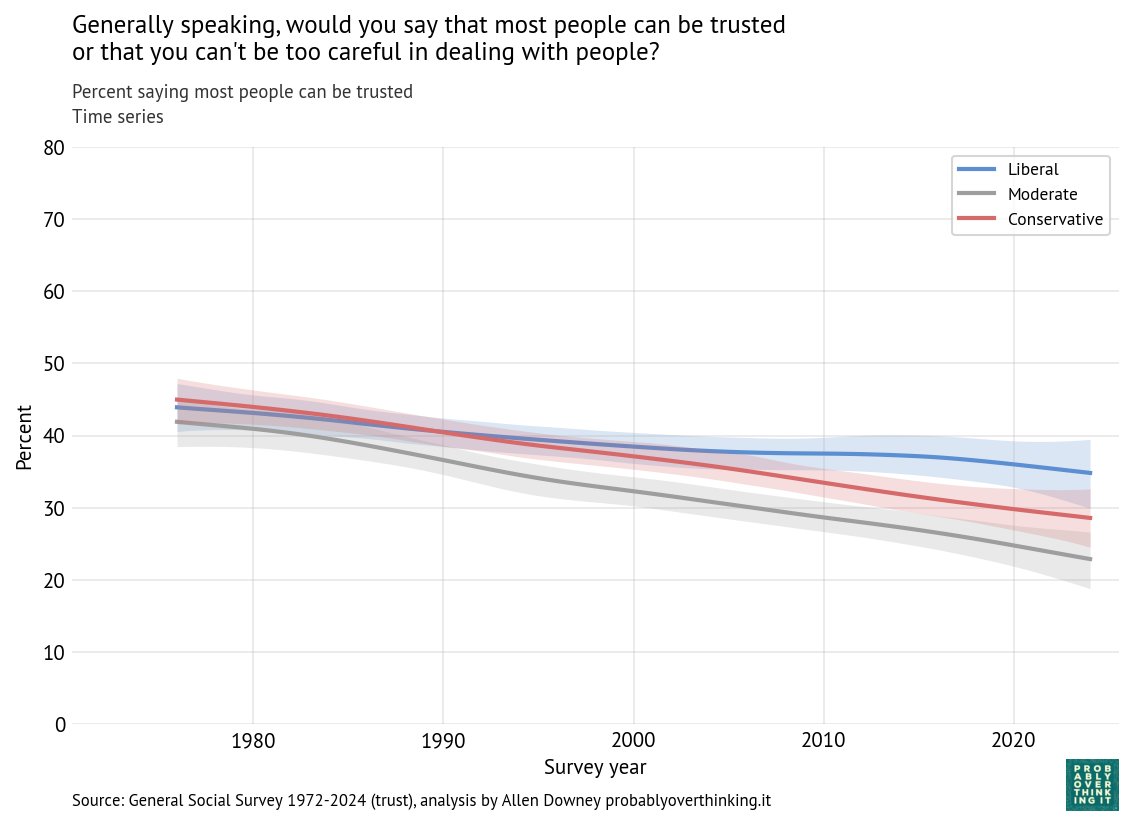
Here’s the time series, broken down by ideology.
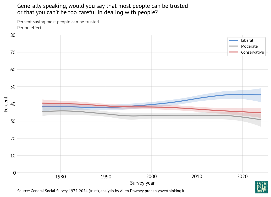
Time series: percent saying most people can be trusted, by 3-point political views
Until recently, there was not much difference: liberals and conservatives were about equally likely to say people can be trusted — both a little more trusting than moderates (who are, maybe, too distrustful to join a team).
Since the 2000s, liberals and conservatives have diverged, and now liberals are more trusting, by about 5 percentage points. But all three groups are still declining.
Now let’s decompose those trends into cohort and period effects. Here are the cohort effects for the three groups.
Standardized cohort effect for generalized trust by political views (uniform weights on survey years within group)
Here we can see what Ryan reported: in most generations, liberals are more trusting than conservatives; it’s only in the most recent generation that it goes the other way. The crossover happens among people born in the mid-1990s, close to the conventional beginning of Gen Z (born 1997 to 2012).
And here’s the period effect for the three groups.
Standardized period trend for generalized trust by political views (fixed within-group cohort weights)
For conservatives and moderates, the period effect is generally downward, although small. For liberals, it’s the other way around, generally increasing since about 2000.
The cohort-period decomposition provides some hints about what’s going on:
Among conservatives and moderates, the cohort and period effects are both downward, so they contributed to a steeper decline over time.
Among liberals, the cohort effect is also downward, but the period effect is upward, so the period effect mitigates the cohort effect.
To explain the cohort effect, I think Ryan’s suggestions are plausible. People born after 1995 have grown up during a discouraging time to be a liberal. Recent developments contrary to the liberal worldview include
The rise of populist and nationalist movements in several countries, along with democratic backsliding or erosion of liberal norms.
Slow progress or reversal on climate change.
Increasing distrust of experts, journalists, scientists, and public institutions.
Declining confidence in institutions such as Congress, the media, and organized religion.
A series of conservative Supreme Court decisions, most notably the overturning of long-established abortion rights protections in 2022.
Negativity bias in the media — especially social media — is probably a contributing factor. And going to school during the pandemic probably didn’t help.
But what about that period effect — can we think of reasons liberals would be more trusting, starting around 2005? If the recent cohort effect among young liberals is driven by the Trump era (at least in part), maybe the period effect was driven by events and trends of the Obama era that were aligned with the liberal worldview:
Perception that the country was becoming more socially inclusive and diverse.
Greater visibility and acceptance of LGBTQ people, and growing support for same-sex marriage, culminating in nationwide legalization in 2015.
Expansion of health insurance coverage through the Patient Protection and Affordable Care Act.
And falling crime rates from the 1990s through the 2010s might have contributed more directly to increasing interpersonal trust.
Of course these explanations are speculative, so let’s get back to what’s supported by the data:
Since the 1970s, interpersonal trust has declined consistently in all three groups (liberal, conservative, and moderate).
Before 2005, liberals and conservatives were about equally trusting; since then, the decline among liberals has slowed, so they are now the most trusting group.
Among conservatives and moderates, the cohort and period effects are both downward, so they contribute to steeper decline.
Among liberals, the cohort effect is steeply downward in the most recent cohorts, but the decline is mitigated by a positive period effect.
For now, liberals are the most trusting group, but if the cohort effect persists, they might not be for long.
You’re stranded in a rainforest after accidentally eating a poisonous mushroom. To survive the poison, you need to lick a certain species of frog. Only female frogs produce the antidote. Male and female frogs occur in equal numbers and look identical, but male frogs have a distinctive croak.
You see one frog alone on a tree stump. In another direction, you hear the croak of a male frog coming from a clearing with two frogs. You can’t tell which one made the sound.
You only have time to go to one place. What are your chances of survival if you go to the clearing and lick both frogs? What if you go to the lone frog?
The second question is relatively easy: if we assume that you are equally likely to see a male or female frog, the probability is 50% that the lone frog is female.
The first question depends on how we interpret the puzzle. In particular, it hinges on the word “distinctive” – does that mean:
Only male frogs croak, and the sound is distinguishable from background noises, or
Both male and female frogs croak, but the male croak is distinguishable from the female croak.
Based on the answer presented in the video, the first meaning is intended. So we’ll start by solving that version.
But the second meaning makes the problem a little harder, so we’ll solve that one, too.
Only Male Frogs Croak
To solve the intended version of the puzzle, we’ll assume
Only male frogs croak, and
When two frogs appear together, their sexes are independent.
So we’ll start with a prior where all two-frog combinations are equally likely.
From the table, we can extract the posterior probability that both frogs are male.
from sympy import init_printing
init_printing(use_latex=False)
table.posterior['MM']
1/3
With these assumptions, the probability 1/3 that both frogs are male (and you die), so the probability is 2/3 that at least one is female (and you live).
And that’s the answer in the video.
Poisson (not Poison) Frogs
But is that the right likelihood? Suppose frogs are equally likely to croak at any instant in time, so their croaks follow a Poisson process. If we assume that these croaking processes are independent, two frogs would be more likely to croak, during a given interval, than one.
If the interval is much longer than the average time between croaks, the probability that either frog croaks approaches 1, which is consistent with the previous solution.
But if the interval is short – as it might be if you were deciding whether to approach the first frog – the probability of hearing a croak would be double if there are two male frogs rather than one.
In that case, the likelihood of the data would be:
With Poisson frogs and a short interval, the probability of two male frogs is 1/2, so it doesn’t matter whether you approach the lone frog or the pair of frogs.
Female Frogs Croak, Too
Now let’s think about the other interpretation of the puzzle: suppose both male and female frogs croak, but we can distinguish one from the other. And suppose male and female frogs croak at different rates, but they are still independent.
Assume that male frogs croak at a rate of 1 per time unit, and female frogs at a rate of r per time unit. In that case, if we start listening at a random time, the probability that we hear a male frog first is 1 / (r+1) if there’s only one male frog, and 1 if there are two male frogs.
So the likelihood in this case is:
from sympy import symbols

r = symbols('r')
likelihood = [0, 1 / (r+1), 1 / (r+1), 1]
If female frogs don’t croak, we get the same answer as in the first scenario.
prob_die.subs({r: 0})
1/3
If male and female frogs croak at the same rate, the probability that both frogs are male is 1/2.
prob_die.subs({r: 1})
1/2
But if female frogs croak much more often, the fact that a male croaked first is strong evidence that both are male, so the posterior probability is close to 1.
prob_die.subs({r: 1000}).evalf()
0.998005982053839
Assortative Mating
Now suppose that when we see two frogs together, their sexes are not independent; specifically, let’s assume that the probability of a same-sex pair is p, so the probability of a mixed-sex pair is 1-p. In this scenario, the priors (before we hear the croak) are not equal.
p = symbols('p')
prior = [p, 1-p, 1-p, p]
Here are the posterior probabilities, assuming again that both male and female frogs, possibly at different rates.
Or anything in between. As is often the case with problems like these, the answer depends on a precise specification of the data-generating process.
Discussion
If all of this seems like more trouble than it’s worth, let me suggest a metacognitive shortcut for solving puzzles like this.
Notice that in all probability puzzles, the answer is either 1/2 or 1/3.
Also, the answer is always counterintuitive; otherwise it wouldn’t be a puzzle.
Therefore, if your intuition says the answer is 1/2, it’s actually 1/3, and vice versa.
That might save you some time.
This notebook uses methods and materials from Think Bayes, second edition. If you like this sort of thing, you can read the whole book, and more examples, at allendowney.github.io/ThinkBayes2/.
This article is one of a series looking at changes in public opinion over the last 50 years, with a focus on culture war topics. In this installment, we’ll look at responses to four questions in the General Social Survey (GSS) related to sexual activity:
Premarital sex (premarsx): There’s been a lot of discussion about the way morals and attitudes about sex are changing in this country. If a man and woman have sex relations before marriage, do you think it is always wrong, almost always wrong, wrong only sometimes, or not wrong at all?
Teen premarital sex (teensex): What if they are in their early teens, say 14 to 16 years old? In that case, do you think sex relations before marriage are always wrong, almost always wrong, wrong only sometimes, or not wrong at all?
Extramarital sex (xmarsex): What is your opinion about a married person having sexual relations with someone other than the marriage partner—is it always wrong, almost always wrong, wrong only sometimes, or not wrong at all?
Same-sex relations (homosex): What about sexual relations between two adults of the same sex—do you think it is always wrong, almost always wrong, wrong only sometimes, or not wrong at all?
As we’ll see, answers to these questions have diverged in the last 50 years. A large majority answer that extramarital and teen sex are wrong, and that has barely changed (although opposition). At the same time, opposition to premarital sex and same-sex relations has declined substantially.
In this article, we’ll look at these trends and decompose them into cohort and period effects. In the next article, we’ll look at the relationship between these responses and religion, both affiliation and attendance.
We’ll start with the first question, on premarital sex.
Premarital sex
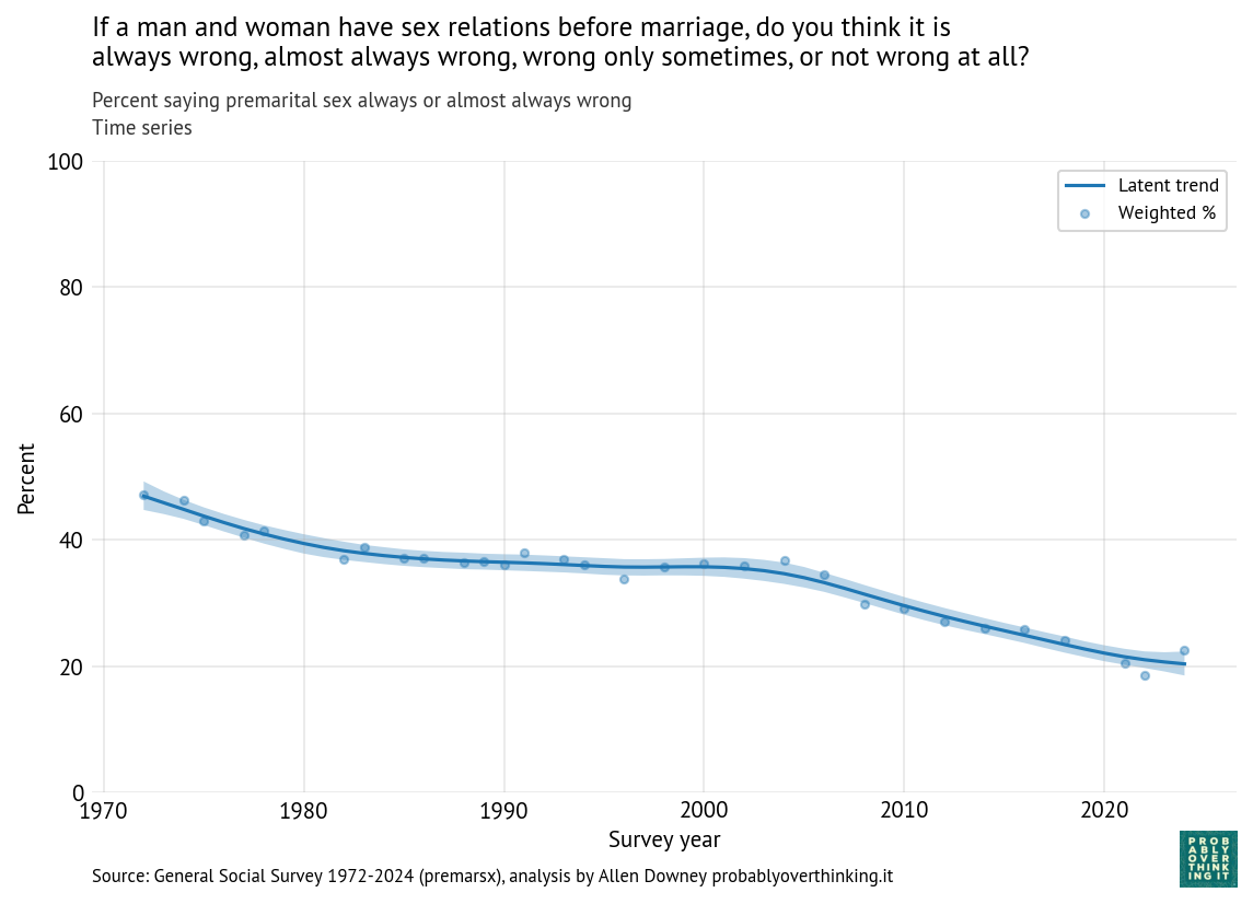
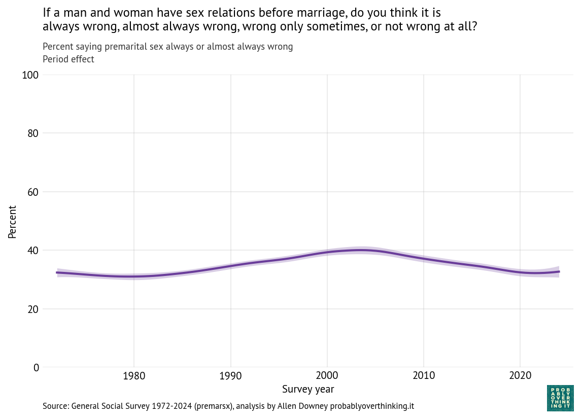
The following figure shows the percentage of respondents saying premarital sex is always or almost always wrong, from 1972 to 2024. The shaded area shows the results from a Bayesian model that estimates the latent trend — that is, a slowly varying underlying level of opposition to premarital sex.
Opposition to premarital sex has declined since 1972, from about 47% to about 20%.
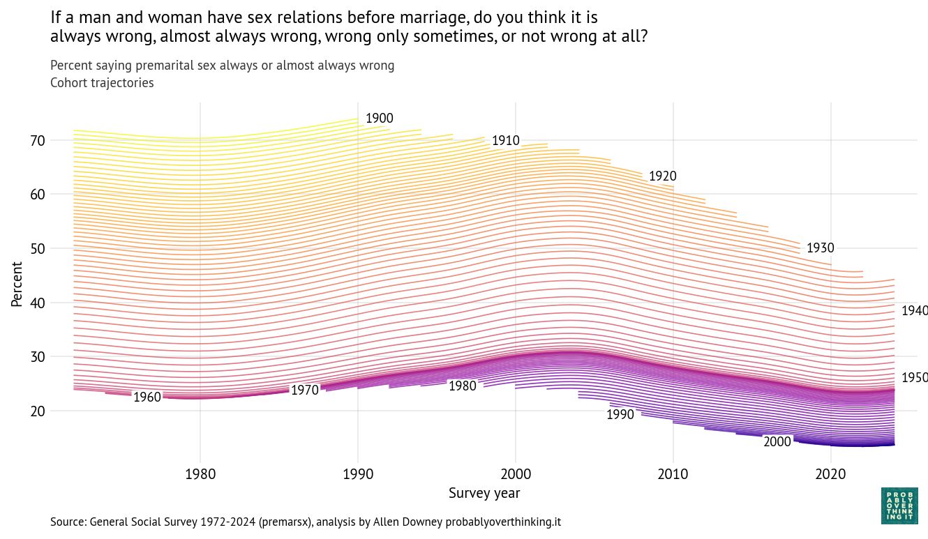
As always, when we see this kind of change over time, it might be caused by cohort or period effects, or a combination of the two. Using a Bayesian model, I estimate a cohort effect for each birth year and a period effect for each survey year. The following figure shows the resulting trajectory for each cohort over time.
Each line represents a single birth year. For example, the yellow line at the top shows the fitted trajectory for people born in 1900, who were 72 when the survey started in 1972 and 90 when they aged out in 1990. The blue line in the bottom right shows responses of people born in 2000, who became eligible to participate in the survey when they turned 18 in 2018.
One pattern is clear: each cohort is less likely than the previous cohort to say that premarital sex is wrong. Among people born in 1900, it was more than 70%. Among people born in the 2000s, it is close to 10%. So that’s a big difference.
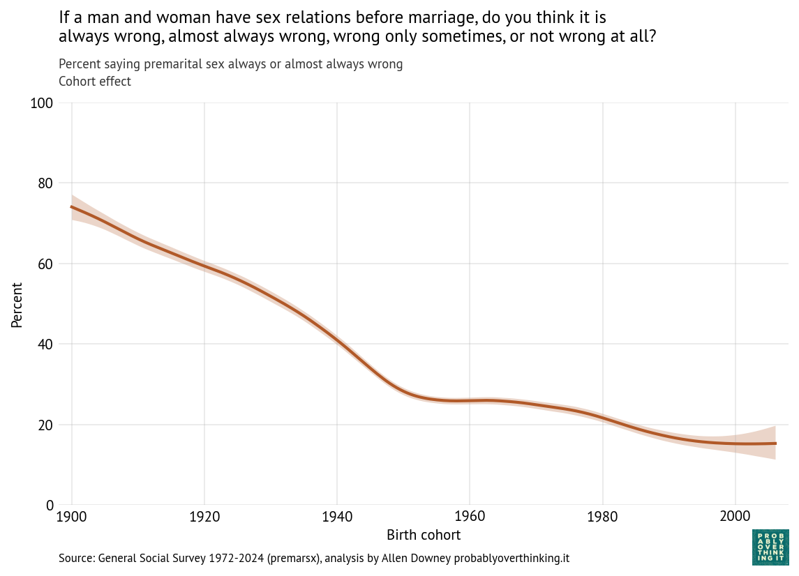
From these results, we can estimate the cohort and period effects separately. The following figure shows the cohort effect, standardized to control for the period effect by simulating responses as if every cohort was interviewed during every iteration of the survey.
The decline was steepest between the cohorts born in 1900 and 1950. After that, it leveled off, then declined again among the cohorts born in the 1980s.
Now we can estimate the period effect, standardized to control for the cohort effect, shown in the following figure.
The period effect is smaller than the cohort effect — about 8 percentage points from peak to trough — and less consistent. Opposition to premarital sex increased between 1980 and 2000, which coincides with increasing awareness of AIDS and public messaging about sexual risk, as well as the rise of the Religious Right and “family values” politics.
But before I speculate about the causes of these patterns, it will be useful to look at the responses to the other questions.
When is sex wrong?
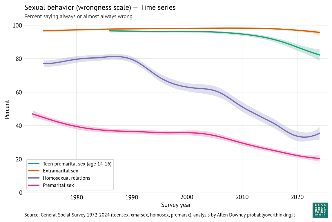
The following figure shows the estimated percentage who think sex is wrong (always or almost always) in each of the four scenarios: premarital, teen, extramarital, and same-sex.
Reading from top to bottom:
Nearly everyone thinks “a married person having sexual relations with someone other than the marriage partner” is wrong, and the percentage has barely changed in more than 50 years.
Opposition to teen sex (the question specifies ages 14-16) is nearly as high, although it has declined since 2005 by about 15 percentage points.
Opposition to same-sex relations was high and mostly unchanged between 1972 and 1990. Since then it has decreased by almost 50 percentage points in 30 years, which is an astonishing speed for this kind of social change. Since 2020, opposition has increased a little.
Finally, as we’ve already seen, opposition to premarital sex declined substantially since the beginning of the survey.
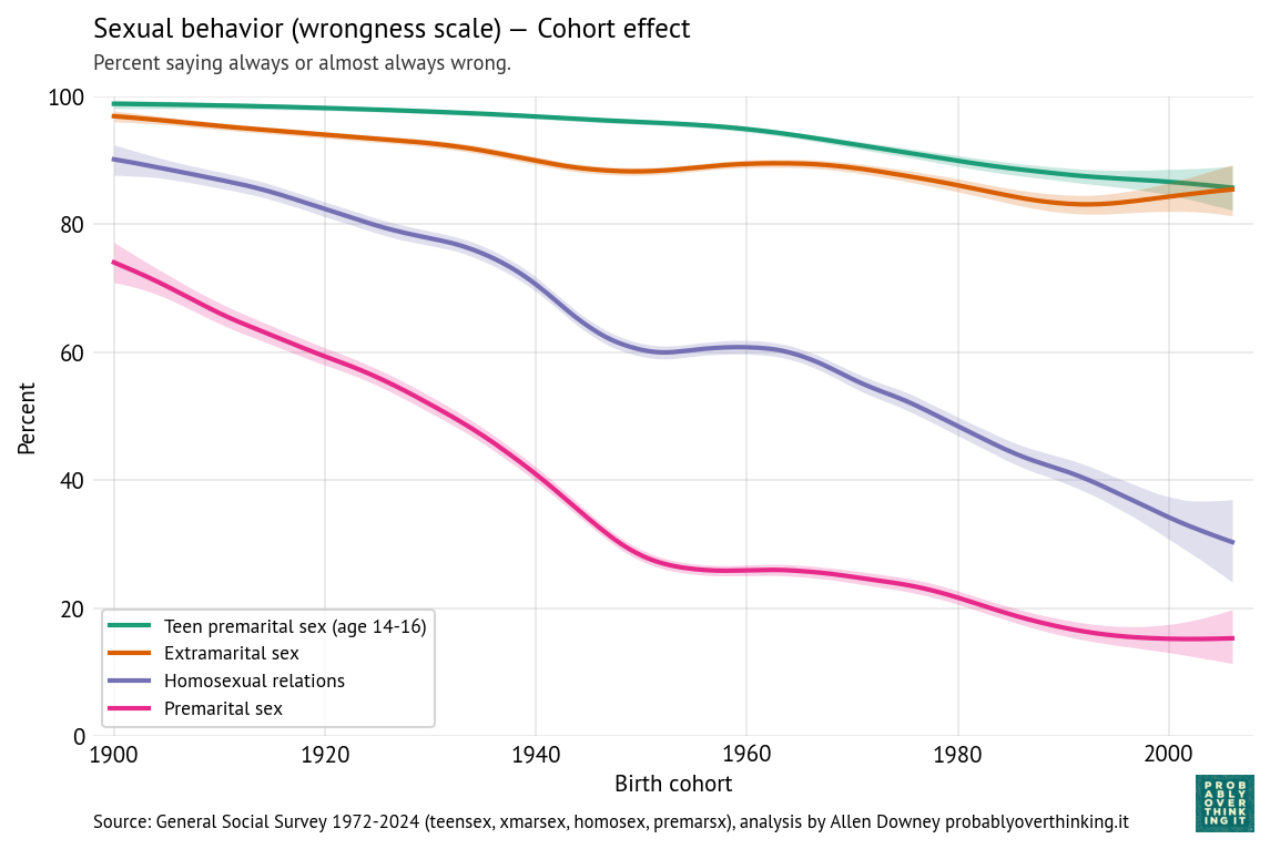
For all four scenarios, we can estimate the cohort effect, controlling for the period effect, shown in the following figure.
For all four scenarios, there is a consistent downward trend in the cohort effect, modest for extramarital and teen sex, much steeper for premarital and same-sex relations.
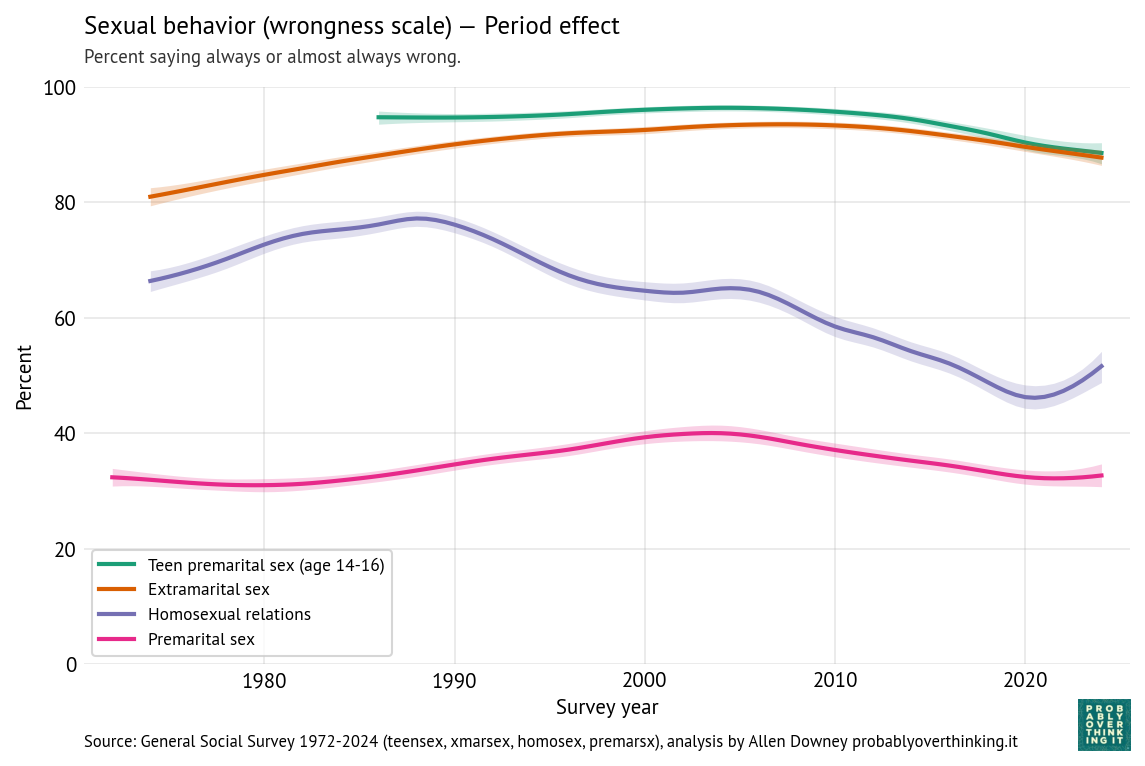
The following figure shows the period effects.
After controlling for the cohort effects, the remaining period effects are more modest.
Opposition to teen sex is mostly unchanged, with some decline since 2010.
Opposition to extramarital sex increased between 1972 and 2010, and decreased since then.
Opposition to same-sex relations shows by far the largest period effect, increasing between 1972 and 1990, and decreasing since then — although increasing again since 2020.
Opposition to premarital sex has increased and decreased modestly.
In most scenarios, the cohort effect accounts for more of the observed change — but for same-sex relations, the period effect also makes a substantial contribution.
Dogma, morality, and health
To make sense of these patterns, let’s think about what people might mean when they say that sex is wrong.
Taking premarital sex as an example, some people consider sex outside marriage to be contrary to spiritual values or religious teachings. Others might be concerned with sexually-transmitted disease or the social consequences of children born outside of stable families.
And for teens specifically, some object because they see adolescence as a period of innocence that should be protected, believe sexual activity compromises purity or chastity, or think sexual restraint reflects virtues like self-discipline and respect for social norms. Also, some might think teenagers don’t have the knowledge, experience, and impulse control to avoid health consequences of sex, especially pregnancy, or the maturity to handle emotional challenges.
Similarly, some people object to same-sex relations because they see them as contrary to religious teachings, inconsistent with traditional ideas about gender and family, or incompatible with social norms about sexuality.
And people might object to extramarital sex because of the emotional harm it causes, because it breaks a vow, because it threatens families and social stability, or because it violates holy matrimony.
In each scenario, objections arise from different concerns: practical risks and harms, social concerns about norms and stability, and moral or religious beliefs. Looking only at multiple-choice responses, we don’t know what respondents had in mind.
But the differences we see — between teen and extramarital sex on one hand, and premarital sex and same-sex relations on the other — suggest a conjecture: objections rooted in immediate harms and concrete consequences might be more stable over time; objections rooted in social norms, morality, and religion might be more historically contingent.
In the next article, we’ll test this conjecture by looking at relationships between religion and attitudes about sex — and how both have changed over time.
This article is one of a series exploring responses to core questions in the General Social Survey (GSS), estimating period and cohort effects, and looking for historical events that might explain the trends we see.
Confidence in American institutions
In this installment, we’ll look at 13 questions related to confidence in institutions. We’ll start with a detailed look at confidence in “the people running Congress”, and then summarize results from the other questions. The complete survey question is:
I am going to name some institutions in this country. As far as the people running these institutions are concerned, would you say you have a great deal of confidence, only some confidence, or hardly any confidence at all in […] Congress.
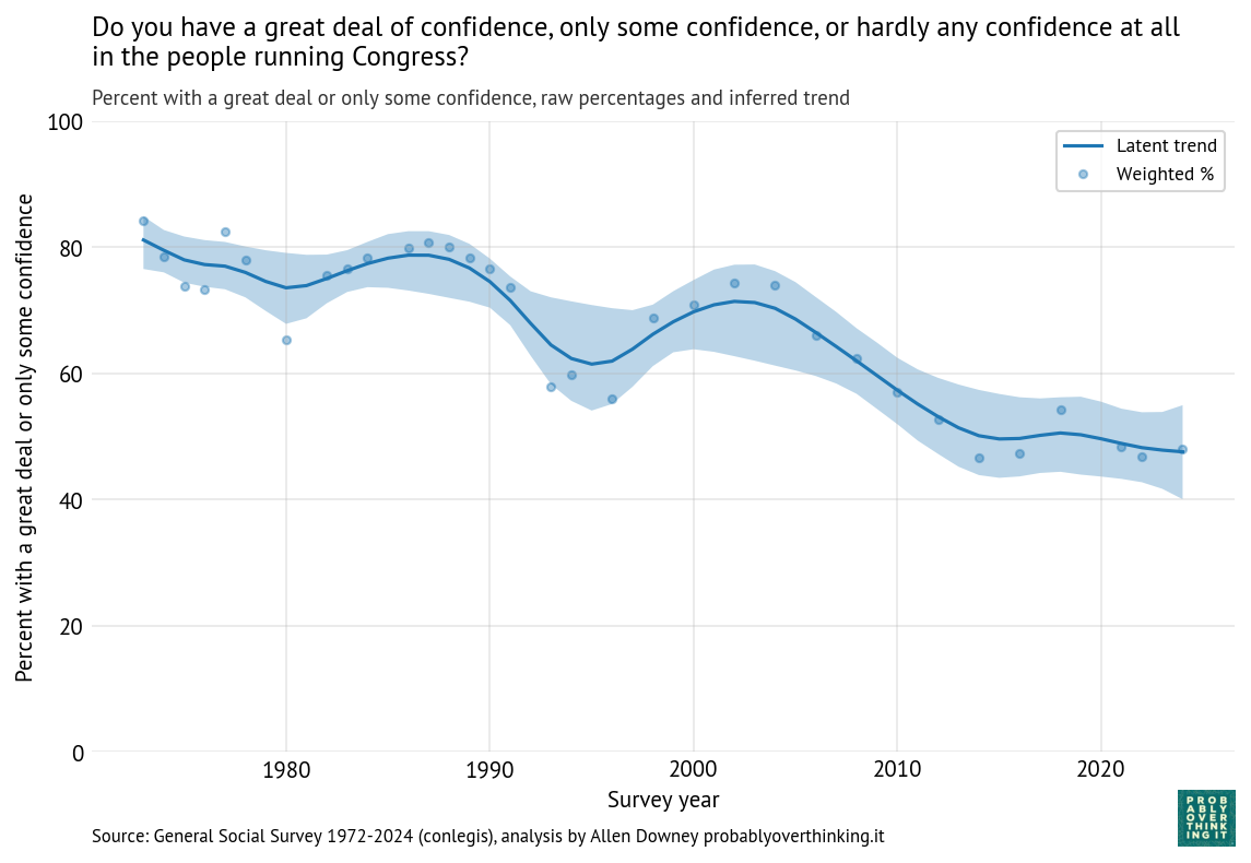
The following figure shows the fraction of people who answered “a great deal of confidence” or “only some confidence,” and a smooth line fitted to the raw percentages.
The long-term trend is downward, from about 80% during the first iteration of the survey to below 50% in the most recent iterations. But there are ups and downs.
It looks like confidence was increasing during the 1980s before collapsing in the early 1990s. Possible causes of the decline include:
Confidence in Congress recovered between 1995 and 2005, and declined again between 2005 and 2015. A likely contributor is the Great Recession from late 2007 to mid-2009.
This period also saw the rise of anti-establishment politics, including the Tea Party movement and Ron Paul’s presidential campaign.
Now we’ll decompose these changes into period and cohort effects.
Period and cohort effects
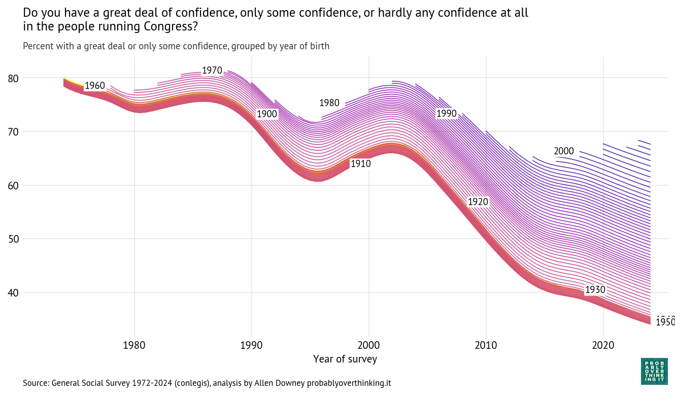
Using the Bayesian model described here we can estimate a latent “confidence in Congress” factor for each birth cohort over time. The following figure shows these estimates; each line represents a single birth year.
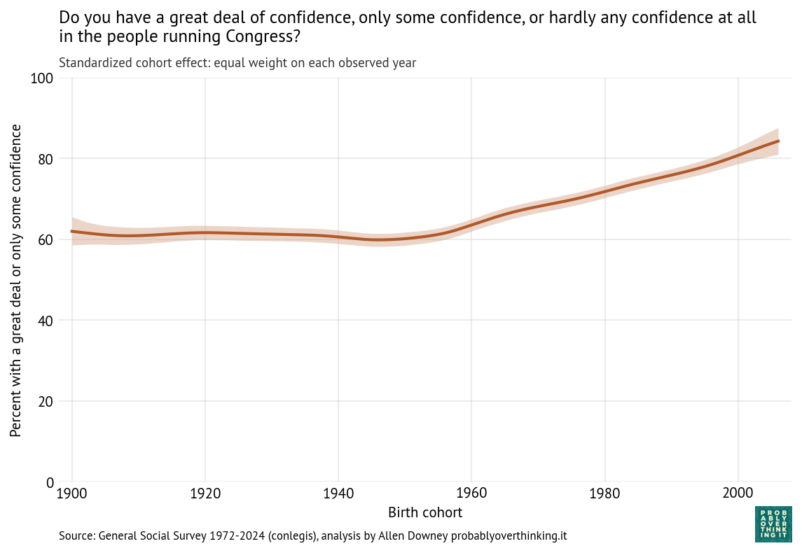
Those results are easier to interpret if we factor out the cohort effect (keeping the mixture of survey years constant) and the period effect (keeping the mixture of cohorts constant). The following figure shows the standardized cohort effect.
Among people born between 1900 and 1950, there is almost no change. Then starting with people born in the 1960s, confidence in Congress has increased consistently and substantially.
To interpret this result, it is helpful to go back to the previous figure. Starting in the upper left:
Among people born in the 1960s and 1970s, about 80% reported confidence in Congress when they were surveyed as young adults.
Among people born in the 1980s and 1990s, it was closer to 70%.
And among people born in the 2000s it’s below 70%.
The entry point of each cohort is below the entry point of previous cohorts, but because these entry points are above the declining trend of previous generations, this relative optimism is interpreted as an increasing cohort effect.
So we should not conclude that younger generations are more confident in Congress, only that when they are first surveyed, they start out above the trajectory of previous cohorts.
As a simplification, we might imagine an 18-year-old entering adulthood with a relatively idealized understanding of American government — shaped by civics classes and maybe a school trip to Washington D.C. — before later political experiences erode some of that confidence.
Another possibility is that younger generations have grown up with lower expectations of government, so when they say they have “some confidence”, they might be evaluating Congress against a lower standard.
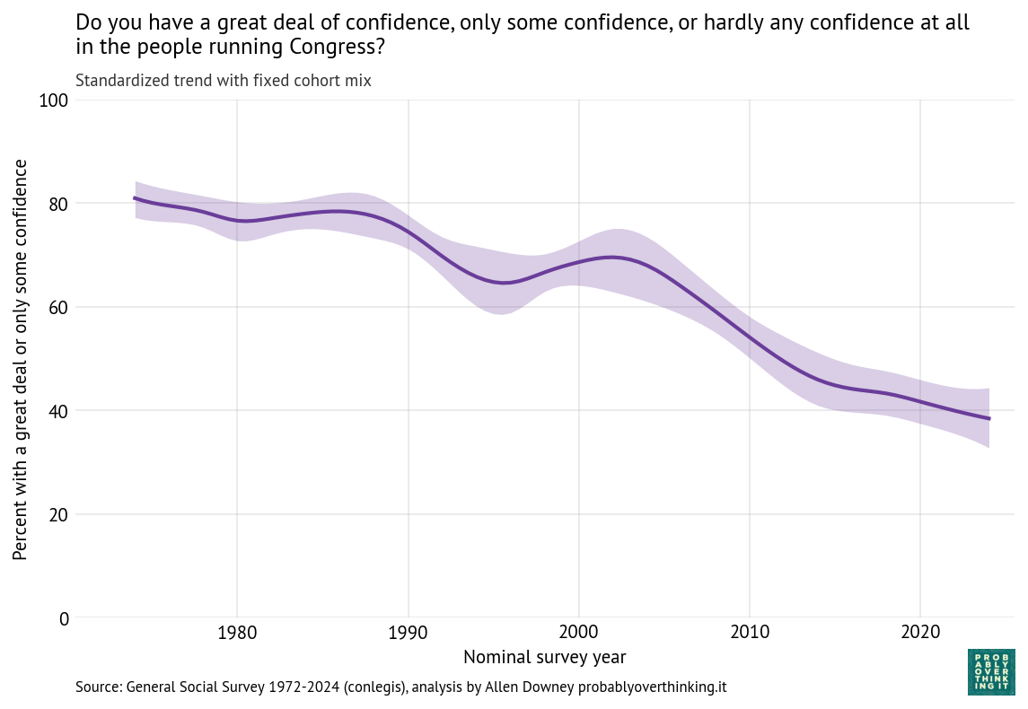
The following figure shows the estimated period effect, with the mix of cohorts held constant.
This decline is steeper than what we saw in the time-only model, because we have factored out the mitigating effect of relative optimism in recent generations.
Government Institutions
Now we’ll apply the same analysis to questions about the executive branch of the federal government, the Supreme Court, and the military (technically part of the executive branch).
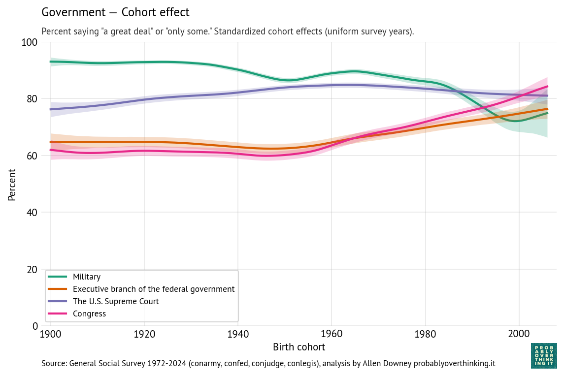
The following figure shows the estimated cohort effects for each of these institutions.
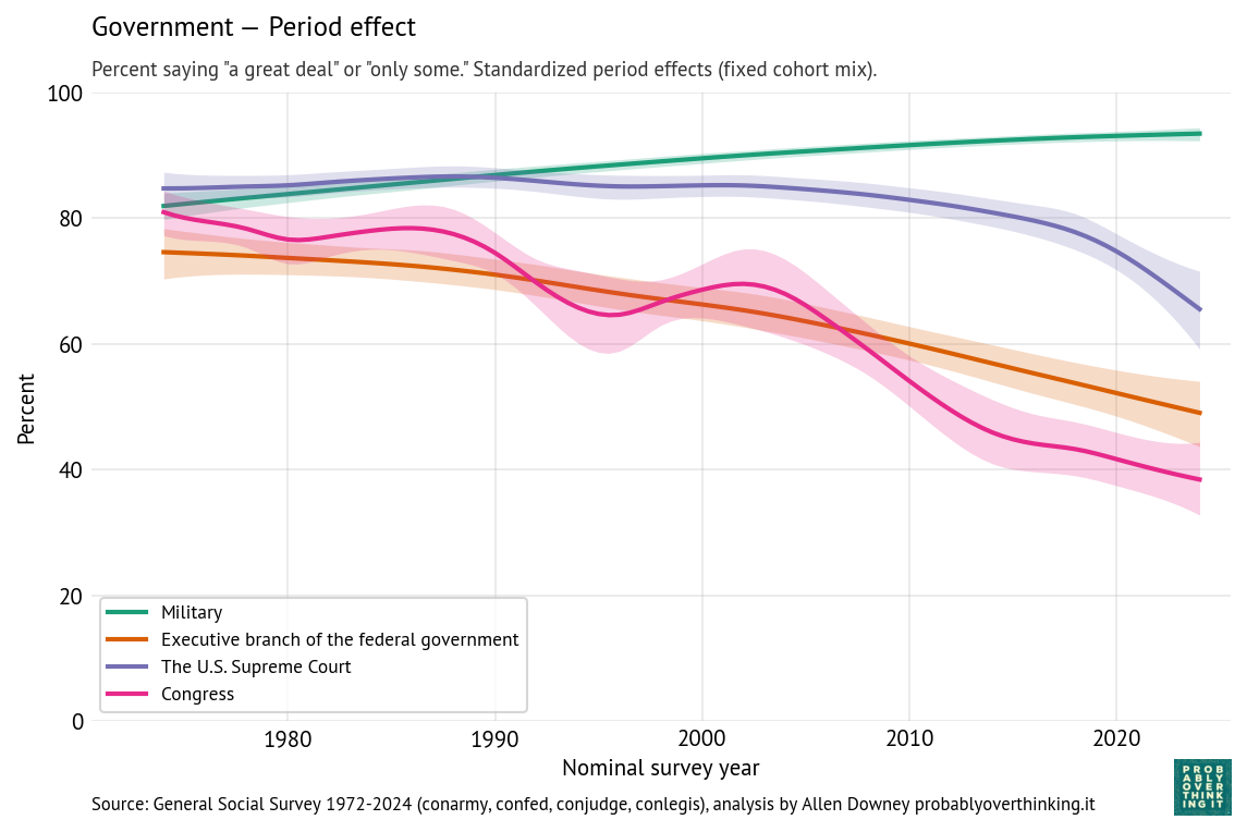
And the following figure shows the period effect, after factoring out the cohort effect.
The results for the executive branch are similar to the results for Congress.
The cohort effect is flat between people born in the 1900s and 1950s, and increasing after that.
The period effect declines substantially and consistently — without the ups and downs of confidence in Congress.
When respondents are asked about the “executive branch”, it’s not clear whether they think primarily about the president, federal agencies, or the federal government in general.
The patterns for the military and Supreme Court are different.
Confidence in the military is generally high. The cohort effect declined gradually, and possibly more steeply among people born after 1980. The period effect gradually increased.
Confidence in the Supreme Court is higher than confidence in other branches, although the period effect has dropped steeply since 2015. The cohort effect increased among people born between 1900 and 1960; among more recent generations it is gradually declining.
Historically, the Court cultivated an image of being above politics; that perception weakened substantially in the 2010s. In March 2016, Merrick Garland was nominated to the Supreme Court after the death of Antonin Scalia. The Republican majority in the Senate refused to hold a hearing or vote on his nomination. The seat remained empty until Donald Trump nominated, and the Senate confirmed, Neil Gorsuch, who is considered to be more conservative. To many liberals, the Senate’s 293-day blockade undermined the legitimacy of the Court.
Then when Ruth Bader Ginsburg died in September 2020, Donald Trump nominated Amy Coney Barrett and the Senate confirmed her 8 days before the 2020 presidential election, in a process criticized by Democratic leaders as illegitimate.
These appointments, along with the confirmation of Brett Kavanaugh in 2018, shifted the composition of the Court toward conservatives, forming what is now described as a 6-3 supermajority of conservative justices.
Since then, the Supreme Court has issued several decisions contrary to majority public opinion, most notably the 2022 decision overturning Roe v. Wade. Other unpopular decisions weakened gun control and limited federal regulatory authority, especially over environmental policy. Many of these decisions have been perceived, especially on the left, to be motivated by politics rather than constitutional principles and precedent.
The slope of the cohort effect might reflect a generational change in associations with the Supreme Court. Older cohorts may associate the Supreme Court with landmark decisions like Brown v. Board of Education and the expansion of civil rights. Younger cohorts may instead associate it with partisan conflict, blocked reforms, and ideological polarization. Older generations might also have been more deferential toward the institution itself. Younger generations, exposed to more adversarial and partisan media coverage, might be less inclined to deference.
Economic institutions
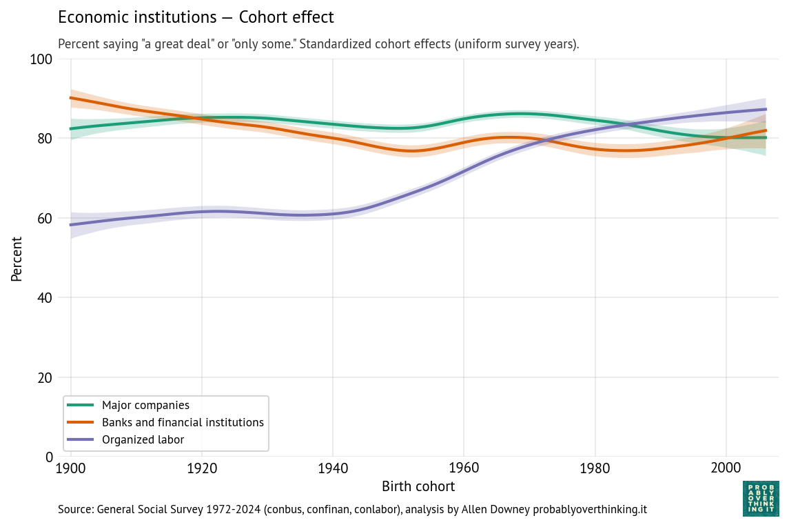
The following figures show the cohort and period effects for confidence in economic institutions: banks, major companies, and organized labor.
Confidence in these institutions is generally high. Looking at the cohort effects, the most salient feature is increased confidence in organized labor among people born after 1940.
A possible explanation is that younger cohorts have less exposure to organized labor. Older generations were more likely to be affected by strikes and related economic disruption, and more likely to be aware of corruption in labor unions. As union membership has declined and the gig economy has expanded, younger cohorts are less aware of the negative aspects of organized labor, including dues, and more likely to perceive their lack of negotiating power in the labor market. Also, anti-labor ideology has declined since the end of the Cold War, as the framing has shifted from “labor versus management” to “workers versus corporations”.
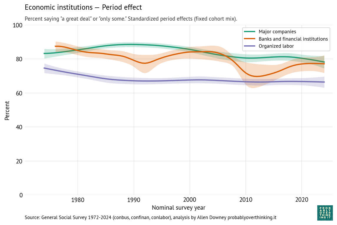
By comparison with the cohort effects, the period effects are modest:
The period effect on organized labor is almost unchanged since the 1980s — the change we see over time is almost entirely due to generational replacement.
The period effect on confidence in major companies has declined somewhat.
The trend for banks and financial institutions is more complicated — arguably driven by shorter-term period effects like scandals and financial crises. The first notable downturn, in the 1980s, coincides with the savings and loan crisis, when hundreds of financial institutions failed and taxpayers absorbed large bailout costs, followed by an economic recession from 1990 into 1991. The larger downturn around 2008 coincides with the 2008 global financial crisis, when taxpayers were hit with even larger bailout costs, and public anger at “private gains, public losses” came to a focus in the Occupy Wall Street protests.
Professions, knowledge, and religion
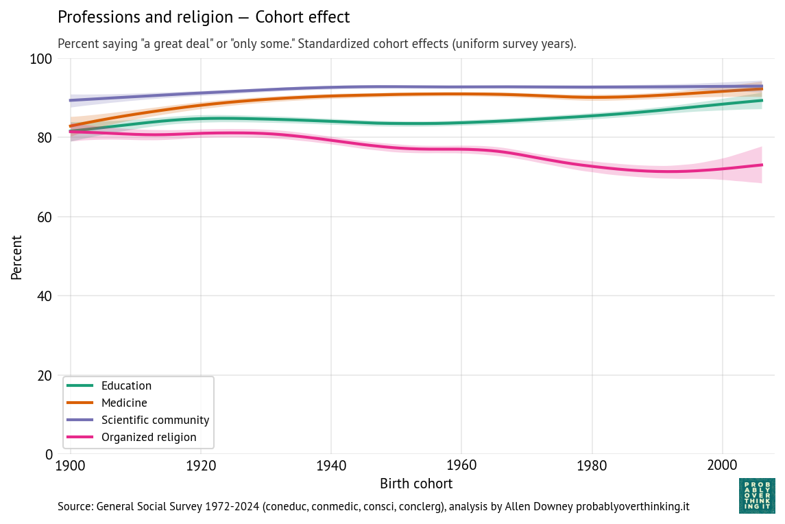
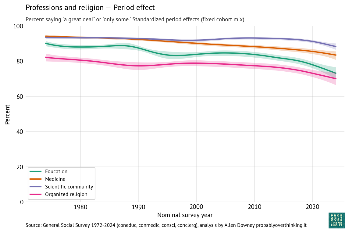
The following figures show estimated cohort and period effects for confidence in education, medicine, the scientific community, and organized religion.
Confidence in these institutions is highest for science and medicine, lower for education and religion.
Looking at the period effects, they are all in decline. Confidence in education declined most steeply; confidence in the scientific community is relatively stable, although it declines after 2020.
Thinking about confidence in education, it might be useful to separate colleges and universities from K-12 schools.
In higher education, the decline might be due to increasing tuition and student debt, credential inflation, and increasing uncertainty about the economic return on a college degree, especially among majors in the arts and humanities. More recently, confidence in universities has decreased steeply, especially among conservatives, due to the perception of ideological bias.
In K-12 education, declining confidence might be related to anxiety about standardized testing, international competition, and especially around the No Child Left Behind Act in 2001, the framing of public schools as underperforming institutions requiring accountability reforms and federal intervention. Also, public schools have increasingly become focal points for political conflicts about curriculum, race, gender, religion, and parental authority.
Most of the cohort effects have increased modestly; in particular confidence in education is higher among people born after 1980, compared to previous generations observed at the same time. But for these institutions, the interaction of the period and cohort effect is similar to what we saw for Congress — it’s not that recent generations have more confidence, it’s just that when they are surveyed as young adults, they come in at entry points above the declining trend of previous generations.
Confidence in organized religion is the exception — the period and cohort effects both trend downward, so the decline is additive. A likely contributor to the period effect is growing public awareness of sexual abuse and institutional coverups in the Catholic Church, which received national attention beginning in the 1980s, escalated after the Boston Globe investigations published in 2002, and continues to the present with additional revelations in the United States and other countries. But the decline is not limited to the Catholic Church, and it began before these scandals were widely known.
The cohort effect likely reflects broader secularization trends, including declining religious affiliation, lower church attendance, and weakening institutional authority among younger generations.
Media
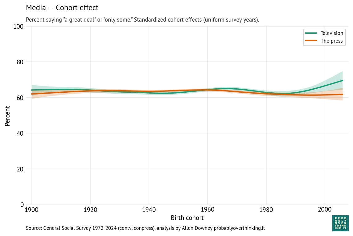
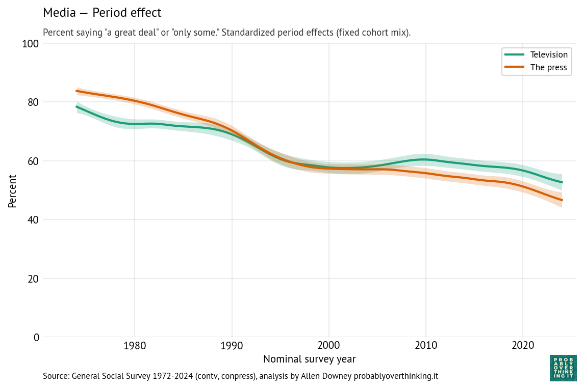
Finally, the following figures show estimated cohort and period effects for confidence in television and the press.
There is almost no cohort effect, although the most recent cohorts might have a little more confidence in television.
The headline here is the period effect, which is consistently downward, and steeper for the press than television. The steepest part of the decline for both media started around 1990, shortly after the 1987 abolition of the fairness doctrine, which required broadcast coverage of controversial topics to be “fair in the sense that it provides an opportunity for the presentation of contrasting points of view,” as described in the 1949 FCC report that established the doctrine.
The end of the fairness doctrine coincided with the rise of talk radio programs with explicit political viewpoints, including The Rush Limbaugh Show, which was nationally syndicated in 1988.
Cable television news followed, including Fox News Channel in 1996, with an explicit conservative orientation, and MSNBC, which developed a more liberal identity in the 2000s.
During this period, more generally, media audiences became more fragmented. Prior to 1980, most Americans were exposed to a small number of shared news sources, notably the three major television networks. Talk radio and cable television offered more options and less common experience.
And then the internet happened, starting in the 1990s with online news and political blogs, including the Drudge Report which started as a weekly email newsletter in 1995, and rose to national prominence when it broke the Clinton-Lewinsky scandal in 1998.
Social media followed. YouTube was founded in 2005; Facebook and Twitter launched in 2006. While these platforms have become important sources of news for many Americans, engagement-driven algorithms often promote emotionally provocative and polarizing content over careful reporting. The rise of the internet contributed to the decline of local newspapers, and eventually national newspapers as well.
Ownership of television stations became increasingly consolidated following the 1996 Telecommunications Act, allowing a small number of national media companies to control larger shares of local news programming. The effect of this consolidation is explained in this Vox article and memorably demonstrated in this Deadspin compilation showing dozens of TV news anchors reading nearly identical scripts provided by the Sinclair Broadcast Group, which requires the channels it owns to air segments called “must-runs” — many of them presenting conservative talking points.
Finally, since the beginning of his presidential campaign in 2015, Donald Trump has repeatedly denigrated television and print media, frequently describing unfavorable coverage as “fake news” and labeling journalists “enemies of the people.” These attacks likely contribute to declining confidence in the press, especially among Republicans.
Negativity Bias
In the previous examples, you might notice that I offer explanations for the downturns, but no explanation for the upturns. That’s because bad things, like scandals and economic crises, often happen quickly and they get a lot of coverage; good things often happen slowly and continue without comment.
For many institutions, no news is good news. When they do their jobs, they don’t get much attention, and public confidence drifts higher, even without specific positive events or coverage.
So I want to end this article by highlighting some of the positive results we see in this data:
Confidence in education, science, and medicine is high and although the period effects are negative, the cohort effects are positive, which bodes well for the future.
Confidence in financial institutions and organized labor is high.
Confidence in government is lower and declining, but as each generation of young adults starts out more optimistic than their elders, there is hope for a turnaround.
But the recent steep decline of confidence in the Supreme Court is a concern, as is the loss of confidence in the media. It’s hard to find a positive take on those trends.
Yesterday I presented a talk at ODSC East 2026, called “Counterfactual Analysis with Bayesian Models: What Drives the Life Expectancy Gap?” Here’s the abstract
Across nearly every country in the world, women live longer than men—but the size of this gap varies from about two years in some countries to more than twelve in others. What explains these differences, and how much of the gap can be closed?
In this talk, I present a practical approach to counterfactual analysis using Bayesian regression models. Using publicly available mortality data, we build a model that relates the life expectancy gap between men and women to differences in cause-specific death rates, including homicide, drug overdoses, traffic fatalities, smoking-related disease, and chronic illness.
The model generates posterior simulations that answer “what-if” questions. For example: How much smaller would the U.S. life expectancy gap be if homicide rates matched those in Western Europe?
The talk presents the workflow—from assembling global datasets to fitting interpretable Bayesian models with PyMC and generating counterfactual simulations. Attendees will learn how Bayesian models can support explainable modeling and analysis under uncertainty.
I think the talk went well, and we got some good questions at the end. There’s no recording, unfortunately, but my slides are here. And if you want to know more, I have a series of blog posts on Substack
I always thought middle age was in your 40s but since life expectancy is around 75 or so, wouldn’t it be about 35?
If life expectancy is 75, you might think the midpoint is half that, which is 37.5. But if 75 is life expectancy at birth and you survive to age 37.5, your life expectancy at that age is higher than 75. So 37.5 is not halfway!
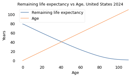
If we really want to find the midpoint – and it wouldn’t be Probably Overthinking It if we didn’t – we have to find the age where your expected remaining lifetime equals your current age.
Let’s do it.
Data
From the Human Mortality Database I downloaded life tables for the United States, combined and broken down for men and women. The following function reads and cleans a table.
The tables include data from 1933 to 2024, so we’ll select the most recent data.
year = blt['Year'].unique()[-1]
table = blt.query('Year == @year').set_index('Age')
The column we’ll use is ex, which is life expectancy as a function of age.
age = table.index.to_series()
ex = table['ex']
Life expectancy at birth is 79 years, so the naive midpoint is 39.5.
ex[0], ex[0] / 2
(79.08, 39.54)
But at age 40, expected remaining lifetime is 41.1, so 39.5 is not the midpoint.
ex[39], ex[40]
(42.04, 41.12)
This plot shows life expectancy at each age, compared to age.
ex.plot(label='Remaining life expectancy')
age.plot(label='Age')
decorate(ylabel='Years',
        title='Remaining life expectancy vs age, United States 2024')
“Middle age” is where the lines cross, which we can compute by linear interpolation.
gap.plot(label='')
decorate(ylabel='Years',
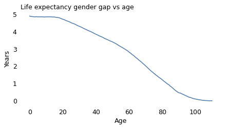
         title='Life expectancy gender gap vs age')
At birth the life expectancy gap is close to five years. At age 100, it is close to zero.
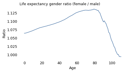
But just looking at the gap might be misleading. For a more complete picture let’s also look at the ratio.
ratio = ex_female / ex_male
ratio.plot(label='')

decorate(ylabel='Ratio',
         title='Life expectancy gender ratio (female / male)')
The life expectancy ratio tells a more complicated story.
At birth, the ratio is 1.06, which means female babies live 6% longer, on average.
Around age 80, the ratio peaks at nearly 1.14 – so between female and male octogenarians, we expect the women to live 14% longer.
At advanced ages, the ratio declines steeply and actually crosses over after age 100 – although the crossover is minimal and might not be statistically valid.
To interpret these results, we can think about the causes of death that contribute to age-specific death rates at different stages of life.
In young adulthood, the causes of death that contribute most to gender gaps include road traffic, homicide, accidental injury, drug use disorders.
In advanced adulthood, they include cancer, cardiovascular disease, respiratory disease, liver disease, diabetes, and suicide.
The causes that affect younger people have large gender gaps, but relatively low death rates. As people get older, these low-rate causes contribute less to age-specific death rates, and the higher-rate causes contribute more.
I think that’s a plausible explanation for the increasing ratio from age 0 to 80. For the decline that follows, I can only speculate that there is a selection effect: people who get to these advanced ages are likely to have better-than-average lifestyle histories (less smoking and drinking, better diet, more exercise) – and among people with better lifestyles, the gender gap is small.
Notes
Data credit: HMD. Human Mortality Database. Max Planck Institute for Demographic Research (Germany), University of California, Berkeley (USA), and French Institute for Demographic Studies (France). Available at [www.mortality.org].
Here are the columns of the 1×1 Period Life Tables:
Year: Calendar year to which the period life table refers.
Age: Exact age (x), in years, at the beginning of the interval ([x, x+1)).
mx: Central death rate at age (x):
qx: Probability of dying between ages (x) and (x+1):
ax: Average fraction of the interval lived by those who die in ([x, x+1)). Typically around 0.5 for most ages, lower for infants (reflecting higher early mortality within the year).
lx: Number of survivors at exact age (x), out of a radix (usually 100,000 births).
dx: Number of deaths between ages (x) and (x+1):
Lx: Person-years lived between ages (x) and (x+1), approximately
In Graphs About Religion, Ryan Burge recently wrote about changing opinions about assisted suicide and how they relate to religion.
As always, when I see survey responses changing over time, I wonder whether it is driven primarily by period or cohort effects. And if you’ve read my last few posts, you know I’ve been working on a Bayesian model to answer that question.
Ryan’s analysis is based on four questions from the General Social Survey (GSS):
Do you think a person has the right to end his or her own life if this person:
Has an incurable disease? (suicide1)
Has gone bankrupt? (suicide2)
Has dishonored his or her family? (suicide3)
Is tired of living and ready to die? (suicide4)
In addition, we’ll look at results from a related question (letdie1):
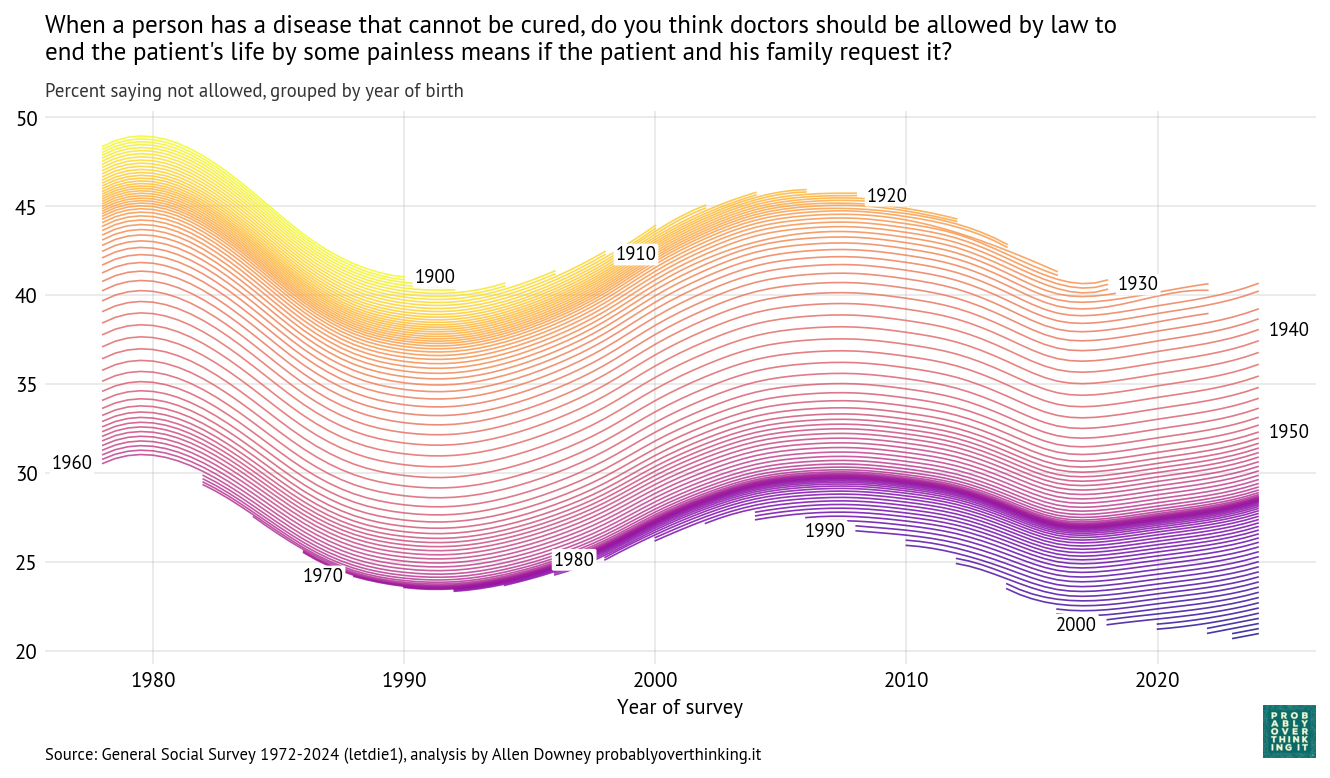
When a person has a disease that cannot be cured, do you think doctors should be allowed by law to end the patient’s life by some painless means if the patient and his family request it?
The framing of the questions is different: the first four are about the right to end one’s life and the last is about the legality of doctor-assisted suicide.
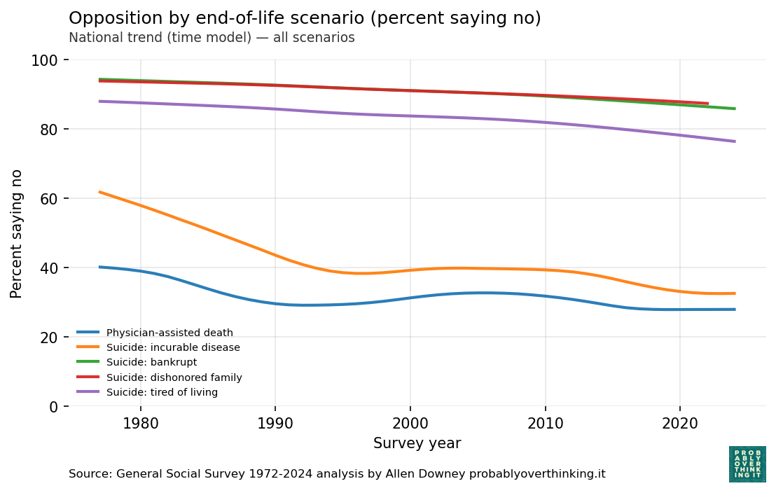
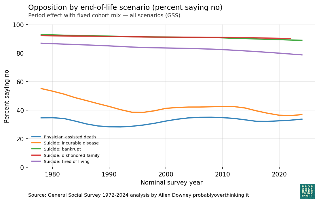
Before we look at the breakdown of period and cohort effects, here are the results from a model that estimates latent opposition to each proposition as a smooth function over time.
Opposition to suicide is high in three of the scenarios — bankrupt, dishonored family, and tired of living — and lower in the incurable disease scenarios.
In all five questions, opposition has declined over time, although for the incurable disease scenarios, it might have leveled off after 1990.
Doctor-assisted death
Now let’s see if we can decompose these changes into period and cohort effects. We’ll start with the question about doctor-assisted death when the patient has an incurable disease.
As in the previous posts, I used a Bayesian model to estimate a trajectory over time for each birth cohort, shown in the following figure.
Reading from top to bottom, we can see that opposition has declined from one cohort to the next, and reading from left to right, we can see that opposition has varied over time within each cohort.
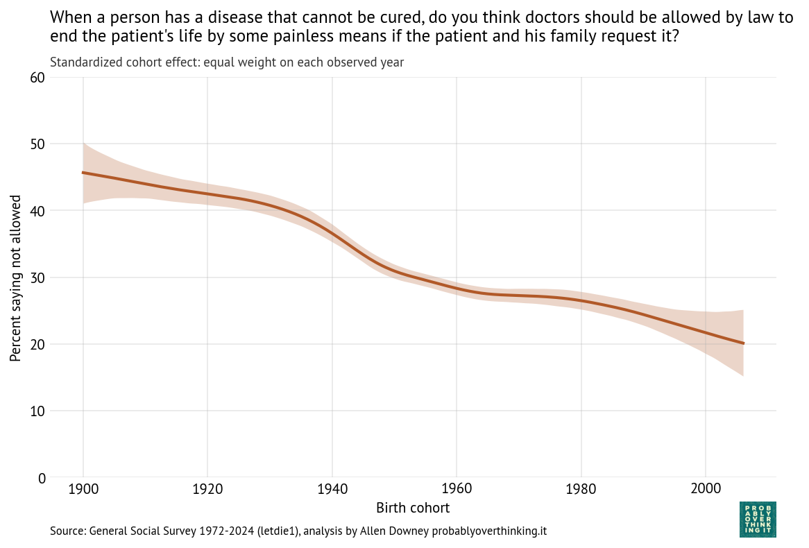
The following figure shows the cohort component alone, standardized to factor out the period effect.
Opposition to doctor-assisted suicide has declined from more than 40% in the earliest cohorts to 20% among people born in 2006.
A possible explanation for the cohort pattern is that people anchor their moral judgments to the legal environment they encounter when they are young. During the “impressionable years” of late adolescence and early adulthood, existing laws can establish a moral baseline, so that what is illegal is inferred to be wrong, and therefore should remain illegal. As a result, gradual legalization can generate long-run attitudinal change through cohort replacement: people who grow up after a practice becomes legal are less likely to see it as morally problematic.
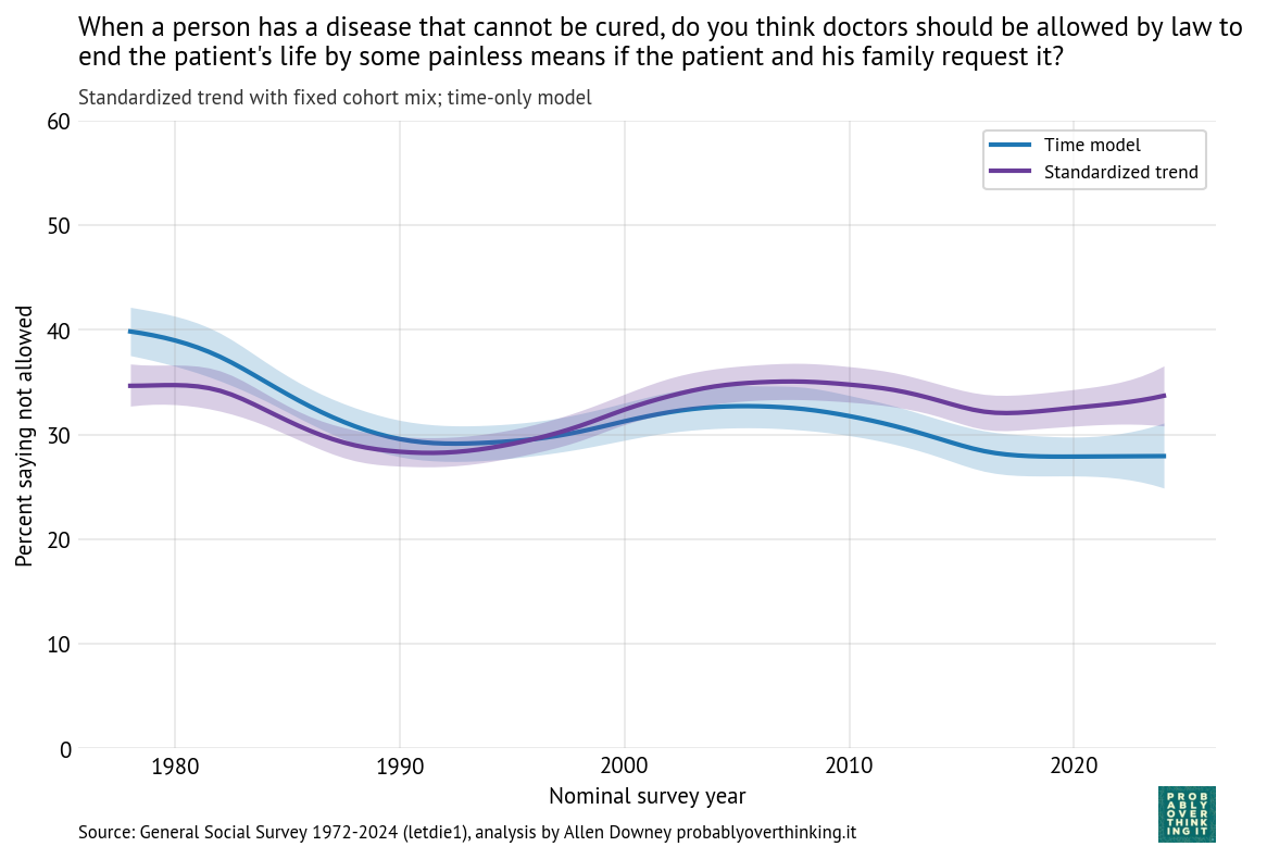
The following figure shows the period effect alone, along with the results from the time model (which includes both period and cohort effects).
Comparing the two lines, we can conclude that the decline we see over time is entirely due to the cohort effect — when we control for generational replacement, the estimated period effect has generally increased since 1990.
The increase between 1990 and 2005 might reflect increasing moral concern due to advances in life-sustaining medical technology, high-profile legal disputes like the Terri Schiavo case, and broader discussions of the sanctity of life.
The decline between 2005 to 2015 might reflect normalization of assisted dying following legalization in several states (Oregon in 1997, Washington in 2008, and Montana in 2009, Vermont in 2013), along with a shift in public discourse toward autonomy, dignity, and patient choice, reinforced by high-profile cases like Brittany Maynard.
Other Scenarios
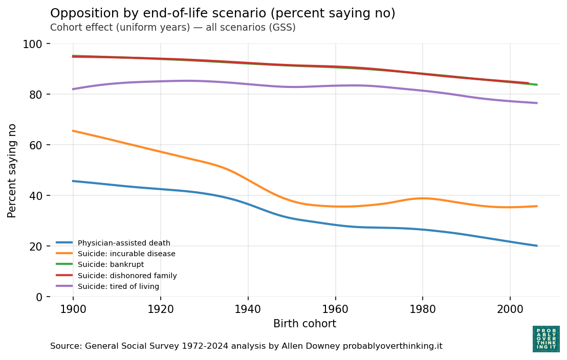
The following figure shows the estimated cohort effects for all five questions.
For the incurable disease scenario, opposition has declined from more than 60% in the earliest cohorts to less than 40% among cohorts born after 1950 — although it might have leveled off since then.
In the other scenarios, opposition has also declined from one cohort to the next, but the size of the effect is smaller.
The following figure shows the estimated period effects, controlling for generational replacement.
Since 1990, most of the period effects are small. The only exception is the “tired of living” scenario, where there is some decline over time, independent of generational replacement.
In the next post, we’ll do the same analysis with questions about abortion and the situations where it should be legal or not.
In a previous article, I claimed that Young adults are not very happy. Now the World Happiness Report 2026 has confirmed that young people in North America and Western Europe are less happy than they were fifteen years ago, and less happy than previous generations.
In this article, we’ll look at results from three related questions in the General Social Survey (GSS):
Trust: “Generally speaking, would you say that most people can be trusted or that you can’t be too careful in dealing with people?”
Fair: “Do you think most people would try to take advantage of you if they got a chance, or would they try to be fair?”
Helpful: “Would you say that most of the time people try to be helpful, or that they are mostly just looking out for themselves?”
As we’ll see, young adults in the United States have a more negative outlook than previous generations: they are less likely to say that people can be trusted, that they are fair, or that they are helpful. And we’ll consider connections between this bleak outlook and unhappiness.
Trust
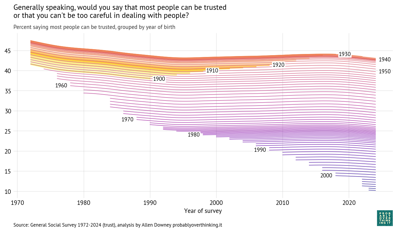
Using the same model from the previous articles, I estimated the percentage who say people can be trusted, following each birth year over time.
Cohort trajectories, percent saying most people can be trusted
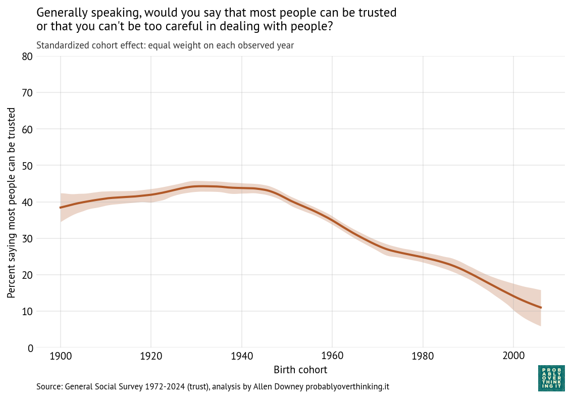
With these trajectories, we can decompose the cohort and period effects. The following figure shows the cohort effect, standardized by holding the period effect constant.
Standardized cohort effect with fixed time mix, percent saying most people can be trusted
The level of trust increased between the cohorts born in the 1900s through the 1940s, and then started a steep decline. This is a large cohort effect, dropping about 30 percentage points over 60 years.
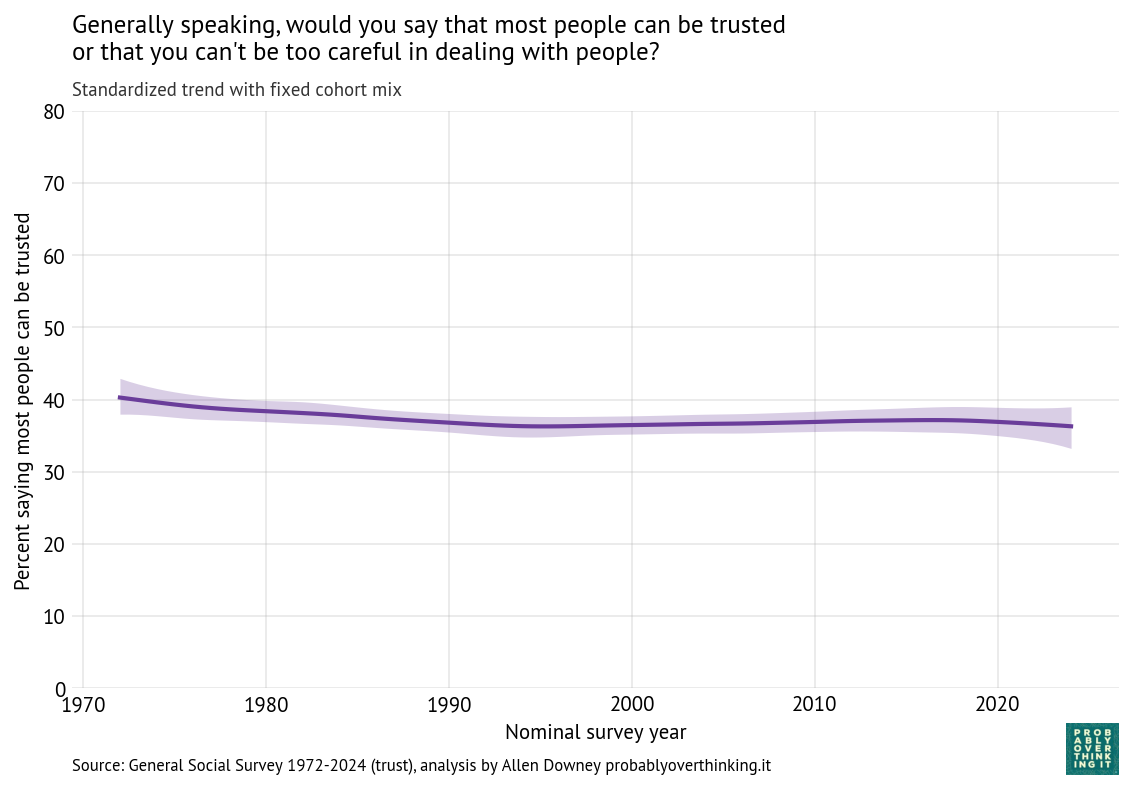
The following figure shows the period effect, standardized by holding the cohort mix constant.
Standardized time trend with fixed cohort mix, percent saying most people can be trusted
In contrast, there is almost no period effect.
The conjecture part
About my previous article, one of my former colleagues said he appreciated my attempt to offer explanations, but reminded me that with this kind of data alone, it is hard to say what causes what with any confidence. That’s true, and it’s a good reminder — but we can get some clues:
When we see a strong cohort effect and almost no period effect, that’s evidence that we’re seeing patterns set in childhood.
When we see period effects, we should look for events that affected all cohorts at the same time.
So let’s think about what was happening in the formative years of these cohorts, starting with the 1940 cohort, which was the high point in trust, before the decline:
Cohort 1940 (childhood: 1940–1960): dense local communities, strong civic and religious institutions, frequent face-to-face interaction, and shared media environment.
Cohort 1950 (1950–1970): suburbanization expands, some weakening of community density, television becomes widespread but still shared.
Cohort 1960 (1960–1980): civil rights conflict, Vietnam War, Watergate scandal, rising crime.
Cohort 1970 (1970–1990): reduced civic participation, rising inequality, more cautious parenting, less unstructured social interaction.
Cohort 1980 (1980–2000): increasing inequality, more segregation by class and education, early internet exposure, continued decline in shared institutions.
At this point a multi-generational effect comes into play — the parents of Cohort 1980, born in the 1950s and 1960s, were less trusting than previous generations of parents.
Cohort 1990 (1990–2010): widespread internet use, early social media, more structured childhood, increasing awareness of global risks.
Cohort 2000 (2000–2020): smartphones and social media throughout formative years, algorithmic content, reduced in-person interaction.
If trust is largely set early in life, then differences between cohorts reflect the environments they experienced during their first two decades.
In addition to this question about trust, the GSS includes related questions about fairness and mutual assistance.
Fair
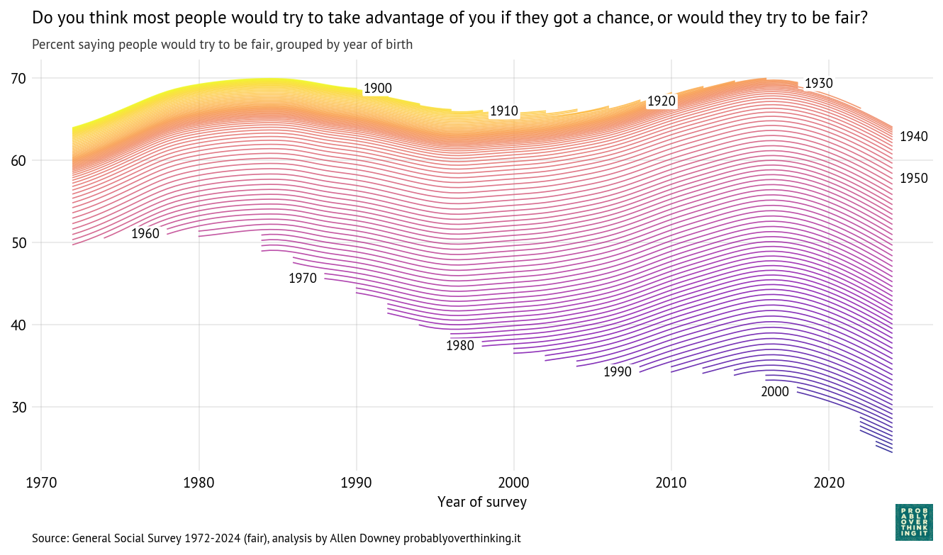
Do you think most people would try to take advantage of you if they got a chance, or would they try to be fair? The following figure shows the percentage who thought people would be fair.
Cohort trajectories, percent saying people would try to be fair
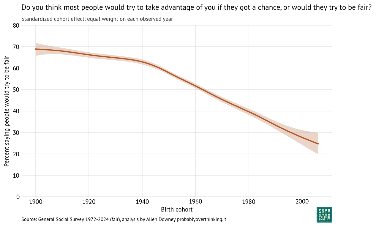
And here’s the cohort effect.
Standardized cohort effect with fixed time mix, percent saying people would try to be fair
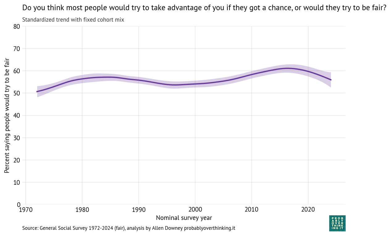
And the period effect.
Standardized time trend with fixed cohort mix, percent saying people would try to be fair
The cohort pattern is similar to what we saw in trust: small changes between the 1900s and 1940s cohorts, and then a steep decline — almost 40 percentage points over 60 years.
The period effect is relatively small, varying by only 10 percentage points from lowest to highest point, but it was generally positive until about 2015 (the onset of the Trump Era?).
Helpful
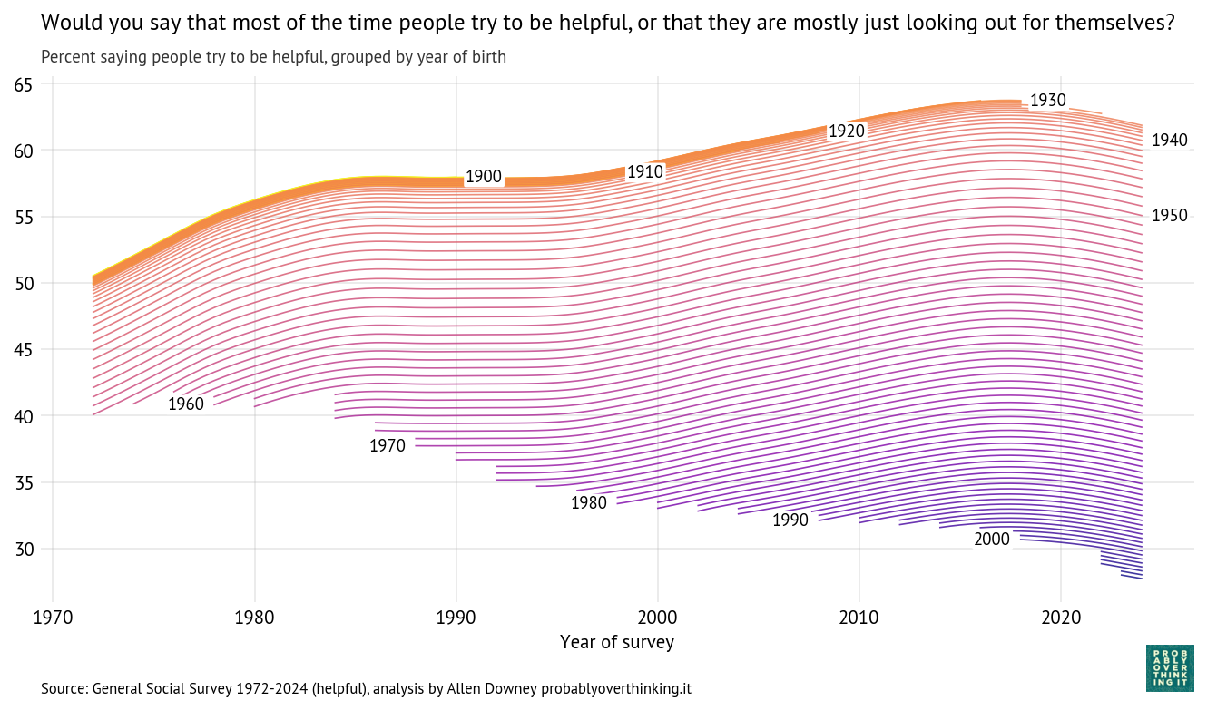
Would you say that most of the time people try to be helpful, or that they are mostly just looking out for themselves?
Here is a period–cohort fingerprint of the responses, showing the percentage who thought people try to be helpful.
Cohort trajectories, percent saying people try to be helpful
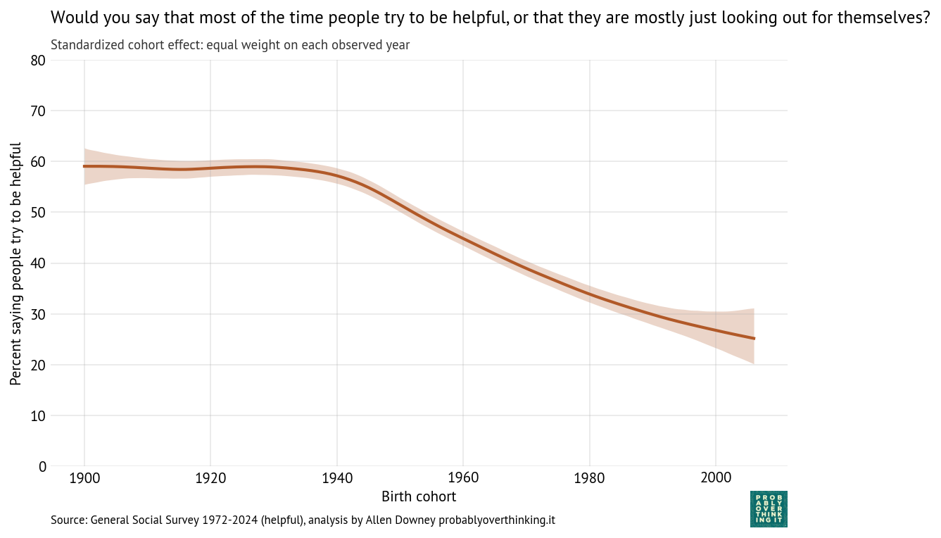
Here’s the cohort effect:
Standardized cohort effect with fixed time mix, percent saying people try to be helpful
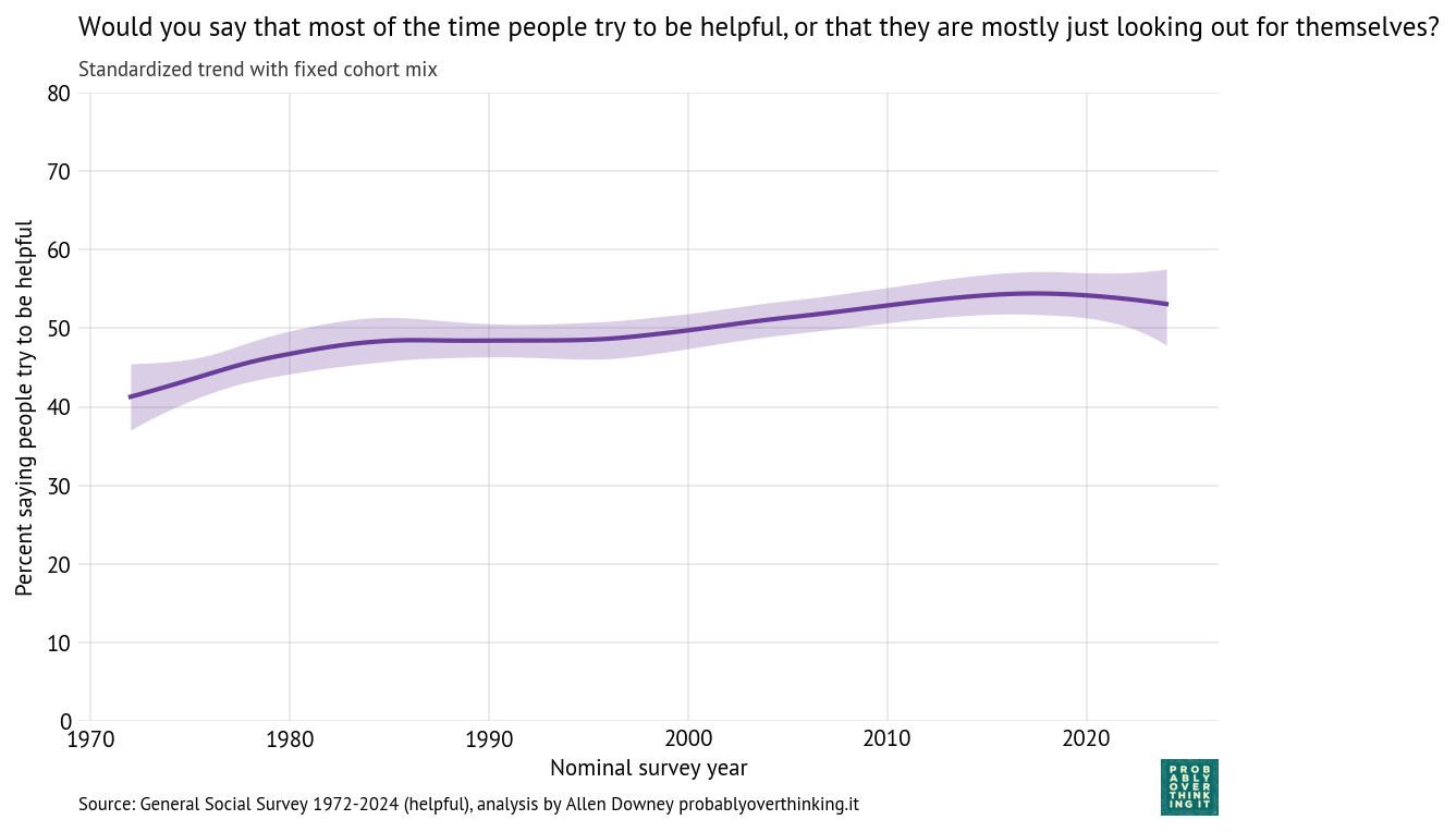
And the period effect.
Standardized time trend with fixed cohort mix, percent saying people try to be helpful
Again we see the same pattern: little change between the cohorts born between 1900 and 1940, and then a decline of more than 30 percentage points over 60 years.
And again, the period effect is comparatively small and generally increasing — but possibly declining in the most recent cycles of the survey.
Cause and Effect?
It is plausible that the decline in trust is a contributing factor to the decline in happiness. If you believe that people are out to get you, and 80% of your friends agree, that’s not a worldview conducive to a sense of well-being. And generational decline in trust precedes the decline in happiness, so it is at least a potential cause.
The decline in trust-related beliefs also supports the interpretation that recent cohorts are actually unhappy, rather than interpreting the question differently, or being more willing than previous generations to say they are unhappy.
I haven’t done full-on causal modeling to quantify these relationships, but I ran a few regression models to explore. To reduce the number of researcher degrees of freedom, I asked ChatGPT to interpret the results:
Differences in happiness across cohorts appear to be partly explained by differences in social outlook (trust, fairness, helpfulness), and these outlook variables behave like stable, cohort-structured traits rather than period-driven fluctuations.
The AI-generated summary of the experiments follows.
Model 1: Cross-sectional association (complete cases)
Specification:
Outcome: very_happy (binary)
Predictors: trust, fair, helpful (all binary)
Sample: complete cases with all variables observed
Purpose:
Estimate the cross-sectional relationship between social outlook and happiness.
Provides baseline associations without accounting for cohort or period effects.
Interpretation:
Coefficients represent conditional associations among individuals at a point in time.
Answers: Are people with a more positive outlook more likely to be very happy?
Model 2: Outlook + cohort + period (restricted sample)
Specification:
Outcome: very_happy
Predictors:
trust, fair, helpful
cohort_c (mean-centered birth year)
year_c (mean-centered survey year)
Sample: respondents born ≥ 1940 with complete data
Purpose:
Assess whether the outlook–happiness relationship persists after accounting for:
Cohort effects (differences across birth cohorts)
Period effects (changes over survey years)
Interpretation:
Coefficients for outlook variables reflect within-cohort, within-period associations.
Cohort and year coefficients capture linear trends in happiness after controlling for outlook.
Answers:
Are outlook variables still associated with happiness after adjusting for historical context?
Is there an independent cohort or period trend?
Model 3: Cohort + period only (no outlook variables)
Specification:
Outcome: very_happy
Predictors:
cohort_c
year_c
Sample: respondents born > 1940 (larger sample since outlook variables not required)
Purpose:
Estimate total cohort and period effects on happiness without controlling for outlook.
Provides a baseline for comparison with Model 2.
Interpretation:
Cohort and year coefficients reflect combined (direct + indirect) effects.
Comparing to Model 2 shows how much of these effects are accounted for by outlook variables.
Answers:
How does happiness vary across cohorts and over time in aggregate?
How much do these patterns change when outlook is included?
Key Findings
Positive social outlook is associated with higher happiness.
Trust, fairness, and helpfulness all have positive and statistically significant associations with being “very happy.”
Estimated odds ratios:
Trust: ~1.25
Fairness: ~1.36 (strongest)
Helpfulness: ~1.29
These effects are modest in size and explain a small fraction of overall variation (Pseudo R² ≈ 0.016).
These relationships are stable across cohorts and time.
Adding cohort and survey year controls has little effect on the coefficients.
This suggests the outlook–happiness relationship is primarily cross-sectional, not driven by historical shifts.
Cohort and Period Effects
Without controlling for outlook:
Later cohorts are less likely to report being very happy.
There is also a negative period trend (declining happiness over time).
With outlook variables included:
The cohort effect becomes small and statistically insignificant.
The period effect remains negative and significant.
Interpretation
Outlook variables appear to mediate cohort differences in happiness.
Later cohorts tend to report lower trust, fairness, and helpfulness.
These differences account for much of the observed cohort decline in happiness.
Period effects persist independently.
There is a modest downward trend in happiness over time that is not explained by outlook variables.
Data Considerations
Approximately 40% of observations are missing at least one outlook variable, reducing the complete-case sample.
This raises the possibility of selection bias in the estimates.
Bottom Line
A more positive view of others (trust, fairness, helpfulness) is consistently associated with higher happiness.
Differences in these outlook measures help explain why later cohorts report lower happiness.
However, there is also an independent downward trend in happiness over time.