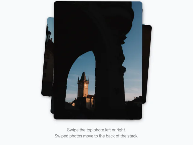
Card stack
A fanned card stack navigated with carousel controls and a top-left pop between cards.
API reference
Components
<CardStackCard />
One card in the stack. Must be rendered inside CardStack.
children?
Card face content.
className?
Merged onto the card face.
<CardStack />
Stack stage with keyboard-reachable carousel group and fan geometry.
state
Card-stack controller from useCardStack.
children?
CardStackCard children, one per card.
visibleBehind?
Cards behind the front that stay visible. Defaults to 2.
cardGap?
Vertical push per step back, in px. Defaults to 16.
cardScaleStep?
Scale shed per step back. Defaults to 0.05.
fanRotation?
Fan rotation per step back, in degrees. Defaults to 4.
cardMinHeight?
Front card min-height for stage sizing. Defaults to "19rem".
label?
aria-label for the carousel group. Defaults to "Card stack".
className?
Merged onto the stack group element.
Hooks
useCardStack
Headless controller for front-card index and movement direction.
useCardStack(options: { total: number }): CardStackHandleReturns
index
Current front-card index (0-based), wrapped into [0, total).
direction
Direction of the last move: 1 forward, -1 backward.
movement
Monotonically increasing movement count.
total
Total number of cards.
advance
Advance the stack by dir (1 next, -1 previous).
next
Advance to the next card.
prev
Return to the previous card.
Featured in
See the card stack composed into full sections.