

Introducing EZ Storyboard: The Tool I Wish I Had Before Making AI Music Videos

Over the past year, I’ve spent a lot of time making AI-generated music videos.

At first, I thought the hardest part would be getting AI to generate good images and videos.

It wasn’t.

The harder part was keeping everything organized.

A three-minute music video can easily contain dozens of scenes. Each scene may need a first-frame image, a last-frame image, a video prompt, reference images, and multiple generation attempts before I finally get something I like.

Pretty quickly, the workflow starts getting messy.

I would have:

  • prompts scattered across browser tabs and text files
  • reference images buried in folders
  • multiple versions of the same scene
  • downloaded files with meaningless names
  • no easy way to remember which settings produced the version I liked
  • no simple way to see the structure of the whole video at once

The AI models kept getting better, but the workflow around them still felt primitive.

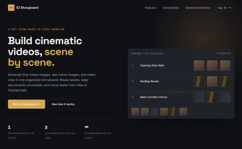
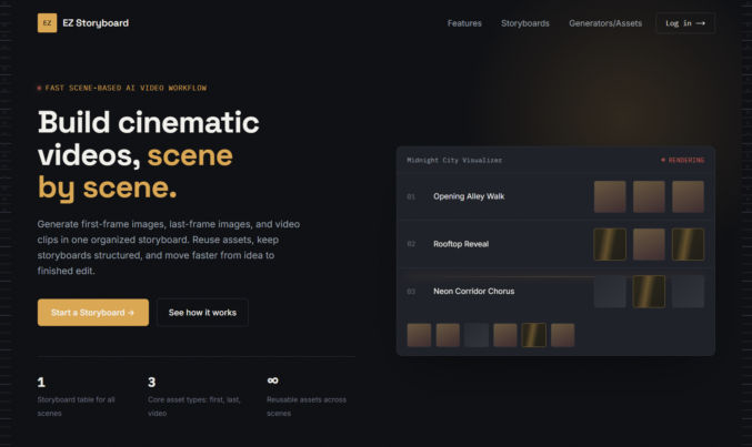
So I built EZ Storyboard.

The realization: I’m not really making one video

When people see an AI-generated music video, they sometimes imagine that I type a prompt and an AI generates the whole thing.

That’s not how it works.

In practice, I’m building the video scene by scene.

For one scene, I may first generate an image.

Then I may regenerate it several times until the composition is right.

Then I might create a different final frame.

Then I animate the first and last frame into a video.

If the motion isn’t right, I regenerate the video while keeping the images.

Then I move on to the next scene.

Repeat that dozens of times.

Eventually, I bring all those clips into something like CapCut and edit them together into the finished music video.

Once I started thinking about the workflow that way, the structure of EZ Storyboard became pretty obvious.

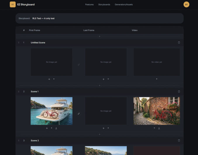
One row per scene

Every project in EZ Storyboard is a storyboard.

Each row represents one scene, and each scene has three main assets:

  • First Frame
  • Last Frame
  • Video

That’s it.

Instead of thinking about folders full of files, I can look at one table and immediately understand the state of the video.

I can see which scenes are complete, which ones still need an ending frame, which videos are rendering, and which scenes I haven’t started yet.

This also makes it much easier to think about pacing.

If I decide that I need another shot between scene 8 and scene 9, I can insert one right there instead of creating a new scene at the bottom and dragging it through a long list.

Scenes can also be reordered by dragging them into place.
Generate images directly inside the scene

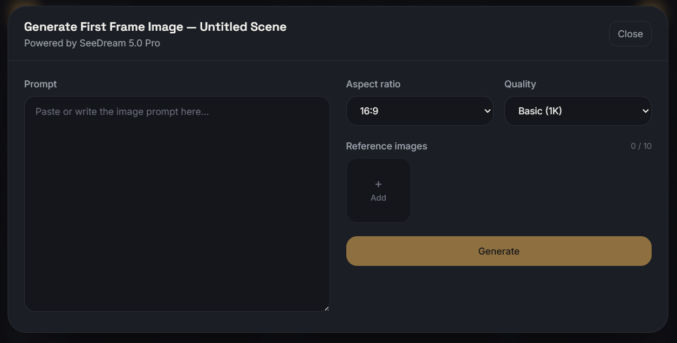
For images, EZ Storyboard currently uses Seedream 5.0 Pro.

Each First Frame and Last Frame cell has its own Generate button.

I can write a prompt, add up to 10 reference images, choose the aspect ratio and quality, and generate the image without leaving the storyboard.

This is especially useful for character consistency.

When I’m making a music video, I may have a character sheet for the singer, another reference image for the location, and maybe another image showing the outfit or lighting style I want.

Instead of repeatedly uploading those files every time I create a new shot, I can keep them in the asset library and reuse them.
Generate the video from the frames

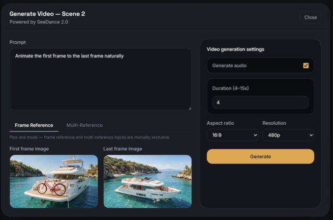
Once I have the first and last frames I want, I can generate the video directly from the same row using Seedance 2.0.

There are two generation modes.

Frame Reference

This is the mode I expect to use most often.

It uses the scene’s own First Frame and/or Last Frame to generate the video.

For example, I might have:

  • the singer standing in one position at the beginning
  • the singer farther down the street at the end

Then I ask Seedance to create the motion connecting those two images.
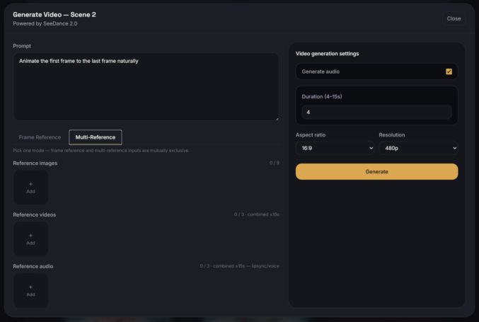
Multi-Reference

Some scenes are more complicated.

For those, I can provide up to:

  • 9 reference images
  • 3 reference videos
  • 3 reference audio clips

along with controls for duration, resolution, aspect ratio, and audio generation.

Audio references are particularly interesting for shots involving singing or speech.
Regeneration was one of the biggest things I wanted to fix

One thing I’ve learned from making AI videos is that you almost never get the perfect result on the first try.

Sometimes I generate the same image five times.

Sometimes the image is perfect, but the video motion is wrong.

Sometimes I just want to change one sentence in the prompt and try again.

That sounds simple, but it gets annoying when every regeneration means rebuilding the entire prompt and configuration from scratch.

So when I reopen a generator in EZ Storyboard, it remembers what created the current asset.

The prompt comes back.

The reference images come back.

The settings come back.

If the previous attempt failed, even that attempted configuration is preserved.

Regenerating becomes editing rather than starting over.

That sounds like a small feature, but after hundreds of generations, it saves a lot of time.

Sometimes I generate first and decide where it belongs later

Not every image starts as part of a specific scene.

Sometimes I just want to explore.

For example, I may generate:

  • several outfits for a singer
  • different versions of a palace
  • ten possible establishing shots
  • alternate lighting styles
  • different character poses

For that, EZ Storyboard also has standalone Image Generator and Video Generator pages.

Anything generated there goes directly into the asset library and can be assigned to a storyboard later.

Bulk image generation

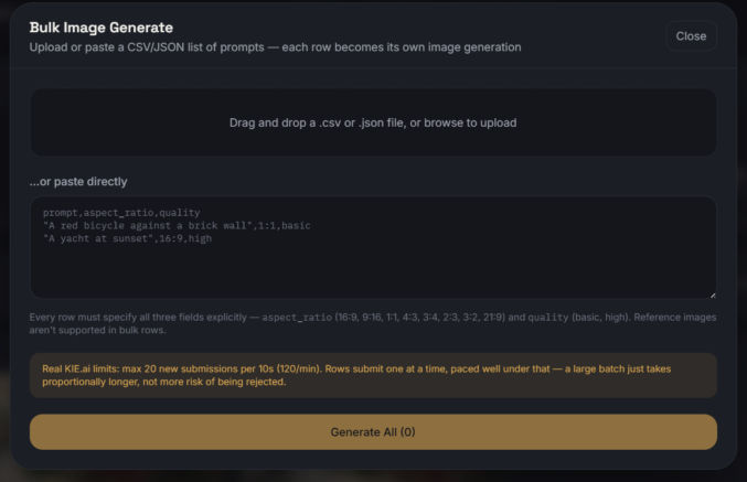
There are also times when I already have a long list of prompts.

Maybe I want to generate twenty storyboard images from a shot list.

Doing them one at a time is tedious.

The Bulk Image Generator accepts CSV, JSON, or pasted text and processes the prompts row by row.

Each row shows its own status, so if one generation fails, the others keep going.

This is especially useful when I’ve already planned an entire sequence and just want to start generating options.
One asset library for everything

This was another problem I kept running into before building the app.

When you’re generating hundreds of assets, eventually you lose track of where everything came from.

EZ Storyboard keeps images, videos, and audio in one asset library.

I can filter them by:

  • asset type
  • storyboard
  • or everything across all projects

More importantly, a generated asset doesn’t just remember the file.

It remembers:

  • the prompt
  • generation settings
  • reference images
  • reference videos
  • reference audio

So if I create a shot I really like, I can see exactly how I made it.

There is also a one-click button to copy the prompt.
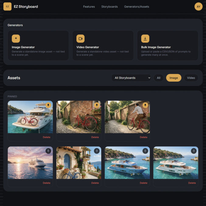
Pinning the assets I use all the time

Certain references get reused constantly.

For example:

  • a singer’s character sheet
  • a particular outfit
  • a location reference
  • a style reference

Those can be pinned.

Pinned assets stay near the top of the asset library and also appear first when I’m choosing references during generation.

It sounds trivial until you have fifty or a hundred files in a project and keep scrolling past all of them looking for the same character sheet.

Small workflow details matter

A lot of the features in EZ Storyboard came from annoyances I encountered while actually making videos.

For example, generated images can be several megabytes each.

Loading dozens of full-resolution images just to display tiny storyboard previews would be unnecessarily slow, so the app automatically serves optimized thumbnails while keeping the original files intact.

Generated assets are also private by default and served through temporary signed links rather than public URLs.

And if I delete a scene, the associated generated assets don’t disappear.

They stay in the asset library.

I’ve accidentally deleted or replaced things enough times while experimenting with AI that I specifically didn’t want scene organization to determine whether an asset continued to exist.

What EZ Storyboard does — and what it doesn’t

I didn’t build EZ Storyboard to replace every part of video production.

It doesn’t try to write my prompts for me.

It doesn’t replace the final video editor.

I’m still going to assemble the finished clips in CapCut or whatever editor I happen to be using.

What EZ Storyboard handles is the part in between:

generating, iterating on, and organizing all the individual scenes that eventually become the finished video.

That was the part of AI video production that kept becoming more tedious as the models themselves became more capable.

Why I built it

The funny thing about AI video right now is that the generation technology is moving incredibly fast.

Models can already produce shots that would have seemed impossible just a couple of years ago.

But making a full video still involves a surprising amount of manual organization.

The bottleneck is increasingly not:

Can AI generate this shot?

It’s:

Can I keep track of the 60 shots, 150 images, 30 reference files, and multiple generations that make up the project?

That’s the problem EZ Storyboard is meant to solve.

I built it because I wanted it for my own projects.

Now it’s live for anyone else who has the same problem.

Try it: ezstoryboard.com

Here’s one music video I made using the same techniques, though I made it the hard way, before I built ezstoryboard.com.
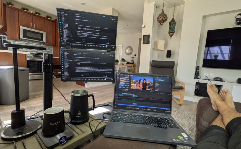

My 3-Screen, Comfy, Sofa-Side WFH Workstation Setup

Since the COVID pandemic, I’ve had to have a permanent home office. After trying different setups, I settled on the following, which included two 32″ 4K monitors and a 15″ MacBook Pro. This works great for intense, manual work, but it wasn’t the most comfortable setup, even with that thick-cushioned office chair. It was also annoying to have to get up from the sofa while watching TV just and walk over to my desk to some urgent work or respond to a message that was easier done from my workstation rather than my phone.

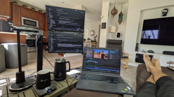
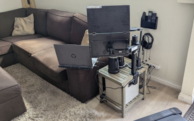
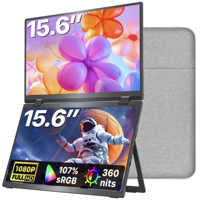
I thought about adding a traditional monitor to my sofa end table, but they are too big. Fortunately, they are lightweight, slim monitors that look like laptop screens that are perfect for mounting to a monitor stand on a sofa end table, as shown below.

Now, I can work from the comfort of my sofa during the day, when I’m doing intense work, and at night, doing casual work while watching TV.

Choosing the right screen and arm was tricky. If you like to copy my setup, here are the products I chose and why.

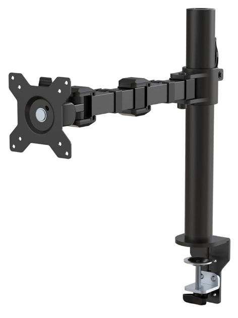
Amazon Basics Single Computer Monitor Stand with Cable Management, Height Adjustable VESA Desk Arm Mount, Fully Adjustable Tilt and Rotation, Steel, Black, Fits 13-30″ Screens

I bought this stand on Amazon for $22.50 (Used – Like New) because it was cheap and versatile. I could slide the arm up and down the pole and rotate the arm at the two hinges and tilt the VESA mount vertically.

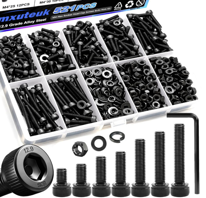
Note: this monitor stand is designed for traditional flat-screen monitors, not thin laptop screens. The provided screws were too long to screw into my screen below. So, I ended up buying M4-0.7 6mm socket cap screws from Home Depot. I used 4 of the provided spacers because even the short 6mm screws were too long.

They’re expensive at Home Depot, so I’m going to buy this assortment from Amazon and return the Home Depot ones.

kksmart Portable Monitor 15.6″ HDMI USB-C VESA Compatible Built-in Speaker, 15.6in

I bought this foldable dual monitor for $300 on Amazon. What’s really impressive is the picture quality and brightness. Text is sharp, but if you want full brightness, you’ll need to plug in the supplied USB power plug. My Windows laptop (bought at Costco) specs are

  • Device name LegionRTX5060
  • Processor Intel(R) Core(TM) Ultra 9 275HX (2.70 GHz)
  • Installed RAM 32.0 GB
  • Graphics card NVIDIA GeForce RTX 5060 Laptop GPU (8 GB)
  • Intel(R) Graphics (128 MB)
  • Storage 1 TB
  • System type 64-bit operating system, x64-based processor

I can power both screens with just one USB-C DP (Display Port) cable (supplied).

The dual monitor also comes with a carrying case, which is great for traveling.

IKEA KIVIK Sectional Sofa

I bought the IKEA Kivik sectional sofa because I liked the price, the comfort, the matching ottoman, and the very wide armrest, which was necessary to serve as a

  • a surface for my laptop
  • a surface to place a plate or bowl of food, like popcorn, while watching a movie

IKEA KIVIK Ottoman

Temperature-controlled Coffee Mug

I don’t like room-temperature or slightly cold coffee. I’ve tried the Ember mugs, but I’ve been disappointed with the quality, so I switched to the iKago Coffee Cup Warmer & Mug Set. It works reliably and maintains a precise beverage temperature.

Overall, I highly recommend this setup and these particular products if you’re looking to create a comfortable WFH workstation where you can lay back on your sofa, rest your feet up on a soft, comfy ottoman, and work, which, for me, is mostly telling AI to work for me 🙂

WatchWise: Watch YouTube More Efficiently

A free Chrome extension that helps you decide if a video is worth watching, generate summaries, and jump directly to the topics that matter.

Every day I watch YouTube to learn something.

Programming.
AI.
Home improvement.
Real estate.
Finance.

The problem isn’t finding videos.

It’s figuring out whether a 45-minute video is actually worth watching.

Too often I click a promising title only to discover:

  • the answer could have been explained in 3 minutes,
  • the title exaggerates what the video actually delivers,
  • half the video is filler.

After wasting enough hours on videos like this, I decided to build a small tool, a Google Chrome extension, myself.

I call it WatchWise.


What WatchWise Does

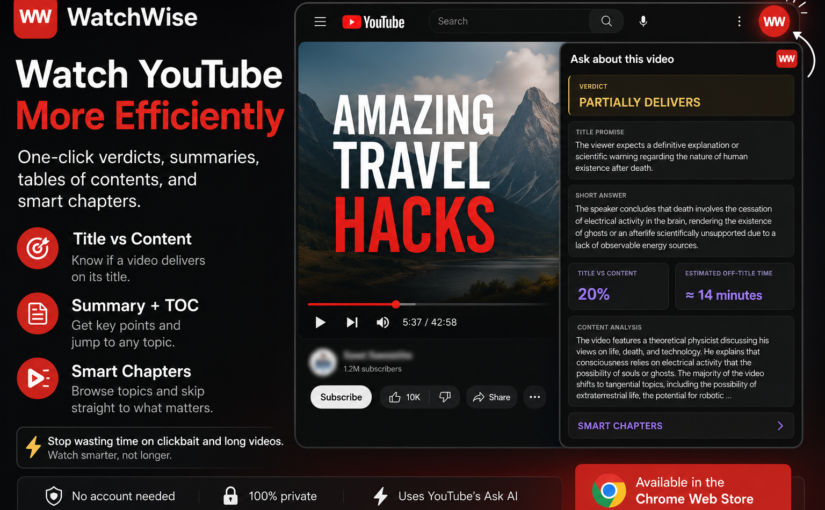
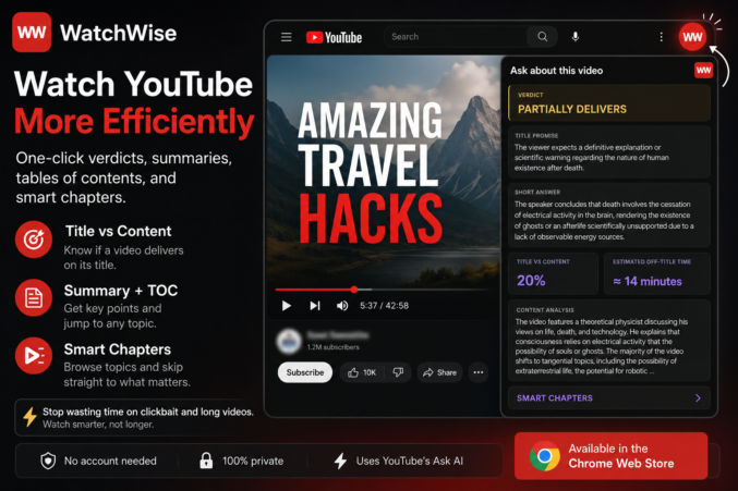
WatchWise adds a small, red WW button to YouTube, located in the top-right corner.

One click expands the WatchWise panel, giving you three built-in tools.

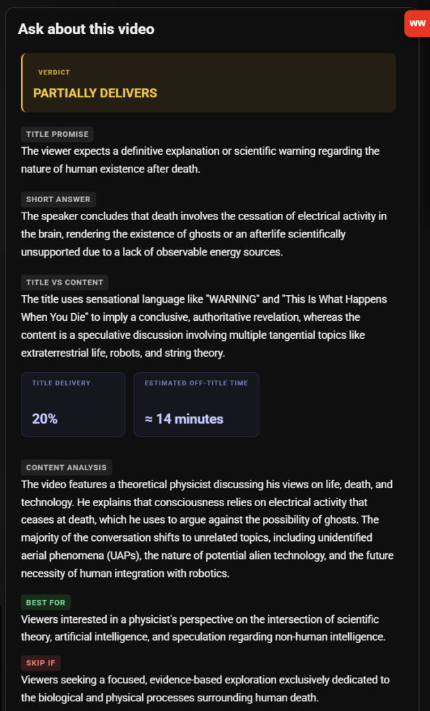
1. Title vs Content

Instead of guessing whether a video delivers on its title, WatchWise asks YouTube’s built-in AI and formats the result into an easy-to-read report.

It tells you things like:

  • Does the content actually match the title?
  • How much of the video stays on topic?
  • How much time is spent on filler?

Here’s a screenshot explaining why a particular video is mostly clickbait and a waste of time to watch.


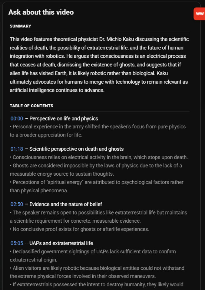
2. Summary + Table of Contents

Sometimes you don’t need to watch the entire video.

WatchWise generates:

  • a concise summary
  • an organized table of contents
  • bulleted list of key takeaways for each section
  • clickable timestamps

You can immediately jump to the section that interests you.


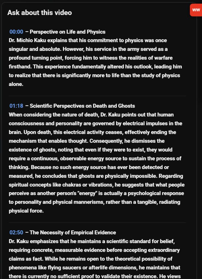
3. Smart Chapters

For long interviews and podcasts, WatchWise organizes the discussion into structured sections that read almost like an article.

Instead of scrubbing through a one-hour conversation, you can browse topics and decide where to start.


Why I Built It

This isn’t another AI chatbot.

It simply makes YouTube’s existing “Ask about this video” feature much easier to use.

Instead of writing prompts every time, I click one button.

That’s it.


Privacy

WatchWise:

  • doesn’t require an account
  • doesn’t collect personal information
  • doesn’t use analytics
  • doesn’t send data to my own servers

Everything happens inside your browser using YouTube’s existing Ask AI feature.


Try It

You can install WatchWise free from the Chrome Web Store.

Chrome Web Store:
https://chromewebstore.google.com/detail/watchwise/baclglojkadoiopgnjakdajnjlbcgekc


Final Thoughts

I originally built WatchWise for myself because I was tired of wasting time on clickbait and overly long YouTube videos. I also wanted a short executive summary in bulleted list format with clickable timestamps as well as a longer summary.

If it saves other people time too, then it has already accomplished its goal.

How to Vibe Code a Web App Using OpenCode

This is not a “build an app in 10 minutes” post. It’s a realistic guide to using AI coding agents the way you’d use a junior engineer: with specs, guardrails, and review.

In this post, I explain how to vibe code a web app using the following tools:

  • ChatGPT Plus/Pro (for planning, strategy, technical architecture, debugging, coding, and explaining everything)
  • OpenCode (AI coding agent)
  • Agent.md (to guide coding agent)
  • OpenRouter (AI coding models, e.g., Claude Opus 4.5, GPT 4.5 Codex, etc)
  • Supabase (for PostgreSQL database, if needed)
  • Supabase Storage (for file storage, if needed)
  • Supabase Auth (for user logins/account management, if needed)
  • Statis HTML, CSS, and JS (for front-end)
  • Embedded JavaScript (EJS) (for header/footer partials)
  • Express.js (for API-based backend)
  • express-ejs-layouts (if you want template layout functionality)
  • Render.com (for hosting both frontend and backend)
  • Stripe (for payments)
  • 3rd-party APIs (like kie.ai for text-to-image AI generation)
  • VS Code (code editor)
  • Resend (send emails using an API)
  • Zoho Mail (receive emails)
  • ImageKit (image optimization)

Note

You can use Next.js for both front-end and backend code using React and Next.js server actions, but for simplicity, I prefer to use static HTML, CSS, and JS for the front-end and Express.js for the backend. Also, you can use Typescript, but for simplicity, I prefer not to. I think these choices are fine for small apps. They definitely allow for faster vibe coding and simplify the codebase, which reduces the surface area for errors to occur, both during development and in production. If I used Next.js, I would host the app on Vercel, but since I’m not, I will host both the static frontend and Express.js backend/app server on Render.com, which simplifies deployment (push from GitHub, no CORS issues, free plan).

There are many, many, many ways to code/vibe code a web app, including using Claude Code, Cursor, Continue.dev, Gemini Antigravity, Gemini Conductor, and Agent Zero. The approach in this post is just the way I’ve found to work for me for now.

App Idea

First, you need an app idea. Consult with ChatGPT regarding the business strategy, pros, cons, and anything else you have on your mind. If you are a solopreneur, it’s probably best to keep your app simple enough that you can manage it yourself. For example, you can create an app that lets people upload an image of the front of their home and redesign their curb appeal by changing exterior paint color, yard design, and driveway design using an AI text-to-image generator like Nano Banana Pro.

User Flow & Functionality

Discuss the user flow and app functionality with ChatGPT until you decide on the details that you want for your app.

Tech Stack

Discuss with ChatGPT what tech stack you should have for your app. In my case, I prefer the stack listed above.

UI

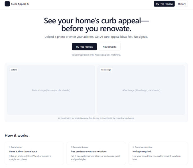
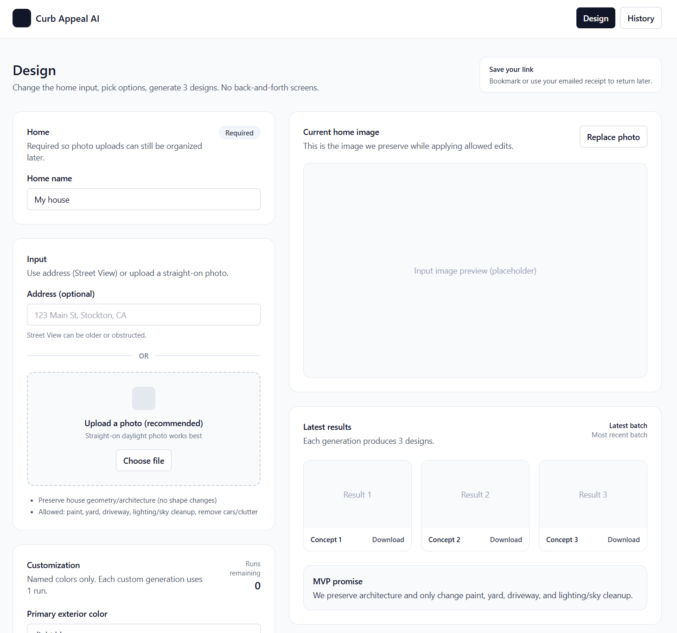
Once you’ve decided on an app idea, ask ChatGPT to give you basic grayscale page designs using shadcn/ui and Tailwind UI components/blocks. You can try to use Google Stitch to generate more polished designs, but if you can’t, just start with a basic grayscale design first. ChatGPT can give you HTML + Tailwind CSS for these designs. For dev purposes only, just use the Tailwind CSS CDN to save time. Here are some example basic designs. Before going live, switch to compiled CSS using Tailwind.

Unique Interactive Elements

To minimize errors and guessing when the AI coding agent codes your app, have ChatGPT update all interactive elements (buttons, links, etc) with unique attributes so that the AI coding agent can uniquely target each element. For example, for buttons, have ChatGPT add a data-action attribution, e.g., <button data-action=”upload-image”…>

Database

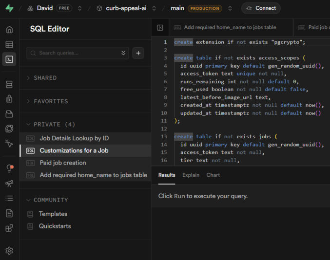
If your project requires a database, ask ChatGPT to propose a database schema. If you agree with the schema, have ChatGPT give you a SQL script to create all tables and constraints. Save the script in a file like 001_init.sql. For the database, I prefer Supabase PostgreSQL for its simplicity.

  1. Create an account at Supabase.com.
  2. Create a project
  3. Click SQL editor
  4. Paste the SQL script and run it to create the database tables.

File Storage

If you need to store files online, like PDFs or images, there are many options, like AWS S3 and Cloudflare R2 (similar to S3 but cheaper). If you’re already using Supabase for your database, you can just use Supabase Storage to store files.

  1. Click “Storage”
  2. Click “New Bucket”
  3. Enter a bucket name
  4. Make sure to make the bucket public if your users or app code needs to access files in it

Authentication

Discuss with ChatGPT the best way to handle authentication and user account management. If you need the usual auth with logins, you can use Supabase Auth. But, if you just need a simpler auth mechanism, like using access tokens, you can do that as well. Discuss the pros and cons of each option with ChatGPT and pick one.

Payments

If you will be accepting payments in your web app, you’ll need a payment processor. Everyone seems to use Stripe for this. It has a test mode, which simplifies testing.

Emails

Your app will most likely need to send emails. There are many popular 3rd-party API-based email service providers, including Resend, Postmark, and Mailgun. I personally prefer Resend for its simplicity. For receiving emails, I do not recommend Resend. It’s too complex for that. When you’re starting off and don’t want to spend a lot of money, you can use Zoho Mail for receiving email. Setup was super simple. In my case, I set up an email address in Zoho and forwarded it to my personal Gmail, keeping a copy in Zoho Mail. Then, in Gmail, I added a “Reply as” account so I could reply to emails using my app’s domain, e.g., support@zabuun.com.

Image Optimization

If you use Next.js, it can automatically optimize images for you. If you don’t use Next.js, or if you prefer to separate the image optimization process, there are many options available, including ImageKit, Cloudinary, and TwicPics. I personally prefer ImageKit. You can still host your images in Supabase Storage or S3 and use them as a custom origin in ImageKit.

3rd-party APIs

If you’ll be dependent on external APIs, like a text-to-image generator using Nano Banana Pro, decide on which APIs to use. I’ve been using KIE because the UI is simple and it’s cheaper than fal.

Project Folder

On your computer, create a folder for your project, e.g., curb-appeal-ai. Add the SQL script to it in a folder called “sql”, e.g., curb-appeal-ai/schema/001_init.sql

Environment Variables

Ask ChatGPT for a list of all environment variables you’ll need for the app, e.g.,

  • SUPABASE_URL=
  • SUPABASE_SERVICE_ROLE_KEY=
  • SUPABASE_STORAGE_BUCKET=
  • STRIPE_SECRET_KEY=
  • STRIPE_WEBHOOK_SECRET=
  • KIE_API_KEY=
  • KIE_BASE_URL=
  • KIE_SUBMIT_PATH=/api/v1/jobs/createTask
  • KIE_POLL_PATH_TEMPLATE=/api/v1/jobs/recordInfo?taskId={id}

Create a .env.example file and a .env file in your project folder, create accounts with each 3rd-party provider (Supabase, KIE, Stripe, etc) and add the values for each of the required variables to your .env file (not your .env.example file)

.gitignore

Create a .gitignore file in your project folder and add any files/folders you don’t want to commit, e.g.,

  • node_modules
  • .env
  • .DS_Store

AGENTS.md

Have ChatGPT create an AGENTS.md file in the project folder, following the format at AGENTS.md, containing all the coding guidelines the AI coding agent will need to successfully code the app without any guessing. Ask ChatGPT if any part of the guidelines and initial setup would require the coding agent to guess/infer anything while coding. If ChatGPT says yes, then resolve them now and add any necessary clarifications to AGENTS.md.

Data Formats

Different APIs have different request and response formats. For all APIs you’ll be using, have ChatGPT add each format, e.g., JSON schema, for each API to the AGENTS.md file so the AI coding agent won’t guess what the structure is like.

Logging

Tell ChatGPT to add a logging specification to AGENTS.md so the AI coding agent will log EVERYTHING to the terminal, which will help significantly with debugging.

Initialize your project

  • Open your project folder in VS Code
  • Open a terminal
  • git init
  • git add .
  • git commit “first commit”

OpenCode

Follow the instructions at OpenCode to install OpenCode. Or, just ask ChatGPT how to install OpenCode.

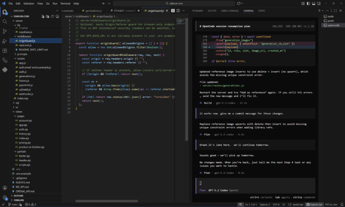
I like to run OpenCode in a VS Code terminal in a separate terminal beside other terminals I use for other purposes, like starting a dev server. In the screenshow below, you can see I have a terminal window for OpenCode and one for Node. I like to have my file explorer on the left, code editor in the middle, and terminals on the right.

AI Model

To use OpenCode, you need to connect to a model. You can use the OpenRouter API with OpenCode to easily switch between models like Claude, Gemini, and GTP Codex. However, you’ll have to buy and pay with credits. A cheaper solution is to use a ChatGPT Plus subscription, which is what I’ve been doing.

OpenCode + OpenRouter

You can use many different AI models with OpenCode, however, you’ll probably want to stick with the best models for web development, which are ranked here. Currently, Claude Opus 4.5 is the best model, but it’s expensive. I’ve been using GPT 5.2 Codex, which is good and cheaper than Opus. Gemini 3 is probably just as good. Instead of creating an account with each LLM provider, it’s easier to just create an account with OpenRouter, which allows you to pay in one place and use a single API key while giving you access to all of the models it supports.

In VS Code,

  1. open a terminal
  2. type “opencode” to launch the OpenCode TUI (Terminal User Interface)
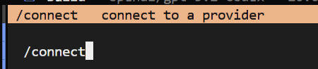
  3. type “/connect” to connect to an LLM provider

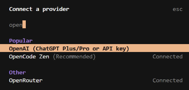
4. type “openrouter” to filter the list and click on “OpenRouter”

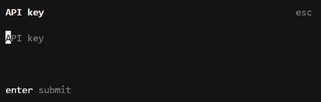
5. Copy/paste your API key from OpenRouter and hit Enter.

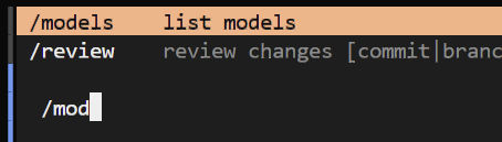
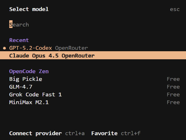
6. type “/models” to view the list of available models

7. Search/browse for the model you want and click on it.

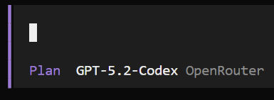
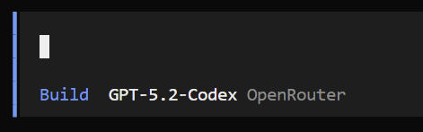
OpenCode has 2 modes: Plan and Build. Click the tab key to switch between modes.

The Plan mode reads your codebase, creates an AGENTS.md file if you don’t already have one, asks questions, and creates a coding plan. It doesn’t modify any files.

The Build mode is for coding.

If you enter a prompt in OpenCode and you get a “User not found” error, then you pasted your API key incorrectly. Re-enter your API key and try again.

OpenCode + ChatGPT Plus/Pro

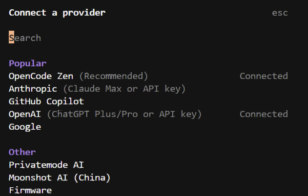
To connect OpenCode to a ChatGPT Plus web subscription, type /connect to open the “Connect a provider” modal. Search for “OpenAI (ChatGPT Plus/Pro or API key) and click it. A link will appear. Open the link in a browser and log in to your ChatGPT account. That will connect OpenCode to your ChatGPT Plus/Pro web subscription account. I find this to be much cheaper than buying credits.

Plan

Switch to Plan mode by hitting the tab key. Ask ChatGPT to guide you through planning and development. In Plan mode, the agent can’t edit any files. Whenever you start a new OpenCode session, always tell the agent to read through AGENTS.md and, optionally, to audit the codebase. You can say things like

  • Read the AGENTS.md file and all files in the repo to get up to speed on what this app is about and what has been done
  • Let’s build this app one step at a time following a typical user flow, e.g., 1) sign up, 2) log in, 3) use app, etc
  • The “Forgot Password” feature gives an error. See attached screenshot. Please debug and propose a fix.
  • Modularize all header and footer HTML into partials using EJS

Build

When you are ready to have OpenCode code, switch to the Build mode. You can say things like

  • implement the plan you just described in Plan mode

Test & Debug

When OpenCode is done coding, you will need to test your app. I like to follow the following workflow:

  1. Test functionality in browser
  2. Switch to Plan mode
  3. If there’s an error, tell the agent. Optionally include a screenshot.
  4. The agent explains the error.
  5. If the error is not related to code, e.g., Supabase config error, the agent tells me what to fix myself.
  6. If the error is a minor coding error, I’ll just fix it myself.
  7. If the error is more than a simple one-line fix, I switch to Build mode and have the agent fix the error.
  8. Once the fix has been made, I test the functionality.
  9. If functionality is fixed, I switch to Plan mode and ask the agent to give me a commit message.
  10. I commit the code changes. Otherwise, I repeat from step 3 until the bug is fixed.
  11. I repeat all steps for all functionality.

Brief Overview of WebDev Using Next.JS and React

What is Next.js?

Next.js is a React framework for building full-stack web applications.

What is React?

React lets you build user interfaces out of individual pieces called components. Create your own React components like Thumbnail, LikeButton, and Video. Then combine them into entire screens, pages, and apps.

Some Next.js Benefits

  • Automatic image, font, and script optimizations for improved UX and Core Web Vitals (Learn more)
  • Client and server rendering
  • Content pre-fetching with the <Link> component when the link is hovered or enters the viewport
  • Client-side navigation (JavaScript-based page transitions) using the <Link> component, which is faster than default browser-based navigation using the <a> tag
  • Optimized CSS
  • Layouts (shared UI) don’t rerender on navigation from one page to another
  • Automatic configuration of low-level tools like bundlers and compilers
  • and much more

App Router and Pages Router

Next.js supports two different routers: App router and Pages router. The App router is newer and supports new React features.

Pre-requisite knowledge

In order to successfully use Next.js, you should know

Knowledge of the following is optional but recommended

Installation

  • Install Node.js 18.18 or later.
  • Run npx create-next-app@latest

After the prompts, create-next-app will create a folder with your project name and install the required dependencies.

You will get a folder structure like this

The “app” folder is where you source code is.

If you were using a the Pages router, your source code would be in a “pages” folder instead.

During installation, if you chose to have your code in a “src” folder, then the “app” or “pages” folders would be nested in a “src” folder.

The “public” folder is where you store static assets like images, fonts, etc.

In package.json, you will have some scripts like

  • next dev starts the development server
  • next build builts the application for production
  • next start starts the production server
  • eslint runs ESLint (for linting)

create-next-app created a starter home page (page.js) and layout (layout.js).

Run npm run dev to start the dev server.

Open http://localhost:3000/ in a browser to see the starter page.

Project Structure

View a listing of the various types of files in an Next.js app.

File-system-based Routing

Each folder represents a route segment that is mapped to a corresponding segment in a URL path. But, a route is not publicly accessible until a page.js or route.js file is added to a route segment.

Creating a Page

page is UI that is rendered on a specific route. 

export default function Page() {
  return <h1>Hello Next.js!</h1>
}

Creating a Layout

A layout is UI that is shared between multiple pages. On navigation, layouts preserve state, remain interactive, and do not rerender.

export default function DashboardLayout({ children }) {
  return (
    <html lang="en">
      <body>
        {/* Layout UI */}
        {/* Place children where you want to render a page or nested layout */}
        <main>{children}</main>
      </body>
    </html>
  )
}

The above is a root layout. It is required and must contain html and body tags.

You can also create nested layouts. Parent layouts wrap children layouts.

Dynamic segments

Dynamic segments allow you to create routes that are generated from data. For example, instead of manually creating a route for each individual blog post, you can create a dynamic segment to generate the routes based on blog post data. In the example below, [slug] is a dynamic segment.

app/blog/[slug]/page.js

export default async function BlogPostPage({ params }) {
  const { slug } = await params
  const post = await getPost(slug)
 
  return (
    <div>
      <h1>{post.title}</h1>
      <p>{post.content}</p>
    </div>
  )
}

Server vs Client Components

Server components are components that are dynamically rendered on the server.

Client components are components that are statically rendered on the client (browser).

Rendering with search params

In a Server Component page, you can access search parameters using the searchParams prop:

app/page.jsx

export default async function Page({ searchParams }) {
  const filters = (await searchParams).filters
}

Dynamic rendering

Using searchParams opts your page into dynamic rendering because it requires an incoming request to read the search parameters from. Use the searchParams prop when you need search parameters to load data for the page (e.g. pagination, filtering from a database).

Static rendering

Client Components can read search params using the useSearchParams hook. Use useSearchParams when search parameters are used only on the client (e.g. filtering a list already loaded via props).

Linking between pages

You can use the <Link> component to navigate between routes. <Link> is a built-in Next.js component that extends the HTML <a> tag to provide prefetching and client-side navigation. Next.js automatically prefetches routes linked with the <Link> component when they enter the user’s viewport.

import Link from 'next/link'
 
export default function Layout() {
  return (
    <html>
      <body>
        <nav>
          {/* Prefetched when the link is hovered or enters the viewport */}
          <Link href="/blog">Blog</Link>
          {/* No prefetching */}
          <a href="/contact">Contact</a>
        </nav>
        {children}
      </body>
    </html>
  )
}

Linking and Navigation

Server Rendering

There are two types of server rendering, based on when it happens:

  • Static Rendering (or Prerendering) happens at build time or during revalidation and the result is cached.
  • Dynamic Rendering happens at request time in response to a client request.

Prefetching

Prefetching is the process of loading a route in the background before the user navigates to it. How much of the route is prefetched depends on whether it’s static or dynamic:

  • Static Route: the full route is prefetched.
  • Dynamic Route: prefetching is skipped, or the route is partially prefetched if loading.tsx is present.

Prefetching happens when the link enters the viewport. If this consumes too much resources, you can just prefetch only on hover.

app/ui/hover-prefetch-link.js

'use client'
 
import Link from 'next/link'
import { useState } from 'react'
 
function HoverPrefetchLink({ href, children }) {
  const [active, setActive] = useState(false)
 
  return (
    <Link
      href={href}
      prefetch={active ? null : false}
      onMouseEnter={() => setActive(true)}
    >
      {children}
    </Link>
  )
}

Streaming

Client-side transitions

Traditionally, navigation to a server-rendered page triggers a full page load. Next.js avoids this with client-side transitions using the <Link> component. Instead of reloading the page, it updates the content dynamically by:

  • Replacing the current page with the prefetched loading state or a new page if available.
  • Keeping any shared layouts and UI.

Server and Client Components

Layouts and Pages are Server Components by default.

<Link> is a Client Component.

Use Client Components when you need:

Use Server Components when you need:

  • Fetch data from databases or APIs close to the source.
  • Use API keys, tokens, and other secrets without exposing them to the client.
  • Reduce the amount of JavaScript sent to the browser.
  • Improve the First Contentful Paint (FCP), and stream content progressively to the client.

For example, the <Page> component is a Server Component that fetches data about a post, and passes it as props to the <LikeButton> which handles client-side interactivity.

Note that the <LikeButton> component has ‘use client’ at the top.

What is hydration?

Hydration is React’s process for attaching event handlers to the DOM, to make the static HTML interactive.

Pre-rendering vs no pre-rendering

With pre-rendering (using Next.js), HTML is rendered on the server (server-side static rendering) and sent to the client (browser), similar to how PHP works. Then JS loads in the browser to “hydrate” the DOM to make it interactive, including links that were created using the <Link> component rather than the <a> tag. If you disable JavaScript in the brower and load a page, the page will load, but it will not be interactive.

If you create a plain React.js app, then all page content is generated dynamically in the browser by JavaScript as a single-page application (SPA). That is why if you disable JavaScript in the brower and load a page, the page will load, but you won’t see anything.

Next.js has 2 kinds of pre-rendering:

  1. Static Generation is the pre-rendering method that generates the HTML at build time. The pre-rendered HTML is then reused on each request. This is like using Next.js as a static site generator.
  2. Server-side Rendering is the pre-rendering method that generates the HTML on each request. This is like how PHP sites, like WordPress, work.

Fetching Data

You can fetch data in Server and Client Components.

Fetching data in server components

You can fetch data in Server Components using:

  1. The fetch API
  2. An ORM or database

With the fetch API

To fetch data with the fetch API, turn your component into an asynchronous function, and await the fetch call. For example:

With an ORM or database

Since Server Components are rendered on the server, you can safely make database queries using an ORM or database client. Turn your component into an asynchronous function, and await the call:

Fetching data in client components

There are two ways to fetch data in Client Components, using:

  1. React’s use hook
  2. A community library like SWR or React Query

Learn more

Updating Data

You can update data in Next.js using React’s Server Functions. A Server Function is an asynchronous function that runs on the server. They can be called from client through a network request, which is why they must be asynchronous.

Define a Server Function by using the “use server” directive at the top of an asynchronous function.

Server Functions can be inlined in Server Components by adding the "use server" directive to the top of the function body:

There are two main ways you can invoke a Server Function:

  1. Forms in Server and Client Components
  2. Event Handlers and useEffect in Client Components

Forms

React extends the HTML <form> element to allow Server Function to be invoked with the HTML action prop.

Event Handlers

You can invoke a Server Function in a Client Component by using event handlers such as onClick.

Show a pending state with a loading indicator

Revalidating

After performing an update, you can revalidate the Next.js cache and show the updated data by calling revalidatePath or revalidateTag within the Server Function:

Redirecting

You may want to redirect the user to a different page after performing an update. You can do this by calling redirect within the Server Function.

Cookies

You can getset, and delete cookies inside a Server Action using the cookies API:

CSS

Tailwind CSS

CSS Modules

CSS Modules locally scope CSS by generating unique class names. This allows you to use the same class in different files without worrying about naming collisions. Learn more

Global CSS

You can use global CSS to apply styles across your application.

Next.js recommends using

  • global styles for truly global CSS (like Tailwind’s base styles),
  • Tailwind CSS for component styling, and
  • CSS Modules for custom scoped CSS when needed.

External Stylesheets

In React 19, <link rel="stylesheet" href="..." /> can also be used. 

Image Optimization

The Next.js <Image> component extends the HTML <img> element to provide:

  • Size optimization: Automatically serving correctly sized images for each device, using modern image formats like WebP.
  • Visual stability: Preventing layout shift automatically when images are loading.
  • Faster page loads: Only loading images when they enter the viewport using native browser lazy loading, with optional blur-up placeholders.
  • Asset flexibility: Resizing images on-demand, even images stored on remote servers.

The src property can be a local or remote image.

Better to store images locally, if possible. Next.js will automatically determine the intrinsic width and height. These values are used to determine the image ratio and prevent Cumulative Layout Shift while your image is loading.

Font Optimization

Metadata

Static metadata

To define static metadata, export a Metadata object from a static layout.js or page.js file. 

Package Managers

Next.js recommends using pnpm as it’s faster and more efficient than npm or yarn.

npm install -g pnpm

Then, to install packages, run pnpm i

To start the dev server, run pnpm dev

Common Folder Structure

  • /app: Contains all the routes, components, and logic for your application, this is where you’ll be mostly working from.
  • /app/lib: Contains functions used in your application, such as reusable utility functions and data fetching functions.
  • /app/ui: Contains all the UI components for your application, such as cards, tables, and forms.
  • /public: Contains all the static assets for your application, such as images.

Demo

This GitHub repo contains pages that demonstrate some of the concepts above. Browse the repo to see the code structure. The demo site is hosted on Vercel, the makers of Next.js.

Live PageCode
Demo home pageView code
Demo <Link> componentView code
Demo using clsxView code
Demo external component – Ant DesignView code
Demo external component – MantineView code
Demo external component – Material UIView code
Demo external component – ShadcnView code
Demo external component – Tailwind PlusView code
Demo using custom fontsView code
Demo using <Image> componentView code
Demo adding page metadataView code
Demo using a nested layoutView code
Demo using external JavaScriptView code

Different Ways to Build a Component-Based Static Website

Static websites are fast and ideal for many types of websites like blogs, marketing websites, and more. When building websites, you should always use a component-based approach for code simplicity, maintenance, and reusability. Here are a few ways to build a static website using components.

  1. Web Components – No framework
  2. Eleventy (11ty) – Very simple and flexible static site generator that supports various template languages (Handlebars, Nunjucks, etc)
  3. Astro – Very similar to Eleventy, with the advantage of being able to load premade components from React, Vue, Svelte, etc.
  4. Svelte – More like React, but better. Outputs static files. Has native benefits like CSS optimizations and the ability to create interactive apps, if necessary.

The following video does a great job in comparing and demonstrating building a static site using web components and Svelte.

Using a Grid System for Web Design and Development

I’ve worked with many graphic designers who were tasked with created web designs. Unfortunately, most designers claimed to know web design when in reality they didn’t. This was obvious when they kept asking me for specific width and height dimensions when I’d ask them for a new hero design. Designing for print is much simpler than designing for web. With print, what you see is what you get because there’s only one size and nothing is interactive. When designing for web, there are numerous factors that must be considered, including SEO impact. In this post, I’ll talk about just one aspect of design that all web designers should understand: grid systems.

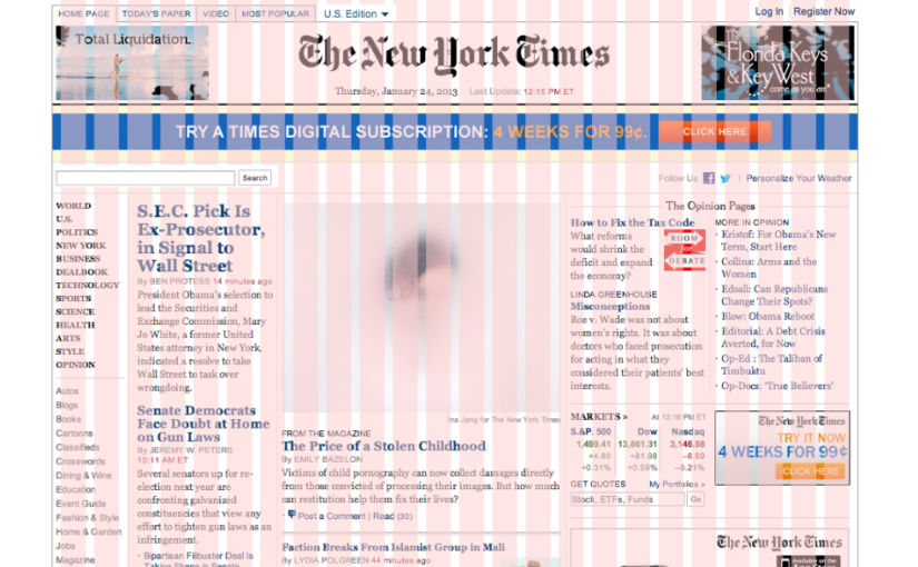
A grid system is just a bunch of columns and, optionally, rows, that help you arrange your design elements. It’s useful for print design, but I’d argue it is essential for web design. In the New York Times screenshot above, you see a bunch of pink columns separate by white gaps (gutters). Notice how the content blocks fit within the columns. Without those columns, your design could end up with a lot of alignment issues, especially when the design contains a lot more than just a bunch of text blocks. Grid systems don’t just make it easier for designers to align content – they also make it easier for developers to develop responsive pages that match the designs they are provided. That’s why CSS has a display option called “grid” and why Bootstrap, one of the most popular CSS frameworks, offers a grid system with sensible defaults.

The most common grid system is the 12-column grid. If you’re a developer, you don’t have to use CSS grid or a premade system like Bootstrap’s grid system – you can use flexbox to lay out your content. But, I personally think it’s better to use a grid for your main layout and just use flex for sub-layouts, e.g., when you’re laying out content within a grid’s cell. This is particularly helpful because your main layout will need to be responsive, and Bootstrap’s grid system already includes code to make your grid responsive automatically. Additionally, if you are part of a dev team, it’ll be easier to update someone else’s code if everyone follows the same coding convention, like using Bootstrap’s grid classes.

If you use Tailwind CSS, you can easily create a grid system using Tailwind CSS classes. However, you’ll have to define your own breakpoints, e.g., on desktop, show 12 columns, but on mobile, show only one.

The easiest way to demonstrate both Bootstrap’s grid system and creating a grid in Tailwind CSS is by example. If you are a developer, the CodePen below should be self-explanatory. Open each CodePen in a separate tab to see the columns on desktop.

Tailwind CSS

See the Pen Tailwind CSS Layouts by Abdullah Yahya (@javanigus) on CodePen.

Bootstrap

See the Pen Untitled by Abdullah Yahya (@javanigus) on CodePen.

Set Up a Component-based Static Site Generator That Uses JSON Files to Store Page Content Instead of a CMS

There are many options for a content management system (CMS). WordPress is the most popular one. Its native WYSIWYG block editor CMS is called Gutenberg. I’m using it right now as I’m typing these words 🙂 WordPress is more than just a CMS, it’s a platform that you can heavily customize and that you can add additional WYSIWYG CMSs on top of it, e.g. WP Bakery, Elementor, and many others. You can even create a non-WYSIWYG CMS in WordPress using Advanced Custom Fields (ACF), which would give you something similar to dedicated non-WYSIWYG CMSs like Contentful. Aside from WordPress, there’s a plethora of WYSIWYG CMSs like Webflow, Wix, etc. Then there are headless CMSs like Contentful, Strapi, Directus, and many more. WordPress can even be used as a headless CMS because it has an API from which you can get all content. This post will share a simple alternative to these complex CMS solutions by using a static site generator (SSG) called 11ty along with JSON files to store content in what you can consider a poor man’s CMS. Why? Because

  1. Faster updates
    CMSs, whether WYSIWYG or not, are for non-technical users (like most marketing people). I’ve worked in marketing for 14 years with many, many marketers. The vast majority of them do not want to update a website themselves. So, if developers have to update the website, there’s no need for a CMS. As a developer myself, the abstraction layer that a CMS provides just slows me down. Elementor, for example, is one of the most popular WYSIWYG CMSs. It doesn’t give you the ability to edit the raw code. Everything must be done visually. That can slow me down if I can’t easily find how to do what I need using the Elementor UI.
  2. Security
    WordPress is known for being vulnerable to hacks, not necessarily because of WordPress itself but because of the many plugins that people install in them. Static websites are more secure than any dynamic website.
  3. Performance
    WordPress websites are dynamic (content is queried from a database and PHP files must be processed on the server before they are delivered to clients). Static websites, on the other hand, require no processing. Of course, caching can improve the performance of dynamic sites, but static sites are still faster.
  4. Simplicity
    WordPress is way more complex than a simple static site, including a static site built by a static site generator like Eleventy. If you add a CMS on top of WordPress, then it becomes even more complex. If you use a static site generator along with a headless CMS like Contentful, then you have another dependency and layer of complexity due to needing to set up content models and then fetch them using APIs. The setup I will show you in this post will allow developers to see their entire website structure in a familiar file system without any CMS UI to get in their way. No CMS will alter code in any unintended way.
  5. Lower learning curve
    If developers have to update a website instead of non-technical marketers, then a static website offers a lower learning curve because all developers already understand website code. On the other hand, not every developer is fluent in WordPress or one of the many CMS plugins it offers, along with whatever customizations may have been made, so it would take them longer to learn these CMSs.
  6. Cost
    The setup I’m using is free because 11ty is free (open source), GitHub is free, and Netlify (for web hosting) offers a free plan. While you can host WordPress for free and use a free open-source CMS, you’ll have to maintain them, which you probably don’t want to do. Many companies go with a managed WordPress host like WP Engine, but they can be somewhat expensive. The Contentful CMS can also be expensive depending on the number of users and records.

Rather than explain how I created this starter website that uses Eleventy + JSON, I will just explain how the code, which is in this GitHub repo, works. If you want to learn how to set up an Eleventy website, just read the 11ty docs. It’s very simple.

Let’s go!

1. Install NodeJS

https://nodejs.org/en/download

2. Install Git

https://git-scm.com/downloads

3. Set Up a New Website Project Folder

mkdir test-website
cd test-website

4. Clone This Git Repo

git clone https://github.com/javanigus/eleventy-json-starter.git

5. Install Dependencies

npm install 

6. Run Eleventy

npm start

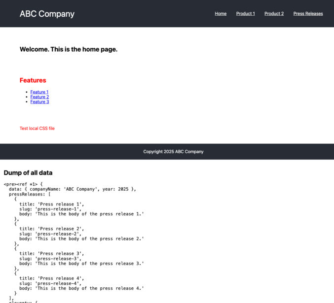
11ty will start a local web server. Open the localhost URL and view the starter site on your machine.

The top portion shows the starter site with a few menu links and some body content. At the bottom is a dump of all variables available to the page template, e.g. home page, about page, etc.

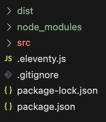
File Structure

  • “dist”, short for “distribution”, is the build output folder.
  • “src”, short for “source”, is where your source code goes
  • .eleventy.js is the Eleventy configuration file
  • the other files are self-explanatory

Eleventy Configuration

The Eleventy config file is .eleventy.js. I’ve tried to keep it as simple as possible. The fewer dependencies, the less the maintenance and the fewer the things that could break. Now, I personally would add PostCSS and Tailwind CSS to this setup if I were using it for work, but that’s beyond the scope of this starter site.

This code basically

  • tells Eleventy which file types to copy from the src folder to the dist folder
  • adds some debugging capabilities
  • tells Eleventy which folder is the source (“src”) and build output (“dist”)
  • tells Eleventy which folder it uses for includes / partials / components (“_includes”)
  • tells Eleventy which folder it uses for layouts (“_layouts”). To keep this starter simple, I’m not using any layouts.
module.exports = function(eleventyConfig) {
    const inspect = require("util").inspect;
	
    eleventyConfig.addPassthroughCopy("src", {
		//debug: true,
		filter: [
			"404.html",
			"**/*.css",
			"**/*.js",
			"**/*.json",
			"!**/*.11ty.js",
			"!**/*.11tydata.js",
            "!**/*.11tydata.json",
		]
	});
  
	// Copy img folder
	eleventyConfig.addPassthroughCopy("src/img");

	eleventyConfig.setServerPassthroughCopyBehavior("copy");

    eleventyConfig.addFilter("debug", (content) => `<pre>${inspect(content)}</pre>`);

	// tell 11ty which files to process and which files to copy while maintaining directory structure
	// eleventyConfig.setTemplateFormats(["md","html","njk"]);

	return {
		dir: {
			input: "src",
			output: "dist",
			// ⚠️ These values are both relative to your input directory.
			includes: "_includes",
			layouts: "_layouts",
		}
	}
};

Website Source Files (src folder)

The “src” folder is where you put your website files (HTML, CSS, JS, etc). Instead of HTML files, I’m using Nunjucks files (“njk” extension). You can use other templating languages like Handlebars, but I prefer Nunjucks. You can think of Nunjucks as a simple version of PHP. It allows you to add logic and loops and output variables.

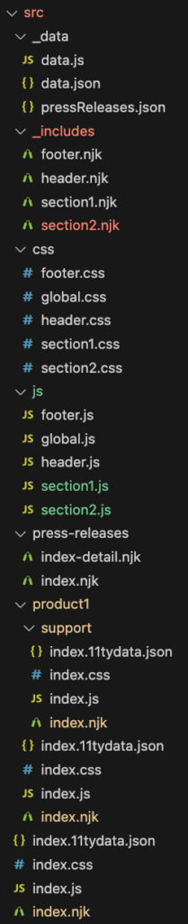
_data folder

The _data folder contains global data, whether it’s data returned from a JavaScript file (data.js) or from JSON files (data.json, pressReleases.json). This data is available to all page templates.

_includes folder

The _includes folder is where I put shared code (header.njk, footer.njk) and components (section1.njk, section2.njk). Section 1 can be a hero component and section 2 can be a features component, for example.

css folder

The css folder contains sitewide CSS (global.css) and CSS for each component (header.css, section1.css, etc).

js folder

The js folder contains sitewide JavaScript (global.js) and JavaScript for each component (header.js, section1.js, etc).

Other files and folders

The other files and folders in the “src” folder correspond to each page on the site,

  • src/index.njk (home page at /)
  • src/product1/index.njk (product page at /product1)
  • src/product1/support/index.njk (product support page at /product1/support/)
  • etc

Home Page

Home Page-specific files

  • src/index.njk (you can think of this as index.php)
  • src/index.css (this CSS file is only needed if you have CSS that is exclusive to the home page)
  • src/index.js (this JS file is only needed if you have JS that is exclusive to the home page)
  • src/index.data.json (this is the JSON file that contains all component data that is used in the page)
---js
{
  variable1: "value1",
  eleventyComputed: {
    datum(data) {
      return data;
    }
  }
}
---

<html>
<head>
    <link rel="stylesheet" href="https://cdnjs.cloudflare.com/ajax/libs/modern-normalize/3.0.1/modern-normalize.min.css" integrity="sha512-q6WgHqiHlKyOqslT/lgBgodhd03Wp4BEqKeW6nNtlOY4quzyG3VoQKFrieaCeSnuVseNKRGpGeDU3qPmabCANg==" crossorigin="anonymous" referrerpolicy="no-referrer" />
    <link rel="stylesheet" href="/css/global.css" />
    <link rel="stylesheet" href="/css/header.css" />
    <link rel="stylesheet" href="/css/footer.css" />
    <link rel="stylesheet" href="/css/section1.css" />
    <link rel="stylesheet" href="/css/section2.css" />
    <link rel="stylesheet" href="/index.css" />
</head>
<body>
    {% include "header.njk" %}

    {% include "section1.njk" %}

    {% include "section2.njk" %}

    <section>
        <p class="localCss">Test local CSS file</p>
    </section>
    
    {% include "footer.njk" %}

    <script src="/js/global.js"></script>
    <script src="/js/header.js"></script>
    <script src="/js/footer.js"></script>
    <script src="/js/section1.js"></script>
    <script src="/js/section2.js"></script>
    <script src="/index.js"></script>
</body>
</html>

<!-- for debugging data -->
<div style="padding: 1em;">
<h2>Dump of all data</h2>
<pre style="white-space: pre-wrap; word-wrap: break-word;"><code>{{ datum | debug }}</code></pre>
</div>

The front matter at the top above the <html> tag is just some code to help with debugging. It goes with the debugging code block at the bottom. Together, this dumps all variables, including global data, to the bottom of the page in the browser.
In the <body> section, I’m including 4 components

  • header.njk
  • section1.njk
  • section2.njk
  • footer.njk

You can think of these as including PHP files in another PHP file. Instead of PHP, it’s Nunjucks.

In the <head> section, I’m including all CSS that I need, including the CSS for the components that I’m using (header.css, section1.css, etc).

At the bottom of the <body> section, I’m doing the same thing for JavaScript.

Now, you might be thinking that this approach could load a bunch of individual CSS and JS files. As is, it would, but you can easily just add a step to your build system to optimize (bundle and minify) all CSS and JS files in just 2 files, one for all CSS and one for all JS. That’s beyond the scope of this post.

So far, this should be straightforward. Before we look at the index.data.json file, let’s look at the components that the home page is using (section1.njk and section2.njk). For demo purposes, I kept them simple.

section1.njk

<section id="section1">
    <h1>Welcome. {{section1.title}}</h1>
</section>

This should be self-explanatory. You’re just outputting a variable just like you would in PHP.

section2.njk

<section id="section2">
    <h2 {% if section2.textColor %} style="color: {{ section2.textColor }};" {% endif %}>Features</h2>
    <ul>
        {% for feature in section2.features %}
            <li><a href="{{feature.link}}">{{ feature.text }}</a></li>
        {% endfor %}
    </ul>
</section>

This section demonstrates the use of conditional logic and looping.

Looking at the 2 components, we know what variables exist, so we can write our JSON data file with corresponding values.

index.data.json

{
    "section1": {
        "title": "This is the home page."
    },
    "section2": {
        "textColor": "red",
        "features": [
               {
                    "text": "Feature 1",
                    "link": "/forms/vmdr/"
               },
               {
                    "text": "Feature 2",
                    "link": "/forms/pm/"
               },
               {
                    "text": "Feature 3",
                    "link": "/forms/cmdb/"
               }
           ]
	}
}

The JSON file contains an object for each component (section1 and section2) along with variables for each.

Building Pages

If Eleventy is running, it will detect any file saves and rebuild, e.g.

Notice how all static HTML files were built and put in the output folder (“dist”). When Eleventy builds each page, it takes all available data (global data from the “_data” folder and local page-specific data (e.g. from index.data.json) and evaluates all includes (components).

The /src/product1/ and /src/product1/support/ pages are very similar to the home page. The /src/press-releases/ folder is different in that it uses pagination to generate multiple pages from a single template. Let’s look at that in more detail.

Press Releases

The relevant files are

  • _data/pressReleases.json (data file for all press releases)
  • src/press-releases/index-detail.njk (file that generates all individual press releases)
  • src/press-releases/index.njk (file that generates a listing page with links to all press releases)

_data/pressReleases.json

This file is an array of JSON objects. Each object contains data for one press release. Note that one key is “slug”. It will be used to generate the URL for the press release.

[
	{
		"title": "Press release 1",
		"slug": "press-release-1",
        "body": "This is the body of the press release 1."
	},
	{
		"title": "Press release 2",
		"slug": "press-release-2",
        "body": "This is the body of the press release 2."
	},
	{
		"title": "Press release 3",
		"slug": "press-release-3",
        "body": "This is the body of the press release 3."
	},
	{
		"title": "Press release 4",
		"slug": "press-release-4",
        "body": "This is the body of the press release 4."
	}
]

src/press-releases/index-detail.njk

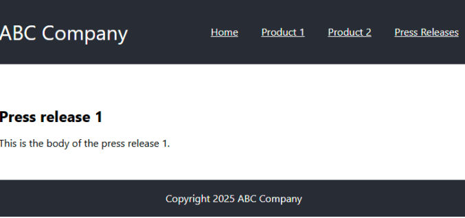
This file will generate a bunch of individual press release pages that will look like this

In this file, we have some front matter that tells Eleventy to paginate (create multiple page) from the data in the “pressReleases” variable (which is from _data/pressReleases.json). The “permalink” contains the “slug” variable. It tells Eleventy the path to use as it iterates to generate each press release page.

In the <body> section, we’re just outputting the press release title and body using variables.

---
pagination:
  data: pressReleases
  size: 1
  alias: pressRelease
permalink: "press-releases/{{ pressRelease.slug | slugify }}/"
---

<html>
<head>
    <link rel="stylesheet" href="https://cdnjs.cloudflare.com/ajax/libs/modern-normalize/3.0.1/modern-normalize.min.css" integrity="sha512-q6WgHqiHlKyOqslT/lgBgodhd03Wp4BEqKeW6nNtlOY4quzyG3VoQKFrieaCeSnuVseNKRGpGeDU3qPmabCANg==" crossorigin="anonymous" referrerpolicy="no-referrer" />
    <link rel="stylesheet" href="/css/global.css" />
    <link rel="stylesheet" href="/css/header.css" />
    <link rel="stylesheet" href="/css/footer.css" />
</head>
<body>
    {% include "header.njk" %}

    <section>
        <h1>{{ pressRelease.title }}</h1>
        <p>{{ pressRelease.body }} </p>
    </section>
        
    {% include "footer.njk" %}

    <script src="/js/global.js"></script>
    <script src="/js/header.js"></script>
    <script src="/js/footer.js"></script>
</body>
</html>

src/press-releases/index.njk

In this file, we want to list all press releases with a link to each one so the page looks like this

So, we loop over the pressReleases array of JSON objects to do so.

---js
{
  variable1: "value1",
  eleventyComputed: {
    datum(data) {
      return data;
    }
  }
}
---

<html>
<head>
    <link rel="stylesheet" href="https://cdnjs.cloudflare.com/ajax/libs/modern-normalize/3.0.1/modern-normalize.min.css" integrity="sha512-q6WgHqiHlKyOqslT/lgBgodhd03Wp4BEqKeW6nNtlOY4quzyG3VoQKFrieaCeSnuVseNKRGpGeDU3qPmabCANg==" crossorigin="anonymous" referrerpolicy="no-referrer" />
    <link rel="stylesheet" href="/css/global.css" />
    <link rel="stylesheet" href="/css/header.css" />
    <link rel="stylesheet" href="/css/footer.css" />
</head>
<body>
    {% include "header.njk" %}

    <section>
        <h1>Listing of all press releases</h1>
        <ul>
            {% for pressRelease in pressReleases %}
                <li><a href="/press-releases/{{pressRelease.slug | slugify}}">{{ pressRelease.title }}</a></li>
            {% endfor %}
        </ul>
    </section>
        
    {% include "footer.njk" %}

    <script src="/js/global.js"></script>
    <script src="/js/header.js"></script>
    <script src="/js/footer.js"></script>
</body>
</html>

<!-- for debugging data -->
<div style="padding: 1em;">
<h2>Dump of all data</h2>
<pre style="white-space: pre-wrap; word-wrap: break-word;"><code>{{ datum | debug }}</code></pre>
</div>

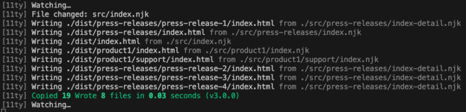
When you save a file, Eleventy will build all pages. As you can see in the screenshot below, Eleventy created 4 press release pages, one for each JSON object in the JSON data file.

  • [11ty] Writing ./dist/press-releases/press-release-1/index.html from ./src/press-releases/index-detail.njk
  • [11ty] Writing ./dist/press-releases/press-release-2/index.html from ./src/press-releases/index-detail.njk
  • [11ty] Writing ./dist/press-releases/press-release-3/index.html from ./src/press-releases/index-detail.njk
  • [11ty] Writing ./dist/press-releases/press-release-4/index.html from ./src/press-releases/index-detail.njk

Eleventy also built the listing page.

  • [11ty] Writing ./dist/press-releases/index.html from ./src/press-releases/index.njk

Hosting

If you use Netlify or Vercel for hosting, you can connect them to GitHub so that whenever you push to GitHub, each will trigger a build and deploy your changes to production on a global CDN.

Updating JSON Files Reliably

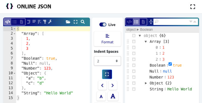
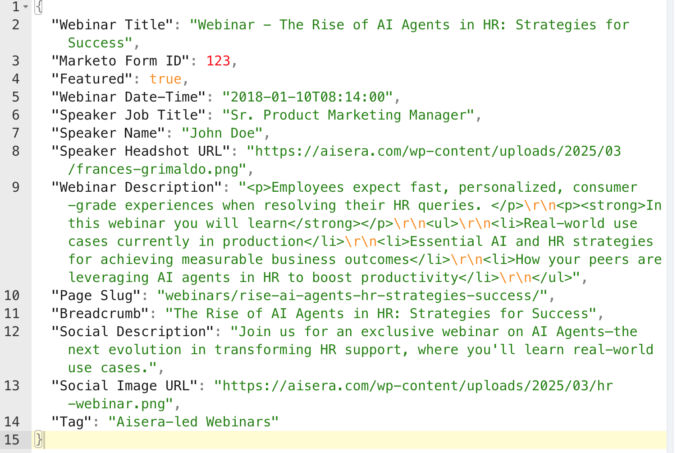
Since content will be in JSON files, you may wonder how easy it would be to edit them without breaking the JSON format. If this is your concern, you can always just copy and paste the JSON code into an online JSON editor like this one. On the left is the JSON content in “code” format and on the right is the same content in “tree” format. In the “tree” format, you can conveniently expand and collapse nodes (in case some are too long) and safely edit the name/value pairs without worrying about breaking the JSON format. If the “Live” toggle is enabled, you can see your changes in both panes updated automatically. When you’re done editing in “tree” view, you can just copy/paste the code in “code” view back to your code editor.

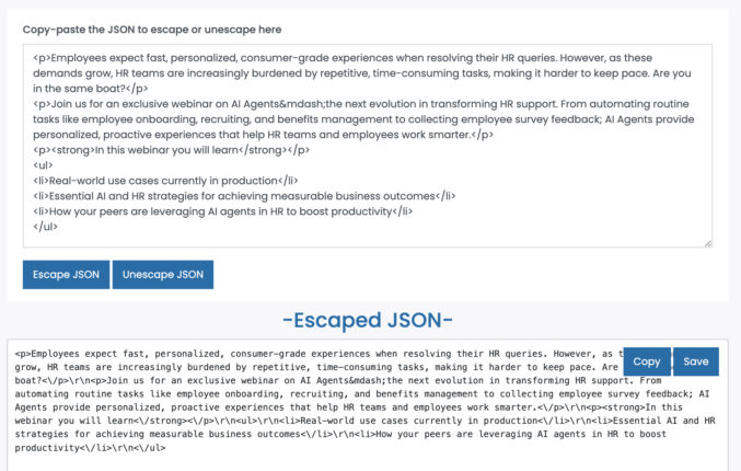
If you need to put HTML in a JSON value, you’ll need to escape the HTML first. you can use an online tool like this one to do that. Just paste the HTML in the top field, click “Escape JSON”, and get the escaped HTML in the bottom field.

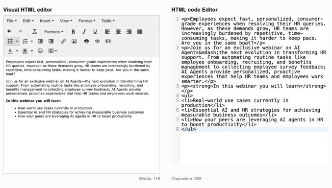
If you need an easy way to get HTML from a visual text editor like MS Word or a Google Doc, you can use EditorHTMLOnline. Just type your content on the left and then copy the HTML on the right.

Here’s an example.

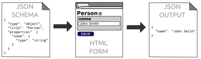
If you want to give users a simple web form with validation and select fields, you can use JSON editor.

Conclusion

Now, you can create components using simple HTML, CSS, JS, and Nunjucks (which is similar to JavaScript) and you can store all your data in simple JSON data files rather than some database or external headless CMS. The entire system is super simple but effective with a very low learning curve and zero abstraction.

Bolt: Save Time Coding Using This Agentic AI Tool

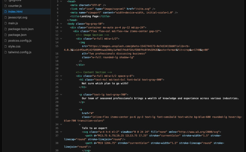
Coding web pages by hand is time-consuming. I’ve tried a few AI-based coding tools like Claude.ai, Ninja AI, and Bolt. Bolt seemed to produce the best results. It’s not perfect, but it definitely can serve as a good starting point. To demonstrate, let’s see how each of these AI tools generate code for this simple section.

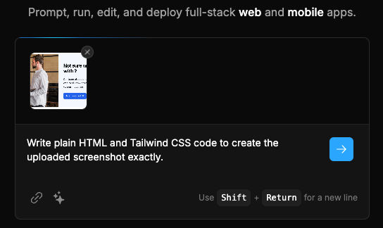
For each tool, I’ll upload the same screenshot of the section and provide the same prompt, namely:

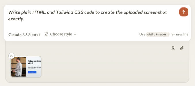
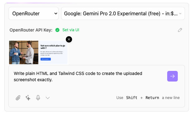
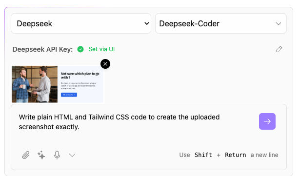
Write plain HTML and Tailwind CSS code to create the uploaded screenshot exactly.

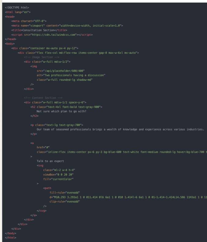
Claude.ai (using Claude 3.5 Sonnet)

Here’s the output.

Claude can’t show a preview, so I copied and pasted the code into Codepen. Here’s how it looked.

That’s actually not bad. The image is missing because it’s a placeholder image to a relative path that doesn’t exist.

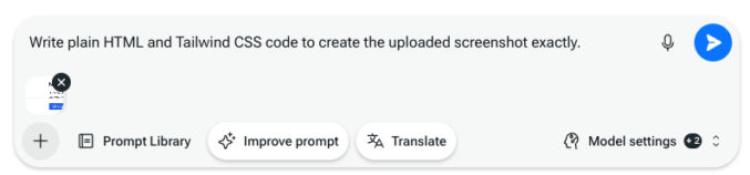
Ninja AI

For the models, I chose Claude 3.5 Sonnet for the external model. Ninja AI will combine it with its own internal models. Here’s the input.

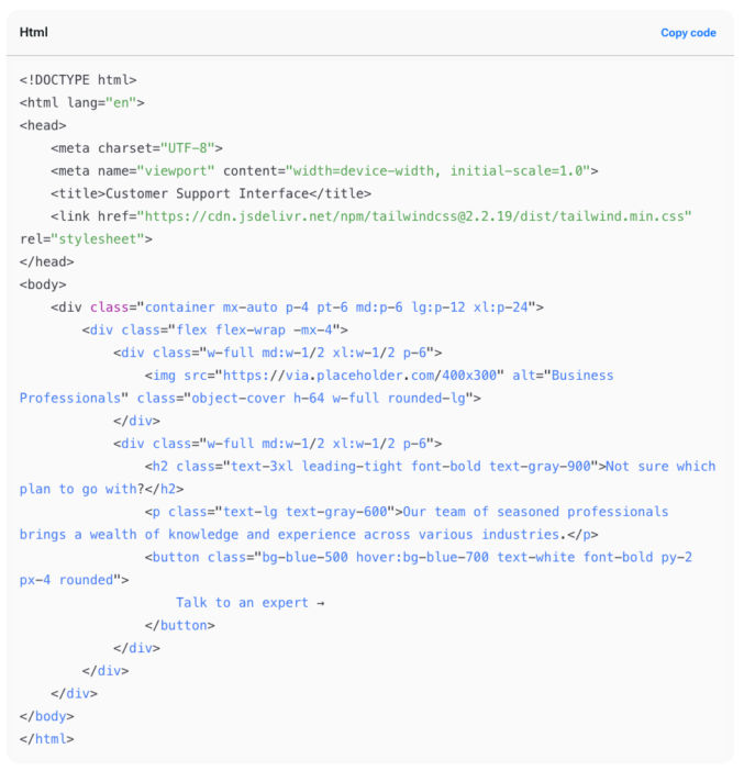
And here’s the output.

Like Claude, Ninja AI can’t show me a preview, so I copied and pasted the code into CodePen. Here’s what it showed.

Not bad, but it’s not as good as Claude even though I chose Claude as the external model. The main issue is the vertical spacing between the elements on the right.

Bolt.new

Here’s the input.

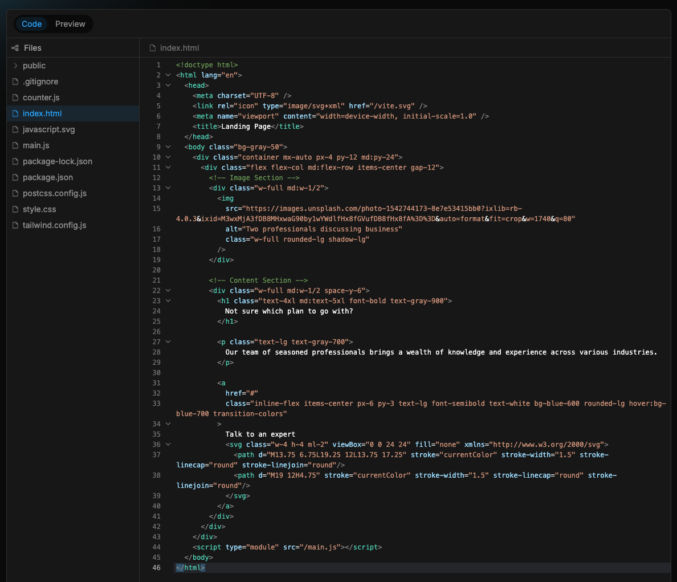
Bolt can show a visual of what the code would produce. Here’s the code output.

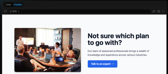
Note that Bold will install a Vite and a bunch of dependencies like Tailwind CSS, Autoprefixer, PostCSS, etc. Here’s the visual preview output.

Conclusion

I’ve run a bunch of other tests comparing all 3 AI tools. Bolt is better than the other tool for code generation.

Bolt.diy

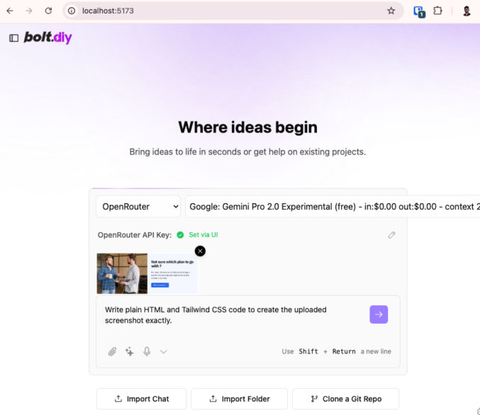
The problem with all of the above AI coding tools is they can become expensive. Luckily, there’s an open-source version of Bolt called Bolt.diy. It can be used with any LLM, including the free, experimental version of Google Gemini Pro 2.0 and DeepSeek. You can install bolt.diy by following the simple instructions at https://github.com/stackblitz-labs/bolt.diy. When you run bolt.diy, it will open in a local browser.

Let’s try a couple of LLMs with bolt.diy to code the same section above.

Google Gemini Pro 2.0 Experimental

To use Google Gemini Pro 2.0 Experimental, you’ll need to get an API key. Go to OpenRouter.ai, search for the LLM, and get a free API key.

Here’s the input.

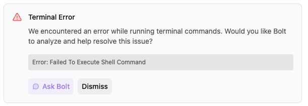
While writing the code, bolt.diy returned an error.

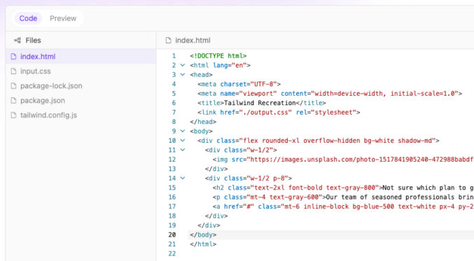
I clicked “Ask Bolt”, it Bolt self-corrected. Here’s the code output.

And here’s the visual preview.

This does not look good at all. Let’s try DeepSeek Coder.

DeepSeek Coder

We’ll need an API key. Go to the DeepSeek platform, sign up, and get a key.

Here’s the input in bolt.diy with DeepSeek selected.

And here’s the output.

Pinegrow: Save Time Coding With This Low-Code Editor

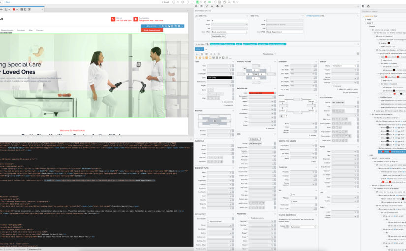
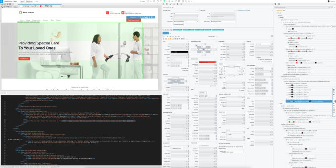
Some of the things that consume too much time as a web developer are manually typing HTML and CSS and looking up documentation. For example, when creating a list, it takes much longer to type <ul><li></li>….</ul> than it is to just click a button and start typing the content like you do in MS Word or Google Docs. Another example is when I don’t remember the syntax for a Tailwind CSS class and I have to look it up in the online documentation. After searching for a low-code editor that allows me to have both a WYSIWYG editor alongside a code editor alongside a list of controls, I have only found one that meets that criteria. Pinegrow offers both a desktop and a web-based low-code editor that supports plain HTML/CSS/JS, Tailwind CSS, Bootstrap, and much more. For now, just using it for plain HTML/CSS and Tailwind CSS saves me a lot of time. Following is a screenshot of how I have the UI.

Due to the large amount of information and my preferences for not having to scroll a lot, I expand the window full size on a 32″ 4K monitor. The screenshot above shows the following panes:

  • top left = WYSIWYG editor
  • bottom left = code editor
  • middle = element properties
  • right = DOM tree

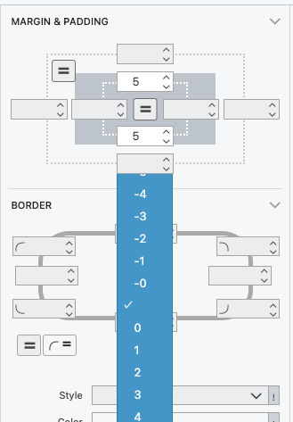
You can edit code and see the changes in the visual editor. You can also insert elements into the visual editor and edit text visually. When you click on an element in the visual editor or the DOM tree, you can edit its properties using the various controls in the middle pane. For example, if I want to add bottom margin to an element, I don’t have to remember the possible Tailwind CSS preset values. Instead, I can just click a dropdown and choose a value. As I hover over the various dropdown values, I can visually see the margin change size. This is much easier than trying different values in a code editor and then reloading your browser to see the change. If I want to enter a custom value, I just type it in the field and choose a unit (px, em, etc).

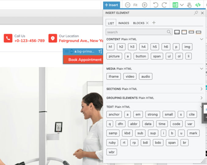
When you want to insert an element, e.g. a list, just drag the corresponding button in the “+ Insert” dropdown over to the location in the visual editor where you want to place the new element.

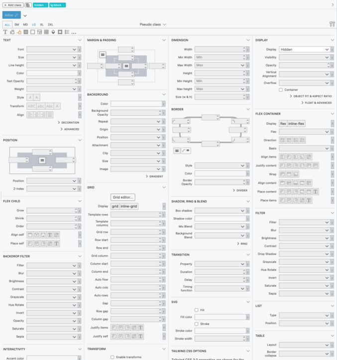
Editing an element’s properties is super easy thanks to the complete controls with pre-populated Tailwind CSS values.

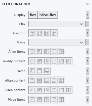
For example, if I want to vertically or horizontally align an element in a flexbox or CSS grid container, I can just visually see which button depicts the alignment I want and then click on it. Pinegrow will automatically update the code and the visual preview.

This is so much easier than typing “items-stretch”, “items-center”, “items-start”, etc.

If you’re having a hard time selecting an element in the visual preview, just click on it in the DOM tree. You can then edit the element’s properties in the middle pane.

If you are using the online version of Pinegrow and you want to export your code, just copy it from the code editor into your other editor (I use VS Code). Or, you can use the desktop version of Pinegrow and edit your local files directly.