
I try to embed a lesson in as many of my articles as possible. This is because my main talent is pattern recognition via Charting. If I were only depending on my charts in a post, the content would be rendered worthless, sometimes within days. Charting helps me locate areas of interest (AOI), prices where I might expect to find buyers, or sellers. This latter becomes helpful, because I am able to set alerts at area where I might want to buy, add, pair back, or sell an investment. This post will take a sample of random charts that I have annotated, so that hopefully you will learn the basic foundation to have for your charts, or mine a more useful tool. Recall, the more work you put in, the more value the AnnualizeThis substack should be able to provide you. I don’t want to feed you a fish, I want to teach you how to fish (as the saying goes).
I present to you Charting 101
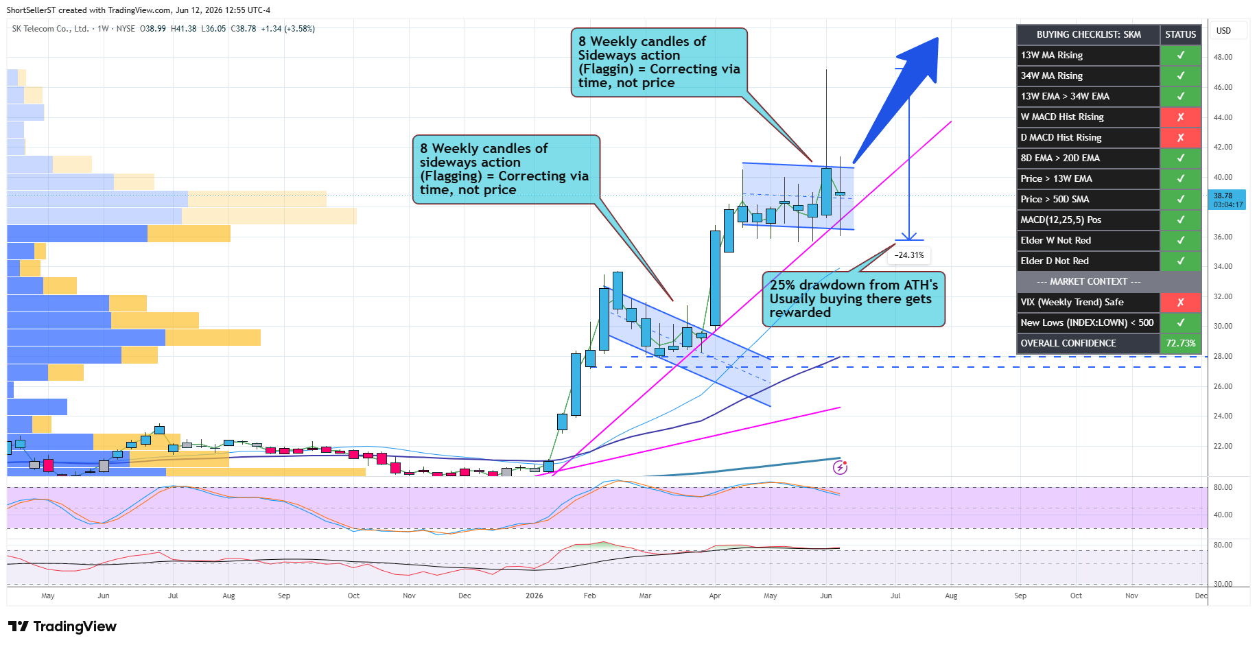
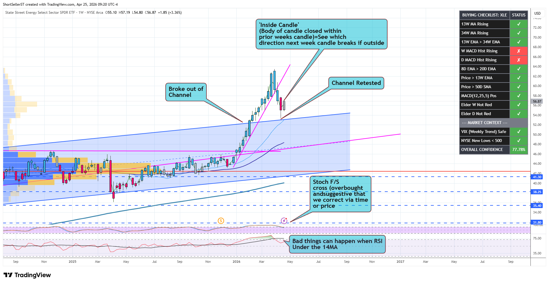
Stocks can correct via time, not just price
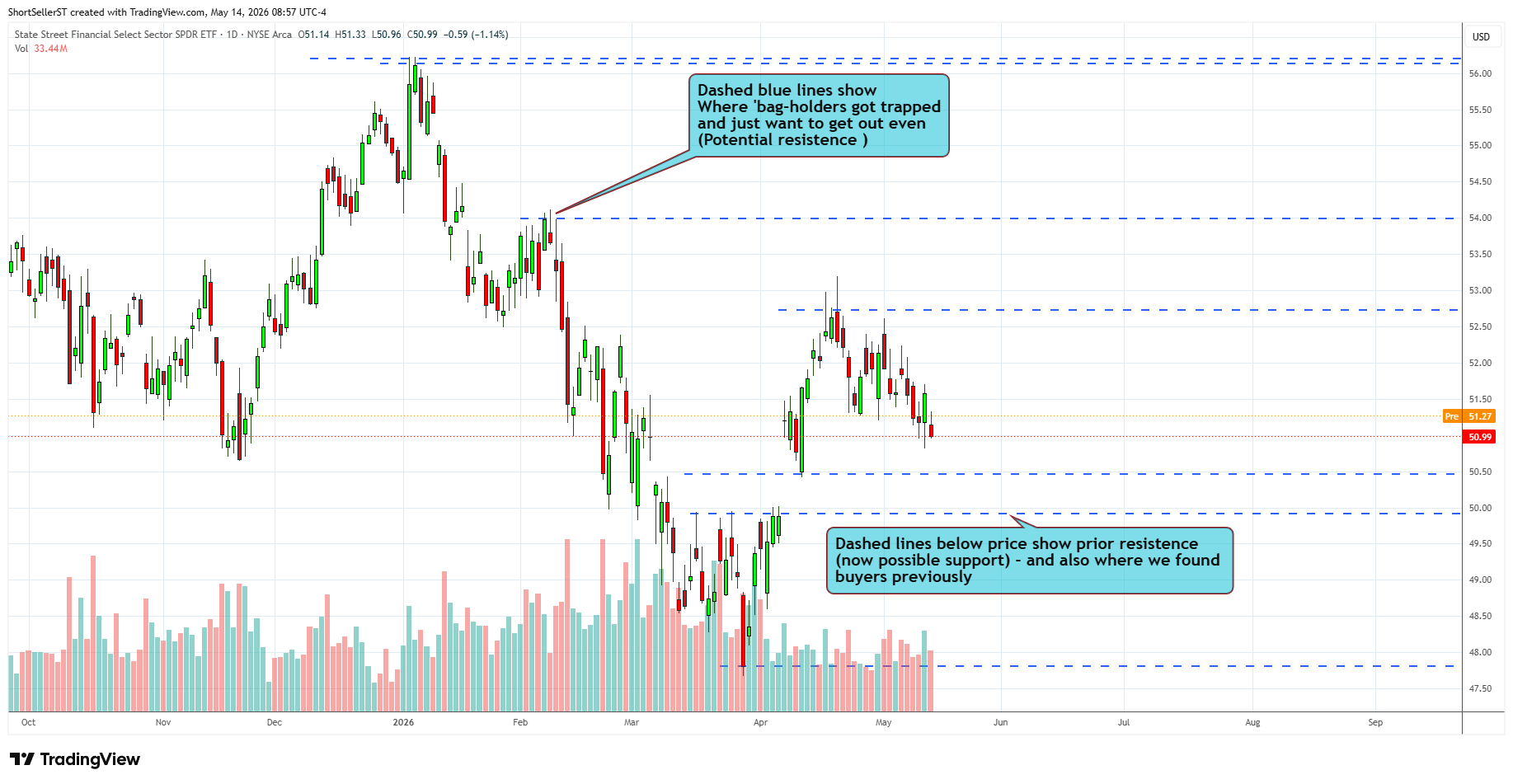
What my dashed blue lines mean (the top one that I have doubled is just to show where the all time high (ATH) is located
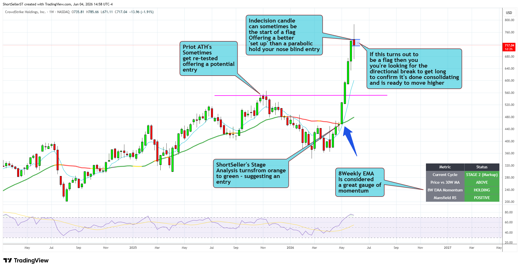
CRWD (Sub is asking how to find an entry to get long…)
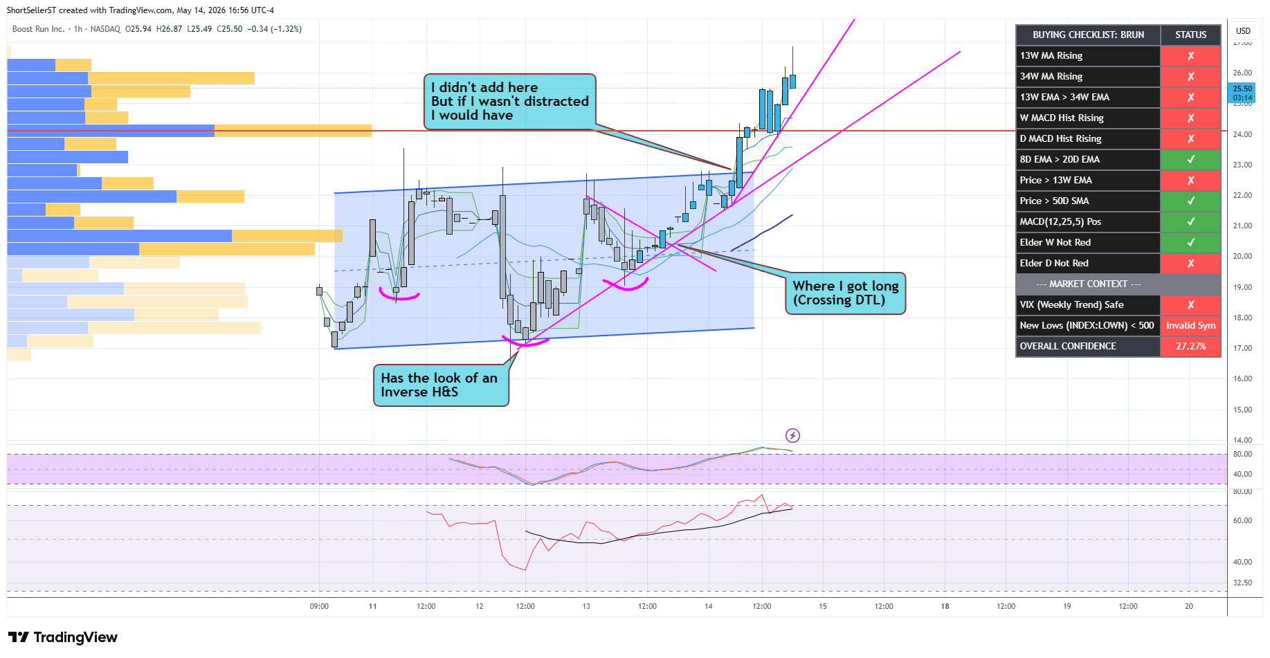
BRUN - Reply to someone asking me what technical signal got me long
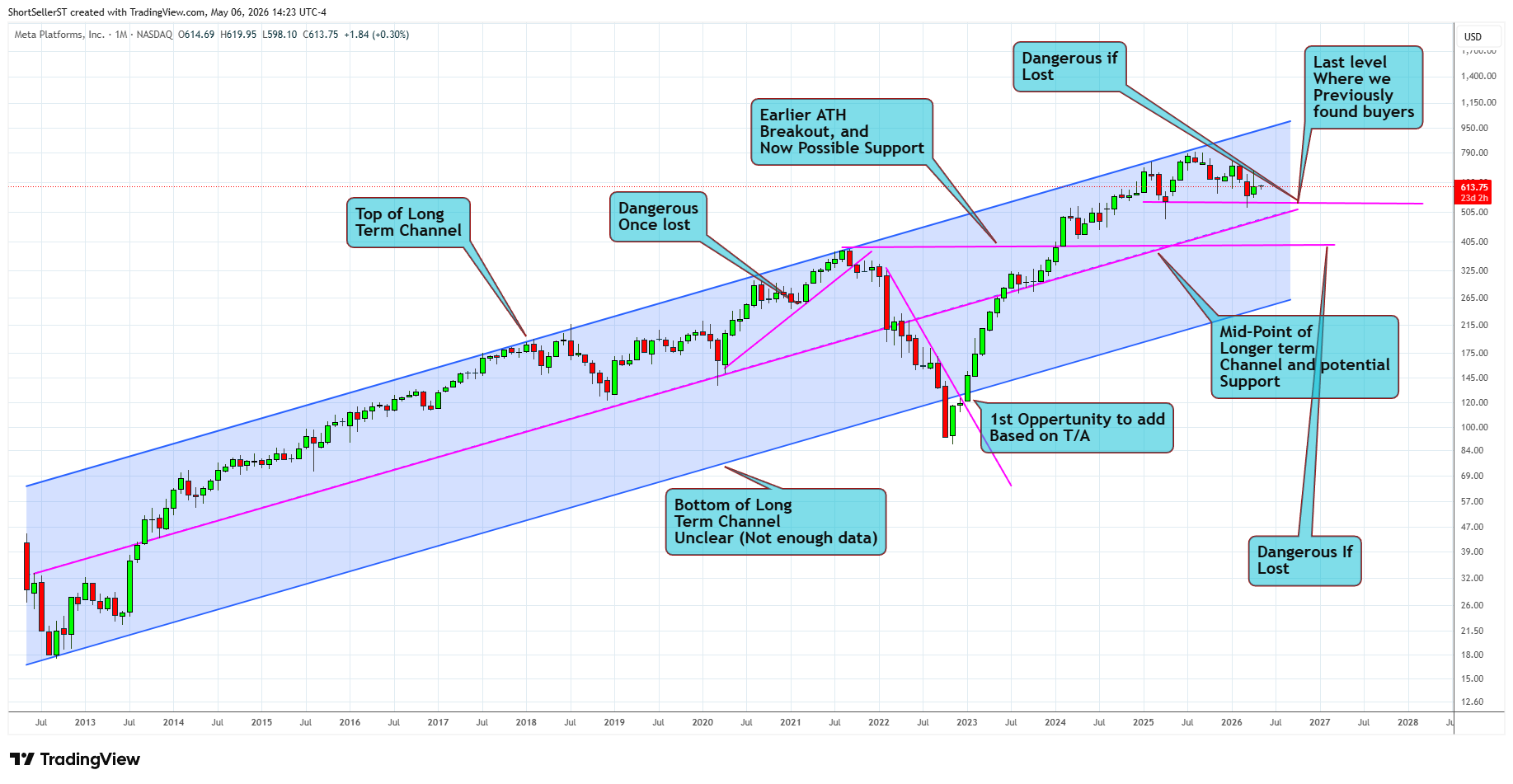
META - Long term chart with some suggestions areas of interest
XLE
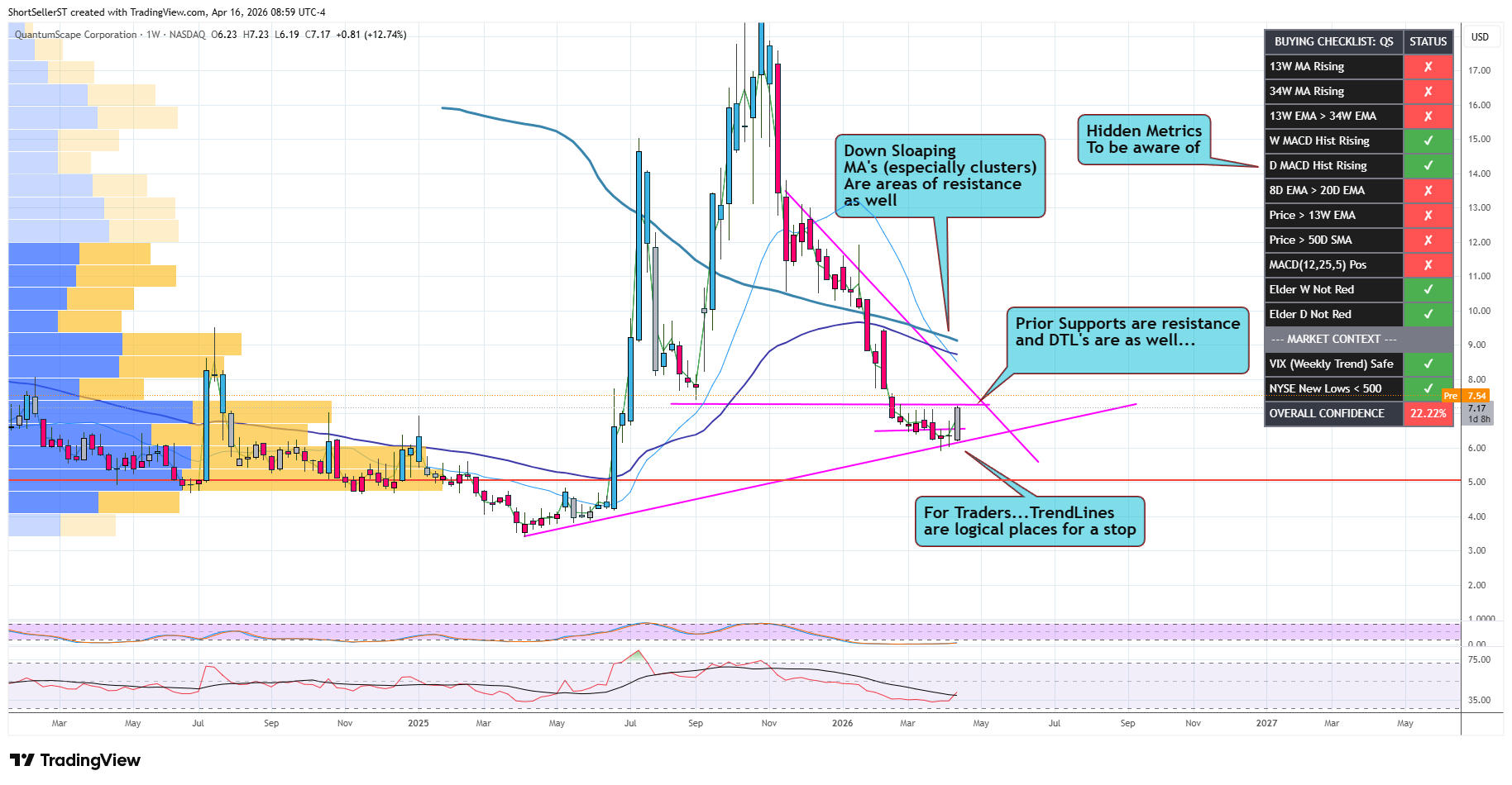
QS
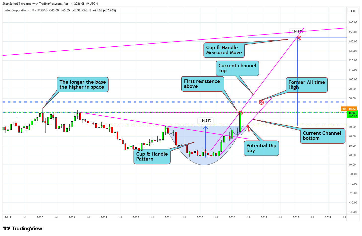
INTC
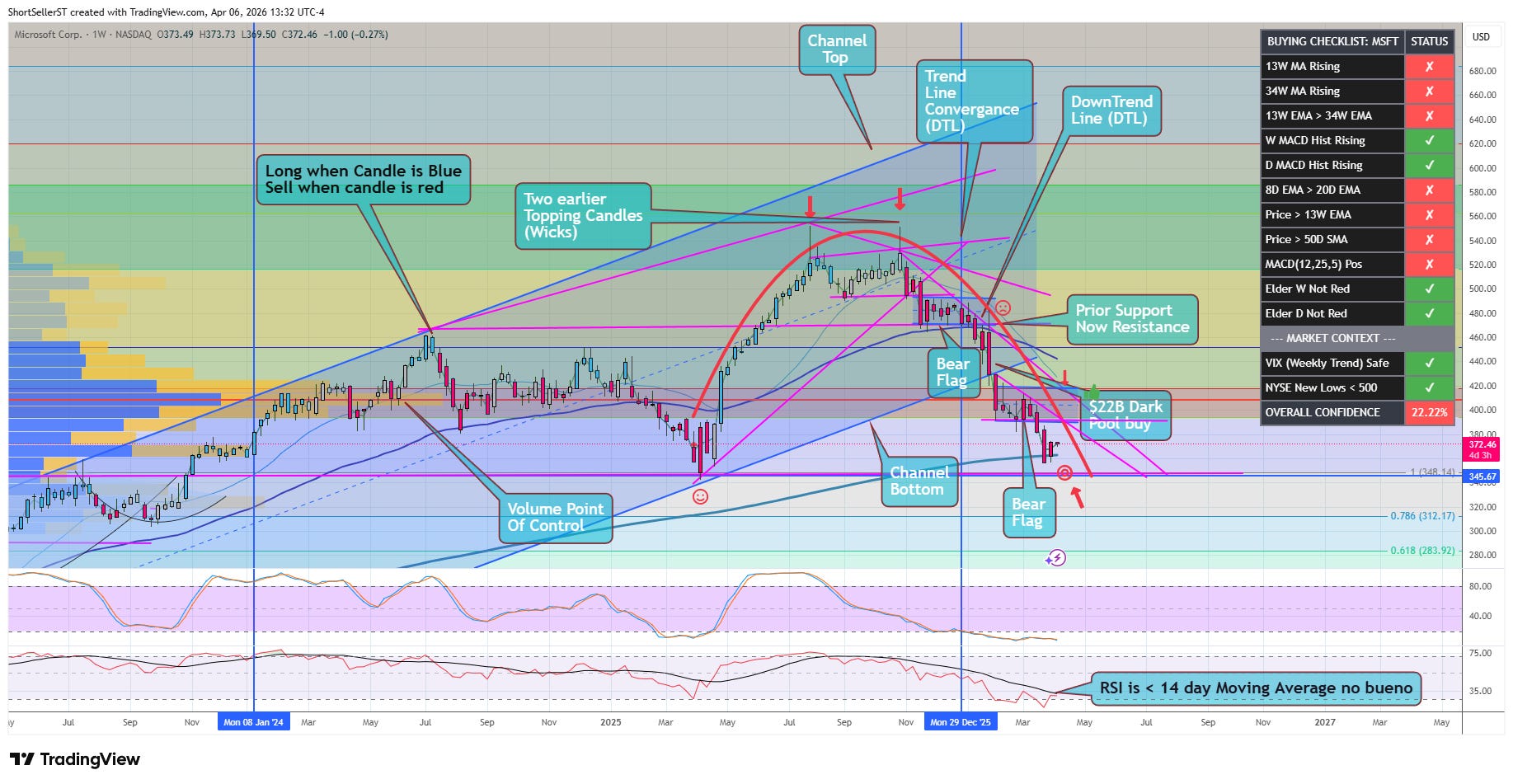
This MSFT (below) chart has a wealth of things I take note of, in no particular order
VPOC-
(Volume point of control) is that long bar on the left of the chart. It simply shows the price at which the most shares trading on a given timeframe)
Channel Tops and Bottoms -
Most things follow mathematical patterns, and while i’m certainly no mathematician, I draw some general conclusions that I believe to be true when it comes to the behavior of price. 70%+ (maybe as high as 90%) of stock trading is algorithmic, it is software deciding the ‘best’ entries and exits for their Sovereign wealth funds, Hedge funds, Mutual funds. Channel bottoms are AOI for funds who are position building, channel tops are AOI for funds looking at you to be their exit liquidity.
Wicks & Tails -
Long wicks show you buyer exhaustion, conversely long tails are showing you where they ‘BTFD …buy the fucking dip’.
DTL’s & UTL’s-
(Downtrend Lines and Uptrend lines) Not dissimilar to channels, this shows you the current ‘trend’ of what price is currently doing. None of this is Voodoo, these are institutions building or exiting a position.
Bear Flag-
A bear flag (a bull flag being the exact opposite), looks like a golf putter. there is a shaft (pole) from a big % red candle/s, and then a series of sideways consolidation candles following. More often than not, in a bear flag, the sellers ultimately show they are not done, and the bear flag resolves lower, as we lose that consolidating shelf. Conversely a bull flag looks just like a Flag on a flagpole. You have a large % candle/s then a series of candles consolidating sideways before a move that more often than not resolves bullish. Take note of the two bear flags I have highlighted here.
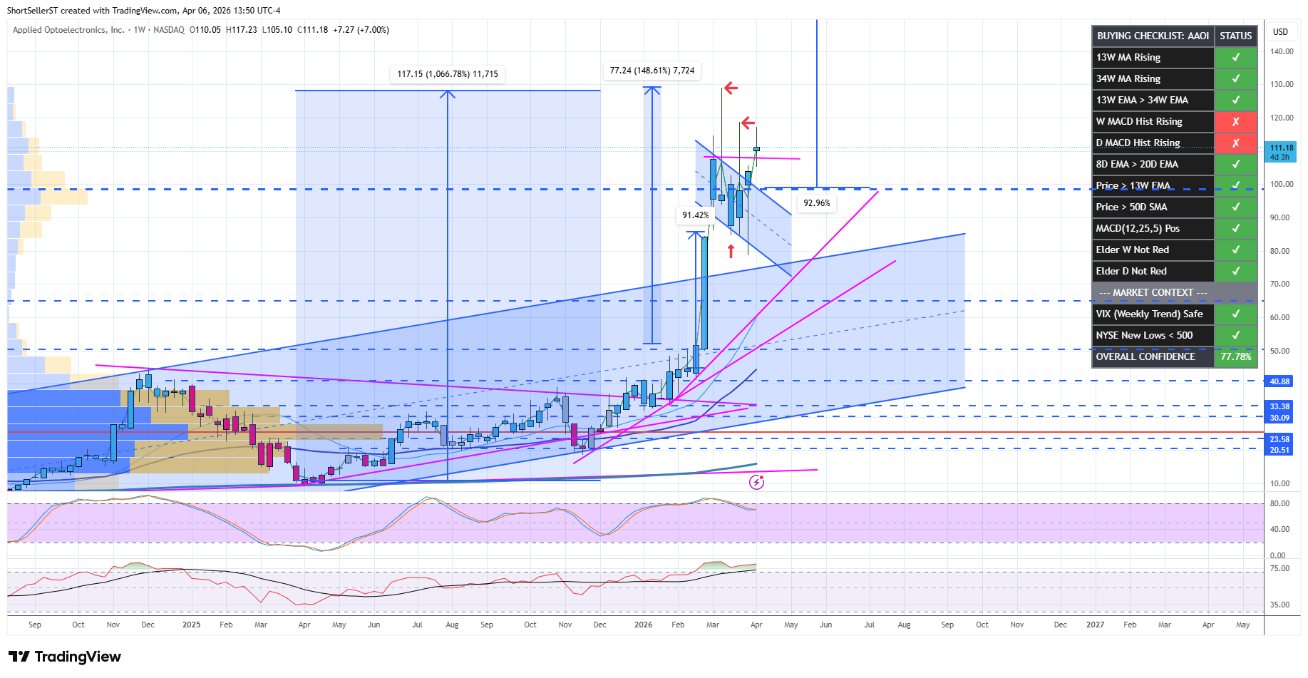
This AAOI chart is a great example of a bull flag, that resolved bullish. Theoretically, the height of the pole, can be suggestive that the move out of the flag breakout will be 90%ish before any meaningful break of the bullish pattern. Also on the AAOI Chart is it’s channel, and subsequent break out from that. I have a theory that when stocks leave their long term channel, it ALLOWS for a parabolic move to begin.
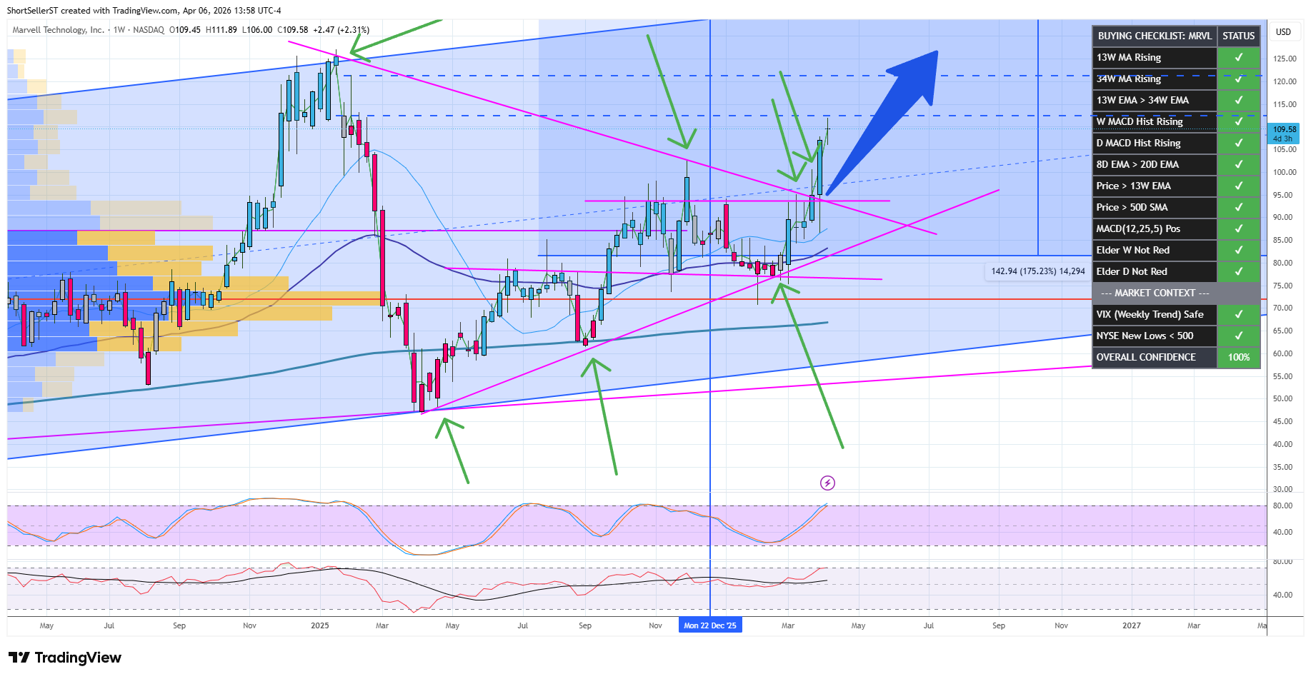
This MRVL chart is a good example to show you a Wedge pattern . Price action in a wedge gets tighter and tighter, coiling until price is able to exit from the wedge. More often than not, the direction that a stock breaks from the wedge, dictates what direction the price action will take next.
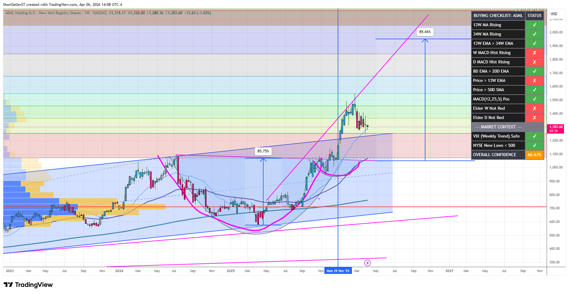
This is a good example of a Cup & Handle pattern using this ASML chart. Not unlike earlier flags , a C&H pattern can also be suggestive of the size of the future move after leaving the handle. Know that inverse H&S are equally valid, and suggestive of moves lower.
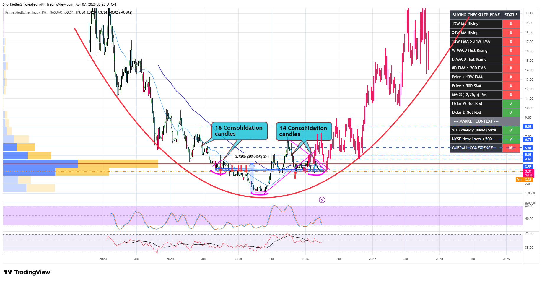
This PRME chart just to suggest synergy, rounded bottoms, and inverse H&S
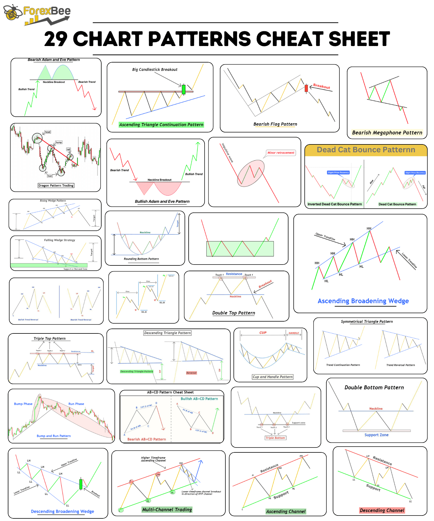
I want this to be a ‘living’ article, so I will add to it every week, and I hope you read it again and again. Until I am able to provide more of my own content on this subject, here is a picture of various common stock patterns, that I took from forexbe.co
No posts
Comments
Nothing yet. Say the first thing.
Sign in to join the conversation.