
Puzzlers’ delight.
If you love letters, but don’t know what to write or share, just keep your pen in hand and make the letters. Over and over. Explore these characters that people our lives. Make a design with them, and you’ll see the fascination for this kind of piece we call an alphabet broadside. Let me share a few thoughts on some of the work both typographers and scribes have done.
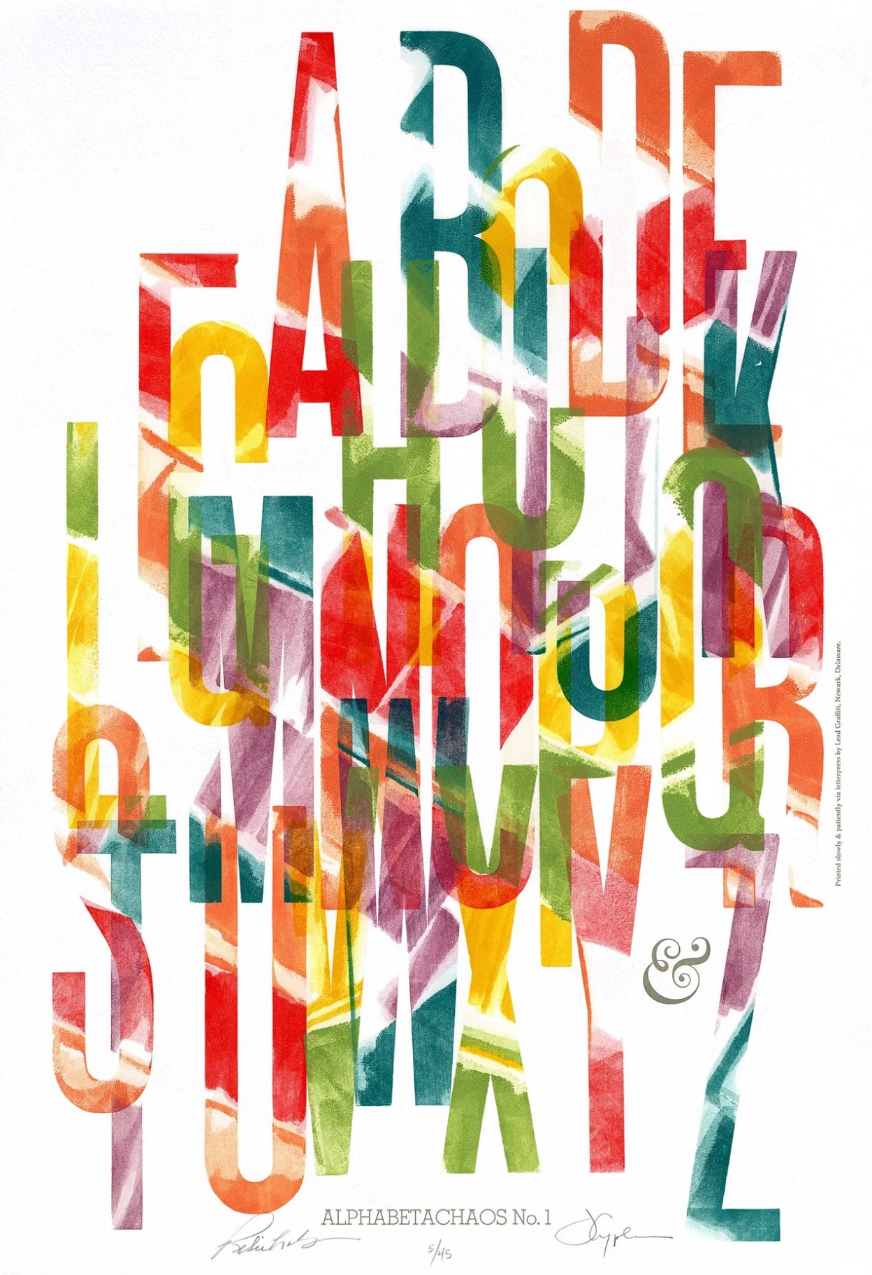
The 26 letters in the Roman alphabet give the artist a playground for design with a focus on figure/ground relationship . A broadside can be done spontaneously, but doing it by hand may also require many rough drafts. Use minuscules, capital letters, or a combination. Play with different sizes, weights, and proportions. But the style is the thing you’ll choose first, the basic footprint of the letter. Then it’s design, color, and experimentation. Consider using different scripts and languages as well, to deepen or broaden the practice time.
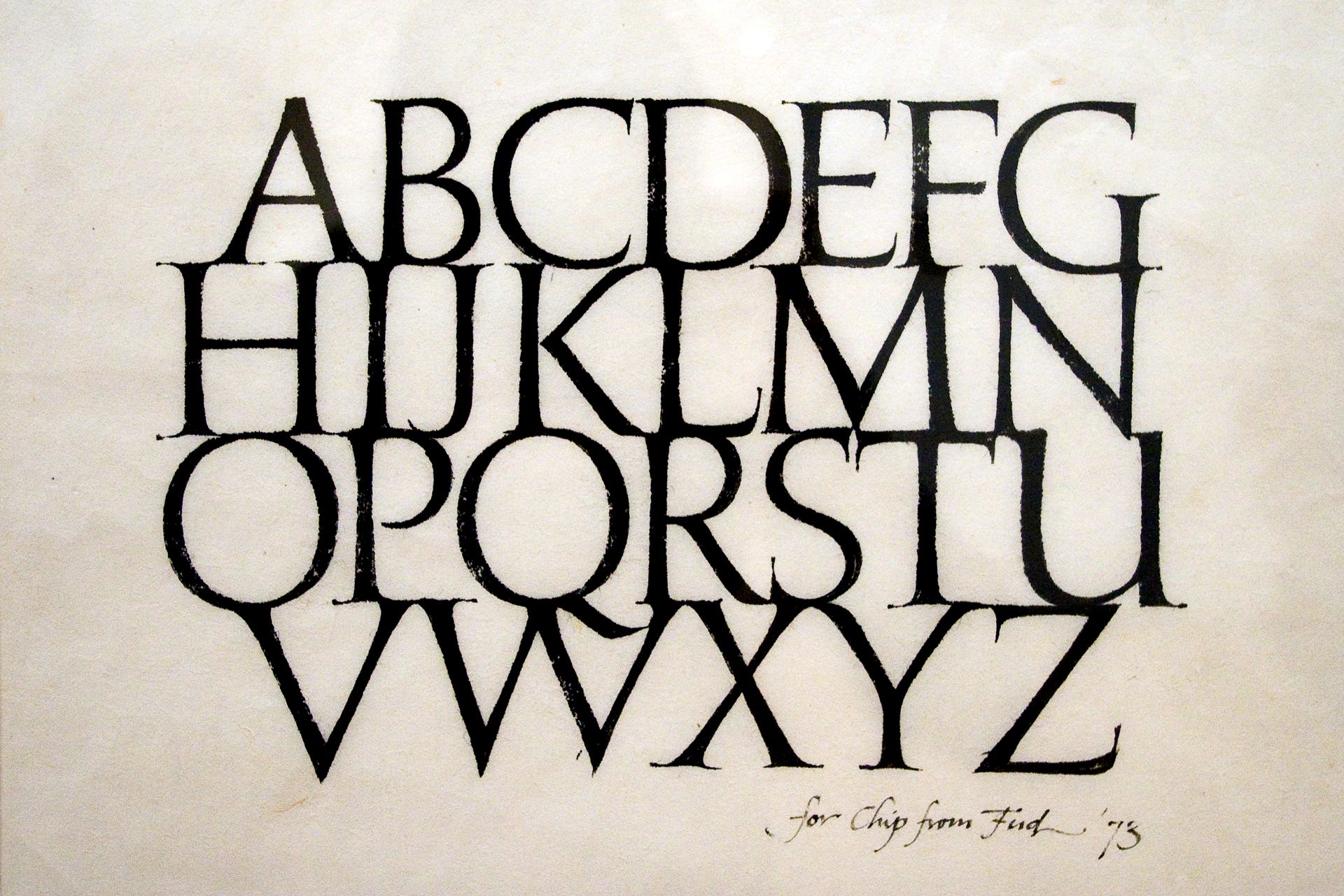
John ‘Fud’ Benson (1939-2024), was a master stone cutter in John Stevens Shop in Newport, Rhode Island. He brush-lettered this Roman capital broadside. All letters touch, creating a solid network of balanced strokes and carefully formed white shapes. There are no straight lines in Imperial Roman capitals!
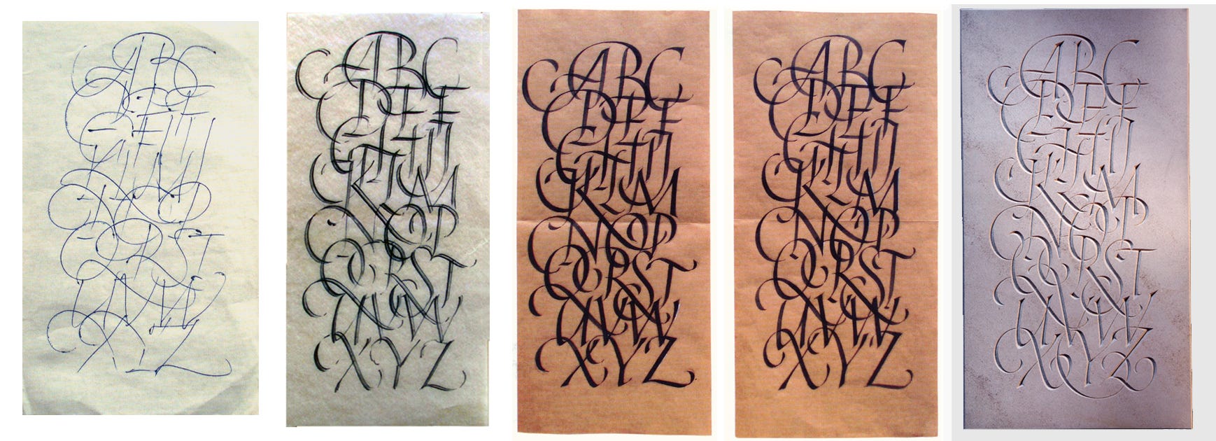
Benson’s drawn letters were in preparation for stone inscriptions. Read about his enormous life contribution, including at age 25 carving the words on John F. Kennedy’s gravestone at Arlington as well as the nearby series of inscriptions from JFK’s inaugural address on a dramatic, curving bench of Deer Island granite. Watch this 1978 video covering his life work with stone. And note the development below from sketch to finished stone!
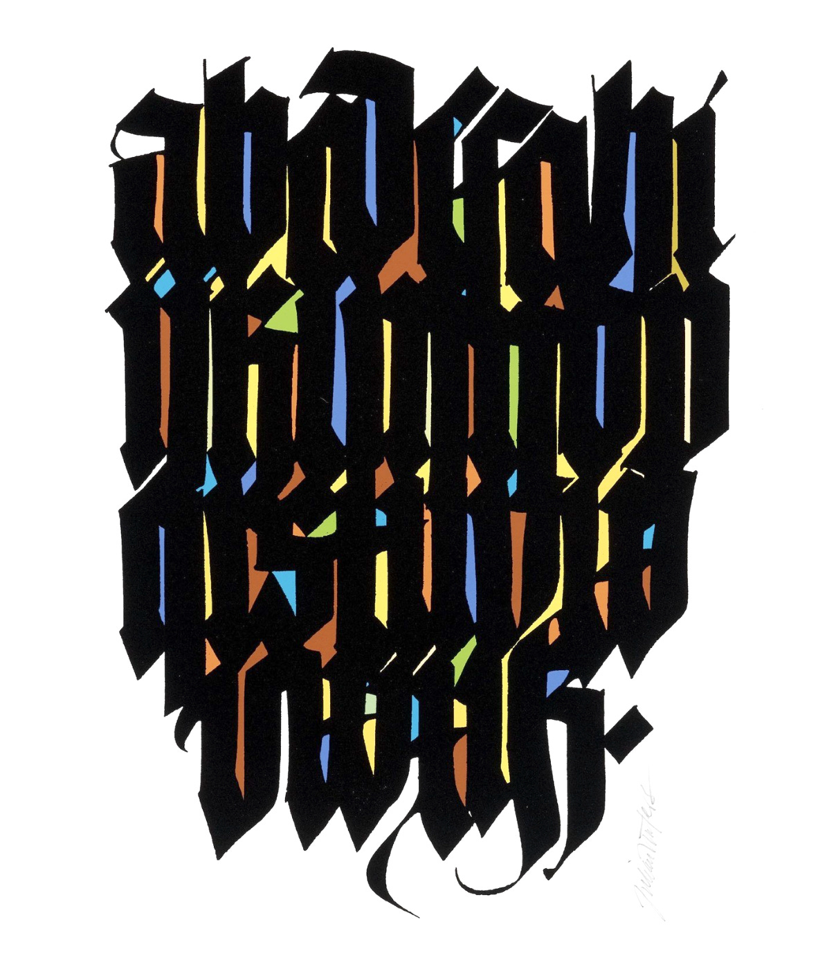
Calligrapher and type designer Julian Waters produced this dramatic, densely-packed broadside in heavy blackletter with harmonious color gleaming through the letterspaces.
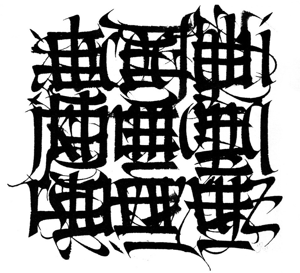
Judy Detrick has an expert command of formal lettering design and calligraphic style. This alphabet broadside is the full 26 written twice, with a hefty understanding of design. One alphabet is written across and then again at 90º, making a pattern of little white quadrangles and so much more. You can feel the unbroken presence of creative attention; every element seems to be in the right place. No area seems clumsy or clogged, the brushwork is smooth, fresh, and controlled, and the kinetic flow is vibrant yet subtle.
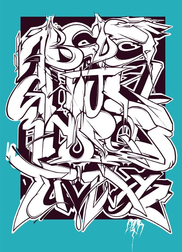
Graffiti artists use the alphabet, bringing exciting, jazzy form sense to the design conversation.
My own work with the ABC broadside happens often during demo time in class. I begin loosely as below, indicating the general x-height spacing, then approach using different styles of writing. The rough draft explores the style and weight, axis and placement. You decide which letters go on each line, and where you can take advantage of rounds, ascenders, descenders and tails, and horizontal accents. You become familiar with the categories or sets of stroke types, and can weave them into place with an eye to balance and distribution of similar elements. Changing one element at a time changes the visual effect. Each draft takes just a few minutes, so you can do many in a short hour. Develop the one that speaks to you.
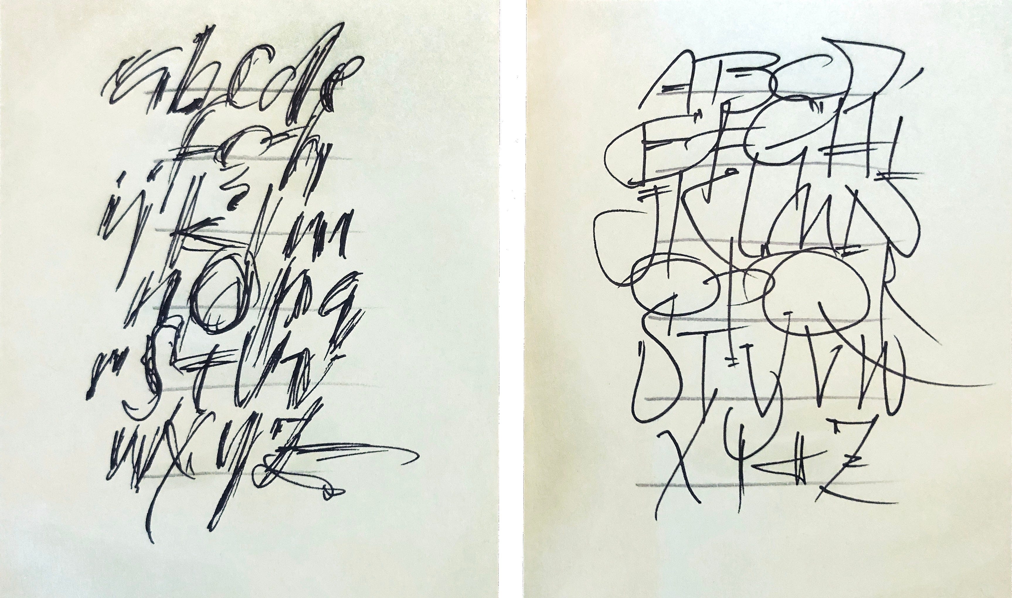
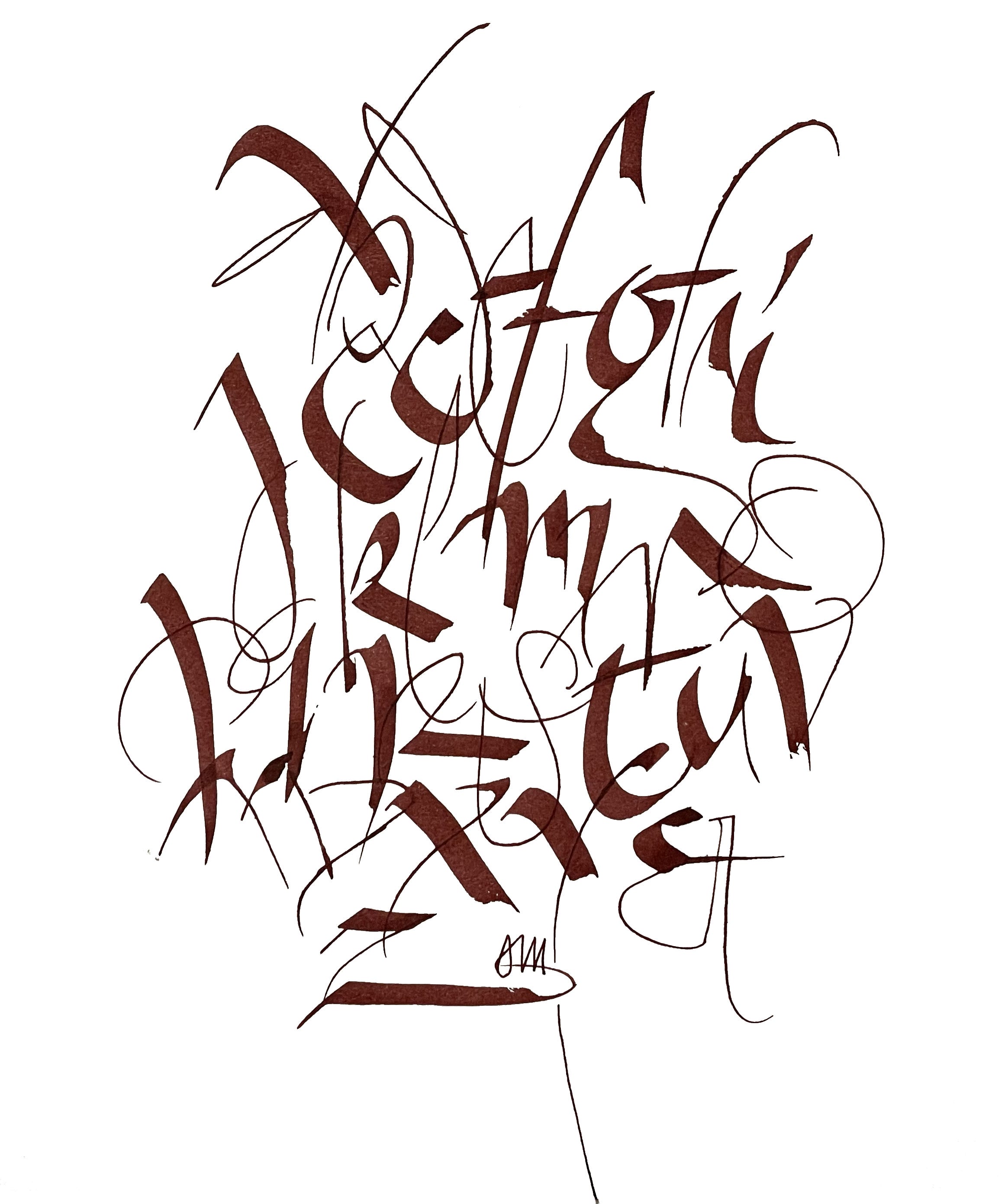
The Automatic pen allows exploration of lively lettering using the 1) full front of the nib, 2) pulled, skewed strokes, 3) the corner of the nib for hairline work, and 4) experimental half-lifts and terminals. The general rhythmical beat was created by alternating heavy and light strokes within each letter. One long hairline stroke was allowed to bleed off the page at the bottom, adding stability. There is a lot of overlapping of strokes, which holds it together. Any exercise like this can spur further development, and the process makes one extremely observant about what works and what doesn’t.
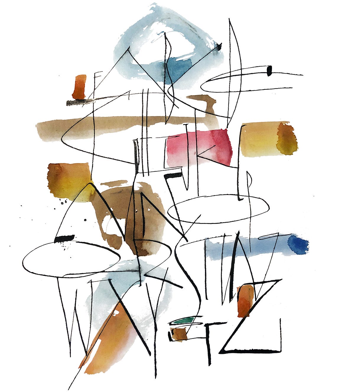
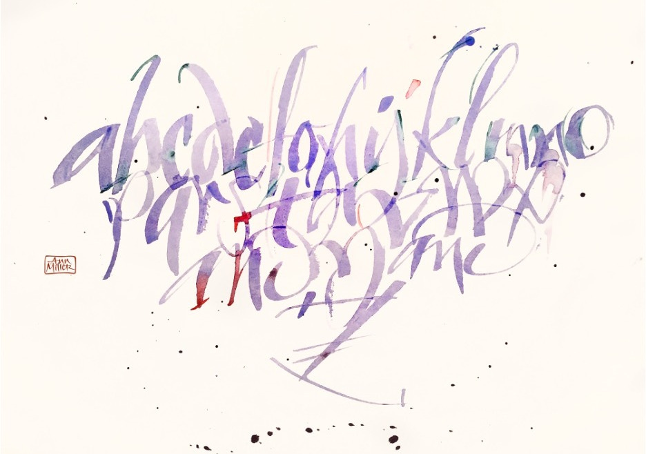
The round sable brush is a lot of fun to pick up and draw your letters with watercolor. We often feel like it’s hard to control, and avoid it, but this is not clear thinking! The feel of the brush on paper is gentle and responsive. And voluntary! Try writing without guidelines, with no interlinear space at all between the rows of letters, and stay alert; don’t plan too far ahead. After you’ve worked with the 26 for a while, you get to know that they fall into groups, and where the similar elements lie. You can exploit the character of certain letters to alleviate overall sameness, or to provide a nice curve where needed. This demo was done in 15 minutes at the end of an 8 hour class session, to show how to let the paint flow onto the page, how to cross over prior strokes, use less or more pressure, drop additional color into the wet strokes, and review everything for finishing touches before it is dry. Try it.
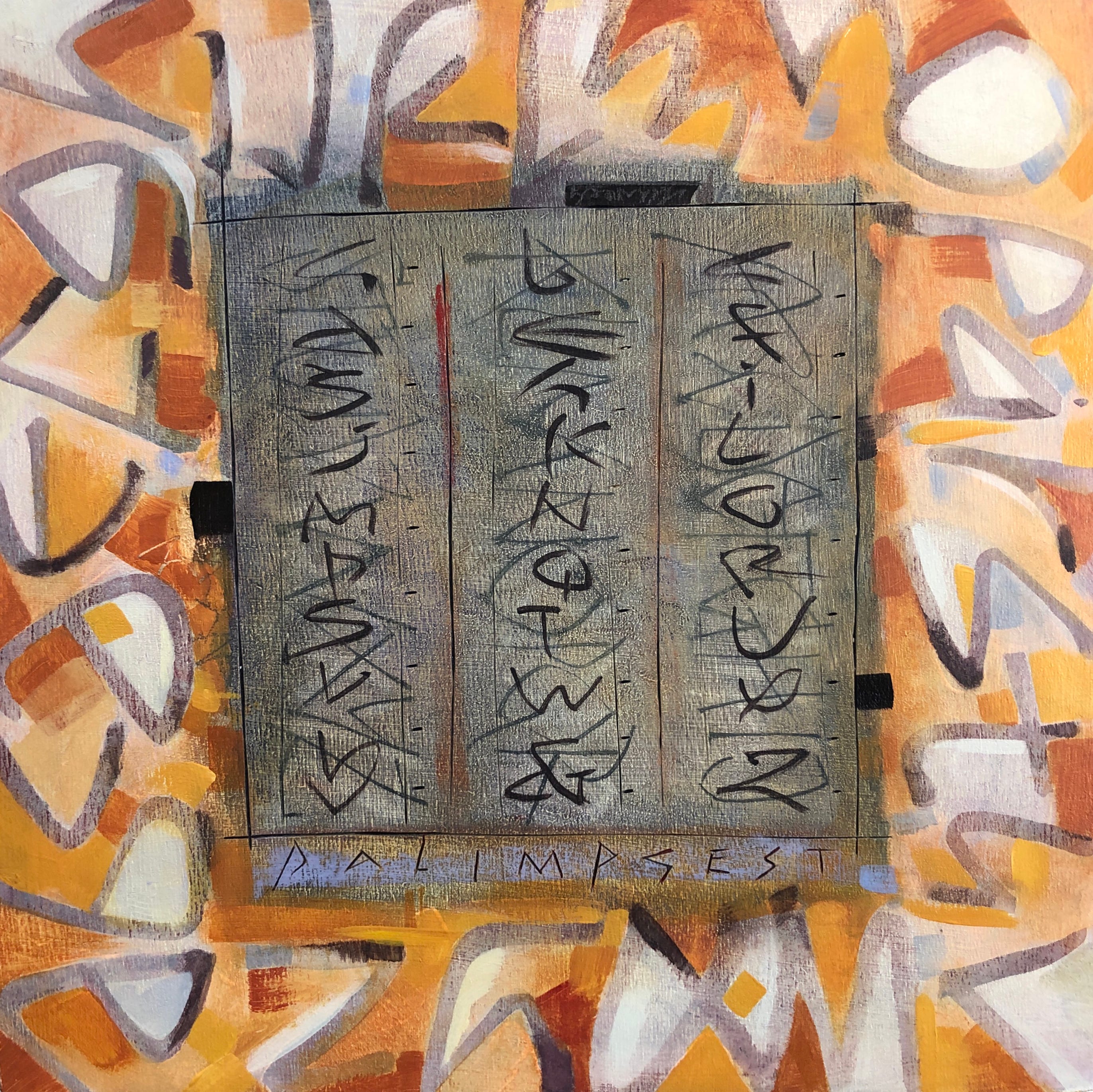
More play on the alphabet theme. While not technically a broadside, the subject of this painting is the alphabet, a place to hang your color and line. Letters are written down from upper right. A second alphabet is written across, superimposed on the previous lettering. Around the border is a pattern made from another monoline alphabet.
I hope you enjoyed these examples of alphabet broadsides. Try weaving your own puzzles with letters and ink and a little savvy.
Thank you all for reading and enjoying my posts. It’s great to be here with you.
ONLINE SUMMER 2026!
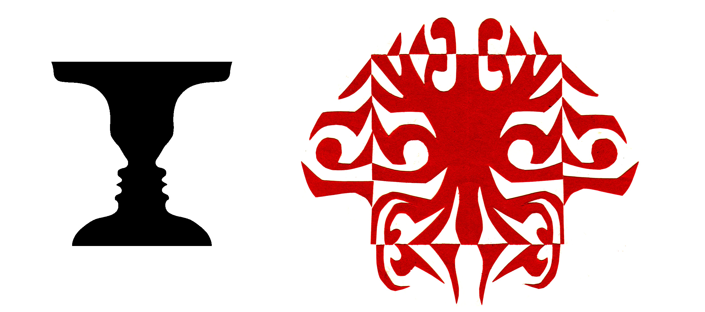
ART 232: The Design of Light and Dark: Text Art and Notan will cover optics, figure/ground theories and compositional methods in studio art, design, and letterform. I’m looking forward intensely to plunge into this area with you.
PRODUCTS
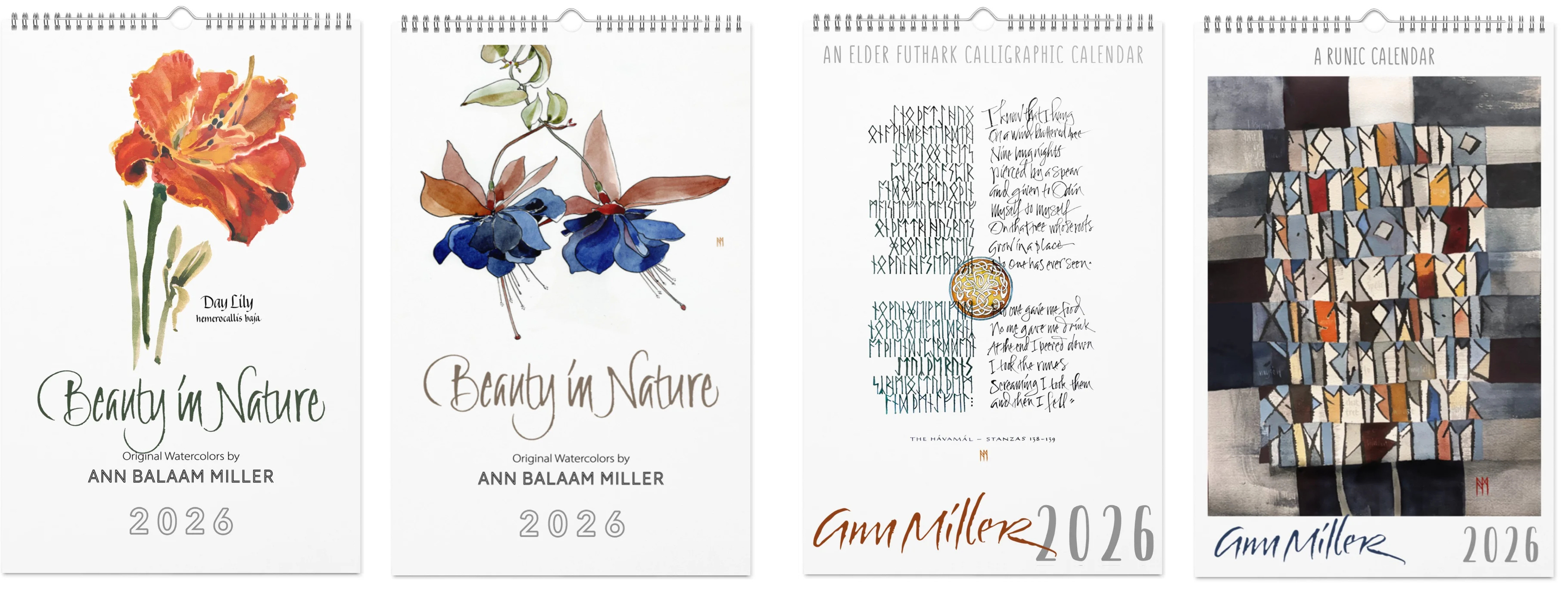
In my shop there are four art calendars for 2026 (it’s never too late!) and a few other items (mouse pads, mugs, pillows, scarves, jigsaw puzzles, and more). Email me for info or assistance with a custom order.
This blogpost on Substack will always be available free. The “paid” area is more interactive, with exercises and activities, discussion, and individual one-on-one conversation and critiques, like an online tutoring session. Your contribution is always appreciated, and helps keep my writing coming your way.
PAID SUBSCRIBERS: All paid subscriptions are now $75 annually or $7.50 monthly. I am eager to devote time to interactive projects and individual discussions on this basis. Invest in improving your graphic skills, design perception, and performance in the visual arts, handwriting, letterformation, and calligraphy.
EDUCATIONAL DISCOUNT: I offer a 50% discount on the annual paid subscription for art instructors and those in the art education field.
A paid subscription gives you access to ongoing conversations on my chat feed, permanent access to all archives, and access to exercises and how-tos. Let’s continue to talk about art and keep it fed, nourished, and productive.
Thanks for reading Getting Inky! Subscribe for free to receive new posts and access two months of archives. Paid subscriptions or donations are always welcome, with my most sincere thanks!
Comments
Nothing yet. Say the first thing.
Sign in to join the conversation.