
A few weeks ago, a product team came to me with a problem. They had run a survey, collected a reasonable number of responses, and found that the insights were pointing in a different direction from what other data sources were telling them about their users. They weren’t sure which to trust, and they asked me to help them interpret what they were seeing.
As we worked through it together, it became clear that the tension between the survey results and the other signals wasn’t really about interpretation. The issue had started earlier, in how the survey questions were written and what assumptions had been built into them before any respondent had seen them.
I thought about the root cause of their challenge a lot, partly because it is not the first time I’ve seen it, and partly because it points to something that I think gets underestimated about surveys as a research method. They produce numbers, and numbers carry a certain authority. When a percentage appears on a slide, it tends to be treated as a finding, regardless of what actually generated it. Understanding why that happens, and what it means for how we design surveys, feels like something worth writing about in some detail.
✨ In this post I’ll cover ✨:
Why numbers from survey data can mislead even when everything looks clean
What it actually takes to build a valid survey instrument
The main decisions in survey design and what the research says about them
The most common mistakes and how to recognise them
There is a reason survey data feels convincing even when it shouldn’t. In a 2022 reflection paper, researchers describe what they call the comforting illusion of data validity: the tendency to trust numbers derived from or about people as though they were objective facts, when they are often something more fragile than that.
The distinction they draw is between counts and measures. A count is discrete and observable. The number of users who clicked a button is a count. Satisfaction, trust, ease of use, or likelihood to recommend are not counts. They are measures of psychological constructs that cannot be directly observed, only approximated through questions. When a survey returns a result showing that 73% of users are satisfied, it is not reporting a fact in the same way that a click log does. It is reporting an approximation, shaped by how the question was worded, what response options were available, how tired the respondent was, and a dozen other factors that leave no trace in the final number.
This conceptual confusion between counts and measures sits underneath a lot of the overconfidence I see teams place in survey results. The number looks precise. The percentage feels conclusive. But what it actually represents is a measurement of something inherently subjective, taken through an instrument that may or may not have been calibrated for the job.
This connects to what this paper described as the illusion of validity: a cognitive bias in which people become overconfident in the accuracy of their judgements when they are looking at data, even when that data is an unreliable basis for the conclusions being drawn. The illusion is particularly strong with quantitative data because numbers suggest precision. A survey that returns clean percentages does not look like a measurement that might be wrong. It looks like a result.
The implication for survey design is significant. A poorly designed survey does not announce itself as poorly designed. It returns numbers just as a well-designed one does. The difference lies upstream, in decisions about question wording, response formats, question order, and sampling, most of which are invisible by the time the data appears on a slide.
Most people who design surveys without a research background assume the hard part is knowing what to ask. In practice, the harder part is understanding what happens between the moment a respondent reads a question and the moment they select a response.
Researchers describe this as a four-stage cognitive process: comprehension, retrieval, judgement, and response mapping. At each stage, something can go wrong in ways that are not visible in the resulting data.
Comprehension is where respondents interpret the question, and where ambiguity in wording does its damage. A question like “how satisfied are you with the price and quality of our product?” asks two things simultaneously and only allows one answer. The respondent may be very satisfied with the quality and deeply dissatisfied with the price, but neither of those positions can be expressed through a single response option. What you collect is an average of two attitudes that may point in opposite directions, attached to a number that implies a single, clean opinion. These are called double-barrelled questions, and they are among the most common wording errors in survey design.
Retrieval is where respondents draw on memory to answer questions about behaviour, and where survey data becomes particularly unreliable. Asking someone how many times they used a feature last month requires them to reconstruct a memory rather than retrieve it, and reconstruction is shaped by current attitudes and recent experience rather than accurate recall. Research on autobiographical memory suggests that retrospective self-report is systematically inaccurate, particularly for frequency estimates over time. Surveys are a weak instrument for understanding actual behaviour, and are better suited to measuring attitudes and perceptions.
Judgement is where respondents decide what they actually think, which may be more uncertain than the response format allows. Many people do not hold stable, pre-formed opinions on the topics surveys ask about. They construct a response in the moment, and that construction is highly sensitive to what they have just been asked, what response options are available, and what they think the survey is for. Researchers documented extensively how context effects, meaning the influence of earlier questions on later ones, can substantially shift responses in ways that have nothing to do with the underlying attitude being measured.
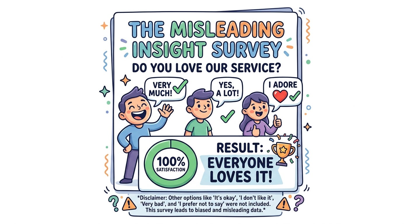
Response mapping is where the judgement gets translated into a response option, and where the design of the scale determines what information is actually captured. If a scale does not include a response option that matches how the respondent actually feels, they will select the nearest available option. That near-enough response then enters the dataset as though it were an accurate representation of their view.
Understanding these four stages matters because most common survey mistakes can be traced back to one of them. The errors are not always obvious when you are writing the questions. They become visible only when you understand the cognitive process you are asking respondents to go through.
Taking all this into consideration, the important questions to ask are what decisions actually matter when designing a survey, and what does the research say about them?
Open versus closed questions
The choice between asking respondents to write their own answer or select from predefined options is one of the most consequential decisions in survey design, and it is often made on the basis of convenience rather than fit for purpose.
Closed questions, meaning multiple choice, rating scales, and similar formats, are well suited to measuring things you already understand conceptually and want to quantify. They are faster to answer, easier to analyse, and appropriate for larger samples. Their limitation is significant: the response options you provide shape the answers you receive. If you have not included a category, you will not discover it. Respondents who do not see an option that matches their view will select the nearest available one, and that near-enough response enters the dataset as though it were accurate.
Open questions allow respondents to answer in their own words and are better suited to discovery: capturing things you did not anticipate, understanding reasoning behind attitudes, and surfacing unexpected mental models. The trade-off is that they are harder to analyse at scale, and research has found that they produce higher rates of non-response in web surveys, particularly among respondents with lower literacy levels or who are completing the survey on a mobile device. Moreover, researchers showed that open and closed versions of the same question produce substantially different response distributions, which means the format itself is an active ingredient in the data you collect, not a neutral container for it.
In practice, the most useful surveys tend to use both formats strategically: closed questions for measuring (e.g. insights from other types of research), open questions for understanding the reasoning behind the numbers. A closed question that asks respondents to rate their satisfaction and an open question that asks what most influenced that rating together produce something closer to the full picture than either format alone.
Scale design
When using rating scales, several decisions affect data quality in ways that are not always obvious.
The number of response options is one of them. Research comparing five-point and seven-point scales suggests that seven-point scales yield somewhat more variance and are marginally better at detecting fine-grained differences in attitude, while five-point scales tend to be easier for respondents and may reduce satisficing, the tendency to give acceptable rather than accurate answers.
Whether to label all response options or only the endpoints is another decision where the research is genuinely mixed. Labelling all points reduces ambiguity about what each number means, but the labels themselves introduce new problems: words like “somewhat agree” mean different things to different people and across different cultural contexts.
Acquiescence bias, the tendency to agree with statements regardless of content, is a persistent problem in agree/disagree scale formats and is worth designing around. Mixing positively and negatively worded items, partially controls for it, though this approach introduces its own complications if respondents do not notice the directional shift.
Question order
Earlier questions prime respondents for later ones in ways that are well documented in the literature. Researchers showed that asking about a specific domain before asking a general question causes the specific frame to contaminate the general response. If you ask respondents how satisfied they are with your customer support before asking how satisfied they are with your product overall, the support question will pull the overall one toward whatever the respondent just said about support.
The conventional recommendation is to move from general to specific, asking broad questions before narrowing into particular dimensions. This is a reasonable heuristic, but it is worth being clear that it is a heuristic rather than a rule. Moving from general to specific reduces the risk of specific priming contaminating general responses, but it does not eliminate context effects entirely. Order matters, and the specific ordering that best serves your research depends on which constructs you most need to measure without contamination.
Satisficing
Satisficing refers to the tendency of respondents to provide answers that are good enough rather than accurate, particularly when the cognitive demands of a survey are high. It manifests as straight-lining on matrix questions, selecting the first plausible option, or choosing the neutral midpoint as a way of moving through the survey quickly.
Satisficing is more likely when surveys are long, questions are complex, response options are hard to distinguish, and the topic feels low-stakes to the respondent. It is also invisible in the resulting data: a respondent who has straight-lined through a grid of ten items produces a dataset that looks exactly like one from a respondent who answered carefully. Reducing satisficing means keeping surveys as short as the research question allows, making questions concrete and specific, varying question formats to maintain engagement, and avoiding the overuse of matrix grids.
Most survey design errors are predictable failures that follow from not accounting for the cognitive processes described above.
Double-barrelled questions conflate two constructs into one response, as discussed earlier. They are easy to write accidentally, particularly when the survey designer is thinking about topics rather than questions. The fix is straightforward: one construct per question.
Leading questions presuppose an answer. “How much do you enjoy using our product?” assumes enjoyment. “How satisfied are you with our award-winning team?” has already told respondents what to think. These are sometimes written deliberately and sometimes accidentally, but the effect on data quality is the same.
Sampling only engaged users is one of the most common and consequential errors in product research specifically. Surveying the users who are easiest to reach, typically those who are most active, most loyal, or most recently engaged, produces a sample that is systematically unrepresentative of the broader user population. The insights it generates may be accurate for that group and misleading for everyone else.
Treating recall questions as behavioural data is a related error. As noted above, asking respondents what they did last week or how often they use a feature produces reconstructed memory rather than accurate behavioural report. Surveys can tell you what people think and feel. For what people actually do, behavioural data or diary studies are more reliable instruments.
Using agree/disagree formats without accounting for acquiescence bias inflates agreement across all items, which means that if all your questions are worded in the same direction, you may be systematically measuring agreement rather than the construct you intended. Mixing item directions or using construct-specific scales rather than agree/disagree formats is another.
A question worth asking before you send anything
Surveys are a legitimate and valuable research method. They are the right tool for measuring attitudes at scale, tracking changes in perception over time, and reaching populations that are difficult to interview directly. The problem is not surveys themselves but the assumption, which is surprisingly common, that any survey will do, and that whatever numbers come back will constitute valid insight.
The more useful question to ask before designing a survey is not whether to send one, but what you are actually trying to measure and whether a survey is the right instrument for measuring it. If the answer is yes, the next question is what it would take to build questions that actually capture what you intend, rather than an approximation shaped by wording choices and cognitive shortcuts that never appear in the final data.
If this is something you need help with for your own product, I work with founders and product teams on user research that delivers insights you can trust. Let’s chat!
🚀 Hi! I’m Andreea, an academic HCI researcher turned UX researcher that helps founders build products users actually love. I conducted hundreds of research studies for tech companies seeking clarity and I started this newsletter to share real examples and stories from my experience, so teams can do better research.
If you found this article helpful, I would be super grateful if you shared it with others.
I also love great discussions and debates, so I’m excited to hear your thoughts in the comments.
When I’m not doing research or writing, I like to go on hikes, read a good novel and play pretend with my dinosaur-obsessed toddler boy. If you’d like to support my work (and energy for writing, hehe), feel free to buy me a coffee!
Either way, thanks for reading and supporting my work ❤️
No posts
Comments
Nothing yet. Say the first thing.
Sign in to join the conversation.