
I see a lot of excitement about AI tools that can build interfaces automatically. We’re all chasing the idea of “faster, smarter, easier.” And yes, these tools can generate screens, buttons, and flows almost instantly. But here’s the thing: just because it works doesn’t mean it works for humans.
I’m currently helping a game development team build a mobile interface using vibe-coding. The AI produces exactly what we ask (and this is the problem). Fast and efficient, with an MVP ready with a few prompts. And yet, when we tested the first build, I immediately noticed how bad the UX and human interaction was: some buttons were impossible to reach, others were tiny, and some actions felt awkward. The interface did what we told it to do, but it didn’t account for the human holding the device (because we didn’t describe it explicitly). This was when I started making notes on the thumb rules, Fitts’s Law, user context and realised how this is a crucial piece of the puzzle when vibe-coding a digital product.
Andreea's Substack is a reader-supported publication. To receive new posts and support my work, consider becoming a free or paid subscriber.
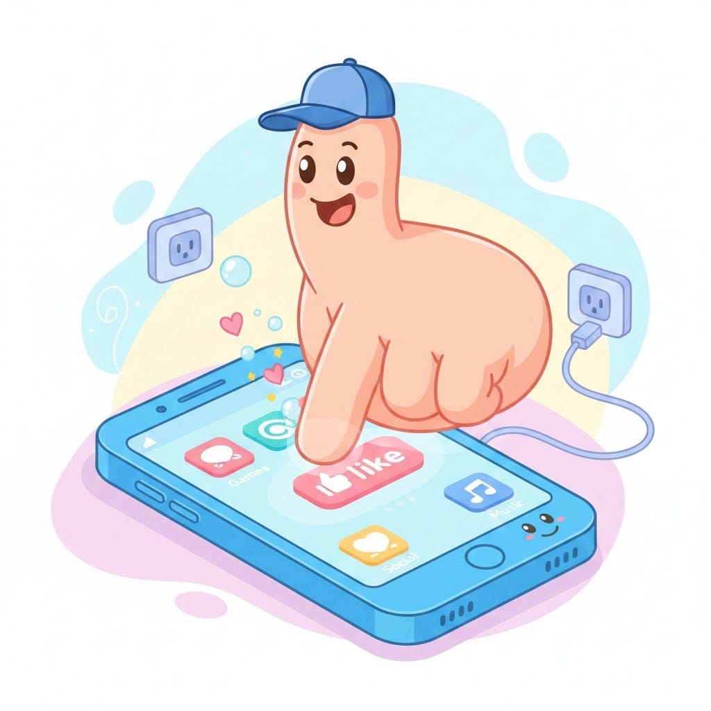
Below is what Gemini gave me when I said: “Generate a cartoon-like image with a thumb interacting with a smartphone via touchscreen”. This made me giggle (and again reconfirm how much we need to polish every simple prompt to get what we want) and thought it’ll make you smile too. Ok moving on to the thumb zone challenged explained.
The thumb zone challenge
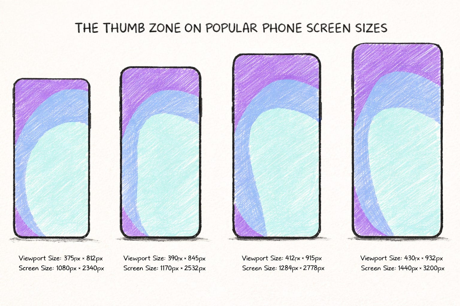
Most people hold phones in one hand. Most people tap with their thumb. That simple fact creates constraints that AI doesn’t inherently understand. Research shows that thumbs have comfortable zones, stretch zones, and awkward zones. Place buttons in the wrong area, and users make mistakes. Frustration rises. Satisfaction drops.
Controlled studies confirm this. Touch targets smaller than 9–10 mm increase errors and slow interaction. Fitts’s Law also applies: the farther and smaller the target, the harder it is to hit. Natural thumb zones vary by hand size, device size, and grip.
Several HCI studies show that the top and bottom edges of the screen are often hard to reach one-handed. Another study mapped spatial thumb reach for one-handed interaction and showed that distant screen regions are rarely accessed comfortably. Others measured how people adopt multiple postures (one hand, two hands, cradled) which dramatically changes the effective interaction area. And perceived comfort doesn’t always match physical reach; people avoid certain areas even if technically reachable.
In our game, AI placed buttons across the screen without considering any of this and created too many interaction points that were too close to each other, creating the perfect recipe for mis-tap and user frustration while playing (exactly when the user wants to be engaged and relaxed). The AI gave us exactly what we asked, but it wasn’t what we wanted.
Beyond thumbs: posture, context, and hands
Interaction isn’t just about thumb reach. It’s about the body, the environment, the context.
Posture and orientation: Sitting, standing, walking, or lounging; portrait versus landscape. Each changes what’s reachable. Landscape mode stretches thumbs further than most one-handed grips allow.
Environment and attention: Users on the street, commuting, or multitasking interact differently than those relaxed on the sofa. Accuracy drops when attention is split.
Hands: One-handed vs two-handed use affects which screen areas are easy to reach. Even with two hands, top corners remain challenging. Left-handed users mirror zones differently, ignoring them can frustrate half your audience.
Emotions and focus: Stress, excitement, curiosity, and fatigue all influence what users notice, how fast they act, and how tolerant they are of friction.
AI doesn’t perceive these factors. It doesn’t know if someone is rushing on a train or lounging on the couch. And that’s why human insight is irreplaceable when designing products users actually love.
Good UX is not a “nice-to-have”, it’s the reason your users convert and come back for more. It’s what makes your product valuable.
To help the team I’m working with (and founders, startups, designers, product managers or anyone building their own product), I decided to put together a small framework to help structure the key elements of good UX and smooth human-computer interaction.
✨PUF✨ , your prompts are user-centred.
Introducing P.U.F.
Before making decisions within your digital product, take a moment to think about these three dimensions, and answer these questions as detailed as you can.
P — Purpose
Why is the user interacting?
Are they trying to exit quickly? Explore freely? Avoid mistakes?
What matters most right now: speed, safety, clarity, or enjoyment?
Purpose drives all decisions. Knowing why the user is acting guides where to place controls, how complex an action should be, and what should be most prominent.
U — User
Who is holding the device, and what’s their state?
Grip, right or left handed, posture, controller use, ideal orientation (portrait, landscape)
Attention level, environment, location and context.
Emotional state: relaxed, rushed, stressed, curious.
User context shapes what interactions are realistic. It also highlights constraints AI doesn’t perceive. One-handed users can’t reach the top-right corner without awkward stretching. Two-handed users can reach more, but some edges remain uncomfortable.
F — Flow
How will the user complete the interaction?
What gestures, taps, or steps are required?
Can the user recover if they make a mistake?
How does feedback communicate success or failure?
Is the exit intuitive? Can users undo or cancel?
Flow combines action, completion, feedback, and exit into a single lens. It forces designers to think about the entire experience, not just whether the screen technically works. It also ensures the interface accommodates Purpose and User state in context.
Why this matters now
Vibe-coding and other AI tools are incredible. You can iterate faster than ever. You can generate hundreds of variations overnight. But speed doesn’t replace judgment. Human bodies, environments, and intentions still define whether an interface is usable.
Before generating screens, ask yourself:
Who is using this?
Where and how are they holding the device?
What are they trying to accomplish?
Can they complete actions comfortably and recover from mistakes?
P.U.F. keeps these questions front and center. It’s a reminder that AI can build what you ask for, but only humans can design what users can actually use.
I’d love to hear your stories on how you design UX and specific human-computer interaction while vibe-coding. What feels challenging? I’ll reply to every comment, let’s start a discussion.
Andreea's Substack is a reader-supported publication. To receive new posts and support my work, consider becoming a free or paid subscriber.
Comments
Nothing yet. Say the first thing.
Sign in to join the conversation.