
Hi friends, today I’m sharing an interview that I did with Needle & Grain for their Spring print quarterly issue — A Return to Slow Living. Hope you enjoy!
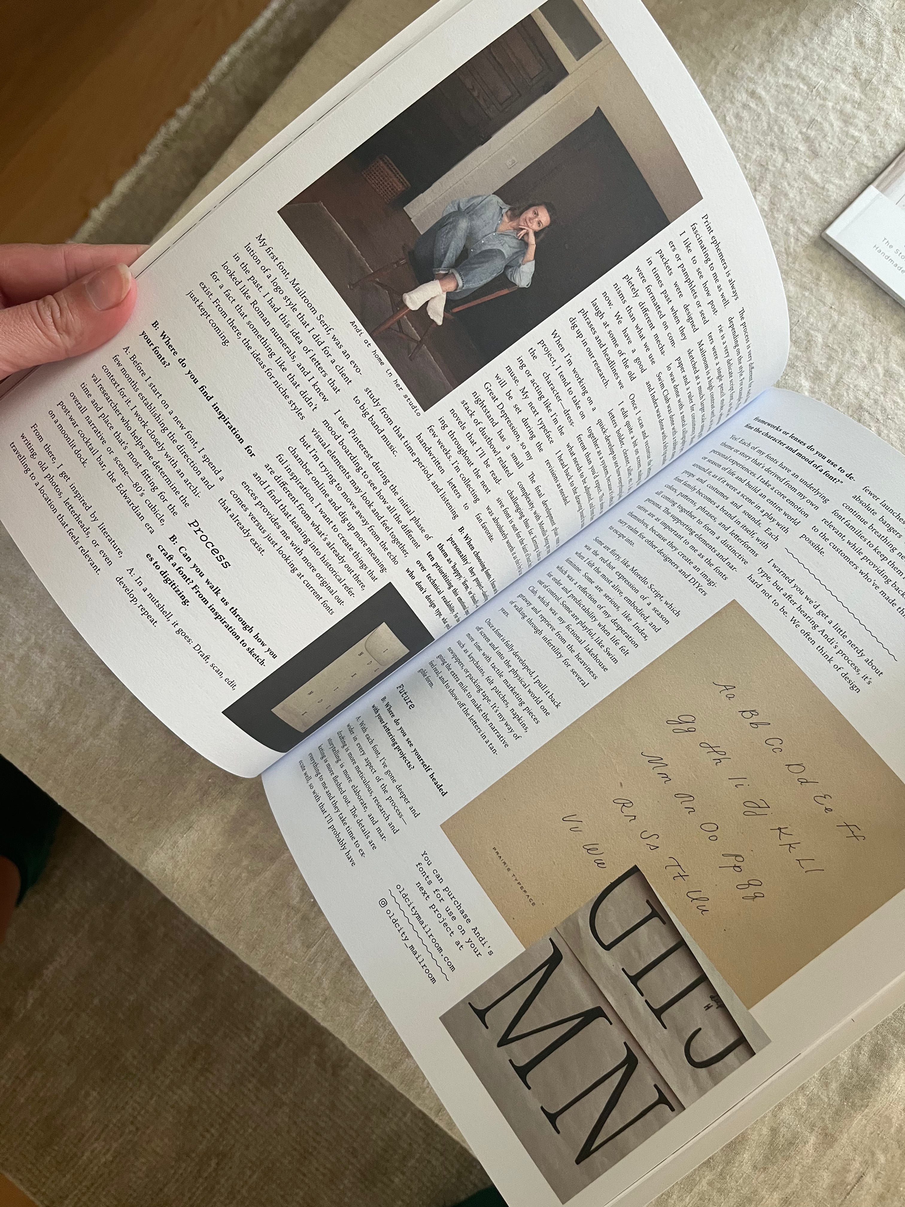
Bryson:
Let’s start it off and give yourself a bit of an introduction. Who you are (personally), what you do (professionally), and what brought you to Columbia? What do you love about being here?
Andi:
I’m Andi Aukshunas: a wife, artist, feeler, dreamer. I’m an amateur dancer, lazy gardener, chef for two and kitty mama. Homebody half the time, social butterfly the other half.
Ten years ago I started a design studio called Old City Mailroom. I began as a calligrapher, transitioned to brand and web design, and now I’m a full time font designer. My fonts have gained notoriety for their perfectly-imperfect handmade quality, and have been used by brands I only dreamed of, such as Anthropologie, Free People, Ballerina Farms, and Kendall Jenner to name a few. Just as importantly, they’ve been used on kindergarten cubbies, kitchen recipes, embroidered wall hangings, and engraved farm signs.
I was born and raised in Franklin, Tennessee then moved to Oregon for five years. If you live in this area, well then you know why we didn’t move back to Franklin. It grew up a lot during those five years. We’ve been in Williamsport now for four years and we enjoy being surrounded by farms and knowing our post office workers by their first name, while also being able to cruise into town for a quality vanilla latte.
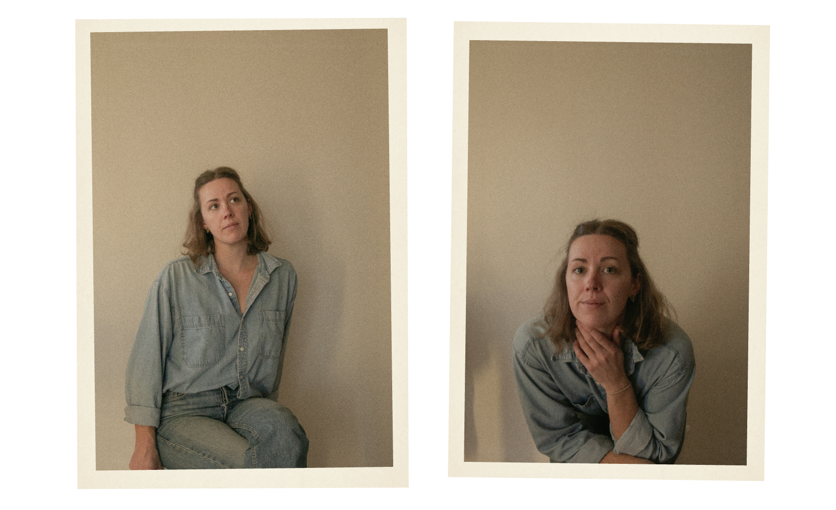
B: Being a designer myself, there’s millions of fonts available to us, what drew you to doing your own typography? Was there just not a style or design you wanted and felt like you needed to do it yourself? Is it just a creative outlet (like this magazine is for me!)?
A: Let’s start from the beginning… About a year ago, I told my husband I didn’t want to do branding anymore after doing it full time for over ten years. I had a few nail-in-the-coffin client experiences back to back and I wanted to shift gears and focus on homemaking, baking, sewing, spending time outside and trying to start a family. It felt like tug-of-war: being a devoted entrepreneur relishing the fruit of what I’d spent years building, and on the other hand wanting to live a slow and intentional life, making food from scratch and immersing myself in books and nature and community. (If anyone knows how to do both, please advise!) Together my husband and I talked about the bare minimum that I needed to make, and I decided I would say no to any work beyond that.
Ironically, when I let go of my attachments and aspirations for my business, creativity naturally began to well up and spill over. The margin I had gained from declining client work gave me fresh headspace to daydream about my own original ideas for the first time in a long time, and so my endeavors as a font designer began.
When I was doing branding full time, I often drafted logos by hand for my clients. I could envision exactly what I wanted it to look like, but rarely was able to find something pre-made that matched that, so I used pencil and paper to bring to life what was in my head. I’ve designed over 100 logotypes throughout my branding career, so I’ve spent my fair share of time scouring the internet for standout typography. I have a pretty good idea what does and doesn’t exist within the industry.
My first font, Mailroom Serif, was an evolution of a logo style that I did for a client in the past. I had this idea of letters that looked like Roman numerals, and I knew for a fact that something like that didn’t exist. From there, the ideas for niche styles just kept coming.
Eventually, I transitioned out of branding altogether and stepped into font design full-time.
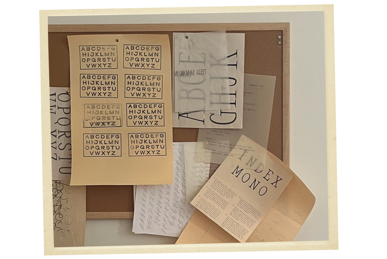
B: As a designer I can get a sense of feeling/personality with fonts. As I scroll through fonts to find the perfect one for a project I’m always assigning personalities, like “happy, serious, clean, firm, light-hearted, fun, friendly” in my mind. I seem to find myself seeking the right emotion I want to convey before I even consider readability and other elements. Are there lenses or paradigms you build or view your fonts or other people’s fonts through as you work on your own?
A: Yes! Each of my fonts have an underlying theme or story that’s derived from my own personal experiences. I take a core emotion or season of life and build an entire world around it, as if it were a scene in a play with props and costumes and sounds. Each font family becomes a brand in itself, with colors, patterns, phrases, and letterforms all coming together to form a distinctive persona. The supporting elements and narrative are as important to me as the fonts themselves, because they create an imaginary realm for other designers and DIYers to escape into.
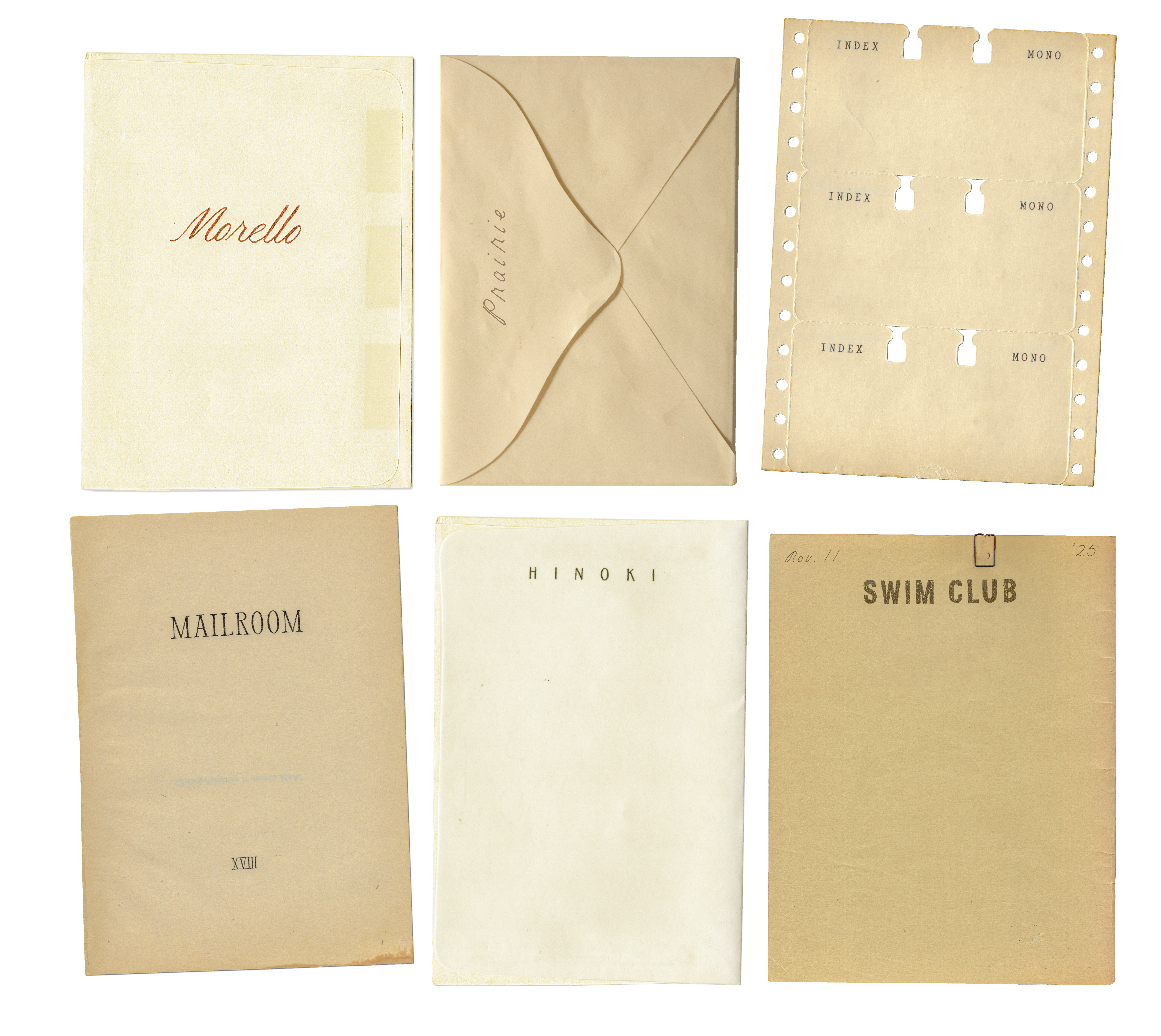
Some are flirty, like Morello Script, which was the red-hot expression of a season when I felt the most alive, embodied, and feminine. Some are serious, like Index, which was a reflection of my desperation for order and predictability when life felt out of control. Some are playful, like Swim Club, which was my fictional lakehouse getaway and reprieve from the heaviness of walking through infertility for several years.
When I zoom out and look at the entire collection from a birds eye view, I see it as an evolving archive of internal states. I think, on a very subconscious level, that customers really resonate with “trying on” a certain mood that matches their prompt or vibe and goes deeper than just the specs of a letterform.
Once a font is fully developed, I pull it back off screen and into the physical world one more time with tactile marketing pieces such as keychains, felt patches, napkins, newspapers, or packing tape. It’s my way of going the extra mile to make the narrative feel real, and to show off the letters in a tangible form.
B: Where do you find inspiration for your fonts?
A: Before I start on a new font, I spend a few months establishing the direction and context for it. I work closely with an archival researcher who helps me determine the time and place that’s most fitting for the overall narrative or scene—80’s cubicle, post-war cocktail bar, the Edwardian era on a moonlit dock.
From there, I get inspired by literature, writing, old photos, letterheads, or even traveling to a location that feels relevant. Print ephemera is always fascinating to me as well. I like to see how posters or pamphlets or seed packets were designed in times past when they were formatted on completely different mechanisms than what we use now. We have a good laugh at some of the old phrases and headlines we dig up in our research.
When I’m working on a project, I tend to take on the character—dressing or acting like I’m the muse. My next typeface will be set during the Great Depression, so my nightstand has a small stack of dustbowl related novels that I’ll be reading throughout the next few weeks. I’m collecting handwritten letters to study from that time period, and listening to big band music.
I use Pinterest during the initial phase of mood boarding to see how all the different visual elements may look and feel together, but I’m trying to move away from the echo chamber online and dig up more meaningful inspiration. I want to create things that are different from what’s already out there, and I find that leaning into historical references provides me with more original outcomes versus just looking at current fonts that already exist.
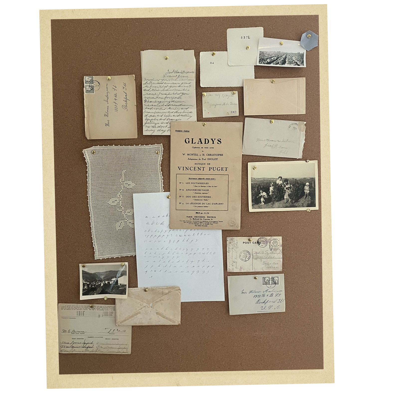
B: Can you walk us through how you craft a font? From inspiration to sketches to digitizing.
A: In a nutshell, it goes: Draft, scan, edit, develop, repeat.
The process is very different for each font depending on the style. For example, Prairie is a very delicate script font, so the letters were a single pencil stroke, whereas Mailroom is a high contrast serif, so it was sketched at a much larger scale using grid paper and a ruler for consistency. Morello was done with a metal calligraphy pen, Swim Club was done with a rubber stamp, and Index was done with a felt tip marker.
Once I scan and vectorize the lettering, I edit quite a bit on screen, making the letters bolder, cleaner, taller, etc. I do a quick-develop to see how everything looks together as a system, because it’s often different than you’d expect. This shows me what needs to be adjusted, and from there I head back to the drawing board to make revisions as needed.
The final development phase varies in complexity, with Morello being my most challenging thus far. Kerning a thin cursive font is not for the faint of heart, but it was absolutely worth it as she’s by far our fan favorite.
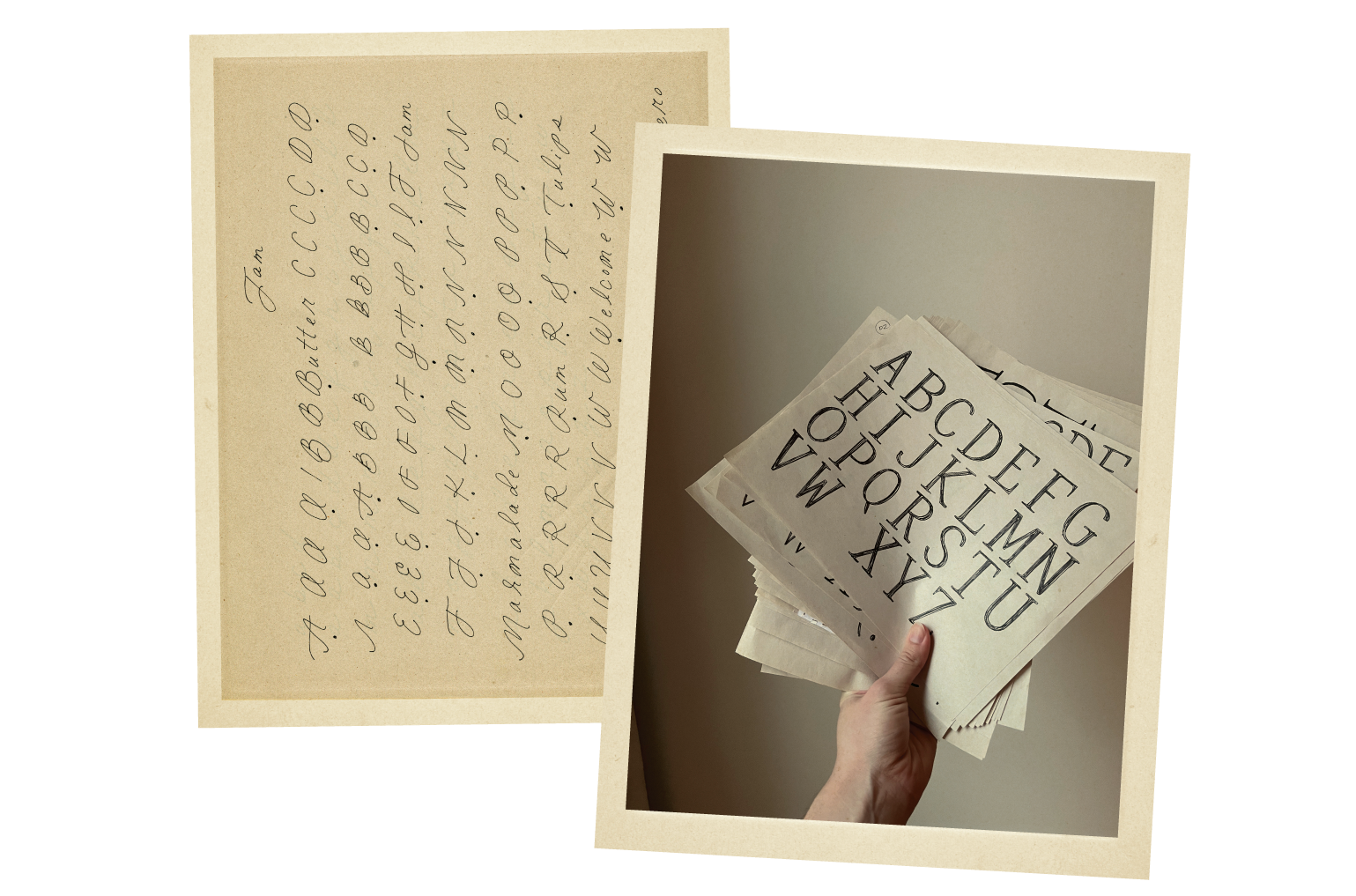
B: Are there elements of your home that influence your work?
A: We live in a 100 year old farmhouse with 12 foot ceilings, bead board accents, transom windows, and solid wood doors. I don’t know that the home itself has influenced my work per se, but it definitely feels congruent in the sense that they are both a little beat up, lived in, and aged but sturdy.
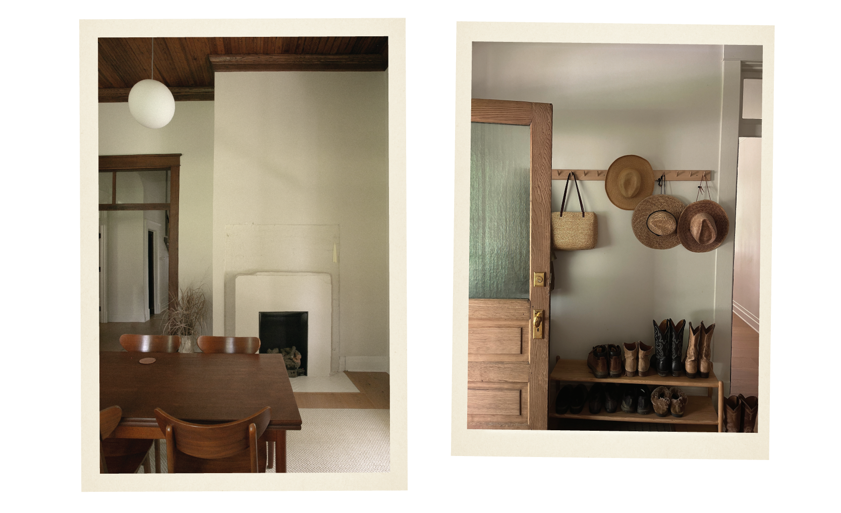
B: Where do you typically work? Can you tell me about your home/office? What parts of your creative space influence your work today?
A: I have a studio at home that I am perpetually re-arranging and finessing. This year I finally upgraded from IKEA-everything to some big girl furniture. After hemming and hawing for months (maybe years), I found the perfect vintage mahogany armoire at the Columbia Antique Marketplace, which I can shove everything into, including my scanner, paper cutter, hordes of process work, and my obnoxiously jumbo printer. I indulged in a dreamy taupe wool rug that’s actually big enough for the room, and I have a bulletin board en route that’s taller than me. I’ve always taped little bits of collected inspiration to my walls, and I’m excited to have a designated place to mood board IRL. I’m very impacted by my surroundings and get easily distracted, so getting the studio more buttoned up has brought me a lot of peace and clarity as I begin my workdays.
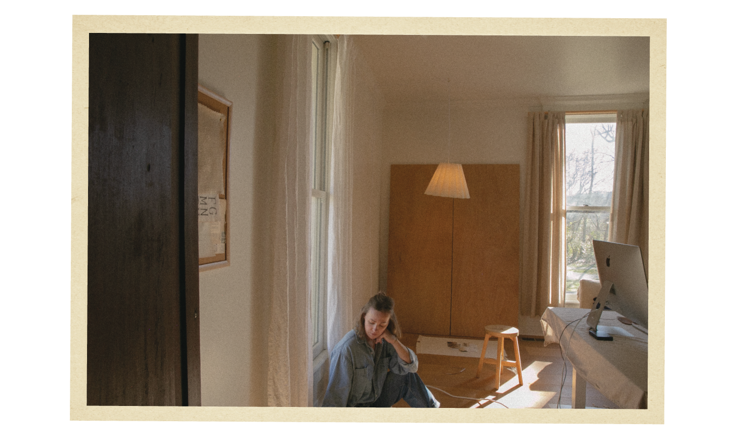
B: Where do you see yourself headed with your lettering projects?
A: With each font, I’ve gone deeper and wider in every aspect of the process—drafting is more meticulous, research and storytelling is more elaborate, and marketing is more fleshed out. The details are everything to me and they take time to execute well, so with that, I’ll probably have fewer launches per year, but they will be absolute bangers worth waiting for. I’ll continue breathing new life into previous font families to keep them feeling fresh and relevant, while providing backend support to the customers who’ve made this dream possible.
Thanks for reading!
xo, Andi
Comments
Nothing yet. Say the first thing.
Sign in to join the conversation.