
Hi there! In case you’re new here, I’m writing about my journey into illustrating for children’s picture books!
I’m currently building up a portfolio with examples of picture book work in the form of personal projects. In this case, Little Red Riding Hood! I thought I’d bring you along with me so you can see my process!
Why Little Red Riding Hood?
Moving from a career as a concept artist for games meant I already had a portfolio of art but none of it was really relevant to picture books, so I need to make new pieces!
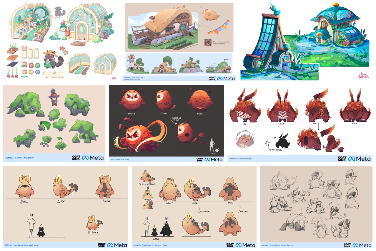
I saw the idea of illustrating a well-known fairy tale in an article with advice about building a picture book portfolio (I have sadly completely lost where I read it, otherwise I would link it here!). Many fairy tales are in the public domain so you don’t run into issues with copyright, and it shows you can adapt to someone else’s text. Plus, it saves you the time of writing a whole new story (even if that is the eventual goal!).
Of course there are LOTS of options for fairy tales, but I landed on Little Red Riding Hood because I love to draw nature and the idea of the forest setting really appealed to me - as well as being able to have fun with the characters!
Step 1: Script
When I started the project I quickly realised I hadn’t actually read Little Red Riding Hood for ages! So I looked it up and familiarised myself, before writing down a rough script for the story.
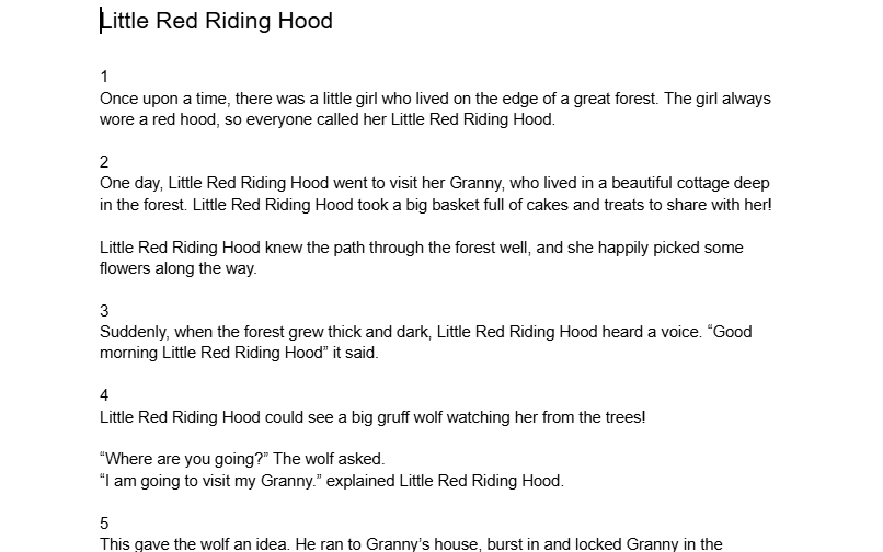
There are lots of different interpretations around so I made a condensed version with some tweaks that felt most like the story I wanted to tell. For example, I didn’t want the wolf to eat Granny; that felt far too bleak! Instead, Granny gets locked in a cupboard then bursts out and scares the wolf away! This just felt much more like the kind of story I wanted to illustrate.
I kept this stage pretty rough; just the key beats of the story with the intention of refining the text later. It just helped me solidify the overall story in my head, and identify which parts I felt were ‘key moments’ that I wanted to emphasise with the illustrations.
Step 2: Thumbnails
I actually made one thumbnail weeks before I started the project at all.
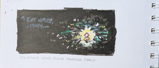
I had this really distinct idea of a scene where Little Red Riding Hood is walking through the woods, and it kind of gave me an idea of the mood/look of the overall story (trust me, it makes sense in my head!). It wasn’t until weeks later that I actually had time to get started on the project properly!
After making a rough draft of the script I came back to thumbnails, but before I share them I want to just give a quick nod to The Good Ship Illustration’s Picture Book Course! I’ve been working my way through that and it has already taught me a lot which helped to tackle this task more easily!
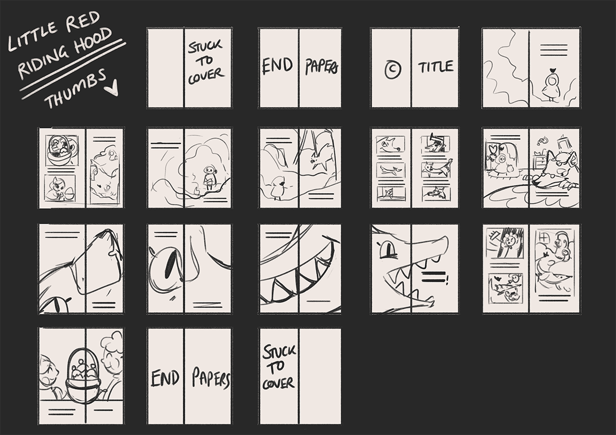
Ok, back to thumbnails. I did my first round on paper - even though I work digitally for ‘final’ illustrations. I just find it easier to quickly scribble down ideas with a pencil, and it feels more loose and fun which I think is important at this stage!
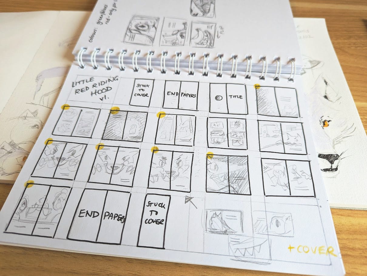
You’ll notice these are super messy! But they don’t need to be neat, they’re just for me (well, and you). These thumbnails helped me work out:
How I want to spread the story out
Where I want to bring emphasis to big story moments
How the story will be paced
The mix of spreads and vignettes that I want to do
Generate fun ideas for how the illustrations can tell the story!
Since this is a personal portfolio project and I’m not actually making an entire book I didn’t worry too much about refining these thumbnails. Looking back now, there are already changes I’d make! But since I’m just choosing some spreads to illustrate I haven’t spent as long on this as I would otherwise.
I did take these into Photoshop and did a second pass (only slightly more refined!) before the next stage:
Step 3: Colour Script
I think I did some sneaky character design before this next step, but really I think they can be interchangeable - so for the sake of this post remaining about thumbnails, I’ll go over character design later!
Next I started thinking about colour! This might feel really early, but I wanted to do a pass at this stage to:
Check what I had in mind would work
Create consistency across the entire book
Explore how I can use colour to emphasise key moments and change the mood across the story
Work out a rough colour palette I can stick to (in theory!) later on so I’m not jumping around wasting time and picking 500 different hues!
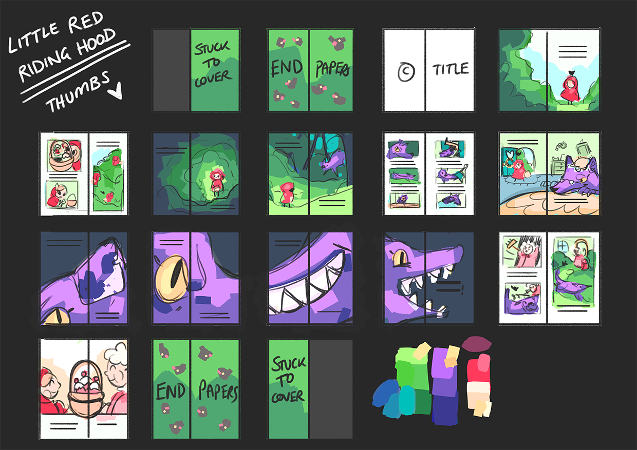
I already had in mind that I wanted the book to be primarily greens and blues, with Little Red Riding Hood as the only red thing so she would really stand out. I then thought it would be good to bring a little bit of red into Granny’s character to create a link between them - but I kept these paler. I chose purples for the wolf so he also stands out but still feels like he belongs in the forest.
Again as this is a personal portfolio project and I’m only illustrating a few spreads I didn’t do as much exploration as I might have done for a ‘proper’ project. Since it’s just for me I already had a strong idea of what colours I wanted to use and didn’t feel like I needed to change them too much. There are definitely some spreads I would look at more closely if I were to take them to a final piece!
Next Steps: Character Design and Roughs!
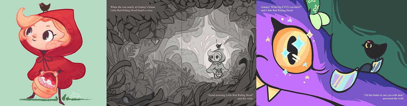
I hope you enjoyed the insight into my process so far! Next I’ll be sharing how I approached character designs, and then roughs for the spreads I’ve chosen to illustrate.
I’d love to hear any comments or questions if you want to post below - or if there’s anything you’d like more detail on! Or if you know anyone who might enjoy this kind of content, feel free to share it!
If you like this article and want to get future ones direct to your inbox, feel free to subscribe! All my content is free - with an entirely optional paid subscription tier if you want to support my work and the blog (and for those that do I am super grateful!).
Comments
Nothing yet. Say the first thing.
Sign in to join the conversation.