
This post has been sitting in my drafts for months, it’s a topic I’m very passionate about and wanted to get it just right. The one-year anniversary of Film Photo Club felt like the perfect moment to polish it up and hit publish.
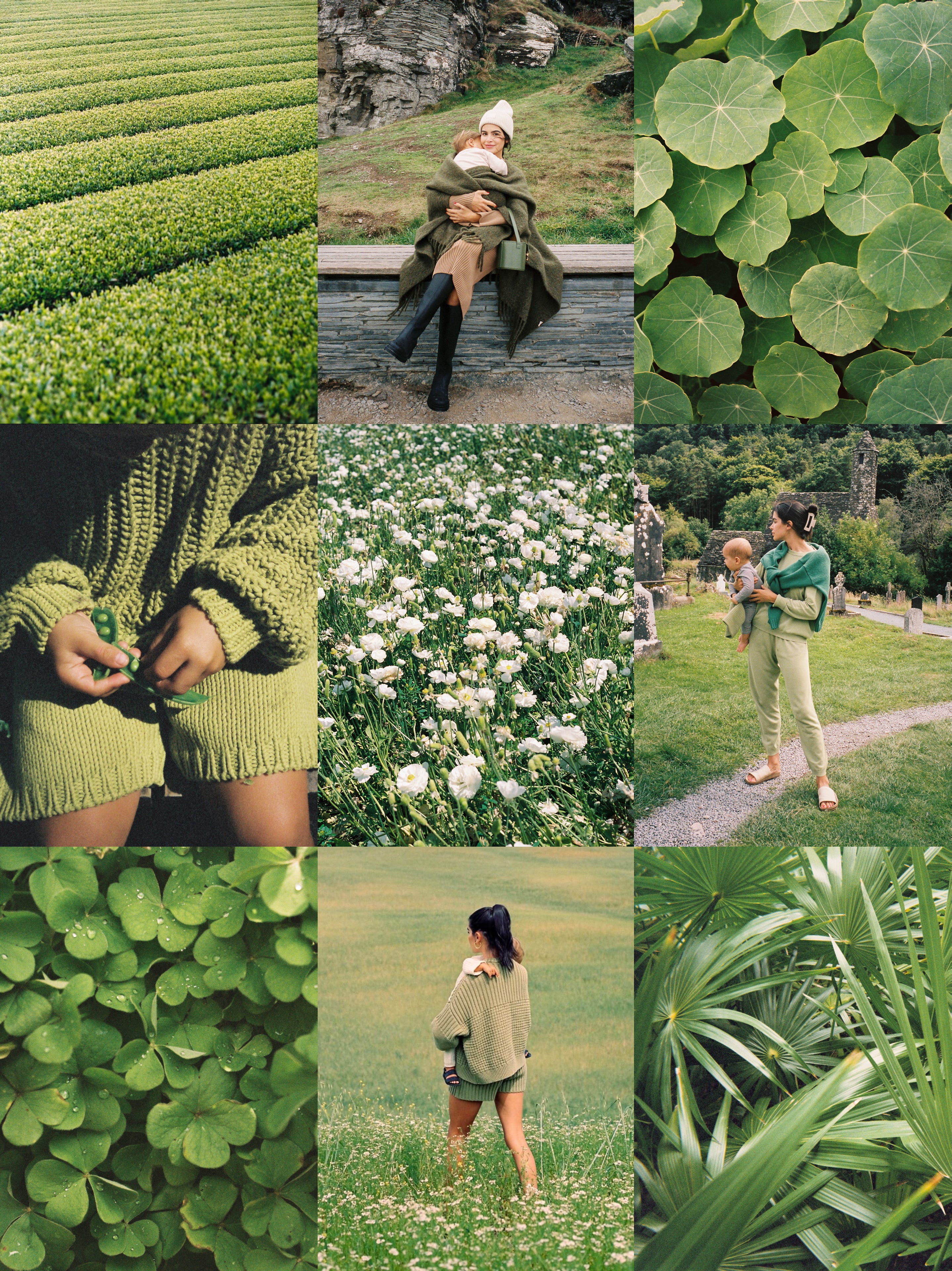
I enjoy studying color theory for a few different reasons. When color is used intentionally, it impacts the emotion and visual impact of an image— I’ve found it to be a really useful tool to have in my back pocket when I’m planning photo sessions.
In this post I’m going to discuss color temperature, intensity and relationships, as well as how I approach photography with color in mind. I also share a couple tips for approaching this month’s focus.
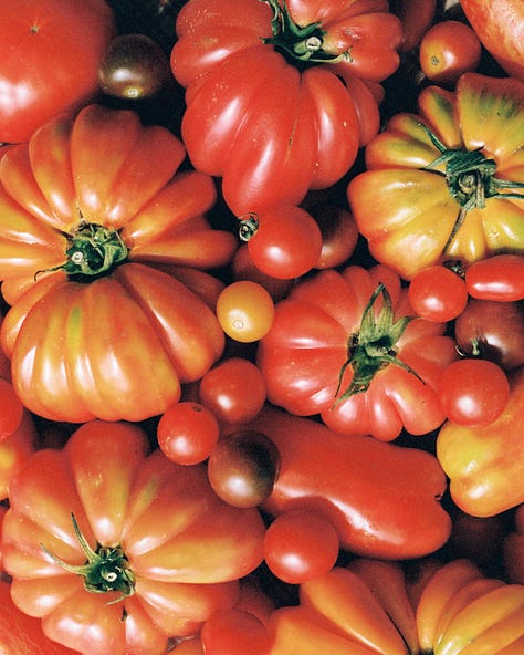


Warm: Reds, oranges, yellows
Visual impact: Warmer colors feel energetic and youthful
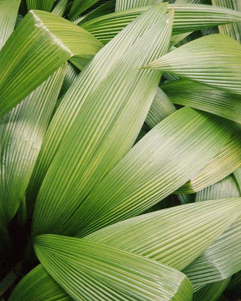
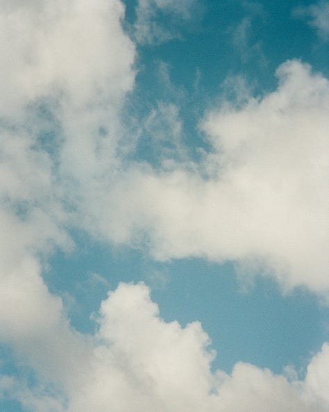

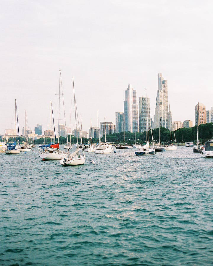
Cool: Greens, blues, purples
Visual impact: Cooler colors feel calm and grounding
Strong
Visual impact: Strong colors communicate energy and intensity
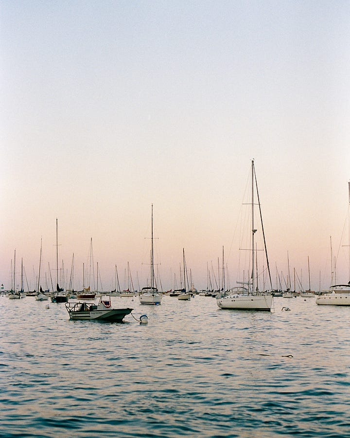
Muted
Visual impact: Muted colors communicate calmness and relaxation
Comments
Nothing yet. Say the first thing.
Sign in to join the conversation.