
Here’s something we see constantly across our community of urbanists.
A planner spends two days making a beautiful map. Layers stacked, colors tuned, legend perfect. They drop it into a client deck. The client glances at it for three seconds, nods politely, and asks a question that has nothing to do with what the map was supposed to show.
The map didn’t fail because it was ugly. It failed because it tried to say everything, and ended up saying nothing in particular.
Most university GIS courses teach the software (and often not even good enough to use the skills in real practice afterwards). How to load layers, run a buffer, style a polygon. That’s it. The actual job, deciding what your map needs to argue and stripping it down until that argument is impossible to miss, is left for you to figure out on the job. Usually under deadline. Usually in front of a client.
So before we get to what our team has been building to close that gap, here are four shifts that will sharpen almost any map you make this week.
Before you open QGIS, write one sentence: “This map shows that ___.” If you can’t finish that sentence in plain language, the map doesn’t have a point yet. Most cluttered maps are cluttered because this step was skipped. Once you have the headline, every layer either supports it or gets cut.
Pick any map you’ve made recently. Count the layers. Now ask which ones actively support the headline. The rest are context at best, noise at worst. A useful rule: context layers should fade into the background (low opacity, neutral grays), study layers should pop. If everything is fighting for attention, nothing wins.
Every good map has three visual tiers: what you want people to see first, what gives context, and what fills the space. If a viewer can’t tell within 2 seconds which is which, the hierarchy is broken. Test it: blur your eyes at the map. Whatever still reads clearly is your first tier. Whatever disappears completely should probably stay disappeared.
The most underused QGIS productivity hack right now is using AI for rule-based expressions. Instead of forum-scrolling for the right syntax, describe what you want in plain language:
“Show buildings taller than 20m in red, fade everything else to gray, only within 300m of a metro station.”
You’ll often get a working QGIS expression back in seconds.
The key is precision: reference the correct field names, values, and if needed field types (string, integer, decimal). For example: “Use the integer field building_height and the string field land_use with value residential.”
The judgment about what to highlight stays yours. The syntax overhead disappears.
📊 The numbers on this shift, based on the workflows our team has been running and teaching:
→ 5 to 10x faster styling and rule-based logic
→ ~70% less time on syntax debugging
→ 2 weeks is the typical payback period in saved time
The cost of learning this properly is recovered in saved time within roughly a fortnight of normal map production.
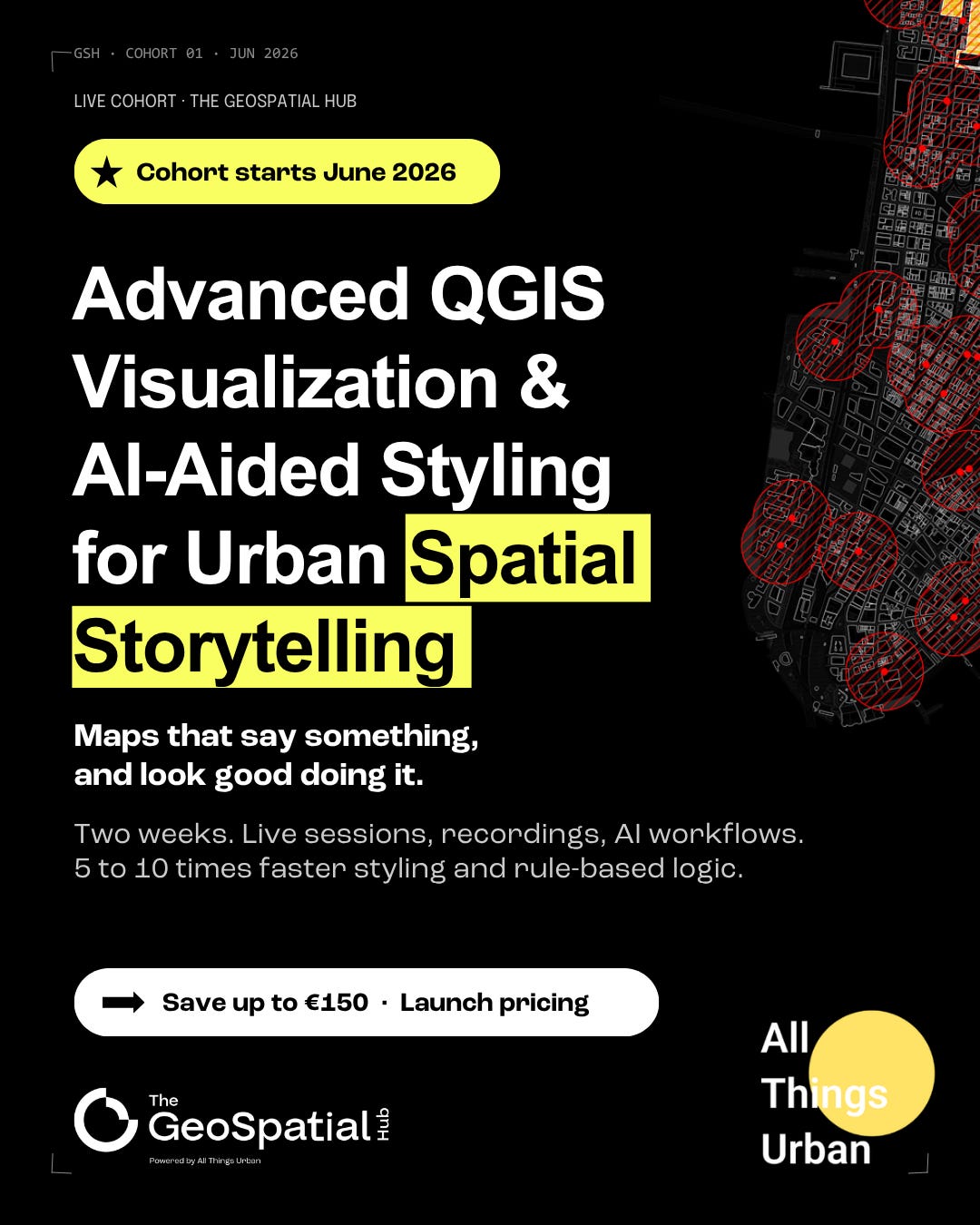
Our team at The GeoSpatial Hub powered by All Things Urban built a brand new intensive course around the principle threaded through this email: maps are arguments first, aesthetics second.
And AI, used the right way, compresses hours of styling work into minutes without compromising your judgment.
The course taught by Juan Pablo Corral, Co-Founder and Director of Applied GIS & Education at The GeoSpatial Hub. Master of City Design from LSE, Master of Architecture, 10+ years in applied GIS across the UK, Europe, the US, and South America, and 500+ urban professionals already trained through his programs.
Define is the thinking work. What the map needs to say, which layers earn their place, where the hierarchy sits. The stuff that happens before QGIS opens. This is the part university courses skip.
Build is the technical layer. Categorized, graduated, and rule-based styling. Labels that improve readability instead of cluttering it. Atlas for automation. AI used as a syntax translator, not a decision-maker.
Refine is the part that usually gets cut for time. Basemaps that give context without noise. Clear separation between study area and surroundings. Fills, strokes, transparency. The decisions that turn a working map into a client-ready map.
Two weeks, four live sessions at 4 PM CEST / 10 AM EDT, all recorded within 3 hours. Cohort #1 runs June 5 to 18. Materials stay accessible for 2 months.
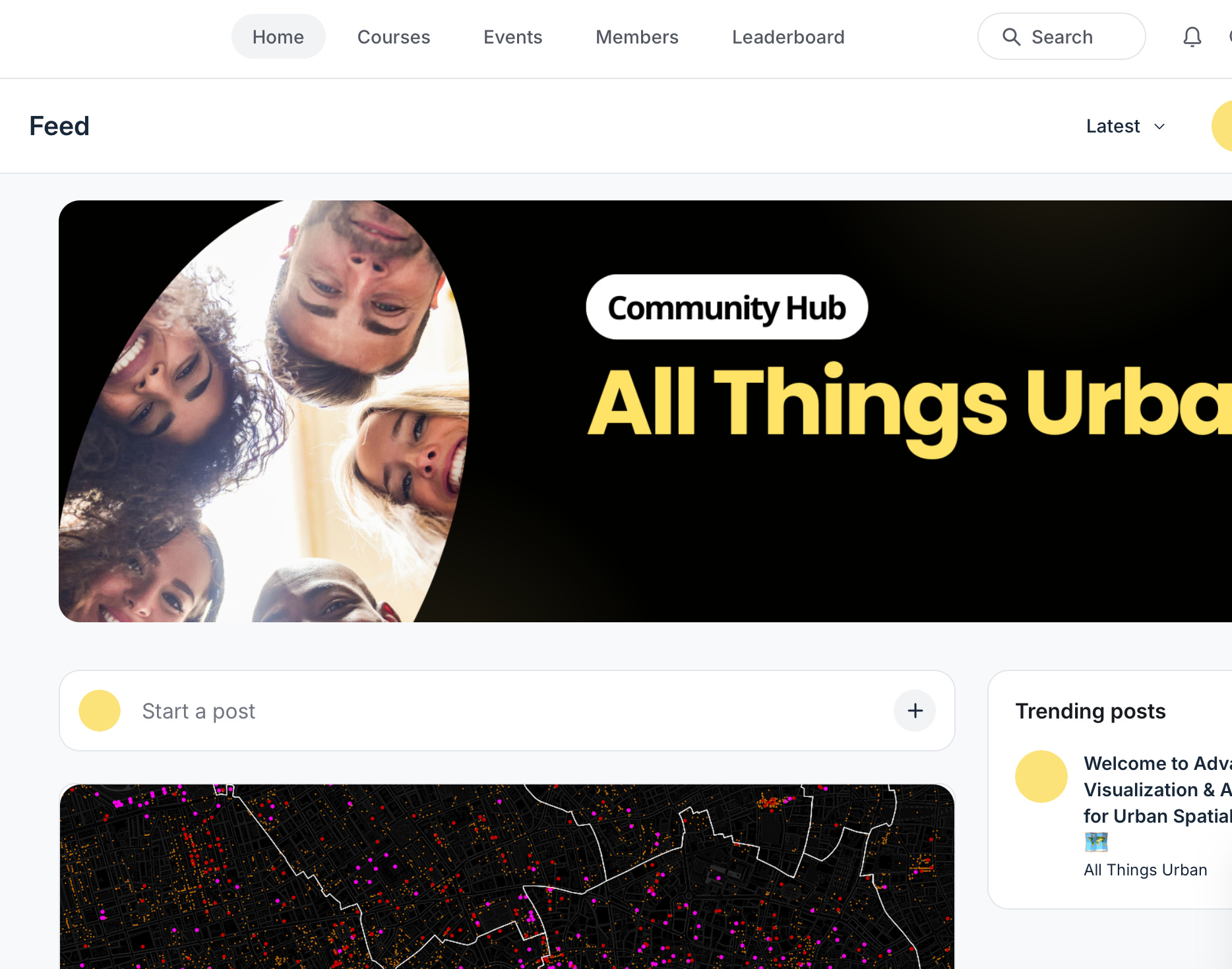
The whole thing lives inside the All Things Urban Community Hub, so you’re learning alongside a global cohort, not watching videos alone.
✦ 4 live sessions with the course professor (all recorded, available within 3 hours)
✦ Full course materials: video lessons, written instructions, GIFs, walkthroughs
✦ Exercises and quizzes to apply each module as you go
✦ QGIS project files, real datasets
✦ Ready-to-use AI prompts
✦ 2 months of access to all materials from cohort start
✦ A global cohort of urban practitioners learning alongside you
Mentored tier adds:
✦ 2 live Q&A sessions with the course professor
✦ 1 month of live chat with the instructor and your cohort for feedback and support
✦ Optional final exam with the professor’s personal review
✦ Certificate of completion
💸 Two tiers, launch pricing. Apply now and save up to €150 from the full price:
Limited seats, and Cohort #1 will likely sell out. If maps are part of how you make your case, this is the one for you.
There’s a 40% discount available through a quick form on the course page.
Probably yes. Most firms have professional development budgets for exactly this kind of training, and the course typically pays for itself in saved time within 2 weeks of normal map production.
On the course page you’ll find:
✦ A downloadable PDF brochure to share with your manager
✦ A ready-to-send email draft you can copy, adjust, and send
Both are designed to make the ask easy and frame it around real impact: faster client deliverables, AI productivity gains, and stronger stakeholder presentations.
Most of what we do at The GeoSpatial Hub happens at the team and organisation level. We design tailored GIS and spatial-analysis programs around your data, your projects, and your tools, delivered as workshops, multi-week training series, or longer-term capacity building.
We work with urban planning departments, public agencies, architecture and design firms, consultancies, universities, research centres, NGOs, and sustainability and climate teams.
If you’d rather bring this workflow into your whole team instead of sending one person, reach out here and we’ll design a program around your needs.
We genuinely believe better spatial storytelling leads to better urban decisions.
Not because prettier maps win presentations, but because clearer arguments help people understand complexity faster, align stakeholders more easily, and move projects forward with less friction.
That’s the real skill underneath all of this.
— The All Things Urban and The GeoSpatial Hub teams
P.S. Try the four shifts above on your next map. The headline-first move alone will save you hours. If you want to go deeper on the AI-aided side, where the 5 to 10x productivity gains live, the course is built for exactly that.
Thanks for reading URBAN CAREER BOOST by All Things Urban! This post is public so feel free to share it.
Comments
Nothing yet. Say the first thing.
Sign in to join the conversation.