
For the past few weeks, I have been staring at my computer screen, spending hours combing through different fonts, colors, and patterns.
I’ve finally made it to the point in this app build where I need to nail down a solid visual brand before I can move forward with building the prototype. For most founders, this is the easy part. It’s the part of building a brand where you simply hand it off to a designer with a list of inspiration for how you want your brand to look. A few weeks and maybe a few iterations later, you have a beautiful brand with matching assets that can be used across your website, products, and social media channels.
But for me, building the visual brand for DEW has been by far the biggest challenge that I have run into during this process.
For one, I don’t have the budget to hire a designer. And even if I did have an extra $10k lying around, there are other areas of the business where investing that money would make more sense.
Also, when it comes to the visuals, honey, I am a PERFECTIONIST! While I may not be a trained designer, I do believe that I have a good eye for design and for making products and experiences aesthetically pleasing. But perfectionism mixed with being incredibly indecisive, and it has taken me way longer than needed to land on a design that I love for more than 48 hours.
But after much trial and error and giving myself a ton of grace, I’ve finally landed on a solid visual brand that I feel can grow with the company for a while.
If you’re a solo founder who is doing everything yourself or if you’re just curious as to how to build a brand with no budget, I want to take you behind the scenes and share my process and the purpose behind the brand assets that I created!
THE INSPIRATION
I always, always start with Pinterest.
I have a Pinterest board where I compile branding inspiration. Any time I come across a logo that I love, a color palette that caught my attention, or packaging that I think is unique, I add it to this board. Think of it as a never-ending inspiration board.
When I started thinking about what I wanted the DEW brand to look and feel like, I went straight to this board to see if there were any common themes in what I was attracted to.
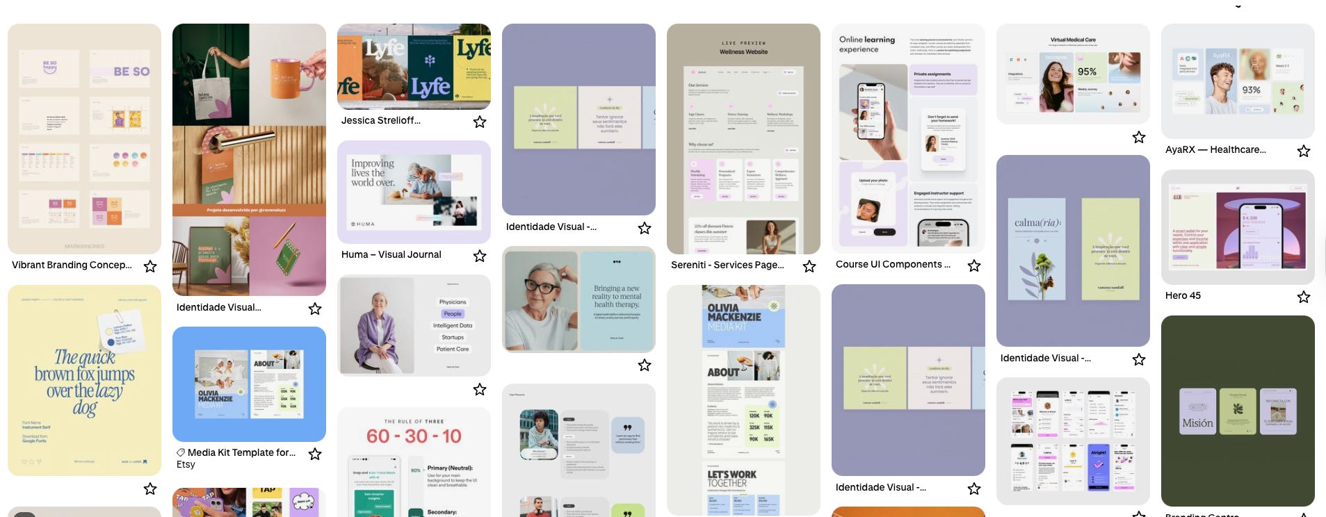
I have always had a thing for white space and editorial style fonts with just a POP of color. I would describe it as walking into a J.Crew or Madewell, or how simple yet powerful a crisp white tee and the perfect pair of jeans could be. From looking at the board I created, what I was attracted to aligned perfectly with that description.
Of course, DEW is a wellness brand, but I’ve known from the start that I did not want it to look like a typical wellness brand. You know what I mean, tons of neutral colors. I want DEW to stand out in this space not only with its mission but also in how it looks. So diverting from the typical wellness brand template was also a big importance.
Lastly, all of the assets for the brand needed to work well on different mediums. The goals that I have for DEW span way beyond just the app, so I need a brand that would also work well for in-person event collateral and for physical products.
With this in mind, my brand must-haves were:
A lot of clean, white space with a pop of color.
To make it fun and not look like the typical wellness brand.
The assets created must look good on products, the app, the website, and future events.
THE LOGO SUITE
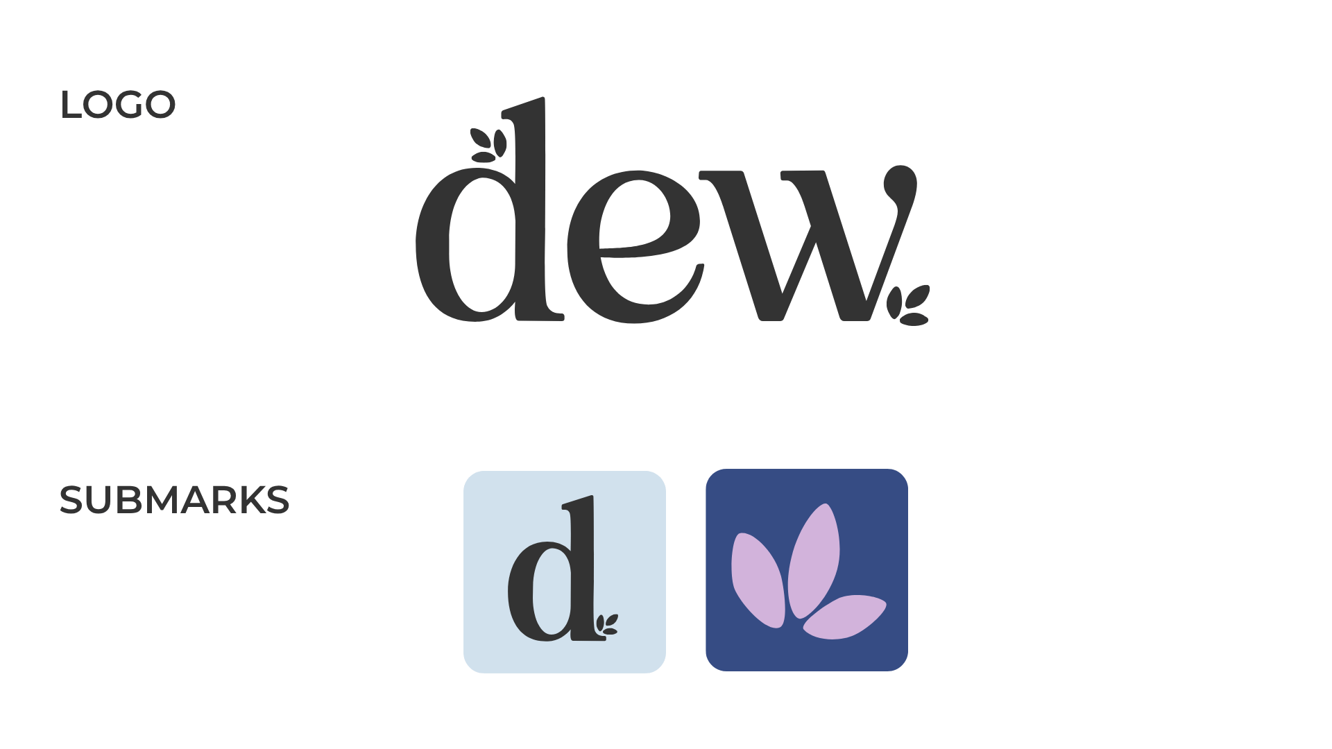
Again, I am not a trained designer, but I do know my way around the Adobe product suite, and with Canva, all things are possible. So instead of trying to create an elaborate logo that would have taken me tons of hours and research to create, I decided to keep it minimal with a bold serif font and little flower/leaf details.
For the app, I knew that I would need a submark to use for the app icon, but I wanted something a little more than just the letter “D.” After playing around with stars, lightning bolts, and hearts 🥴, I landed on this dainty little flower.
Comments
Nothing yet. Say the first thing.
Sign in to join the conversation.