
You can usually tell when a website was created by AI. It often happens with “one-shot designs”: you ask a coding assistant to create a website, open the result, and immediately see that it is AI-generated.
A lot of the time, that is completely fine. For a simple website, one-shot is more than enough, and it’s way better than what I could ever design myself.
But I don’t want my websites to look too generic. There are thousands of web pages now that all look the same. In writing, we have markers like “delve” or excessive bold formatting that give away AI-generated text. In design, there are similar elements you notice immediately.
One-shot designs also get hard to use. They tend to grow overly complex, with elements not always where I’d expect them. Each new page brings elements that don’t match the rest. Eventually, the whole thing becomes messy.
I am not a designer, and I never liked front-end or design work. But I build a lot of user-facing tools now, both web and mobile. I want them to look nice and clean, with elements placed logically.
One-Shot AI Designs
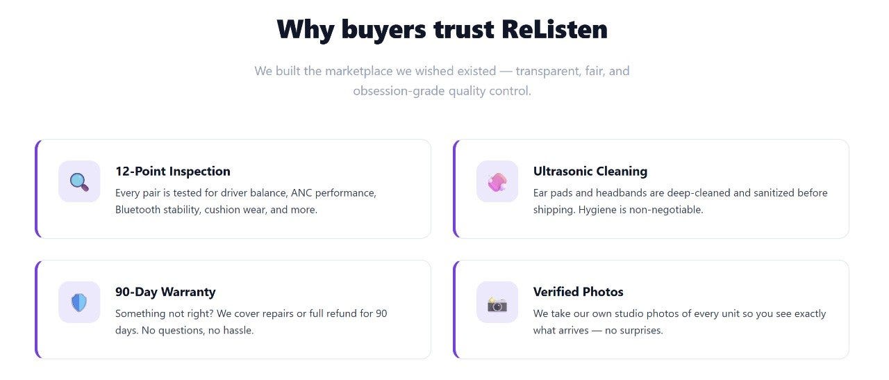
When you look at AI-generated designs, the first thing you notice is the feature grid: cards with an icon, a heading, a short description, and a colored accent. I find it very generic and often boring. And these left-border accents give away AI designs immediately.
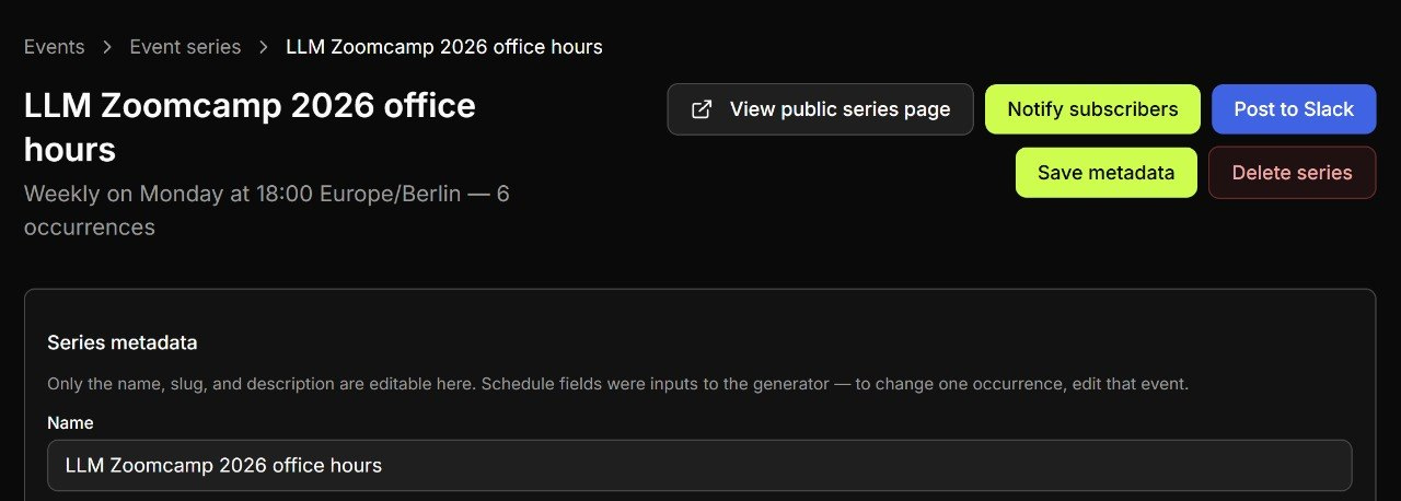
When you ask AI to implement something more complicated than a landing page, it tends to cram elements together. For admin panel interfaces where you want to perform some actions, AI will put a lot of buttons together to the right from the title. I always have to correct it and ask to put the buttons under the title.
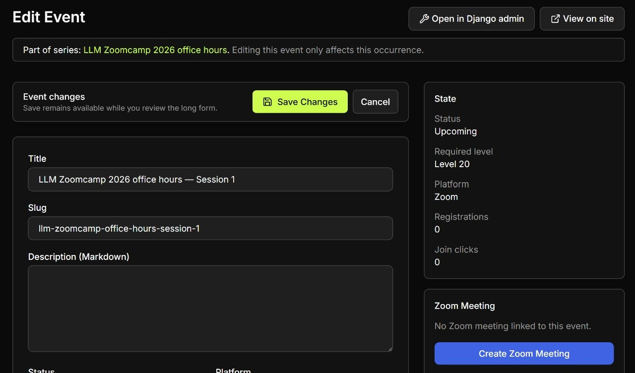
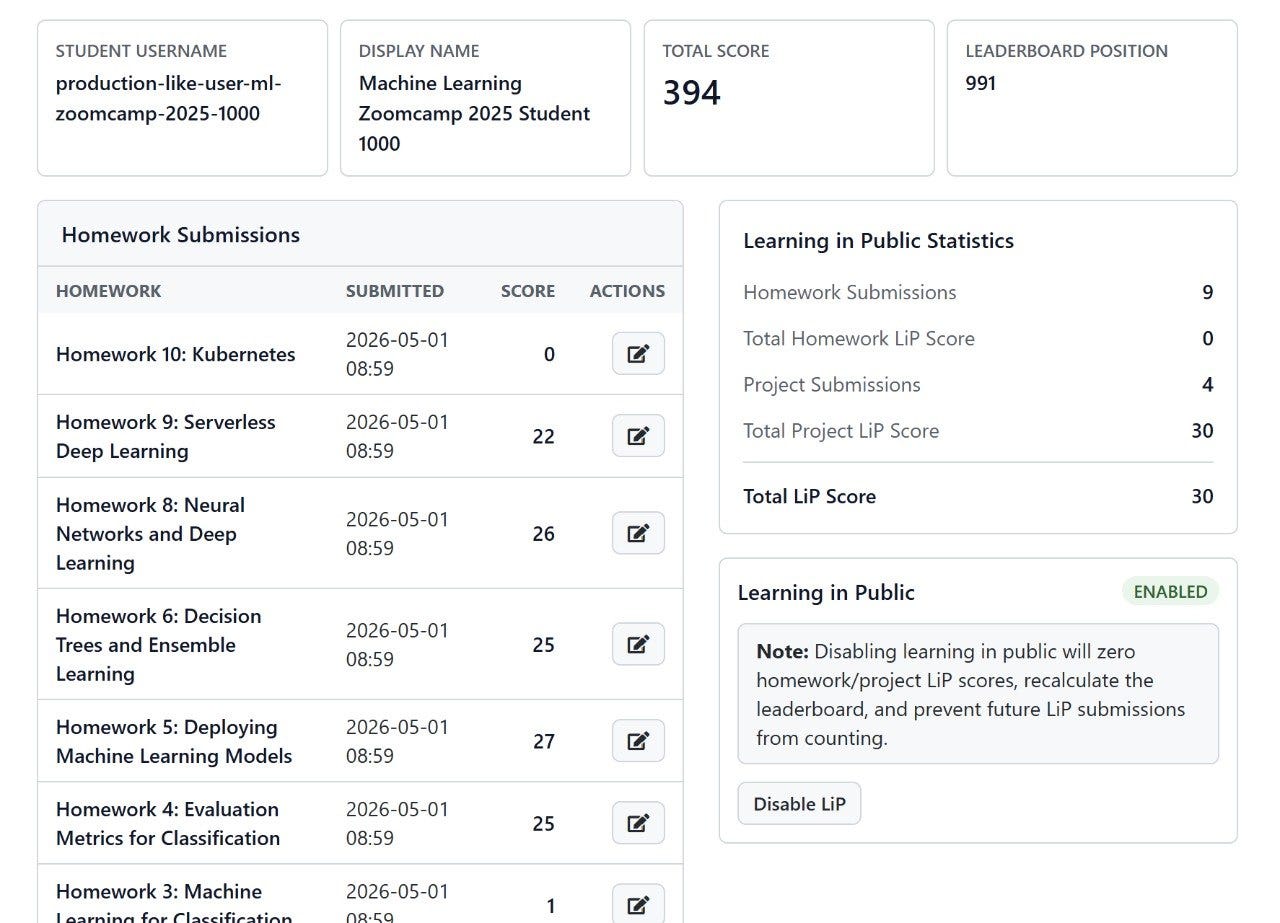
Also, coding agents like columns. Agents split forms from metadata panels, or put metrics, tables, and settings panels at the same visual level. The page becomes quite busy quickly.
I can see these patterns repeated across different projects with both Codex and Claude producing similar designs.
My Own Designs
While you can notice AI-generated patterns, my own work is by no means better. I’m not a designer and always wanted to stay as far away from front-end work as possible.
But I still needed to create web pages, like the main DataTalks.Club website that I created back in 2020. I used the Bootstrap framework because it was something I was already familiar with, so it was easier for me to build something on top of that.
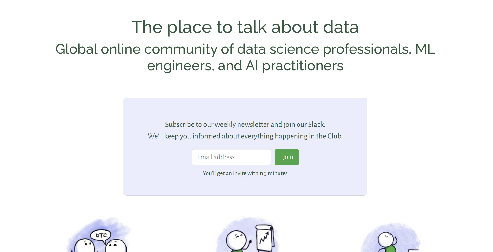
It has a headline, a signup form, a few illustrations, and a lot of empty space. It did the job, but you can clearly see that I’m not a front-end engineer.
Another example is the Course Management Platform. This is the platform we use at DataTalks.Club to run courses. For each course we have homework and project submission forms, a leaderboard and a few other useful things.
Previously I had to manage everything via Google Forms and Google Spreadsheets that were stitched together with a bunch of Python scripts. I started working on automating all that in 2023, and again chose Bootstrap as the CSS framework. I ran the first cohort of the Data Engineering Zoomcamp with it in 2024 and it has been saving so much of my time since then.
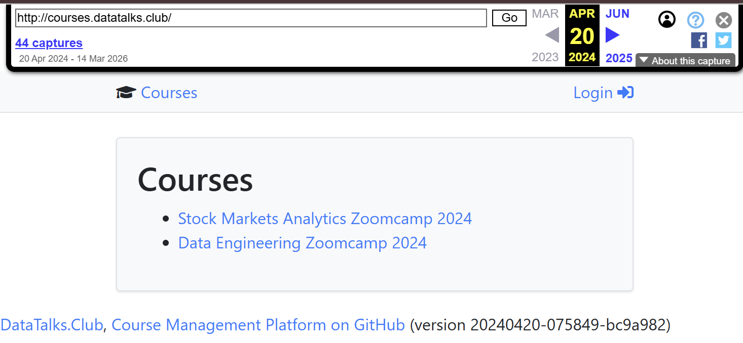
For a long time that was fine. The platform did its job, and styling was never the priority for me.
Migrating the Course Platform to Tailwind in Codex
In November 2024, one of the course participants filed an issue to migrate the course platform to Tailwind.
I had no time for it, and I knew nothing about Tailwind, so I didn’t implement it. There were attempts to redesign the website from other contributors, but I didn’t like the outcome, so none of that work eventually was merged.
But in 2026, I had a Codex subscription and in a few days my token usage would reset. When it happens, I want to make sure I use my subscription as much as possible, otherwise these tokens would be wasted.
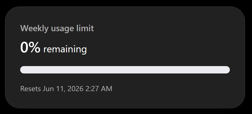
I use these tokens to clear the backlog in many of the open source projects I’ve been working on for the last few years.
One of these projects was the Course Management Platform and I finally reached the Tailwind issue. I had wanted to redesign the platform since the day I created it. It was functional and was already saving a lot of time but the look could definitely be improved. I thought that the day to do it finally had come.
So I dropped the issue into the Codex session and asked it to create a redesign. I don’t have any screenshots from that day, but the output was terrible. I didn’t like the one-shotted design at all. It screamed “AI-generated” at me and looked like millions of other websites on the internet.
Using GPT Image to Generate Interface Mockups
Around that time, GPT Image 2 came out. People on X were posting AI-generated screenshots with the caption “this is not a screenshot”.
I thought that if GPT Image is so good at generating screenshots, maybe it’s also good at generating interfaces.
I took a few screenshots of the Course Management Platform and asked ChatGPT to redesign it. With a few iterations I got a result that I liked. It wasn’t the final result, but the direction was definitely good.
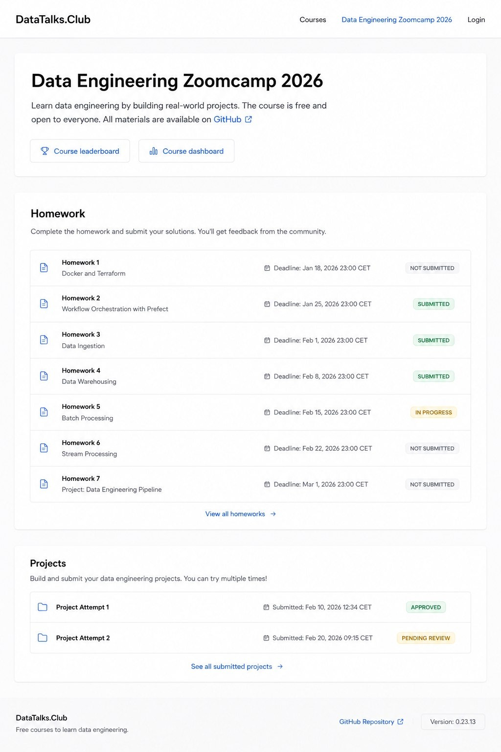
Once the desktop version was ready, I also asked to generate the mobile ones.
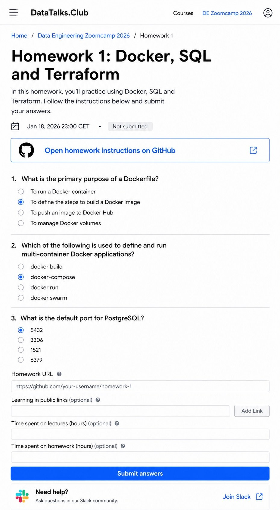
Then I gave the results to Codex and asked it to build the pages in that style. The result was far from identical, but directionally it was good.
After that, I needed to iterate on the pages separately. I moved things around a bit until I got the result I personally wanted.
Using GitHub Primer as the Design System
The first pages were ready, and I started redesigning other screens.
I immediately saw that the style drifted from the original design mockups:
The buttons and other UI elements were placed in unexpected places
The CSS styles for these UI elements were not consistent across the pages
Also, the gaps between elements were different. Even the width of the pages wasn’t consistent
I needed to come up with a specification of how exactly the elements should look like, where they should be placed, the gaps between them, the colors and the styles. I needed a design reference that the agents could use when implementing the changes or adding new elements.
I started talking with Codex and told it to find a good reference that actually fits our system, so we can base all the design decisions on it.
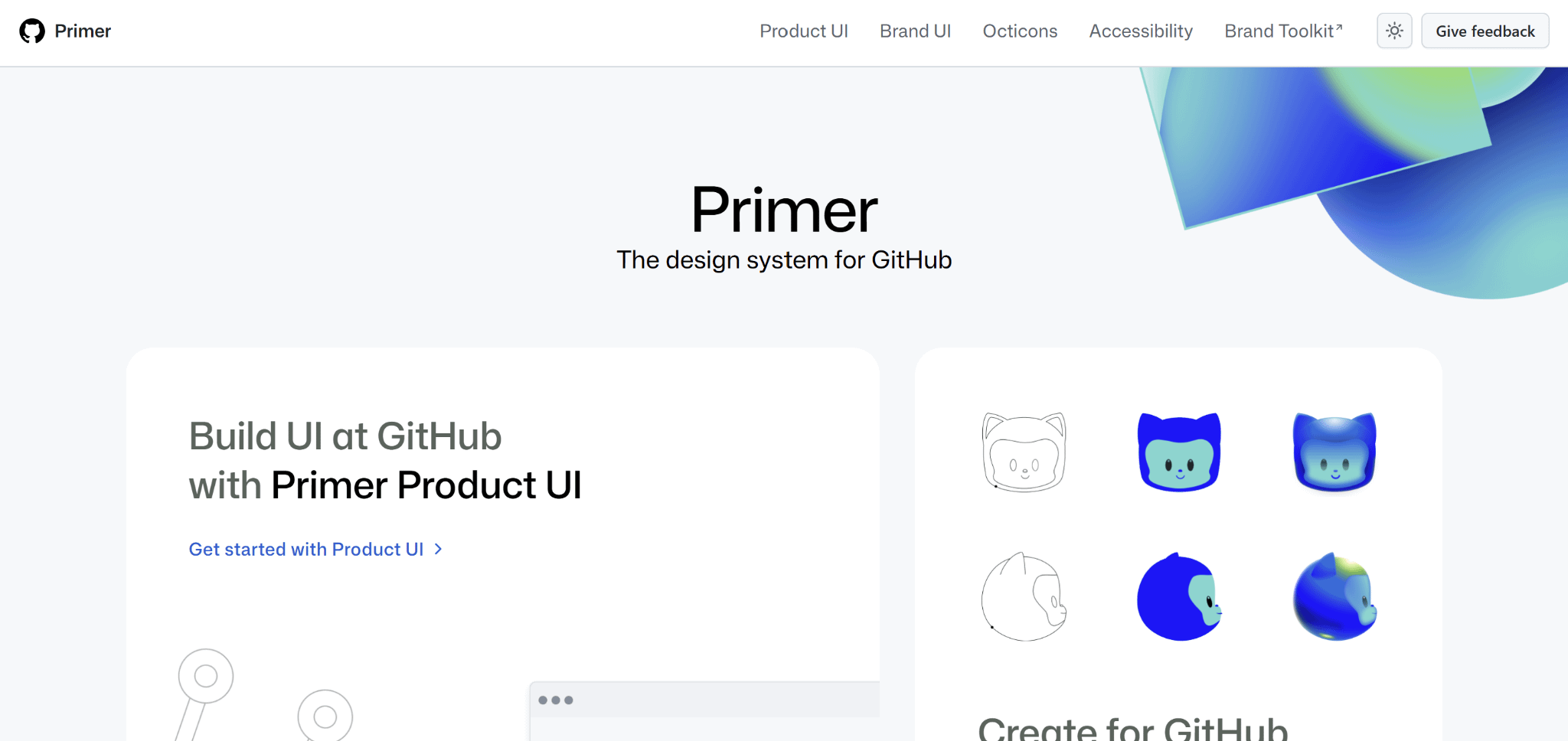
Codex suggested GitHub Primer and I liked it a lot, so we documented the result in design-system.md.
The Algorithm
Just giving the mockups and the design system wasn’t enough, so I still needed to check all the pages and see things that I didn’t like. I then asked to move them around until I liked the positions and styling.
There are still a lot of things that I want to improve, especially in the internal part of the website for the instructors. But overall I’m quite satisfied with the outcome. You can check the platform at https://courses.datatalks.club/.
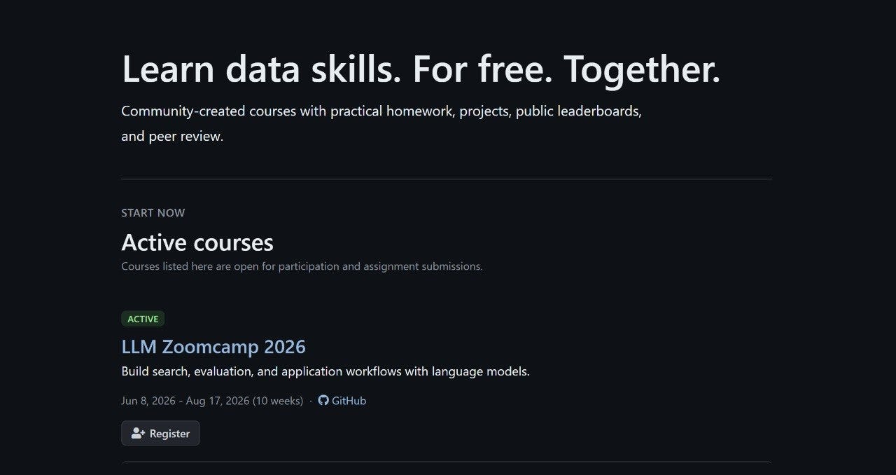
So the algorithm I arrived at was:
Describe to ChatGPT what kind of site I want and what should be on the page
Ask it to generate a mockup image
Iterate on the image until I like the direction
Give the image to the coding agent and ask it to implement the layout
Check the results, note the things you don’t like, fix a few of them
Ask the agent to pick up a reference design system (or a combination of multiple) and create the design system document
Add new pages to your project, make sure the agents follow the design system, and when you don’t like what they create design-wise, ask them to document that in the system
This approach also worked well for other websites that I work on, like AI Shipping Labs.
Android Applications
It also works well for other user-facing applications, not only web.
Right now I am working on an app that lets me manage agents from my phone. I call it Pocket Shell. The first version already works, but the interface is still rough.
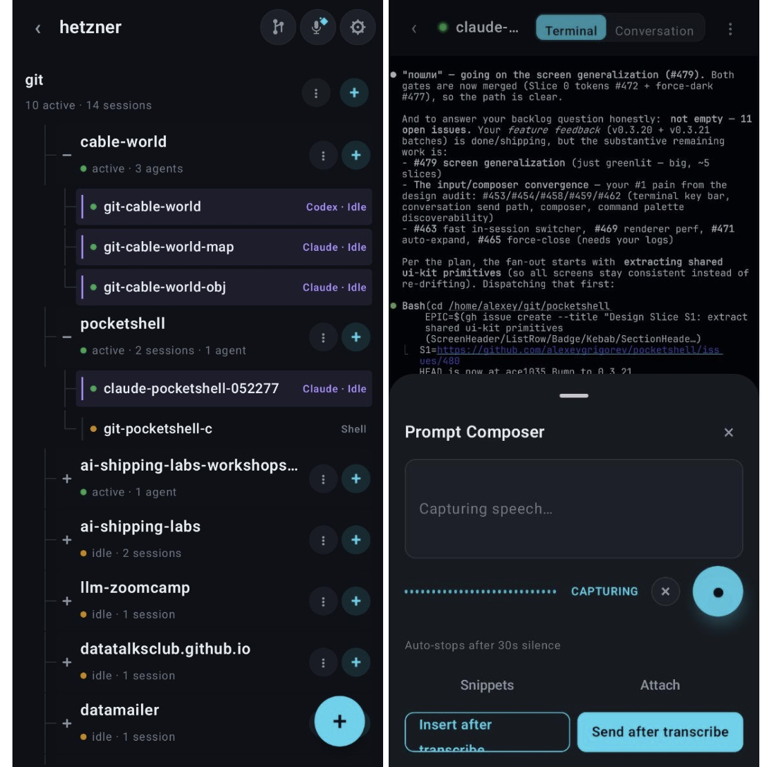
I took these screenshots and asked ChatGPT to redesign it. It took a few iterations until I arrived at the result I liked (directionally).
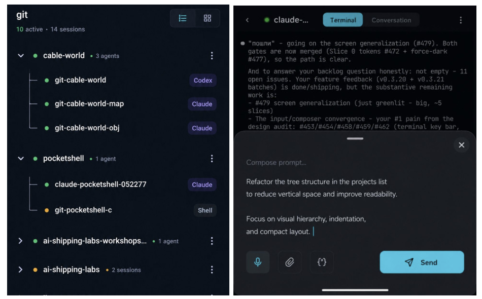
I used the mockups to set the direction, then polished the details in code. There’s still a lot of work in the app, but I like the current screens much more.
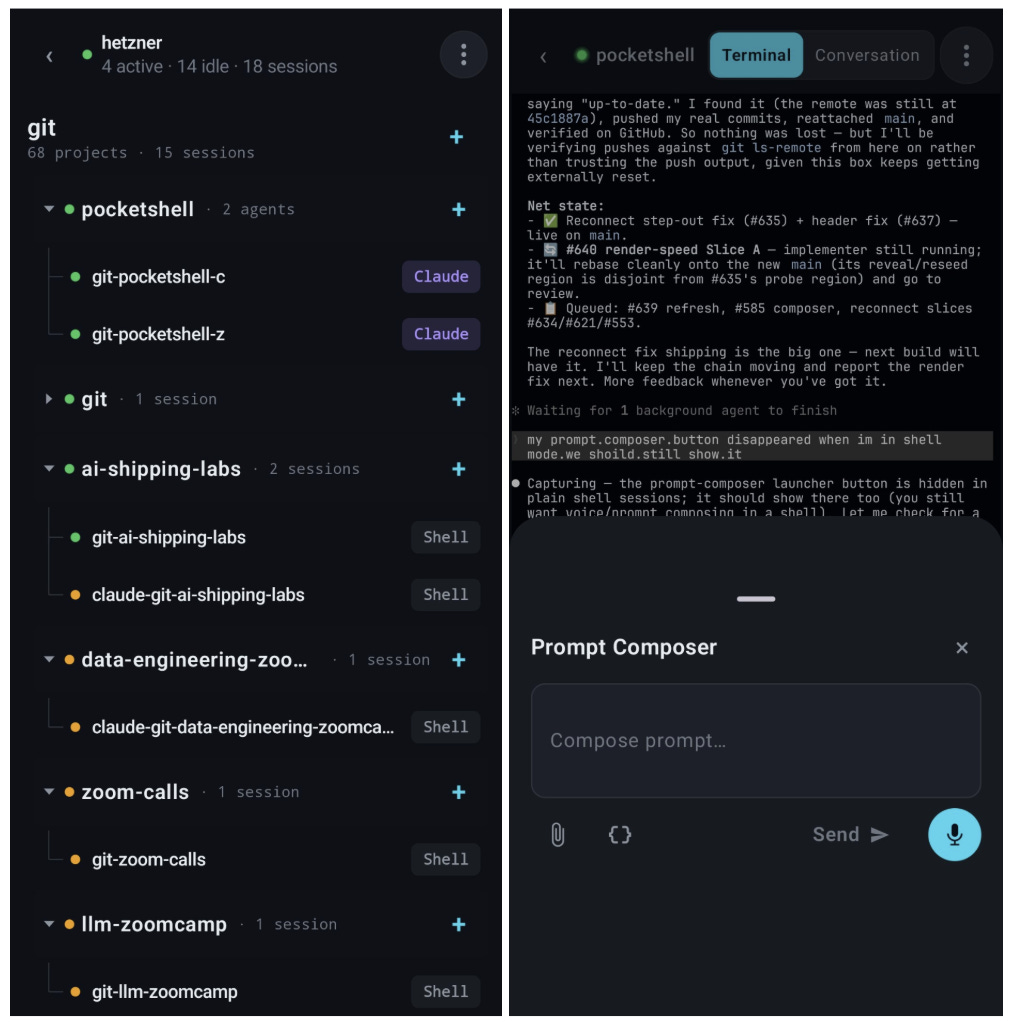
This workflow helps me a lot with design, even though I still don’t think I’m good at it. Of course, I still rely entirely on coding agents to do the implementation, but at least now the designs that come out of the process look less generic.
What I’ve Been Working On Recently
1. LLM Zoomcamp Launch
We launched LLM Zoomcamp this Monday and 754 people joined the launch session.
This year I reworked most of the content and we also added a new module about orchestration.
The course is up-to-date and if you’re looking to start with AI Engineering, you can do it now. Join us for the next 10 weeks and let’s learn together!
Also, at the beginning of the stream I asked people how they discovered the course and a lot of people said that AI recommended it. That’s really cool! I’m happy that ChatGPT and Claude are making the right recommendations when it comes to courses.
Also, many AI Shipping Labs community members are doing the course too, and I’ll be hosting office hours there.
2. Vector Search Workshop at AI Shipping Labs
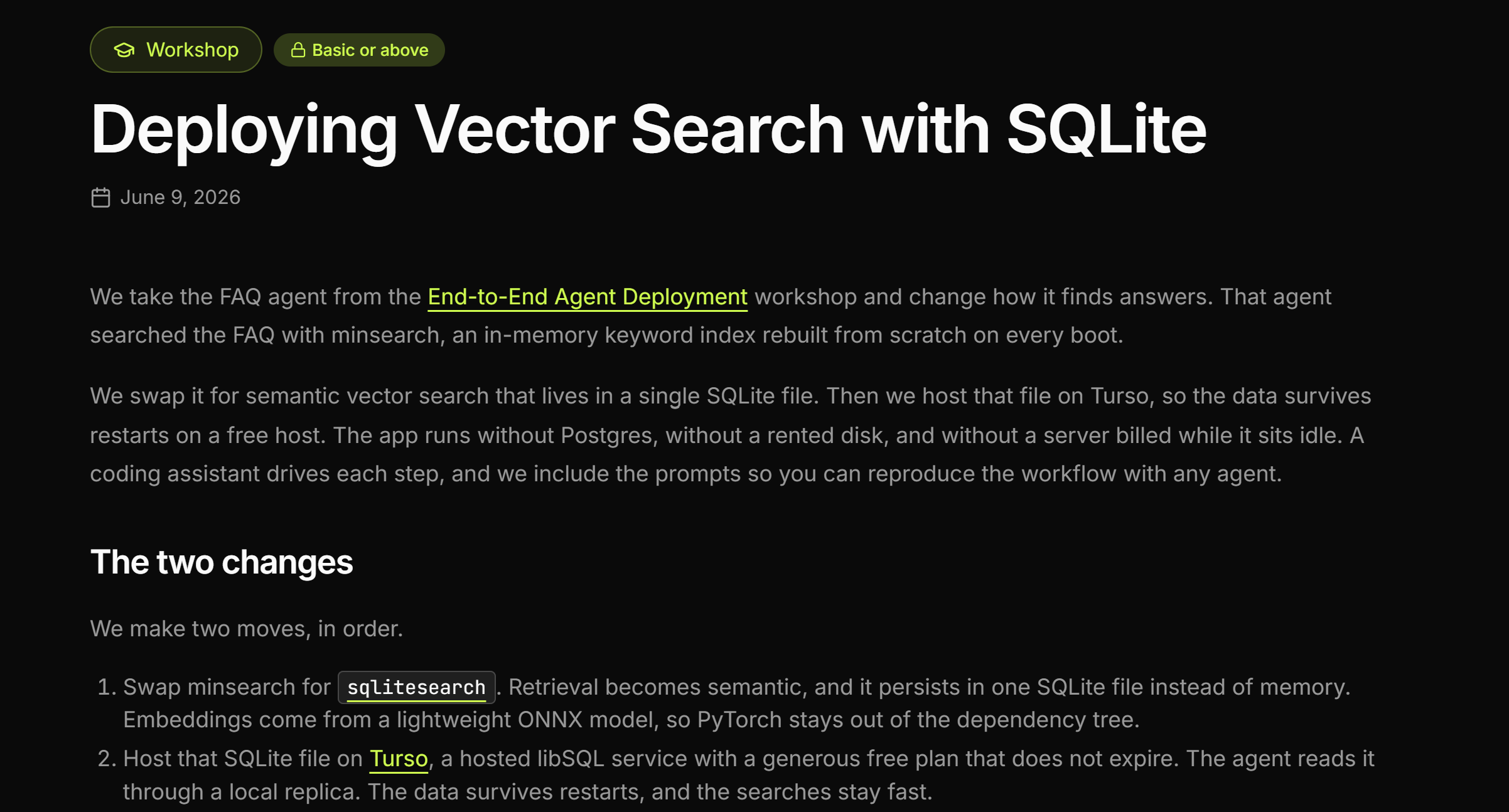
This week I run another workshop at AI Shipping Labs. During our first ever workshop in April I wanted to deploy an agent end-to-end: create a FastAPI backend, a frontend and deploy it to the cloud. My original plan was also to include vector search, but we didn’t have time back then. This week we finally did it.
As the service for hosting the database, we chose Turso and used SQLiteSearch on top of it to do vector search. You can check the code here.
During the workshop, we also discovered CloudFlare Vectorize - a fully serverless vector database. I want to learn how to use it and cover in the next workshops.
My Talk “Managing AWS Access for Humans and AI Agents”
On Tuesday I gave a talk at Berlin AWS Group meetup, where I shared my approach for providing AWS Access in low-trust environments like public workshops or for your AI agents.
I plan to write an article based on this talk, but you can already check the video.
Tools
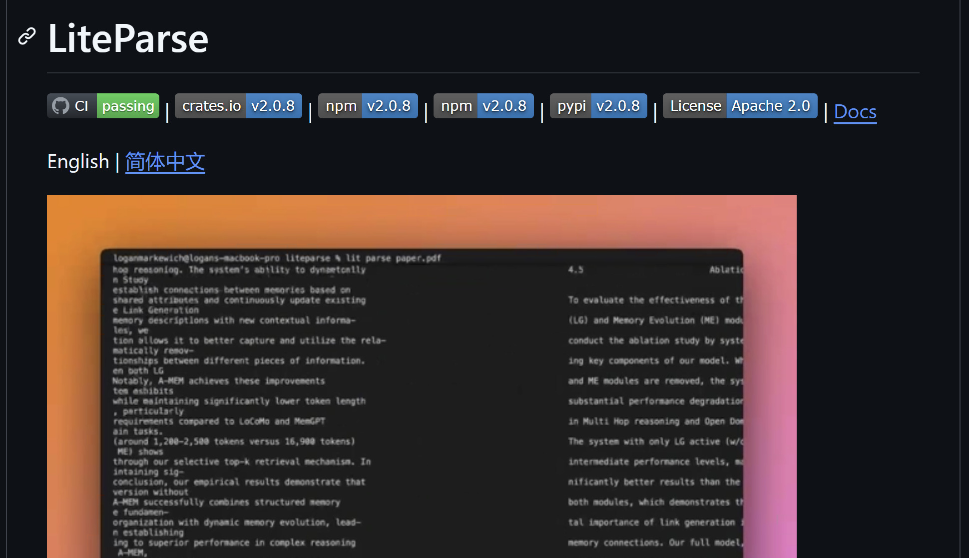
LiteParse is a fast, open-source document parser from the LlamaIndex team that runs entirely on your machine with no cloud dependencies or proprietary LLM features. It does spatial text parsing with bounding boxes via PDFium, handles PDF, DOCX, XLSX, PPTX, and images, and offers selective OCR through bundled Tesseract or any HTTP OCR server. The Rust core ships with bindings for Python, Node.js/TypeScript, the browser (WASM), and a CLI, so you can plug it into a local document pipeline from whatever stack you use.
Edited by Valeriia Kuka
Comments
Nothing yet. Say the first thing.
Sign in to join the conversation.