
If you’ve shipped anything with a text box and a blinking cursor, you know the trap.
You start with the visible things: the bubble shape, the typing indicator, the empty state. You polish what users can see in a screenshot.
Meanwhile, users are asking a harder question they don’t always say out loud:
Do I understand what this thing is doing?
And if I don’t like where it’s going, can I steer it?
Framer - The best code-free tool for designers to create beautiful websites like examples below. Use our special promotion code: partner25proyearly to get 3 months free yearly Pro subscription.
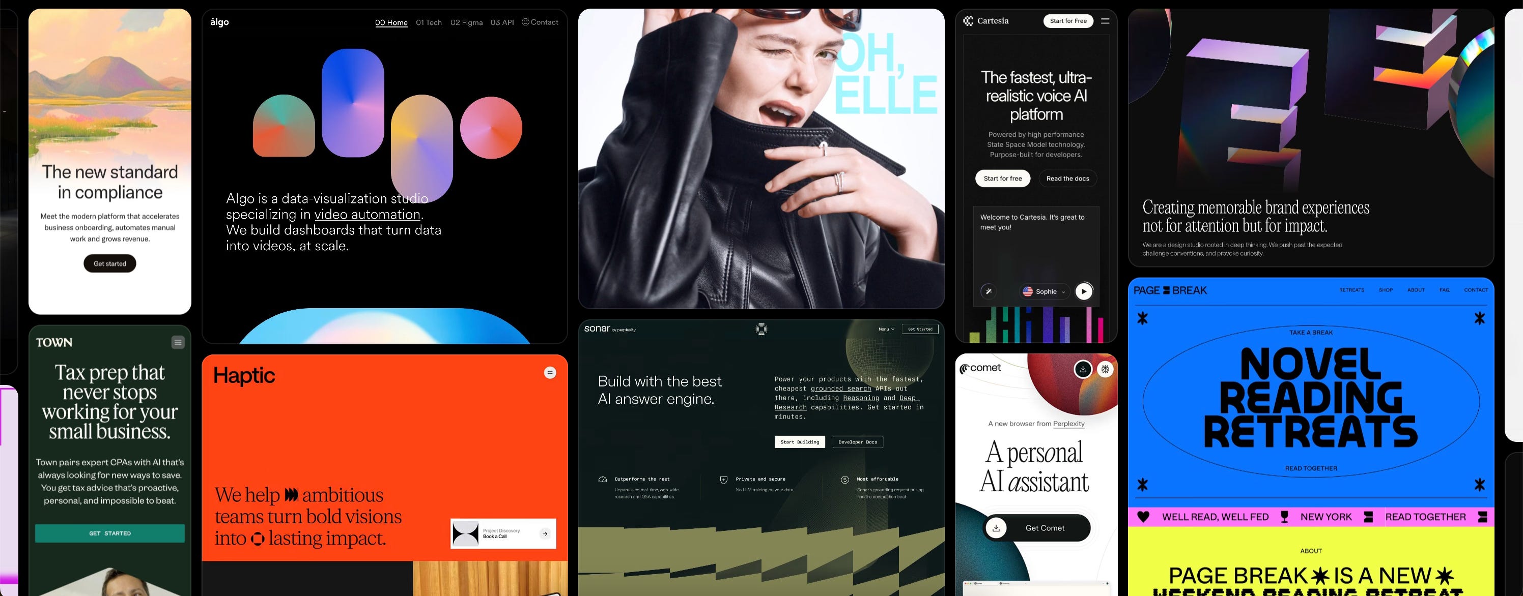
Anything AI - Turn your words into mobile apps and sites with great taste.
Chronicle - AI presentations that you feel proud of. Slop Free.
Thanks for reading AI/UX Playground! Subscribe for free to receive new posts and support my work.
Most AI chat products don’t lose because the model is weak.
They lose because the interface makes intelligence feel random.
This is where design matters. The patterns below live in AI Interface Design Patterns, with product examples in the Interface Gallery.
1) Legibility first: show that work is happening
Waiting in silence feels longer than waiting with context. A blank pause reads like failure. A visible stream reads like progress.
Pattern: Streaming
Streaming is more than animation. It’s reassurance.
When output arrives incrementally, users get a simple signal: the system is alive and working. That alone lowers anxiety and reduces premature retries.
Design note: If your product is occasionally slow, streaming is not optional polish; it’s core UX debt payment.
Pattern: Progress Steps
Streaming answers “Is anything happening?”
Progress steps answer “What kind of work is happening?”
If the model is searching, reading files, calling tools, or computing, show that pathway in collapsible steps. Keep it quiet by default, available on demand. This gives power users control without burdening everyone else.
For trust-sensitive flows, pair legibility with patterns in Trust.
2) Replace mystery mode with explicit control
The fastest way to make users uneasy is to let capability change silently.
Did it search the web this time?
Is the file still attached?
Are we in fast mode or deep mode?
If users have to infer this, they’ll trust less and over-prompt more.
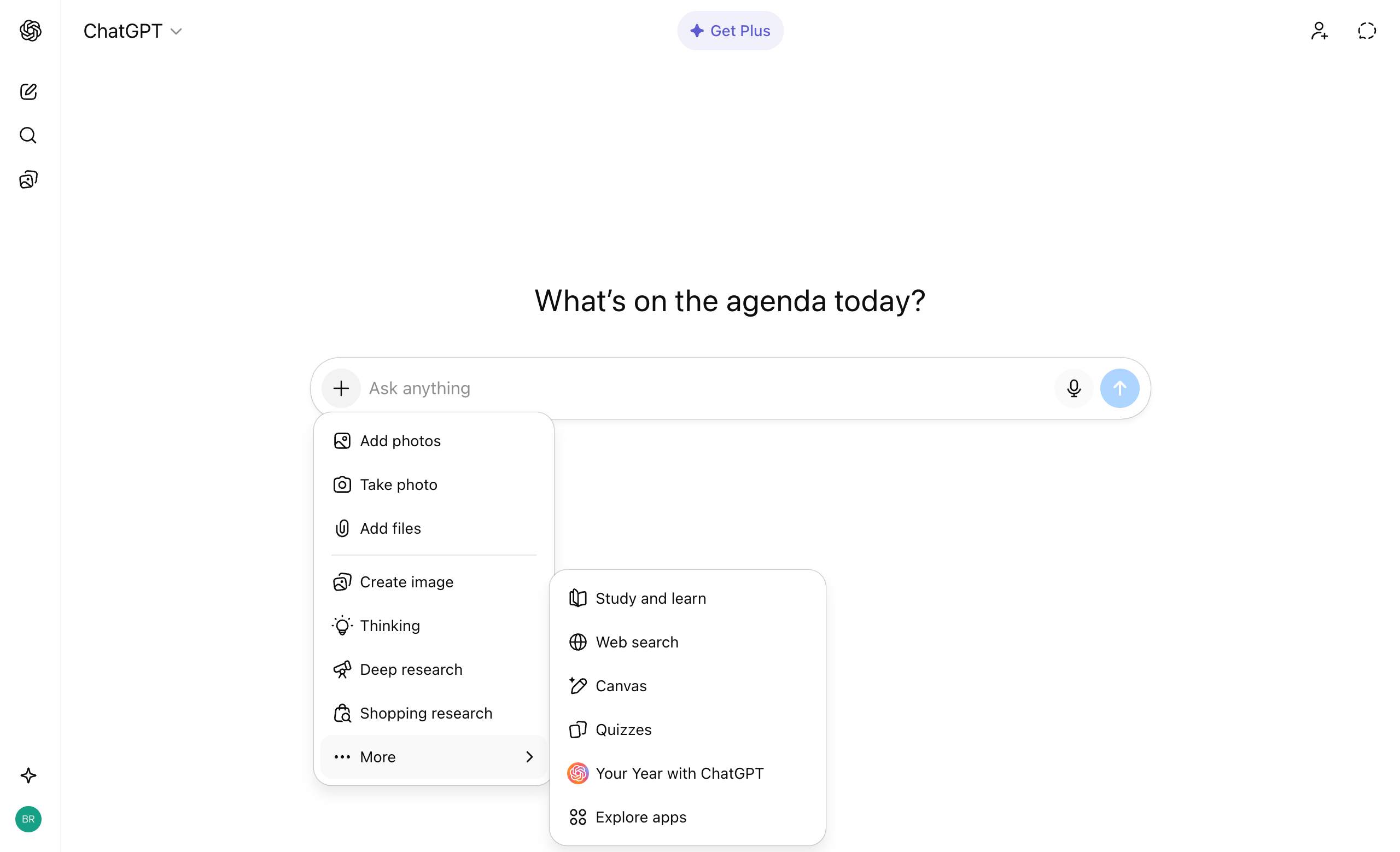
Pattern: Tool Switching
Let users select capabilities directly: search, code, image, research, etc.
Then keep active tools visible before and after send.
This turns “guessing what happened” into “choosing what should happen.”
ChatGPT example:
Pattern: Context Chip Management
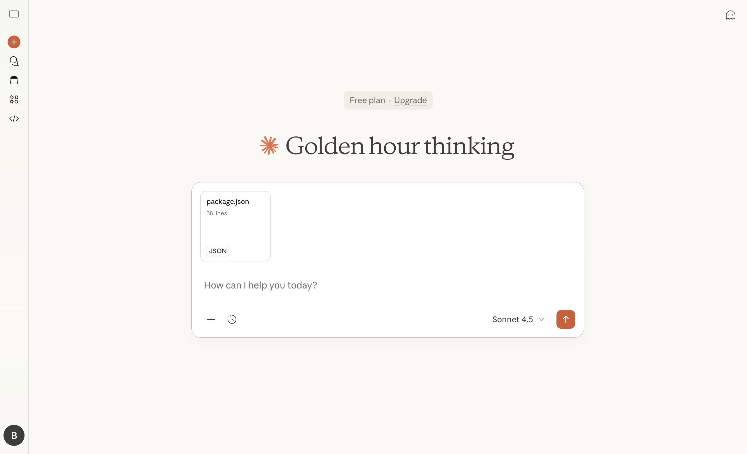
If links, files, repos, or project scopes are in play, show them like ingredients on a cutting board: visible, removable, hard to miss.
The goal isn’t flashy chrome.
The goal is a stable mental model.
Example: Claude uses context chips with file icons displayed above input field
See more in Inputs and real UIs in the Gallery.
3) Treat outputs as drafts users can shape
A chat thread is great for dialogue and terrible for finishing serious work.
If every output stays trapped in the scroll, users start copying into somewhere else the moment stakes rise.
Pattern: Chat Artifacts
Use a side panel or dedicated workspace for docs/code/diagrams.
Let chat stay conversational while the artifact becomes the working surface.
Pattern: Smart Code Blocks
Code should be actionable, not inert.
Copy, run, apply, explain—actions should sit right where the code appears.
Pattern: Response Refinement
Most first answers are drafts.
Make second drafts one tap away: shorter, deeper, try again, add sources.
Users shouldn’t have to re-prompt from zero to improve quality.
Example: ChatGPT’s response refinement menu showing options to modify AI response
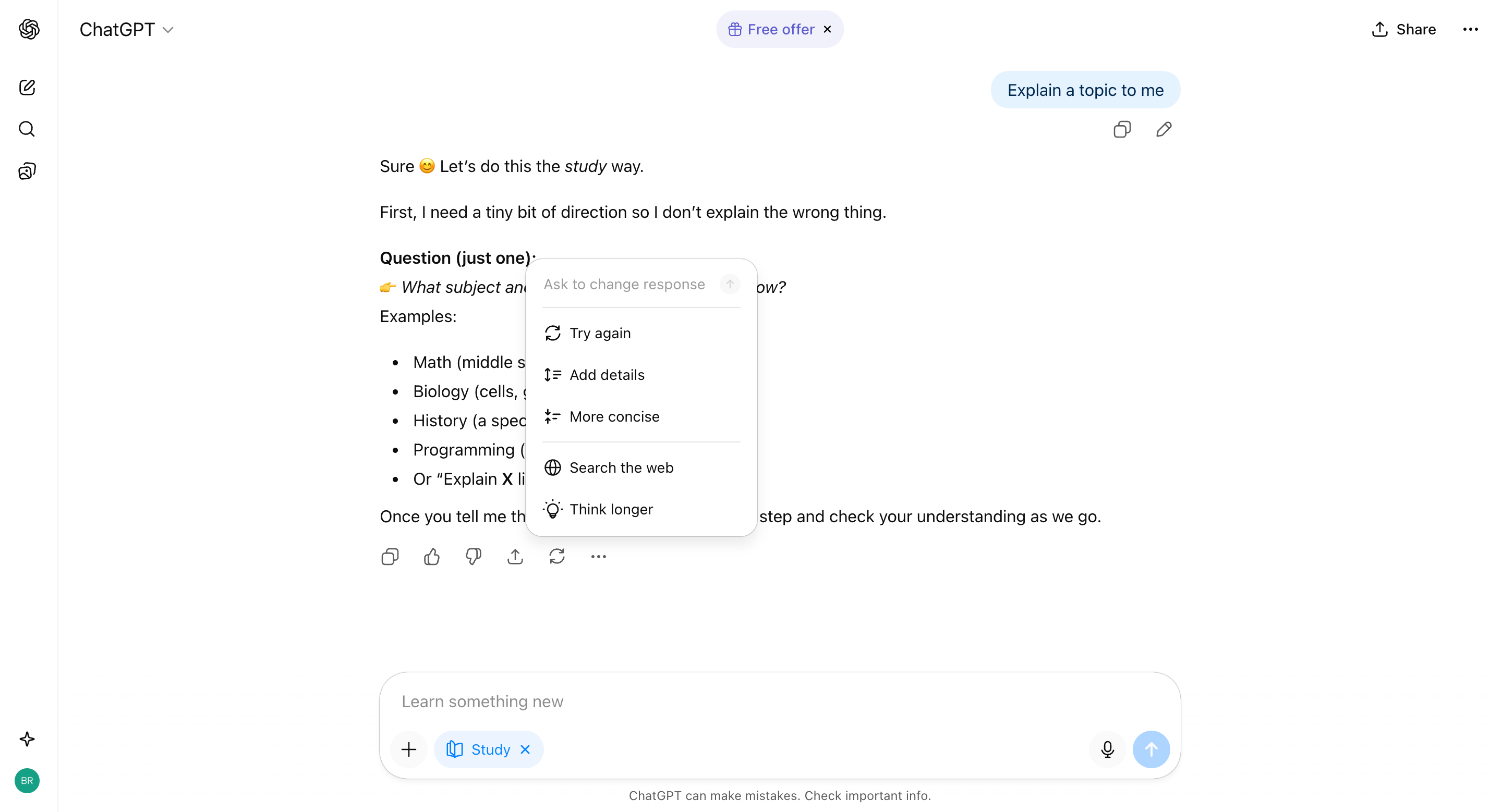
Explore Outputs and screenshots in the Gallery.
4) Design for how people actually think: in branches
People don’t reason in one clean transcript.
They try paths, backtrack, and compare options.
Pattern: Thread Branching
Let users fork from an earlier turn without rewriting history.
Pattern: Regeneration Carousel
Treat alternate answers as candidates, not hidden retries.
Comparison is part of decision-making.
Pattern: Follow-up Chips
Helpful when the next step is obvious. Harmful when they become decorative clutter. Good chips reduce decision cost. Bad chips increase visual noise.
More in Chatbot.
A quick audit you can run this week
For your current chat experience, ask:
Can users tell what the model is doing right now?
Can users explicitly control tools and scope?
Can users improve outputs without restarting?
Can users explore alternatives without losing context?
If those answers are mostly “yes,” your interface feels collaborative.
If not, even a strong model can feel like a coin flip.
In Part II, we’ll cover the layer most teams ship too late: trust proof, memory, and thread longevity, how citations, search, pinning, and export turn a one-off chat into something users can depend on.
If you want to explore the patterns referenced here, browse the full library at AI UX Playground.
Thanks for reading AI/UX Playground! This post is public so feel free to share it.
Comments
Nothing yet. Say the first thing.
Sign in to join the conversation.