
This post is part of The Branding Flock paid series. We're building a complete visual brand system from scratch, step by step, using AI tools. Check out the full series archive here.
TL;DR: Your logo is the single most important brand asset you'll ever create for your Substack. It's not something you design — it's something you discover. This post gives you two free ChatGPT prompts to generate your first concepts today, five real Substack logos to study, and the full discovery framework and deep brief behind the paywall.
Your Logo Is the Single Most Important Brand Asset You’ll Ever Create.
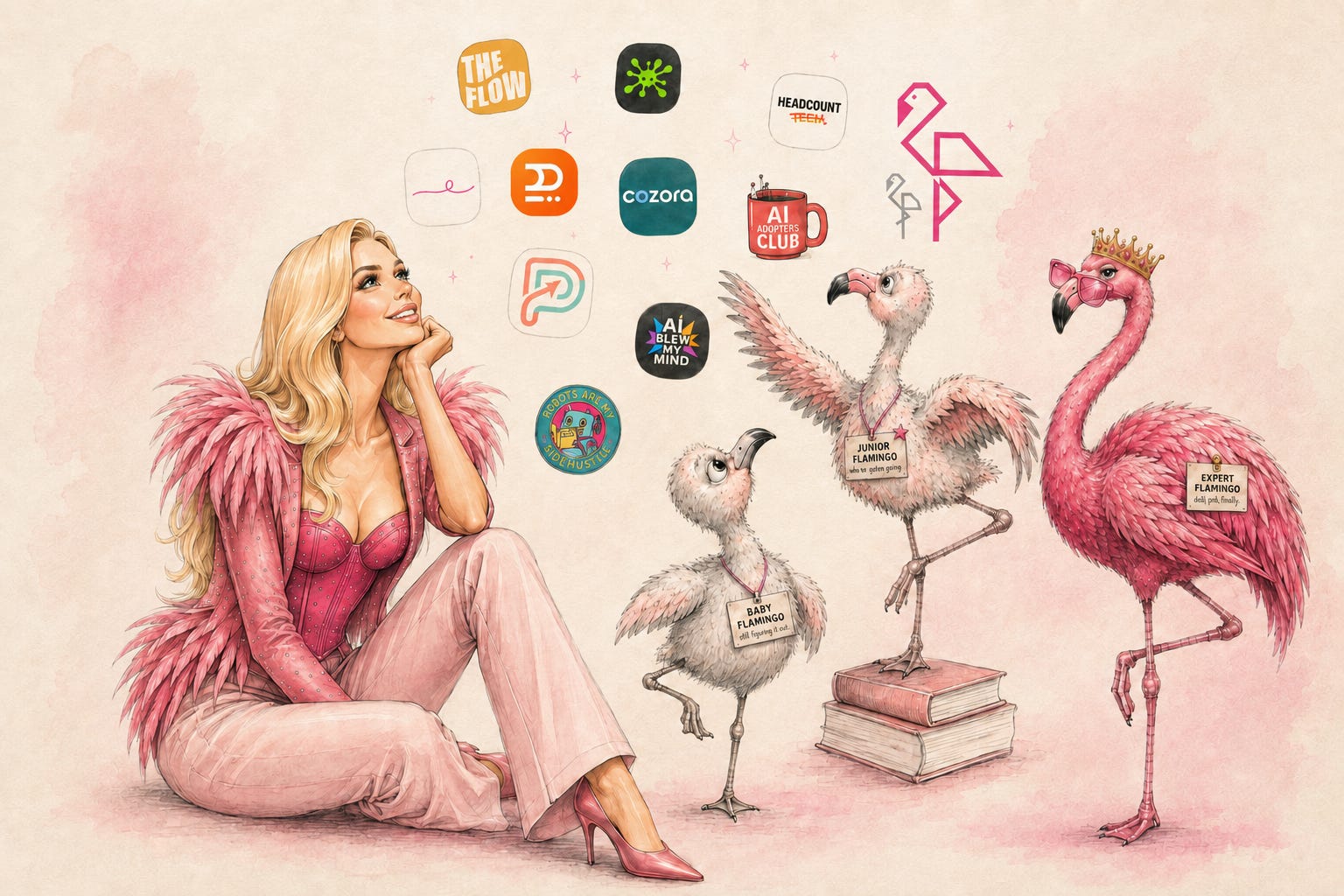
There is not a week that goes by without someone messaging me, or tagging me in a Note, because they saw a flamingo somewhere and thought of me. While shopping. While walking their dog. While scrolling a feed that had nothing to do with me or branding or Substack.
Every time it happens, I feel it. Not because it’s flattering — though it is, irrationally so — but because of what it means strategically.
That’s heavy lifting. That’s my brand doing work in a situation I would never be able to manufacture. A stranger sees a bird in a shop window and their brain fires a connection to . Everything I’ve built coming to fruition in a moment I wasn’t even present for. For someone who talks about building a recognizable presence on Substack — that’s exactly the positioning I want.
And it all started with a logo.
Your logo follows you everywhere. It’s on your Substack profile, your Instagram, your TikTok, your Facebook page. It’s the circle your readers see in their inbox every time you publish. It’s the first thing someone encounters before they’ve read a single word you’ve written. Done well, it does brand work constantly and silently — it lives in people’s heads even when you’re not publishing.
That’s what I want for you. A mark that makes someone think of you when you’re nowhere near the conversation.

What you’ll learn:
Why your logo is your most powerful brand asset — and what “working” actually looks like in practice
Five real Substack logos and what makes each one work
Two free ChatGPT prompts to generate your first concepts right now, plus a shareable output to post in Notes
The full Logo Discovery Claude Skill & Prompt — a guided Claude conversation that walks you through the discovery process and builds your ChatGPT brief, concept review, and final logo system in one session (paid)
Hey, I’m Pinkie. I help creators build recognizable Substack brands that drive consistent subscriber growth. I share the exact branding systems, prompts, and workflows I use to transform ideas into distinctive, repeatable output. If you’re new to AI Meets Girlboss, welcome! Honestly, this might be the best time to join. start here! 🩷🦩

Designing a Logo and Discovering One Are Two Different Things.
Most creators open Canva, type in their brand name, pick a style they saw someone else use, and call it done. The result may look professional at first glance, but it’s completely forgettable the moment you close the tab.
Here’s the difference.
Designing asks: What should represent me? You’re building something from nothing.
Discovering asks: What already does? The answer is usually already there, in the image you keep reaching for, the metaphor you keep using, the tension that defines why your brand exists at all.
The best logos that live in people’s heads are almost never designed. They’re exaggerated versions of something that was already there.
If you’re unsure what represents you, start with building your brand voice before a visual identity. The full framework, is in Turn Your Personality Into Your Brand Voice. It’s also a good first step before today’s logo workflow, or a useful next step if you want more depth after you’ve tried the prompts here.
Five Real Substack Logos. Here’s What They Actually Do.
Before you generate anything, I want to show you what a working logo looks like in practice. I studied five real Substack publication logos asking one question about each: is this doing brand work or decorative work?
Brand work: remove the name. Would the right person still recognise what this stands for?
Decorative work: the logo is there, but it could belong to any one of a thousand newsletters.
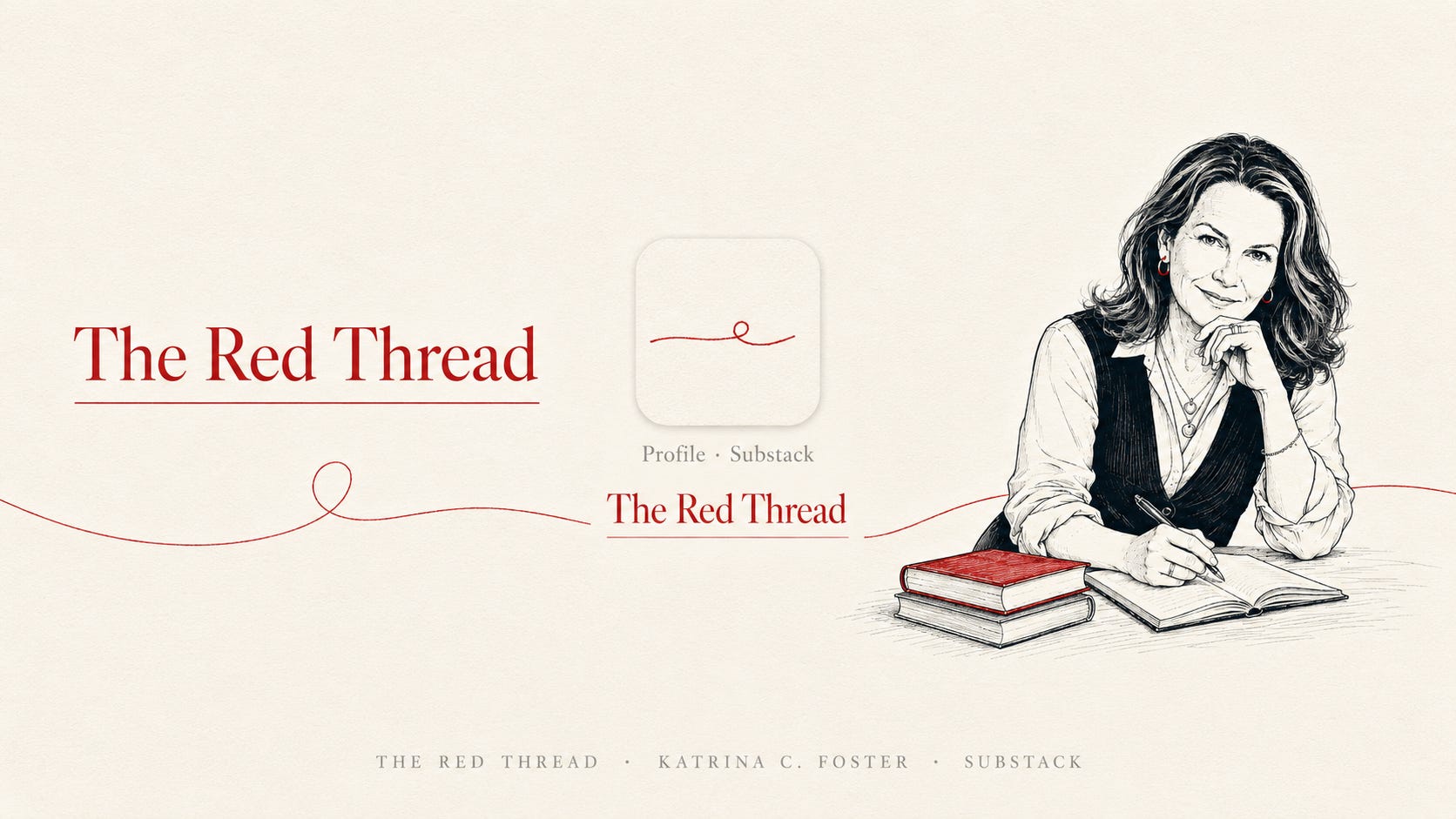
The Red Thread — A literal red thread drawn as a line. ’s red thread metaphor was always there. The red thread is the career narrative that connects everything. The logo is exactly the metaphor, made visual. Nothing invented, but instantly recognizable brand work.
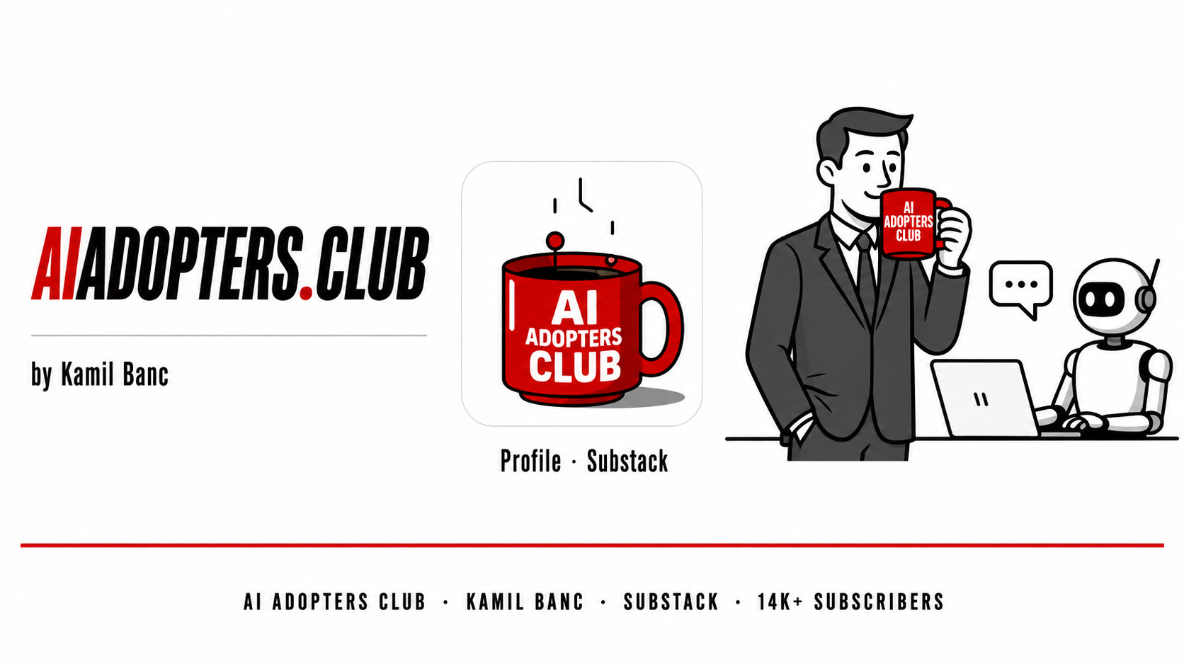
AI Adopters Club — A red corporate coffee mug with the name stamped on it.
The mug appears everywhere. In the logo, on the covers, held by the protagonist in every illustration. If you've ever worked in a multinational company, you know this mug — it's the branded swag that follows you from desk to kitchen to meeting room for a decade. took the most recognizable prop in corporate life, and made it the face of a newsletter that teaches managers to adopt AI. The concept does the positioning instantly. You see the mug and you know exactly who this is for.
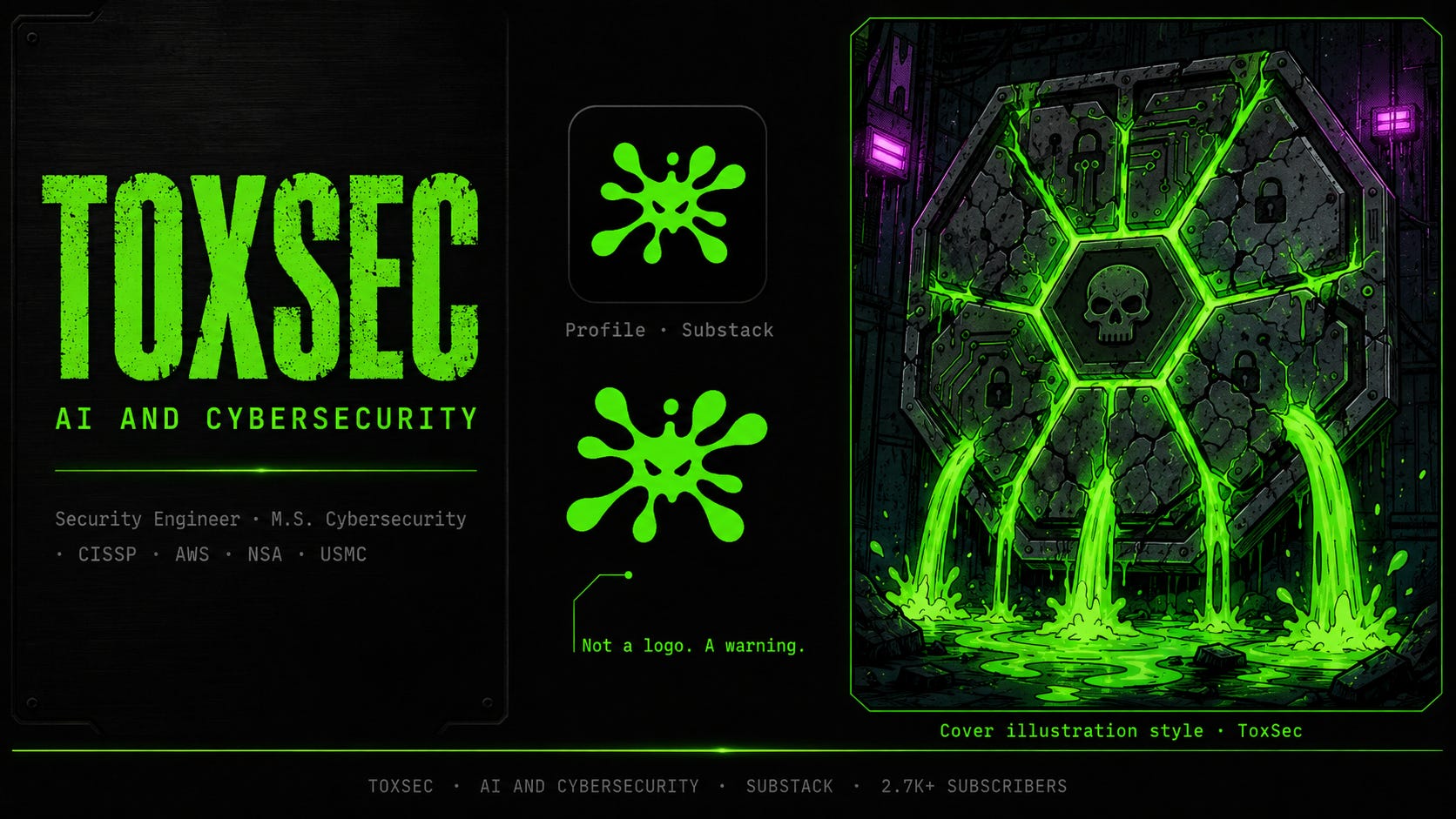
ToxSec — Neon green toxic splat on black. ’s logo and brand is entirely literal: security, threat, toxicity. This shouldn’t work. But the color temperature and shape are executed at such a specific register that it’s still completely distinctive. Literal can work when the topic is visceral and the execution is committed. In the sea of publications, you’ll instantly spot his logo.
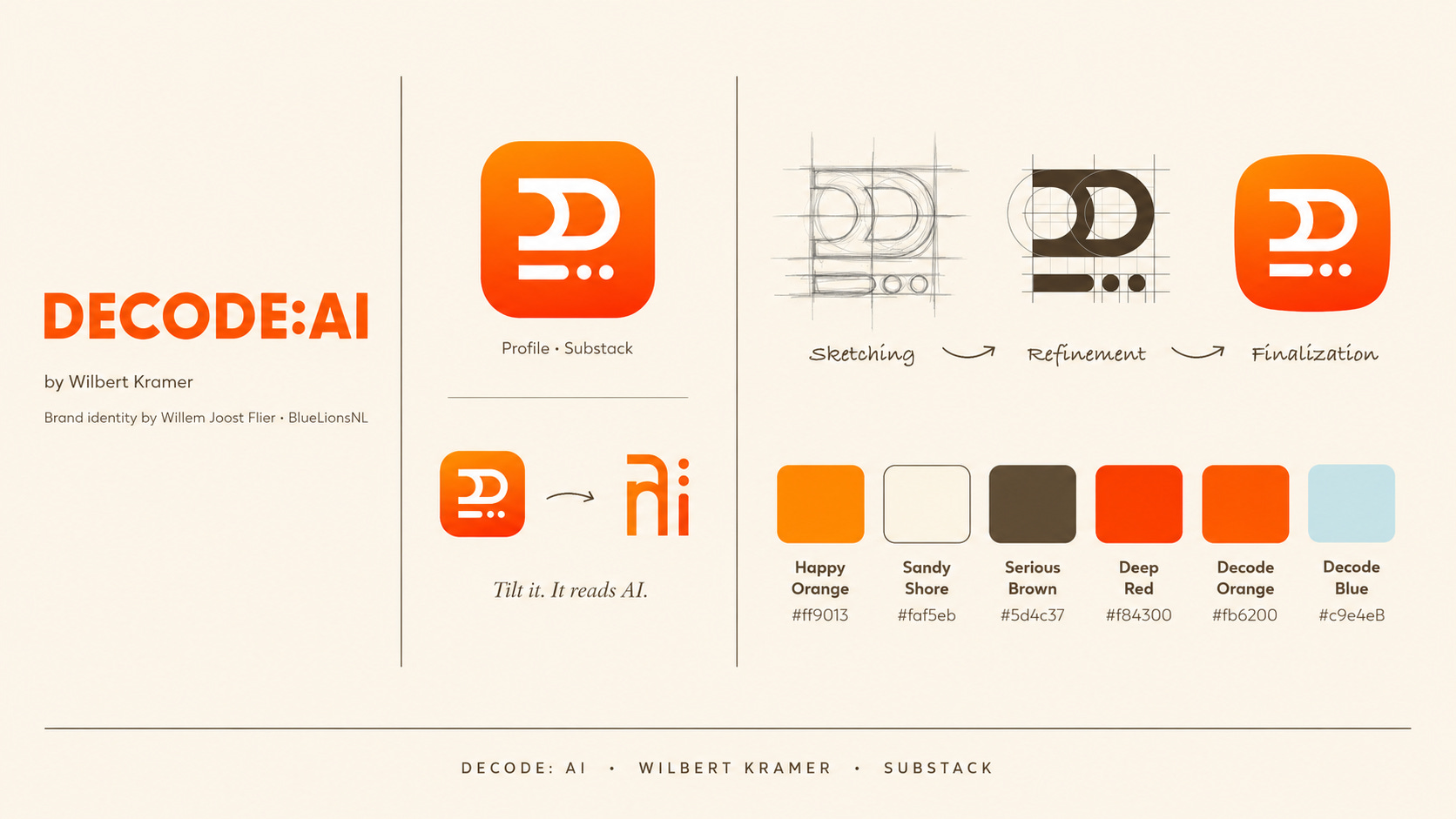
Decode: AI — A logomark that is itself an act of decoding. called in his friend and designer to build a proper brand book. The result is a mark that hides D, a colon, and AI inside a single geometric shape. Tilt it 90 degrees and it spells AI. The reader gets the experience of decoding from the logo itself — before they've read a single word.
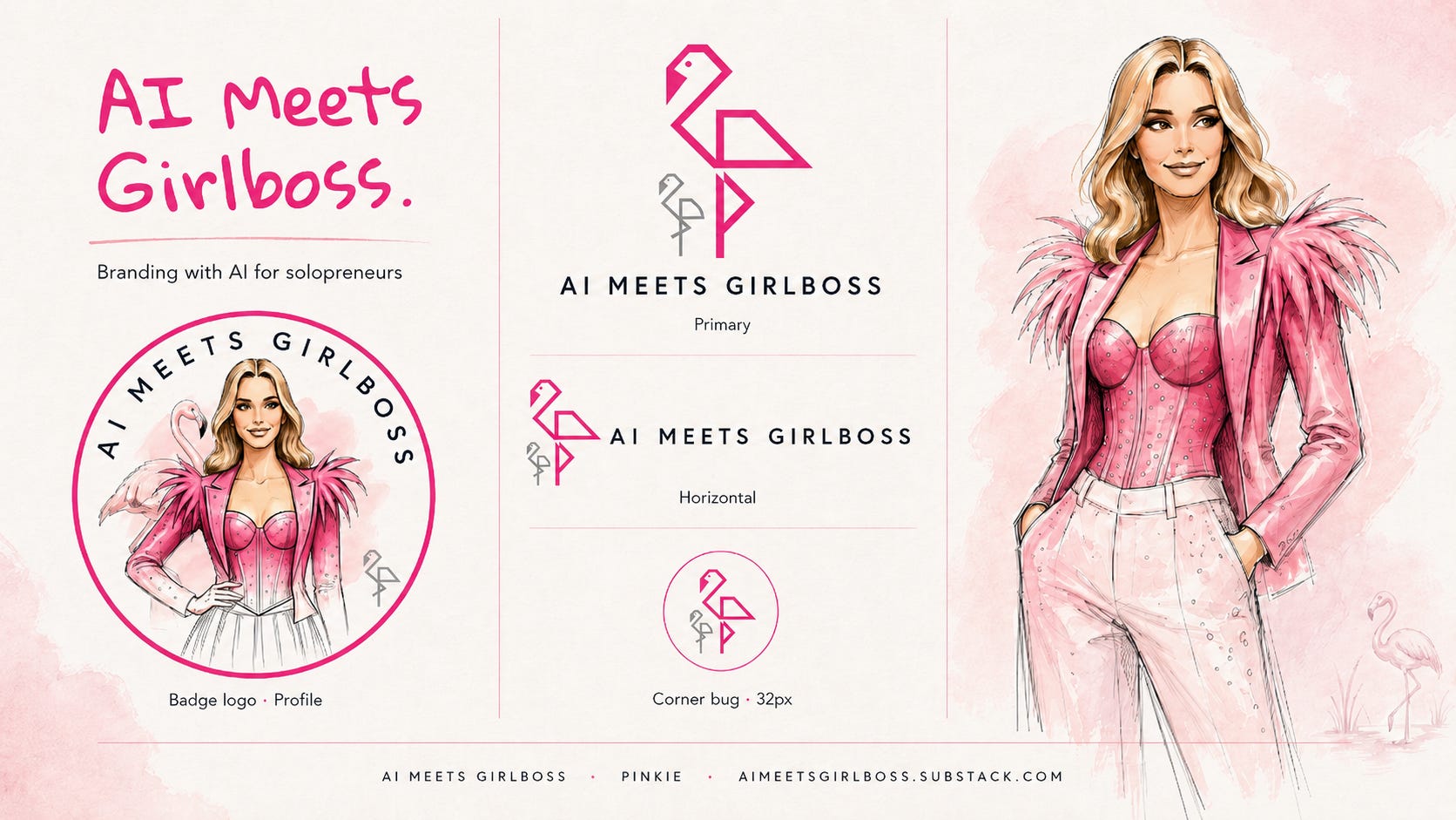
AI Meets Girlboss — Hot pink and a flamingo, in a space that was all grey and blue. When I launched, nobody in AI content was leading with aesthetics. The flamingo, the pink, the fashion illustrations — it wasn't decorative, it was a stance. A signal that said: this is for someone the rest of the space wasn't designing for. Now people spot flamingos in the wild and send them to me. That’s brand work.
Five logos. Five different approaches. Every one of them answers one of two questions: how do I make my reader feel? Or what is non-negotiably mine?
The logos that fail answer neither. They illustrate the topic generically and call it done.
Not sure if logo is even your next move? Take the Brand Maturity Quiz first — Baby Flamingo means start with voice, Junior or Expert means you're ready for this.
Try This Now: Generate Your First Concepts. (Free)
You don’t need to have it figured out before you start generating. In fact, reacting to options is one of the fastest ways to discover what you actually want. What repels you is often more useful than what attracts you.
I tested ChatGPT Images 2.0 on this in a recent post — my honest verdict: round one is decent. Round two, with more constraints, lifts considerably. The tool rewards specificity. Same rules as working with a human designer.
The full experiment is here: ChatGPT Images 2.0 Just Made Me Reconsider My Whole Workflow. The logo generator is one of several experiments — the brand photoshoot and cover tests are worth running while you’re at it.
Prompt 1 — The Quick Start.
What this does: Give ChatGPT your Substack URL and a few basic inputs. It reads your profile and generates five concepts from what it finds. This is the fastest way to get something on screen — which is the point.
What to expect: Decent but probably not distinctive. This is a first date, not a marriage. You’re not looking for “the one” — you’re looking for reactions. What direction feels closer? What colors feel right? What shapes make you wince? Both responses are useful. And remember: whatever you land on will live on your Substack, Instagram, TikTok, and Facebook profile. It follows you everywhere.
How to use it: Run it once. Note what you feel. Use those reactions to build round two.
Research my Substack page called [YOUR PUBLICATION NAME].
It's a page about [YOUR TOPIC]. [YOUR SUBSTACK URL]
Design 5 logo variations for my page that reflects my brand
and will make me recognizable.
Must have elements:
- Color: [YOUR HEX CODES]
- Mascot / symbol: [YOUR BRAND ELEMENT]
- Style: [YOUR AESTHETIC — e.g. fashion, editorial, minimal]
Prompt 2 — Round Two With Constraints.
What this does: You’ve seen round one and you have reactions. Now you add more specific direction and run again. This is where the output lifts. The more constraints you give — a font direction, a layout rule, what to avoid, which version was closest — the better the result.
What to expect: Noticeably sharper and more specific than round one. Still a starting point, but now you’re converging.
How to use it: Take your closest direction from round one and add constraints:
Take version [X] from round one as the closest direction.
Now refine and generate 5 new versions with these additional constraints:
- Typography: [e.g. clean geometric sans-serif / bold display / no handwriting]
- Layout: [e.g. icon above the name / name and icon side by side]
- What to avoid: [e.g. gradients, anything corporate, cartoon styles]
- The icon must work at 32x32px — simple enough to read as a profile photo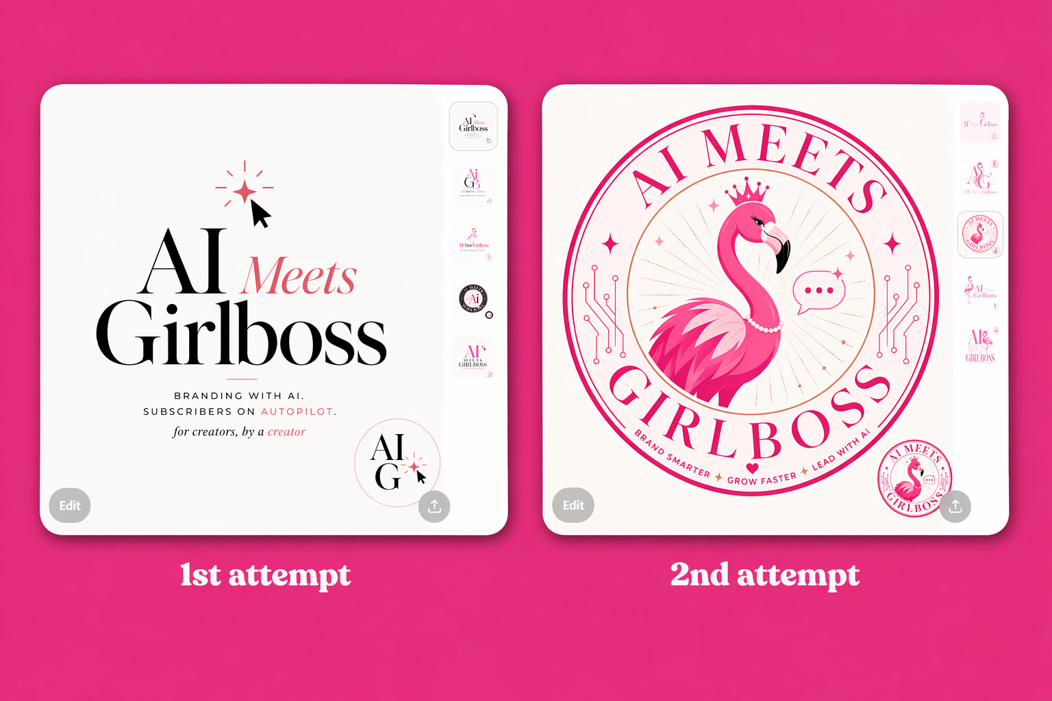
These two prompts are a starting point and a brief-builder. They're not a finished logo system. But they will get you somewhere real to react to — which is exactly where the discovery work begins.
In the Notes…
Post your best result from round one — even if it’s not right yet. Tag me. I’ll restack everyone who shares theirs. I want to see what the flock is working with.
(Bonus: if you spot anything pink or flamingo-shaped in the wild and it makes you think of this post — that’s a sign your brand is starting to work on you before you’ve even built it.)
Take a deep dive into the logo workflow!
The full Logo Discovery SKILL MD file and prompt — a guided Claude conversation that walks you through the discovery process and builds your full logo system for you.
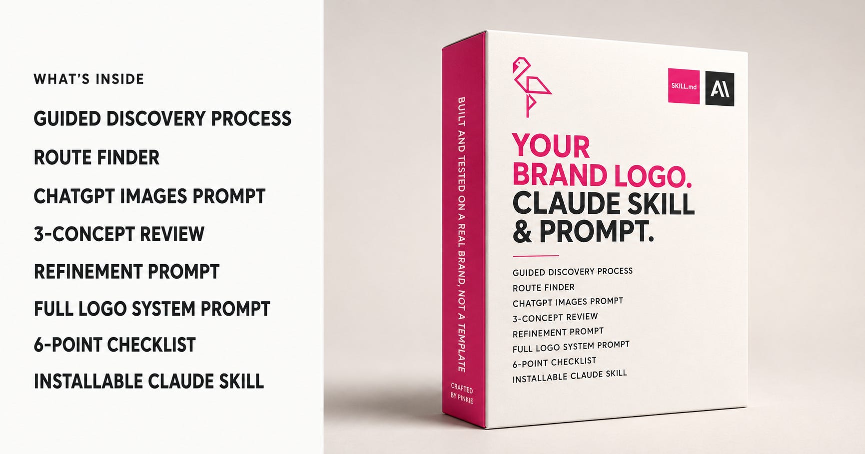
You can get this two ways:
🩷 As part of The Branding Flock (paid subscription) — my 12-month visual brand program, where this prompt and everything else I build lives inside your subscription. Join the flock!
📥 As a standalone download — the full prompt, ready to paste into Claude, on Gumroad.
Comments
Nothing yet. Say the first thing.
Sign in to join the conversation.