
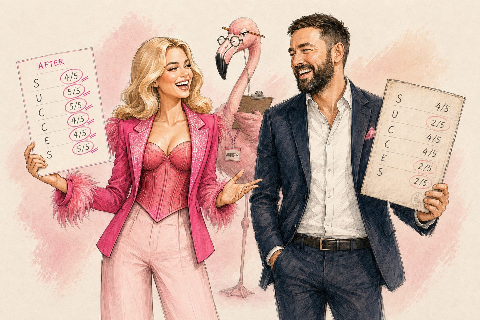
TL;DR: The Visual Brand Distinctiveness Test is a free custom GPT that scores your Substack visuals across six dimensions and tells you the invisible rule your brand is playing by. David Roy from ENG Sales ran it. His scores helped him redesign his brand. You can read his post here.
A few months ago, I scored my own Substack brand to see how distinctive it is, and the result was… quite humbling. A slap on the face, to be honest. Especially for someone working in branding for the past 8 years.

I’d built what I thought was a recognizable AI content channel. Consistent visuals, clear topic, regular posting. The diagnostic disagreed. Consistency was my only strength. Everything else was safe, polished, and invisible enough that — and this is the GPT’s actual output — “another creator could replicate this vibe in a single prompt.”
I rebranded based on what that audit told me. Two weeks later I went from 64 to 200 subscribers. Same voice. Same posting frequency. Different visual system.
After I shared that story publicly, the DMs started. David Roy approached me and asked “Can I run this on my brand? Does this work for non-lifestyle creators? What if I’m B2B?”
So I turned the audit into a tool anyone can use.
Hey, I’m Pinkie. I help creators build recognizable Substack brands that drive consistent subscriber growth. I share the exact branding systems, prompts, and workflows I use to transform ideas into distinctive, repeatable output. If you’re new to AI Meets Girlboss, welcome! Honestly, this might be the best time to join. start here! 🩷🦩
What the SUCCESS Model is and why it works as a visual brand diagnostic
How to score your own Substack brand across six dimensions of distinctiveness
Why most AI-generated visuals fail -- and it has nothing to do with quality
What “balance is the enemy of recognition” actually means for your covers
How a B2B newsletter founder David Roy scored the test and what it found
The difference between authority and memorability -- and why they need different visual decisions
How to use the free Visual Brand Distinctiveness Test GPT to get your own scorecard in 10 minutes
The test is built on the SUCCESS Model from Made to Stick by Chip Heath and Dan Heath — a framework for why some ideas lodge in memory and others slide past. I adapted it as a visual brand diagnostic.
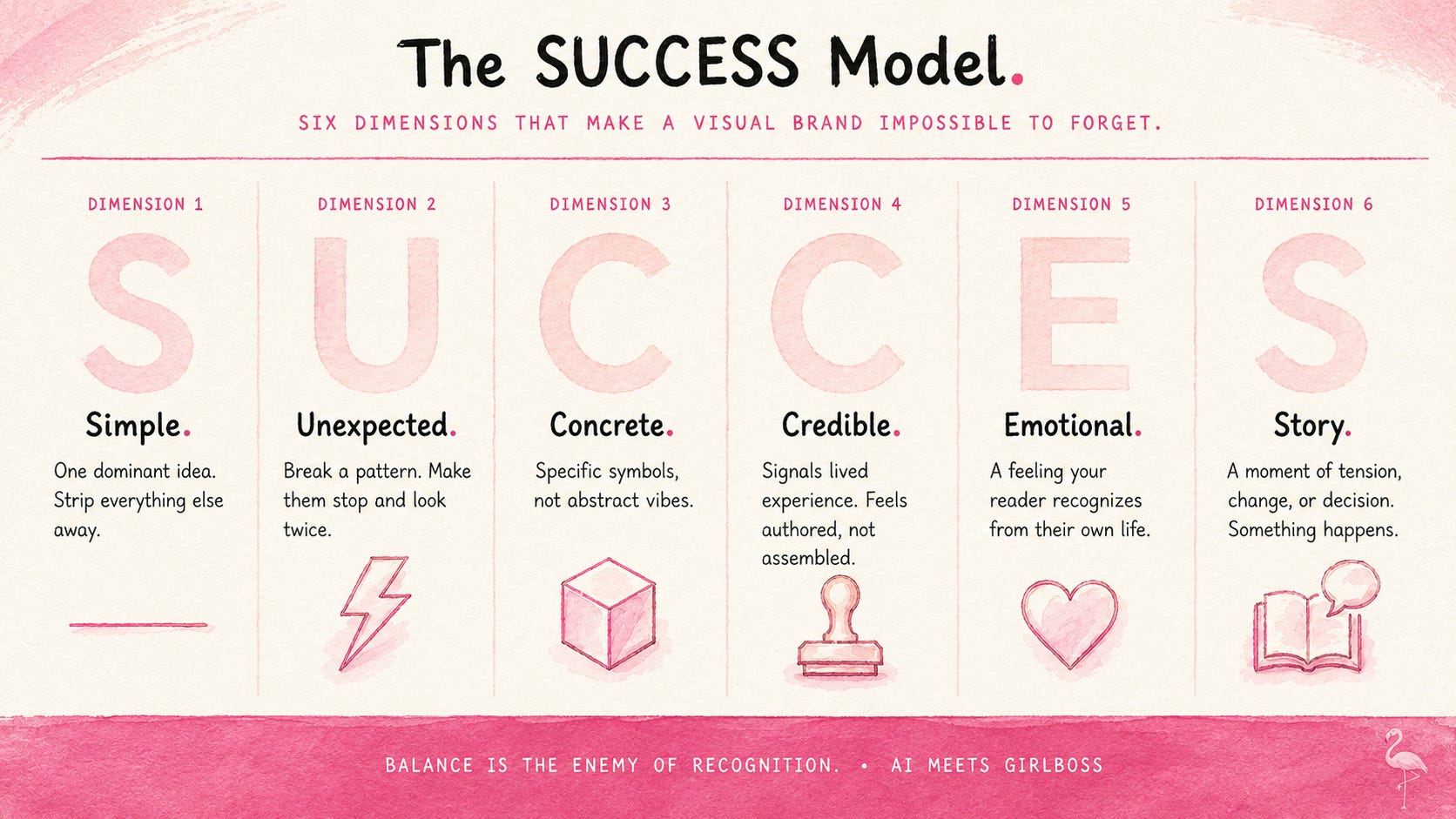
The six dimensions:
Simple — One dominant idea per visual. Does your cover communicate one thing, or is it negotiating with itself?
Unexpected — A clear break from your category’s defaults. What does everyone in your niche do visually — and are you doing that too?
Concrete — Specific symbols, not abstract vibes. A flamingo is concrete. “Professional and approachable” is not.
Credible — Signals lived experience or real authority. Does the visual feel authored, or assembled?
Emotional — A legible feeling within seconds. Not inspiration. A specific emotion your reader recognizes from their own life.
Story — A moment of tension, change, or decision. Is something happening in the image, or is it just a scene?
Most AI-generated visuals don’t fail because they’re bad. They fail because they try to score evenly across all six — and end up dominating none.
Only 15% of brand assets are truly distinctive. 90% of snap judgments are based on color alone. Your cover forms a brand opinion in 50ms before a word is read.
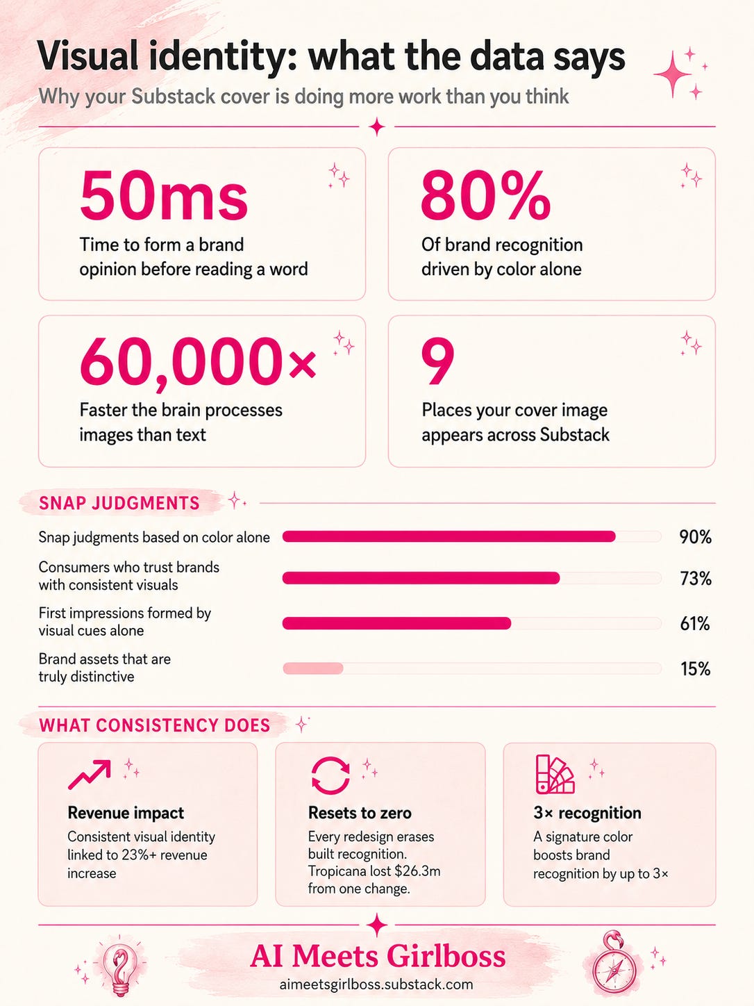
Most AI-generated visuals fail because they try to score evenly across all six — and end up dominating none, which is exactly why the raw output from tools like ChatGPT Images 2.0 needs a system behind it, not just a good prompt.
The strongest visual brands pick two or three dimensions and commit to them completely. The test tells you which ones you’re actually winning, which ones you’re pretending to win, and which invisible rule is keeping you safe and forgettable.
Balance is the enemy of recognition.
The strongest visual brands pick two or three dimensions and dominate them completely. The test doesn’t ask you to be good at all six. It asks you which two you’re willing to go all in on.

David Roy writes ENG Sales Solutions, a newsletter for technical founders who want to win at sales without becoming someone they’re not. David has tight writing and a clear point of view. His page is worth a follow if you’re into building a strong sales system. You can read his post on his rebrand process here.
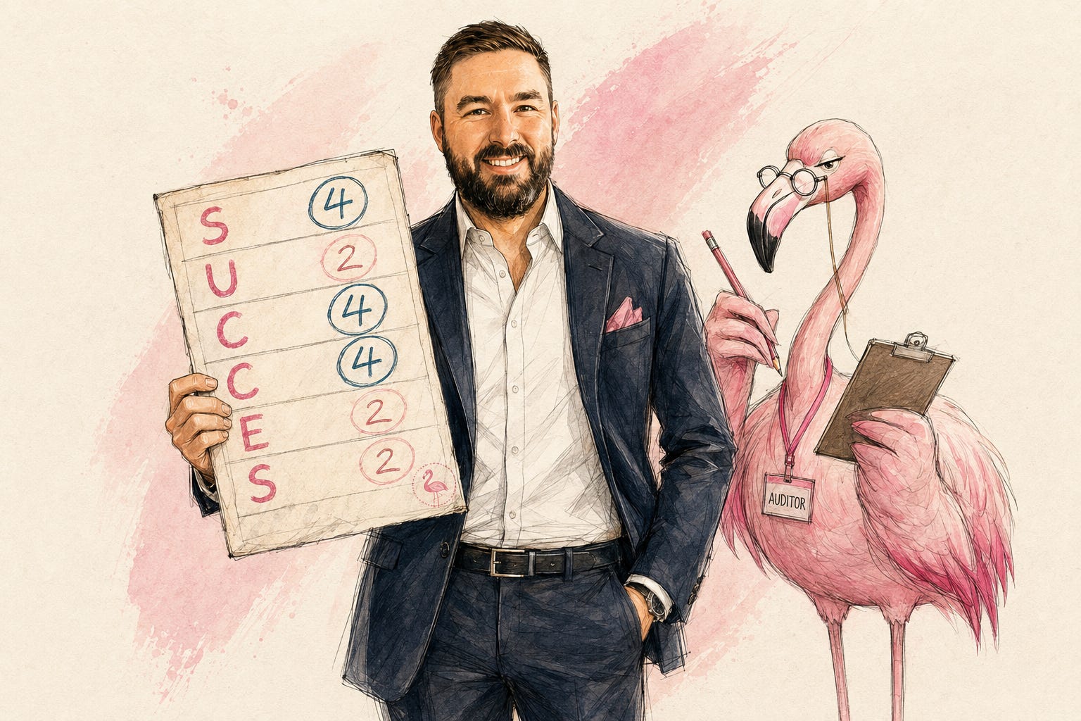
His scores told a more specific story:
Simple: 4/5 — Consistent palette, consistent typographic approach. Reads as framework.
Unexpected: 2/5 — Once you’ve seen three covers, you’ve seen the system.
Credible: 4/5 — The brand feels authored. Visual restraint signals seriousness to technical buyers.
Concrete: 4/5 — Statement-driven covers with specific business claims.
Emotional: 2/5 — Intellectually correct. Almost nothing feels emotionally lived.
Story: 2/5 — Covers communicate conclusions. Few communicate moments.
David’s brand was optimizing hard for authority. Simple, Credible, Concrete — those are the safe dimensions. The ones technical founders naturally gravitate toward, because they’ve been trained to distrust anything that reads as sales-y. Emotion reads as sales-y. Story reads as soft. So both get suppressed, the same suppression I see constantly in Turn Your Personality Into Your Brand Voice, just aimed at a different audience.
The result is a brand people respect and don’t remember.
What the test named — and what David said landed — was the trade-off he’d been making:
The brand is optimizing for authority over memorability. The audience remembers the advice. Not necessarily the brand.
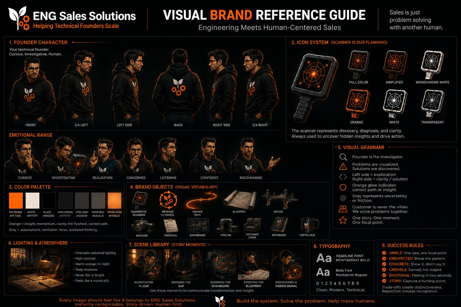
After the diagnostic, David built a complete visual brand reference sheet, a single image file that locks his character, his palette, his icon system, and his visual grammar so every AI-generated image starts from the same foundation.
The process mirrors the 6-step brief-to-brand workflow I use with every client — concept first, then prompt, then image, checked against a locked reference.
His brand works with dark background, cinematic lighting, orange glow for insight and gray for friction.
He has a founder character with seven different emotional states.
His brand mascot is a scanner which appears in his visuals consistently.
David ran the diagnostic, understood what was missing, and built a system he can use for all his Substack image generation tasks.
He built it after watching me demo the workflow live with Joel Salinas — concept first, then prompt, then image generated against the reference sheet.
I wrote a detailed post earlier on how to create a brand reference sheet to stay visually consistent. Image gen tools won’t produce the same consistent output just based on words. Go build yours.
After the scorecard, the test moves into direction-setting. The question it asks isn’t “what aesthetic do you like?” It’s closer to: what does your reader feel the moment before they open your newsletter?
For David, that answer was specific. Technical founders who know their product is good and keep losing deals they should be winning. Not a vague frustration — a real one with texture. A post-call silence. A stakeholder who went quiet for six weeks.
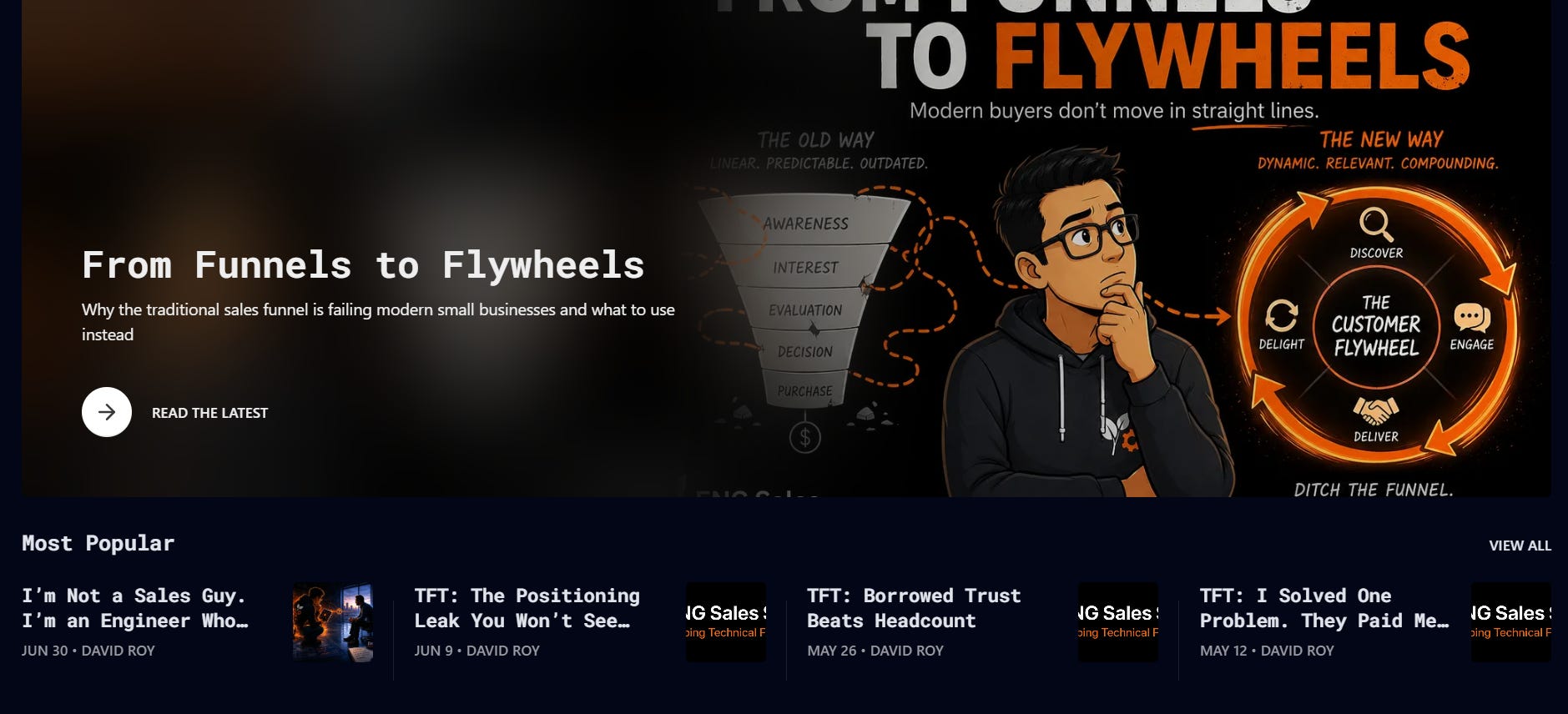
From that anchor, the concept that emerged: a buyer journey that looks like a software workflow. A process map with labeled steps. Except the buyer doesn’t follow the process. They loop backward. They disappear. They return three months later with a new stakeholder the funnel never accounted for.
His audience reads broken workflows every day. They recognize one immediately. Showing them their buyer behaving like a misrouted API call is a description of something they’ve seen before.
That’s the shift the test pushes toward: not warmer, not more personal, but more specific. Authority tells people what you know. Recognition shows people you understand what they feel.
Those require different visual decisions.
In the comments...
Run the test on your own brand and drop your lowest score below. Just one number and one sentence: what it is and whether it surprised you.
(Mine was Unexpected: 2/5. Stung more than I expected.)

The Visual Brand Distinctiveness Test is free and it takes about ten minutes.
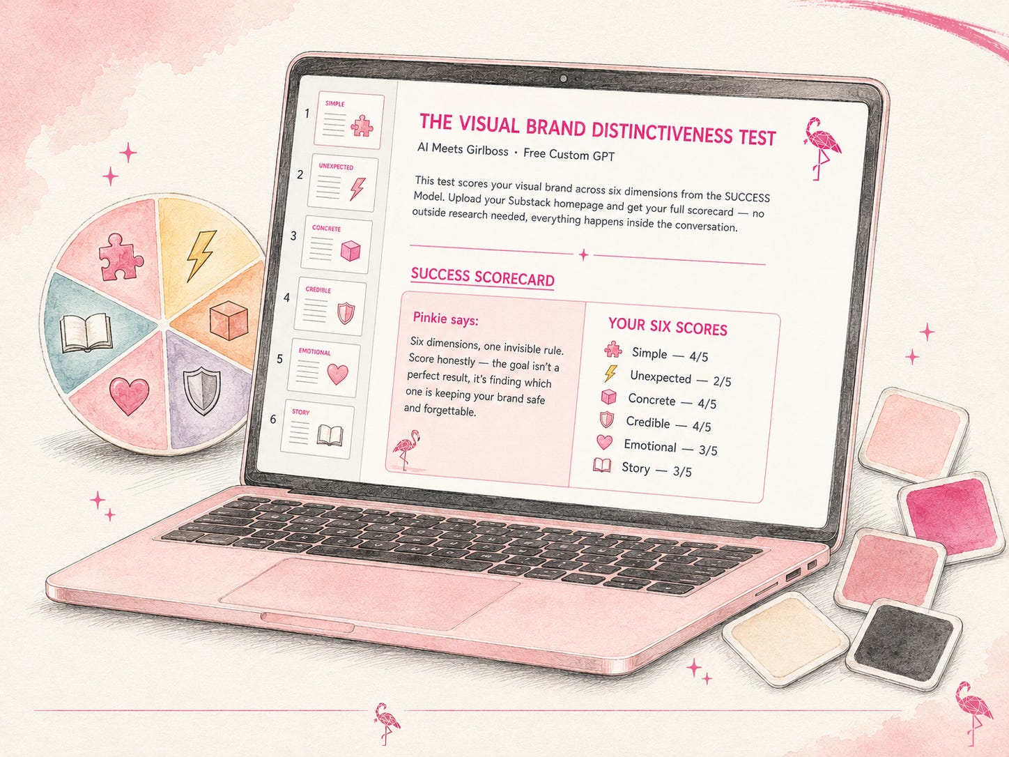
Run the Visual Brand Distinctiveness Test in ChatGPT →
Upload a screenshot of your Substack homepage in grid view. You’ll get your full SUCCESS scorecard, the invisible rule your brand is playing by, and one concrete thing worth changing next.
If you want to go deeper after the scorecard, ask it to move into cover direction. That’s the stage where it helps you find the visual anchor that makes your specific reader feel seen — before they read a word.
Talk later, Girlbosses.
Pinkie 🩷🦩
If today’s post made you think about your own visual brand, I am running The Branding Flock, a visual brand & identity program for Substack creators who are done being invisible.
Full breakdown posts, real prompts, real outputs. Your color palette, your logo, your brand character, your content system — built step by step alongside the flock.
25% off your subscription if you are brave enough to look in the mirror, and take the brand maturity test developed by a group of very judgmental flamingos.
Comments
Nothing yet. Say the first thing.
Sign in to join the conversation.