
I've been sharing prompts like this in my Notes for seven months, and they're consistently the most popular thing I post. People kept asking how to find the old ones, and the answer is: you can't, Notes aren't searchable. So Prompt Tuesday gets a proper home as a post every week, starting now.
TL;DR: This week's prompt turns one photo you attach into a banknote concept, name your own currency, pick your own colors, use your own subject. The full prompt is below, along with why a banknote is secretly one of the best ways to learn how AI image generation actually works.
A banknote is probably one of the hardest things you can ask an AI image generator to do well: dense layout, tiny repeated numbers, microscopic text, a portrait that has to survive a completely different rendering style.
If you want to understand how these tools handle structure, not just "make me a pretty picture," this is probably a great teacher.
That's the idea behind Prompt Tuesday: fun visual play that leaves you more fluent in how AI image generation actually works, one prompt at a time.

Quick disclaimer since it's not obvious from a screenshot: these are just-for-fun design concepts, not real currency, not legal tender, and not meant to resemble any actual banknote. Purely an illustration exercise.
Hey, I’m Pinkie. I help creators build recognizable Substack brands that drive consistent subscriber growth. I share the exact branding systems, prompts, and workflows I use to transform ideas into distinctive, repeatable output. If you’re new to AI Meets Girlboss, welcome! This might be the best time to join. start here! 🩷🦩
That crosshatched engraved look isn’t just an aesthetic choice, it’s called intaglio, and it started with 15th-century goldsmiths, later adapted for currency because the ink physically presses into the paper under massive pressure, creating texture no regular printer can fake.
Those swirly background patterns (guilloché) trace back to a watch-engraving machine from 1827, originally a security feature, Your brain reads “official” the moment it sees one.
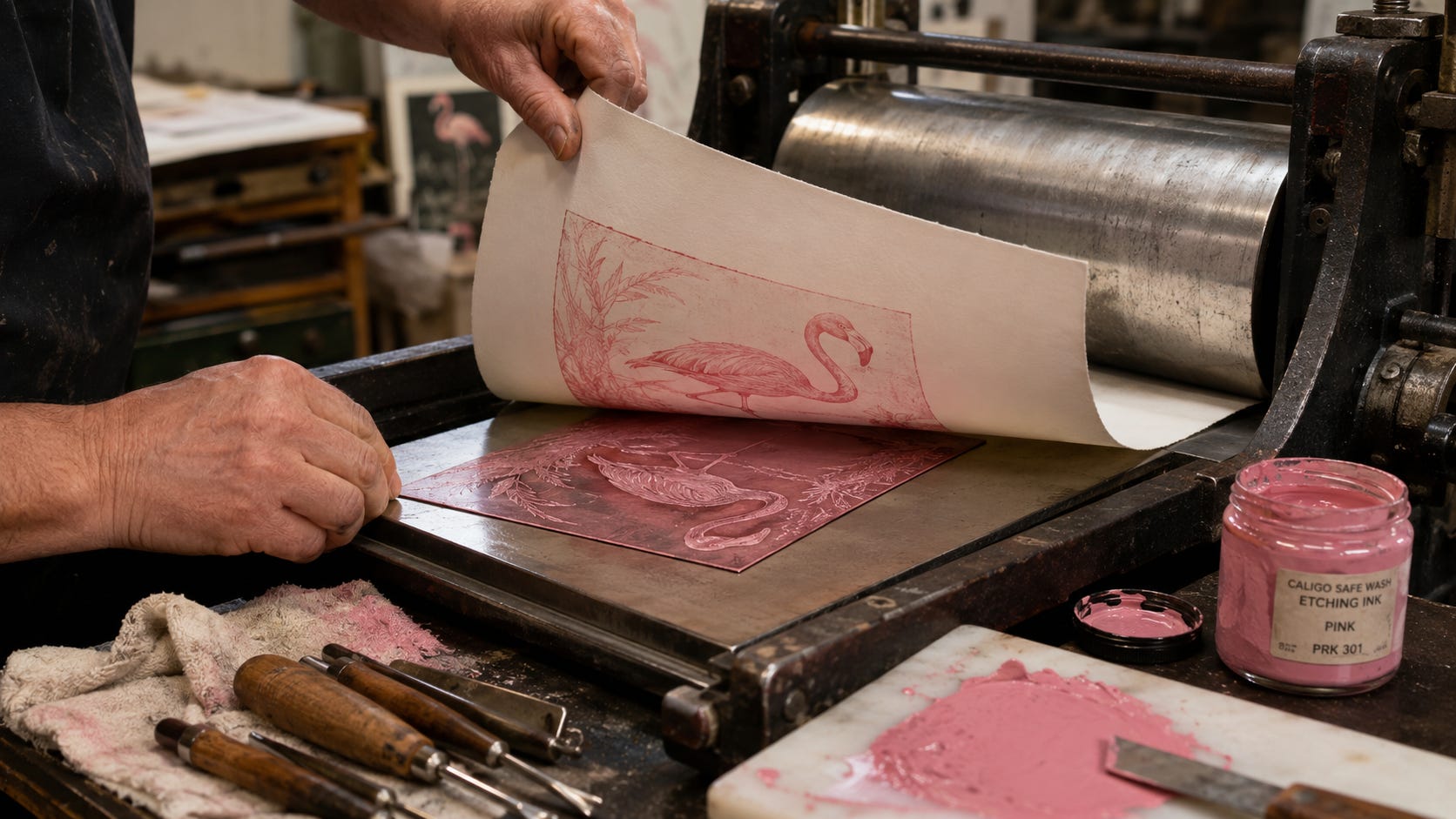
Mia Kiraki 🎭 shared a Substack Note that the European Central Bank is running a real public survey on shortlisted designs for the next generation of euro banknotes, ten design teams from across Europe, and you can vote on your favorite here.
Several proposals lean hard into European birds and rivers, portraits, water, migration patterns rendered as security foils, genuine engraving-level craft. (Not one of them has a flamingo. Unacceptable.)
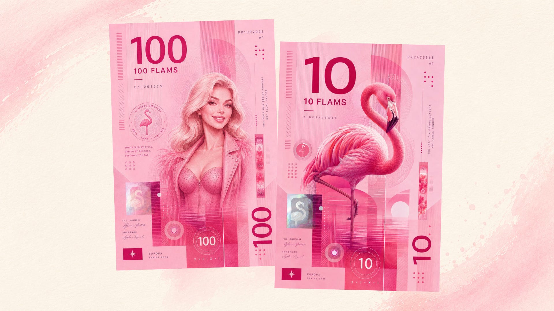
I created mine using a portrait of my brand character Pinkie, and the flamingo, Flavio. I quickly came up with the currency name: Flam, short for Flamingo. I shared my first images in my Substack Notes and a few of you asked for this prompt after seeing them.
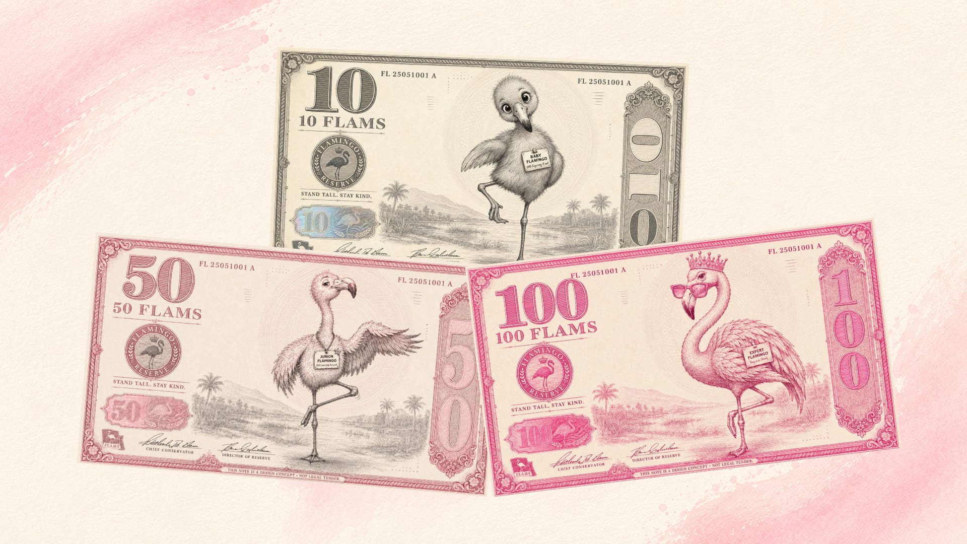
I went a bit further and built a small tiered collection: a starter denomination, a mid-tier, and a top-tier. It’s the same “leveling up” logic behind The Branding Flock‘s Baby, Junior, and Expert stages: it turns out that structure works just as well for a currency as it does for a brand maturity model.
You can use these as house currency for family game night, a chore-chart reward system for the kids, an inside joke or “Coffee Fund” note for your friend group, a gag insert for a birthday card, or a bachelorette favor.

I am sharing the fillable template prompt below.
Fill in just two things: your currency name and your accent color.
Attach a photo of whatever you want engraved as the star of the note (your pet, an object, a plant etc), then paste this into your image generator.
Create an image of a collectible banknote concept, horizontal landscape orientation, engraved intaglio-style illustration.
Use the uploaded reference image as the main engraved portrait, positioned right-of-center, rendered in fine engraved linework (crosshatching, printmaking texture, not photographic or flat).
Include standard banknote elements: a large denomination number in the top-left and repeated oversized along the right edge, a "[DENOMINATION] [CURRENCY NAME]" label, a fictional serial code top-left and top-right, a circular seal/emblem with a short tagline on the left third, a small holographic-style foil patch and two scrawled signature lines in the bottom-left, a small flag icon in the bottom-left corner, ornamental line patterns and fine decorative details filling the background, and tiny microprint reading "THIS NOTE IS A DESIGN CONCEPT · NOT LEGAL TENDER."
Monochromatic palette in tints and shades of [YOUR ACCENT COLOR] only, plus white/cream negative space. Classical serif typography. No photorealism, no gradients, no drop shadows. Aspect ratio 16:9.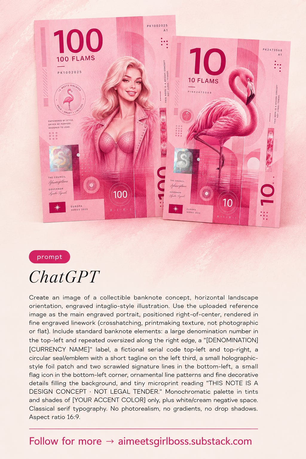
Notes on using it:
A clear, front-facing reference photo works best.
This works especially well in ChatGPT Images 2.0, which handles the tiny repeated text and fine layout control a banknote needs. More on why in ChatGPT Images 2.0 Is Out. These 7 Prompts Are All Substackers Need.
If your generator throws an error, soften any “banknote/currency” language in your own edits. Realistic-looking money can trip content filters even when the intent is obviously playful.
Tag me if you make one. Substack won’t show me images in comments, so share it in your Notes, I’ll restack as many as I can and feature my favorites in an update to this post.
Talk later,
Girlbosses. Pinkie 🩷🦩

If today’s post made you think about your own visual brand, I am running The Branding Flock, a visual brand & identity program for Substack creators who are done being invisible.
Full breakdown posts, real prompts, real outputs. Your color palette, your logo, your brand character, your content system — built step by step alongside the flock.
25% off your subscription if you are brave enough to look in the mirror, and take the brand maturity test developed by a group of very judgmental flamingos.
Comments
Nothing yet. Say the first thing.
Sign in to join the conversation.