
⚽ Top 5 leagues are kicking off — football is back.
So I built a little something — yet another of my sport interactive experiences.
top5.aguywithascarf.com
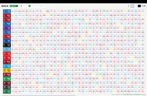
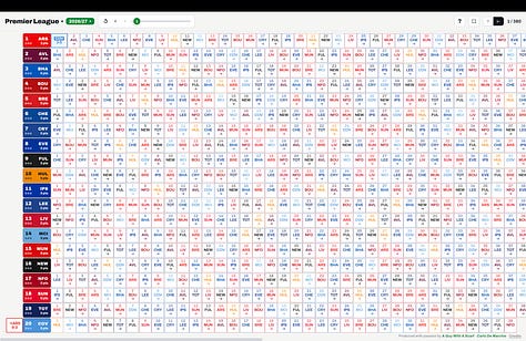
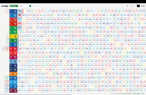

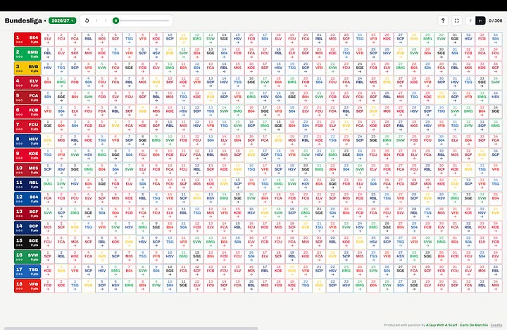
And TBFH, to be fully honest: this is a rework of an NFL visualization I’ve been chipping away at for years — which I’ll finally launch at the start of September. This football version just… jumped the queue. ⚽🏈
I wanted one big landscape screen where I could keep all the matches of a season in view at once — every result, every club, the whole shape of a league in a single glance.
But there’s a second idea in here, and it’s not mine — it’s my son Miles’ (11), who plays for a Juventus elite academy team. He looks at the table differently - he is also a big consumer of all my interactive experiences from his iPad, with the unwanted side effect of the number of sports data and stats question from him increase dramatically, which I totally am not able to reply to.
His thinking: at the start of a Serie A season, every team already owns all its points. 38 games × 3 = 114 points, sitting in the bank. From there you don’t earn points — you try not to lose them. Lose a match, 3 gone. Draw, you still drop 2. A tie isn’t a small win; it’s mostly points let slip.
He imagined having a physical “thing” in the locker room where the team manually moves blocks from the upcoming games to either the positive (win) or negative (lost) or both sides (tie) of the tower, maybe made with Lego?
So instead of a normal table, each team is a tower: what it kept stacks up, what it dropped pulls down — and a draw shows on both sides, because it’s +1 earned and 2 lost at the same time. Two teams on equal points can look completely different once you see the points they gave away. I call them towers as they started vertical then I also did a horiziontal version which works best on landscape, both models are available.
It’s a very simple visualization — honestly not the most visually satisfying thing I’ve made 🙂 — but it’s the best way I’ve found so far to see a season the way Miles sees it. Data updates once a day as matches are played.
Have a look 👉 top5.aguywithascarf.com
All my other interactive experiences: dataviz.aguywithascarf.com
A Guy With A Scarf — Carlo De Marchis #football #dataviz #SerieA #PremierLeague #NFL #dataviz
Comments
Nothing yet. Say the first thing.
Sign in to join the conversation.