
Every so often something stops your thumb mid-scroll. This time it was a piece by Emilio Sansolini that landed on my timeline: a World Cup knockout bracket, but not the usual left-to-right ladder. A circle. (original here)
I stared at it far longer than I’d like to admit.
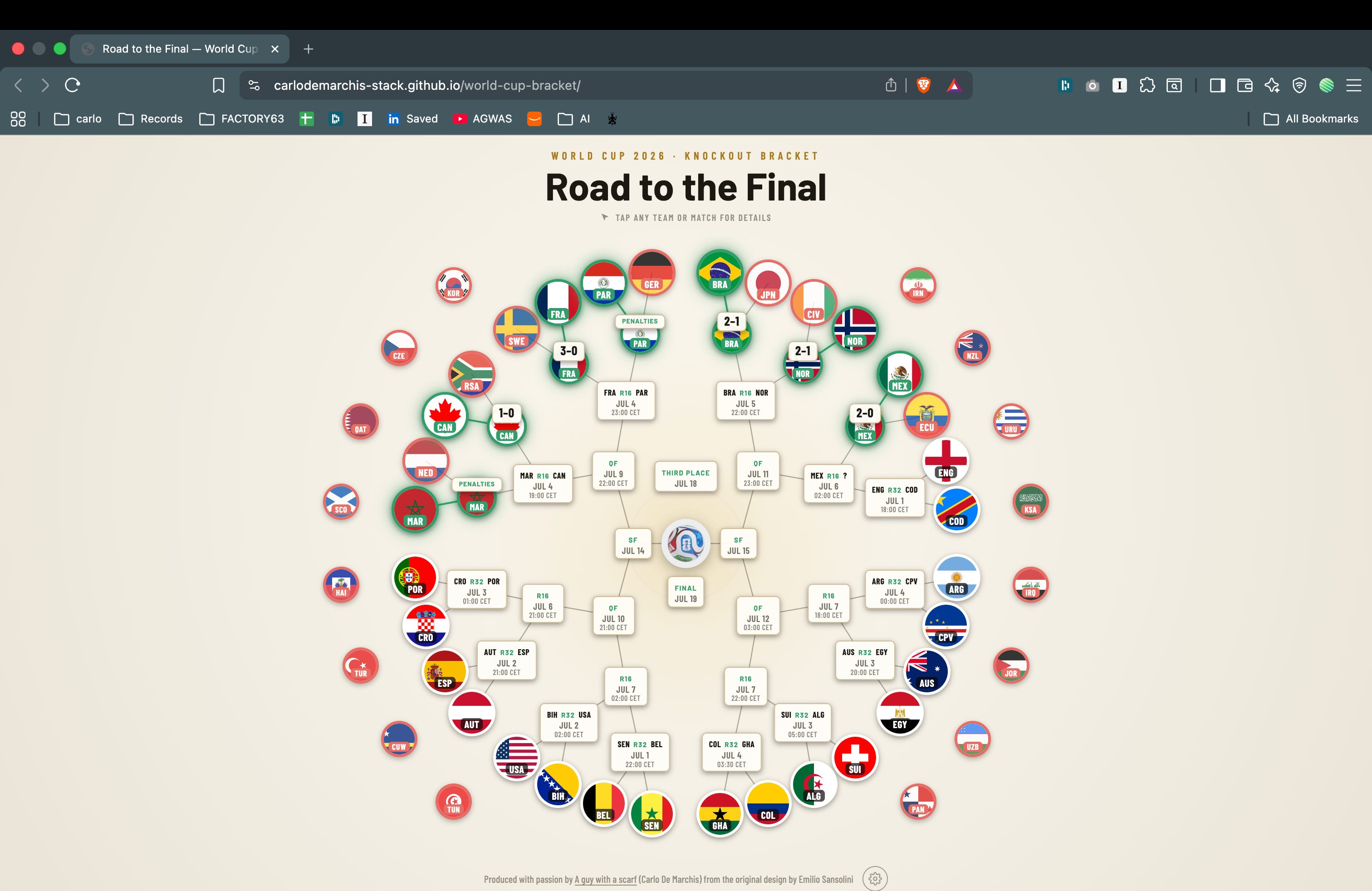
Look at it. A black canvas, the federation crests paired with the national flags, the golden trophy glowing dead centre. Coloured threads trace each surviving nation’s path inward, toward the middle. It’s premium, poster-grade work. The radial layout does the quietly difficult thing every great sports infographic does: it turns “the road to the final” from a metaphor into a literal shape. Everyone starts on the outside, the prize is in the centre, and you read the whole tournament in a single glance, no legend required.
And here’s the thing about work that good. It provokes you.
I’ve spent an embarrassing share of my life at the crossroads of sport, media and technology, and the part of my brain that never switches off is the one obsessed with UX for sports. So to me a beautiful static image is a dare.
What if it breathed? What if you could tap any flag and see how that team actually got here? What if every little date knew who might turn up to play it? What if the picture updated itself as the tournament unfolded?
So a bit of Claude Coding and some UX discipline, I started building.
Emilio’s is a finished, framed poster. Mine is a living, slightly scrappy, always-a-work-in-progress web page that I can nurse through the whole tournament.
I kept the soul of it: the circle, the trophy at the heart, the road pulling inward. I changed almost everything else in service of interaction: a lighter default look (with a dark mode for the purists), flags first, and (the whole point) everything is clickable.
→ carlodemarchis-stack.github.io/world-cup-bracket
Produced with passion by A Guy With A Scarf, from the original design by Emilio Sansolini.
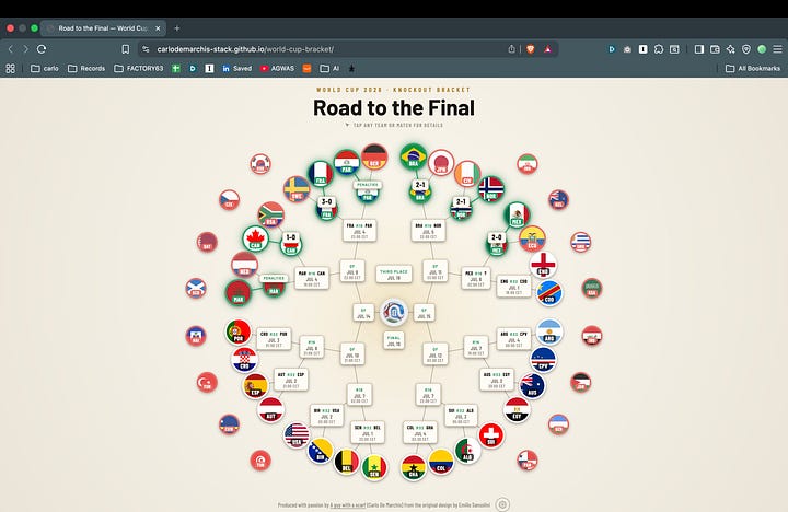
The interactive bracket, the full circle. My take, live. Same soul as Emilio’s (the circle, the trophy at the heart), flags-first, lighter, and every crest and chip is clickable.
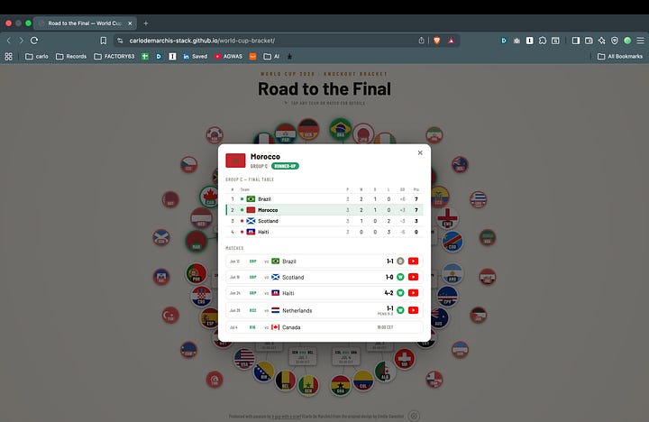
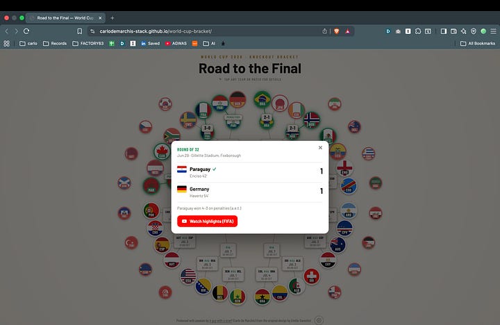
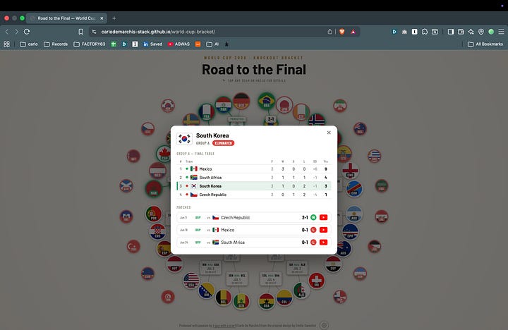
Tap anything. Click a team’s flag and a card opens with its full group table, every match it’s played (group and knockout), and (where FIFA has posted them) a link straight to the highlights. Click a match instead and you get scorers with minutes, venue, extra time or penalties, the lot.
Status you can read at a glance. Each crest wears its state in its border. Green means still dancing, red means eliminated, white means yet to play.
The teams that didn’t make it aren’t forgotten. The sixteen group-stage exits sit in two arcs on the left and right, like parentheses around the survivors. And they’re clickable too.
The future, sketched in. Matches that haven’t happened yet still tell you what they can: an upcoming Round-of-16 or quarter-final shows the possible teams (”one of BRA / NOR”) narrowing as results come in.
Little touches. The official Trionda ball at the centre, a dark/light switch and a few style options behind a gear, and the whole thing scales down to a phone.
A team card. Tap a flag: the group’s final table, every match the team has played (group and knockout), and (where FIFA has posted them) a highlight link per game.
A match card. Tap a match instead: scorers with minutes, venue, and how it was settled, right down to “won 4–3 on penalties (a.e.t.)”.
The part I’m quietly proud of: it’s data-driven. All the schedule and results live in one JSON file. Recording a result is basically a one-line edit, a score and a winner, and the bracket redraws itself: the crest advances, the loser dims, the borders and the “who plays whom next” all update on their own. It’s hosted for free on GitHub Pages, so updating it is just a commit. Cheap, boring, reliable, exactly how I like my infrastructure. That’s the honest reason it can stay a living thing. I can keep it alive in five-minute bursts.
It’s not finished, and it isn’t trying to be. Some highlight clips aren’t up yet. A couple of far-future venues are best-effort. There are a hundred small polish decisions still ahead of me. I’m publishing anyway, because waiting until it’s “perfect” is how projects quietly die.
This is where you come in. What reads instantly, and what makes you squint? What would you want to click? What did I overthink, and what did I miss entirely?
My passion for visualising sport and building UX around it never dies. The best fuel for it has always been other people’s eyes on the thing. Emilio’s design lit this one up. I’d love yours to shape where it goes next.
And credit where it’s overwhelmingly due: go and look at Emilio’s original, and give him a follow. It’s the good stuff.
Grazie, and enjoy the football.
— A Guy With A Scarf
A Guy with a Scarf is collaborating with Dolby OptiView - Enabling live sports experiences that engage and captivate fans. #ad
Comments
Nothing yet. Say the first thing.
Sign in to join the conversation.