
When Australians talk about inequality in our cities, we often use cardinal directions as shorthand. In Melbourne and Sydney, “The West” is typically seen as disadvantaged compared to “The East”. In Perth this is inverted. Out in the capital of WA, its western suburbs seen as privileged instead; the area often referred as “The Golden Triangle”, a fittingly metallic description of its wealth.
But how real are these directional distinctions in our cities?
In the United States, there is an ongoing discussion about cities containing a “Favoured Quarter”, where jobs, wealth and services tend to concentrate, drawing lineage to Hoyt’s sector model. This framework goes that: these areas are where most of the wealthy white people settled, incentivising shopping centre developers and employers locating there, leading to more highways, making property values rise and more high-income earners, shopping centres, and jobs locating there. Meanwhile lower-income residents in other sectors of the city must endure long commutes, to access services and jobs.
It is worth taking a moment to reinforce this with an example in the United States: Atlanta.
Atlanta has a very strong “Favoured Quarter” in its north. Buckhead and suburbs like it are home to historic mansions built in the early days of Atlanta and were major destinations for the “White flight” that occurred in several major US cities in the 20th century.
This density of high-income earners in the northern suburbs made the development of secondary job hubs viable such as at Sandy Springs, where two major freeways intersect.
Whilst freeways are integral to these job precincts, Atlanta’s rail system is a factor. It travels further into its north than any other direction to service these job clusters including, but not limited to Sandy Springs.
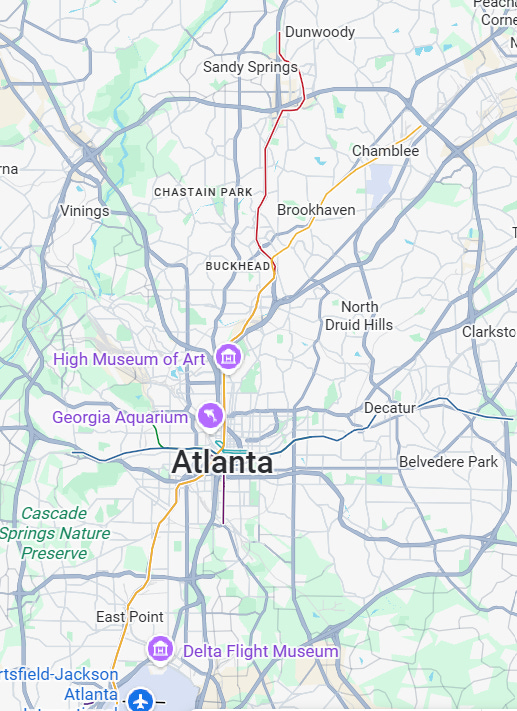
This concentration of jobs, wealth and services in the northern suburbs of Atlanta makes providing railways, expanded freeways, more jobs, and more services to this direction more viable. This in turn makes new housing developments on the northern fringe more attractive – and more expensive, as they are closer to all these jobs and services than on the other side of the city.
This is the mechanism that the favoured quarter is not only maintained, but continues expanding in the same direction, away from the CBD of the city. This is not the only example – this pattern is easily discernible in Charlotte, Washington D.C, Phoenix amongst others.
My question now is whether Australian cities truly exhibit similar patterns. Whilst our urban history is distinct from the USA, our cities also seemingly display persistent geographic concentrations of wealth and disadvantage. Do Sydney, Melbourne, Brisbane, Perth and Adelaide each possess their own favoured quarter - or have our cities followed a different path?
To see if Australian cities do indeed have favoured quarters, the first place I chose to look is income variation. The favoured quarter concept suggests wealth should radiate outward in a particular direction and stay in a particular direction wedge as the city grows. I will refer to this prediction as the “sectoral model” and contrast it with a traditional “concentric model” where income changes evenly the further out you go from the CBD regardless of direction.
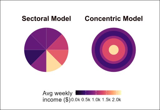
To test these models on Australia’s major cities, I sorted every SA1 (small census areas) into a grid: bands of distance from the CBD (in 2-kilometre steps), and slices of direction, (in steps of every 5 degrees). Each SA1 lands in one distance band and one angle slice, so a given SA1 might be “10-12km from the CBD, in the 95-100° slice” (due east, roughly).
With every area sorted into this grid, I ran an ANOVA statistical test, which essentially asks: if you had to predict an area’s income, how much would knowing its distance band help, versus how much would knowing its angle slice help?
Using the results of this test, I produced this summary chart:
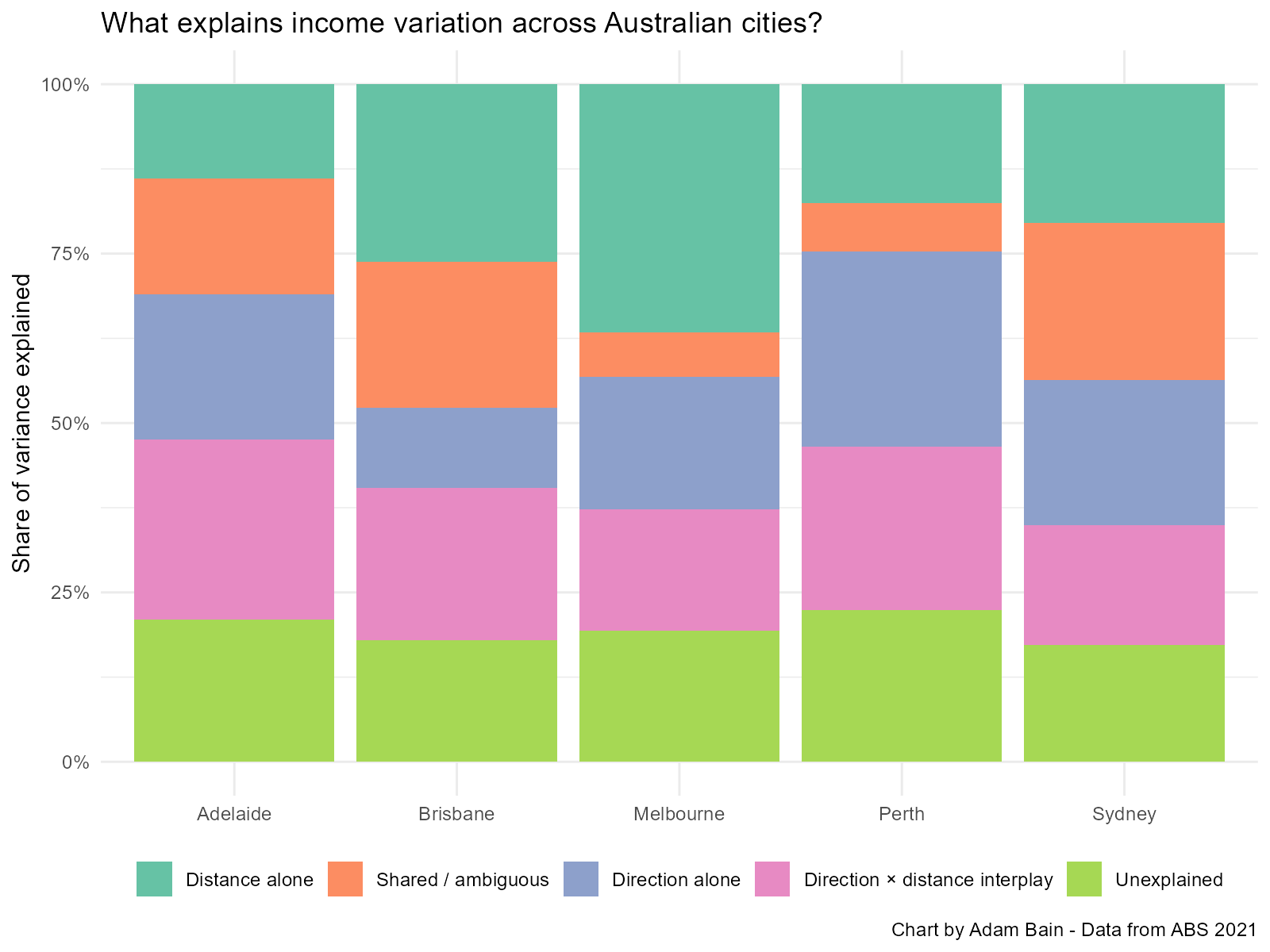
Let’s unpack this chart a bit, because it’s a little complicated. This chart depicts the share of variance that either model can predict. Why are there five bands rather than two? Rather annoyingly, when you do an ANOVA (Type I SS), the order the variables are fed in matters. When I first ran the test, I put distance to CBD in first and got rather high distance shares and small direction scores. I reversed the order and got high direction scores and low distance scores.
This happens as the test essentially asks how much can be plausibly explained by the first variable, then only tests the remainder for the next variable. If a datapoint could have been explained by the second variable, too bad – it has been explained by the first and is out of the picture now.
To account for this, I tested both orders, and used the smallest results from each, labelled on the chart in as “Distance alone” in teal and “Direction alone” in blue. The difference between the smallest and largest results, is given the orange “Shared / ambiguous” share. We can be pretty sure that either distance or direction can explain this share of the variance – we just can’t be sure which is which.
In pink, is the interaction between the two, “Direction x distance interplay”. This is variance that can be predicted only by combining the two variables in some way. For instance, a city might have higher income areas in the south, that get higher income the further out you go from the CBD, whilst the relationship in the north may be reversed, becoming lower income as distance from the CBD increases. In bright green are the residuals, “Unexplained”, by the proposed models.
The broad takeaway from the chart is that the story is not the same across our major cities so let’s walk through them one by one.
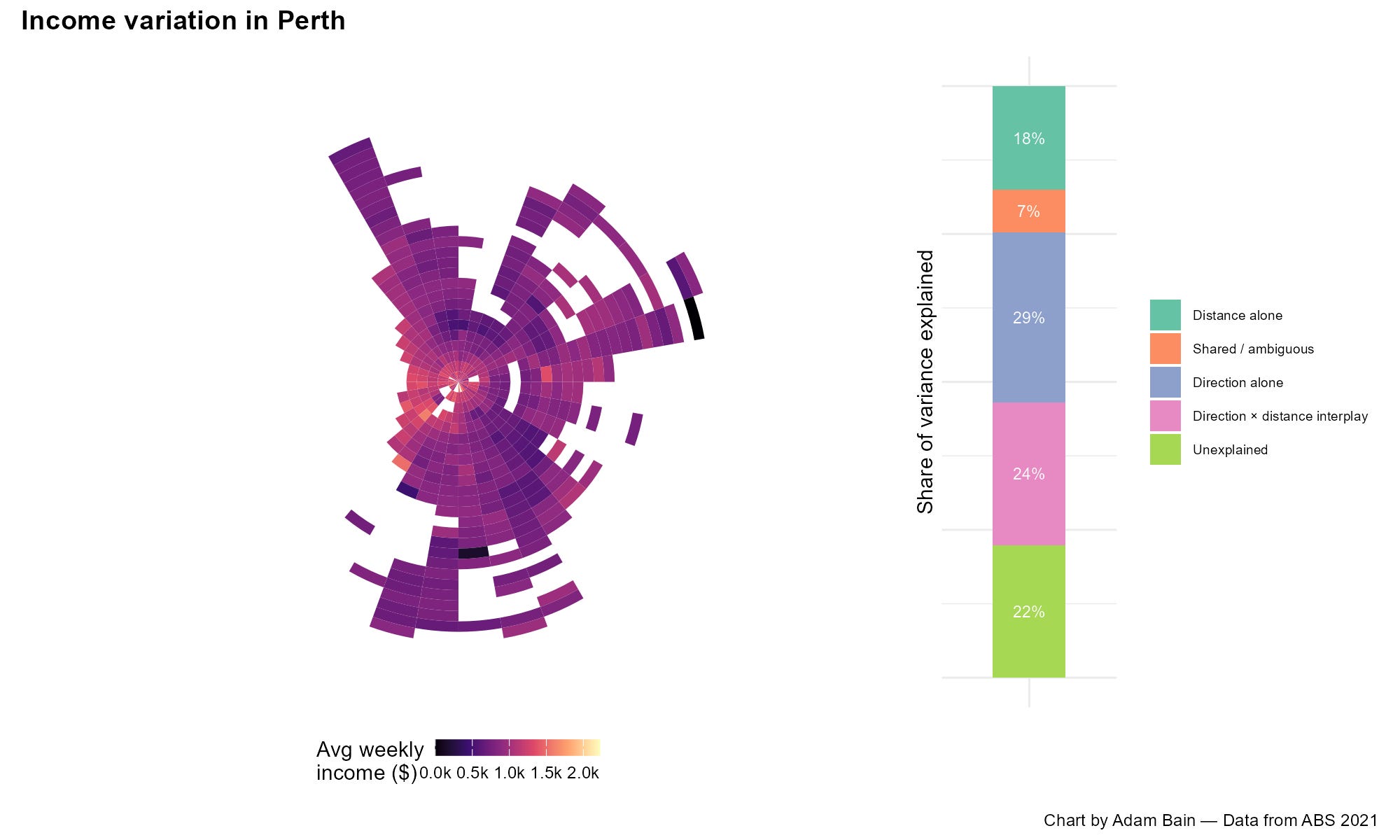
Of all major Australian cities, Perth conforms to the sectoral model the most, with 29% of variance in weekly income explained by direction alone, compared to the 18% share for distance alone. As we can see in the map, the western suburbs (aka the Golden Triangle) are notably higher income, compared to the north and south.
Why may Perth seem to have such a strong favoured quarter in its west? Typically, Australian CBDs are surrounded by a ring of higher income areas, both historically wealthy suburbs and fast gentrifying former working-class areas. This phenomenon is a bit more limited in Perth, with inner urban lower income suburbs in its north and southeast counteracting this distance-based phenomenon.
This may be because Perth grew late; it had a similar population to today’s Geelong at the end of the Second World War, meaning its belt of “heritage” suburbs is rather limited. Perhaps early wealthy settlers in Perth prioritised living close to the Indian ocean, with its attractive beaches rather than being close to the inner core.
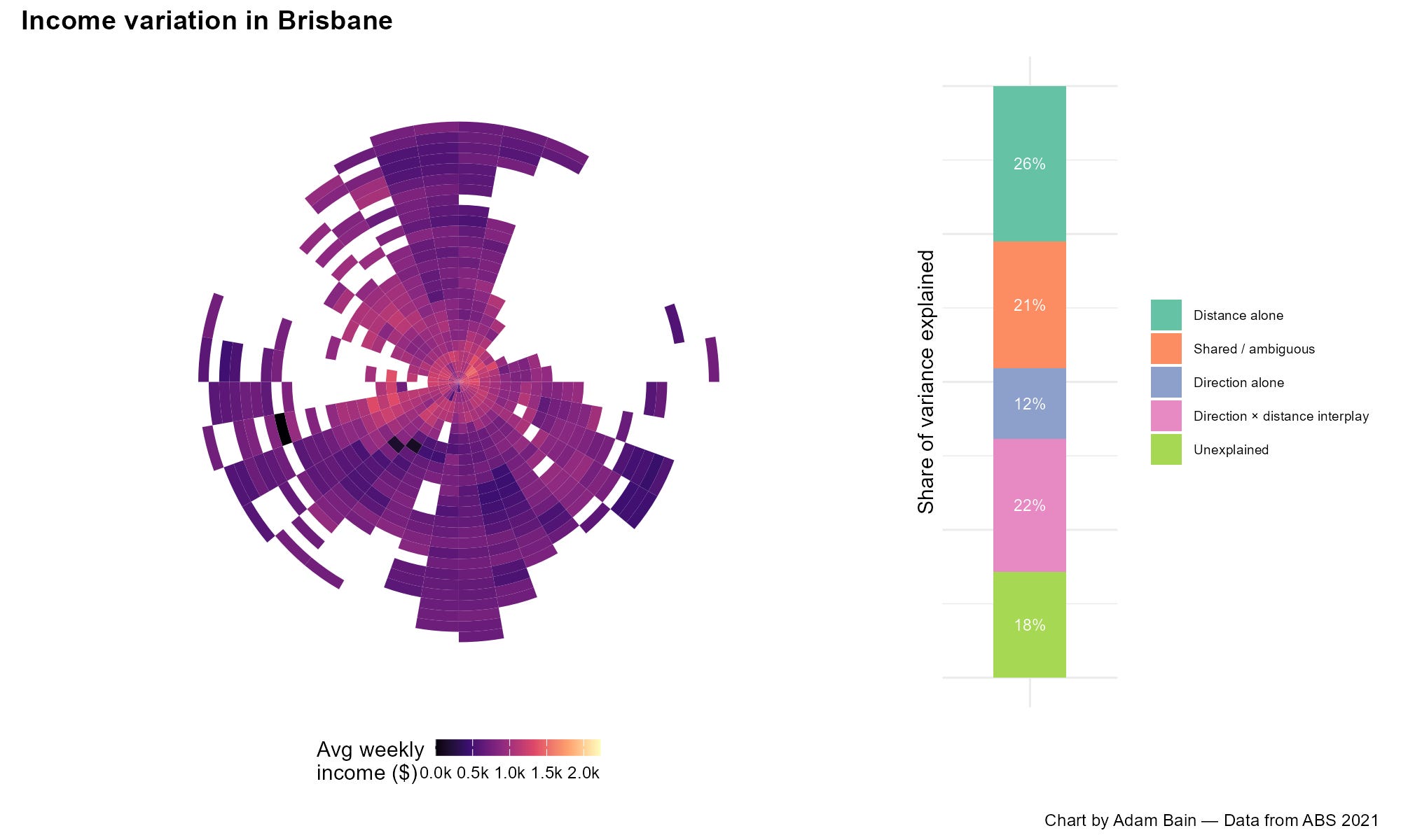
Brisbane on the other hand conforms more to the concentric model, with the distance alone share of variance at 26% compared to the almost negligible direction alone share of 12%. Brisbane has no obvious favoured quarter, instead it has a relatively strong core of well-off inner areas, surrounded by gradually falling average income, the further away from the CBD you get, although this is patchy.
For what it’s worth, from my recent trip to Brisbane, I can anecdotally back up that Brisbane is quite a consistent city, with the southern suburbs feeling very much like the northern suburbs, with not much visual class difference. The one exception is I thought that areas around the river seemed particularly gentrified, maybe visible on the map if you squint.
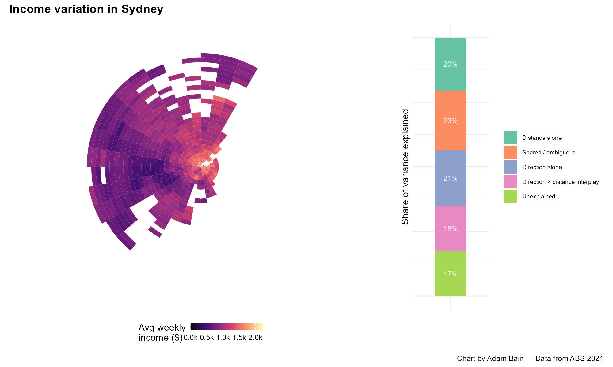
Sydney is curious – both distance and direction matter roughly equally, but they’re quite entangled. The 23% shared / ambiguous share is the largest. I believe Sydney might be thought of as conforming both models, with a concentric pattern in the inner suburbs which gives way to the sectoral pattern in the outer suburbs.
In the outer suburbs, Sydney seems to have a noticeable “dis-favoured quarter” in its west, with a wedge of lower income areas in the Bankstown-Liverpool area, in comparison with a large potential favoured quarter in its northern suburbs in the Ryde-Hornsby area.
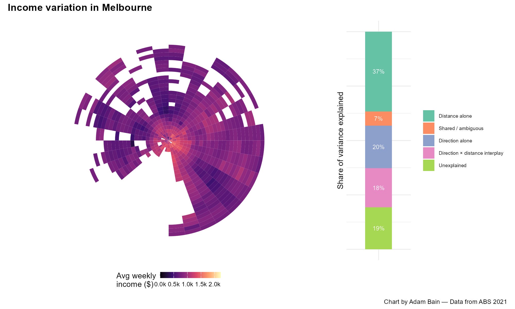
Melbourne’s income distribution on the other hand is clearly dominated by the 37% share for distance but unlike Brisbane, direction matters quite a bit on its own terms with a 20% share. I think looking at the map, we can see a plausible favoured quarter in the east and possibly a “favoured slither” along the eastern coast of Port Philip Bay. (Australians do seem to put a premium on living close to the beach).
However, the concentric model is more explanatory than the sectoral model, with lower income areas generally in the mid-outer suburbs separated by middle income areas from a high-income core. Put simply: the outer vs inner divide is stronger than the east vs west divide.
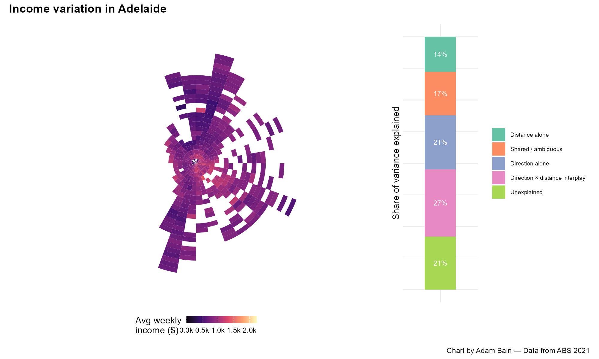
And finally, Adelaide is quite similar to Perth, fitting the sectoral model a bit better than the concentric model, with lower income areas to the north and south. However, rather than the possible favoured quarter being along the coast in the west, it is in the southeast, towards and within the Adelaide Hills.
Perhaps the wealthy of Perth were historically sea-changers, whilst the wealthy of Adelaide were tree-changers? In the north there is a wedge of low-income areas around the planned community of Elizabeth – an area hit hard by de-industrialisation.
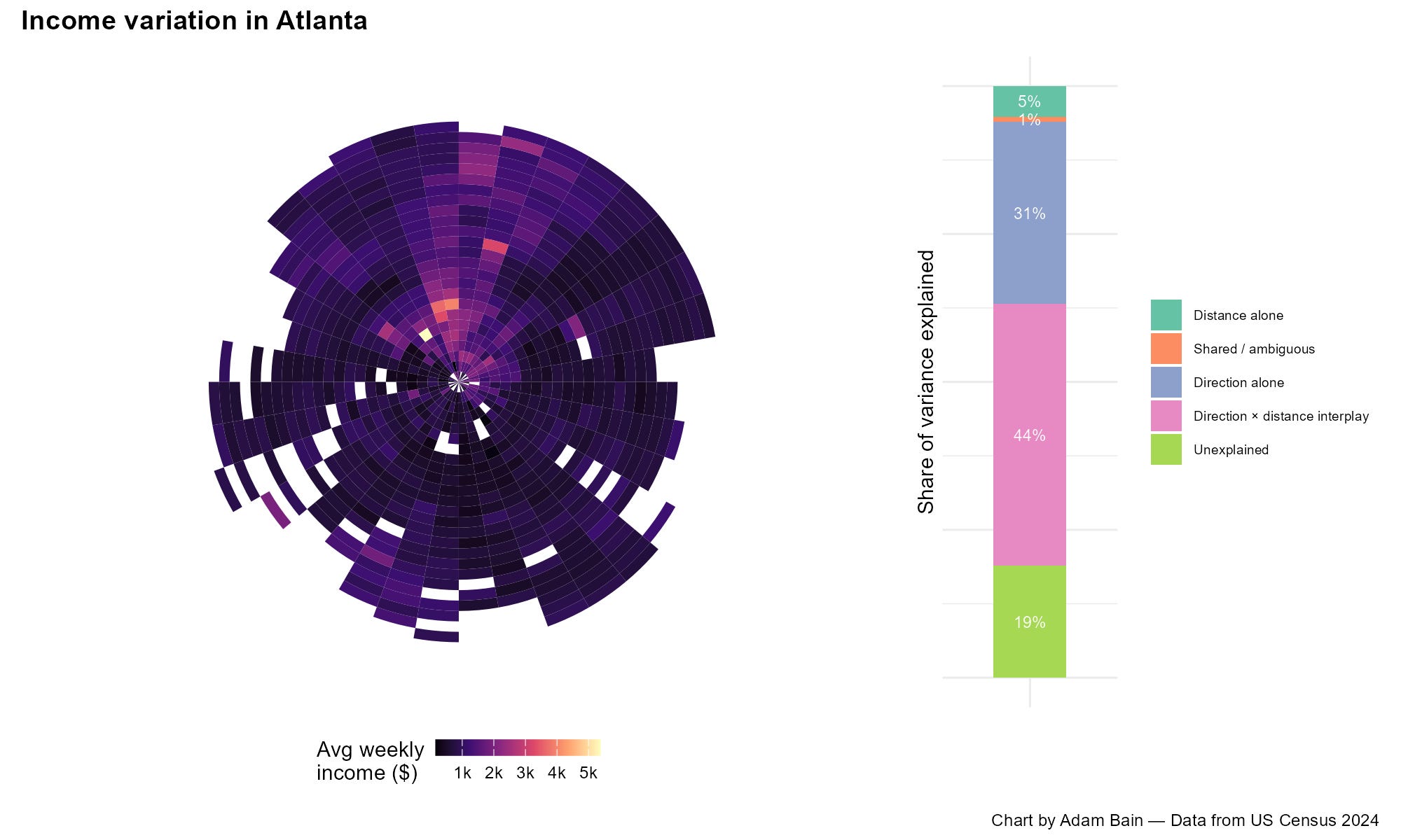
And just to check if this method would capture the American favoured quarter example from the introduction, I ran the same analysis on Atlanta and sure enough it does. This is a city where the sectoral model is vastly more explanatory than the concentric model, with a maximum 6% of variance explained by distance from the CBD alone. It is drastically distinct compared to the Australian cities, with a very clear favoured quarter in its north around Sandy Springs, and no evidence of a core of high-income suburbs around its CBD.
There are a couple of statistical caveats to this analysis. First, there is a significant spatial autocorrelation in the data, with a very large RSerr of 827.99, suggesting that the “Unexplained” variance is strongly clustered by spatial proximity. This is likely due to local factors such as proximity to schools, public transport stops or shopping strips. This is an issue because ANOVA tests assume independent data points in the unexplained variance. I ran a more sophisticated spatial error model for Sydney that accounts for this and found direction still mattered even after this correction – several of Sydney’s directional wedges, including a clear southwest disadvantage, remained statistically significant. With this limitation in mind it’s best to keep in mind that the percentages I have stated so far should be treated as estimates.
The other caveat is about the grid method. To get a detailed picture, I used a particularly fine grid – 2km distance bands and 5° direction slices. But a very fine grid gives the model a lot of room to fit tiny, specific quirks of the data rather than genuine geographic patterns – a bit like how a join-the-dots picture looks more impressive with more dots, even if some of those dots are just noise. When I reran the same test with a much coarser grid (5km bands, 45° slices), the overall patterns held up – Perth and Adelaide were still the most sectoral cities, Brisbane and Melbourne still the concentric, Sydney still a bit of both – but the exact percentages dropped across the board. So, it is best to take specific numbers I used above as an upper estimate of how much distance and direction explain; the more conservative, coarse-grid version suggests the true figures are a bit lower, even though the overall pattern and city-by-city ranking stayed consistent either way.
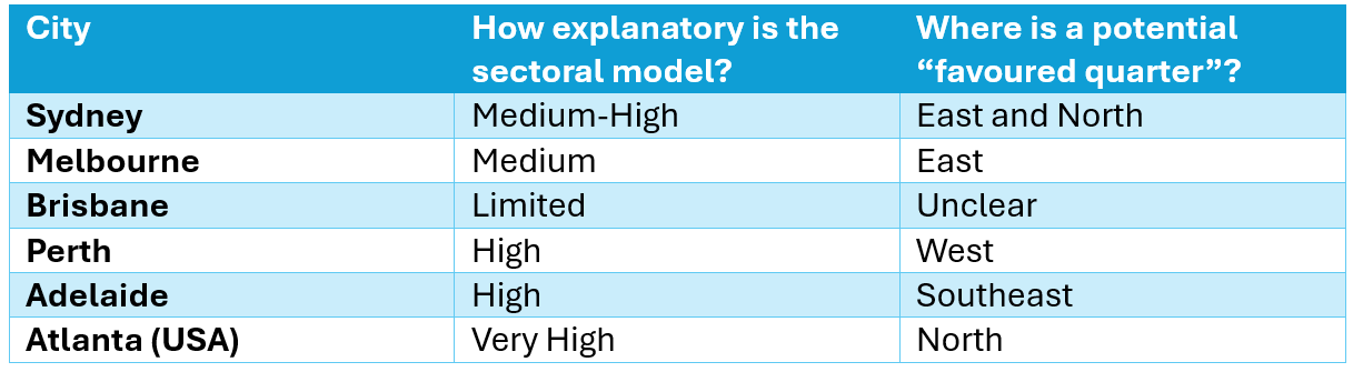
Caveats over, I thought it might be worth putting in a summary table with the findings so far, so we can keep up:
The favoured quarter framework connects directional income variation to the establishment of suburban jobs and service clusters, particularly near urban highways. It suggests that they tend to grow most in areas with more high-income residents, which in turn makes those areas more attractive in a positive feedback loop.
A greater density of employment clusters in the potential favoured quarters identified in the previous section would support the application of this framework to Australian cities. To identify such employment clusters, I found all suburban DZNs (The smallest ABS workplace data geography) and filtered them to the threshold of 4,500 jobs per square kilometre (top 13.17%). I then conjoined adjacent DZNS to designate clusters.
It is important to note I used 2016 data, so the following content will be slightly out of date. The reason for this is because the 2021 census conducted during the COVID pandemic changed workplace data in an uneven way; a lot higher income jobs were able to be done from home, often the kind of jobs located in higher density job clusters.
Let’s start with Sydney.
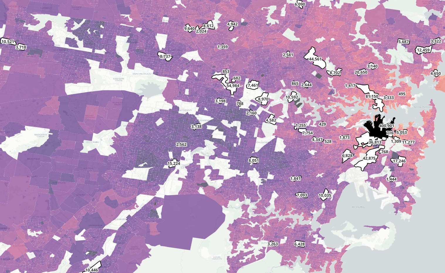
No city in Australia has as many high-density suburban job clusters as Sydney, most of them concentrated on an arc that stretches from Parramatta to the CBD, through Strathfield and Redfern then back northwest out towards Epping through Chatswood and Macquarie Park.
The largest suburban cluster is immediately north of the CBD – St Leonards/North Sydney with 81,150 jobs, containing several corporate offices including Microsoft in Australia. To the north-west is the third largest cluster – Macquarie Park with 44,561 jobs, where further corporate offices are located, including the Optus headquarters. Further out is Bella-Vista and Norwest, with the headquarters of the Woolworths Group.
I think this is decent evidence for a favoured quarter; the largest suburban job hubs are in either in or adjacent to the northern suburbs, the area that the previous section suggested might be a favoured quarter – and importantly many are located along a freeway corridor (M1/M2), a prediction of the favoured quarter concept.
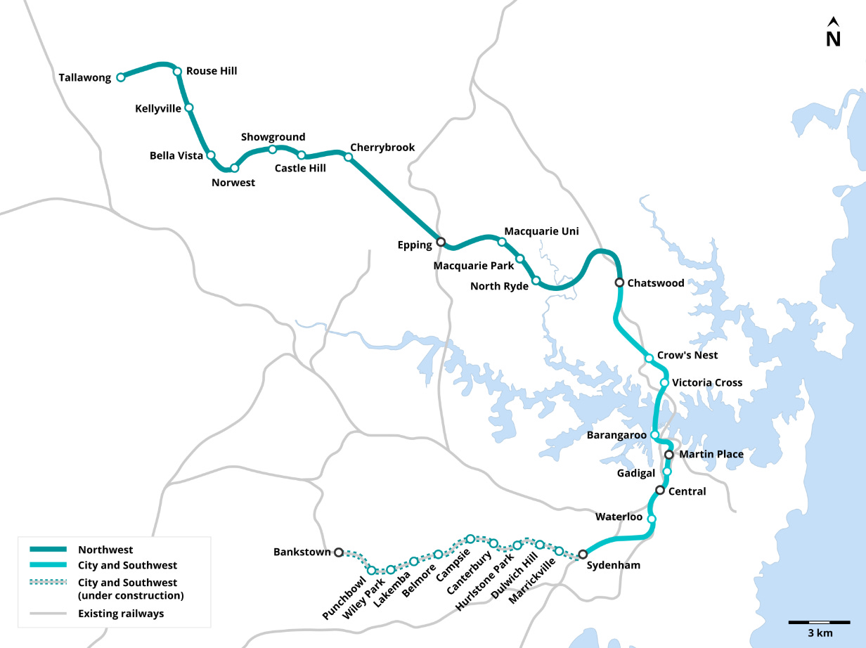
Whilst most of the northern job clusters are located along the Sydney Metro corridor, this data is from 2016, prior to the opening of the metro and not too long after the construction of the Chatswood to Epping line in 2009. Because of this, I think the freeways are more integral to the development history of these hubs.
In the southwest, in the potential “disfavoured quarter”, there are far fewer high-density job clusters, the only notable hubs being Liverpool, Bankstown and Campbelltown, all with less than 20k jobs. Whilst important to their local areas, they are not of the same magnitude as the major job clusters in the northern suburbs. The NSW government has promoted the growth of Parramatta CBD (Recommendations and Actions | Centre for Western Sydney) as an equalising measure, positioning high income jobs out in the western suburbs but I do think it is worth recognising that Parramatta happens to still be on the edge of Sydney’s broader well-off north, rather than in the heart of the lower income south-west.
I think all up this adds to the case that the northern suburbs of Sydney shares structural similarities to the favoured quarters in the US, but what about our second largest city? So far, my analysis has pointed to Melbourne having a directional bias in income, yet one which is less significant than the distance.
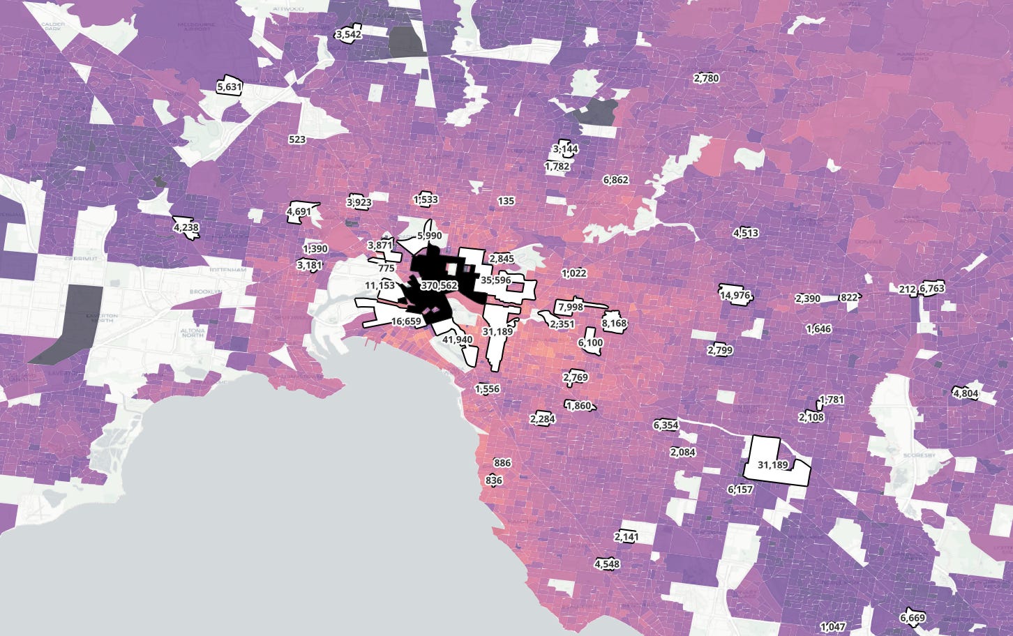
Melbourne has less suburban job clusters than Sydney. This is likely at least in part due to the relative centralisation of the CBD at the heart of Melbourne’s urban sprawl. But of which suburban job clusters there are, there does appear to be a bias towards the eastern suburbs, with the significant Box Hill, Monash and Camberwell-Hawthorn network being larger than their western counterparts, combining to form a ratio of around 4.1 jobs in high-density clusters east of the CBD for every similar job west of the CBD.
Much of these are in a clump of inner suburban job clusters, most notably St. Kilda Road, Cremorne-Prahran and Richmond-Collingwood, all containing a large amount of office space. However, whilst the inner west might not have as many high-density job precincts, it does contain a lot of historically unattractive industrial land.
The largest mid/outer-suburban job cluster in Melbourne is the Monash precinct with 31,819 jobs, anchored by Monash University, with a large student population (including myself). The Monash precinct is connected to the rest of Melbourne, primarily by the Monash Freeway, and close access to Eastlink (M3).
The Monash Freeway also connects to the Hawthorn East and Burnley job clusters. I think that the presence of these freeway-oriented job clusters is supporting evidence for Melbourne having a favoured quarter, however as with the sectoral vs concentric model comparison, it is a weaker pattern than is seen in Sydney.
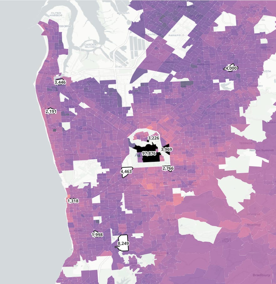
Adelaide on the other hand, doesn’t seem to have a directional bias in terms of its high-density suburban job clusters – indeed, it doesn’t have many of them at all. Adelaide is a relatively small city and thus can get by being the most centralised major city in Australia. Whilst the southeast of Adelaide may be higher income than its other directions, the lack of significant job clusters is a mark against the application of the framework to the festival city.
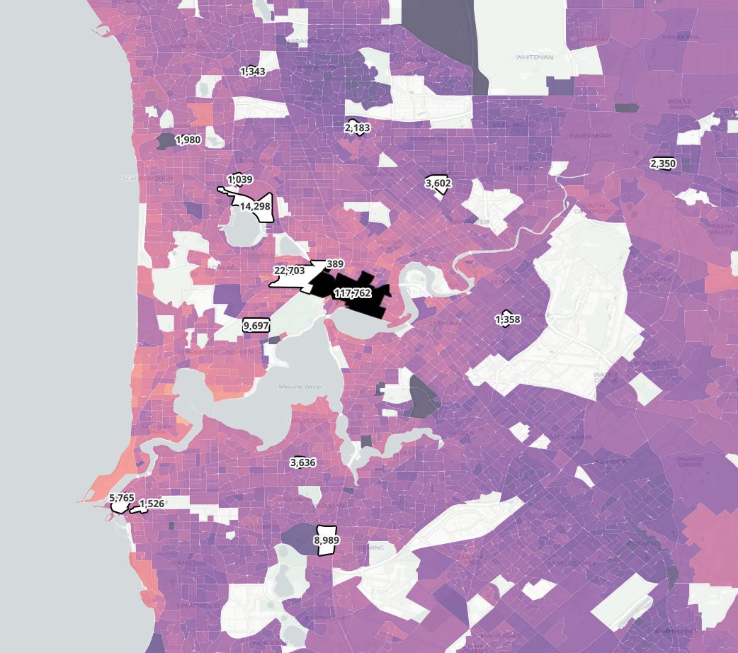
Perth is somewhat more promising, with the large Subiaco/Leederville job cluster with 22,703 jobs west of the CBD, and the Osbourne Park Industrial area with 14,298 jobs just a bit further north-west. Both are not only closely connected to the freeway network, but also the corresponding railway network, much of which runs down freeway medians.
Fremantle, at the mouth of the Swan River, also shows up as a notable job hub. Fremantle is not only a modern job hub, with the growing presence of Notre Dame University, but also a historically important one; almost as important as Perth in the early history of Western Australia. In 1900, Fremantle, still a separate town to Perth, had 16k residents, just under half of Perth’s 37k (Source: p6 - 23 Mar 1900 - The West Australian (Perth, WA : 1879 - 1954) - Trove). I think it is plausible that Fremantle’s significance made the communities in between it and Perth proper attractive for wealthy settlers.
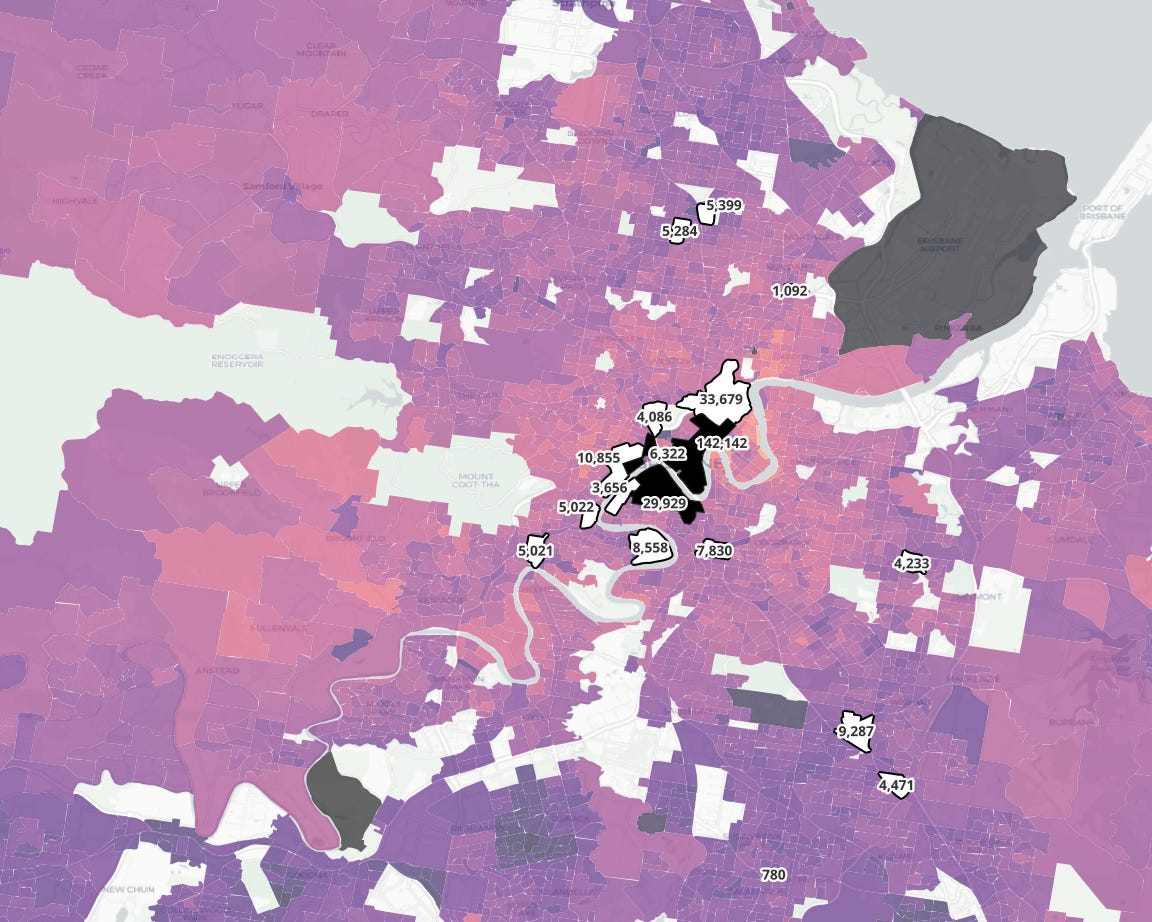
Brisbane, whilst it doesn’t have a strong directional bias, has a few significant suburban job clusters. Without the directional bias, this does not increase the likelihood that Brisbane has a favoured quarter. The largest of these clusters, at Chermside in the north and Mount Gravatt in the southeast, are both about 10km away from the CBD, possibly supporting the concentric model for Brisbane’s development. They are also located close to freeway access, although the Airport Link freeway tunnel near to Chermside was only opened in 2012.
Now we have hit all five major cities, updating the table from before with what the jobs data adds:
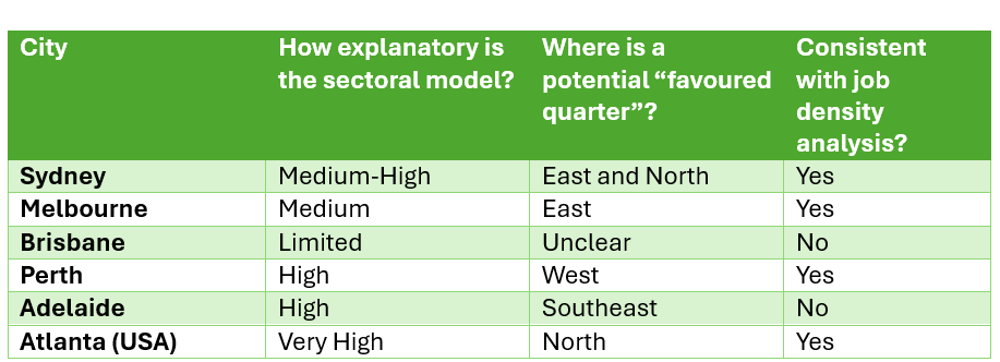
The analysis of high-density job hubs has strengthened the case for Sydney and to a lesser extent Melbourne and Perth having “Favoured Quarters” but weakened the case for Adelaide. This is likely due to Adelaide’s small size and CBD job concentration, as well as its relatively undeveloped urban freeway system, weakening the use of the favoured quarter concept to explain inequality in Adelaide.
In the United States, the structure of local government is often used as a partial explanation for the development and maintenance of favoured quarters. As American cities extended out, away from their CBDs, wealthier areas resisted consolidation into the principal local government area (LGA). This phenomenon known as “Tax base fragmentation”, enabled them to keep their taxation revenue from being spent across the city, in communities with less opportunities, whilst enhancing local public services such as schools, transport, police and utilities.
In Australia, our local governments have far fewer responsibilities, and even less ability to raise local revenue than in the USA, due to the strength of our state governments. In many ways, a major American LGA such as the City of New York shares more in common with the State of Victoria than the City of Melbourne.
I didn’t plan on writing about this specific topic, until while I was writing the previous sections, I noticed that the Australian city that fitted the favoured quarter concept the best – Perth, has the most fragmented municipal governance in Australia.
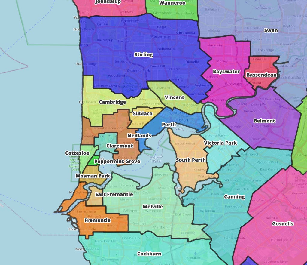
This effect is particularly noticeable in the western, wealthier area between the CBD and Fremantle. Peppermint Grove, officially the “Shire of Peppermint Grove” is the wealthiest enclave within Perth – and the smallest LGA in all of Australia.
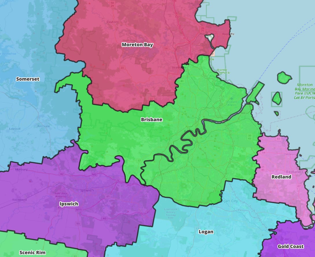
Meanwhile, the city with the least evidence for a favoured quarter – Brisbane – is unique in Australia in just how centralised the local governance is into one major council, with over 1,242,825 residents, larger than Tasmania and the ACT combined. Brisbane City Council is the most American-like council in Australia, given its expansive scope of responsibilities, including the local bus system.
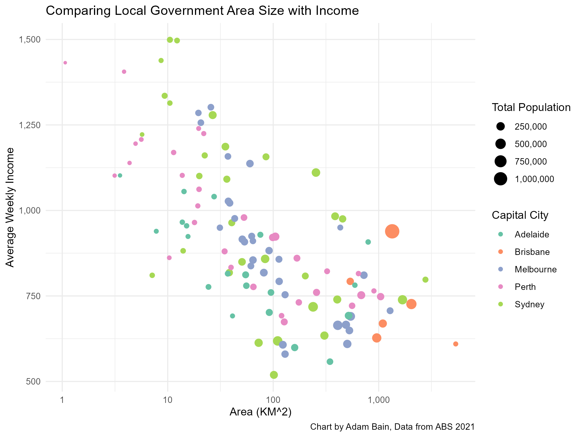
I decided to compare the area of LGAs with average weekly income, and found a significant correlation, with an adjusted r-squared of 0.57, meaning that more than half of income variation can be explained by the area.
Whilst there is indeed significant correlation here, I don’t think this supports the application of the favoured quarter framework in Australia, as the tax base fragmentation that occurs in the USA is not as relevant in Australia due to our weaker LGAs. I have proposed a couple of alternative mechanisms to explain this observation.
It is likely that there are two things happening – lower income outer suburban LGAs tend to be former rural LGAs, large with lots of non-urban land. The longer it took for suburban growth to reach these LGAs, there was less incentive to split them due to improving communications and transport technology. In the other direction, as state governments decided to merge smaller councils, wealthy councils such as Peppermint Grove and Hunters Hill in Sydney’s north, deployed their social capital to defeat these plans.
The favoured quarter framework has become an established part of the urban discussion in the United States, and I thought it would be interesting to apply it to Australia’s major cities. Whilst none of our cities feature as pronounced favoured quarters as seen in US cities such as Atlanta and Charlotte, there is evidence for directional variation in income, particularly in Adelaide, Perth and Sydney and to a lesser extent, Melbourne. The presence of high-density job clusters near freeways in those cities except for Adelaide supported the existence of American style favoured quarters.
To end with I want to discuss transport infrastructure, particularly the Suburban Rail Loop – a topic I am sure that we’re not yet sick of but will be soon. In Melbourne, this controversial project has been criticised by people I know from the western suburbs as being a project that unfairly biases the privileged eastern suburbs. Whilst the divide in Melbourne is more Inner vs Outer instead of East vs West, distance based rather than directional, there is still a wealth bias towards the eastern suburbs. Whilst maybe unfair to residents of the western suburbs, there is a good reason that the SRL was started in the East.
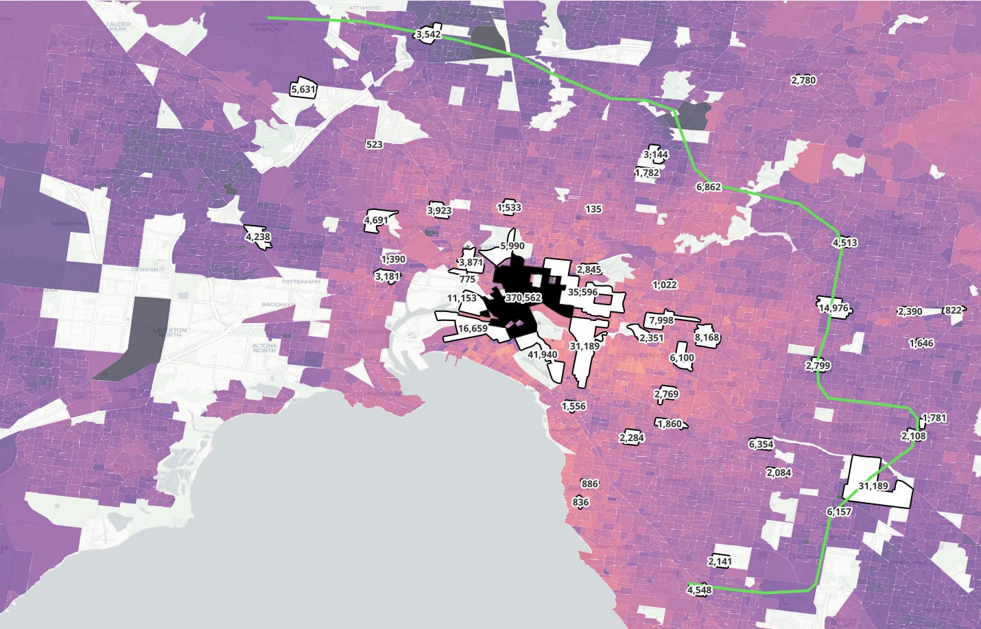
I have overlaid the high-density job clusters map with the alignment of the SRL, and I think it is quite clear to see why the eastern leg of the project was its first. High-capacity public transport requires major destinations along the route to be successful, and it is only in the east of Melbourne and to a lesser extent in the North, that these exist in a scale to make viable a non-CBD bound underground railway line.
We can see this in Sydney too, where the new metro line started operating in the wealthy north, where many of the largest non-CBD job clusters are, as well as in Atlanta, where the red and gold lines travel to job clusters in that city’s wealthy northern suburbs.
These suburban job clusters grew due to proximity to higher income residents and existing transportation infrastructure, and projects like the SRL and Sydney Metro NW are ultimately likely to do more to reinforce the directional advantages of their respective cities than to disperse value across the entire urban areas, like how freeways in American cities concentrated and maintained value in the favoured quarters.
This puts equality minded policy makers in a bit of a bind. The most valuable big infrastructure projects for the state economy, are likely to be in what might be described as “favoured quarters”, leaving more disadvantaged areas stuck behind. In my opinion there should be a balance struck between the most productive, “bang-for-buck” projects, which may maintain existing spatial disparities and projects that are less straightforwardly productive, due to being in structurally disadvantaged areas.
For a project like the SRL, I would want to make sure that value capture from both direct and indirect means is used to enhance infrastructure and services in less favoured parts of Melbourne.
Thanks for reading this rather long post. I am keen to hear what you think about this topic.
No posts
Comments
Nothing yet. Say the first thing.
Sign in to join the conversation.