
In the spring of 2020, when the stock market’s meteoric rally was well underway but the labor market was still languishing from the pandemic, an anonymous internet user coined the term “K” as a stark, visual description of a highly unequal recovery. Eventually that recovery became broad-based, and the term faded from discourse… Only to make a roaring comeback in the second half of 2025:
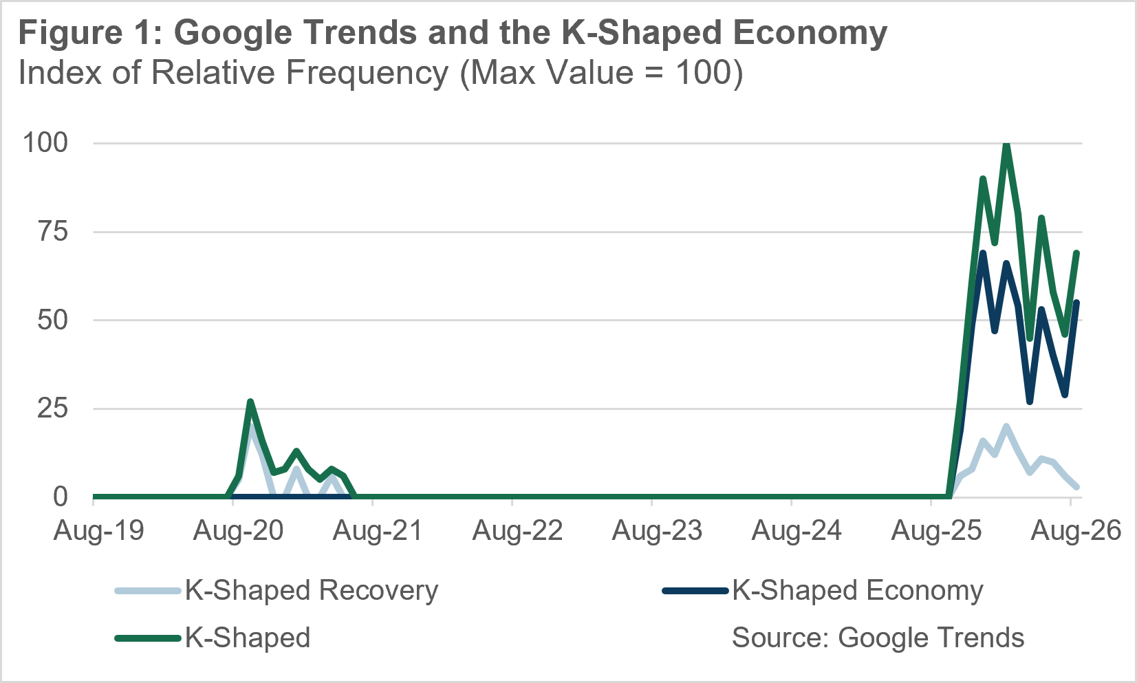
Underlying that were a big stock market rally, solid real GDP growth (2.4% annualized H2), and disappointing job market outcomes (the labor market shed 46,000 jobs across 6 months, and the unemployment rate rose by about 0.2 percentage points). There was a widespread sense that even though the economy was expanding and financial asset prices were rising, Main Street wasn’t seeing any of the benefits.
In this month’s piece, we take a look at the supposed K-shape of the economy from an income and wealth perspective. Our conclusion is that this narrative is overblown. The US economy and labor market are substantially more unequal than they were 20-25 years ago, but most of the widening of inequality is far in the rear-view mirror. And over the past year, as handwringing about the K-shaped economy spiked, we’ve seen very little further worsening of America’s inequality problem.
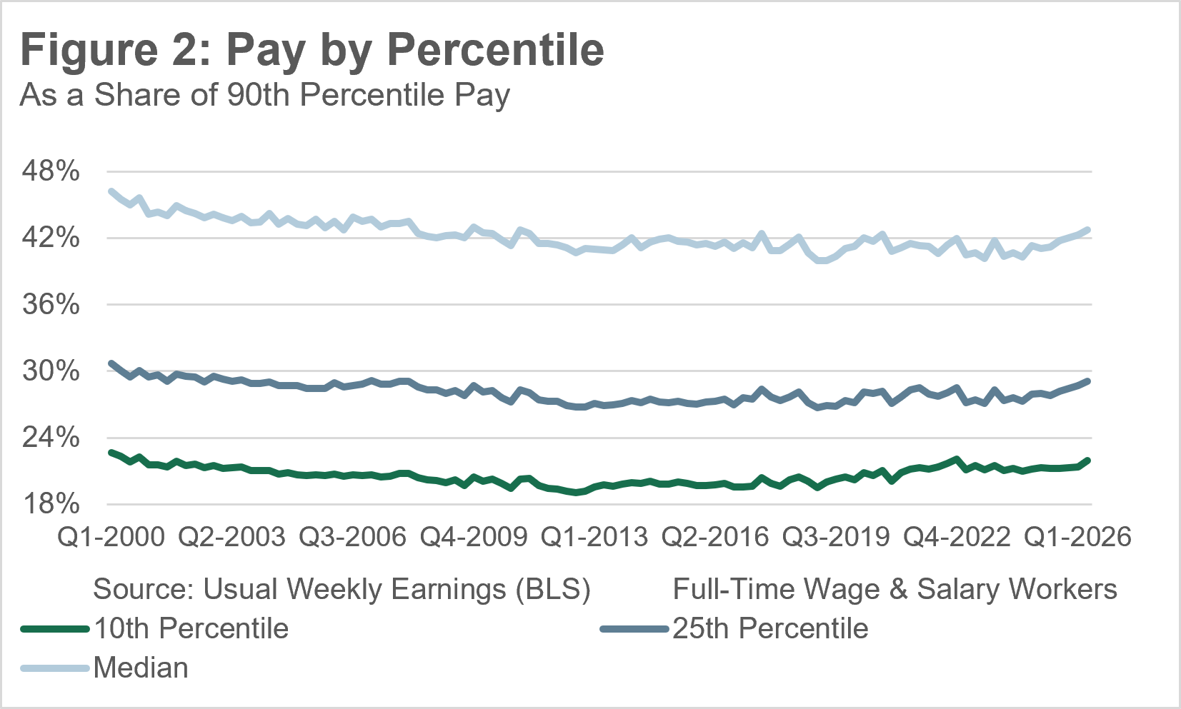
It’s worth starting with one of our most up-to-date time series on the income distribution: usual weekly earnings of full-time wage and salary workers. This misses a lot of key dimensions of inequality - it excludes non-wage income, it excludes people who don’t work or only work part-time, and it uses the individual as the unit of observation (rather than households).
Still, in a leitmotif that will recur throughout this piece, we see a clear pattern: inequality rose through the early/mid 2010s and has not changed much (or even improved a tiny bit) since then. To the degree a K-shaped economy exists, it’s not a novel development (and may be de-Kaying a little).
As I mentioned, looking at wages provides an incomplete picture, but household income (which is released with a substantial lag) does not change the story much. Household income inequality widened over the half-century from 1967 to 2017, then leveled off.
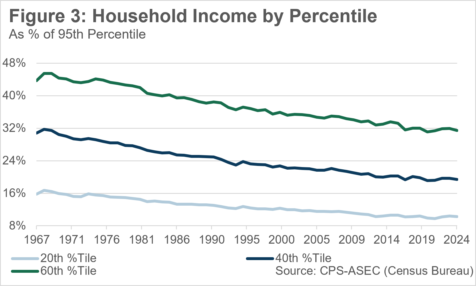
Now, we should curb our enthusiasm. None of this data indicates that we’ve “solved” income inequality - it remains elevated relative to a few decades ago, and any recent improvement is small. But there’s no recent K-shaped development on the income side.
Of course, income is not the only metric by which folks assess inequality. There’s also wealth. And there has been a massive compression in wealth inequality, if you compare the bottom half of the distribution to the top 0.1% - that ratio is now at 17%, back where it was in 2007. Now, it is true that most of this is a recovery from the financial crisis; a lot of households that were in the red shifted into the black as they regained their jobs, shed their debt and saw their home prices appreciate. But nevertheless, it’s a huge improvement!
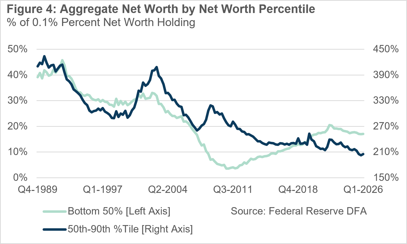
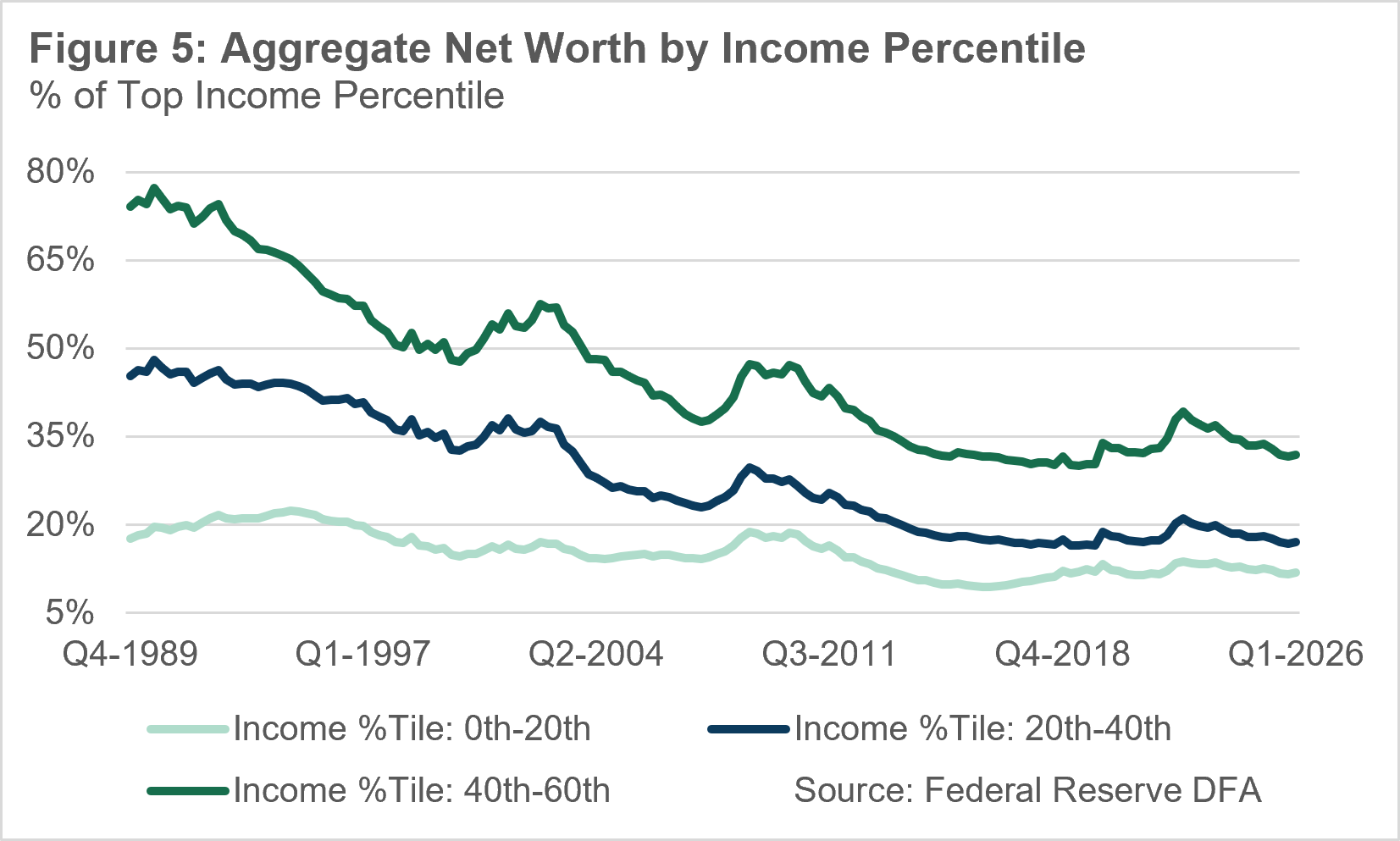
There are other ways to compare wealth - for example, by income percentile (i.e. compare the net worth of high-earning households to low-earning ones). And there the story is more nuanced - we don’t see any sort of meaningful reduction in inequality (except maybe between the lowest-income households and the highest-income ones). But we also don’t see any sort of emerging K-shape, either! Inequality increased during a multi-decade period, and then the increase stopped.
If I had to give an explanatory thesis, it’s a boring one: labor markets make a big difference. During most of the period from the late 1970s to the late 2010s, monetary policy maintained an anti-inflationary bias that fostered labor market slack. Since the late 2010s, we’ve spent most of the time (with a brief exception during COVID) in relatively hot labor markets (but higher inflation). Unemployment or precarious employment will tend to increase income & wealth inequality; tight labor markets, where workers experience rising inflation-adjusted wages, decrease it.
I’ll wrap this piece by making a final point - there’s a common tendency to link the K-shaped economy with another thesis, on equity market gains fueling consumer and business spending growth. I think linking these two is a mistake. It’s important to realize that stock ownership is much more widespread than in the past. In 1989, only 29% of middle-income US households owned stocks directly or indirectly, and only 15% of lower-middle-income US households. As of 2022, those numbers had risen to 60% and 40%, respectively.1 We don’t have 2025 data yet, but they’ve almost certainly risen at least a little in the past 3 years. And while these holdings aren’t huge, they’re substantially larger than in the past.
This is good in one respect: everyday US households benefit from upside in equity prices, and the stock market may boost their spending power. But it also means that the effect can run in reverse - the US middle class is probably more sensitive to stock market selloffs than it was a few decades ago. Let’s hope the party doesn’t stop!
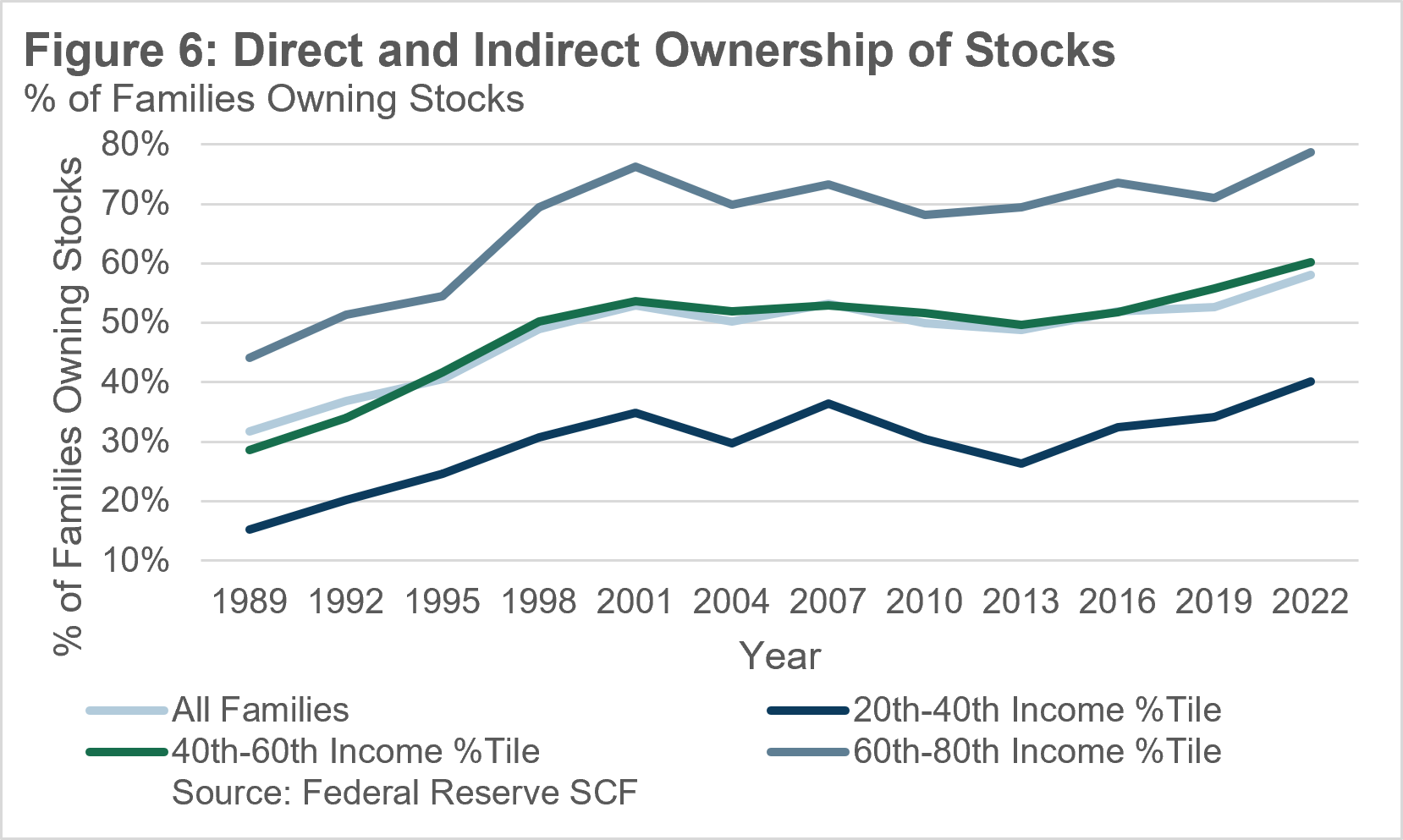
To some extent, this reflects the shift from defined-benefit pensions to defined-contribution retirement accounts.
Comments
Nothing yet. Say the first thing.
Sign in to join the conversation.