
Hey folks,
I gave Claude Code a blank Next.js page and one sentence: “Build a polished landing page.”
The first version worked.
It also had the same purple gradient, generic cards, and Inter typeface I’ve seen on hundreds of AI-made sites.
Functional. Forgettable.
Then I changed the setup.
I gave Claude a design system it could search. I connected it to a catalog of real components made by design engineers. And I stopped asking it to “make it look good” without defining what good meant.
The difference was immediate.
Better type. Cleaner spacing. Motion that had a reason to exist. A layout that looked designed instead of assembled.
Here’s the exact setup
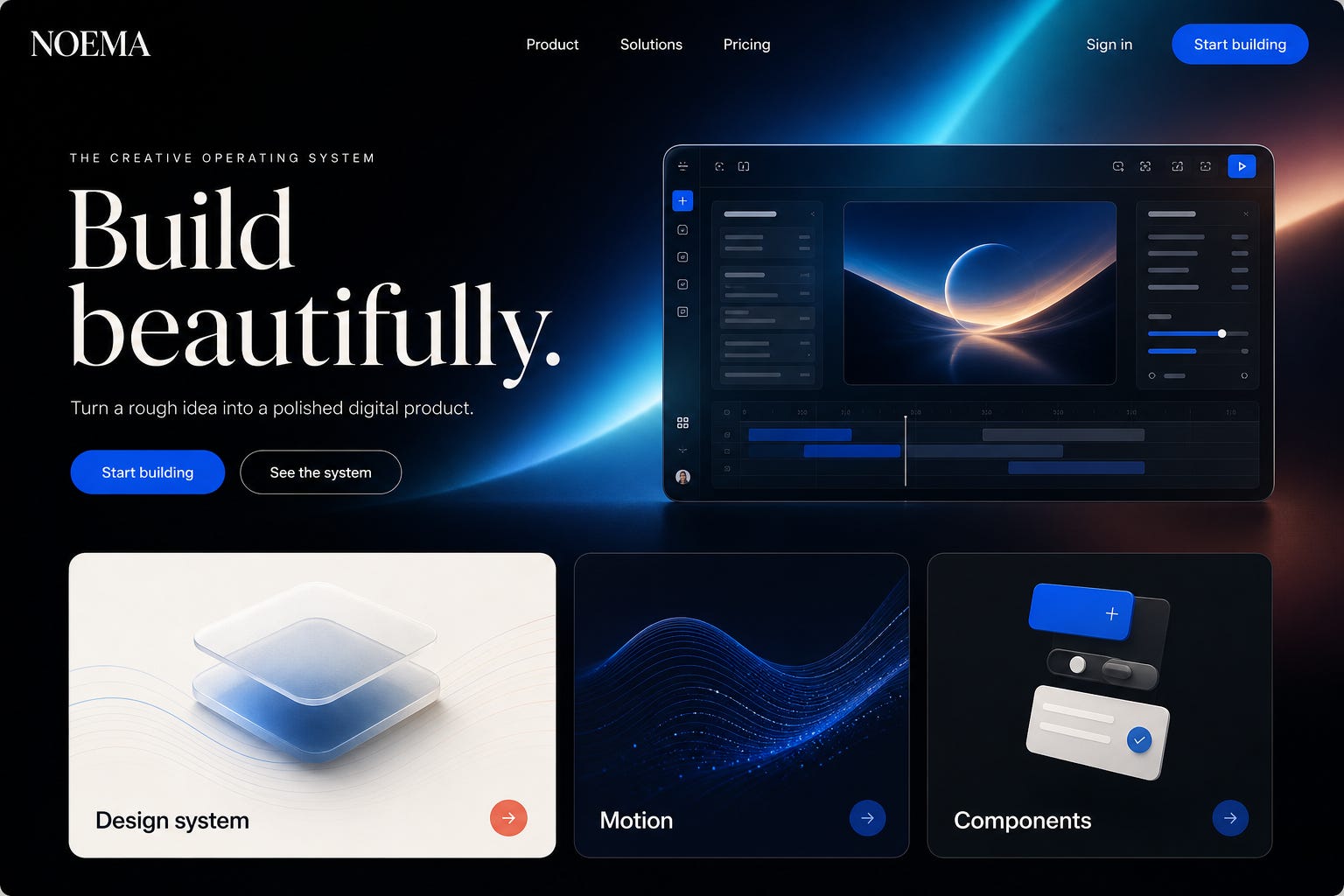
.A concept example of the visual quality this workflow can produce. The image is a mockup, not a promise that every first attempt will look identical.
Two things changed while this workflow was spreading online.
First, the numbers are much bigger now.
The current UI/UX Pro Max repository lists:
79 searchable UI styles, with 50 active styles used in normal recommendations
192 color palettes matched to product types
74 font pairings
34 landing-page patterns
119 UX guidelines
22 supported tech stacks
So if you saw a video mentioning 50 styles, 97 palettes, and 57 font pairings, those numbers came from an older version.
Second, Magic MCP has been replaced by the unified 21st MCP.
The old @21st-dev/magic package still works as a compatibility proxy, but 21st now recommends its new CLI setup. Old Magic API keys were reset, so you need a fresh key from 21st.dev/mcp.
Use the current setup below.
Think of it as three separate jobs.
UI/UX Pro Max gives Claude design judgment.
It helps Claude choose a visual style, palette, type pairing, page structure, and interaction rules that fit the product. It also includes anti-patterns and accessibility checks.
21st gives Claude real components.
The 21st catalog contains React and Tailwind components, full templates, shadcn themes, animated heroes, gradients, shaders, and interface blocks made by hundreds of designers.
Claude Code does the implementation.
It reads your codebase, installs the right dependencies, adapts components, connects the pages, runs the app, and fixes what breaks.
The skill provides taste. The MCP provides building blocks. Claude Code puts them together.
That division matters.
If Claude Code is already running on your machine, skip this part.
Claude Code currently requires a Claude Pro, Max, Team, or Enterprise account, or a Console account with API access. The official installation guide has every supported option.
On macOS, Linux, or WSL:
curl -fsSL https://claude.ai/install.sh | bash
On Windows PowerShell:
irm https://claude.ai/install.ps1 | iex
Then open the folder where you want to build and start Claude Code:
cd /path/to/your/project
claude
Follow the browser sign-in flow the first time.
You’ll also need Node.js because the 21st setup uses npx. Check it with:
node --version
npx --version
If either command fails, install the current LTS version from Node.js.
21st is strongest with React, Next.js, Tailwind CSS, and shadcn/ui conventions.
You can use another framework. But if you’re starting from a blank folder and want the smoothest path, this stack removes a lot of translation work.
Create a new Next.js project:
npx create-next-app@latest my-site
cd my-site
npx shadcn@latest init
claude
If you already have a site, open Claude Code inside that repo and keep your current stack. UI/UX Pro Max supports React, Vue, Nuxt, Svelte, Astro, Angular, Laravel, HTML with Tailwind, React Native, Flutter, SwiftUI, and more.
The cleanest Claude Code setup uses the plugin marketplace.
Run these two commands inside Claude Code:
/plugin marketplace add nextlevelbuilder/ui-ux-pro-max-skill
/plugin install ui-ux-pro-max@ui-ux-pro-max-skill
Then run:
/reload-plugins
Open /plugin, switch to the Installed section, and confirm that ui-ux-pro-max appears.
The Claude Code plugin guide explains why this takes two steps. Adding a marketplace registers the catalog. Installing the plugin adds the actual skill.
There’s also a CLI route. This is handy when you want the skill files directly inside a project:
npm install -g ui-ux-pro-max-cli
cd /path/to/your/project
uipro init --ai claude
For every project on your machine:
uipro init --ai claude --global
The search script uses Python 3, but it only needs the standard library.
Check your install:
python3 --version
Once installed, the skill should activate automatically when you ask for UI or UX work. Claude Code skills are local instruction packages that load when relevant. You can read the official skills guide if you want to understand how that works.
Thanks for reading AI Action Letter! This post is public so feel free to share it.
Go to 21st.dev/mcp, sign in, and create a fresh API key.
Then run this in your terminal from the project folder:
npx @21st-dev/cli@latest init --client claude
The CLI writes the correct Claude project configuration and merges it with your existing MCP file. That means it shouldn’t wipe out the other servers you already use.
Restart Claude Code. Then run:
/mcp
You should see 21st connected with tools available.
You can also verify from the shell:
claude mcp list
If a tutorial tells you to run npx -y @21st-dev/magic@latest, that’s the legacy compatibility path. The new 21st CLI is the recommended route.
And please don’t paste an API key into a file that gets committed to GitHub. Keep secrets in environment variables or use the guided setup. The Claude MCP guide explains project scope, user scope, and secure configuration.
The first two installs are enough. These extras make the workflow more consistent.
Anthropic has an official frontend-design plugin that pushes Claude toward a clear visual point of view, stronger typography, deliberate motion, and fewer generic AI patterns.
Install it inside Claude Code:
/plugin install frontend-design@claude-plugins-official
/reload-plugins
You can inspect the official plugin source before installing it.
21st is excellent for expressive community components. shadcn gives Claude a dependable set of accessible primitives for dialogs, forms, dropdowns, buttons, and other interface basics.
From your project folder:
pnpm dlx shadcn@latest mcp init --client claude
Restart Claude Code and check /mcp again. The official shadcn MCP guide also shows the manual configuration.
My preference is simple:
Use shadcn for dependable interface primitives
Use 21st for high-impact sections, distinctive motion, and visual inspiration
Use UI/UX Pro Max to keep the whole page in one coherent system
If you are finding value in my AI action letters, please consider subscribing. It keeps me going.
Most bad AI websites begin with one bad instruction: “Build me a beautiful website.”
That gives Claude no audience, no conversion goal, no style boundary, and no definition of done.
Paste this first:
I want to build a [TYPE OF WEBSITE] for [AUDIENCE].
The main user action is [PRIMARY CONVERSION GOAL].
The brand should feel [3 TO 5 ADJECTIVES].
The site must not feel [STYLES OR PATTERNS TO AVOID].
My preferred stack is [STACK].
Before changing any files:
1. Use UI/UX Pro Max to generate a complete design direction for this product.
2. Define the page structure, color tokens, typography pairing, spacing scale, corner radius, shadows, icon style, and motion rules.
3. Check contrast, keyboard focus, responsive behavior, and reduced-motion support.
4. Use the 21st MCP to find three component directions that fit the same visual system.
5. Show me the three directions with a short reason for each.
6. Recommend one direction and explain the tradeoff.
Do not write implementation code yet. Stop after the design plan.
This tiny pause saves a lot of ugly code.
Once you’ve picked a direction, paste this:
Build the approved website in this repo.
GOAL
Create a [TYPE OF WEBSITE] for [AUDIENCE] that gets visitors to [PRIMARY ACTION].
CONTENT
Use the copy and facts in [FILE OR FOLDER]. Do not invent testimonials, customer logos, metrics, awards, or product claims. Mark missing proof clearly.
DESIGN SYSTEM
Use the approved UI/UX Pro Max direction as the source of truth. Save it in design-system/MASTER.md so later pages stay consistent.
COMPONENTS
Use the 21st MCP to search for components that fit the approved style. Prefer a small number of strong components over a page full of unrelated effects. Adapt every component to our tokens, type scale, spacing, and content.
LAYOUT
Create a clear information hierarchy. Use an asymmetric layout only when it improves scanning. Avoid repetitive equal-width card grids. Give each section one job.
TYPOGRAPHY
Use one distinctive display face and one readable body face. Set a deliberate type scale and line length. Avoid defaulting to Inter unless the design plan specifically calls for it.
MOTION
Use one choreographed page entrance and a small set of meaningful hover or scroll interactions. Respect prefers-reduced-motion. Do not animate every element.
QUALITY
Make the site responsive at 375px, 768px, 1024px, and 1440px. Add visible keyboard focus. Keep body-text contrast at 4.5:1 or better. Prevent text clipping and horizontal overflow.
IMPLEMENTATION
Use production-ready code. Reuse components. Keep design tokens in CSS variables. Install only the dependencies you actually use. Preserve the existing app structure unless a change is necessary.
VERIFICATION
Run the app, inspect every breakpoint, fix console errors, test the main interaction, and report what you changed plus any content I still need to provide.
Use this after the first build:
Audit this page for generic AI-made design patterns.
Look specifically for:
- Purple gradients used without a brand reason
- Inter or another default font used without a type decision
- Repetitive equal-size cards
- Excessive rounded containers
- Random glass effects
- Too much centered copy
- Weak hierarchy
- Decorative motion with no purpose
- Placeholder text or invented proof
- Inconsistent spacing, radii, shadows, or icon styles
Use UI/UX Pro Max guidance and the approved design system.
List the five highest-impact changes first. Then implement them. Keep the working behavior and content intact.
Animations can make a site feel expensive.
They can also make it feel like a template from 2024.
Use this:
Add a restrained motion system to this page.
Create:
1. One choreographed page-load sequence with staggered reveals
2. Clear hover and pressed states for interactive controls
3. One meaningful scroll-triggered moment for the main product story
4. Smooth state changes for menus, tabs, accordions, and dialogs
5. A reduced-motion version that removes nonessential movement
Use CSS for simple transitions. Use the project’s existing motion library for complex sequences. Do not add a new animation dependency unless the current stack cannot handle the approved motion.
Keep timings consistent. Avoid parallax on long text. Avoid animating layout properties that cause jank. Test keyboard and touch behavior after the changes.
Desktop screenshots can hide a lot of problems.
Run this every time:
Review this website at 375px, 768px, 1024px, and 1440px.
Check:
- No horizontal overflow
- Headings wrap naturally without clipping
- Buttons and inputs have usable touch targets
- Navigation works with keyboard and touch
- Focus states are visible
- Text contrast meets WCAG AA
- Images have useful alt text
- Forms have labels, errors, and clear success states
- Dialogs trap focus and close correctly
- Motion respects prefers-reduced-motion
- Content order still makes sense on mobile
Fix every issue you can verify. Do not hide content just to make the layout fit. Report anything that needs a product decision.
You can also give Claude a screenshot or a URL you like.
Don’t ask it to copy the site. Ask it to study the design logic.
Use the attached screenshot or reference URL as design inspiration only.
Analyze:
- Information hierarchy
- Type scale and line length
- Spacing rhythm
- Color relationships
- Section transitions
- Component density
- Motion patterns
- How the primary CTA is emphasized
Do not copy trademarks, logos, written copy, artwork, or source code. Create an original design for [MY PRODUCT] using our approved tokens and content.
Use UI/UX Pro Max to translate the reference into a coherent design system. Use 21st to find components with similar structural ideas, then restyle them so the result has its own identity.
Build a premium SaaS landing page for an AI meeting assistant used by sales teams.
The primary action is starting a free trial. The brand should feel sharp, calm, credible, and fast. Avoid generic purple gradients, cartoon robots, fake logos, and walls of cards.
Use UI/UX Pro Max to create a design system for a B2B AI product. Use 21st to find an expressive hero, a product-demo section, a proof section, and a pricing block that can share one visual language.
Use a dark ink and warm ivory base with one electric accent. Pair a distinctive editorial display font with a clean body font. Show the product through a believable interface preview. Add one page-load sequence and restrained interaction states.
Make every claim editable from a single data file. Do not invent customers, security certifications, or performance metrics.
Build a personal portfolio for a product designer who works on AI tools.
The primary action is booking an introductory call. The site should feel editorial, thoughtful, and slightly experimental. Avoid a generic headshot hero, skill-percentage bars, and identical project cards.
Use UI/UX Pro Max to choose the portfolio pattern, type pairing, and motion rules. Use 21st for one strong navigation idea and one distinctive project-story interaction. Keep the rest custom and quiet.
Structure the page around three case studies. Each case study needs the problem, the designer’s decision, evidence, and result. Use real content only. Add a simple contact section and make the full site work well with keyboard navigation.
Build a high-converting website for a private physical-therapy clinic in Austin, Texas.
The primary action is booking an evaluation. The brand should feel warm, expert, local, and reassuring. Avoid medical stock-photo clichés, neon colors, aggressive animations, and vague wellness language.
Use UI/UX Pro Max to choose an accessible service-business pattern, calm palette, readable type pairing, and clear booking flow. Use 21st for a tasteful hero, service comparison, testimonial layout, FAQ, and appointment CTA.
Prioritize location, insurance information, practitioner credentials, patient concerns, and the booking path. Do not invent reviews, outcomes, credentials, or accepted insurance plans. Use placeholders that clearly say what the owner must provide.
Write the brief. Define the audience, conversion goal, content, and what the site must not look like.
Generate the design system. Make Claude choose type, color, spacing, layout, and motion before it touches code.
Pick components with one visual language. Search 21st for the few sections that need extra character.
Build one page first. Don’t generate a ten-page site before the home page feels right.
Run the anti-generic audit. Remove lazy defaults and invented proof.
Check mobile and accessibility. A beautiful desktop screenshot isn’t a finished website.
Add motion last. Motion should support hierarchy and interaction, not cover weak layout.
Test the real conversion path. Click the button, submit the form, open the menu, and read the confirmation state.
Fast. Repeatable. Much easier to debug.
Glassmorphism isn’t a quality metric.
Neither is a giant gradient, a 3D globe, or a page that moves every time you scroll.
The strongest sites usually have:
A clear audience and one main action
Real copy with believable proof
A consistent type and spacing system
A few memorable visual decisions
Fast loading and clean mobile behavior
Accessibility that survives the polish pass
These tools help Claude make better decisions. They don’t replace your product judgment.
And community code still needs review. Check the component author, license, dependencies, responsiveness, and accessibility before using it in a commercial product.
UI/UX Pro Max Basic: Open source under the MIT License. The repo also promotes a paid premium version with broader brand and asset tools.
21st: Browsing is free. The current site says free accounts receive two component installs per day, while 21st AI generation uses credits.
shadcn/ui: Open source. Components are copied into your repo so you own and edit the source.
Claude Code: Requires an eligible Claude plan or Console API access.
Prices and free limits can change, so check the linked product pages before you commit a team workflow to them.
My honest take?
Claude Code was already good at building functional websites. This setup gives it a much better shot at building one people remember.
Thanks for reading AI Action Letter! This post is public so feel free to share it.
But the real improvement comes from the workflow: design first, choose components second, implement third, then audit the result like a picky creative director.
That’s the part most tutorials skip.
If you know someone who keeps getting generic AI-made websites, please share this with them.
That’s it from me today.
Till next time. Stay tuned as I will share best resources from both my Harvard and Google networks to bring the best to you. Let’s up skill together. Aspyre higher!
No posts
Comments
Nothing yet. Say the first thing.
Sign in to join the conversation.