
Marketing teams love carousels because they can showcase multiple promotions or products without taking up additional space. But have you ever stopped to think about how users actually experience them? Imagine trying to read a slide that disappears before you’ve finished and there is no way to pause or using a screen reader and suddenly finding yourself on a completely different slide without realizing the content has changed.
For many people with disabilities, it is a daily experience.
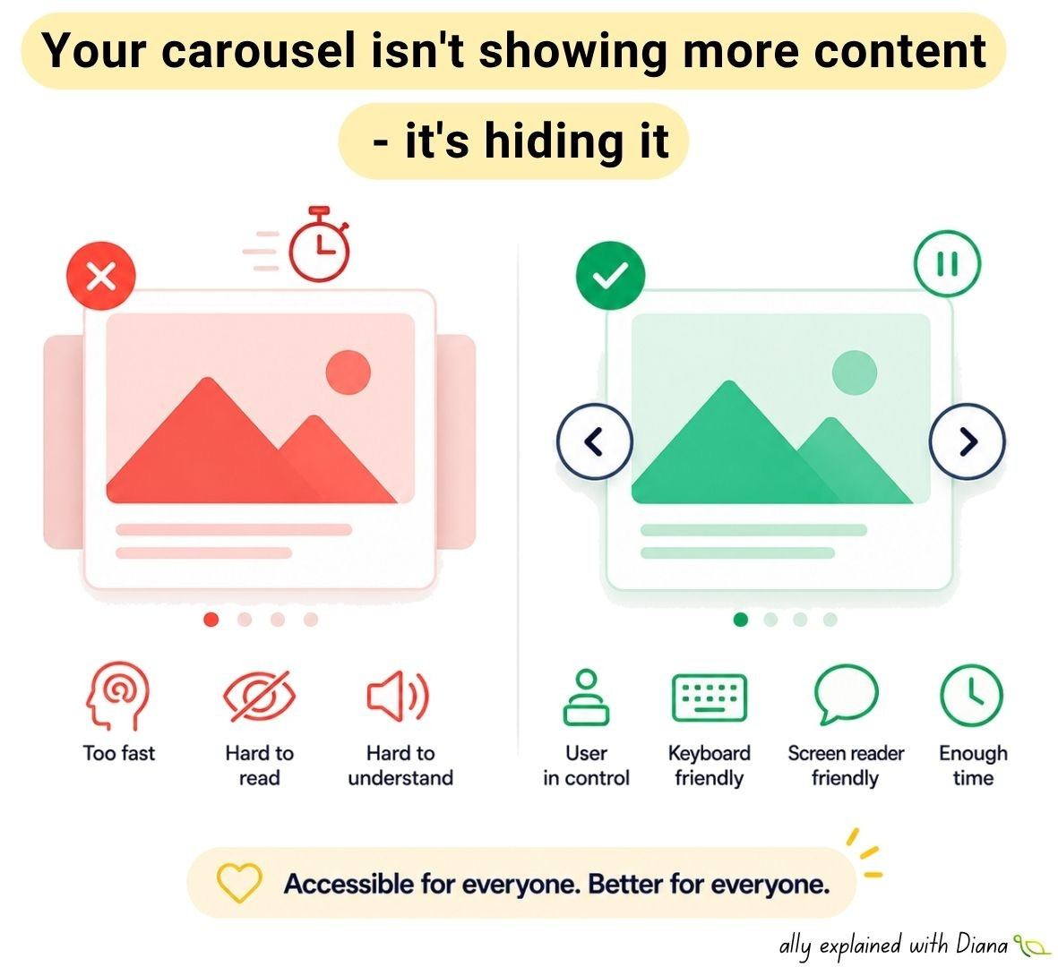
Here’s a good way to handle carousels: if your website includes a carousel, users should always have an ability to pause it and get information from each slide via assistive technologies.
➡️ Users need enough time to read the content.
➡️ Keyboard users must be able to reach every control.
➡️ Screen reader users need to understand where they are and what is located on each slide.
➡️ People with cognitive disabilities shouldn’t have to compete with moving content.
➡️ Everyone benefits when interaction is predictable and under their control.
Nielsen Norman Group found that users overwhelmingly interact with the first slide while subsequent slides are largely ignored, questioning whether automatic rotation actually improves communication.
The first large-scale eye-tracking study of carousel interfaces found that people browse carousel layouts differently than traditional webpages, challenging many assumptions designers have relied on for years.
Section508 accessibility specialists explain that autoplaying carousels increase cognitive effort and can become inaccessible for users with low vision, cognitive disabilities and screen reader users unless they can easily pause or stop the movement.
💡 Previous and Next buttons should have accessible names like “Previous slide” and “Next slide”, not simply icons.
💡 Slide indicators should be labelled (for example, “Go to slide 2 of 5”).
💡 Automatic rotation should stop when keyboard focus enters the carousel or when a user presses a Pause button.
💡 Swipe gestures should never be the only way to navigate.
✅ Provide Previous and Next buttons.
✅ Make every control keyboard accessible.
✅ Give controls meaningful accessible names.
✅ Allow users to pause or stop automatic rotation.
✅ Stop auto-play when users interact with the carousel.
✅ Clearly identify the current slide.
✅ Avoid automatic rotation unless it genuinely benefits users.
✅ Test the entire carousel using only the Tab key and a screen reader.
Thanks for reading A11y explained with Diana! This post is public so feel free to share it.
No posts
Comments
Nothing yet. Say the first thing.
Sign in to join the conversation.