
One of the common mistakes in accessible color design is treating a contrast checker as the finish line, but in reality it isn’t.
WCAG gives us important minimum thresholds: 4.5:1 for normal text at AA, 7:1 at AAA, and 3:1 for relevant non-text elements. These thresholds are essential for conformance, but they don’t describe the entire visual experience.
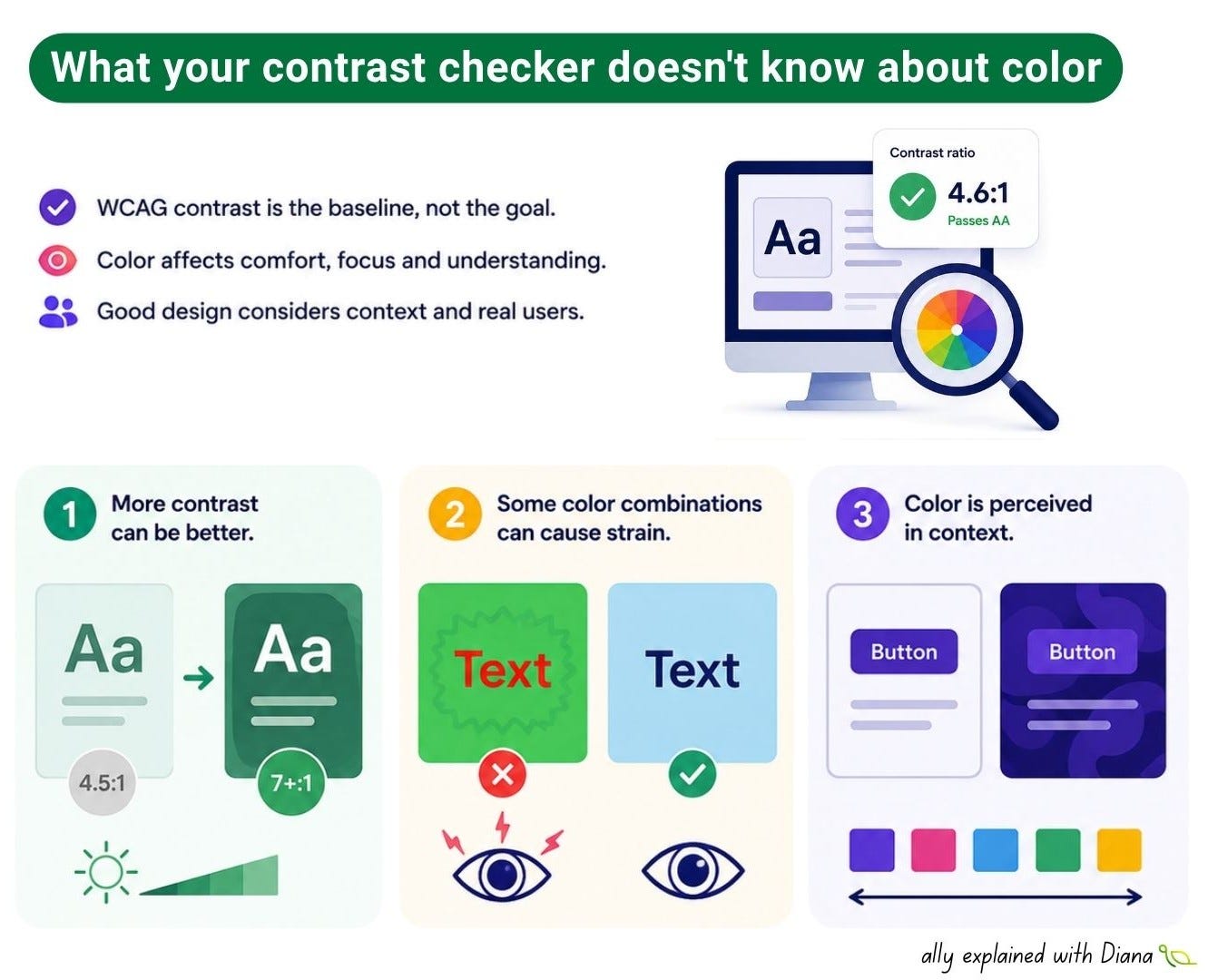
Contrast ratio is a minimum, not a design target
If 4.5:1 passes, that doesn’t mean 4.5:1 is the best choice. Greater luminance separation can make interfaces more resilient across different displays, lighting conditions, text sizes, and individual visual differences.
Highly saturated colors can behave badly together
Certain combinations of strong, saturated hues can create a visual “vibration”: edges may appear unstable, shimmer, or become harder to focus on. Some chromatic contrasts can also produce a perception of blur or instability at boundaries. This is related to the way our visual system processes different wavelengths. So a pair of colors can have a technically acceptable contrast ratio and still be uncomfortable to look at.
Color is perceived in context
Josef Albers’ Interaction of Color is a great reminder that we don’t perceive colors independently. The Bezold Effect demonstrates how changing one color in a composition can alter the perceived appearance of surrounding colors.
The same text color can therefore feel completely different depending on its background and neighboring colors. For digital interfaces, this means a color shouldn’t only be tested in a contrast checker - look at it in context.
Check WCAG contrast ratios
Don’t automatically design to the minimum threshold
Check highly saturated color combinations for visual “vibration”
Evaluate thin and small text more critically than large text
Look at colors in their actual UI context, not in isolation
Check text against its real background, including gradients and images
Make sure meaning isn’t communicated by color alone
Test important states such as hover, focus, error and disabled
Review the interface under different lighting and display conditions
One important thing to keep in mind: a contrast checker measures a relationship between colors, but it doesn’t measure the entire human experience of looking at them. Remember that WCAG compliance is the baseline.
Thanks for reading A11y explained with Diana! This post is public so feel free to share it.
No posts
Comments
Nothing yet. Say the first thing.
Sign in to join the conversation.