
Following my previous post about color contrast, here’s the practical question that comes next: so how do we check color contrast properly? It is actually more complicated than just using a color contrast checker.
There are several things happening between the moment we design something and the moment someone actually sees it:
Compression can change the result
Images uploaded to social platforms are often compressed. Colors can shift slightly, edges can become softer, and text can lose definition. If your contrast was already close to 4.5:1, that margin can disappear.
Resizing changes readability
A large graphic may look perfectly readable on your screen. Then the platform displays it at a smaller size. Text becomes smaller, strokes become thinner and edges get softened by scaling. The colors haven’t necessarily changed, but the perceived contrast can.
Thin fonts + antialiasing matter
Contrast tools usually calculate the ratio between the defined foreground and background colors. But that’s not exactly what every pixel on the screen looks like. With antialiasing, edge pixels are blended between the text and the background. Thin fonts therefore contain many pixels that are neither the original text color nor the original background color. This is one reason why 4.5:1 with thin text can feel very different from 4.5:1 with a heavier typeface.
The screen isn’t a controlled environment
People might view the same content:
-☀️ in bright daylight
-📱 on different phones
-🔆 at different brightness levels
-🖥️ on different displays
-👓 with or without corrective lenses
A design that is just barely readable in your design environment may not be equally robust everywhere.
Check the final rendered version
If you’re designing an image for social media, don’t only check the colors in Figma, Sketch or your design tool. Check the actual image after export, upload and resizing. If possible, take a screenshot of the final rendered version and measure that. You’re then testing the pixels users are actually seeing, not just the colors you originally specified.
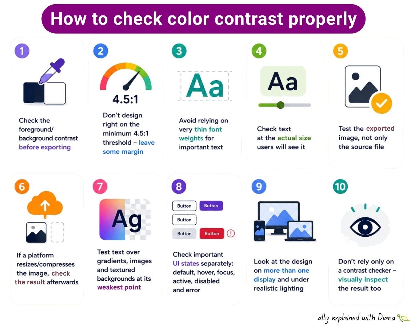
✅ Check the foreground/background contrast before exporting
✅ Don’t design right on the minimum 4.5:1 threshold - leave some margin
✅ Avoid relying on very thin font weights for important text
✅ Check text at the actual size users will see it
✅ Test the exported image, not only the source file
✅ If a platform resizes/compresses the image, check the result afterwards
✅ Test text over gradients, images and textured backgrounds at its weakest point
✅ Check important UI states separately: default, hover, focus, active, disabled and error
✅ Look at the design on more than one display and under realistic lighting
✅ Don’t rely only on a contrast checker - visually inspect the result too
Thanks for reading A11y explained with Diana! This post is public so feel free to share it.
No posts
Comments
Nothing yet. Say the first thing.
Sign in to join the conversation.