
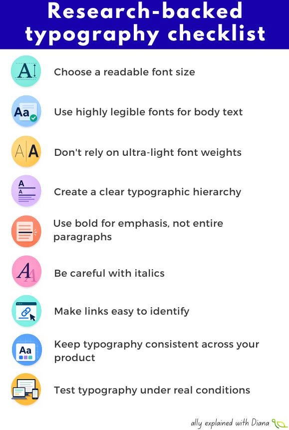
Choose a readable font size
Small text creates unnecessary barriers for many users, including people with low vision, older adults, and anyone reading on a mobile device. It is recommended to use at least 16px (1rem) for body text.
👉 Prioritize readability over fitting more content on the screen.
Use highly legible fonts for body text
Decorative or highly stylized fonts can make it harder to distinguish similar letterforms, increasing cognitive effort. Familiar, well-designed fonts help users focus on the content rather than deciphering the letters.
👉 Save decorative fonts for branding or headings and use clean, legible fonts for longer passages.
Don’t rely on ultra-light font weights
Thin fonts may look elegant, but they often become difficult to read on lower-quality displays, in bright sunlight, or for users with reduced vision. Stroke thickness affects how easily text can be perceived.
👉 Regular (400) or medium (500) weight is usually a safer choice for body text.
Create a clear typographic hierarchy
Clear differences between headings, subheadings and body text help people understand the structure of a page before they start reading. Strong hierarchy benefits everyone.
👉 Use consistent differences in size, weight, and spacing to communicate importance.
Use bold for emphasis, not entire paragraphs
Overusing bold text reduces its effectiveness and makes scanning more difficult. Selective emphasis helps users find key information faster.
👉 Highlight the words that matter most instead of bolding large blocks of text.
Be careful with italics
Italic text changes the shape of letters, making them harder to recognize for many readers, especially people with dyslexia or low vision. Large blocks of italic text increase reading effort.
👉 Use italics sparingly and avoid them for important instructions or long paragraphs.
Make links easy to identify
If links are distinguished only by color, some users may not notice them, particularly people with color vision deficiencies. WCAG recommends providing more than one visual cue.
👉 Underlines remain one of the clearest ways to indicate clickable text.
Keep typography consistent across your product
Changing fonts, sizes, or spacing patterns from page to page forces users to continually adapt, increasing cognitive load. Consistency helps users build familiarity and navigate interfaces with greater confidence.
👉 Define a typography system and apply it consistently throughout your product.
Test typography under real conditions
Typography that looks great on a designer’s high-resolution monitor may become difficult to read on a phone outdoors, an older laptop, or at 200% zoom.
👉 Test your typography on different devices, screen sizes and zoom levels before shipping.

Thanks for reading A11y explained with Diana! This post is public so feel free to share it.
No posts
Comments
Nothing yet. Say the first thing.
Sign in to join the conversation.