
👋 Dear creative. How are you doing today?
Trusting your hands starts with trusting your eyes… or rather, training your eyes
I know not all of you are into animation, yet you may find some gems just by indulging in these seeing exercises.
I have been a fan of animation since childhood. I started my way into this storytelling world thanks to Japanese animation: Nicky Larson, Sailor Moon, Dragon Ball, Galaxy Express, Albator, and so many more. Then Ghibli kicked in, and it was a whole new journey.
I did not stay in Japan. I explored Manhuas, French artistry in moving pictures, innovative Indian animation, standout African studios empowering African stories, and more. I am looking forward to crafting an Animation issue soon.
I did not study animation; I always had a profound interest in it. My course in motion design revealed a new gear to my work, and I made my first short video piece about the creative block. It demanded so much from me… not what you think. It demanded my graphic design eye and ability to infuse the animation-patience machinery. It pushed me to find smart ways to express a character, an emotion, and scenery. Adding a design mind to the mix to bring that world to life.
That is why I know there is a world between me and the work of the pilgrim masters I look up to as a consumer of these masterclasses.
The goal of this post is to muscle the eye.
See through the frames: the art of making things, people, and emotions move. How to capture with very little tension. How to amplify a universe. Because the background matters as much as the foreground, and it is crafted.
See through and decode what you need to decode, then infuse it into your thinking, your work, or just your idleness.
My latest awe is Queen Millennia, by Leiji Matsumoto, also the creator of Albator.
More below…
A focus on the frame: a vintage issue. I was a baby on Substack…
🎈Follow your curiosity, ease, and joy; they will never fail you.
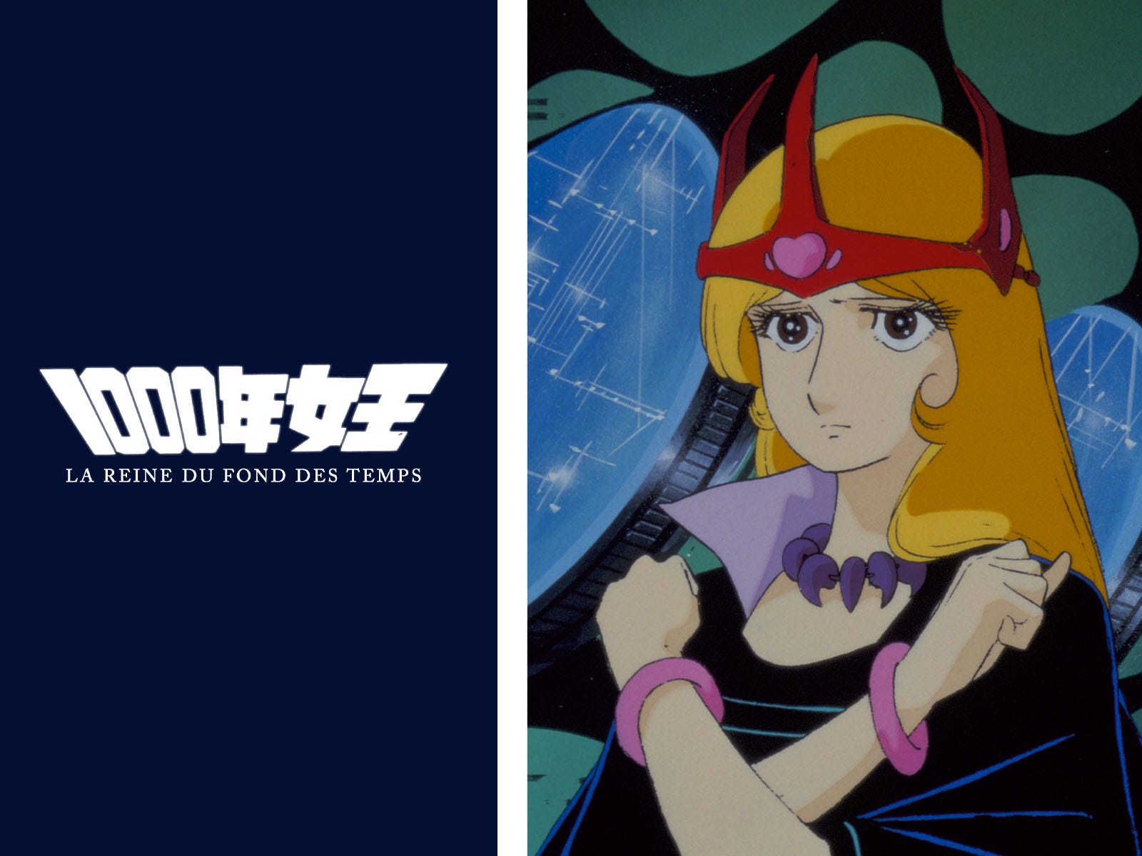
❇️ Look at it if you can. It is spectacular. It’s galactic. It speaks of a future we do not want to experience, yet it strives for the human first… in an idealized way.
⚡ I started the TV series by chance, and I saw the last episodes, and I was hooked. Now I’m starting it all over to understand the plot from the beginning.
The story follows a young, pre-adolescent, smart boy, Édouard (Hajime Amamori), who becomes friends with a mysterious woman known in French as Opale (Yayoi Yukino), the Queen Millennia. She has been living on Earth for about a thousand years. She commands the organization installed on Earth, which has the striking mission to kidnap human scientists to be enslaved on her home planet, Râmetal (La-Metal). It is the only way to save their dying world.
But Opale has grown deeply attached to humans. Especially when she meets the funny, uniquely drawn character, Édouard, and their friendship becomes the emotional anchor of the story.
The duo begins a journey to rescue Earth from the threat of Râmetal. Among their allies is Ambre (Selen), Opale’s older sister, who eventually joins the fight against their mother, Queen Larela.
Everybody is fighting to save their people, believing that this sole intention validates the actions they take. Opale gets trapped between her mission to her planet and her attachment to her adopted land and people.
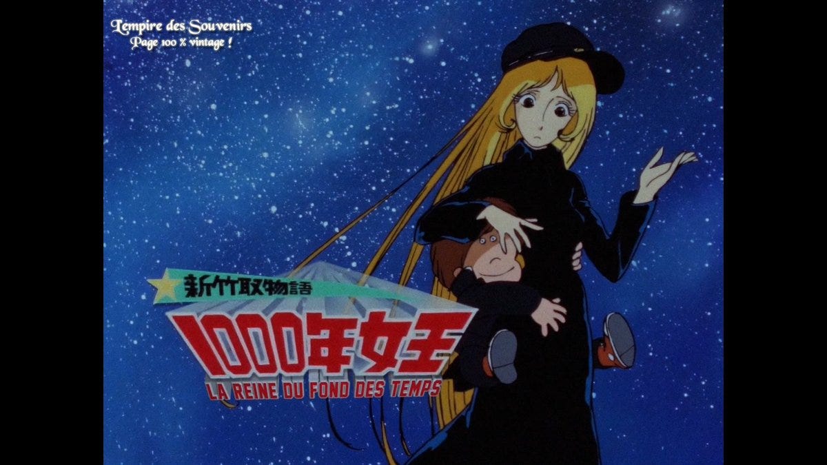
— The characters are familiar. When you see Opale, you think Albator. Her features, that eternalizing long hair, those eyelashes beauty founders want to recreate, that empress hacking her mission to choose to save humans. Her male lead, Édouard, is also familiar. The plot is enticing and intriguing. A continuation of the visual and bold universe engineered by Leiji Matsumoto.
The unique, quietly awkward placement of the eyes and nose in Édouard’s family of characters is the standout. At first, it feels strange. Then, somehow, it becomes completely normal within Matsumoto’s visual world. The rhythm is good. And even pretty good*. And the bonus? Those frame-to-frame, hand-drawn details you can catch during the scenes. There is dedication, patience, and smart ingenuity in the way one key character design can generate an entire family of traits. It saves time, creates harmony, and builds a recognizable visual language. Look at Opale and her sister: different characters, but clearly sharing the same visual DNA. That’s part of Leiji Matsumoto’s visual language and family of characters.
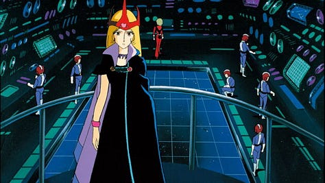
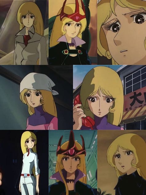
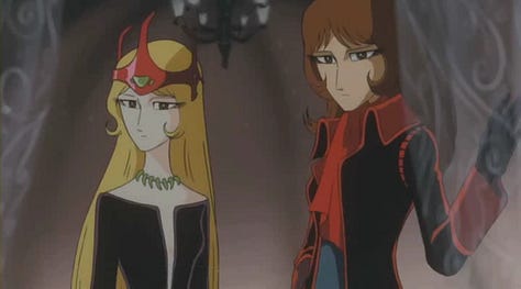
The scenes have these beautiful hand-painted aesthetics.The earth, galactic cities and universe are so detailed and inviting. An ode to the hand and its resilience. I read that the characters were drawn and painted onto transparent animation cels, then layered over separately hand-painted backgrounds and photographed frame by frame. Patience is definitely a muscle…
Oh, I must highlight the graphic compositions and layouts. Very edgy! And the music is just the perfect complement to the artistry they poured into this masterpiece. The TV series’ music was composed by Ryūdō Uzaki and Tomoyuki Asakawa, with Masaki Takanashi’s voice giving us the mesmerizing opening theme, Cosmos Dream. The music draws you into the story.
I am heading to my animation class: Episode 27.Bon visionnage !
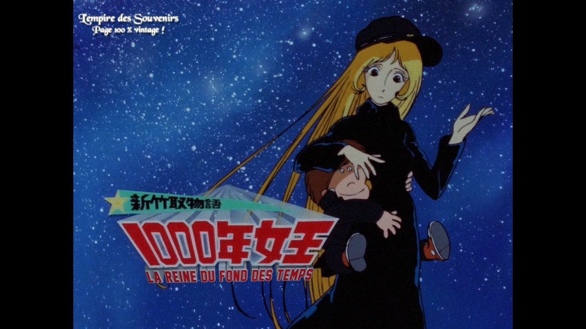
*I watched the Movie Queen Millennium, a spin-off of the series, and I found it slow. The cuts in the story and focus were a little bit off. Yet, give me some time; a few years in, I may enjoy it with fresh eyes.
❇️ A soft, delicate observation of youthful relationships.
⚡ Just a delight. It has been my animation class for some time. Every time I think of Ocean Waves, I think of animation class. It is a moment to decode. The work with light, those shadows, the nostalgia and romantic vibes of the bikes, the walks, the sea, or just friends gathering in a restaurant. Those lines speak!
Wonderful work of art by director Tomomi Mochizuki, with Katsuya Kondō leading character design and animation, and Naoya Tanaka as art director.
Despite AI’s attempts to absorb the aesthetics and visual language of the Ghibli studio, nothing compares to intentional, original work. The precision in the characters, scenery, light, and storyline is enlightening. It is a treasure to study…
— What I look forward to each time is the shadows. The way they mimic time with so little, and sometimes even seem to stop time. The innovative use of minimal white backgrounds and those rectangular video frames is brilliant. They really create a style, an art direction of their own. The close-ups are beautiful as well: the red phone, the feet, the windows… So many little details that move from the inside out. And the ending is sweet!
❇️ One you can watch with kids if any are around. An ode to texture and color.
⚡ Here we have a French animated series by Ellipse Animation, with Ellipse Studio based in Angoulême. They already have a rich portfolio of animation work.
Belfort & Lupin uses 3D rendered in a 2D style, which gives the series a beautifully illustrated feel. Their use of colour is vivid and immediately captures the eye of any creative. The illustrations are intense and refined; you can almost feel the textures and volume. Their typography and lettering are great too.
The storyline takes us to the Château de Versailles under Louis XIV, where Belfort, the king’s favourite spaniel, and Lupin, a wolf from the gardens, form an inseparable duo.
— The first time I stumbled upon this series, it was so bright that I immediately thought about kids. The colours were really vivid, but in a good way. I have seen too many cartoons that are way too saturated for children’s eyes. Yet I was impressed and intrigued by the illustration work. That is what captured my attention. The animals are elevated in such a delicate way, almost like an upgraded version of Lady and the Tramp. You can feel some references there.
In a nutshell, it is a fun moment to immerse yourself in an illustrative world: intense characters and expressions, dramatic cuts, sophisticated environments, and so much detail to decode.
❇️ When you have stones, charcoal, grit, and imagination
⚡ Check out this wonderful post by Animation Obsessive on the Congolese animation project Machini by Frank Mukunday and Tétshim. I saw it, and it blew my mind! A disruptive work that really moves the needle on what is possible in animation: anything can be animated.
— Here we have a mix of materials, dimensions, innovative cuts, and a very engaging storyline. Stones become characters, chalk becomes landscapes, and found materials become part of the world. They built the scenes almost like sculptures, then animated them frame by frame. Brilliant!
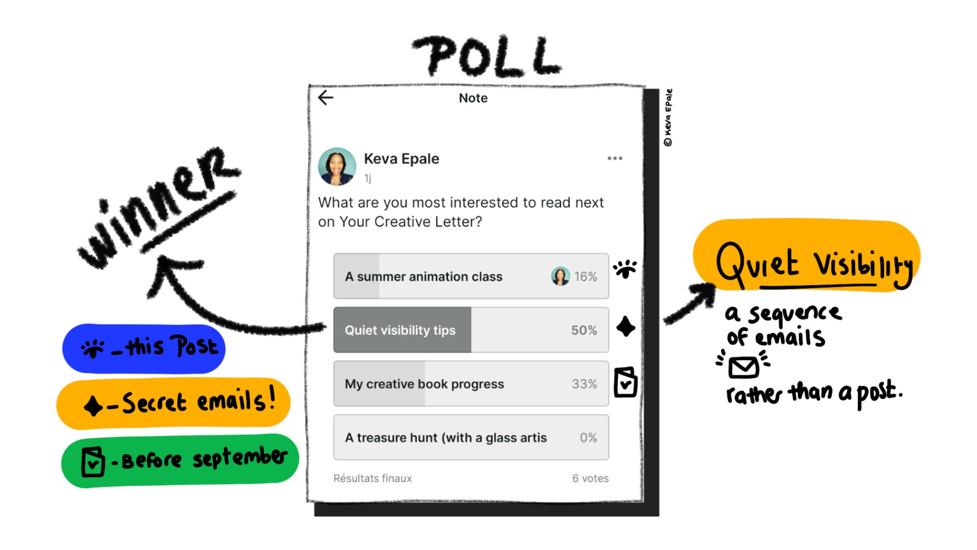
I posted a poll to find out what you would like to read next, and the results were clear. Now, it’s not that I don’t listen to the results; I already had the animation post in mind, with Quiet Visibility as the next focus.
No worries. For those who want to receive the tips, just hit reply, and I’ll add you to the secret email sequence for this series. As for the Creative Book progress, more in my next public post. Thanks to everyone who voted!
📩 Hit reply with this icon or a short message to be added to the Quiet Visibility email series.
Creativity is in every little curious experimentation.

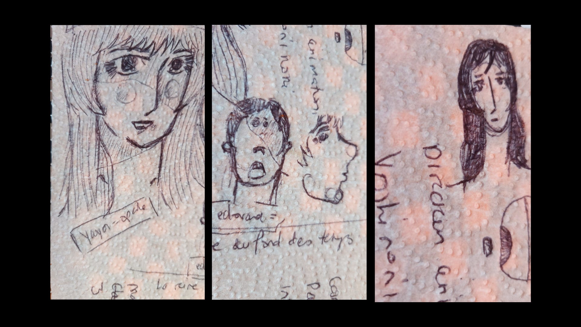
You may watch one, two, or three of these animated masterclasses.
But if you do, pause and really look. What caught your eye? Any storytelling patterns? Any artistry in the use of colour, shapes, shadows, eye contact, movement, smooth transitions…?
List 1 to 3 visual cues that stood out to you. Why did they catch your eye? What do they say about craft or storytelling?.
And if your curiosity takes you further, research the artists behind the work, their techniques, and how the project came to life.
Look closely. Decode what you see. Then bring one new idea back to your work.
These Trust Your Eyes exercises are simply a playground for the imagination.
Congrats, you made it to the end! I hope you enjoyed this bubble in seeing.
Enjoy your weekend,
Keva.

Comments
Nothing yet. Say the first thing.
Sign in to join the conversation.