
Two Ellipse Watches That Defied David Chokron’s Expectations
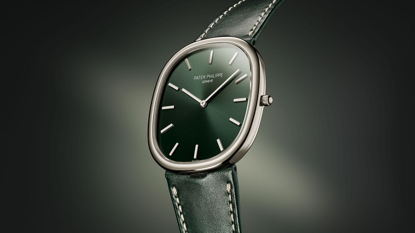
Trusting one’s gut is often good advice, except, it turns out, when judging watch design. David Chokron admits to having dismissed two watches on sight, only to fall for both once he actually wore them. The first was Patek Philippe’s Golden Ellipse, which he initially found dated and uninspired, until trying the current reference 5738 changed his mind entirely. The second came roughly fifteen years earlier with Daniel Roth’s Ellipsocurvex, a design he first read as awkward and overworked, then grew equally attached to the moment he put it on.
Both cases combine a circular top and bottom with rectangular sides, but the resemblance mostly ends there. Patek Philippe’s Golden Ellipse, born in the experimental late 1960s, relies on subtly arched flanks and a nearly invisible transition between straight and curved sections, a design choice Chokron credits to genuine craftsmanship rather than any golden-ratio mysticism. Daniel Roth’s Ellipsocurvex takes the opposite approach: parallel sides meeting curved top ends at a sharp, deliberate inflection point, wrapped in godroon detailing and steeply angled lugs that give it real character.
The contrast extends to styling. Roth, who once worked at Breguet, filled his cases with wide numerals, guilloché or stamped dial patterns, fluted casebands, and layered complications. Patek Philippe, by comparison, strips things down to a clean dial, thin flat hands, and a slim typeface, deliberately avoiding lugs altogether.
Chokron notes the irony directly: he generally dislikes overly minimal watches for lacking substance, and considers Roth’s original design excessive, yet he cannot resist either one in practice. A Golden Ellipse tempts him to slip it off the table; a Daniel Roth makes him want to sit and study it at length. That persistent tension between expectation and reaction, he suggests, is part of what keeps watch collecting interesting even after decades in the field.
Roger Dubuis Rethinks the Mechanics Behind the Retrograde Hand
Most watch hands move in continuous circles, following the same rotational logic that governs a mainspring unwinding inside its barrel. A retrograde hand breaks that pattern deliberately, advancing steadily toward a fixed limit before snapping back to its starting point in a single motion, a display chosen for readability, visual balance, or simply added drama on a dial.
That snap-back motion demands a lot from the movement underneath. The mechanism has to guide the hand forward, define a stopping point, store energy throughout the journey, then release it all at the precise instant the hand reaches its limit, not unlike a bow gradually drawn back before releasing its stored tension in one burst. Conventional retrograde constructions rely on a cam, a rack, and a spring working together to manage that sequence.
Roger Dubuis, working with Jean-Marc Wiederrecht since 1989, took a different approach to solving the same problem. Their design replaces traditional blade springs with balance springs mounted directly on the hand pinions rather than the rack, paired with a fully redesigned cam. The effect is to bring the return mechanism much closer to the hand itself, shortening the path energy has to travel and improving how precisely the motion can be controlled. A useful comparison is a door closer: rather than pulling the door shut from a distance, this system integrates the restoring force directly into the hinge.
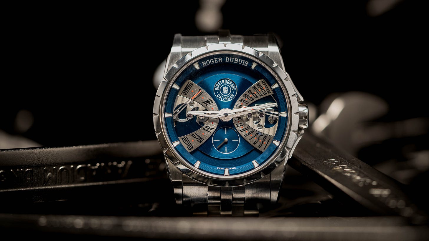
That engineering shows up clearly on the Excalibur Bi-Retrograde Calendar, where both the day and date unfold across generous sectors rather than small subdials, each tracked by an angled, skeletonized hand. Layers of finishing, including a detailed flange, rhodium-plated counters, and a circular-brushed central plate, surround a small seconds display and the openworked RD840 caliber, all pulled together by a cosmic blue finish that sets the mood without overwhelming the design. The result is a complication that trades circular predictability for something more theatrical, while still holding to the mechanical discipline the format demands.
IWC’s Perpetual Calendar ProSet Finally Fixes the QP Setting Problem
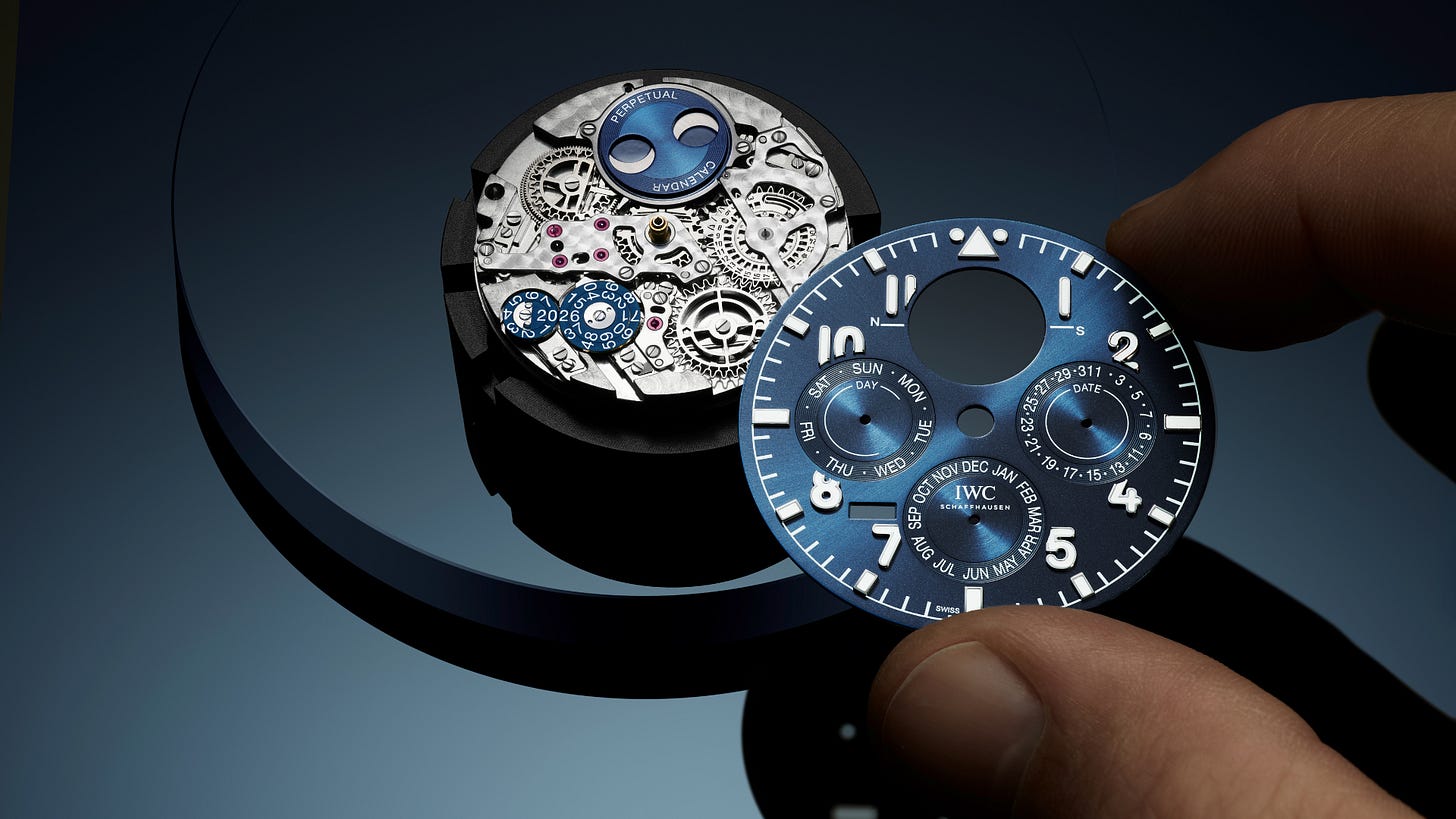
Perpetual calendars have carried a reputation for being simultaneously impressive and impractical, and David Chokron argues IWC may have finally resolved their most persistent flaw. The core complaint has always been setting: correctors recessed into the caseband, special tools rarely on hand, and a moon phase adjusted by guesswork against a plain gray disc.
IWC first addressed part of this problem back in the mid-1980s, when in-house technical director Kurt Klaus built a pre-synchronized calendar module operated through a single pusher, an innovation Jaeger-LeCoultre later adopted as well. Its one limitation was direction: the mechanism could only move forward, meaning a long trip away from the watch, say ten, thirty, or fifty days, meant tedious repeated pushing with no reliable way to count, and no fix once the date was overshot.
The new Perpetual Calendar ProSet, introduced in caliber 82665, removes that constraint entirely. Setting now happens through a dedicated crown position rather than a pusher, and adjustments can run in either direction. The technical challenge behind this shift lies in how a QP movement holds its wheels in place across a day, a week, a month, or a year, traditionally through springs and levers that only work reliably in one direction, and that cannot be adjusted during certain overnight hours without risking damage to the mechanism.
IWC’s solution replaces those rigid connections with wheels made using LIGA fabrication, a technique capable of producing intricate, hollowed-out teeth and flexible built-in connectors. The result functions almost like a mechanical computer, a program wheel meshing with a continuous gear train, preserving the original module’s synchronized-setting advantage while finally making it bidirectional.
Other practical alternatives exist, Chokron notes, including Greubel Forsey’s highly legible perpetual calendar and Audemars Piguet’s crown-operated caliber 7138, though both come with steep prices or cumbersome multi-position crowns. The Big Pilot’s Perpetual Calendar ProSet, by contrast, uses just two crown positions, one for time and one for the calendar, and costs under €40,000, a combination Chokron suggests the industry has been waiting decades to see.
Some watches aim for balance and restraint. The Monaco has always done the opposite. Launched in 1969 with a water-resistant square case, blue dial, and automatic Calibre 11, it stood apart from everything else on the market, yet the design initially failed commercially, vanishing from the catalog after just five years despite Steve McQueen wearing it in Le Mans in 1971. Its 1997 relaunch turned that early rejection into one of TAG Heuer’s defining icons, a reversal that shapes how the brand approaches any update to the model today.
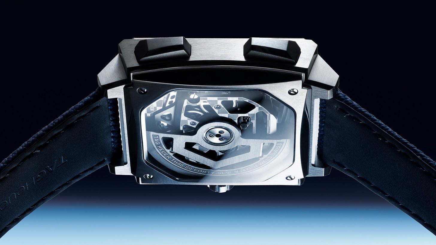
The 2026 Monaco Chronograph and Evergraph reduce weight, add subtle curvature, and improve overall fit, all while keeping the watch’s uncompromising shape intact. The Monaco now uses a 39mm Grade 5 titanium case with gently curved sides and a redesigned caseback, while the Evergraph goes further with a 40mm case, slimmer proportions, a square sapphire caseback, and elongated pushers. Titanium construction preserves the watch’s visual weight while making it noticeably lighter to wear, and the reshaped caseback brings the case closer to the wrist, addressing a common complaint that earlier generations sat somewhat above it.
The Evergraph’s chronograph mechanism represents the more significant technical shift. Developed over five years, it replaces most traditional levers and springs with two bistable flexible components governing start, stop, and reset functions, an architecture that changes both how the movement operates and how the pushers feel when pressed.
Despite these updates, TAG Heuer left certain elements untouched. The square case remains, still interrupting the line of the wrist and catching light in a way no other shape does. The left-side crown, originally a byproduct of the Calibre 11’s construction, stays as a link back to the 1969 original. Bold colors, contrasting subdials, and openworked details continue to define the Monaco’s character, particularly striking, the brand notes, on a smaller wrist where its proportions and contrasts read as more graphic than sporty. The result is a watch that wears more comfortably without losing the eccentricity that made it an icon in the first place.
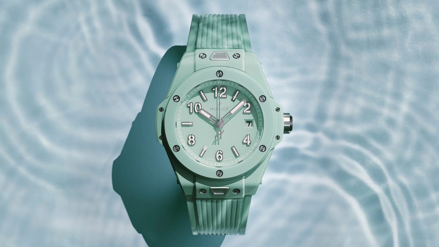
Watch dial typography rarely gets the attention lavished on beveling or enamel work, yet it plays just as large a role in shaping how a brand’s identity reads at a glance. A handful of houses have turned their lettering into something instantly recognizable.
Nomos Glashütte leads with restraint as its guiding principle. Its proprietary typeface treats every numeral and marker with the same disciplined precision found across the brand’s watches, producing something clean and understated enough to avoid ever feeling dated.
Breguet’s contribution predates the modern industry itself. The numerals Abraham-Louis Breguet introduced, now known simply as Breguet numerals, combine generous proportions with elegant curves, part of a broader visual language that also gave watchmaking guilloché dials, fluted casebands, and his distinctive open-tipped hands. Over two centuries later, the design remains unmistakably tied to its origin.
Cartier takes a more discreet approach, hiding the word “CARTIER” within the legs of Roman numerals like the “VI,” “IX,” or “X” on select dials, including the Ballon Bleu’s “VII.” Though counterfeiters can now replicate the detail with ease, Cartier has kept it in place as a piece of heritage rather than a security measure.
Hermès offers the most distinctive example, thanks to graphic designer Philippe Apeloig, who created the Slim Hermès numerals in 2013 after designing the visual identity for the Saut Hermès event. Hermès publicly credited his contribution at the time, an unusual move, and the resulting typography still feels fresh over a decade later.
Bvlgari rounds out the list not through originality but consistency. Introduced alongside the first Octo Finissimo in 2014, its simple, upright Arabic numerals have remained essentially unchanged since, proving that versatility across sizes and materials can matter more than novelty.

Geneva Watch Days returns from September 2 to 6, and its open-door approach continues to set it apart from the industry’s more formal gatherings. With 68 brands presenting across the city’s hotels and boutiques, the Pavilion and the Blue Box at the Rotonde du Mont-Blanc remain the event’s central hub, though five specific experiences stand out for visitors planning their schedule.
On Wednesday, September 2, independent watchmaker Konstantin Chaykin will demonstrate his craft live, offering insight into the thinking behind projects like the 1.65mm ThinKing concept, unveiled in 2024 as the world’s thinnest watch, and its recent limited-edition production version, the ThinKing Mystery.
Daily at the Pavilion, the Official Swiss Chronometer Testing Institute invites visitors to test their own watches for accuracy, learn how magnetic fields affect automatic movements, and watch industry figures compete in the CaliberShip Challenge, where entrants regulate a movement against the clock. This year’s competitors include Jean-Marc Pontroué of Breitling, Antoine Pin of De Bethune, and Jonathan Birnbaum of Bulgari, alongside the article’s author defending her 2025 title.
Saturday, September 5 brings the Fondation de la Haute Horlogerie’s Brunch & Quiz, a lighthearted morning of trivia and debate that tends to teach even experienced collectors something new. For those with less time, guided tours through the Blue Box on Friday, Saturday, and Sunday offer a condensed overview of the year’s most notable releases, alongside Emmanuel’s Picks, where FHH Content Director Emmanuel Schneider walks through his personal favorites each morning.
Finally, on Sunday, September 6, the International Museum of Horology’s Kids’ Club gives younger visitors a hands-on introduction to gears, springs, and movement components, a workshop aimed at sparking the kind of early curiosity that, for some, turns into a lifelong pursuit.
No posts
Comments
Nothing yet. Say the first thing.
Sign in to join the conversation.