
Designing an illustration for a product is very different from creating a single artwork for a portfolio. When my agency sent me a brief from Educa Borras to illustrate a 1000-piece puzzle featuring historical women (non-fiction yaaay!), I really welcomed this challenge! Plus, I am a huge fan of puzzles, so this project was perfect.
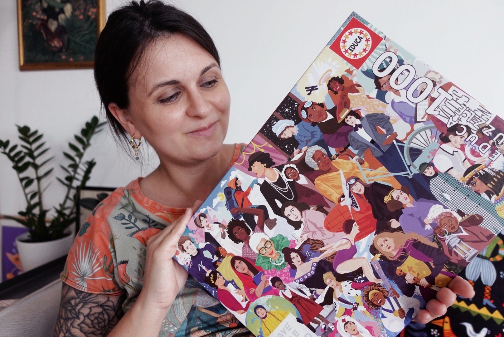
Let’s take a closer look at the brief from the client.
The project came to me through my illustration agency. The client was Educa Borras, a Spanish puzzle and games publisher, and the task was to create a single illustration for a 1000-piece puzzle that would feature historically important women.
Project title: “Women Who Changed the World”
Format: 1000-piece adult puzzle, 48x34 cm, CMYK, 300dpi, 5 mm of bleed
Style: Elegant, modern, educational, and diverse
A symbolic tribute to 40 historical and contemporary women across fields like science, activism, literature, and exploration.
A reminder to myself:
A puzzle is a product first - an illustration second.
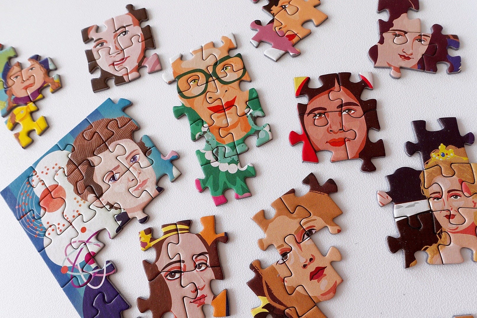
Before I even started drawing, I spent time researching each woman. Some of them were very familiar, and others were new to me. That part of the process is honestly one of my favourite aspects of projects like this, and this is the main reason why I decided to work more on my non-fiction portfolio pieces.
In my research, I looked for:
recognisable visual references
typical clothing, hairstyle or accessories
and one or two subtle visual cues that could help identify each person without relying on text
A strong silhouette and an instantly recognisable element are often more important than perfect historical detail.
PS: I had to negotiate reducing the characters from 40 to 36, it was a lot of work and I needed to meet my deadline. Designing one character is comfortable. Designing 36 characters that all need to feel:
equally important,
visually distinct,
and balanced within one composition…
…is a completely different challenge.
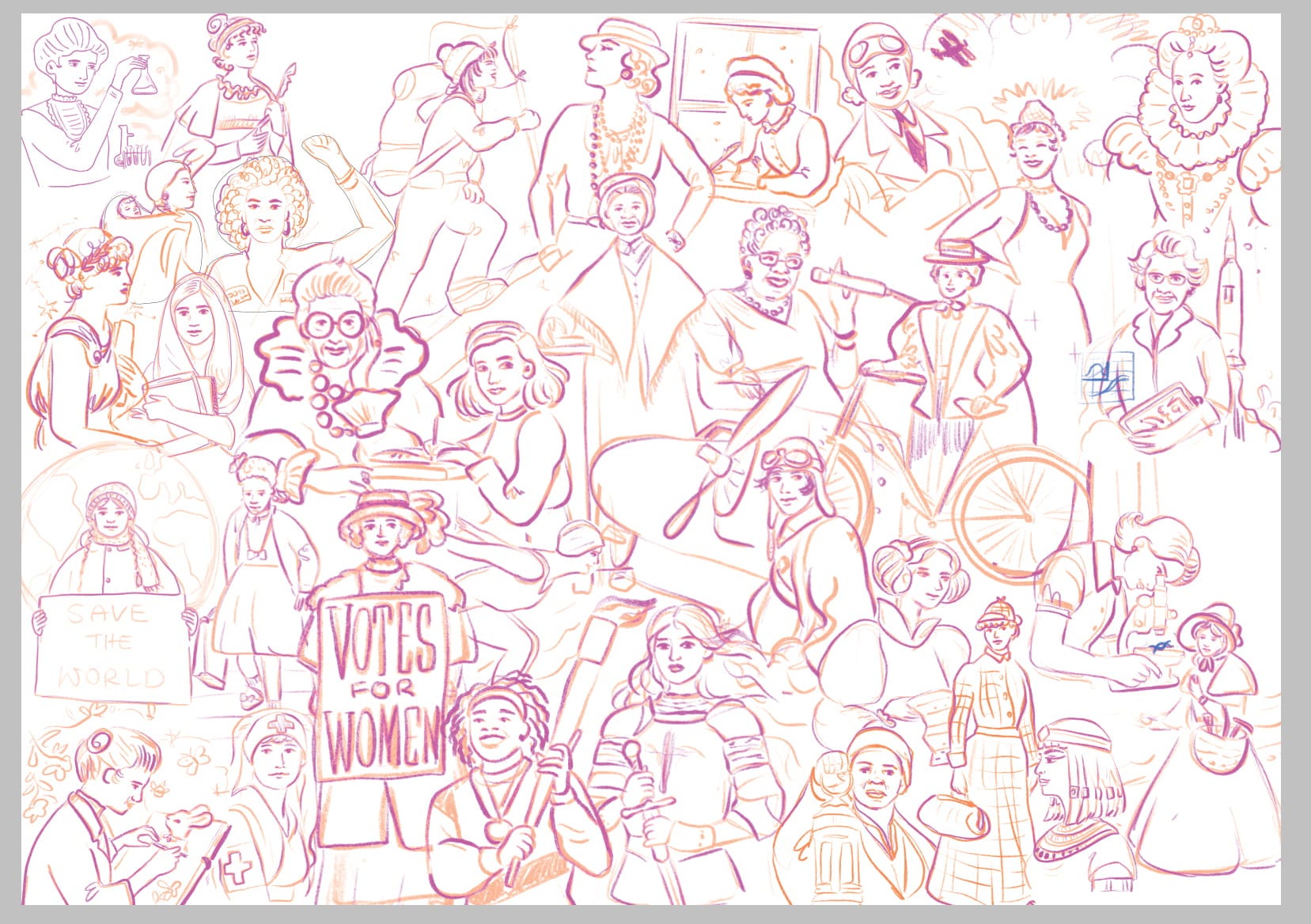
From the very beginning, I treated this illustration more like a poster layout than a traditional scene. My main goals were: no character should visually dominate the whole image, no faces should be too small or hidden, and the viewer should be able to slowly “travel” through the image while discovering new figures
I spent a lot of time on my sketch, here is one work in progress view:
One of the most important mindset shifts in this project was remembering that the final artwork would be cut into 1000 pieces. That can affect:
contrast
color placement
and how busy certain areas of the illustration can be
Large flat areas can be boring for a puzzle. But overly detailed areas can become visually overwhelming once cut into small shapes.
So I consciously designed:
repeating color accents across the image
gentle background variation
texture/pattern elements on the clothes of the women
This is something I always teach in my own courses as well: designing with the end product in mind changes your illustration decisions.
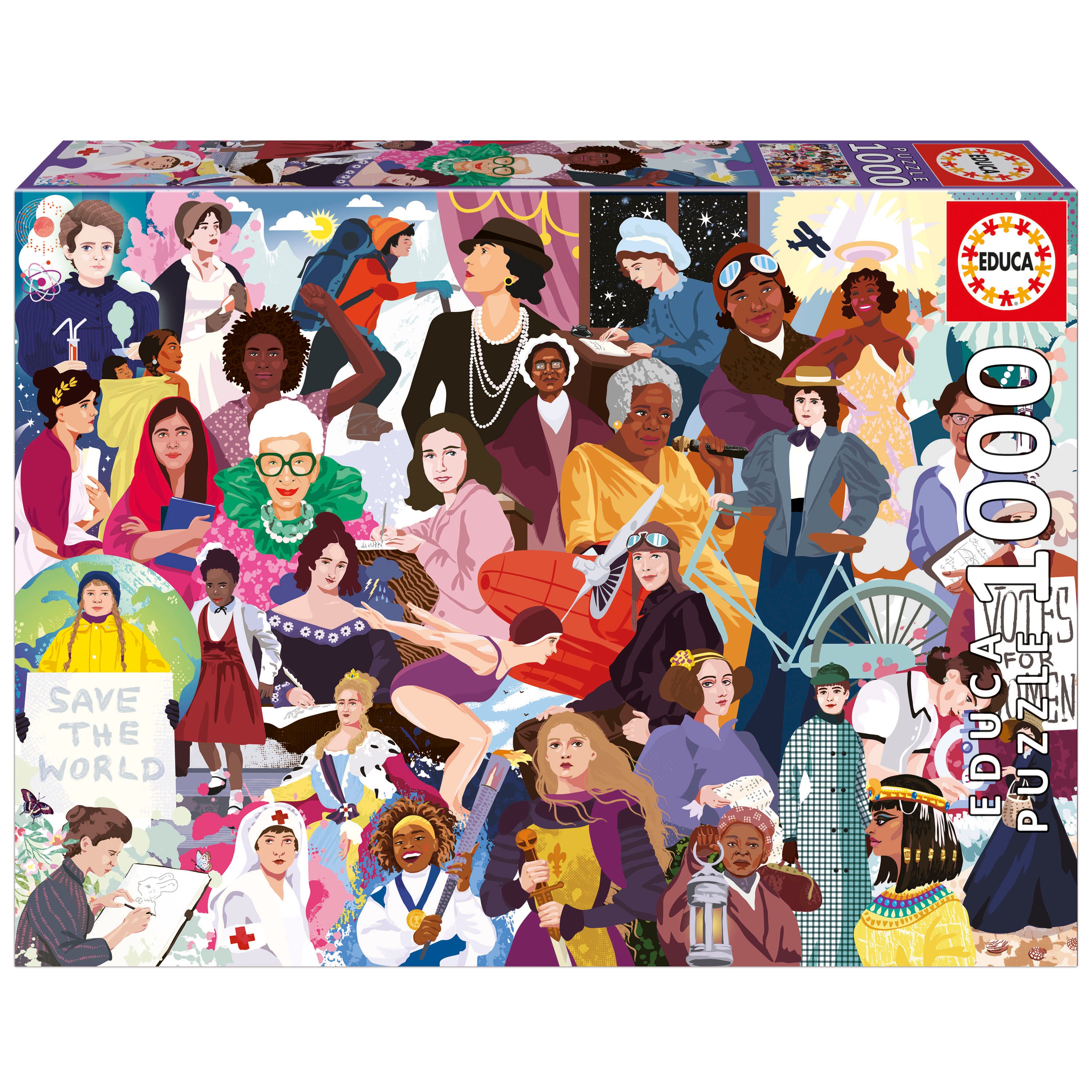
Good commercial illustration is not about showing how much you can draw.
It is about how clearly you can communicate an idea within real constraints.
Designing a puzzle with 36 iconic women was not only a creative challenge.
It was a design problem. And that is exactly the kind of work I love most.
Wish me luck - I would love to illustrate more puzzles!
Thanks for reading The Art of Growth! This post is public so feel free to share it.


Hi! I’m Weronika Salach, a freelance illustrator specializing in children’s books, toy design and surface pattern design. Internationally I’m represented by Advocate Art. Over 50,000 happy students have taken my digital illustration courses and watched my YouTube videos. Let’s connect :)
👉 Website
👉 Courses
👉 “The Art of Growth” blog-letter
👉 YouTube
Comments
Nothing yet. Say the first thing.
Sign in to join the conversation.