
We’re back with a new edition of Web Wizards! It’s always fun to explore a site that has a unique design direction. Tiket Design have done an amazing job at creating an incredible visual experience with their website, one that helps you understand the essence of their team and the fun work they do. Take look!
Got a cool website you’d like to see featured? Let me know by replying to this email or reaching out.
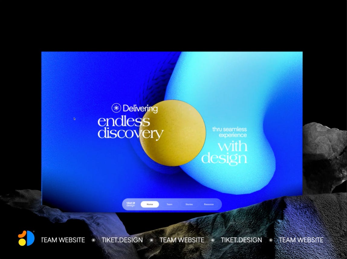
Alvin Niza & Samad are product designers for tiket.design, the biggest online travel agent (OTA) in Indonesia.
➤ Alvin’s Socials: Website, Dribbble, Read.cv, Medium
➤ Samad’s Socials: Dribbble, LinkedIn
Tiket.com product design team is one of the well-known product design teams in Indonesia. As the team keeps growing, we want to have a dedicated space to communicate our values and share our learning. So we made the decision to build our website.
URL: tiket.design
Collaborator(s): Alvin Niza (Designer/Developer), Samad (Designer/Developer), Shafira Pithaloka (UX Writer), Ernest Dimitria (UX Writer), Cindy Kim (Graphic Designer), YB Pambayun (Graphic Designer), Much Fahreza (Graphic Designer)
Tools: Framer


Tiket design wishes to rebrand the team, and our brand & community team has already provided some direction in that regard. As a result, we don't start empty-handed. What we do next is create a mood board. We go through Dribbble, Awwwards, and godly.website and curate the elements that spark us. What follows is an unorganized yet creative design process.
The website represents our design team so we put more direction that communicates our creative side. This means that we make an effort to design novel and uncommon design elements and interactions. The process of finding and creating the ‘right’ element is fun! Sometimes I lost sense of time when doing that lol

It’s challenging for us to ensure that the teams are all working toward the same goals for the website. These initiatives involve a large number of individuals, both directly and indirectly, and everyone has an opinion on how the website should look like.
Another challenge is how to build a UI element that is scalable. Making sure the website is finished is important, but so is making sure the website is easier to manage. On our website, we have some content that regularly needs to be updated. We must keep it in mind while we build the website.
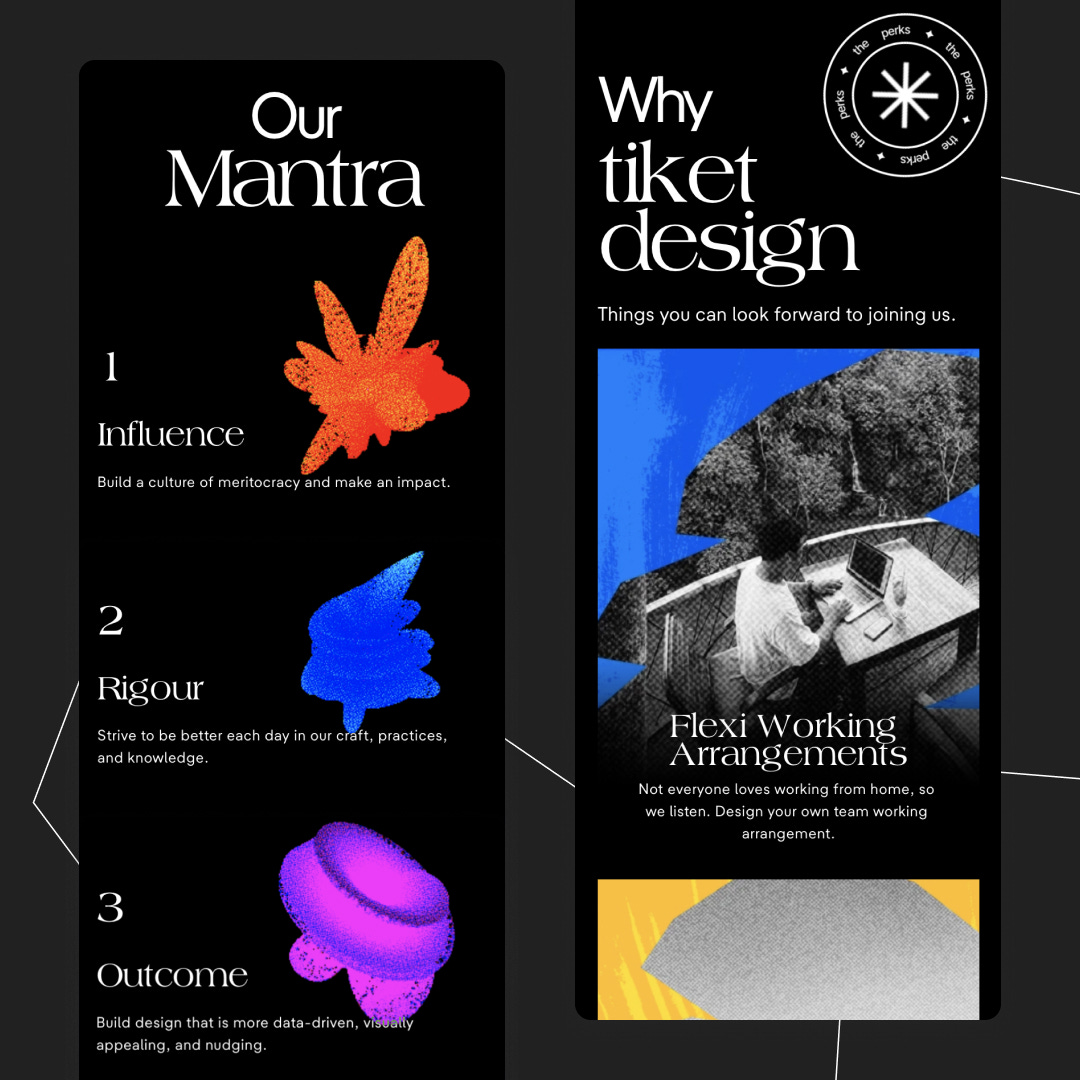
Alvin
Personally, I like the ‘Our Mantra’ section. I like how hovering over it exposes a distinct gradient shader shape that resembles our mantra.
Samad
I love the header element where there is a big yellow ball and its blue gradient background. I think that element speaks to our identity the most.
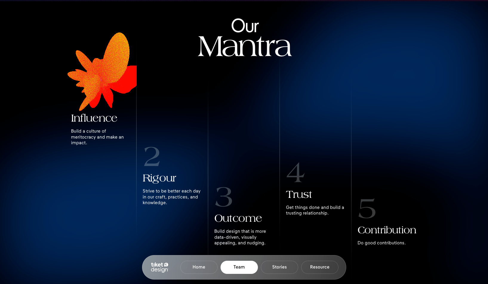

I think the one that resonates the most with us is how we learn to make the website run smoothly. As you may already know, there is a significant amount of interaction on our website. We need to find a "hacky" way and make some adjustments to get the seamless-desired interaction while not slowing down the website's performance.
That's an interesting question. I think the overall feeling of the experience is complemented well by “My Universe - Coldplay & BTS”. The song conveys a message about friendship and the power that can be created when people work together even though we all come from different backgrounds and cultures. In the song, Coldplay and BTS sing about creating their own "universe" together, where they can feel safe and connected to one another. I think it has a similar vision to what our team wants to achieve.

Thanks for reading! Definitely reach out if you’d like to be featured or would like to recommend a site to feature.
Comments
Nothing yet. Say the first thing.
Sign in to join the conversation.