
First, hello and welcome to the many of you who joined this week 👋🏼
This is a weekly newsletter sharing a tip, idea or mini lesson so you can keep your brushes going.
Pick up a round object. Hold it up to a light source and look at it closely. One side is bright, the far side falls into shadow, and between them the surface curves through every value in between. If you place it on a surface there is a spot where light bounces back up, and a dark shadow anchoring it to the surface.
That is a complete lesson in light, and everything you need to know to make an object feel solid on paper.
In one of my earliest posts I shared a simple idea: that any object lit by a single light source shows four zones of light. It’s still one of the most useful things I know, and it’s worth revisiting in more detail.
So this week, with some fruit from the fridge, we’re going to see the light.
Place a pear (or apple) on a light surface, such as a sheet of paper, next to a strong light source like a window or a lamp. One side should be clearly lighter than the other.
Now observe the four zones of light:
Light
Shade, usually with a gradual transition
Reflected light, bouncing up from the surface or nearby objects
Cast shadow, darkest where it meets the object
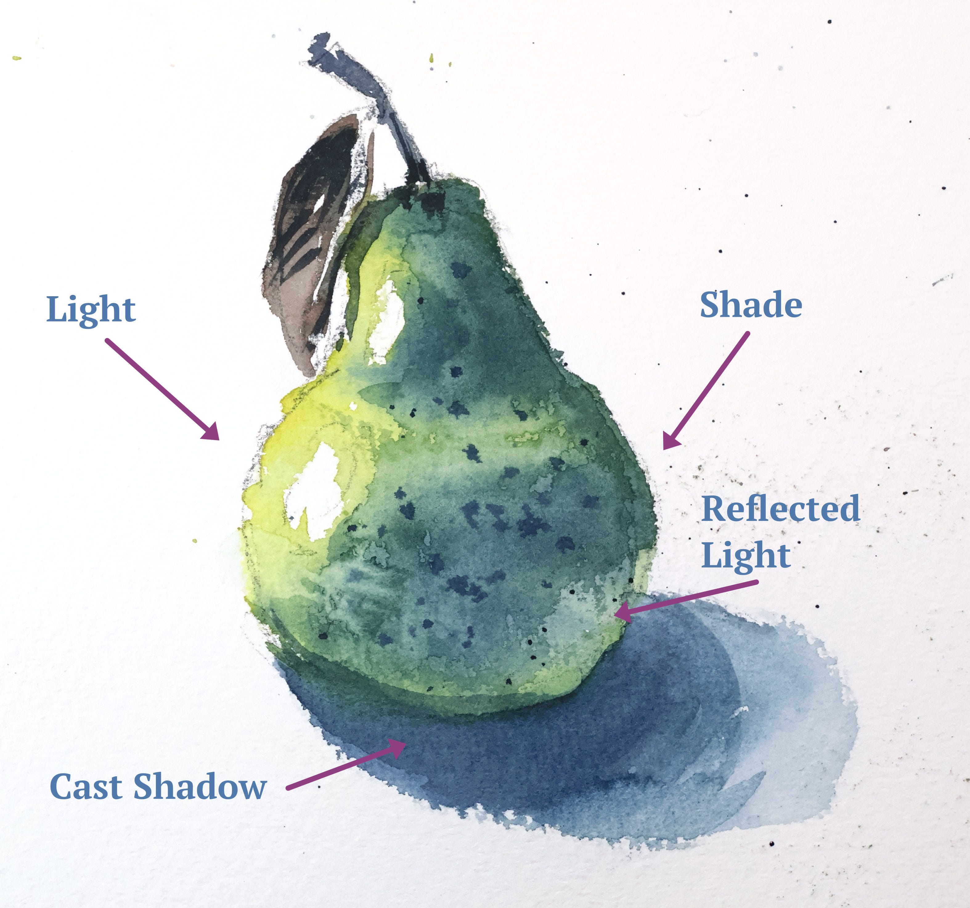
Start with a light yellow, leaving a couple of highlights as white paper
Drop in green wet-in-wet and let the colours blend. Keep less water in the darker mix so it stays put and doesn’t flood the light side. Add more and darker green to build up the value.
Before it dries, lift out some colour for the reflected light on the shadow side
Once dry, glaze more shade onto the pear to deepen the light-to-dark contrast
Paint the cast shadow. Strengthen it directly under the pear and soften the edge as it fades out
Add some details to the stem and some splatters for texture
Now we add an orange, so the two can throw reflected colour onto each other, which is where a group of objects starts to feel real.
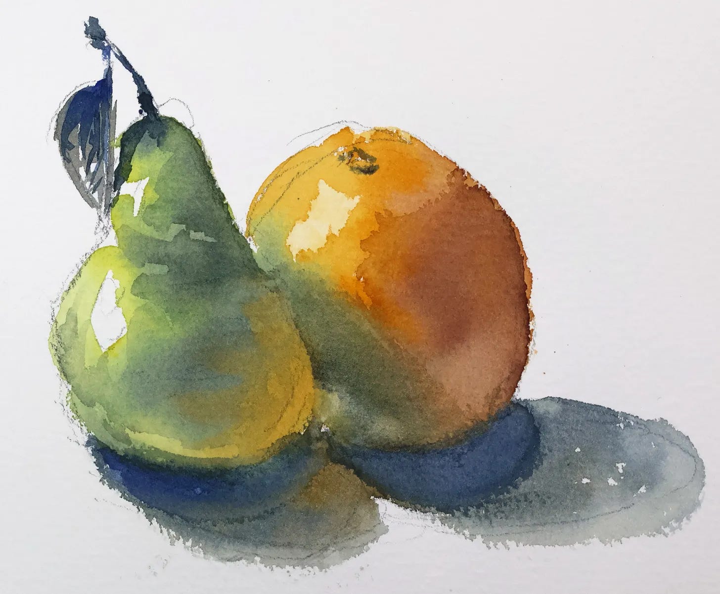
Start with the pear in a light yellow wash. Paint the orange next to it in a light orange, letting the edges blend. Preserve a few highlights on each
While wet, paint the darker green of the pear, but let the orange bleed in where they overlap. Add a touch more orange if that area turns too green
Paint the darker shade on the orange with a reddish brown. Where the pear overlaps it, drop in some green for the shadow
Once dry, paint the cast shadows. Keep them warmer in the middle and lighter as they fade out
Glaze more shade if needed, then add the darker details like the stem
The four light zones help with rendering solid form.
Working from a real object under real light trains your eye far better than copying a photo. You can move around it and see how the light changes.
Painting fruit is low stakes, and there’s no right or wrong
Comments
Nothing yet. Say the first thing.
Sign in to join the conversation.