
Hi there!
The first issue of this little newsletter started with a proposal for shot charts transformed to the polar coordinate system.
Its motivation was that a bulk of players’ attempts occur in around the rim, which got squeezed into small space like in the below left. It meant that most shot charts actually weren’t showing accurately how many shots were taken around the rim vs other places. Accordingly, I proposed using a “polar” coordianate system like a radar might.

While it was a pretty neat idea, it had more than a few kinks to work out. Firstly, it wasn’t going to win any beauty contests .
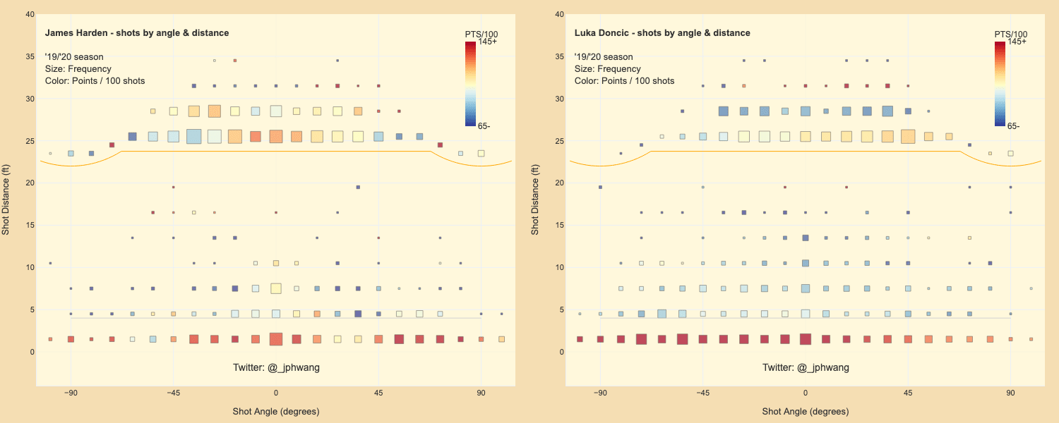
The other was that the chart was just … too confusing. These polar shot charts to me were had a bit of the “uncanny valley” quality to them, as it had some resemblence to a real basketball court without actually being it.
So I have been thinking about how these charts might be improved.
Before we get to that, let’s go on a little detour.
Recently I had been dealing quite a bit with maps, and map projections to be specific. I’ll have more to show on that front later, but most of you probably know that different map “projections” exist for turning our 3D globe into a 2D map that can be printed and used.
The “Mercator” projection is an (in)famous projection, maligned for how it greatly distorts sizes of land masses especially at locations further away from the equator (see below).
This has greatly distorted many people’s mental perceptions of land masses, and for at least this reason the Mercator projection is discouraged from usage by many these days. The reason for its existence is a critical one, however - which is that it preserves angles between straight lines and it was indispensible for seafarers in the days of yore.
What does this have to do with basketball and data visualisations?
Well, maps are one of the most developed forms of visualisations. And just as maps don’t need to be everything for everybody, neither do any other visualisations.
Polar shot charts were intended to show shot distances and angle tendencies. So I thought it might be a good idea to focus on representing those aspects, rather than aim to mimic Goldsberry-style shot charts.
Here are some early sketches of breaking down the court areas into segments. Freed from trying to represent the data as a grid map, we can explore using variable spacing for each of the zones.
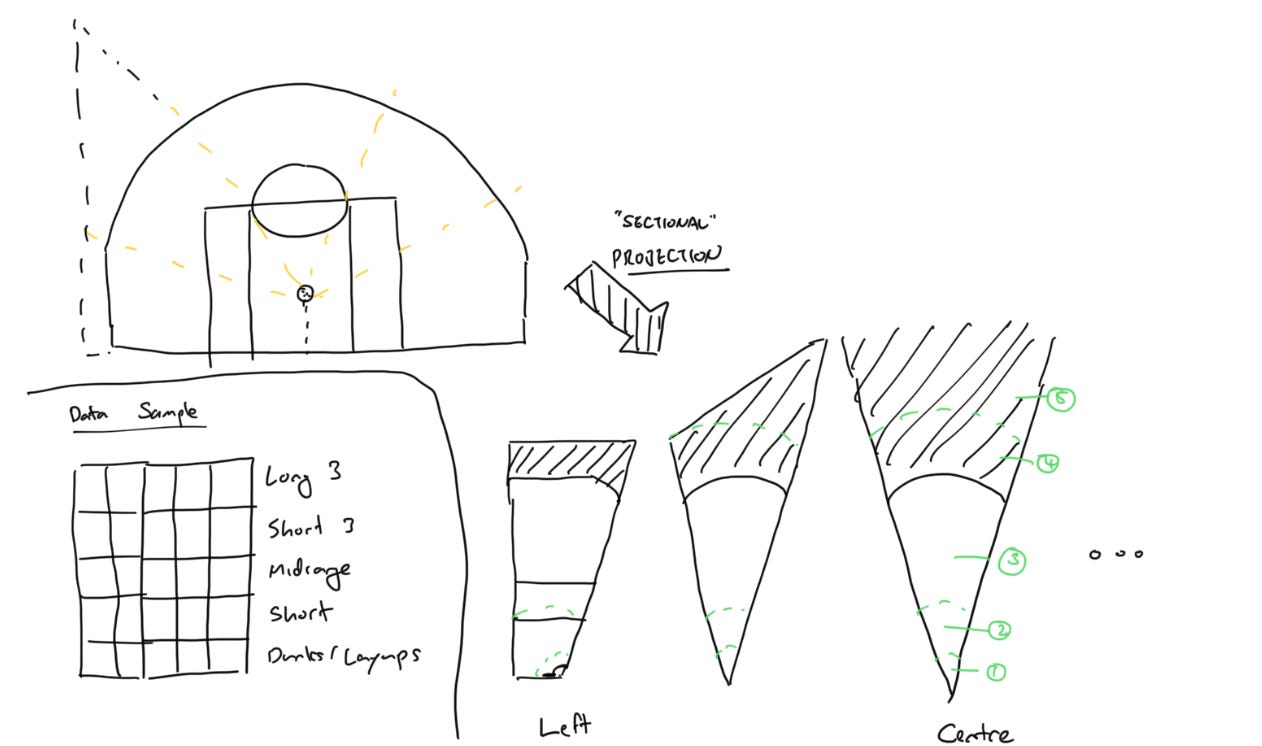
And subsequent sketches wondering how the properties (frequency, accuracy, etc.) of each zone might be represented as a visual.

You can see a couple of design decisions being explored here.
One is whether to use rectangular shapes where the area would scale linearly with length, vs segments where it would be a square of the length. The other is whether to represent both attempts and makes spatially, or not.
Here was a rough mockup.
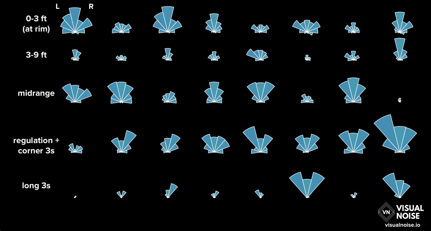
This looked pretty promising, but I thought to be honest this was a few too many segments given the smallish sample size that would exist for most players.
So this is what I ended up going with for now, where the area represents the volume of shots or makes:

Putting in the real data, players’ actual shot profiles can be constructed:

And here’s the same thing, where the number of successful shot attempts (“makes”) aren’t separately shown to the attempts.

It does a reasonably good job at a couple of things; showing each player’s general tendencies and efficiencies in terms of shot location (y-axis) and their preference in each zone. Of course it has some room for improvement, especially in terms being able to compare frequencies across categories, as it is rather difficult at the moment. It looks pretty cool though in my humble opinion.
What do you think? I’d love to get your thoughts here or on Twitter.
Todd has recently moved onto a new gig but he is still putting out some sweet work onto the public domain that makes us equal parts envious and inspired. Just… look at how crisp and soothing these colours are. Oh my goodness.

Todd Whitehead@CrumpledJumper
How does the style of play in summer league compare to what we see in regular season NBA games?


Synergy Sports @SynergySportsHQ
With the NBA Summer League now over and fans looking ahead to the regular season - we looked at play type data across all teams and games to answer the ever-present question: How similar is Summer League to the regular season? https://t.co/ca38QD7GIa
8:10 PM · Sep 2, 2021
10 Reposts · 85 Likes
I have a soft spot for NLP (natural language processing) and even more so for good looking visualisations in that space. Yeah, it’s depressing stuff but it’s useful to read, so…
Amanda Shendruk@AShendruk
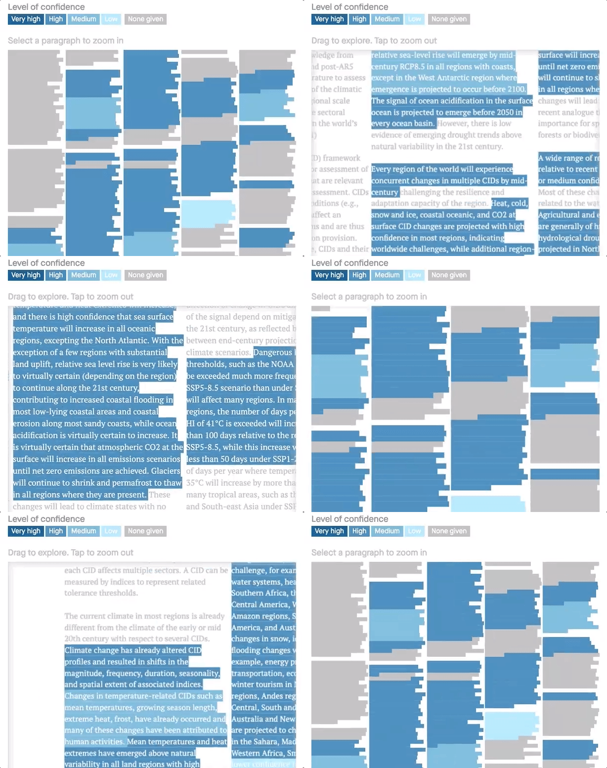
One of the coolest things about the @IPCC_CH #ClimateReport is that the authors are so confident about the science — they even tag sentences with their confidence! So, naturally, we visualized it. (And we summarized every chapter, too) qz.com/2043894/what-d…
5:52 PM · Aug 10, 2021
168 Reposts · 480 Likes
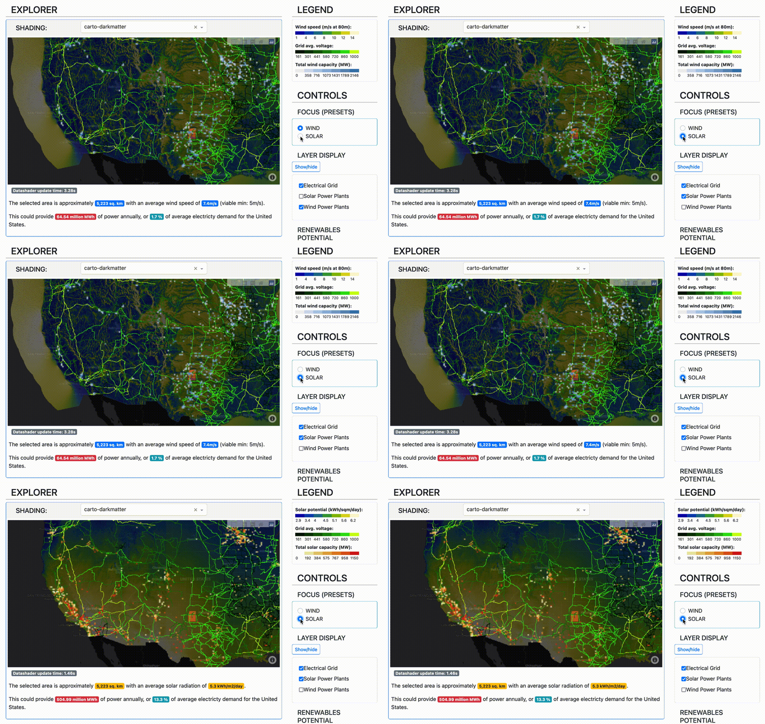
I recently finished another project with Plotly, and this one I am quite proud of. This app overlays the US electric grid with the solar and wind energy potential in forms of solar radiation and wind speeds.
It’s only a showcase app but the idea is that something like this could be used to quickly identify potential areas for further renewable plants or need for grid upgrades.
A set of tutorials (a video and an article) for a client (IEX) on portfolio construction using correlation analysis. It’s been pretty well-received so I can recommend it with only a little bit of sheepishness. ;)
That’s it for me today. If you liked this - please share / subscribe!
No posts
Comments
Nothing yet. Say the first thing.
Sign in to join the conversation.