
Which model is “good enough”? Which one is better? Did last week’s tweak actually improve things? Every developer and user of machine learning asks some version of these questions regularly, and the answer always hangs on the metric you choose. Yet the measure used most often in the scientific and business communities—Area Under the Receiver Operating Characteristic Curve (usually shortened to AUC)—captures only one thin slice of model performance. Rely on it alone and you’ll miss many qualities that predict whether an algorithm will actually help when applied in the real-world.
This post gets a bit technical, but for good reason: I’ll unpack what the AUC means, why the AUC falls short as a global performance measure, and then walk through the broader evaluation toolkit we use at MTN to make sure our own models (and those we help partners build) deliver real-world clinical value.
Imagine designing a WWII radar system that needs to distinguish enemy bombers from flocks of geese. A low detection threshold catches nearly all bombers (true positives), but also many false positives (geese). A high threshold reduces false alarms but misses real threats. Plotting true positives against false positives across the entire spectrum of thresholds creates what’s now known as the ROC curve.

Originally describing the “characteristic” performance of a receiver and radar-operator pair, the ROC curve spread to other fields like medical diagnostics because it neatly summarized predictive accuracy when events are rare, or errors carry vastly different consequences.
Epidemiologists refer to sensitivity (the probability of a positive test in a patient who has the disease) and specificity (the probability of a negative test in a patient who does not have the disease). Sensitivity is the true positive rate; the false positive rate is (1 - specificity). Thus, a ROC curve plots sensitivity against (1 - specificity) across different decision thresholds.
Sensitivity and specificity (and therefore, the ROC curve) are counterintuitive. They’re conditional probabilities that suppose a true disease status that isn’t known. They’re also often confused with predictive values, which are conditional probabilities upon test results and are often the quantities that clinicians really want to know.
A helpful way to understand ROC curves more intuitively is the “Walking Man” analogy (https://pubmed.ncbi.nlm.nih.gov/37562728/).
First, imagine ranking the radar blips or medical test results from strongest to weakest signals (or highest to lowest result). For the case of binary classifier machine learning models generally, consider the predicted likelihood to be the ‘test result’.
Label each result as “Yes” (bomber/disease) or “No” (geese/healthy) while maintaining the overall ranking
Next, visualize a grid: vertical axis cells corresponding to each positive case and horizontal cells corresponding to each negative one.
Starting bottom-left, imagine a “Walking Man” who moves up for each “Yes,” they encounter (in ranked order) and right for each “No.”
This path represents the ROC curve.
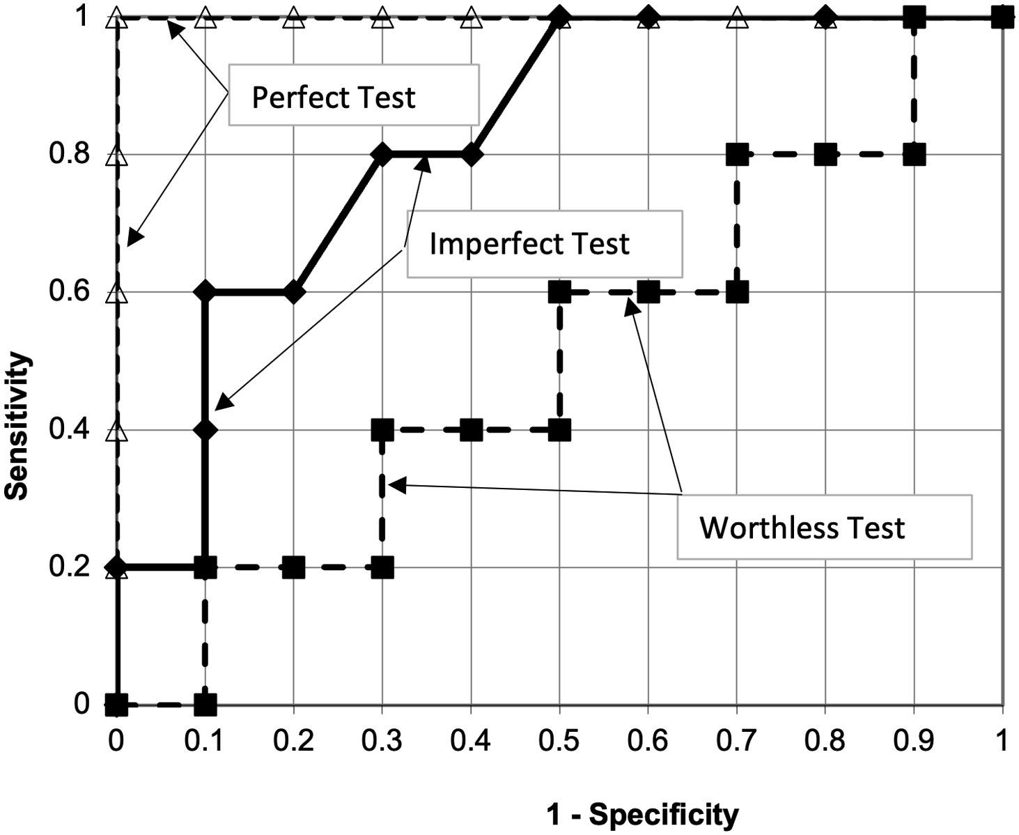
This works because the starting point (the origin) represents an extremely high detection threshold. At this point, you’d detect almost no real bombers (sensitivity near 0%), but you’d also rarely misclassify geese as bombers (false positive rate, or 1-specificity, also near 0%). Each step of the “Walking Man” corresponds to when the gradual lowering of the threshold leads to a potential reclassification - either correctly or incorrectly.
Perfect discrimination, where all bomber/disease cases are ranked higher than all geese/healthy cases, results in all steps up, then all steps right - an Area Under the Curve of 1 (the entire grid).
No discrimination leads to roughly a diagonal line - where the chance of taking a step up and a step to the right is no different from baseline chance.
Partial discrimination is represented with curves somewhere in between.
This framing demonstrates what an AUC value means: The area under the ROC curve (AUC) represents the probability that a randomly chosen bomber–goose (or diseased-healthy) pair is correctly ordered by their signal strength (or test result). This follows because, in the Walking Man visualization, every point on the grid corresponds to a specific pairing: columns represent geese ranked by their signals, rows represent bombers ranked by theirs. As the Walking Man moves from strongest to weakest signals, each step upward (bomber) or rightward (goose) ensures all pairs below the path are correctly ordered pairs —where the bomber’s signal surpasses the goose’s.
At first glance, the ROC curve offers reassuring simplicity—a clear visual paired with a single tidy metric summarizing discrimination. But the Walking Man analogy also highlights why strong discrimination alone doesn’t guarantee good real-world performance. As we’ll explore shortly, discrimination is just one of several critical dimensions of model effectiveness, and many other key aspects remain completely unmeasured by the AUC.
The first drawback is that the AUC only considers ranks.
Consider two hypothetical models. Model A makes reasonably accurate predictions, while model B halves every prediction from Model A. Both models produce identical rankings (and thus, identical AUC scores), despite vastly different real-world usefulness. Medical decision-making is often based on thresholds, so the calibration (how close predicted probabilities match actual outcomes) is usually at least as important as discrimination (ability to separate cases from noncases), but is not accounted for in the AUC.
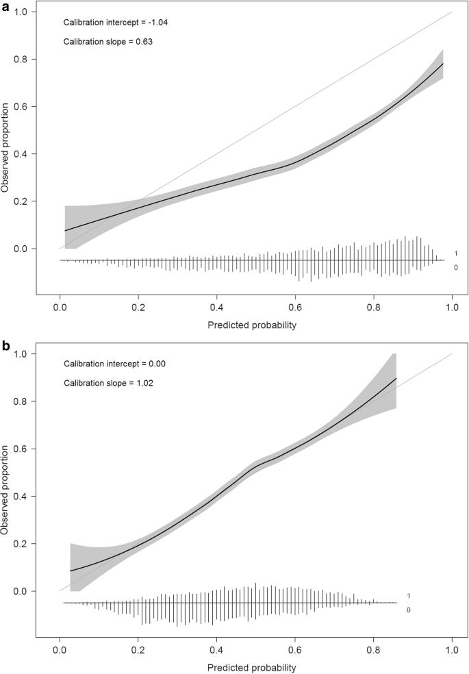
This also means that the AUC is not a proper scoring rule. A scoring rule is proper when a forecaster maximizes (or minimizes) the expected score only by giving the true probabilities. AUC, however, depends solely on the ranking of cases: any monotonic transformation of the predicted probabilities—halve them, square them, push everything toward 0 or 1—leaves the ranking (and therefore the AUC) unchanged. This means you can “game” the metric: report distorted, poorly calibrated probabilities yet suffer no penalty so long as the order stays the same. Proper rules such as log-loss or the Brier score do penalize those distortions, rewarding predictions that get both the rank and the numbers right.
Second, not all misclassifications carry equal consequences.
Consider medical tests: a false negative (e.g., missing a dangerous diagnosis) might be catastrophic, while a false positive may simply lead to additional follow-up testing. Ideally, evaluation metrics should reflect these different “costs,” prioritizing models that minimize the most harmful errors, rather than treating all errors as equivalent, as the AUC implicitly does.
To understand why relying solely on AUC doesn’t adequately support meaningful model development, it’s helpful to consider an analogy to clinical drug trials. Just as drug developers rely on a hierarchy of trial designs end-points, we at MTN adopt a structured set of evaluation metrics that move models from promising to genuinely impactful.
Pharmaceutical development follows a clear ladder of outcomes. Pre‑clinical studies show that a compound engages its target in cells or animals. Phase 1 trials test safety and dosing in humans. Phase 2 then looks for early signs of benefit—often changes in a biomarker or imaging measure that serve as surrogate endpoints. Only in pivotal Phase 3 trials does a drug have to prove it actually improves patient‑centered outcomes such as survival or symptom relief. Surrogate read‑outs—like receptor binding or biomarker shifts—are not outcomes patient care about. They are valuable only if they reliably forecast which compounds are likely to have that final, real‑world benefit if the compound ultimately undergoes the pivotal Phase 3 trial.
Prediction accuracy metrics, like the AUC, serve a similar ‘surrogate outcome’ role. We don’t actually care about the AUC itself; we care only because it indicates the potential for real-world benefit of deploying a model. Definitive outcomes, analogous to pivotal Phase 3 drug trials outcomes, are the measurable impacts on patient care and clinical decision-making after implementing the model into a clinical workflow—as discussed in the posts on the Wells Score (Part 1, Part 2). A machine-learning performance metric is therefore more useful if it is a better predictor of whether the model will succeed when ultimately deployed.
The clinical-trials analogy also gives an explanation for why the AUC is overused: just as pharmaceutical companies have incentives to promote surrogate outcomes as if they were definitive (for example, hyping up an Alzheimer’s drug that has a promising impact on a biomarker but hasn’t been demonstrated to improve symptoms), the machine learning research and business communities often similarly oversell accuracy metrics like AUC. When presented with an impressive AUC, our reaction should be cautious: “This model looks promising—but a long pipeline of testing must occur before we’ll know if it adds value when deployed.”
The STRATOS initiative, a widely respected group that creates guidelines for reporting medical research, has recently released an excellent stepwise framework for evaluating predictive machine-learning models (https://arxiv.org/abs/2412.10288) that addresses exactly that need. They suggest assessing and reporting:
Discrimination: the ability to separate cases from non-cases (e.g., AUC) as a necessary but insufficient precondition to a model succeeding on subsequent steps.
Calibration: Alignment of predicted probabilities with observed outcomes.
Overall accuracy: Proper scoring rules, which combine discrimination and calibration (e.g. Brier score or log-loss)*.
Clinical utility: Metrics reflecting clinical impact that incorporate the consequences of errors (e.g. decision analyses/net benefit).
Real-world impact: Actual effectiveness when deployed.
(*One reason AUC is so popular is that it is prevalence-invariant: a high AUC reflects the model’s ranking ability rather than the class balance of the data. Raw proper scoring rules such as the Brier Score are not prevalence-invariant. They combine model quality with task difficulty. However, modifications like the Brier Skill Score address this by reporting the proportion error reduction relative to a baseline model. Because clinicians always interpret model outputs, evaluations that compare “Clinician + Model” versus “Clinician Alone” provide stronger and more clinically relevant evidence, making these skill-based scores especially appealing.)
Optimizing model performance on this structured progression of metrics moves toward genuine clinical value, rather than mere surrogate performance.
Take MTN Monitor as an example. The system uses wearable devices for reliable detection of patients experiencing worsening alcohol withdrawal. As a rough simplification, imagine the model predicting the likelihood that severe alcohol withdrawal will be identified at the next caregiver assessment.
A conventional research report might generate a ROC curve and tout a high AUC to imply that the model is deployment-ready. We treat that as step one, followed by:
Calibration check: If the model predicts a 70% risk of worsening withdrawal, about 7 out of every 10 such patients should indeed worsen. If the observed results differ substantially, recalibration or retraining is necessary
Optimize overall prediction quality: We calculate and optimize an overall accuracy with a metric like the Brier Score, then express that as a skill score to summarize the proportional error-reduction versus the base-rate of severe withdrawal or caregiver gestalt.
Clinical-utility modeling: Working with front-line staff, we estimate the subsequent harms of an unpredicted withdrawal worsening against the hassle of a false alarm, then choose operating thresholds that maximize net benefit. Fairness metrics (a subject for another post) are also assessed.
Deployment evaluation: After adequate performance is achieved in the preceding steps, it’s time for the definitive assessment: what happens when the model is deployed?
In short, good AUC is a starting point to model assessment—not a destination. Genuine impact demands evaluation through the pipeline of metrics assessing model discrimination, calibration, overal performance using a proper scoring rule, clinical utility, and then, finally, real-world validation.
At MTN, this framework informs the development of our own predictive models (e.g. those deployed in MTN Monitor), but also how we design our MLOps products, with Data Foundry and Harness explicitly supporting teams through these essential validation stages. We encourage data scientists, clinicians, and product teams alike to move beyond the ROC curve, always asking: what comes next?
Thanks for reading View from the MTN! This post is public so feel free to share it.
No posts
Comments
Nothing yet. Say the first thing.
Sign in to join the conversation.