How to Turn Dashboard Tables into Clear Visual Insights
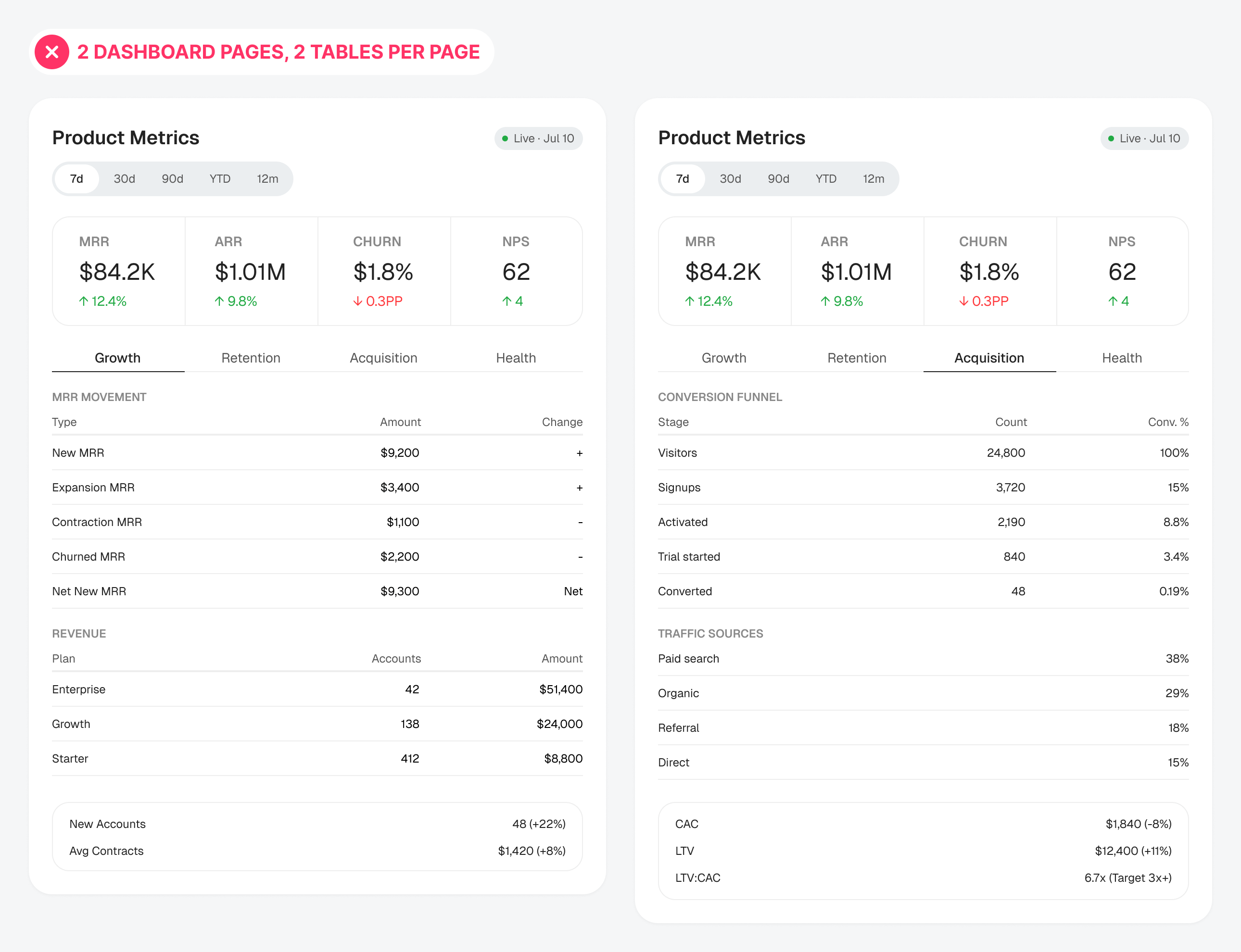
Turning the tables on cluttered data tables

Become a master at user experience design
Live Last read · last published · next check
Turning the tables on cluttered data tables
Bringing transparency to input selection
Help users choose the right option
One context, one cognitive interaction
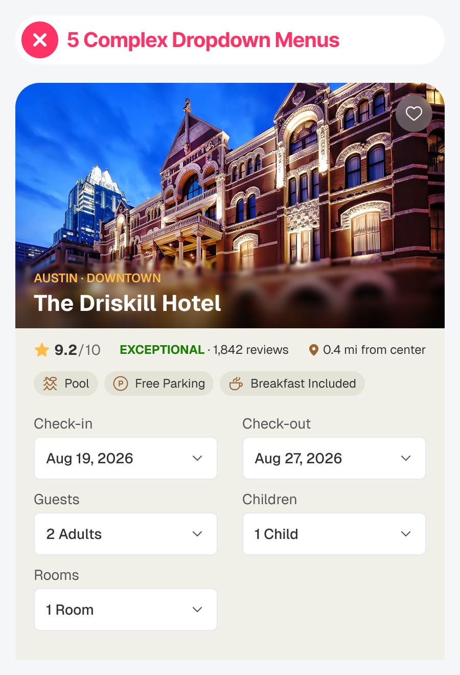
Killing dropdowns for better UX
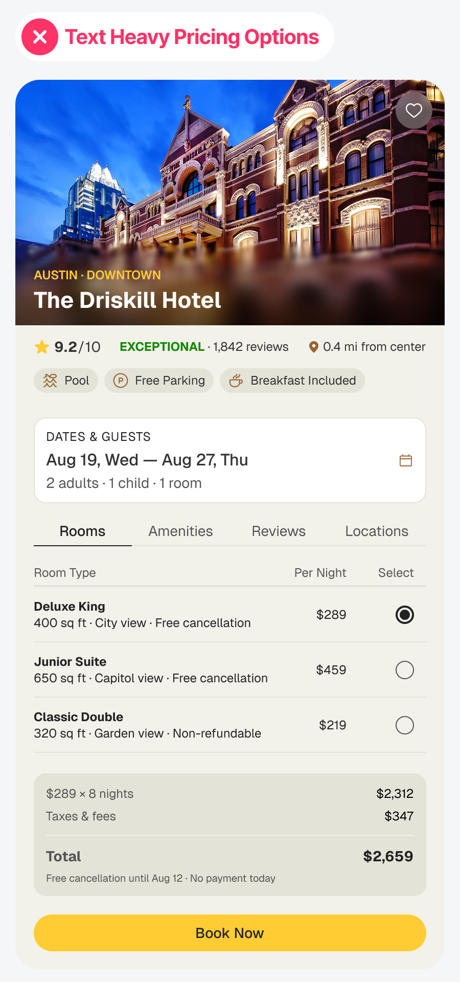
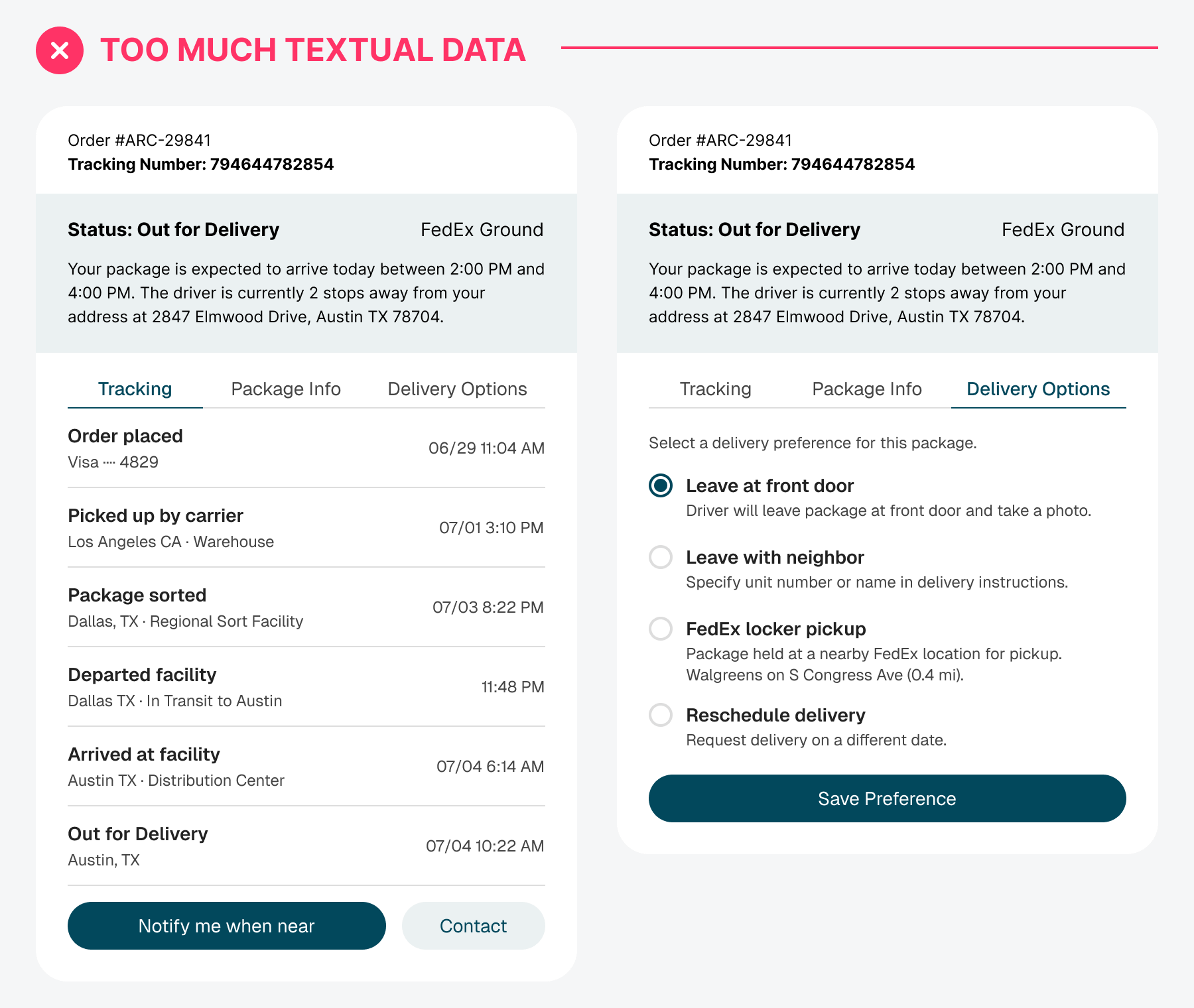
3 techniques for scannable design
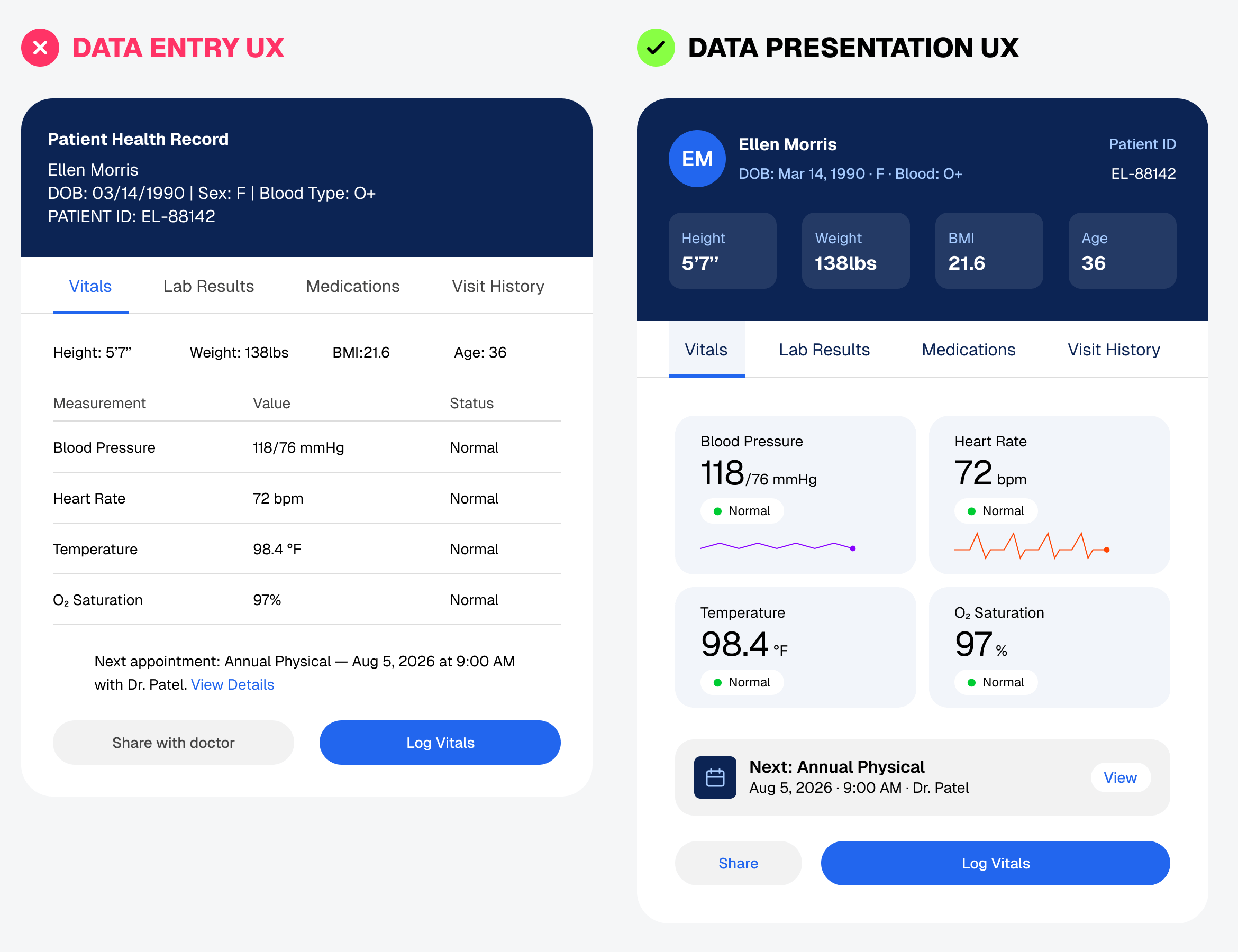
From textual to visual UI
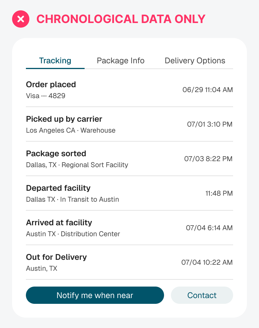
A better way to display progress
Design for faster visual recognition
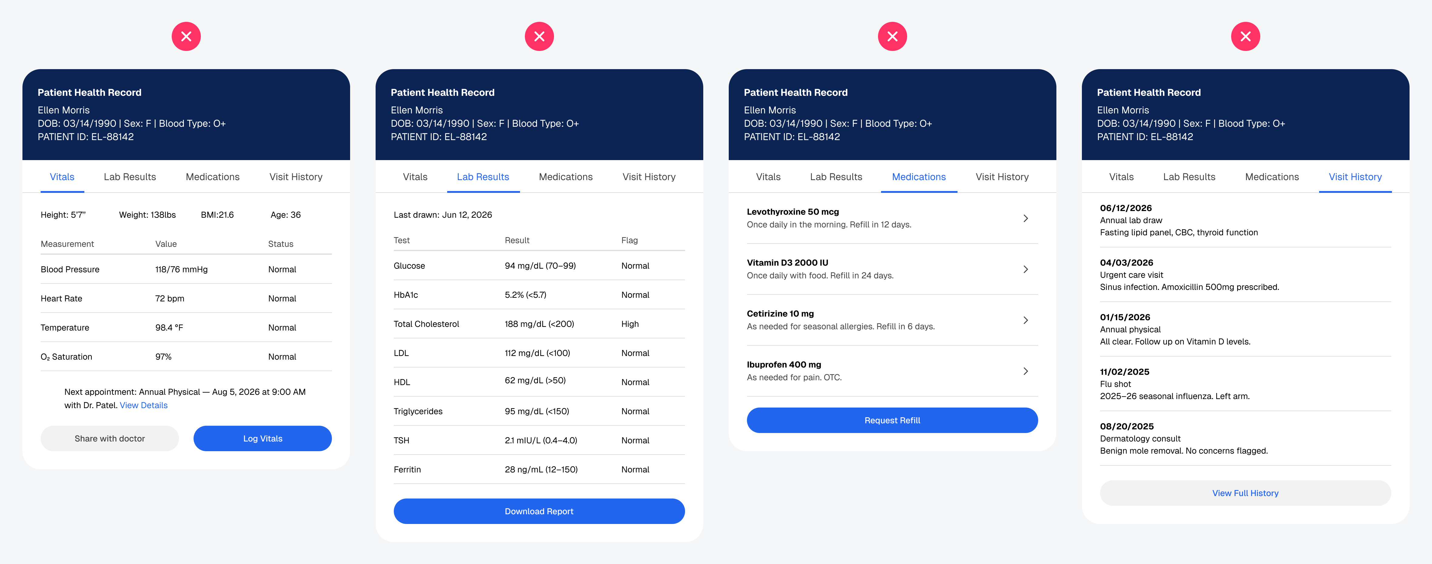
What data presentation UX looks like instead