
A very important factor in trading and investing, quite near the top of the list, is risk. Before entering a trade, a trader needs to understand the risk involved, and what their tolerance for risk versus the potential of profit are.
Risk tolerance refers to an investor’s ability and willingness to endure losses in pursuit of potential returns. It varies based on factors like age, financial situation, investment goals, and emotional response to market fluctuations.
Levels of Risk Tolerance:
Conservative: Prefers low-risk investments like bonds and blue-chip stocks
Moderate: Accepts some risk for higher potential gains, balancing stocks and bonds
Aggressive: Willing to take high risks for higher potential returns, often investing in growth stocks and speculative assets
Understanding risk tolerance is crucial for building a portfolio that aligns with an investor’s financial objectives. Risk tolerance for individuals may very greatly, and your own tolerance for risk may not be the same as other traders; always define your own risk and reward ratios, and make your own educated decisions.
The Unusual Whales Risk Charting offers several ways to consider a ticker’s overall risk profile.
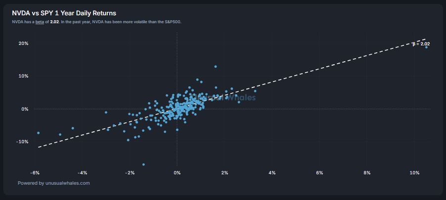
This chart compares the respective ticker and SPY’s 1-Year Daily Returns, showing how the ticker’s daily stock returns correlate with those of the overall markets (using SPY as a benchmark) over the past year.
The X-axis shows daily SPY returns, with the Y-axis showing the NVDA daily returns.
As of the publishing of this article you can see that NVDA has a beta of 2.02. Which means that NVDA has been 2.02x more volatile than SPY over the last year.
You could conclude, given what we see above, that NVIDIA has shown high sensitivity to overall market moves, with larger swings both up and down compared to the S&P 500. This makes it a high-beta (high-risk, high-reward) stock.
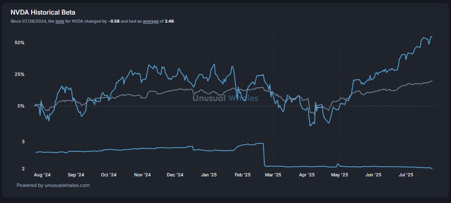
The top portion of this two part chart compares the respective ticker’s historical 1 year returns and overlays it with that of SPY’s (once again used as a benchmark).
The bottom portion of the chart shows the historical beta trend between the two.
As of the publishing of this article you can see that NVDA, despite seeing a decrease in its beta over the last year (-.58), still remains highly volatile.
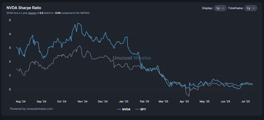
The Sharpe Ratio helps investors evaluate the risk-adjusted return. It tries to answer the question: “Am I getting a good reward for the amount of risk I’m taking?”
As of the publishing of this article you can see the following Sharpe Ratios:
NVDA: 0.30
SPY: 0.34
This means that on a risk-adjusted basis NVDA underperformed SPY by 0.04.
Higher Sharpe Values offer them most return for the least amount of risk:
A ratio of 2 or higher is generally considered excellent.
A ratio of 1 is considered to be ok.
Ratios under 1 are considered to be a suboptimal risk-adjusted return, meaning the investment’s returns are not sufficiently compensating for the level of risk taken
This chart shows the daily profit and loss (P/L) distribution for the respective ticker over the past year, modeled as a normal distribution (bell curve). It returns other relevant data.
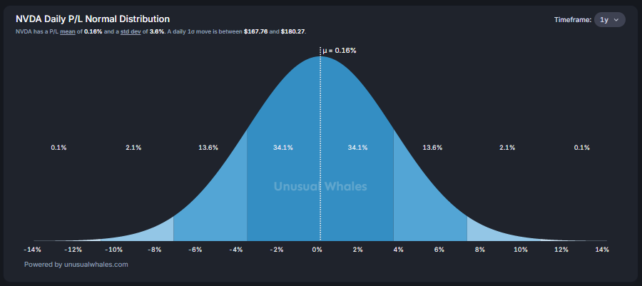
As of the publishing of this article:
On average, NVDA gained 0.16% per day over the last year.
NVDA’s daily moves typically swing ±3.6% from the average.
This chart shows the drawdown for the respective ticker, overlayed with that of SPY, measuring how far each asset dropped from its previous peak over the past year.
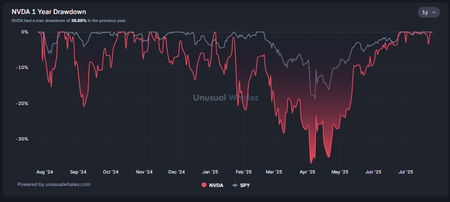
As of the publishing of this article NVDA has returned to all time highs, as depicted by the drawdown chart being very close to the 0% line. You can see that back in April NVDA saw a 36.89% drawdown from it’s peak.
The chart shows a historical look of the duration of each drawdown for the respective ticker over the last ten years.
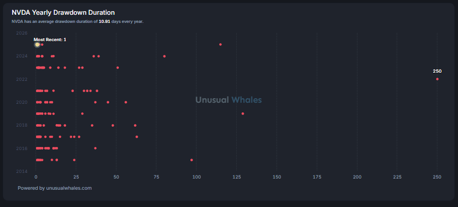
Each red dot represents a single drawdown event — a period when the stock fell from a peak and hadn’t yet recovered.
The x-axis shows how long (in days) the drawdown lasted. The y-axis shows each year.
As of the publishing of this article you could observe that NVDA’s drawdowns are usually brief, but when it does experience extended losses, they can be very prolonged.
Thank you as always for reading! I hope you found this helpful, and you can find many more articles like this one at https://unusualwhales.com/information!
NOTE: This post is not financial advice. The stock market is risky, and any trade or investment is expected to have some, or total, loss. Please do research before any trade. Do not use this information for investment decisions. Check terms on site for full terms. Agree to terms before considering this information.
Comments
Nothing yet. Say the first thing.
Sign in to join the conversation.